
Mobile devices contribute to over 60% of online traffic—and it’s a fact that shows the need to provide superior user experiences on mobile devices. A great mobile UI (User Interface) design is crucial to web design and a website's success. It takes a strong grasp of how to apply visual elements that facilitate interaction with mobile apps and services. So, learn how to delight users from the first tap in the IxDF Mobile UI Design Course, and discover the foundations of mobile user interface design to engage users instantly.
People often delete three out of ten apps within a month of downloading them—and it’s a trend that stems from poor user experiences or interfaces that fail to engage. Whatever the target audience, users can ditch apps without a second thought, and mobile UI design that's not intuitive or appealing to them is what often leads to app abandonment.
In mobile UI design, the goal is to create compelling interfaces with high user centricity. When designers keep this goal in sight as they strive to apply design principles effectively in their design process, they’ll increase the likelihood of long-term engagement and satisfaction. If you master mobile UI design, you can help turn creative ideas into interfaces that captivate your users—and customers—and these skills prove crucial for any UX or UI designer who wants to excel.
Mobile UI design stands out due to its focus on small screens and the dynamic nature of its users. You’ve got to account for the limited space and the fact that people often use these devices on the move, often in busy environments. This calls for you to understand user needs and behavior patterns.
If you want to understand more about mobile UI design, read on—and learn these five things.
The Basics of Mobile UI Design
You must understand key concepts that form a strong mobile UI design foundation. Understand these and you can create mobile interfaces that cater effectively to user needs time and time again.
Affordances
Affordances in mobile UI design help users interact intuitively. This means that the design elements signal their function. For example, a button designed to look like it pushes down invites users to tap it. This visual clue helps users understand how the app works without confusion or additional instruction. It’s intuitive, like a real-world physical button.
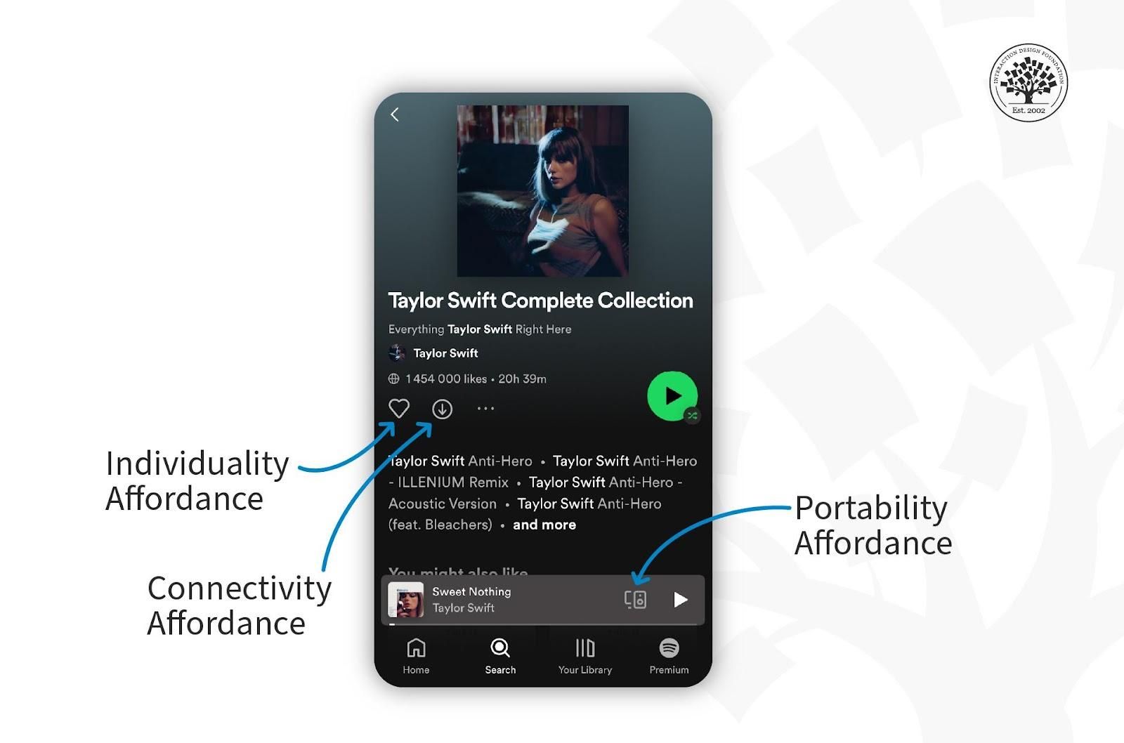
An affordance shows the perceived and actual properties of a thing.
© Interaction Design Foundation, CC BY-SA 4.0
Signifiers
Signifiers in mobile UI design are visible cues or indicators that guide users through an interface. These cues can be symbols, colors, text or sounds. They point out possible actions. For example, underlined text in a mobile app signifies a hyperlink—something that users have become used to as a convention. Users recognize this as a cue to tap the text to navigate to another page or section. This simple signal helps users perform tasks efficiently.
Tappability
Tappability refers to how easily users tap a button or an element on a mobile screen. You make interactive elements large enough and spaced well to avoid errors. Take a call-to-action button as an example. The CTA button has got to stand out as an important element and be big enough for fingers to tap without hitting nearby options. It’s an approach that helps users navigate an app with ease.
Watch Frank Spillers, CEO at Experience Dynamics, discuss the concept of tappability.
Show
Hide
video transcript
- Transcript loading…
One Thumb, One Eyeball Test
The One Thumb, One Eyeball Test is a guideline for mobile UI design. It checks if users navigate an app with one thumb and understand it at a glance. This test checks whether users find the app easy to use on the go, too.
Instagram exemplifies the One Thumb, One Eyeball Test. It places its key features—Home, Search, Reels, Shop and Profile—at the bottom of the screen. This design lets users navigate the app with one thumb, and it makes it accessible and easy to use while they’re on the move.
Essential UI Patterns for Mobile
If you want to create consistent mobile user interfaces, then you’ll need patterns. These patterns focus on ease of use and familiarity for users. So, let’s dive right in and understand the essential mobile UI patterns and why you need them in this product design approach to effective mobile applications and more.
What are Mobile UI patterns?
Mobile UI patterns are standard solutions to common design challenges—and they help you create intuitive and easy-to-navigate interfaces. You can select optimal and widely recognized interfaces tailored to the user's needs. These patterns include several elements:
The user's problem related to usability.
The specific context or situation in which this problem arises.
The underlying principle, such as error management.
A tested solution for designers to apply and tackle the problem's root.
The justification for the pattern's use and its impact on usability.
Illustrations of the pattern's application in real scenarios, including screenshots and explanations.
Detailed guidelines for implementation (provided in some cases).
To use them well, designers identify recurring problems within their projects, and they then apply these patterns to solve these issues for consistency and usability. Here’s an example:
Problem: Users struggle to find a specific function within an app due to a cluttered interface.
Context: This issue often arises in apps with many features—where navigation becomes cumbersome.
Principle: Simplification and accessibility.
Solution: Implement a "hamburger" menu—it’s a three-line icon that users can tap to reveal a side navigation panel with clearly labeled sections.
Why: The "hamburger" menu consolidates all navigation links in one place. It reduces clutter and improves findability—and it’s a design pattern that helps users locate features quickly and enhances the overall user experience.
Example: Many social media apps use the "hamburger" menu to neatly hide options for settings, profile management and content categories. This makes the main interface cleaner and more focused on core activities for users.
Implementation: You can place the "hamburger" icon in the top corner of the app's interface. This way, you’ll make the icon visible and accessible from any screen within the app. The navigation drawer should slide out smoothly and present options in a clear, easy-to-select manner.
Examples of Top Mobile UI Design Patterns
Certain mobile UI design patterns stand out for their effectiveness and widespread use. These patterns address common user needs and make apps more intuitive and enjoyable for users. Here are some top examples:
Hamburger menu: Hides options off-screen to simplify navigation. Users can access it via a three-line icon.
Tab bar: Places key navigation options on the screen's bottom. It lets users switch between app sections quickly.
Swipe gestures: Enables easy navigation through content or menus with a simple swipe. They make the interaction feel more natural to users.
Pull to refresh: Offers a convenient way for users to update content—they need to pull down on the screen to use it.
Onboarding screens: Introduces the app's features and benefits through introductory screens.
Infinite scroll: Lets users scroll through content without interruptions continuously. It’s ideal for social media feeds or news apps.
How to Design for Mobile
You’ve got to understand user needs and the limitations of smaller screens whenever you design for mobile. Here are key areas to focus on:
Mobile Search
Mobile search directly impacts how quickly users can find the information or products they seek. A well-placed and intuitive search feature reduces frustration and enhances user satisfaction. You want users to spend less time in search and more time engaging with the content. This efficiency encourages longer sessions and repeated use.
Here’s how you can improve mobile search:
Place the search bar prominently at the top of the app.
Use clear, concise placeholder text to indicate what users can search for.
Include filter and sort options to help users quickly find what they need.
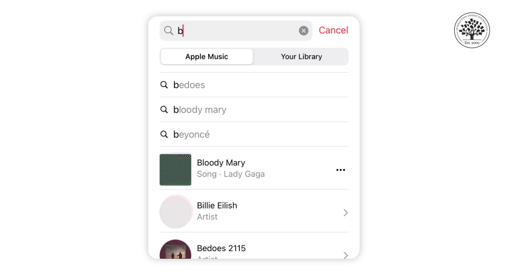
Mobile search helps users quickly and easily find information within an app.
© Interaction Design Foundation, CC BY-SA 4.0
Mobile Forms
Better mobile forms minimize user effort and increase conversion rates. Short, straightforward forms that have large input fields make it easier for users to enter information, especially when they’re on the go. If you provide immediate visual feedback on input validation, it helps you prevent errors and improves form completion rates for users. This attention to detail in form design greatly enhances the user experience, and it leads to higher engagement and success in registrations and checkouts.
Here’s how you can improve mobile forms:
Keep forms short. Ask users only for necessary information.
Use large, easy-to-tap input fields.
Provide visual feedback when users complete a field correctly or make an error.
Help Section
A well-designed help section empowers users to find solutions quickly without their needing to leave the app to look for assistance. Familiar navigation icons, swipe gestures and collapsible menus make the help section accessible and easy to use for users. This provides immediate assistance to users and so reduces the burden on customer support services. An easily accessible help section doesn’t just support users; it promotes trust and loyalty to the app, too.
Here’s how you can improve the mobile help section:
Use familiar icons and symbols for navigation.
Implement swipe gestures for ease of use.
Include collapsible menus to save space.
Provide a "Help" section within easy reach.
Notifications
Effective notifications help you engage with users without overwhelming them. It’s important to feature relevant and timely notifications to keep users informed and encourage them to return to the app. You can control users' notification preferences to enhance the user experience—and so foster ongoing engagement and ensure that users don't miss important updates or opportunities.
Here’s how you can design better mobile notifications:
Categorize notifications by urgency to help users understand which actions need their immediate attention.
Let users customize notification settings for a personalized experience.
Make notifications concise, clear and accessible to all users.
Use user feedback to refine notification designs and improve usability for them.
How to Improve Visual Design in Mobile
You’ve got to focus on various visual elements so you can improve visual design in mobile. These elements engage users and enhance their user experience. Examples include these:
High-quality images: Sites like Instagram and Airbnb use great photos to draw users in.
Videos: Short clips can show products or tell stories to catch users' attention.
Infographics: These make complex information easy to grasp and look good.
Visual hierarchy: Use size, color and layout to highlight key info and actions.
Branded visuals: Consistent use of logos and colors boosts brand recognition.
Human impact visuals: Pictures of people can make users feel more connected.
User-generated content (UGC): Real content from users adds authenticity to the experience.
These elements help you captivate mobile users so you can keep them interested. Let's understand how to improve these visual elements for a better mobile experience.
Watch Frank Spillers discuss the role of visuals in Mobile UX in this video.
Show
Hide
video transcript
- Transcript loading…
Make Better Use of Layout, Color and Typography
Layout, color and typography can help shape the visual experience on mobile. Effective layout helps with easy navigation, color influences emotion and focus, and clear typography conveys information. They create an engaging, intuitive interface that enhances usability and satisfaction. Here’s a detailed look at their roles and how you can improve them.
Layout
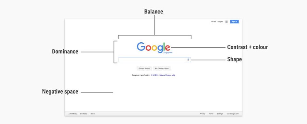
Layout determines how users interact with a mobile app—and it makes navigating through the app feel intuitive for them. Key information and features need to stand out and be easy to find. A good layout guides users from one section to another. It acts as the foundation of the app’s design.
The layout helps you naturally organize content for the user—and this organization is crucial for a positive user experience to happen. It helps users achieve their goals quickly, without frustration. Create an effective layout design and you’ll make the app enjoyable and easy to use.
Here are three guidelines to make better use of layout.
Keep it simple. Use clean, uncluttered layouts.
Prioritize content. Show important information first.
Make navigation easy. Help users find what they need fast.
Color
Color plays a vital role in mobile app design—and that role is impossible to overstate. It’s so powerful that it can influence feelings, highlight important details and guide users on what to do next. A consistent color scheme throughout the app is something that helps create a cohesive look and makes the app more visually appealing.
Contrasting colors improve readability—and that’s especially the case for text-and-background combinations. Colors can direct attention to where you need it the most. Not only do they add to the app’s overall feel to make the user experience visually pleasing and intuitive. Adequate color contrast is important for accessibility, too.
Here’s how you can make better use of colors.
Use color wisely. Colors can guide users and show them what's important.
Maintain consistency. Use the same color scheme throughout the app.
Choose contrasting colors for text and backgrounds to improve readability.
Typography
Typography is key to how you present information in mobile apps. Right fonts and sizes help you make the text clear and easy to read on small screens. Good typography creates a hierarchy to make what's most important obvious. This text organization helps guide users so they focus on key information first.
It’s vital to use typography to set the app's tone and align with the brand’s identity. What’s more, it can make the app accessible and enjoyable for users. Well-executed typography enhances user engagement—and that’s because it makes information consumption effortless and pleasant for users.
Here’s how you can best use typography in mobile apps.
Pick readable fonts. Use the easy-to-read text on small screens.
Use different sizes for headings and body text to organize information.
Permit proper space between lines for better readability.
Leverage Google’s Material Design
Material design is a design system from Google. It offers guidelines, components and tools that support best practices in user interface design. Its open-source code helps designers and developers work better together and teams can use it to make their products look good quickly.
To use Material design well, you’ve got to learn its guidelines first, and then, you can apply its components and tools in your design work. This will help you make your designs easy to use and visually appealing. What’s more, Material design has many resources to help teams work together better. It helps you speed up the digital product creation process, and you can use Material design to make products more attractive and easy for everyone.
Follow Top UI Design Trends
UI design trends change—often—and influence how we see and use digital products. From minimalism to neumorphism, each trend has got its benefits. These trends can help you create new ideas and improve your design work, too. Here's a look at important UI trends that have shaped our screens since the first graphical user interfaces:
Skeuomorphism: This design makes digital items mimic real-world counterparts—for example, the calculator app.
Minimalism: Keeps designs simple and focuses on what's important.
Flat design: Uses simple elements without any 3D effects.
Bauhaus style: Features simple geometric shapes and clean lines.
Bold typography: Uses large and bold fonts to grab attention.
Neumorphism: Combines minimalism of flat design with the realism of skeuomorphism.
Apply neumorphism to interactive interface items like buttons and dials. It helps you give them a three-dimensional, realistic effect with a minimalist focus.
© Interaction Design Foundation, CC BY-SA 4.0
Glassmorphism: Designs look like translucent frosted glass to add depth.
Animation/Motion: Adds custom animations to enrich the user experience and add dynamism.
Illustration: Uses unique drawings to stand out and tell stories.
Dark mode: Uses dark backgrounds to ease eye strain and save battery.
Reduce Cognitive Friction in Mobile
Cognitive friction is what happens when users feel puzzled or uncomfortable when they use a website or app. It may happen if the app is hard to understand or if it doesn't work the way they expect. The design may not match how people naturally think or behave—and it’s a problem that makes the user put in more effort to figure things out.
Cognitive friction can make users feel frustrated and make mistakes—and both of these problems are serious red flags for designers to watch out for. Users might even stop using the product, too. So, you’ve got to reduce cognitive friction if you want to make a user-friendly design, so everything feels smooth and easy to use.
Here are some ways to reduce cognitive friction in mobile design.
Simplify navigation: Use clear labels and a logical structure to help users find what they need quickly and easily.
Minimize input effort: Use autofill options and limit the number of fields in forms. This will make data entry faster and less error-prone for users.
Use familiar patterns: Stick to design conventions that users recognize. This won’t just reduce the learning curve but speed up interaction, too.
Provide feedback: Let users know their actions have been successful. Use visual cues to load states and confirm.
Optimize content: Break down information into small, digestible chunks for users. Use headings, bullet points and images to make content easier to scan for them.
Limit choices: Offer clear options without overwhelming users with too many choices. When they have the right number of choices—and clearly—it will help them make decisions more confidently and quickly.
Design AR Experiences
Augmented Reality (AR) is a technology that overlays digital content—such as images, videos or 3D models—on top of the real world as seen through a mobile device's camera.
For example, whenever you point your phone's camera at something, AR can show you digital images or information on the screen that adds to what you see in real life. It's like you add a digital layer to the world around you.
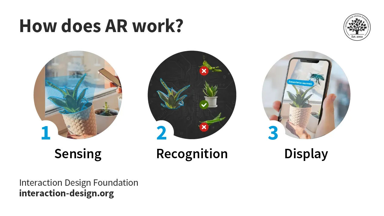
The three stages a device goes through to display AR content. It includes sensing, recognition and display.
© Interaction Design Foundation, CC BY-SA 4.0
Some of the best use cases of AR include:
Shop: Try on clothes or see how furniture looks in your room before you buy.
Education: Learn about history or science by seeing 3D models come to life in textbooks.
Gaming: Play games where your real environment turns into the game world.
Navigation: Get directions that overlay on the real streets in front of you.
Repair and maintenance: See step-by-step instructions to fix things on the object you want to repair.
Tourism: Point your phone at landmarks so you can learn more about them.
Interior design: Visualize how your home could look with different paint colors or decor.
When you design AR experiences for mobile, it's crucial to:
Understand AR's Role: You’ve got to know how AR can change user experiences in your area. AR can make learning interactive, shopping more informative and games more immersive.
Engage users: Aim for AR features that draw users in. Whether users want to try on clothes virtually in a shopping app or interactive educational content, AR should improve the experience.
Use available tools: Platforms like ARKit and ARCore help developers build AR experiences. These platforms give you the tools you need to bring immersive experiences to life.
Keep it simple: Your AR experiences should be easy to use. Users should feel like they naturally interact with the app without the need for complicated instructions getting in the way.
Test with real users: You’ve got to test your AR experiences with real users. Make sure your app works well in different real-world situations and listen to what users say to improve your app.
About the IxDF Mobile UI Design Course
The IxDF Mobile UI Design Course is a four-week journey into the heart of mobile user interface design. You will learn in-depth about what we discussed in this piece and about the world of visual design principles specifically tailored for the small screens of mobile devices. This course covers essential topics such as affordances, signifiers, touch targets and common UI patterns. Learn how to create good interfaces and promote ease of use and task completion.
This course is ideal for:
UX and UI designers aiming to refine their mobile design skills.
Visual and graphic designers venturing into the mobile space.
Junior designers and students seeking to expand their knowledge.
Marketing professionals and product managers looking to enhance app usability.
Software engineers and entrepreneurs desiring a foundational understanding of UI design.
Frank Spillers is your expert guide through this course. Frank is the CEO of ExperienceDynamics.com, a seasoned author, speaker and globally respected Senior Usability practitioner. You will gain knowledge based on his evidence-based research and firsthand practice in mobile user experience.
You will engage in the "Build Your Portfolio" project as part of the IxDF Mobile UI Design course. This series of hands-on exercises offers a practical experience to apply the methods discussed. Each lesson contributes to your project and culminates in a comprehensive case study perfect for your portfolio.
References and Where to Learn More
Enrollment for the IxDF Mobile UI Design course is now open. It’s included in an IxDF membership.
To become a member, sign up here.
Learn more about the differences between UX and UI in the article UX vs UI: What’s the Difference?
Get a comprehensive understanding of Mobile UI from Design for Mobile by Android Developers.
Have a look at Mobile vs. Desktop vs. Tablet Traffic Market Shares.
New data shows uninstalls remain a significant pain for apps. Understand the strategies to lower the uninstall rate for your app.
Take our course on UX Design for Augmented Reality.


