
People get easily bored with trends, and every few years, the pendulum swings from one way to another. We have all seen the rise and fall of iconic fashion pieces or art movements. The same thing happens in User Interface (UI) design. UI trends go from interfaces that mimic real-world objects to super-minimal interfaces with no embellishments. All of these have their advantages and disadvantages. With knowledge about these UI trends, you can create and experiment with new ideas, which are essential to innovate, push the design industry forward, and elevate your own design practice.
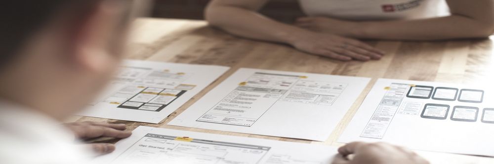
To deliver exceptional visual designs and an excellent user experience, let’s look back and learn from the most relevant UI design patterns and UI trends since the earliest graphical user interfaces appeared. Only then can we understand how different visual choices bring value to users and their relationship with the context of use. Let’s learn the 10 UI trends every UI designer should know.
1. Skeuomorphism
Skeuomorphism was the visual approach used to design the earliest graphical user interfaces. In skeuomorphism, design elements mimic their real-world counterparts to bridge the physical and digital worlds. The most well-known example is the recycle bin icon, which mimics a real-life recycle bin.
When personal computers or smartphones first appeared, it made sense to design them in a way that would help first-time users immediately grasp how to navigate the new digital world. Skeuomorphic designs, therefore, prioritize similarities to the real world over visual appeal to ensure an intuitive user experience.
Early versions of Apple’s mobile operating system, iOS, used skeuomorphism heavily across the user interface.
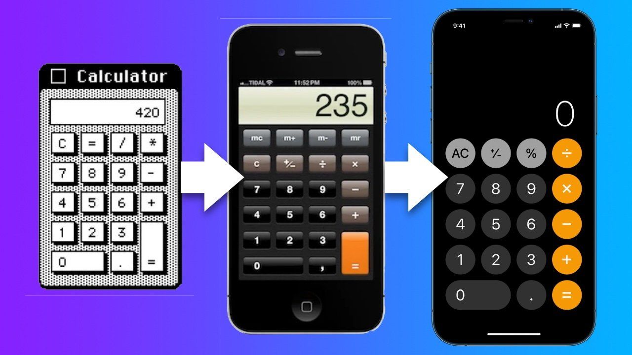
The evolution of Apple’s skeuomorphic calculator. The visual interface of early Apple apps and software imitated real-life objects to make their use more straightforward and intuitive for first-time users.
© Apple Insider, Fair Use
Skeuomorphic design was the standard until early 2010. This design aesthetic played a big part in making the transition to digital platforms as smooth as possible. As more and more people became digital natives, literal design elements weren’t as essential for a good user experience.
In addition, skeuomorphic design elements require a lot of technical ability since they are highly detailed. The increased digital literacy today paved the way for new UI design styles to flourish.
2. Minimalism as a UI Trend
The minimalist UI trend is based on the Minimalism art movement, the main principle of which is “Less is more.” Minimalism doesn’t translate into an empty and vague design. It focuses on “The More of Less”—as stated in the title of the American author Joshua Becker’s book. That means using fewer elements to reduce clutter, and give more attention to what matters most.
Minimalist interfaces are elegantly simple and focus on the functionality of every element, the use of negative space combined with bold colors and font combinations. Overall, minimalist UIs can be very usable since there are no decorative elements, and thus—if they are designed well—the user will have a highly intuitive journey through the design. Typically, minimalist interfaces have an elegant and sophisticated visual appeal.

The writer Alan Trotter’s website is an example of a minimalist UI with a twist. Users have to click the highlighted words to discover the hidden message.
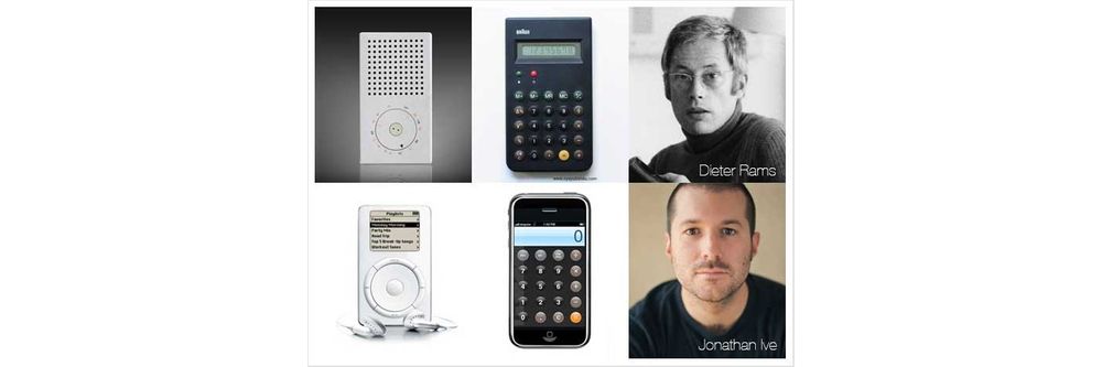
Minimalism emerged in the late 1950s in New York, and its main characteristics were order, simplicity and harmony. The German industrial designer Dieter Rams adapted the “Less is more” principle of minimalism to become the “Less, but better” principle of Good Design. In other words, “Good design is as little design as possible.”
“A shape, a volume, a color, a surface is something itself. It shouldn’t be concealed as part of a fairly different whole. The shapes and materials shouldn’t be altered by their context.”
— Donald Judd, American artist
Besides minimalist UI designs, many other UI trends—including flat design—follow the principles of minimalism to a greater or lesser extent.
3. Flat Design
Flat design is a UI design aesthetic centered around simplicity. It shifted the interface design paradigm from real-life-looking objects to schematic simplifications of elements. This UI trend represented a substantial technical advantage, especially in mobile user experience design and mobile devices, since it allowed faster loading speeds. Flat design uses a minimalistic approach to UI elements without any shadows or decorative elements. It heavily relies on bright colors and good use of typography to infuse character and visual appeal into the designs. For instance, look for typefaces that have some flair and can add visual interest but that have even strokes and are coherent with a minimalist aesthetic.
Flat design gained traction in 2012 with the release of Windows 8, Apple’s iOS 7, and Google’s Material Design. However, to some extent, flat designs lack visual affordances, and users might not know which elements are interactive or not.
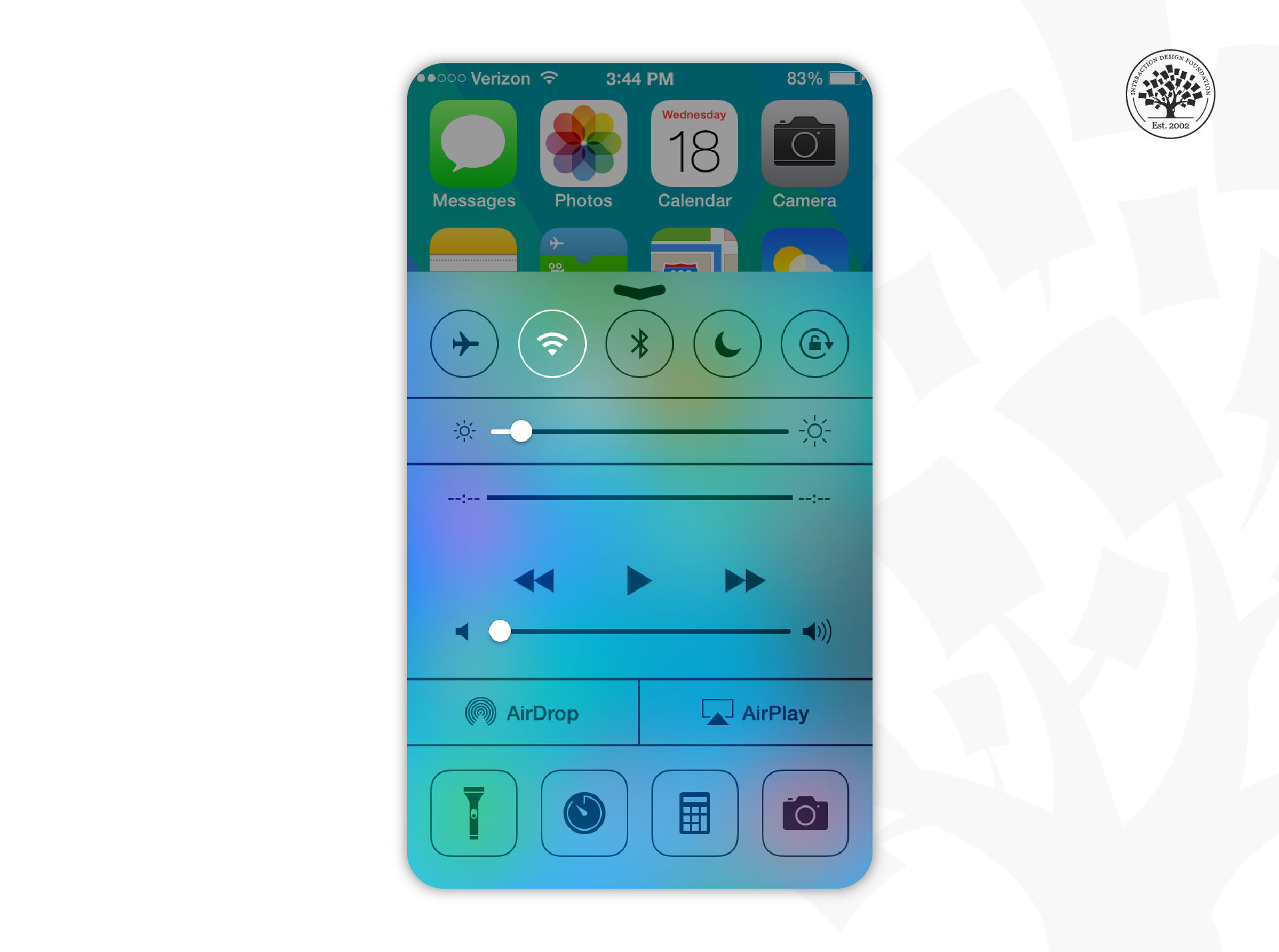
© iOS Guides, Fair-Use
Flat design 2.0 addressed this concern to improve usability. This evolution of flat design uses subtle shadows or color variations to highlight interactive elements to indicate to users how to interact with a design. These subtle changes help increase depth and dimension and thus improve usability.
Overall, flat design lends an uncluttered and clean visual appeal to digital interfaces.
4. Bauhaus Style
The Bauhaus UI style revolves around geometric graphics: semicircles, circles, rectangles, triangles, and other shapes. It’s also known for the innovative use of typography and non-distracting non-functional details. This design style relies on the design elements themselves: line, shape, color, and it features abstract shapes and balanced forms.
In this video, find out more about the Bauhaus movement and how it has impacted design.
In this video, find out more about the Bauhaus movement and how it has impacted design.
© Google Arts & Culture, Fair-UseThis UI design style is based on the Bauhaus art and design movement that began in 1919 in Weimar, Germany. This movement created a bridge between art and industry by combining crafts with art. The basic principle of the Bauhaus Movement was “Form follows function.” This principle has profoundly shaped design ever since. According to it, simple geometric shapes were designed based on an object’s intended function or purpose, resulting in a minimalist aesthetic that can also be beautiful. Bauhaus championed a geometric, abstract style featuring little sentiment or emotion and no historical nods.
Bauhaus-style interfaces have an elegant, modern and clean visual appeal to digital interfaces.
“Transferring the Bauhaus principles into a modern product design setting means to be brave enough to remove noise.”
— Melanie Daveid, UX designer & art director and Adobe Live host
5. Bold Typography
Bold typography, or rule-breaking typography, is a UI trend where typography takes center stage. In this design style, typography transcends its traditional role and becomes the center of the design. When typography is the main element of a design, rules change; spinning, twisting, extravagant sizes, division of words in many lines and poor readability are all fair game. However, it is essential to comprehend the principles of typography to bend them successfully. It’s best to make these bold design choices only when they serve a purpose.
Bold typography usually makes a big statement and can have shock value, and thus needs to be thought through and planned very carefully and intentionally.
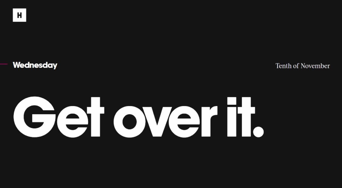
The website of the digital agency Huge uses bold typography.
6. Neumorphism
In neumorphic design, elements seem to extrude from the background. Neumorphism combines the minimalism of flat design with the realism of skeuomorphism. However, it doesn’t focus on imitating objects from real life but rather on creating objects that could work in real life. A neumorphic UI interface looks like you can physically interact with it; you can press buttons and move sliders.
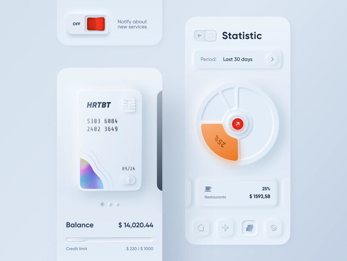
This design of a banking app done by Alexander Plyuto went viral on Dribbble, and it is said to be the first neumorphic design. His intention was to explore how skeuomorphism could have evolved in mobile interfaces, and the design community welcomed it as a fresh and exciting trend to explore.
© Alexander Plyuto via Dribbble, Fair Use
The key to neumorphism is how it treats depth. Buttons will appear raised until you press them, and then they will display on the sunken level. Neumorphism uses shadows and gradients to achieve a three-dimensional look, resulting in a sleek and fresh interface design. The essential elements of neumorphism are low contrast, monochromatic color schemes and subtle shadows.
This type of design may come with potential accessibility issues, especially in dark mode, due to its characteristic low contrast. People with vision loss, blindness and color blindness will find it very difficult to interact with this style of interface design. Therefore, good neumorphic design requires extra attention to design elements and principles such as typography, space or hierarchy to ensure the interface has good usability despite its low contrast. Designers are problem solvers and thus may find several strategies to ensure good accessibility in neumorphic designs.
The term “Neumorphism” was first coined by Michał Malewicz, Creative Director and CEO of Hype4, in 2019, after seeing a new take on skeuomorphism in designs on Dribbble and Behance. Neumorphism comes from the expression “New skeuomorphism”. This UI trend has also been called “soft UI” due to its characteristic low contrast.
7. Glassmorphism
Glassmorphism is a UI trend where design elements have the appearance of translucent frosted glass. Users feel that they can see through the elements, and it has a sense of verticality to it. Design elements look layered—with objects floating on space—and the top layer seems like a piece of virtual glass. To achieve the frosted glass effect, you can use a background blur and a semi-transparent outline to simulate the edge of the glass. For this trend to shine, backgrounds need to have enough tonal difference to make the glass effect visible.
The three most important characteristics of glassmorphism are transparency, light borders, and vivid or pastel colors.
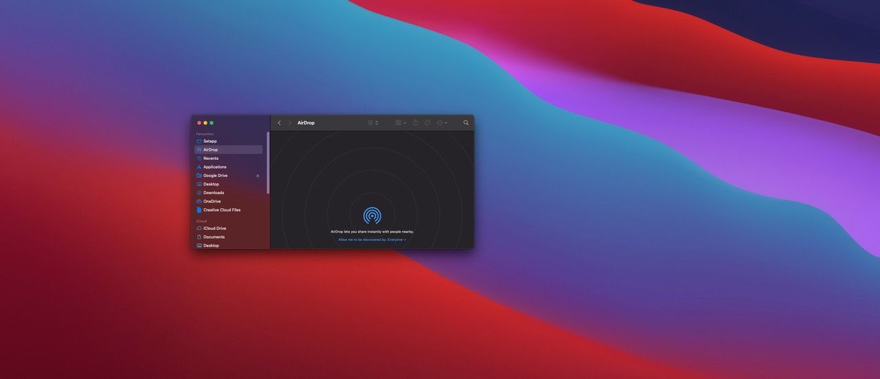
Apple’s macOS Big Sur operating system uses the frosted glass effect.
© Apple Inc, FairUse
There’s a great deal of discussion between designers about whether this trend can promote good accessibility. A safe starting point is to use this effect only in backgrounds since a UI should still work without any background. This way, visually impaired people could still interact with the interface.
Michał Malewicz also coined the term “Glassmorphism”. This UI design style became popular after Apple’s update of macOS Big Sur in 2020. Glassmorphism offers an eye-catching, beautiful and minimalistic visual appeal.
8. Animation/Motion as a UI Trend
Motion UI refers to the trend of adding attractive and customized animations and transitions to an interface. Motion or animation is a fun way to enrich a user experience and add life-like elements to an interface. This trend boosts visual appeal by adding the dimension of movement to a design.
If we want moving elements to make sense and feel natural, we need to add animations that enhance the design rather than distract from it. It is very easy to get carried away with all the fun animations, but we have to choose wisely to ensure a successful design. For example, you can use animations to guide or even entice your user to perform a specific action or give them feedback.
What’s more, beyond adding motion to an interface to boost visual appeal, you can use motion to tell a story. A common way to add storytelling to digital platforms is through scroll-triggered animation. In this case, motion occurs after users scroll through the page. Users feel an active role in the story since they make it unfold, something that creates an immersive experience—to a certain extent.
Alex Dram’s UX/UI portfolio’s website is an example of using motion in an organic and innovative manner to grab the user’s attention.
© Alex Dram, Fair-Use
Overall, adding motion or animation to your designs can be a way to breathe life into static interfaces, which, if done correctly, will improve user experience and user engagement in your products.
9. Illustration as a UI Trend
As a UI trend, illustration helps differentiate and give products more personality. In a sea of endless digital platforms, the ability to stand out is a precious asset. Illustrations can be digital or hand-drawn, 2D or 3D, and can have very different aesthetics. In addition, illustrations can also help static pages come to life, especially when combined with motion design. People are drawn to people, and thus, adding characters into a digital platform or a product can generate empathy, make a memorable experience and improve user engagement.
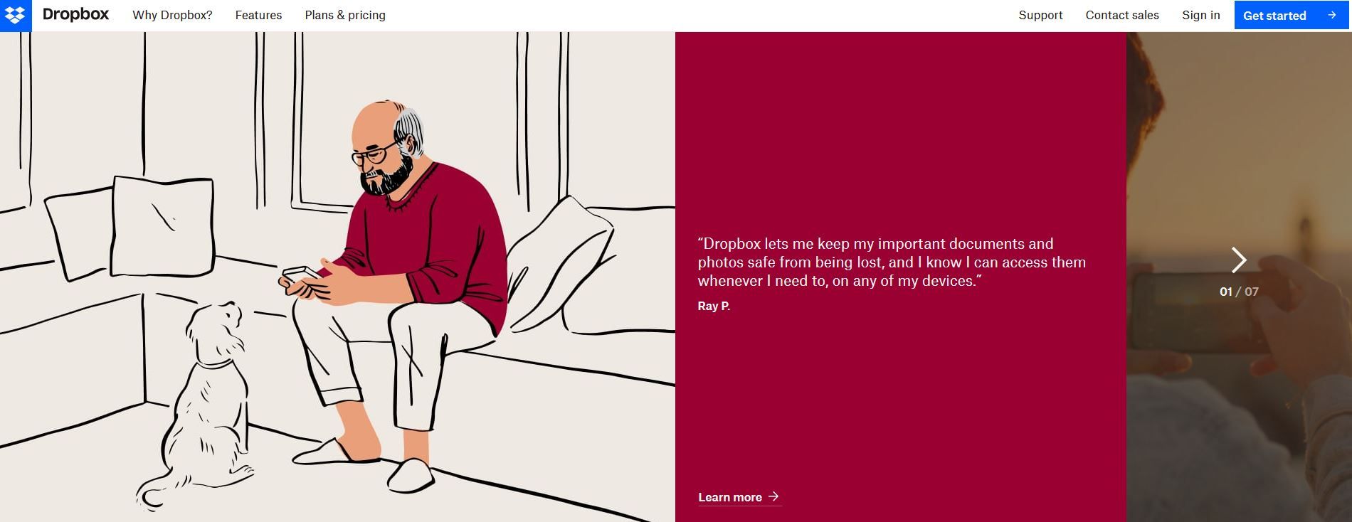
Dropbox uses illustrations on their website to help visualize their message and create emotions.
© Dropbox, Fair Use
However, we should create illustrations strategically to enhance user experience instead of distracting users or slowing down the platform. When done right, purposeful illustrations can increase conversion rates and significantly improve user experience.
Custom illustrations have taken over from stock images and have the power to give a unique visual appeal to your designs and help tell the story of your products.
10. Dark Mode as a UI Trend
The dark mode UI is a design style where light text sits on a dark background. This color scheme reduces the luminance emitted by device screens. Some studies suggest that it helps improve visual ergonomics by reducing eye strain. Dark mode also helps conserve battery power to some extent.
Dark theme UIs came about as a countermove to the dark-on-light color schemes, which simulated the appearance of ink on white paper. Implementing a dark mode is not about using black and white but rather low light and high contrast between elements. Google's Material Design recommends using dark gray for backgrounds and a lighter one for text (not entirely white, though).
This trend appeared in 2016 when Twitter experimented with a light-on-dark color scheme. However, many older operating systems worked with light text on dark backgrounds—you probably remember the screen with green numbers on a dark background from The Matrix films.
This trend seemed to take off when Apple released a dark mode option in the iOS 13 update. Since then, dark modes have become a common alternative in many interfaces, where users can choose between a light and a dark interface.
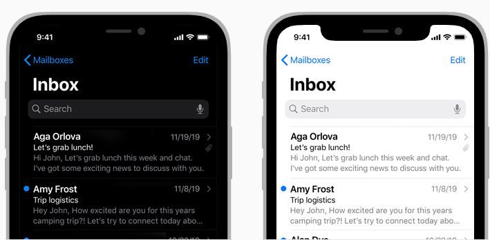
Dark mode vs. light mode.
© Apple Inc, Fair Use
Dark mode UIs have a sharp, sleek, and modern visual appeal that might be gentler on the eye. Therefore, dark themes may have become popular in response to the increase in users’ time spent staring at a screen. If you’re designing a product where users will be on-screen for long periods, you may want to consider adding a dark theme option, as you always must consider your user's context of use and brand requirements.
The Take Away
UI design has seen the rise and fall of many trends, from skeuomorphism—where UI elements mimic real-world objects—to minimalism—where UI elements are schematic and have no embellishments. Each was a product of its time and brought something relevant to the table. If you understand the reason behind each trend, you’ll be able to use that knowledge to improve your visual design choices and deliver exceptional user interfaces.
Regardless of the visual style you choose for your projects, always ask yourself how you can best support user experience with visual design. Doing this will ensure that no matter what the trend of the moment is, you’ll make the right visual design choices and deliver the best user experience.
References and Where to Learn More
To learn more about how users engage with different UI visual trends, read the article From skeuomorphism to flat design: age-related differences in performance and aesthetic perceptions.
Learn more about visual design in the IxDF Visual Design: The Ultimate Guide course.
Hero Image: © Google, Fair Use


