Notification design is critical in the age of mobile interruption. It’s become a key part of mobile user experience (UX) design. Here, we look at how designers can create transparent interactions that add value to people's digital exchanges instead of nuisances that distract the user or create mental health issues.
Products notify users to get their attention, and only rarely for productive reasons. If your smartphone buzzes off the hook through the day, then you can blame social media to a certain extent—social media has driven the pattern of alerting users each time any activity occurs on their profile.
Properly designed notifications are a good idea because we know mobile is an interruptible domain. But if we overdo it, it can frustrate the user, and lead to mobile phone addiction and other mental health issues.
Notifications can affect people in different ways. Clement Kao, Co-Founder at Product Manager HQ, notes the following factors that influence people:
Content: What is the notification?
Tonality: How is the tone of voice?
External Activity: What is the person doing when they receive the notification?
Time of Day: What time of the day do they get the alert?
Frequency: How many times are they getting notified?
Location: What is the person’s location when they receive the notification?

How your notifications impact your users depends on their context. For example, Uber’s notification that the driver is arriving soon is critical for the user. In one glance, the user knows the car type and number without even opening the app.
© Uber, Fair Use
According to Kao, there are a few guidelines to follow to develop an engaging mass notification system that does not annoy the user:
Identify the intent and value of the notification. What outcome do you intend to accomplish? What value will the notification provide users?
Define the notification’s origin within the product. Where does the notification originate? This is usually a specific action or trigger within the product.
Design the message content. What information will the message include? How will you communicate it?
Set the message timing and location. When and where will users receive the message?
Choose the type of notification. How will you share the message (through SMS, transactional email, push notification, or another channel?)
Design the notification output. What does the notification interface look like within the digital product?
“The foremost thing to be done is to understand the intent and value of a particular notification to the user. There's no point in wasting a user’s time with meaningless content. It's basic human nature to ignore things which are of zero value to them. In this context, it's crucial to understand the users’ needs and goals. Without this understanding, we might design a notification system of poor value to the end user.”
— Clement Kao, Co-Founder, Product Manager HQ
Microsessions and Self-Sufficient Notifications
Research indicates that user interactions on mobile last an average of 15-second microsessions. That is how much time you have to support a user’s task before they are interrupted by another task. Keep this in mind when for your user interface (UI) design for mobile. This means users have less time to focus, concentrate or think about what happens on the screen.
“In order to design a successful, notification-based microsession, create notifications that are self-sufficient: that convey a fully formed idea and do not require the user to go elsewhere to understand what the notification is about.”
— Raluca Budiu, Director of Research, NN Group
Give Users More Control of Notifications
Notification design can no longer be considered a neutral UI and treated like any other design problem. Digital wellness is a growing attempt mainly by device manufacturers to address the growing concerns around mental health issues or stress triggered by mobile interactions, content and notifications. “Giving users control” used to be an essential usability guideline. Today, it is sorely needed in notification design.
Notifications are the primary trigger responsible for:
Interruptions: most notifications are often optional or low priority, but pretend to be urgent.
Broken tasks: they can interrupt another task by demanding immediate attention.
Anxiety: users might associate an excessive number of notifications with an emergency, causing anxiety.
Stress: Notifications can be an exhausting experience when they constantly demand attention, especially when users are trying to relax. If you’ve heard “ding, ding, ding” throughout the day, you know the drill.
Excess screen time: Spending too much time on social media sites like Instagram can worsen depression caused by excessive screen time. This is why Google offered “do this instead” suggestions to users in 2022 if they spent too much time on a single app.
Instead, give users the ability to manage, customize, mute, schedule, turn off, and choose their preferred channel to receive the notification.
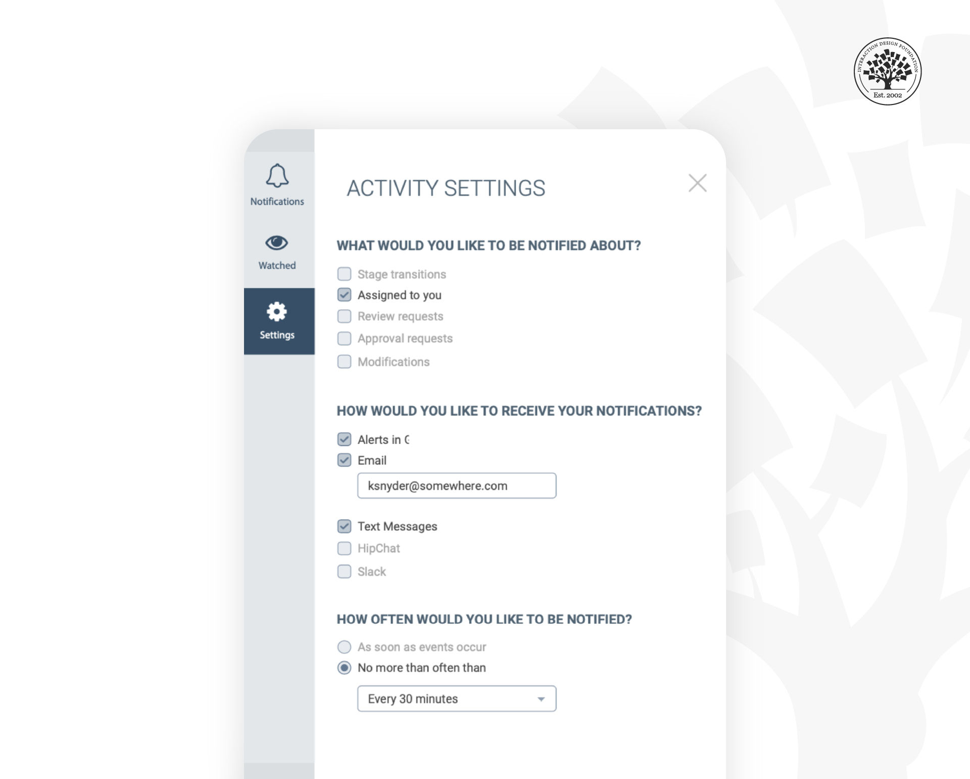
In this example from Experience Dynamics, CEO Frank Spillers says, “We tried to give users more control and think carefully about notifications since we didn’t want to overwhelm users in this B2B app. However, looking at this screen, with an attention-respecting focus, we could probably improve it even more.” What do you notice could be improved?
© Experience Dynamics, Used with permission
Think strategically about notification design. How can you help users get notifications when they are in a task flow, such as waiting for service (delivery, pick up and so on). Consider the ethics of constantly notifying users based on, for example, solely the activity of other users. This also applies to business to business (B2B) users as much as consumers. Wasting users’ time and squandering their attention does not lead to a great degree of user satisfaction and adds unnecessary app fatigue and cognitive load.
The algorithmic-based model of “user engagement” we take for granted was first promoted in the mid-2000s by the former Facebook executive and founder of Social Capital, Chamath Palihapitiya. Chamath’s VC firm funds impact projects and everyday tools like Slack. Reflecting on his role in creating Facebook user engagement, Chamath said:
“I think we have created tools that are ripping apart the social fabric of how society works. The short-term, dopamine-driven feedback loops we’ve created are destroying how society works.”
A report by The Wall Street Journal found that Meta’s (formerly Facebook) own team of researchers said the app hurts sleep, work relationships, or parenting for about 12.5% of users (or about 360 million people).
The social media model of user engagement has yet to improve its usefulness. Or at least it needs an ethical reboot with digital wellness at the forefront. We need to redefine User Engagement in our app designs. We cannot continue to rely on what the Center for Humane Technology, Chamath and others refer to as the ‘dopamine’ economy: compulsive app experiences and notifications that activate our reward systems while hijacking the amygdala in the brain (much like gambling or taking addictive substances does). We ought to be helping our users’ brains, not hacking them.
Nir Eyal, who taught at the Stanford Graduate School of Business and the Hasso Plattner Institute of Design and author of the book Hooked: How to Build Habit Building Products, followed it up several years later with his book Indistractable: How to Control your Attention and Choose your Life, a book about respecting user attention and minimizing the harm of inducing addictive behaviors, deliberately or unintentionally.
Digital wellness is a growing ethical responsibility that continues to evolve. All designers must consider the impact of notifications and UI elements on their UX strategy.
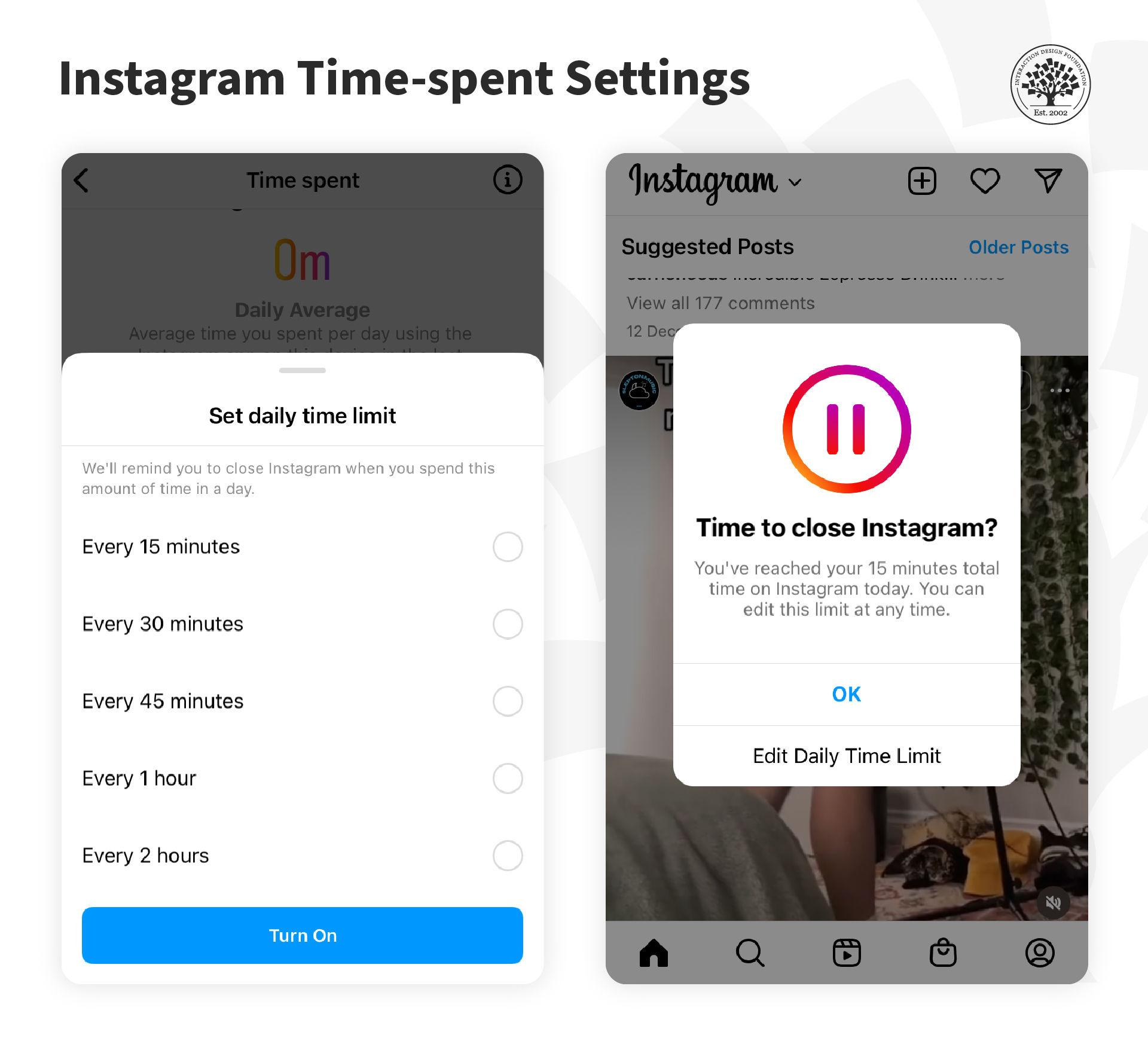
Instagram now includes a feature called "Your Activity", which allows users to monitor the amount of time they spend on the app and set daily reminders to take breaks.
© Instagram, Fair Use
The Take Away
Notifications underlie app design and fit the interruption model of mobile. However, poorly designed notifications can disrupt and distract users, robbing them of value instead of being helpful. The design of notifications should also be conscious of the harm of constantly requiring users to be engaged. Instead, notifications should be designed to give users control and respect for their digital wellness.
References and Where to Learn More
Here is Raluca’s article on Mobile Microsessions.
Read Ferreira and colleagues’ work on microsessions here: Contextual experience sampling of mobile application micro-usage.
How one in eight users are affected by Facebook.
Read and listen to Chamath’s address at Stanford:
Former Facebook executive: "you don’t realize it, but you are being programmed".
Chamath Palihapitiya, Founder and CEO Social Capital, on Money as an Instrument of Change.