Web forms act as essential bridges between users and services, and what they do is enable interactions like registrations, feedback, and orders. Their design can help you engage and retain visitors. Every element, from question phrasing to layout, matters in making the form smooth. That’s why it’s valuable to explore the essential tips that will help you create effective forms and learn from real-world examples where you see those tips in action.
Imagine a user visiting your website, eager to sign up or purchase something. The form pops up—and it's a mess. This creates a frustrating experience and they leave. Discouraging, right? Forms are everywhere, on every website and serve countless purposes. They guide users through signups, checkouts, feedback, and much more. That’s why forms matter a lot.
In fact, in user experience (UX) design, forms are such important parts of design that if the form isn't straightforward, welcoming, and visually appealing, it may become hard to convince visitors to share their details at all—and 81% of people abandon the form after they start to fill it out. So, it might be a challenge to create engaging and functional forms as a designer. This guide focuses on easing that.
Now, we’ll look into the best practices, types of forms, and examples to help you create the best UI forms. Our aim here is to equip you with the knowledge to create forms that align with project goals. Let's make form design a highlight of your website, not a hurdle.
The Importance of Form Design
Effective form design bridges the gap between user needs and business goals. Here's why it matters:
Simplifies user interaction: Well-designed forms guide users from start to finish. This encourages them to finish the form.
Boosts conversions: Users are more likely to fill clear, concise forms. It directly impacts the conversions.
Reduces errors: The right layout and checks as users fill out the form can help them enter information correctly. This means fewer mistakes.
Enhances accessibility: Good design is something that makes sure that forms are accessible to all users, and that includes user with disabilities.
Builds trust: Secure, well-structured forms convey professionalism and respect for user privacy. It helps build trust with your audience.
Saves time: Features like autofill and predictive text features save users time. It makes the form-filling process quicker and more efficient.
Bad form design can turn users away—and fast. It can make your digital space less effective. A hard or confusing form is something that can lead to people giving up, fewer conversions, and a bad user experience. What’s more, it’s not just about understanding user behavior; there’s the point that a poorly designed form can make people doubt your brand's security and professionalism, too.
It's crucial to prioritize user-friendly design principles to prevent these pitfalls and ensure your forms enhance—rather than detract from—the overall user experience.
Form Design Best Practices: 25 Expert Tips
Effective forms collect information, assist users in interacting and lead them to take specific actions. You must understand and apply best practices to design a form that users will fill out.
In this section, we’ll talk about the top expert tips to improve your form design. Stick to these guidelines and you can make forms that look great and function well. Whether you're working on a straightforward contact form or a detailed survey, these tips ensure your forms are easy to use and successful.
Simplify Form Structure
The first aspect to consider in form design is the form structure—a vital factor. A well-structured form guides users smoothly through the process—and it's something that makes it easy and intuitive for them to complete. Let's look into what elements within the structure need attention for optimal form design.
1. Keep Forms Concise
Keep forms concise and include only essential fields to prevent overwhelming users. For instance, if you create a signup form, ask only for critical information like name, email, and password. This approach makes it more likely for the user to complete the form. Shorter forms translate to higher completion rates and a better user experience. Users feel more motivated to complete shorter forms without unnecessary questions adding to the text input demands. Apart from that point, you may violate data protection regulations in some countries by asking for irrelevant information.
2. Arrange Questions Wisely
Start with the simplest questions and then move on to more complex ones. This strategy encourages users to fill out the form and keeps up their momentum—it makes the form feel less daunting and more manageable. What’s more, put sensitive questions towards the end. Users have committed effort to completing the form and may be more inclined to answer.
3. Use a Single-Column Layout
Single-column forms guide users in a clear and direct manner—unlike multicolumn layouts, which often lead to confusion. Research from Baymard Institute shows that single-column forms perform better than multi-column layouts. They reduce errors and boost completion rates—thanks to the point that they present a straightforward path.
Although some e-commerce sites choose multicolumn forms to save space, the benefits of single-column layouts stand out—they’re great for easier form completion. This makes them the better option for form design and a no-brainer for mobile platforms with mobile phone users.
Single-column form vs multi-column form design.
© Interaction Design Foundation, CC BY-SA 4.0
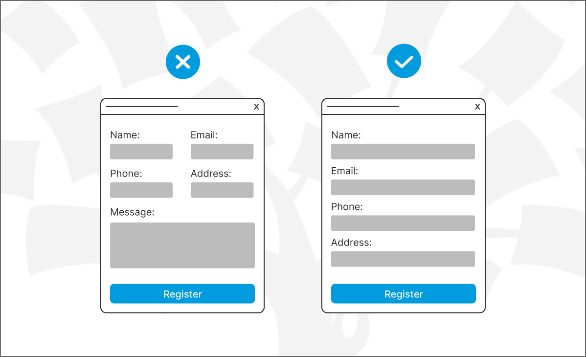
4. Group Related Fields
Organize input fields into related sections to help users process information more efficiently. It makes it easier for users to understand what you want to know in each part, too. Group by theme or topic and you’ll be able to improve the user experience. If in doubt, try user research!
Group related fields to make it easy for users to understand the information they must fill in.
© Interaction Design Foundation, CC BY-SA 4.0
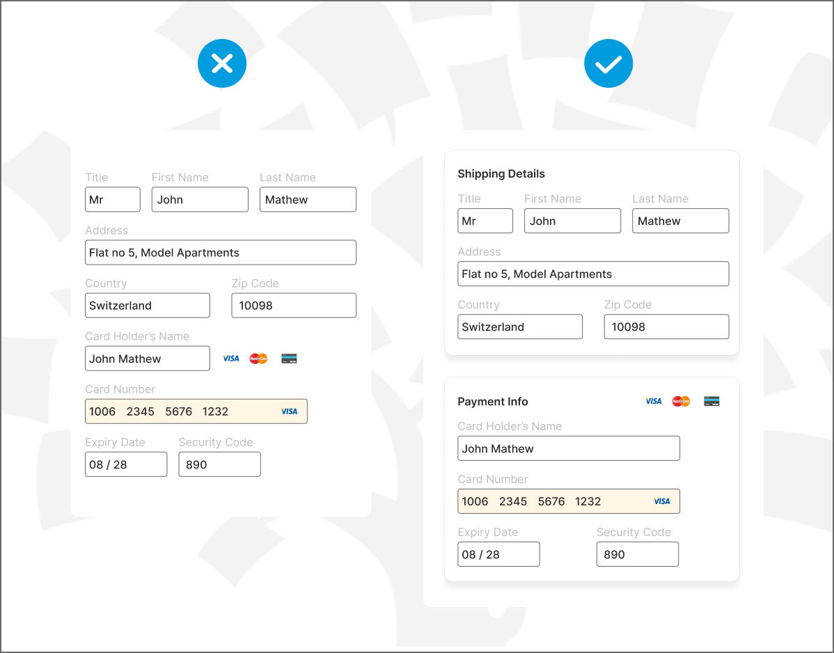
5. Opt for a Multi-Step Form
Multi-step forms break down the data-collection process into manageable chunks—and they’re a smart UX design move. Instead of confronting users with a long, daunting form, multi-step forms present information in a sequence of steps or pages. It’s an approach that can simplify complex forms—like applications or surveys—to make the task feel less intimidating.
Users can focus on one section at a time—and it’s an important point, one that can lead to more accurate responses and higher completion rates. What’s more, multi-step forms allow for progress indicators—a point that further motivates the users to complete the form. Venture Harbour implemented a four-step form with over 30 questions and achieved an impressive conversion rate of 53%.
But don't get carried away. It is counter-productive to split fields that belong together into separate steps in the form.
Multi-step forms have higher conversions as they don’t overwhelm the users.
© Venture Harbour, Fair Use
Improve Visual Elements
Looks are important—how the form looks plays an important role in the user experience. A visually appealing form doesn’t just attract attention but helps users navigate and understand, too. As you enhance the form's visual elements, you make it more engaging and user-friendly—and here's how to use design to your advantage.
In this video, William Hudson, User Experience Strategist and Founder of Syntagm Ltd, explains how usability heuristics, like consistency, error prevention, and minimalist design, can guide you in evaluating and improving the visual elements of your forms to create clearer, more user-friendly interfaces.
Show
Hide
video transcript
- Transcript loading…
6. Apply Consistent Branding to Forms
Incorporate your brand's colors, fonts and style into forms as they strengthen brand identity. For example, using your logo’s color scheme for form buttons and headers makes the form instantly recognizable as part of your brand. But do make sure that the colors you choose offer adequate contrast. Otherwise, you should avoid their use in the text.
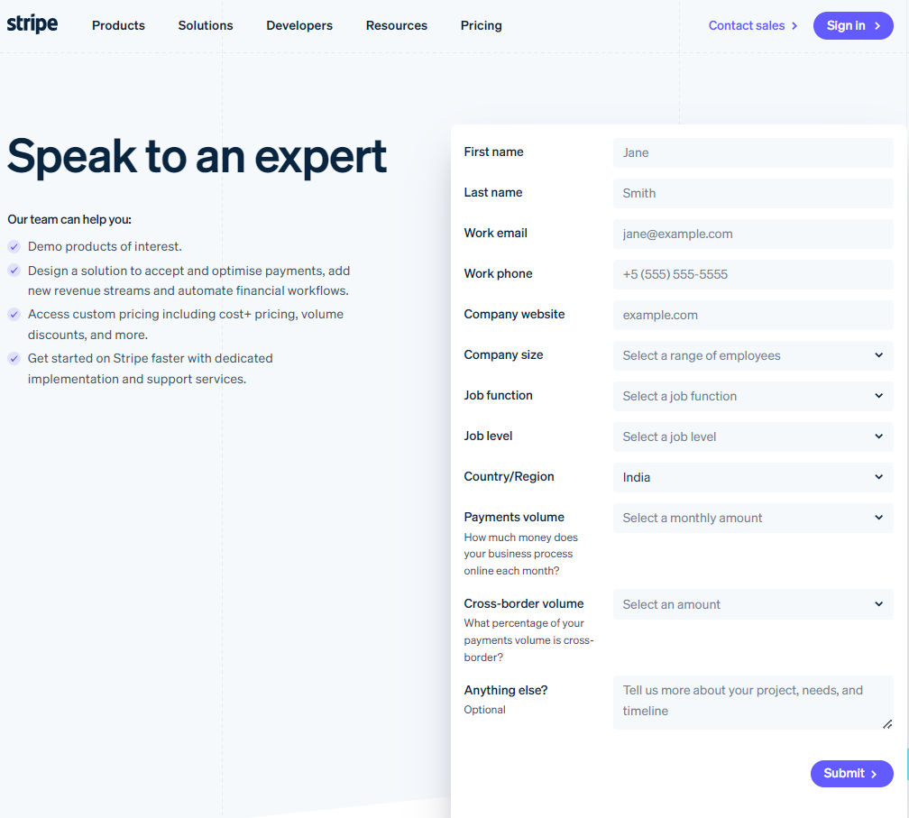
You need consistent branding on forms because they serve as touchpoints between your organization and your audience.
© Stripe, Fair Use
7. Integrate Intuitive Icons in Forms
You can add clear icons—like a key for passwords or an envelope for email fields—to guide users through the form. This visual aid nicely simplifies the process, and it’s especially helpful in complex forms. It communicates function and reduces text dependency. Have a look at this example from W3schools.
You can easily find icons for fields like username, email, password, etc. So, use them (if they make sense).
© W3schools, Fair Use
8. Provide Visual Feedback for Actions
Highlighting an active field with a border color change or animating the submit button upon hover gives users clear feedback on their actions. This makes the form more interactive; plus, it reassures users that you’ve registered their inputs. You can see how Duolingo provides visual feedback when you click ‘Continue’ in the signup form.
Duolingo’s interface showing visual feedback if users click on continue button.
© Duolingo, Fair Use
9. Use Whitespace to Enhance Form Readability
Effective use of whitespace around form elements prevents overcrowding. It makes the form look cleaner and easier to read. Strategic spacing is a valuable aid that lets users' eyes rest and distinguishes between different form sections. Take a cue from Thespacecube’s contact page.
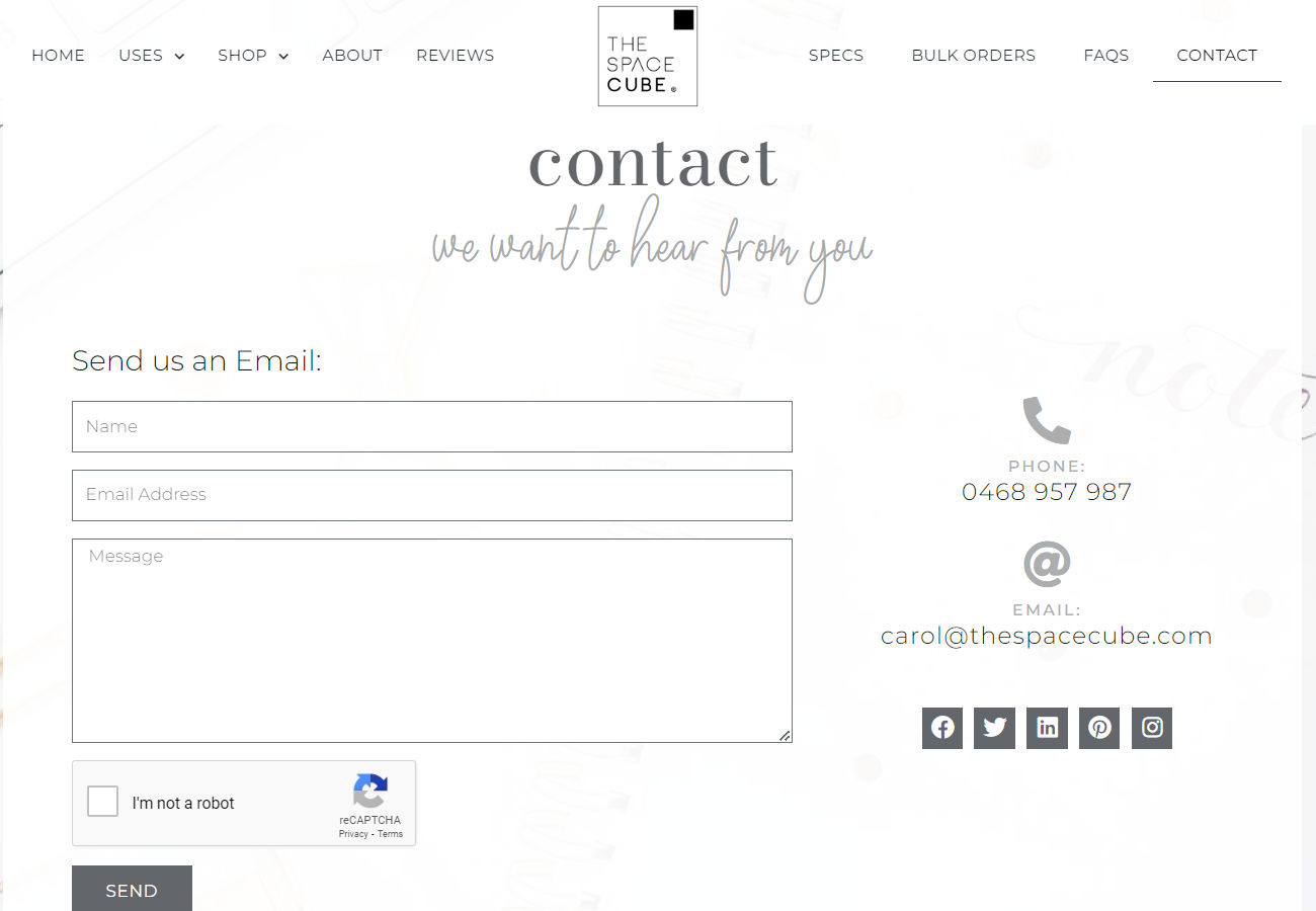
The use of white space in forms improves readability and user focus.
© The space cube, Fair Use
10. Employ Contrast for Better Visibility
High contrast between text and background is a powerful aid that ensures that all users—including those with visual impairments—can easily read the form instructions and labels. For instance, dark text on a light background for instructions is a superb way to boost readability. It makes the form easy to understand for everyone.
Focus on these tips for better color and contrast for the web forms:
Use WebAIM's Contrast Checker to measure text-background contrast.
Normal text minimum ratio: 4.5:1
Large text minimum ratio: 3:1
Non-text elements minimum ratio: 3:1
Enhance visuals with colors in labels, icons, shapes, or patterns.
Avoid using color alone for required fields, errors or success indicators.
Choose color schemes compatible with dark mode and high contrast mode.
Enhance User Interaction
People find forms easier to fill out when it's a simple and clear thing for them to fill them out—and so means more people will finish them. Here's how to make forms better for everyone.
11. Use Inline Validation
Inline validation is a feature that checks the information users enter into form fields in real time. As soon as a user moves to the next field, this validation instantly tells them if their input is correct or if there’s an error that they need to fix. This immediate feedback helps users correct mistakes on the spot—and it’s much better than error messages appearing only after they’ve submitted the form. This feature nicely reduces frustration and stops users from submitting incorrect information.
Make it easier for users to fill the form with inline validation
© SmashingMagazine, Fair Use
12. Make Form Filling Faster With Autofill and Predictive Text
Features like Autofill and predictive text automatically fill in common information—like names and addresses—based on past entries. This feature cuts down on typing and speeds up completion—and it makes the process less cumbersome and more user-friendly.
13. Use Clear Labels and Instructions
Clear labels and instructions make forms easier to understand. They help users know what you need from them. For example, if a field asks for a "Date of Birth," including an input hint like "MM/DD/YYYY" clarifies the expected format. This doesn’t just allow for clarity but guides users on how to fill out the form in the correct manner, too. It makes the form-filling smoother and enhances interaction with the form—lessening the chances of “headaches” later from a wrongly filled-out form.
Give cues in your forms to help the users understand it better.
© CSS script, Fair Use
Optimize for Mobile
Since mobile devices account for over 53% of global website traffic, you must optimize forms for mobile. People often reach for their phones first, whether they want to sign up for services or fill out surveys. This section will guide you through enhancing mobile form usability to give users on any device a seamless experience.
14. Focus on Responsive Design
Forms should look good and work well on any device. This means they change size and layout to fit small phone screens or big computer screens. Everyone gets the same great experience, no matter how they access the form.
See this quick video to understand what it means to create a responsive design.
Show
Hide
video transcript
- Transcript loading…
15. Design Touch-friendly Inputs
Buttons and dropdown menus need to be big enough to tap with a finger. It’s important—if not crucial—to consider the size and distance between these elements. Design it properly and you’ll make it easy for everyone to use the form without mistakes. And be sure to test touch-based design with older users. Drier skin and reduced motor control can mean forms that work well for a 20-something audience need further adjustment to cater for a broader base.
16. Simplify Input Methods with Mobile-Friendly Tools
You have many mobile-friendly tools like sliders, toggles, and date pickers that you can use while making forms. Instead of typing everything, people can use sliders to adjust values, toggles to turn options on or off, and date pickers for selecting dates. But also consider accessibility. A popup calendar is a nightmare to complete for someone who can't easily see or touch the screen.
Foster Trust and Security
People often hesitate to trust new websites with their personal information. They worry about getting too many promotional emails if they share their details—which is a natural-enough concern. To reduce the skepticism, you’ve got to show users their privacy and security matter to you. Here’s how to do it right:
17. Communicate Privacy Policy
It's vital to share your privacy policy clearly on forms—and it’s a practice that shows respect for users' privacy and choices. A detailed privacy statement explains how you handle user information. Include opt-in checkboxes for marketing communications. This approach ensures users know they control the information they share and receive.
To do it right, follow these rules:
Place your privacy policy where users can easily find it—like near the submit button or as a link next to email subscription options.
Use simple language in your policy. It’s critical to avoid legal jargon that might confuse users.
-
For opt-in checkboxes, be sure to make them clear and straightforward. Let users choose if they want to receive updates or offers. Note that in some countries, it's not permissible to pre-check opt-in boxes. Credit card companies also take a dim view of pre-checked opt-ins.
This transparency builds trust.
18. Show Your Security Efforts
Tell users about your security steps, such as SSL encryption. This makes users feel safer—and that’s especially important when they need to give personal or financial information. If they know their data is truly secure, they’ll feel much better about filling out forms.
19. Keep Forms Secure but User-Friendly
You’ve got to focus on form security while maintaining user-friendliness. Implement CAPTCHA and similar measures and you’ll help prevent spam; plus, it protects your site from malicious activities. Even so, the challenge lies in choosing straightforward methods for users but ones that are difficult for automated bots.
You can opt for CAPTCHA versions that require minimal effort from users, such as simple tick boxes labeled "I'm not a robot" or image selection CAPTCHAs that ask users to identify common objects. These methods don’t cause unnecessary complexity for genuine users.
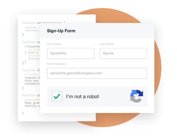
Humans can easily solve Captcha but “bots” and other malicious software find it hard to figure out.
© Formstack, Fair Use
Streamline Completion and Submission
Now, we focus on closing the form effectively. You’ve got to make sure visitors don't abandon the form at any stage. That’s why it’s important to make the submission process better—and here's how to enhance the end stages of form filling.
20. Show Progress Indicators
You’ve got to add progress bars or step indicators for longer forms. They’re tools that show users their progress and how much more they need to complete. This clarity motivates users to continue and reduces the chance that they’ll abandon what they’re doing and the app or site. Progress indicators make the form-filling journey visible as they guide users to the finish line. For very long forms, don't show progress on a per-question basis—as it may frighten users; use sections instead.
21. Use Clear Call-to-Action (CTA)
Make the submit button eye-catching—and a clear, standout CTA button does the trick. Use action-oriented language that matches the form’s purpose. For example, "Submit Application" or "Sign Up Now" tells users exactly what will happen when they click. A well-designed CTA button catches the eye and encourages completion, and it’s something that makes it an essential element of successful form design.
In this video, Torrey Podmajersky, Author, Speaker and UX Writer at Google, demonstrates how to refine interface text through iteration—focusing on purpose, voice, and clarity to create messages that guide users effectively, just as well-crafted CTAs do in form design.
Show
Hide
video transcript
- Transcript loading…
22. Feedback Upon Submission
Immediate confirmation once users have submitted a form reassures them that their effort was successful. It’s good to display a message that thanks them for their submission and explains what happens next.
Whether it's a confirmation email on its way or an estimated time for follow-up, clear communication sets expectations and maintains trust—and it’s a vital thing. This feedback loop makes users feel valued and informed, and it completes the form experience positively, just like the example below.
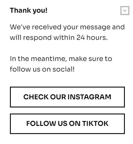
A form's success message confirms submission and expresses gratitude. Though it may not have any upside but it may have a downside if it’s not there.
© Getsitecontrol, Fair Use
Innovative Techniques and Trends
You can use the latest trends to make forms fun, interactive, and easier for users. These innovations help keep users engaged and increase the chances of form completion. Here's a closer look at some cutting-edge techniques.
23. Voice Input Integration
You’ve got the option to offer an alternative to typing. Voice input lets users fill out forms—especially on mobile devices—and it’s a method that can speed up the process; plus, it’s particularly helpful for users on the go or those with physical disabilities. Voice input makes forms more accessible and convenient.
24. Personalized Form Fields
Adjust form fields dynamically based on user data or choices that they’ve made earlier in the form. This personalization can streamline the filling process to make it feel less generic and more relevant to the individual user. You can use personalized fields to minimize unnecessary questions. It’s particularly valuable as it shows users that you value their time and attention.
For instance, if a user selects "United States" as their country, the form can dynamically adjust to show just states that are relevant to the U.S. This personalization streamlines the shipping information process. What’s more, geographical customization lets you alter date and telephone number formats—and it makes the process faster and more relevant.
25. Gamification Elements
Add gamification—like rewards or visual milestones—and you can make form completion more appealing. For example, if you show progress bars that fill up or offer badges for completed sections, it can motivate users to continue. Gamification turns a routine task into a more enjoyable experience, and it’s something that can increase completion rates.
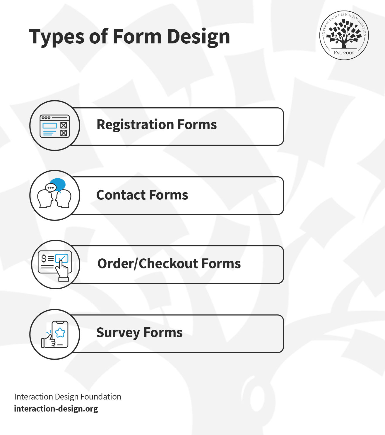
Form Design Types
There are several types of web forms—and each one serves a different purpose. These forms help you in various ways, from collecting information to facilitating transactions.
1. Registration Forms
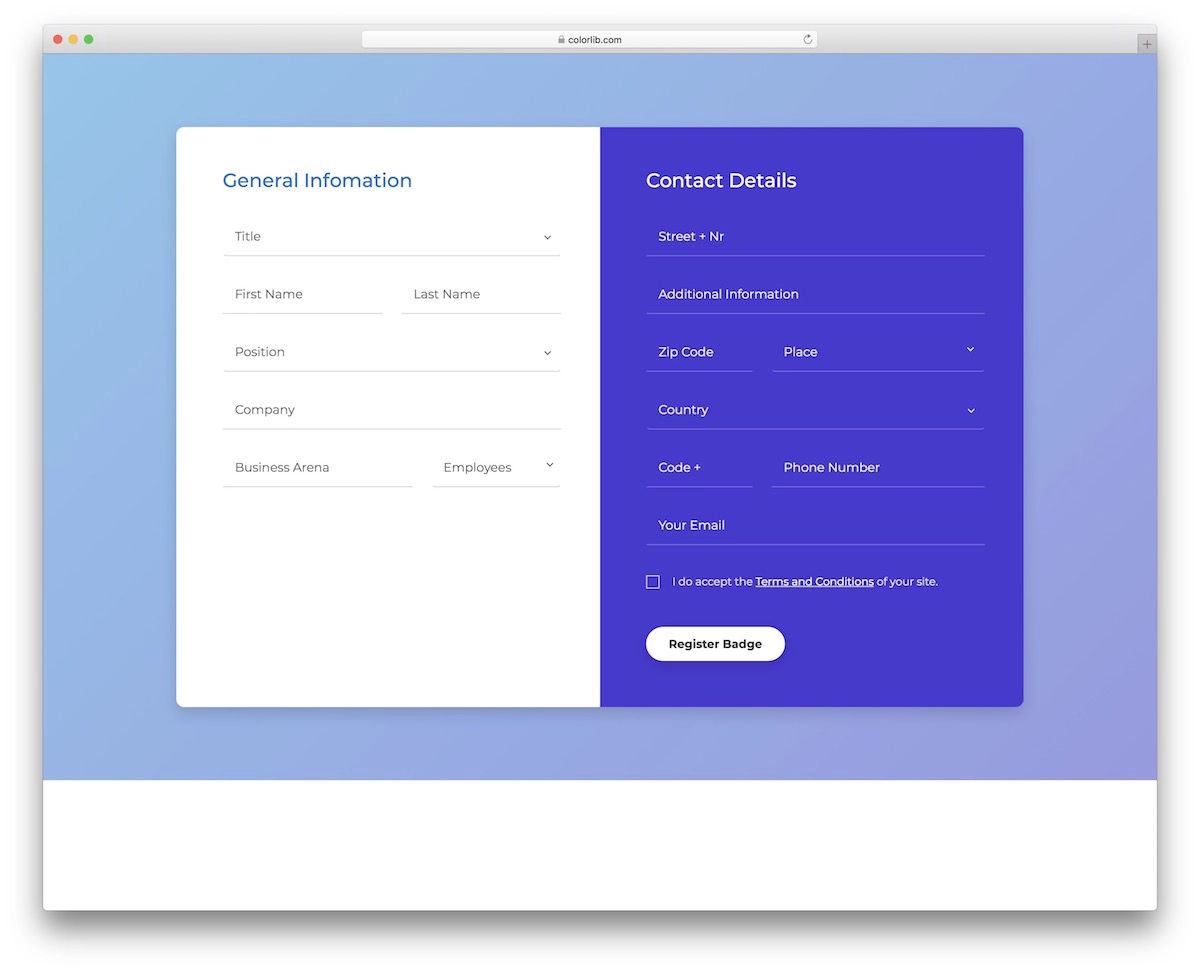
© Colorlib, Fair Use
Registration forms gather key details from users, including name, email and password. They enable users to create an account and grant access to more services or features on a website. These forms start a personalized user experience as they can offer customized content and preferences, and they help you engage users and establish relationships with them.
2. Contact Forms
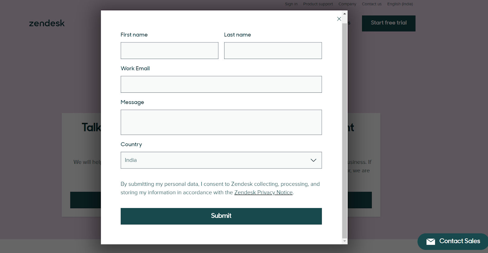
© Zendesk, Fair Use
Contact forms provide a straightforward way for users to send messages or inquiries directly to you. They simplify the process for users to send inquiries, feedback, or messages without exposing email addresses publicly.
In the main, these forms include fields for the user's name, email, subject, and a message box. This structured approach is one that ensures that users can easily reach out with questions or comments while website owners receive the information they need to respond effectively. It encourages open lines of communication.
3. Order/checkout Forms
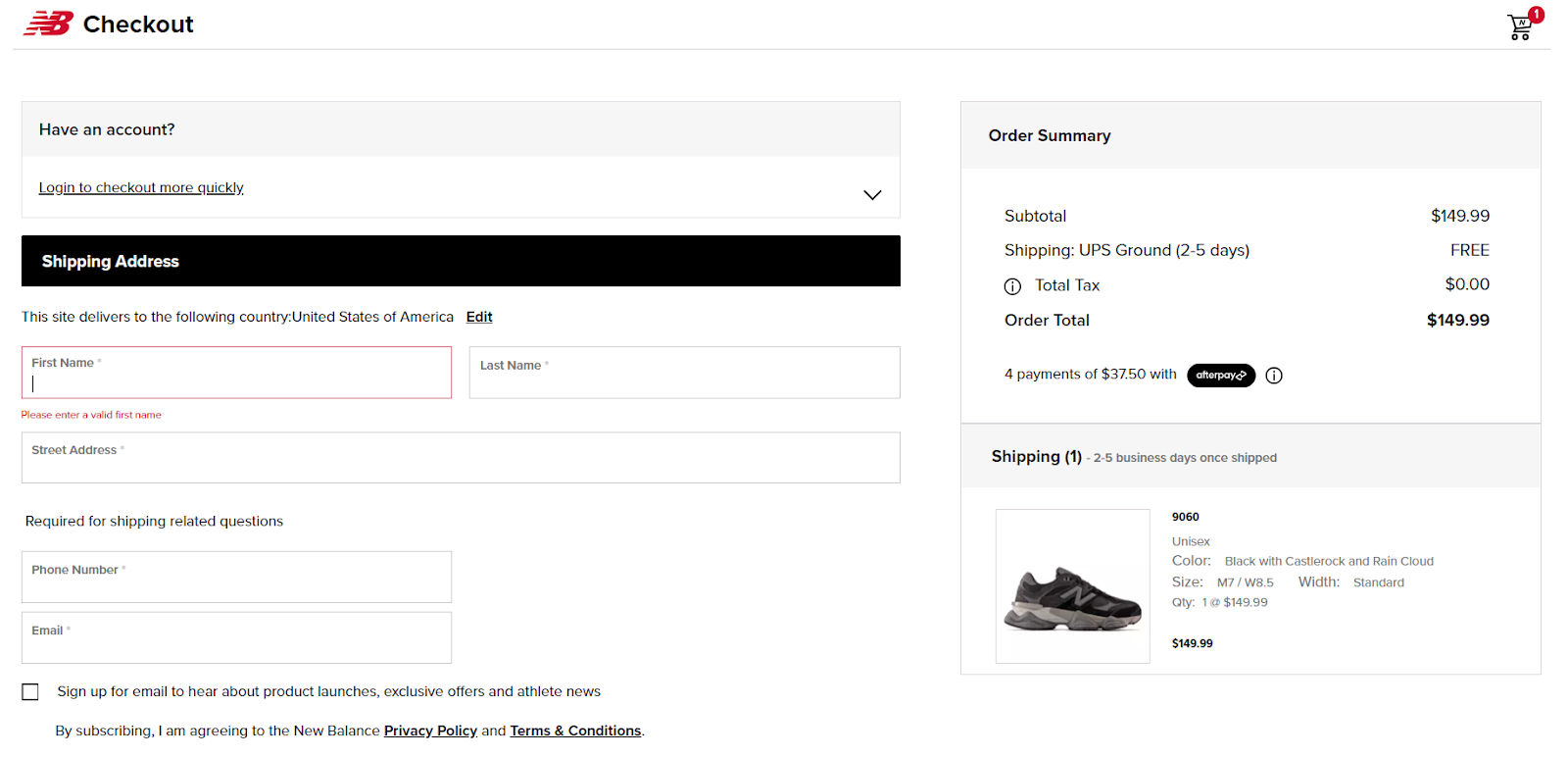
© New Balance, Fair Use
Order or checkout forms play a key role in online shopping. They let customers provide all the needed details for buying items. This way, shopping online becomes easy and fast. Customers fill out these forms to complete their purchases securely. An order form often involves several steps because it needs details like your credit card, shipping and billing information, and contact details.
4. Survey Forms
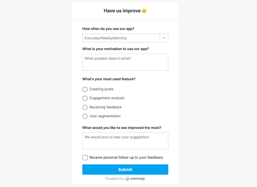
© Usersnap, Fair Use
Survey forms feature a range of questions, including fill-in-the-blanks, multiple-choice and long answers, to gather detailed feedback on various topics. Businesses use these forms so they can gauge customer thoughts and satisfaction levels. It’s an approach that helps them to understand customer needs more accurately and find trends or areas for enhancement. Companies can tailor their strategies and services through survey forms to better meet user expectations and drive improvements.
© Interaction Design Foundation, CC BY-SA 4.0
Why Testing Matters and How To Do It
Testing is an important aspect of form design. It ensures forms are user-friendly, functional, and effective in gathering data. It identifies issues that could hinder user experience or form completion rates. You have different testing methods available, such as:
Content testing: Make sure that your questions make sense to users. You can do this before you put the forms together. It isn’t necessary to do this with straightforward fields like name and address, but more complex questions can be challenging to understand. Also make sure that you are using the correct terminology. For example, in a product registration form, don’t ask for a “product identifier” when the product box shows “model ID.”
Usability testing: This involves observing real users as they interact with the form. It highlights areas of confusion or difficulty.
A/B testing: Here, you compare two versions of a form. This method determines which version performs better in terms of user engagement and completion rates.
Analytics review: To analyze form interaction data is something that helps spot where users drop off or encounter errors.
When you choose a testing method, follow the steps below to perform the testing correctly:
Define objectives: Clearly outline what you aim to achieve with your testing—it could be things like improving completion rates or enhancing user satisfaction.
Select the right method: Pick a testing method that aligns with your objectives—different methods provide insights into various aspects of form performance.
Recruit participants: Recruit participants who match your target audience for usability testing. That’s a crucial way to ensure there’s relevant feedback.
Analyze results: After testing, thoroughly analyze the data. Look for patterns or recurring issues that need addressing.
Implement changes: Based on the findings, it’s time to make necessary adjustments to the form. This could involve simplifying questions, altering the layout, or adjusting the navigation.
Repeat as needed: Testing isn’t a one-time task. Repeat the process to refine and improve the form.
UI Form Design Examples and Inspirations
Now, let's see our tips in action, and we're going to explore how designers focus on the finer details to create better forms. These small touches—like the placement of a checkbox or the shade of a button—are significant things that can enhance the user experience. So, let’s see how a thoughtful approach to form design can lead to more intuitive and user-friendly interfaces.
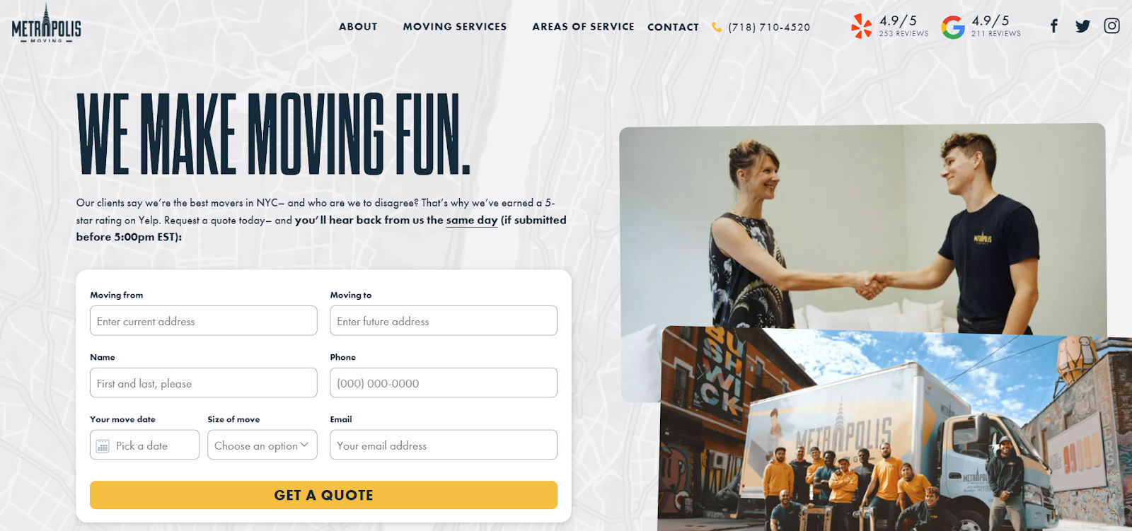
1. Metropolis Moving
© Metropolis Moving, Fair Use
Metropolis Moving presents a great example of effective UI form design. This New York City moving company, based in Brooklyn, uses concise copy to set a friendly tone. It reassures customers with high Yelp ratings and promises a same-day response if the users submit the form before a specific time. This clear communication is an important thing that sets expectations and builds trust from the outset.
Top Highlights:
Streamlined field selection: Metropolis Moving uses only necessary fields. It avoids clutter and simplifies the process.
Aligned for readability: Left-aligned form fields and placeholders support easy reading and completion.
Clean layout: The form adopts a single-column layout. It guides the user naturally from top to bottom without distractions.
Simplified input methods: The form uses a calendar for selecting the move date, which simplifies the process of entering a date. Drop-down menus for specifying the size of the move provide structured choices.
2. Spotify Pets
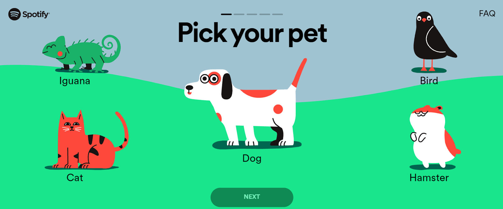
© Spotifypets, Fair Use
Spotify Pets adds a playful twist to the Spotify experience. It creates playlists for both pets and their owners. It tailors music using the owner's listening patterns and the pet’s attributes.
Top Highlights:
Interactive slider for pet traits: Spotify Pets features a fun slider that users move to capture their pet's personality, reducing the need to type.
Seamless progress bar: The service integrates a progress indicator that fits naturally with the vibrant, playful design theme.
One-question multi-screen layout: Each screen on the questionnaire focuses on a single question. They all focus on mobile-friendliness.
3. Airbnb
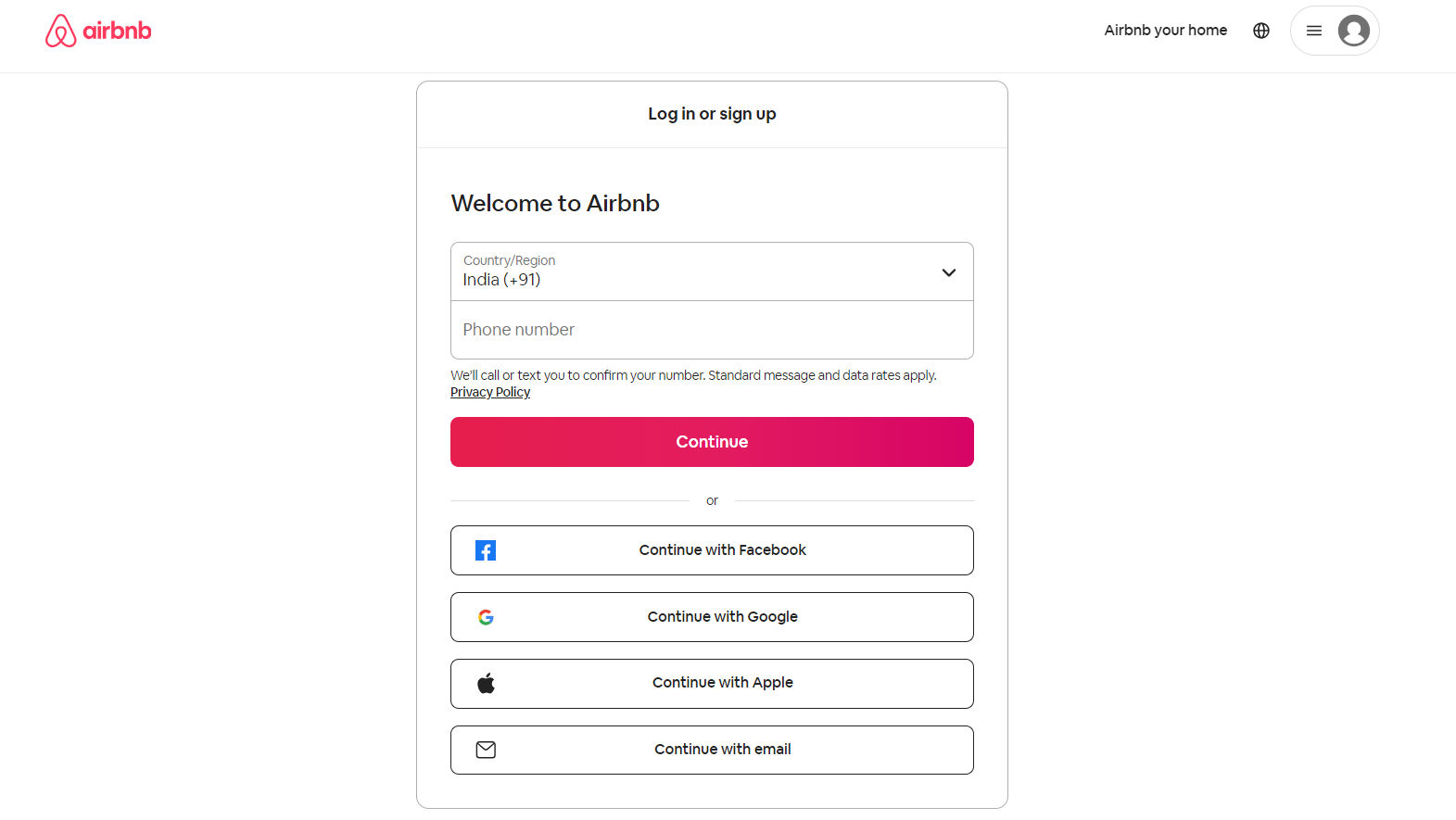
© Airbnb, Fair Use
Airbnb—a globally renowned online marketplace—connects travelers to local hosts for unique stays and experiences worldwide. The platform simplifies travel arrangements with many listings and personalized adventures.
Top Highlights:
Privacy first: The form mentions the privacy policy to inform users of their data protection rights and how the company uses the user information.
Multiple login options: Airbnb offers various login methods—including social media platforms like Facebook and Google—and it caters to user convenience and preference.
OTP authentication: The use of OTP authentication with phone numbers suggests a layer of security. It provides users extra account safety.
User-friendly design: The form's clean and minimalist design, clear labeling, and easy navigation enhance user experience and facilitate quick and secure log-in or sign-up.
4. Primal Pet Foods
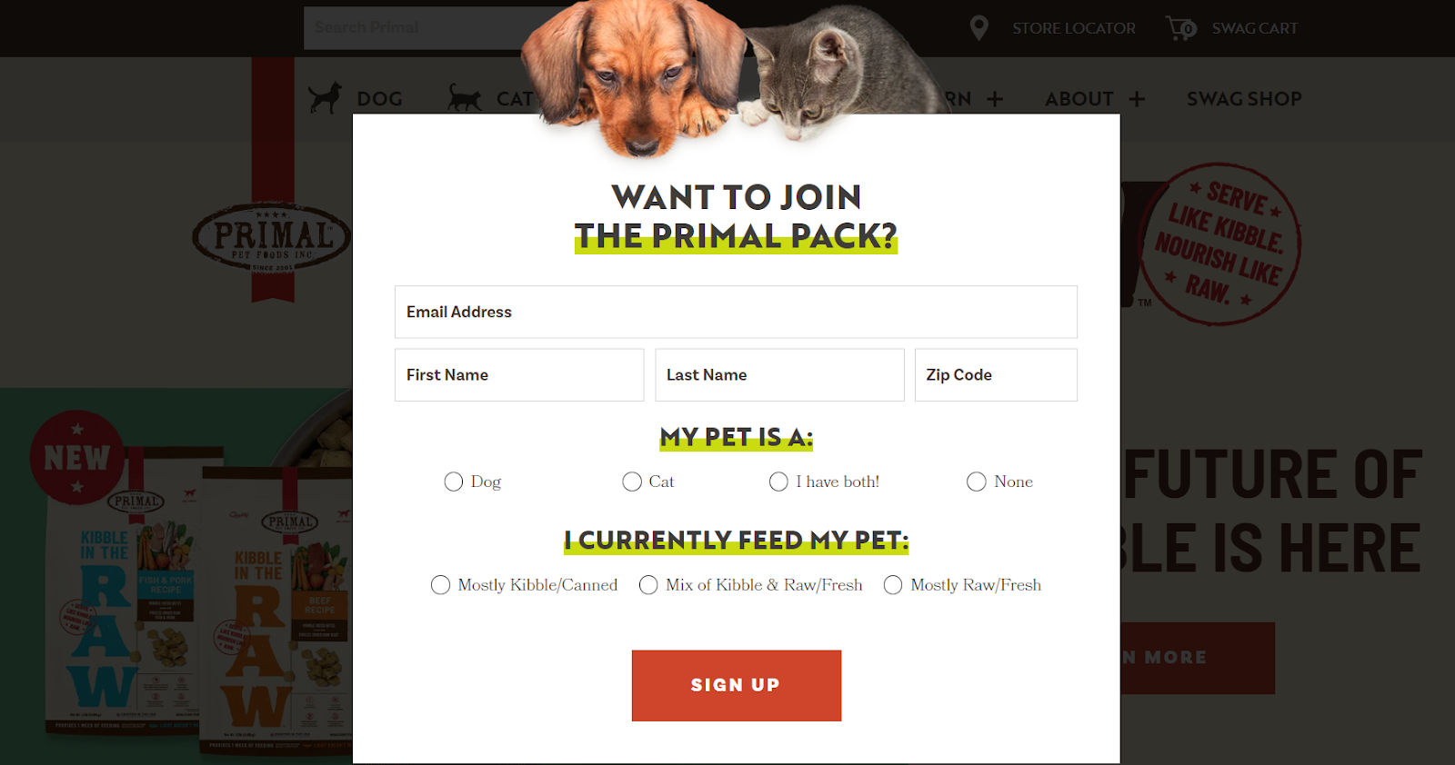
© Primal Pet Foods, Fair Use
Primal Pet Foods showcases a signup form that effectively captures user interest with a clear value proposition. It invites pet owners to join 'The Primal Pack' with a visually appealing and easy-to-navigate form.
Top Highlights:
Targeted information: It asks for basic contact information and pet details—it’s something that provides a customized experience for the user and their pet.
Pet-focused customization: The option to specify the pet type and current diet suggests that subscribers will receive personalized content and offers.
Engaging design: The form features bold colors, clear fonts, and engaging imagery that aligns with the brand and attracts the target audience of pet owners.
Simple choices: Radio buttons for pet type and diet preferences make it simple for users to provide information.
5. NeilPatel.com
© Neil Patel, Fair Use
Neil Patel's marketing savvy shines through with his form offering a personalized 7-week SEO action plan. The compelling invitation to complete the multi-step form promises tailored insights to your inbox.
Top Highlights:
Low-friction start: The form smartly asks for your website URL, a low-barrier entry point that's necessary for customizing your SEO report.
Benefit-focused questions: Each question in the form focuses on the user's benefits—while it justifies why there’s the need for the requested information.
Clean and purposeful design: The form's design is exceptionally clean. It enhances user focus on the task at hand.
Strategic data collection: Neil’s form justifies each data request. He aligns it with user benefits and makes the process feel transparent and trust-building.
The Take Away
Web forms stand as crucial touchpoints between businesses and their audience. They’re vital things that offer a direct channel for engagement, data collection, and user feedback. These digital gateways cater to various needs—such as registration, feedback, and transactions—and to create the best forms, it’s best to focus on these three takeaways:
Simplicity enhances completion: A straightforward, clean design encourages users to complete forms.
Visual appeal and accessibility matter: The use of brand elements and creating accessible forms—including for users with disabilities—broadens reach and improves user experience.
Mobile optimization and security are essential: Focus on optimizing forms for mobile users and emphasizing security—they’re vital parts to think about here, as it builds trust and encourages form completion.
So, why not leverage the power of well-designed web forms to track online leads, follow up with clients and potential customers, and learn more about your buyer personas? Create visually appealing and user-friendly web forms—because they’re important things that help you grow your business and expand your network.
References and Where to Learn More
Take our masterclass on How To Design Forms Like An Expert.
Read Zapier’s article on The 11 best online form-builder apps.
Read this Forbes article that discusses More Ways To Use Forms To Grow Your Business.