
In Mobile UX, affordances are critical because of the shift of contexts while the user is in motion. Users interact in short bursts and need to know how to interact with a UI without the need to experiment. Here, we’ll dive deeper into tappability—one of the key ways to support affordances.
In this video, Frank Spillers, CEO of Experience Dynamics, explains the importance of tap efficiency, how to make affordances clear to the user and how signifiers and UI animations can help.
Show
Hide
video transcript
- Transcript loading…
What Are Touch Targets?
Tappability refers to an affordance for tapping. User Interface Design (UI) elements that people can tap are called touch targets or tap targets. These include elements such as icons, buttons, input elements (text boxes, radio buttons, checkboxes, etc.) and hyperlinked text, and they may extend beyond the visual bounds of an element.
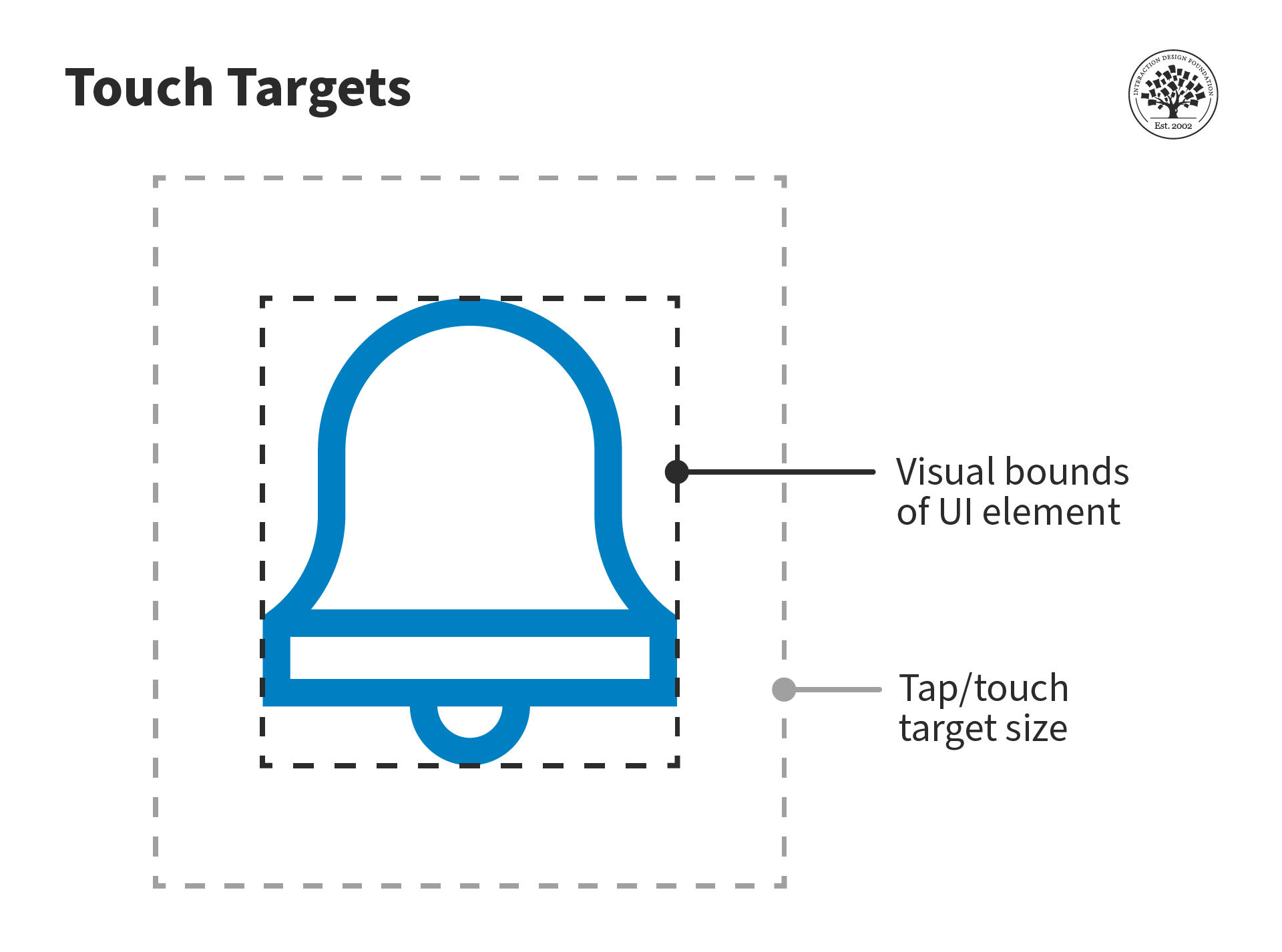
Tap or touch targets should be large enough for people to easily interact with them.
© Interaction Design Foundation, CC BY-SA 4.0
Unlike a pointer on a computer, when you interact with a touchscreen device, you do not know exactly where you tap—your finger or thumb blocks your view.
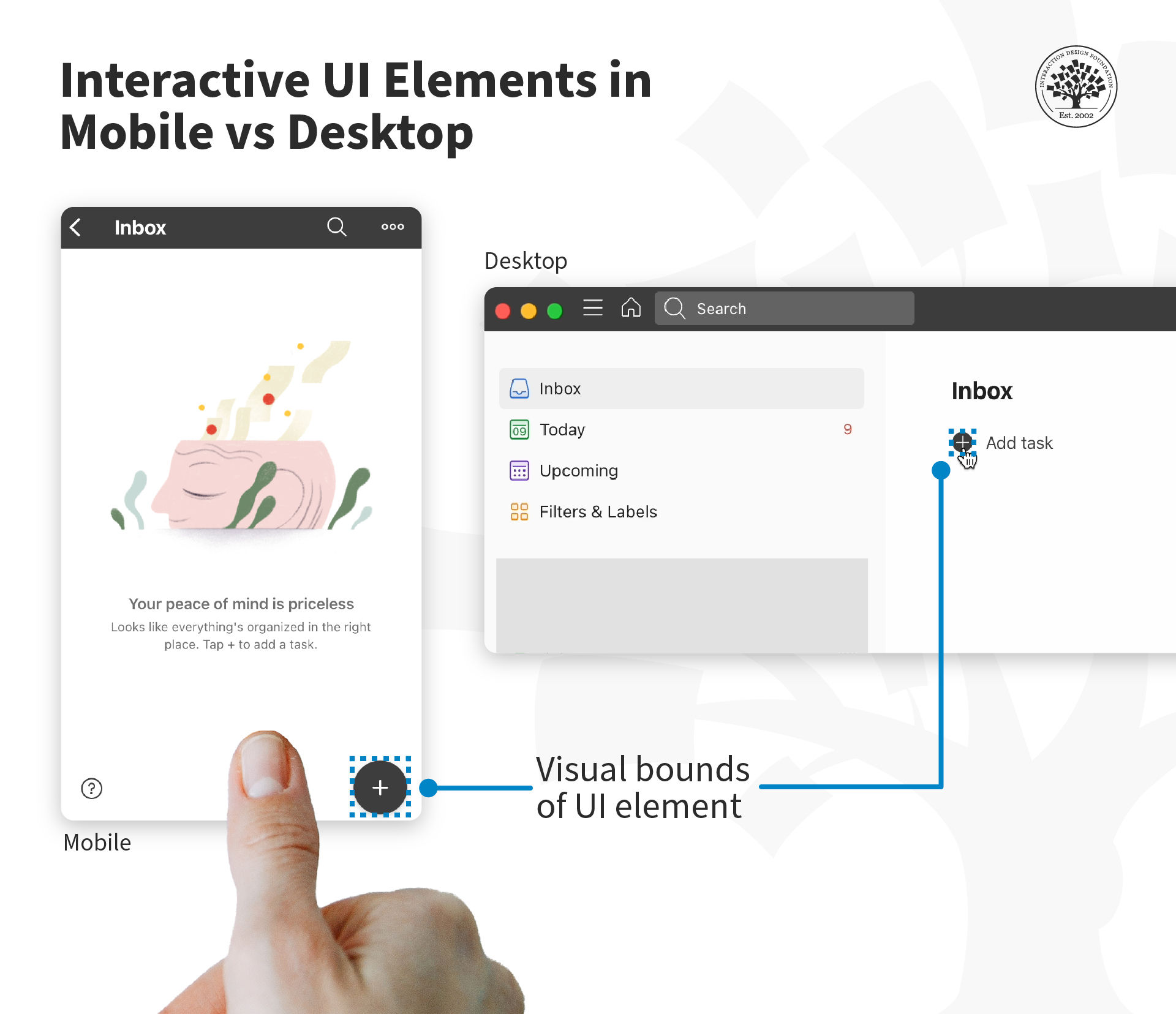
When the icon is small, and you do not touch it accurately, the action will still work if the area around the icon is also tappable. Hence, it is essential for the tap target to be large enough to accommodate our approximate taps, swipes and drags.
© Todoist, Fair Use
UX consultant and design leader, Steven Hoober suggests that visual targets need to be big enough and clear enough so:
They attract the user's eye.
The user understands that they are actionable elements.
They are readable, and the user can understand what action they will perform.
The user is confident that they can easily tap them.
How Big Should a Touch Target Be?
Our fingers are three-dimensional and soft. The area of contact between our fingers and a touch interface can vary, and it will depend on the angle and pressure with which we touch the surface.

Only part of a user’s finger gets flattened against the screen.
© Interaction Design Foundation, CC BY-SA 4.0
“A little under half of all touches are with one hand. Many other thumb touches are with another hand supporting the phone. Many users hold with one hand, and touch with a finger on the opposite hand. And sometimes, people use both thumbs at the same time.”
— Steven Hoober, UX Consultant and Speaker, in Designing for Touch
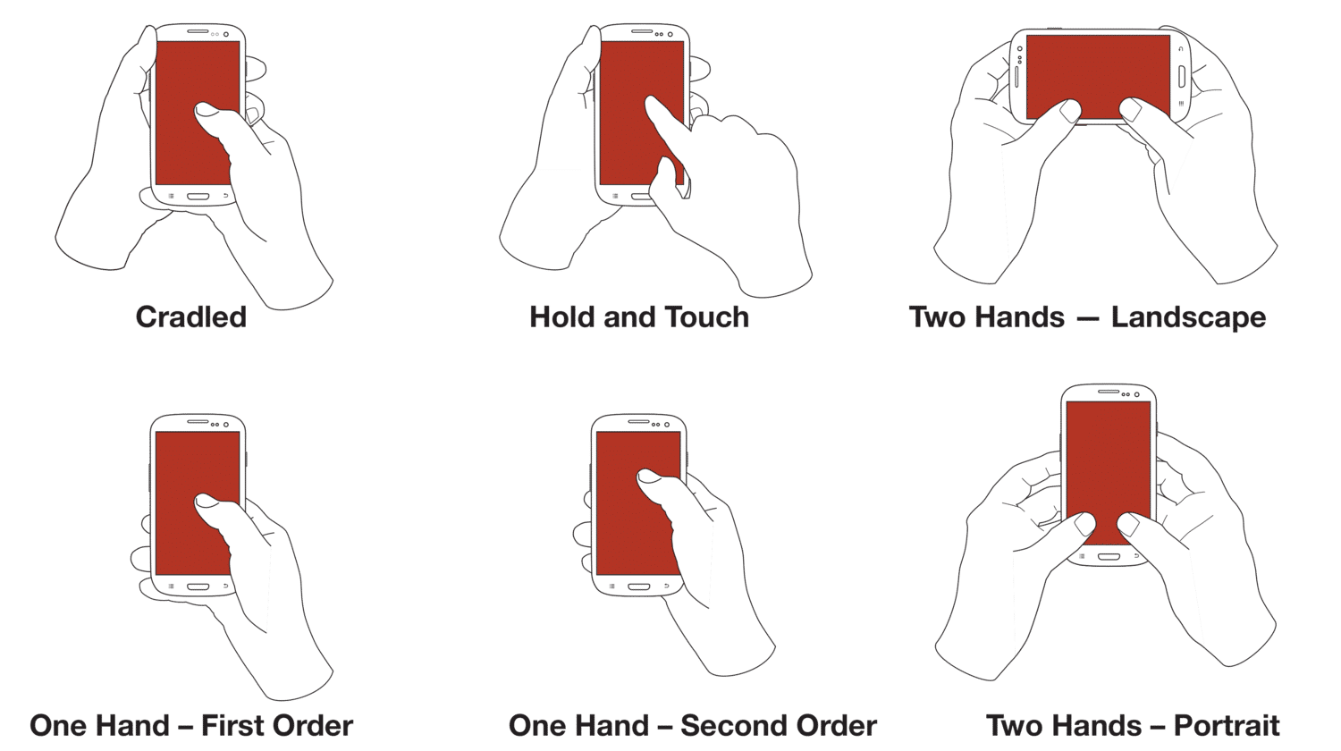
People hold and operate mobile devices in different ways. They shift their grip often and change how they hold the device, often within one session. What’s more, people do not have preferred ways to use their devices.
© 4ourth Mobile , Fair Use
To account for the variation in touch areas, Steven Hoober suggests the following size range for interactive elements:
7 mm at the center
9 mm along the edges
12 mm in the corners
Notice that these numbers are in millimeters, not pixels—the units designers use for digital designs. Before we dive into the pixel sizes for tap targets, we first need to understand a crucial aspect of a pixel: There is no standard size of a pixel.
Screen Design Units: Millimeters, Pixels or Points?
People interact in the physical world, where spaces are measured in units such as millimeters, inches, etc. Designers create interfaces in the virtual world, where the unit is pixels.
Unlike physical units like millimeters or inches, which are the same size anywhere in the world, the size of a pixel varies from one device to the next, and depends on the resolution of the screen. Screen resolution (also called pixel density) refers to how many pixels the screen displays. It is measured in pixels per inch (ppi).
For example, a screen with a resolution of 160 ppi (pixels per inch) packs in 160 pixels in an inch. So, a pixel will be 1/160 or ~ 0.006 inches. In high-resolution devices that have upwards of 400 ppi, a pixel will be ~ 0.002 inches.
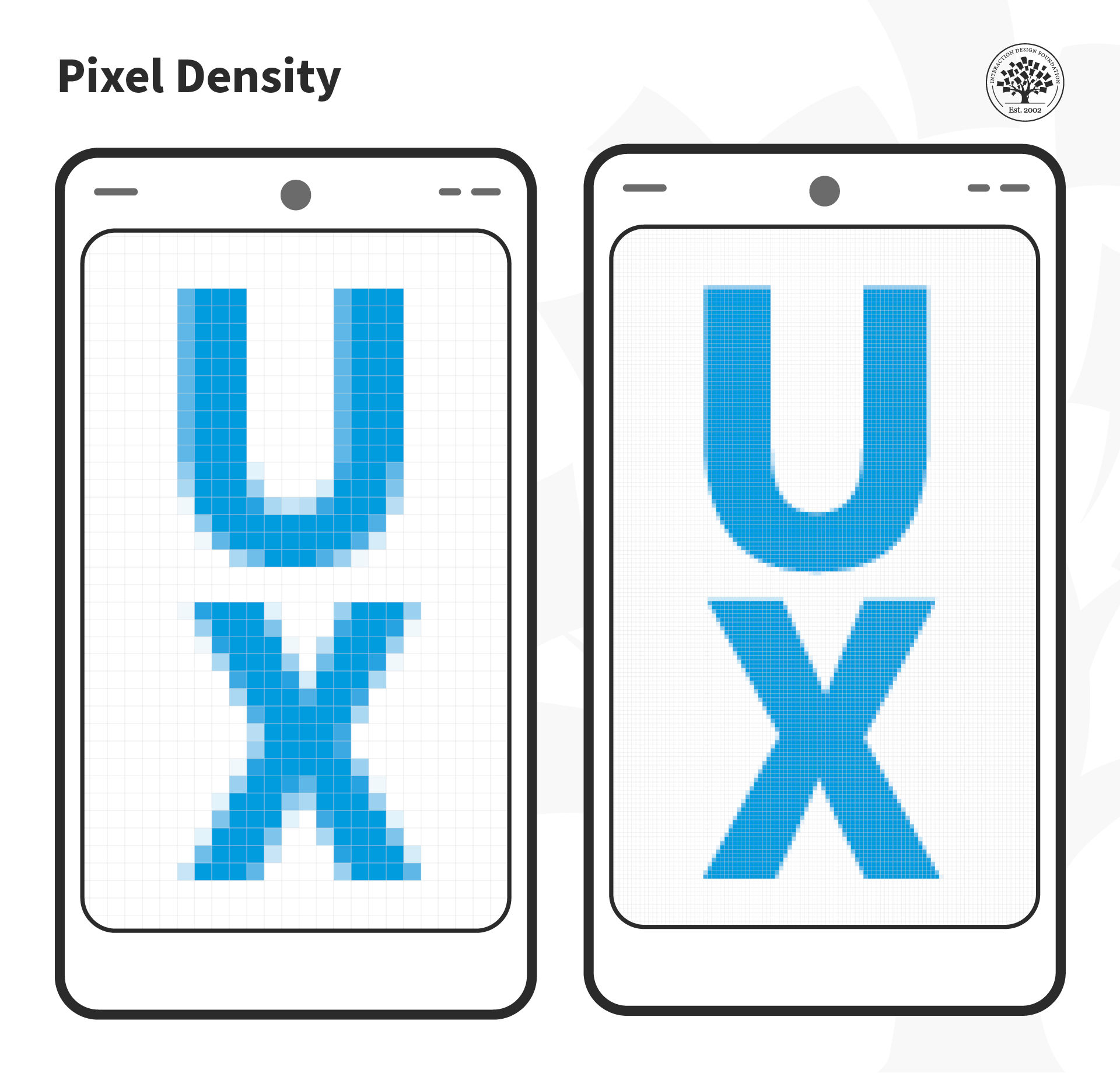
If two screens have the same physical size, but different resolutions, then the pixel size will be different. The higher the resolution of a device, the smaller the size of the pixel.
© Interaction Design Foundation, CC BY-SA 4.0
Since mobile devices come in different sizes and resolutions, it is virtually impossible to define a good size for tappable objects using pixels as measurement.
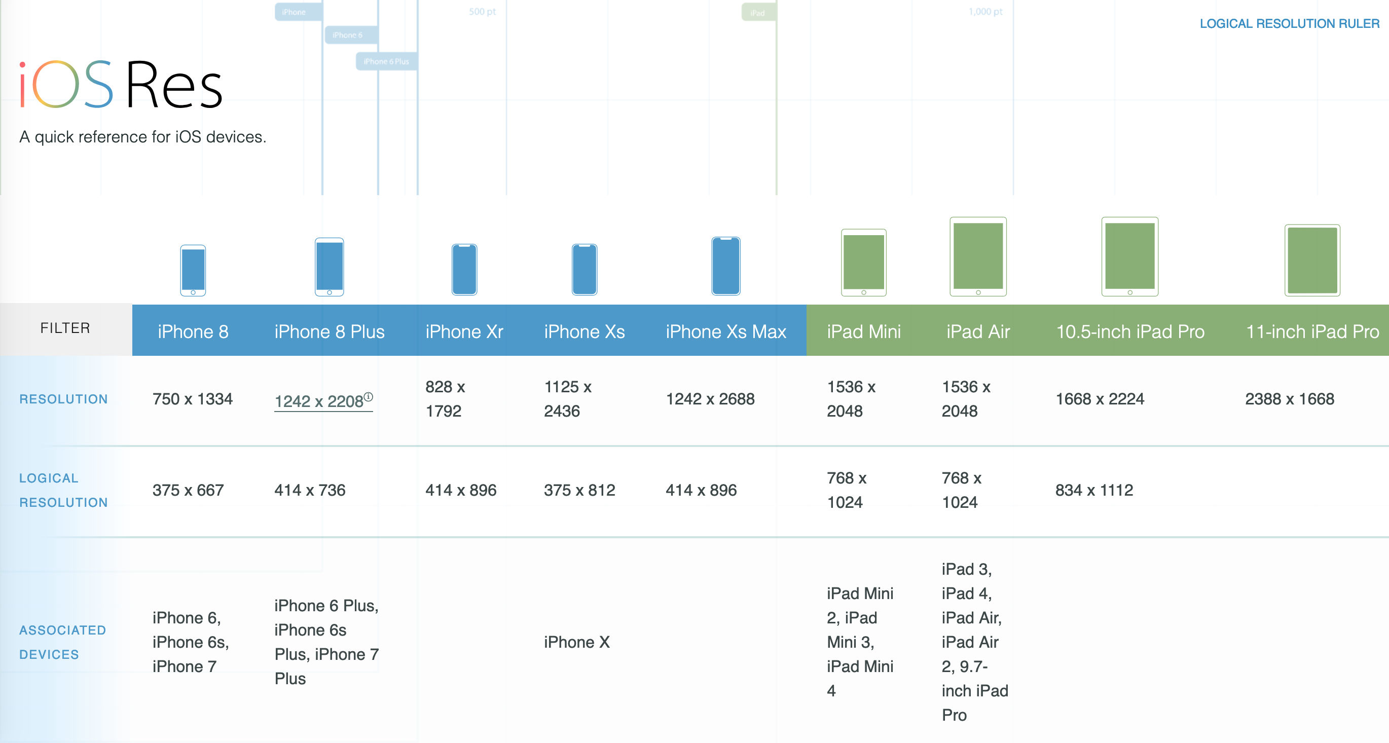
Even though iOS runs on fewer devices (compared to Android), Apple’s devices cover a wide range of resolutions, from 264 ppi to 458 ppi.
© iOSRes, Fair Use
To make life easier for designers and developers, Apple introduced logical resolutions.
“Logical resolution essentially is what a device’s resolution would be if it did not have high resolution. This baseline is set at roughly 163 pixels per inch…
This means a line that is 163 points long is equal to 163 pixels on a screen with a resolution of 163 pixels per inch. The same 163 point line on a high-resolution display (326 pixels per inch) will use twice the number of pixels but remain the same length.”
— Dr. Gregory Schmidt, designer and founder of BodoHealth
Apple defines logical resolution in points. Note that Apple’s “points” are different from the typographer’s points that are used in the print industry. In graphic design, the point measures 1/72 of an inch.
Similar to Apple’s points, Google’s Android system uses density-independent pixels (dps or dips) that sets the baseline at 160 pixels.
In practice, Web pixel ≈ Apple point ≈ Android density-independent pixel. So, when you work on an interface:
Set your canvas to the logical resolution of the device. In other words, create the layout in the baseline (small) resolution, not for high resolution. Unlike in print where you must select a large canvas size for good results, in mobile UX, you design for the smaller resolution and then scale up. If you scale down, you will likely get pixel sizes in fractions.
Export the assets such as icons and images in different resolutions. Ask your developer how many sizes they need. You may need to provide 3-4 different sizes in accordance with the platform. In iOS these are typically labeled 1x, 2x and 3x. And in Android, they are mdpi (1x), hdpi (1.5x), xhdpi (2x), xxhdpi (3x) and xxxhdpi (4x).
Where possible, use vector formats such as SVG, so you don’t have to create and export multiple image sizes.
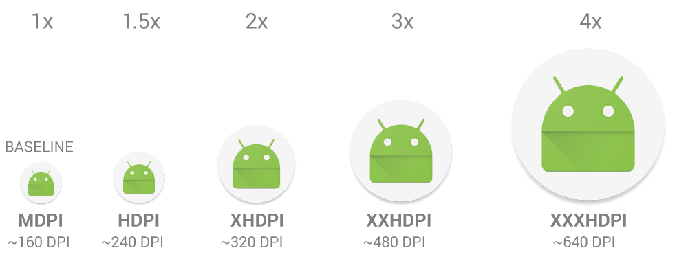
Android’s rough classification of screen densities.
© Android, Fair Use
The Bottom Line
Google’s Material Design recommends 48dp as a minimum touch target, while Apple’s guidelines suggest 44 pts.
“Consider making touch targets at least 48x48dp, separated by 8dp of space or more, to ensure balanced information density and usability. A touch target of 48x48dp results in a physical size of about 9mm, regardless of screen size.”
— Android Accessibility Help
Apart from the size of the elements, be mindful about the space between different elements. For example, if a Delete and Edit option are too close to each other, then users might accidentally tap the wrong option. To prevent user errors from accidental taps, rearrange layout elements farther apart.
However, as we’ve seen above, the physical size recommendations (in mm/inches) depend on the position of the tap object. Hence, it is crucial to test your design with real users, ideally in their context to understand how people interact with the device, where and how they tap, and whether the touch target is truly tappable.
The Take Away
People use mobile devices in short bursts and need to know how to interact with a UI without the need to experiment. Tappability is essential to support affordances.
Tappability refers to an affordance for tapping. UI elements that people can tap are called touch targets or tap targets and they may extend beyond the visual bounds of an element.
The position of the tap target depends on how users interact with the device, so keep the tap targets between 7 mm and 12 mm. Google's Material Design recommends touch targets be a minimum of 48 dp (~9mm) while Apple recommends these be 44 points (~7 mm).
References and Where to Learn More
Know the core principles to use animation in user interfaces:
10 Principles of Animation in Material Design
Read this fantastic explanation of the different units in mobile UX design by Dr. Gregory Schmidt:
When is a pixel not a pixel? pixels, points, dps
Android’s developer documentation offers a good overview of the different pixel densities in the Android ecosystem:
Support different pixel densities
UX Consultant and design leader Steven Hoober’s research on touch:
Designing for Touch
See the Google Material Design Accessibility Guidelines here that cover touch targets and many more fundamental accessibility and usability principles:
Accessibility – Material Design 3
Pixels to Millimeters Converter is a handy calculator that you can use to convert virtual pixels into physical units, based on the screen density.


