We live in a world of distractions, and so do your users. Hence, your designs must factor in users’ contexts and behaviors amid distractions. Let’s look at a simple, yet effective test to evaluate how quickly and easily users can complete their tasks: the “one thumb, one eyeball” test.
Luke Wroblewski, Product Director at Google, proposed the one thumb, one eyeball test during the design of “Polar”, an app designed to create photo polls and allow users to vote on them.
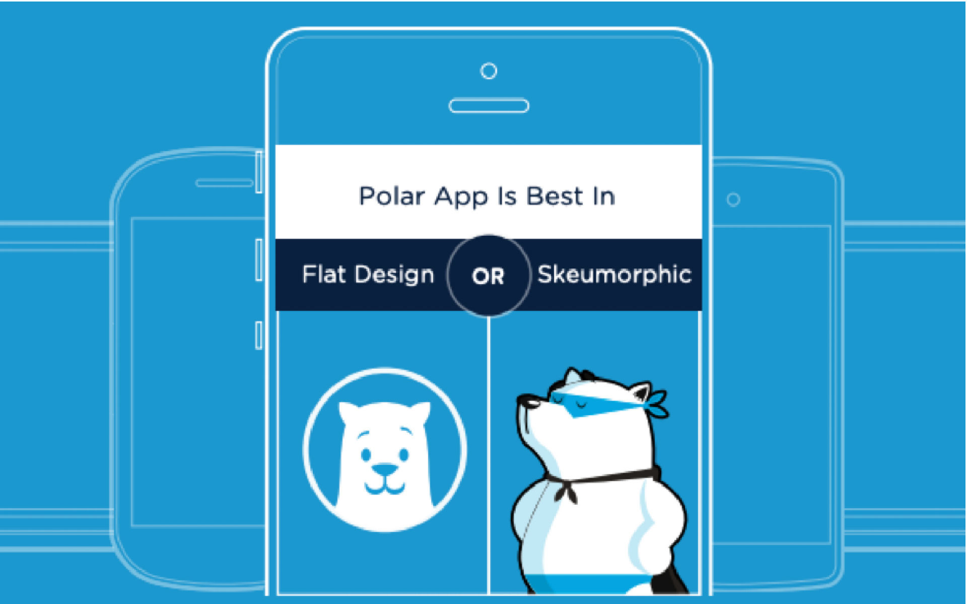
Wroblewski incorporates humor to make the Polar App UI memorable for users. He uses a polar bear as the logo for an app about polls between polar opposite choices.
© Luke Wroblewski, Fair Use
The Polar team’s objective was that a user should be able to create a new poll in less than a minute with only one thumb to do so. The results were impressive: Luke’s team delivered a process so simple that most users could deliver a new poll in thirty seconds.
Here is the test in action on the Polar app:
The video shows that the team tested whether voice input could deliver a faster experience. They concluded it wasn’t that much faster than the one thumb input process. Note that this may be because users are more familiar with one thumb input processes than voice input processes and the efficiencies might improve as voice input becomes a more widely used form of interaction with smartphones. As a general rule, always test your applications with your users to decide what works best for them in their context.
The one thumb, one eyeball test is a great way to conduct simple usability research for mobile apps and mobile websites. It’s a useful measure of mobile user experience (UX) design, inexpensive and may appeal to even the smallest design/development teams on the tightest budgets.
Why One Thumb and One Eyeball?
In a distracted environment, the best form of smartphone interaction is a high-speed, easy-to-use one. Luke calls the typical mobile usage a "one thumb, one eyeball" experience, since the highly distracted environment causes most mobile users to engage in one-handed use with short spans of partial attention.
The one thumb, one eyeball test is thus to help you find out if your mobile design allows users to easily use the app with one hand and partially distracted attention. In other words: Can users perform a certain number of tasks with just one hand in under 60 seconds?
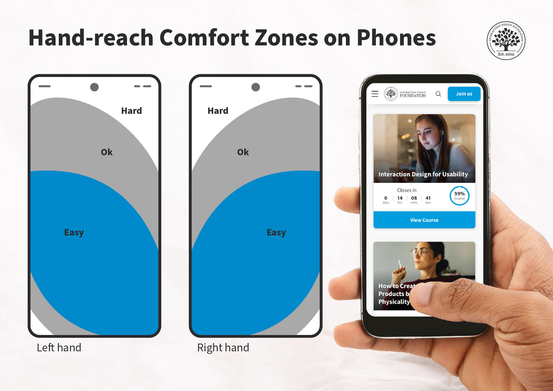
Have you ever noticed how some buttons on your phone are more accessible to reach than others? This is because of hand-reach comfort zones, where users can comfortably interact with the device with only one hand.
© Interaction Design Foundation, CC BY-SA 4.0
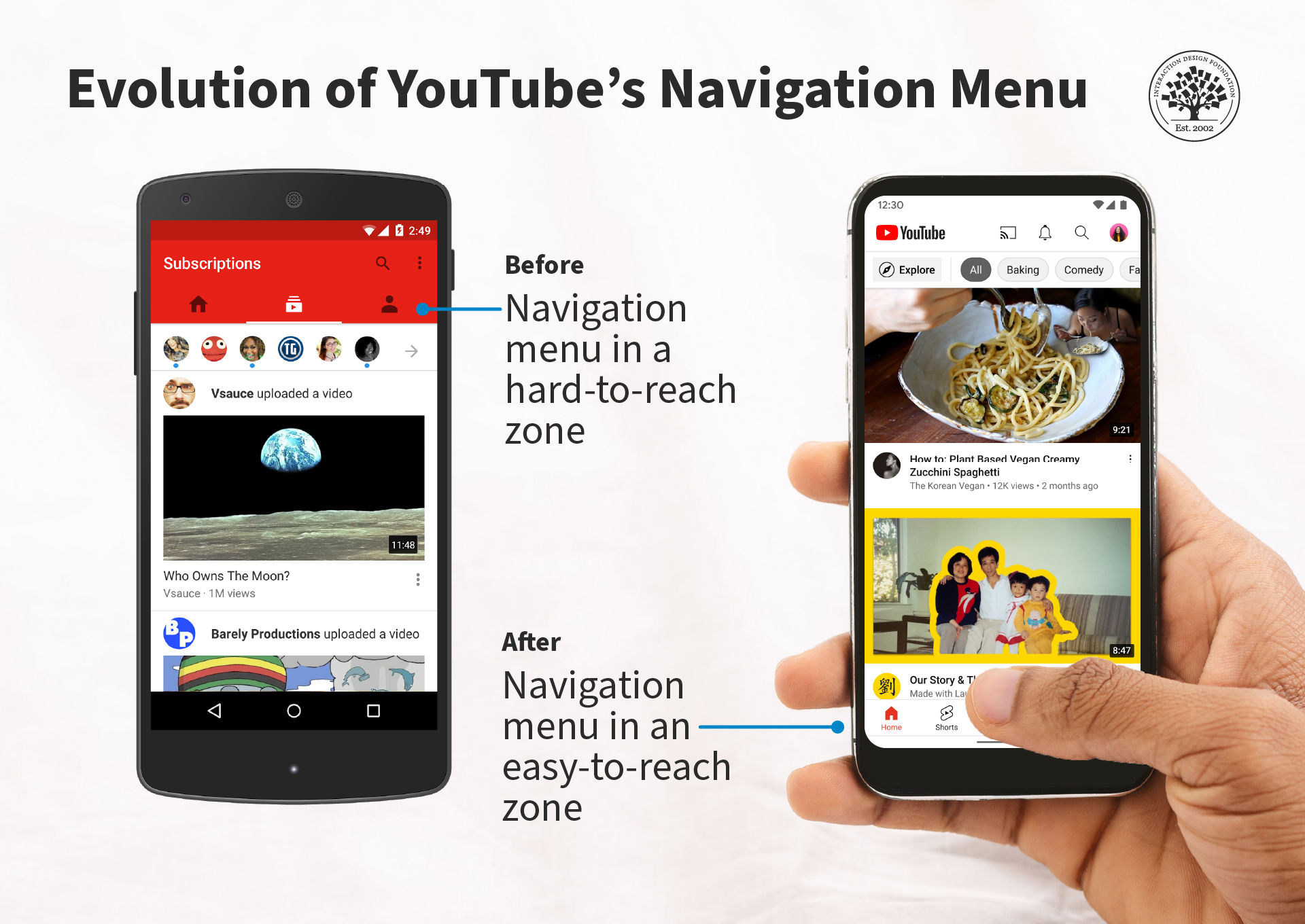
In 2016, YouTube changed the position of its main navigation menu from top to bottom.
© YouTube, Fair Use
If an interaction is measured in minutes or seconds, anything that complicates it is likely to hinder the user experience. When people engage with smartphones, say, while they wait at a doctor’s office, or while on a bus, they will often not want to spend 5-10 minutes on working out how to interact with an app or mobile website. They expect that you will cater to their “need for speed” in the design, and if you don’t, they’ll go elsewhere to someone who will.
The Take Away
Users face a variety of different situations throughout the course of the day, and to deliver a high-quality user experience, designers need to optimize the interaction with their products to enable the highest chances of user acceptance. The one thumb, one eyeball test is a simple measure to see if the design delivers this simplicity of interaction.
References and Where to Learn More
Harvard Business Review examines how mobiles are used in terms of activities.
Luke Wroblewski’s original piece and a great video of the test in action can be found on his blog.
Discover what Luke learned with Polar.