
Let’s pay a virtual visit to a famous industrial designer’s workshop. By examining the principles of his winning approach, we can incorporate vital elements into our designs in the “less is more” age.
As user experience practitioners, most of us have worked with Nielsen and Molich’s 10 heuristics or rules of thumb and the Eight Golden Rules by Ben Shneiderman. These are user interface principles that we get to learn and apply. They’re part of the human-computer interaction knowledge “package”. With the expansion of the UX field and its infiltration into many aspects of business, we’ll have to tackle product design more and more. Thus, it’s always useful to learn from other design disciplines.
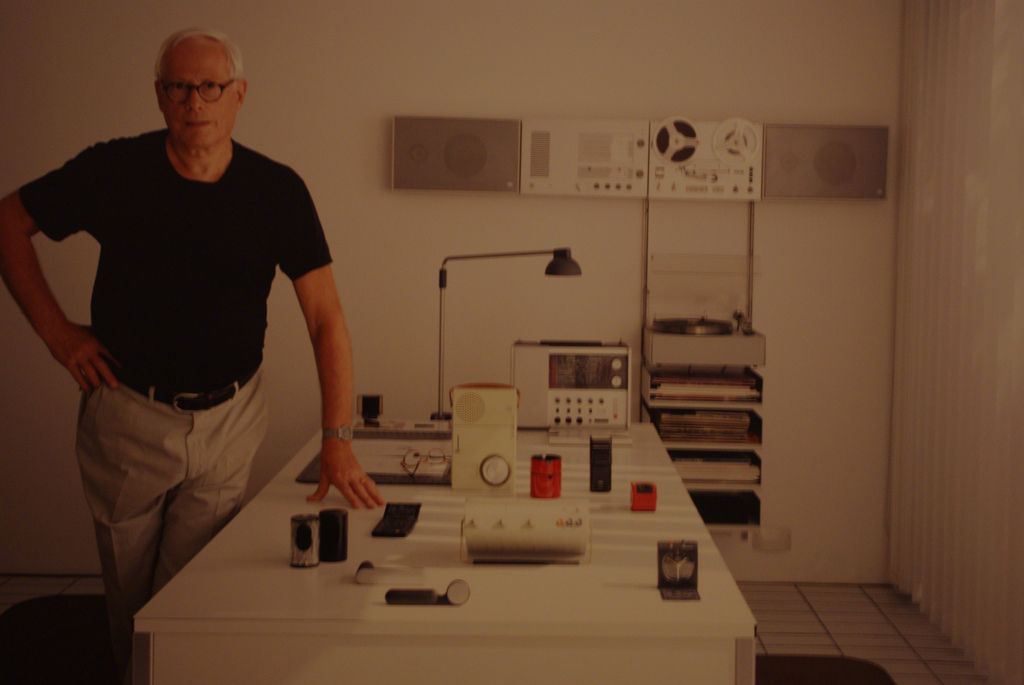
Author/Copyright holder: Ged Carroll. Copyright terms and licence: CC BY 2.0
Dieter Rams is a German industrial designer who was responsible for the design of Braun’s consumer products for many years. About 50 years ago, in his quest to answer the question “Is my design a good design?”, he developed the 10 principles of good design, sometimes also known as 10 commandments. It’s amazing to see how valid these principles are today, so much that we might feel than even more than back then, when Rams actually wrote them!
Both consumer products and technology have changed tremendously. Even aesthetics have changed considerably and many of Rams’ designs look old-fashioned for most of us, or trendy and “in” if you’re a fan of ’60s and ’70s designs. Despite all these changes around, the commandments remain valuable guidelines for anyone working in design and not only for industrial designers but also for you, user experience designer!
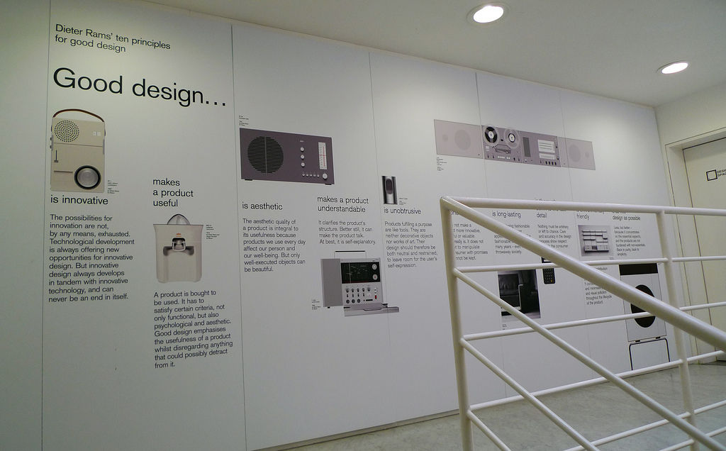
According to Dieter Rams, good design:
Is innovative
Makes a product useful
Is aesthetic
Makes a product understandable
Is unobtrusive
Is honest
Is long-lasting
Is thorough down to the last detail
Is environmentally friendly
Involves as little design as possible
Let’s see each of them in a little more detail (the explanation of each principle has been retrieved from https://www.vitsoe.com/us/about/good-design):
Good design is innovative. The possibilities for innovation are not, by any means, exhausted. Technological development is always offering new opportunities for innovative design. But innovative design always develops in tandem with innovative technology, and can never be an end in itself.
Good design makes a product useful. A product is bought to be used. It has to satisfy certain criteria, not only functional, but also psychological and aesthetic. Good design emphasizes the usefulness of a product whilst disregarding anything that could possibly detract from it.
Good design is aesthetic. The aesthetic quality of a product is integral to its usefulness because products we use every day affect our person and our well-being. But only well-executed objects can be beautiful.
Good design makes a product understandable. It clarifies the product’s structure. Better still, it can make the product talk. At best, it is self-explanatory.
Good design is unobtrusive. Products fulfilling a purpose are like tools. They are neither decorative objects nor works of art. Their design should therefore be both neutral and restrained, to leave room for the user’s self-expression.
Good design is honest. It does not make a product more innovative, powerful or valuable than it really is. It does not attempt to manipulate the consumer with promises that cannot be kept.
Good design is long-lasting. It avoids being fashionable and therefore never appears antiquated. Unlike fashionable design, it lasts many years – even in today’s throwaway society.
Good design is thorough down to the last detail. Nothing must be arbitrary or left to chance. Care and accuracy in the design process show respect towards the user.
Good design is environmental-friendly. Design makes an important contribution to the preservation of the environment. It conserves resources and minimizes physical and visual pollution throughout the lifecycle of the product.
Good design is as little design as possible. Less, but better – because it concentrates on the essential aspects, and the products are not burdened with non-essentials. Back to purity, back to simplicity.
In web and app design, we’re surrounded by applications and state-of-the-art software. Thus, a common danger is that we innovate for the sake of innovation. Browse for weather apps, and you’ll find out a myriad of them. From those that really serve a purpose – i.e. Umbrella – to those that focus solely on the design or on features no one really needs. We should think about our must-have items here and be careful about introducing “delighters” unless we’re sure that they are both innovative and serve a purpose for our users.
Even when designing digital interfaces, we can bring Rams’ commandment on board and make our web designs useful by:
Making them easy to interact with to the point that the user delights in it. This is user enjoyment through user enablement.
Our design should always show the user what its function is so that there’s never a gap between what the user perceives the design’s capabilities are and what they truly are.
Designing with a view to guide our users towards the needed interactions. We must make buttons look like clickable buttons and think about positive and negative interactions. Think of traffic lights: green means go (positive); red means stop (negative).
Not building unneeded elements into our designs. Remember the 80/20 rule and think carefully before adding every element to avoid the chance of clutter.
What are you designing for? Is it a bank, where security and padlock insignias and the use of an ever-reassuring blue color scheme are needed? Make your design reflect the character of the purpose of the design and remember that, on the scale between engineering (aestheticless functionality) and art (functionless aesthetics), we’re in a unique position—design.
A good design can speak for itself, without asking the user to commit much effort: showing is better than telling. If a user can intuitively deduce what to do with your design, that’s ace! If you have to compose instructions to get him/her to interact with it, that’s not so ace. In your design, think about this: can you cut down the user’s cognitive load so that the design has already done the thinking for him or her, and all the user has to do is go along with it and interact?
Yes, we’re designing for the digital realm, so we have a challenge that mechanical products didn’t. Looking at a hairdryer, you can work out straight away what to do. Looking at a web/app design will take more mental investment. As long as we can make our designs understandable and flow in a way that our users can interact efficiently, there’s a great chance that we’ll save ourselves from generating user frustration.
This surely sounds familiar to us, in how we design to allow the user to maneuver his/her creativity into the design. Digital design affords a lot of room for expression. Because of this, we have to design with an appropriate structure. Take Facebook and MySpace; the former has grown into a tableau where we forget the form and focus on the content—what we’re saying about our lives. MySpace didn’t have that miracle structure.
We designers can get trapped sometimes. Digital design is an abstract tableau, and we know that we often have a job to make concepts easier for our users. For example, the advantage point of applying skeuomorphism can lead to a wrong mental model for the user; one that might prevent him/her from error recovery or to become a more advanced users. Thus, we should always consider all sides of the coin and choose the option that is best for the user.
We should be especially careful to keep our designs from being put in the “old hat” pile. The first way to avoid this is to ensure that your product/service serves a purpose, as we have seen with the previous principles. Besides, you can also try to:
Future-proof our designs by keeping them adaptable. Don’t hem yourself in with assumptions about “new ways forward”.
Keep a neutral aesthetic feel to your design. For example, be mindful of crisp, clear text (which will always be readable) versus playful fonts that seem “cool”. Check out the lettering on the covers of 1970s pulp-fiction books … dated, aren’t they?
The web is a living medium. Updates happen all the time. So, the easier it is to maintain your design, the more likely it will survive on new devices. This means getting back to basics and keeping an eye on the nuts and bolts of design. Yes, we mean brushing up on your HTML to get ready for what the future throws at us all.
This is crucial for us in web/app design. Every detail must pull its weight on the journey to reaching the best UX. So, think out every detail. Nothing can appear as an afterthought, including that “Forgot password?” screen. Error alerts are another area to watch. When do you customize a design to go the extra mile to reassure the user? During loading, is your page showing a spinning hourglass, a message, a neat animation, or…did you leave it all sterile and white, leaving users wondering?
Watching carbon footprints is relevant to designing. It may sound comical, but the clicks users take and the amount of time they spend on electronic devices add up.
If we imagine the Internet as being like the world, we’re on the right track there. Think how you can design with impact and not fill up the Internet with unnecessary pages. That sacred minimalism of “less is more” comes through to another dimension on that note!
Rams’ signature statement might be: “Less, but better”. Simplicity in web and app design, as with mechanical design, is the ultimate goal in helping users in the digital age. The Internet is saturated with element-heavy designs. This may give us confidence that we can beat out competitors who don’t know what they’re doing wrong, but there’s still the point that many users are wary of the Internet because over-designed sites dominate. Less is more, but “thoughtfully less” means “better”. Making our designs good means making them simple; making great designs means staying focused only on the essentials. Cut off the frills.
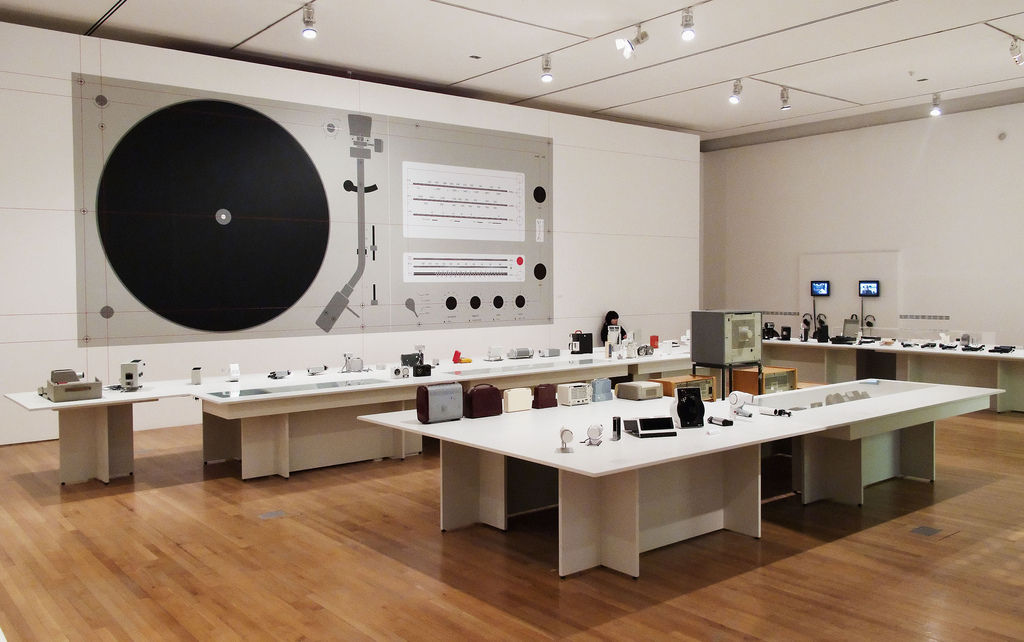
Author/Copyright holder: squarecircle. Copyright terms and licence: CC BY-NC 2.0
The Take Away
Dieter Rams’ 10 commandments are proof of his minimalist and functional approach to design but, more than that, they are proof of his professional stand. This is why we can easily make these principles our values, our philosophy of how design—hence, UX design —should be for any product or service.
A tiny example of how relevant his ideas still are is the mobile myth that “mobile=less”. Anytime you sense this opinion again, you can answer: “exactly, less but better”. We’re sure that while reading the principles, many more examples have come to your mind.
In December 1976, he gave a speech in New York of his design work at Vitsoe. Here are the initial paragraphs:
“Ladies and gentlemen, design is a popular subject today. No wonder because, in the face of increasing competition, design is often the only product differentiation that is truly discernible to the buyer.
I am convinced that a well-thought-out design is decisive to the quality of a product. A poorly-designed product is not only uglier than a well-designed one but it is of less value and use. Worst of all, it might be intrusive.
[…]
A designer who wants to achieve good design must not regard himself as an artist who, according to taste and aesthetics, is merely dressing-up products with a last-minute garment.
The designer must be the gestaltingenieur or creative engineer. They synthesize the completed product from the various elements that make up its design. Their work is largely rational, meaning that aesthetic decisions are justified by an understanding of the product’s purpose.”
Maybe he did not mention user experience as such but all of his ideas distill the same philosophy and values. Even then, design was nearly the only means for product differentiation. That is so much true still today. As he pointed out, we, as designers, need to be creative engineers who solve people’s needs and respect the 10 principles:
Good design is innovative. Good design must be useful. Good design is aesthetic design. Good design makes a product understandable. Good design is honest. Good design is unobtrusive. Good design is long-lasting. Good design is consistent in every detail. Good design is environmentally friendly. And, last but not least, good design is as little design as possible.
Author/Copyright holder: Incase. Copyright terms and licence: CC BY 2.0
We’re still awestruck at the savviness of his commandments! If you’re not, go back and re-read.
Where to learn more:
Norman, D. and Tognazzini, B. (2015). “How Apple Is Giving Design A Bad Name”. Fastco.
Koschei, J. (2015). “Good Design Is as Little Design as Possible”
Latin, M. (2014). “A User In Total Control Is A Designer’s Nightmare”. Smashing Magazine.
Read Dieter Rams’ full speech, “Design by Vitsoe.”
Check some pictures that exemplify each commandment.
An interview with Dieter Rams: If I Could Do It Again, “I Would Not Want To Be A Designer”
Resources
Hero Image: Author/Copyright holder: Axel Tregoning. Copyright terms and licence: CC BY 2.0


