
The hamburger menu—with its three horizontal lines—simplifies website navigation. Not every interface benefits from its use, but it can help in certain scenarios. That’s why it’s vital to understand when it shines and when alternatives might serve users better. So, learn the pros and cons of using this small—yet effective—icon and implement the best practices for effective application.
Have you ever clicked on a symbol that resembles a hamburger to open up a menu? That's the hamburger menu for you. By the way, cheeseburger menus don’t appear to be an option (yet), in case you’re wondering if graphic designers created a menu’s worth of a variety of these. This icon—which comprises three horizontal lines—is a passage to a site or app's various sections. It's a compact and efficient way to stash away navigation links, and it’s an icon that many users are super-familiar with. Its principal benefit? It keeps the user interface nice and clean and user-friendly.
The hamburger menu holds immense potential to simplify user journeys and to enhance interface cleanliness. It’s got a lot going for it in product designs like app and web design. Even so, despite its approachable name and simple design, this little icon sparks a large amount of discussion among designers. Critics believe the “burger icon” lacks intuitiveness and that it may even confuse users who’re unfamiliar with it.
If you want to know the ins and outs of the hamburger menu, stick around—you're in the right place. We’re going to talk about the essence of using this navigation tool effectively. What’s more, we’ll cover design essentials, offer practical usability advice and discuss how to strike the perfect balance between look and function.
The Brief History of the Hamburger Menu
Norm Cox crafted the hamburger menu icon in 1981 as a container for contextual menu choices, but it originally didn’t have a name. It was just a menu icon, with the lines resembling the contents of the menu that would appear when clicked. The icon later got its name when it was popularized in mobile apps from around 2009.
Its graphic design was meant to be very “road sign” simple, functionally memorable, and mimic the look of the resulting displayed menu list. With so few pixels to work with, it had to be very distinct, yet simple. I think we only had 16×16 pixels to render the image. (or possibly 13×13… can’t remember exactly)
— Norm Cox, Creator of the Hamburger Menu
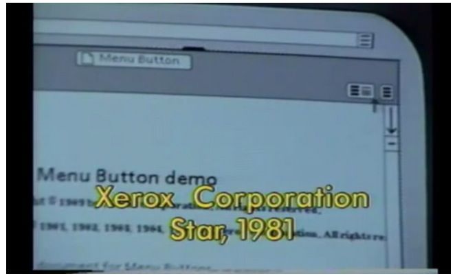
The early use of hamburger menu in Xerox Corporation Star.
© cultofmac, Fair Use
After its debut on the Xerox Star, Windows 1.0, released in 1985, featured the hamburger icon in its control menu. This design choice was a brief one to hold; Windows 2.0 replaced it with a single horizontal line for the control menu. It was by no means the end, though, and the icon saw a return in a different form in Windows 95, which used the program's icon instead. After several years, the hamburger icon returned to Windows 10's Start menu, and the rest is—well—history.
The icon's progression shows it didn't gain much popularity and remained, in fact, nearly forgotten for years. The introduction of smartphones and their apps was what marked its resurgence and how it’s become something of a household name of an item.
The Pros and Cons of Using a Hamburger Menu
The hamburger menu simplifies the user interface. It enhances the mobile experience and accommodates numerous links. That said, though, it may reduce discoverability, slow down navigation and even overwhelm users with choices.
© Interaction Design Foundation, CC BY-SA 4.0
The hamburger menu—now a common icon—stirs much debate among designers. Feelings toward it can span a wide range from love to hate, and this controversy shows how important it is to understand the pros and cons of the hamburger menu.
You can make informed decisions in design based on the pros and cons. Choose when, how and if you want to incorporate this three-lined icon into your projects for digital products or services. So, let’s digest the following:
Pros of Hamburger Menu
First, let’s look at the benefits of the hamburger menu:
Simplifies the Interface
The hamburger menu hides navigation options to create more visual space. It’s a handy simplification that makes the user interface more appealing and less cluttered.
Indeed, users do find a clean interface easier to navigate—and can focus on content without any interruption that numerous links may pose. The “burger approach” works especially well for platforms that prioritize a minimalist design. It goes a long way to ensuring that users enjoy a seamless experience as they get to focus on what matters most in what a design includes.
Better utilization of visual space can help you grab the visitor’s attention, and the Gestalt principles play a big part in that, as Mia Cinelli, Associate Professor of Art Studio and Digital Design, University of Kentucky, explains in this video.
Show
Hide
video transcript
- Transcript loading…
Enhances User Experience on Mobile Devices
Smaller screens mean you’ve got less space to work with when it comes to visual elements, navigation bars and the like—a lot less compared to their desktop counterparts. The hamburger menu maximizes this limited space as it consolidates navigation links into just one spot. This design choice is one that improves usability on mobile devices.
Users access the menu with a simple tap, and it makes for a smoother online experience. Users appreciate the easy access to what they need without having to navigate and wade through a crowded interface. This advantage is crucial for mobile-friendly websites and apps—not least since mobile users form the majority in terms of accessing brands digitally. And, certainly, it’s on mobile where user satisfaction depends so much on the efficient use of space.
Accommodates Numerous Links and Categories
Another big plus is how you can use the hamburger menu to handle many links and categories. It keeps everything tidy so users don't get overwhelmed with jumbo servings of content. It’s a feature that is especially beneficial for complex websites or applications, since it lets users access a broad range of content from a single point.
Users can easily explore different sections and get more of a seamless experience in the process. What’s more, it improves their ability to find specific information or products. This way, even with many options, users get to have a smooth experience—and take in the brand experience without even realizing there’s a phone screen in the way.
Facilitates Secondary Access
The hamburger menu is perfect for extra features that users don't always need. It keeps the main navigation clean and focuses on the important stuff. That said, when users want more, they just click the menu. This setup is nice because it doesn't crowd the screen. It keeps things simple while secondary options stay a tap away. It's a smart way to offer more without making things messy. It’s a useful example of progressive disclosure.
Cons of Hamburger Menu
In spite of the widespread use of hamburger menus in websites and mobile apps, they do have certain limitations.
Reduces Discoverability
Hamburger menus hide navigation options, and it’s something that can lower the visibility of important sections. As a result of that, users might miss out on valuable content or features. What’s more, new visitors may find it hard to discover what a site or app offers. They’ve got to click the menu to see the available options, and this extra step can negatively affect the overall user experience.
Slows Down Navigation
It calls for an extra tap or click to access the hamburger menu—an additional action that slows down the navigation between sections. On platforms where users need quick access, this delay can frustrate users, and it makes getting to specific content or features less efficient. What’s more, it can be a big drawback for tasks that require frequent navigation.
Can Overwhelm Users
When users open the hamburger menu, it sometimes presents too many options all at once—an overload that can overwhelm users. They face a long list of choices without clear guidance on what to pick. This complexity is especially important to manage for sites and apps that have got extensive content. So, you’ve got to simplify the menu or organize options better to alleviate this issue and give the digital solution—and its users—a helping hand.
Might Not Suit All User Groups
Not all users recognize the hamburger menu icon—and recognition rather than recall is a huge part of design. This lack of familiarity can really get in the way and hinder navigation for less tech-savvy individuals. Older users or those who’re less accustomed to modern user interface (UI) design patterns may get confused. So, you’re going to have to provide intuitive access to navigation for all user demographics—and alternate cues or labels might improve usability for these groups.
When to Use the Hamburger Menu (and When You Shouldn’t)
It makes more sense to use the hamburger menu in the scenarios given below:
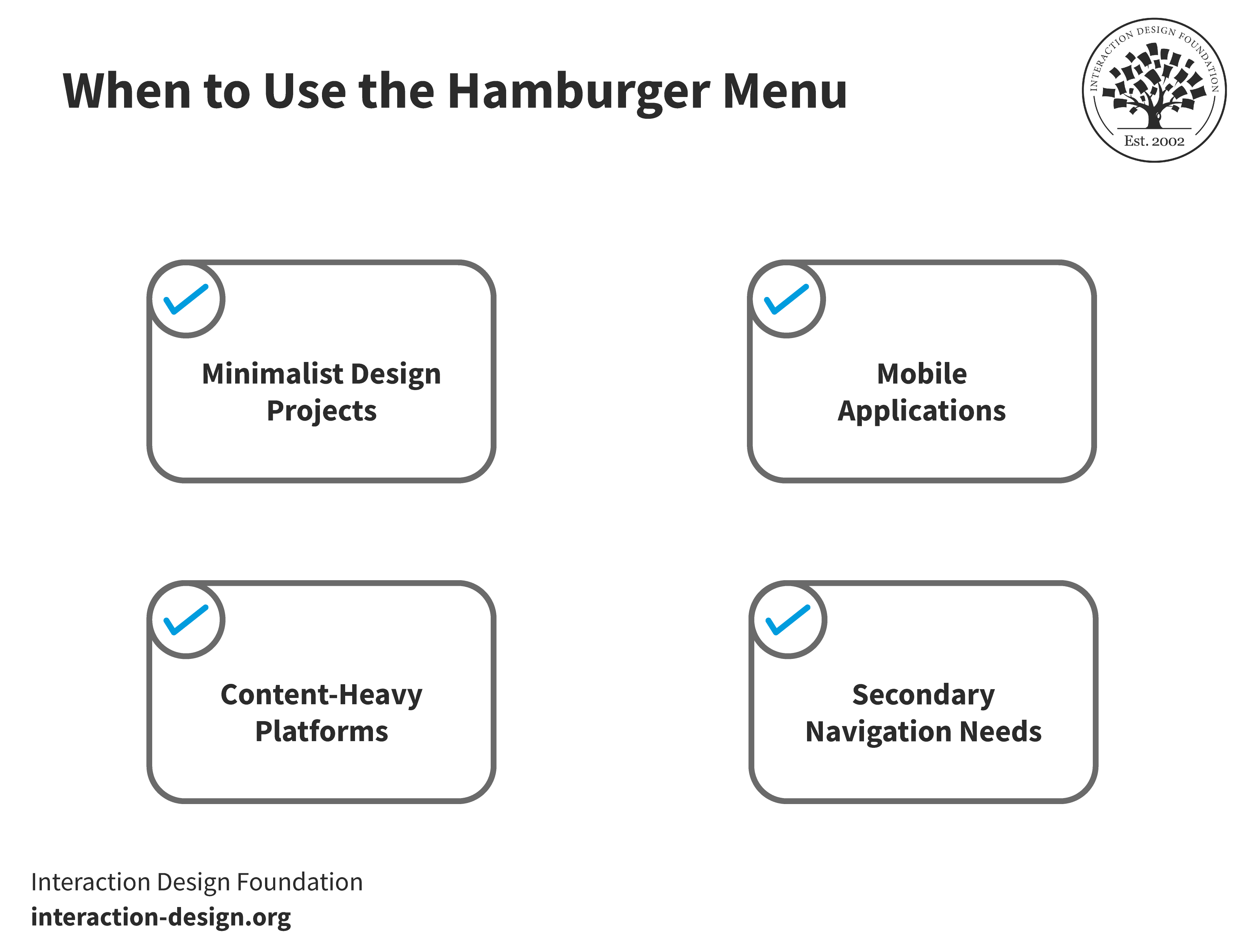
The use of a hamburger menu makes more sense in minimalist design projects, mobile apps, content-rich platforms and for secondary navigation needs.
© Interaction Design Foundation, CC BY-SA 4.0
Minimalist Design Projects: If you want a clean, uncluttered look for your websites or apps, then hamburger menus keep navigation tidy and the content hidden to give a minimalistic look.
Mobile Applications: Screen real estate comes at a high “premium” on mobile devices; so, a hamburger menu can efficiently organize navigation without compromising usability on limited screen space.
Content-Heavy Platforms: For platforms with extensive content—such as news sites or e-commerce platforms—hamburger menus can help tidily manage and categorize many sections or products.
Secondary Navigation Needs: When you’ve got straightforward primary navigation but need additional, less critical navigation options, then the hamburger menu can handily house these without cluttering the main interface.
Look at the scenarios when you can avoid using the hamburger menu because it might affect the user experience.
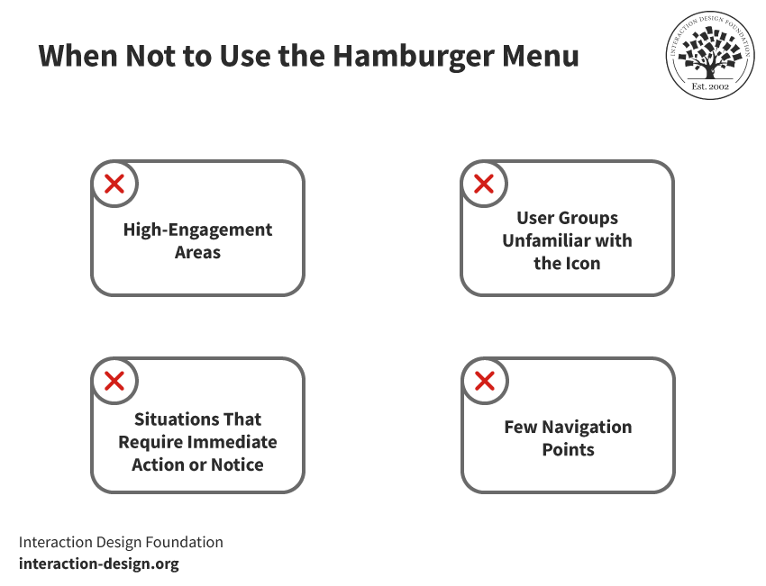
It mightn’t be a good idea to use a hamburger menu in high-engagement areas, when users are unfamiliar with the icon, in situations that require immediate action or if there are fewer navigation points available.
© Interaction Design Foundation, CC BY-SA 4.0
High-Engagement Areas: You’ve got to prefer direct navigation options for parts of a website or app that call for quick, frequent access—such as a checkout process in e-commerce—as they don’t slow down the user journey.
User Groups Unfamiliar with the Icon: Your target audience may include demographics who’re less familiar with modern UI conventions, such as older users. In that case, you may need alternative navigation solutions that are more intuitive.
Situations That Require Immediate Action or Notice: You may need certain features or sections to stand out immediately to a user—for example, urgent notifications or calls to action. So, in that case, it won’t make sense to embed these within a hamburger menu; it might reduce their visibility and impact.
Simple Websites with Few Navigation Points: A hamburger menu on a website or app that’s got limited navigation options might overcomplicate the user interface. Direct navigation links in the header or footer might serve better there. That’s because they ensure users have immediate access to all sections.
Four Alternatives to the Hamburger Menu
While the hamburger menu does suit many design needs, it's by no means a one-size-fits-all solution. You can use the alternatives to enhance usability, improve visibility and cater to user preferences. Let’s look at some effective options:
Tab Bar
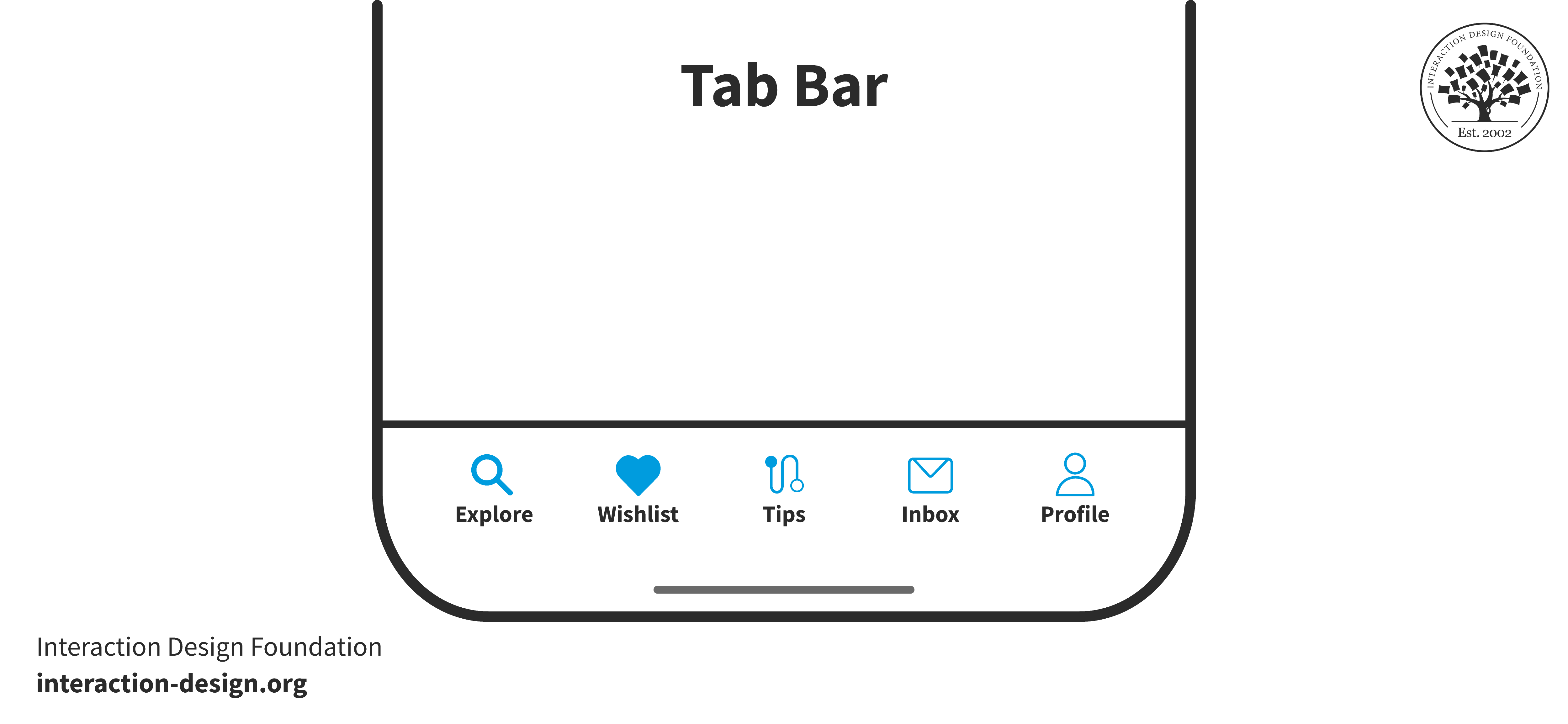
A tab bar displays all the options at once.
© Interaction Design Foundation, CC BY-SA 4.0
A tab bar displays key sections at the bottom or top of the screen, and it's a great pick for mobile apps. Users see important links at a glance for better navigation—and this choice works well for apps with three to five main areas.
Design choices for the tab bar like using color to show your current location or clear icons to convey features and enhance navigation and usability. A simple click or tap lets users switch—and easily—between pages or features. This design choice does call for you to give up some screen space so you can make navigation options visible.
Floating Menu
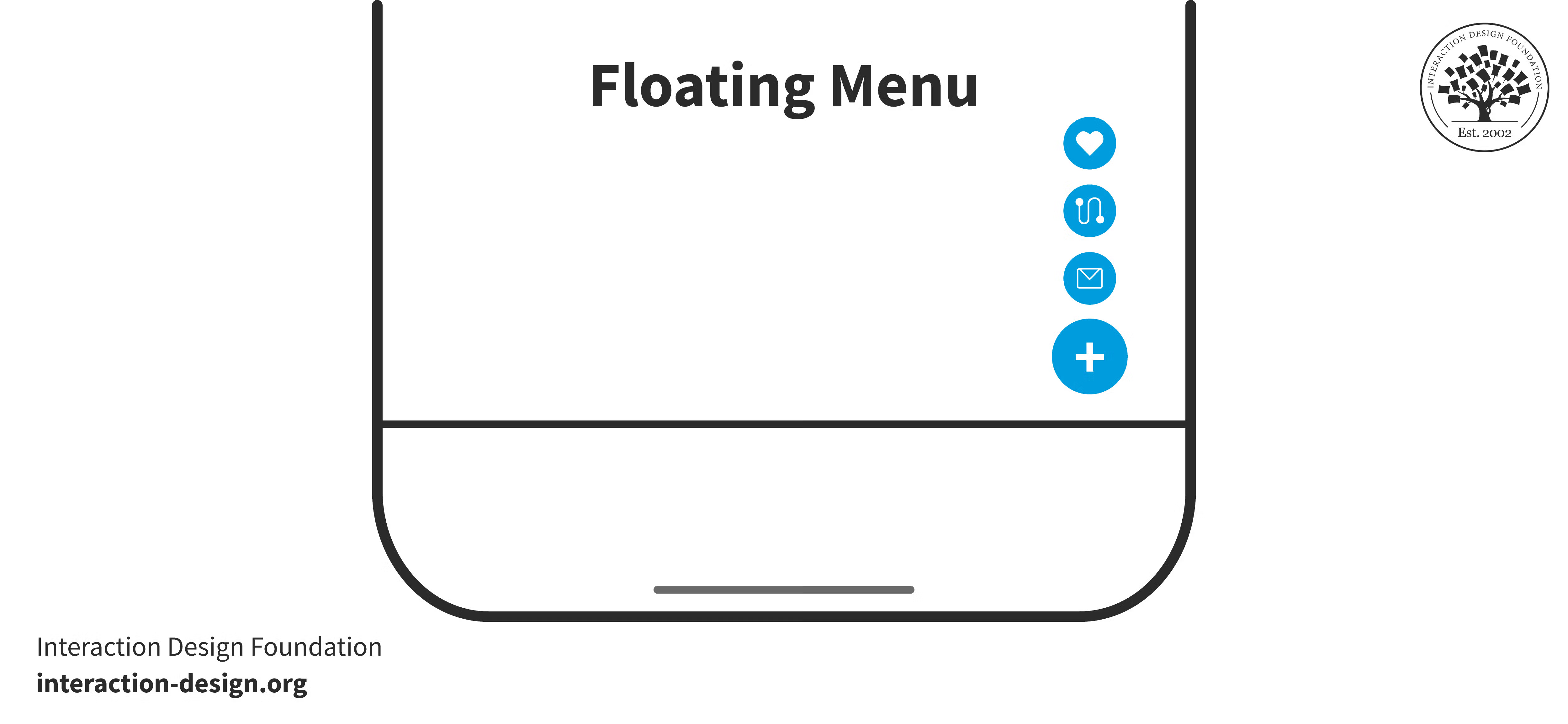
A floating menu displays options at the click of a button.
© Interaction Design Foundation, CC BY-SA 4.0
A floating menu appears over content, usually anchored to a screen corner. It stays visible as users scroll and offers constant access to key functions. This design suits mobile interfaces for a quick way for users to navigate or perform actions without any need to search for hidden menus. It makes essential features readily available—a big way to enhance the user experience. Floating menus adapt well to various screen sizes so that vital navigation options remain within easy reach for users.
Mega Menu
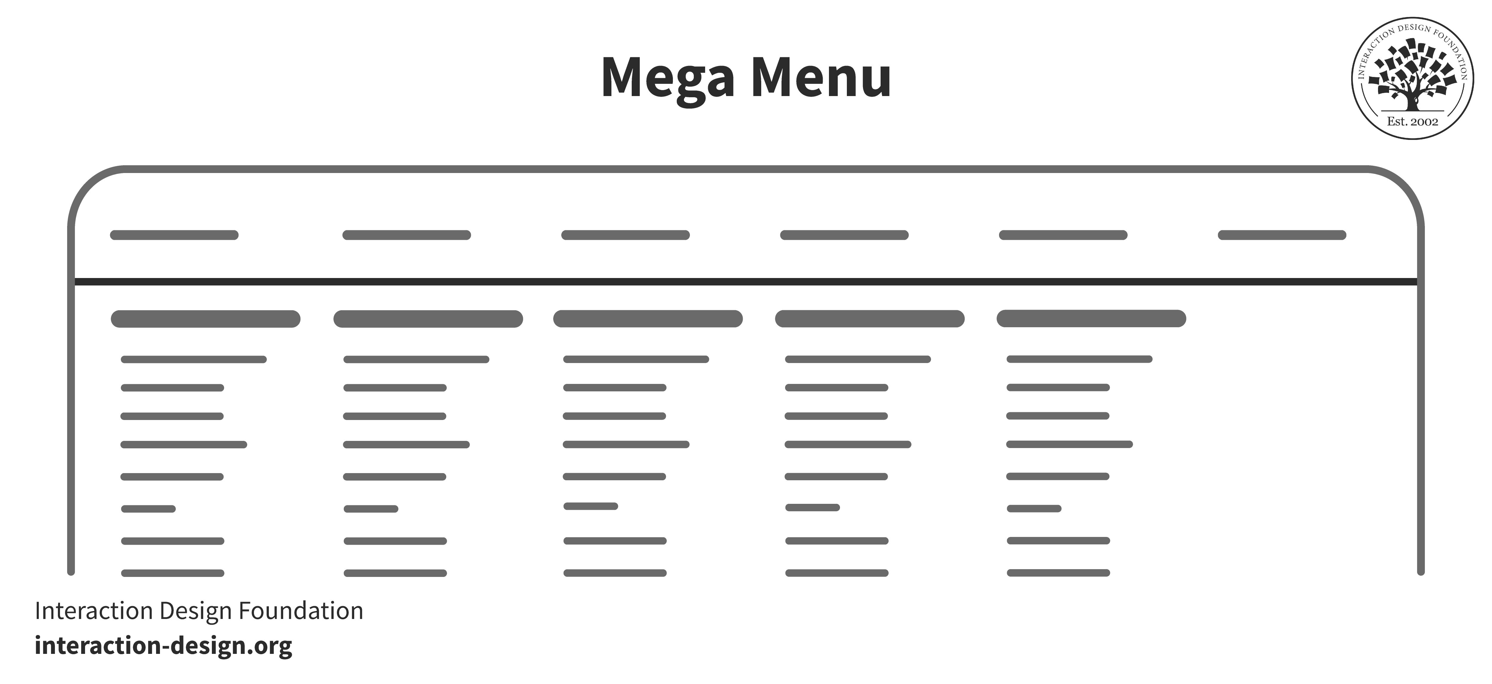
A mega menu displays each category or group at once.
© Interaction Design Foundation, CC BY-SA 4.0
You’ll find mega menus useful particularly for sites that have got extensive content or complex navigation paths. Unlike the hamburger menu—which consolidates navigation options into a hidden menu—mega menus display all the available choices at once. You organize the menu into categories or groups for the sake of clarity, and this direct visibility can make it easier for visitors to understand the site's structure and find what they want without having to make additional clicks.
Mega menus can streamline navigation for online stores or websites with various topics—and it’s an approach that lightens the cognitive load on users, who might struggle to remember the options in a collapsed hamburger menu. What’s more, mega menus can incorporate visual cues like icons or images to help navigation that much further.
Progressively Collapsing Menu
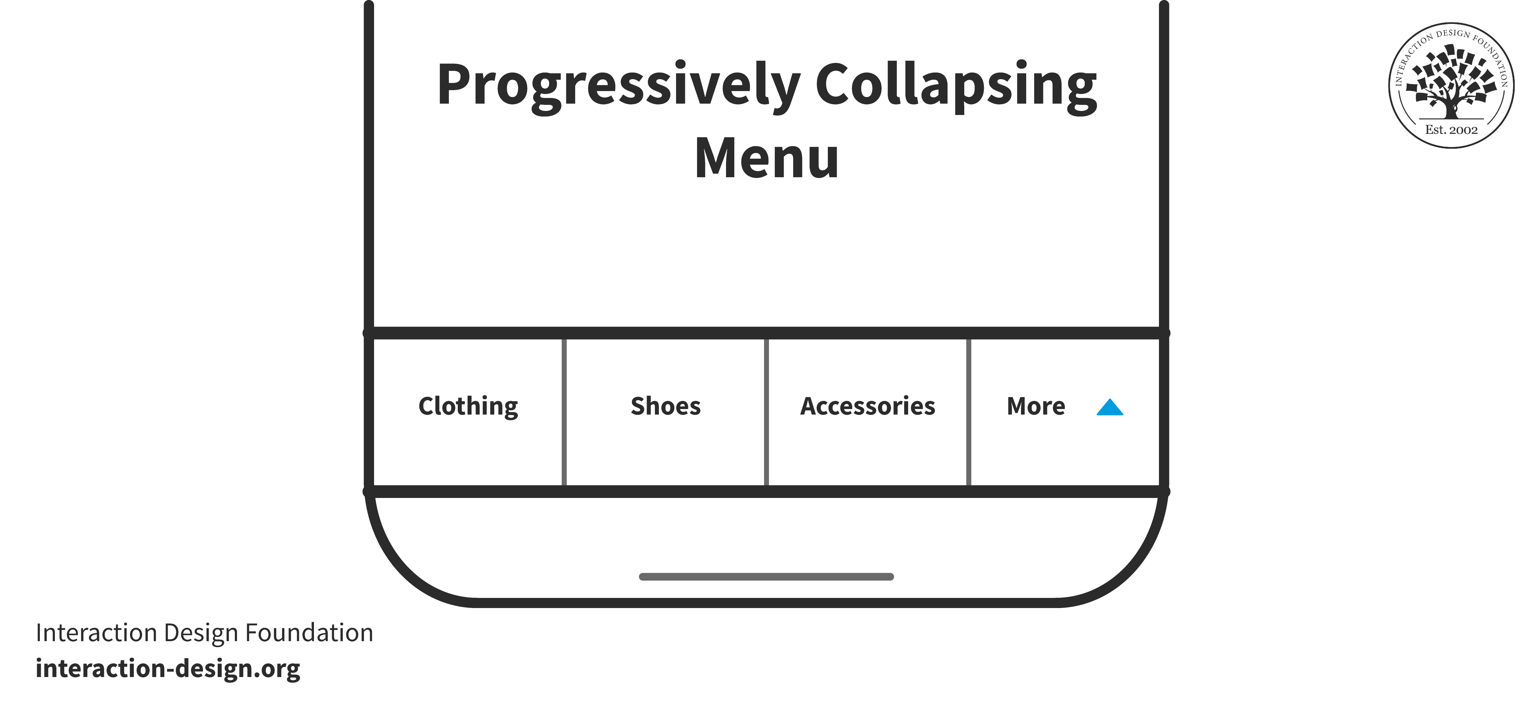
A progressively collapsing menu hides a few options under the “More” button.
© Interaction Design Foundation, CC BY-SA 4.0
A progressively collapsing menu adapts to the screen size—and it shows as many navigation items as possible. As the screen gets smaller, less critical items collapse under a "More" option—an approach that balances visibility and accessibility so that the most important links remain upfront.
This collapsing menu helps users find key sections without their needing to dig through hidden menus, and it stands as a user-friendly alternative to the hamburger menu. This type of menu improves site navigation both on large and on small screens. It offers a seamless experience that keeps essential navigation in plain view for users to conveniently have.
Expert Tips and Best Practices
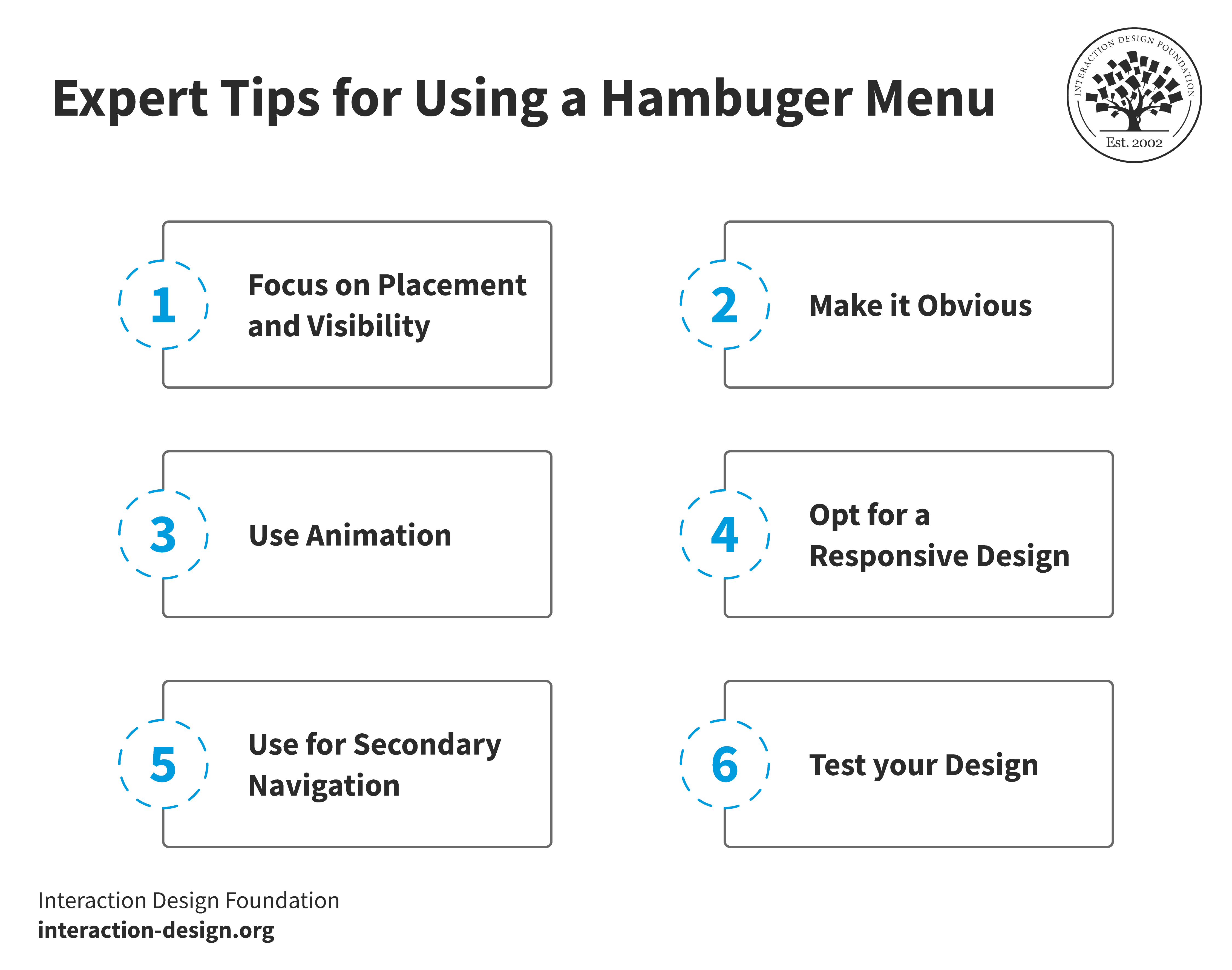
Focus on the visibility and placement of the hamburger menu, so be sure to place it at an obvious place. You can use animation and responsive design to make the hamburger menu better, and it’s better to use it for secondary navigation.
© Interaction Design Foundation, CC BY-SA 4.0
Whenever you want to craft a user-friendly navigation menu, the hamburger icon has become a staple for mobile and desktop applications. Let's delve into some expert tips to make sure your hamburger menu fits your site's aesthetic and really enhances the user experience.
Focus on Placement and Visibility
You’ve got to place the hamburger menu well for intuitive navigation—as consistent, prominent location makes sure that users find it easily. You have two options: to place the hamburger menu on the left or right.
Support for the left side comes from the reading habits of those who read left to right—as in, many users in the West; they typically scan web pages in an F shape. This habit is something that may have compelled many designers to place the menu on the left. Whatever the concrete reason, users have grown accustomed to this placement. Material design guidelines call this a “navigation drawer” and recommend placing it on the left.
On the other hand, you may position it on the right to cater to ease of access—especially on larger smartphones where users find it cumbersome to reach the top left. Though the right side might suit secondary navigation options better, user habits and physical comfort do play important roles in this decision.
Make it Obvious
You’ve got to make the hamburger menu obvious for easy navigation. Users really need to spot and use this feature quickly—and it’ll ensure a smooth experience on your site or app. So, follow these practices to make the hamburger menu visible:
Improve Contrast: The icon should stand out; use contrasting colors for better visibility.
Make the Icon Bigger: A larger icon is easier to see and click.
Use Labels: A label like “Menu” helps users to understand the icon's purpose.
The aim is to make it effortless for the user to find the menu—it’s a crucial thing. An obvious hamburger menu makes it simpler to navigate your site or app, and—what’s more—it improves the overall user experience.
Use Animation
A touch of animation can bring your menu to life—in keeping with how animation is something that can deliver benefits to users. When the menu stays active, you can transform the icon into an “X.” This visual cue shows the menu is open and interactive, and it guides users through their navigation journey.
A menu toggle-close animation makes it more dynamic—and, even in apps or websites that have got minimal animations, UX micro-interactions elevate the user experience. They make menus and buttons so much more interesting. Such animations should be smooth and quick so users don’t end up feeling frustrated.
Opt for a Responsive Design
A responsive menu adjusts its size, layout and functionality—and it aims to provide seamless navigation regardless of the device that’s used. Users expect an intuitive interface that works well on any screen—a cue for responsive design. A well-designed, responsive menu really meets these expectations, and it contributes to a positive impression from users of your website or app.
You should prioritize responsiveness and test the menu on various devices to make sure there’s optimal performance. This approach makes sure that all users get to enjoy easy and efficient access to your content.
It’s important to make the design adaptive and responsive for multiple devices. While both aim to enhance the user experience, they do call for a different approach. Watch Frank Spillers, CEO at Experience Dynamics, talk about adaptive design in more detail.
Show
Hide
video transcript
- Transcript loading…
Use for Secondary Navigation
If you store only secondary features in the hamburger menu, it keeps the app's UI nice and clean and maximizes screen space. Users don’t feel overwhelmed by having too many options at once. Initially, users engage with the primary features on the home screen, and this design choice simplifies their introduction to the app.
Over time, users become comfortable with the main functions—which makes it easier to discover and use secondary features. This method effectively balances accessibility with a clutter-free environment, and it guides users from basic to more complex functionalities. What’s more, this strategy makes navigation straightforward and it allows for a gradual exploration of the app's full capabilities.
Test your Design
Every design seems perfect until it faces the ultimate judge—the user. User responses to a design can vary widely. Factors like familiarity with UI trends, preferred apps and age can influence their interaction with your interface. It’s vital to test with real users for a user-centered design process to be truly centered on users.
You can use the safest strategy: that’s to create and test multiple design versions (A/B testing) with your target audience. This approach reveals which version aligns best with your brand. You can leverage the power of heatmaps to understand how users navigate your interface.
The Best Hamburger Menu Examples
Now, let's look at top hamburger menu designs—and these ones mix good looks with ease of use. They show smart ways to put menus on apps and websites. Take inspiration from these examples to simplify navigation and fit it well into different layouts.
Amazon
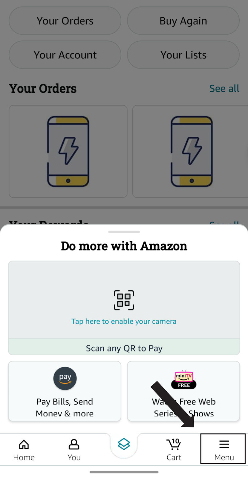
Amazon mobile user interface uses a hamburger menu in the bottom tab bar.
© Amazon, Fair Use
Amazon's Android app takes a truly unique approach with its hamburger menu. Unlike the traditional top-left placement, Amazon positions it at the bottom right—and it becomes the fifth icon in their toolbar. The icon is familiar—three horizontal lines—yet adding the label “Menu” clarifies its purpose. This makes it accessible to both seasoned and new users. (Contrary to popular trends, labelling icons with text has always been the most effective way of using them—display considerations permitting.)
Upon selection, the menu leads to a screen that shows various departments and utility sections like Amazon Pay, Deals & Savings, Amazon Prime, etc. It allows users to see all the offerings concisely (which they can also see on the home page). This design treats the hamburger icon as an integral part of the navigation, on par with the other icons.
Gmail
Gmail places its hamburger menu at the corner. When you hover over it, you see the “Main menu.”
© Gmail, Fair Use
The hamburger menu sits in the top left corner of Gmail. Hover over it and "Main Menu" appears. This prompt signals more options that await beneath this simple icon. Click on it and a full range of features unfolds. You see your Inbox, Sent Mail, Drafts and more options. Everything tucks away nice and neatly and allows for a clean, distraction-free main screen.
This design choice makes efficiency and ease a priority, and users can navigate to different parts of their email with ease—part of the magic of a seamless experience. The term "Main Menu" adds clarity, and it’s especially helpful for those who are new to the interface.
Gmail's layout demonstrates how a well-placed hamburger menu simplifies complexity. It stores a wealth of functionality behind a single icon, and it’s an approach that keeps user interaction straightforward. It allows for more screen space devoted to content, like emails and conversations.
Starbucks
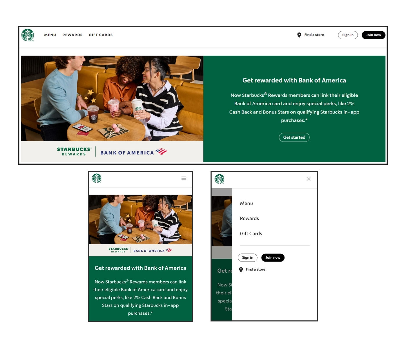
Starbucks uses a hamburger menu on mobile devices while the desktop website reveals everything in the top bar.
© Starbucks, Fair Use
Starbucks adapts its website for mobile devices well. On the desktop version, menu items like "Rewards," "Gift Cards," "Find a Store," and "Sign In" are directly visible. On mobile, Starbucks cleverly hides these options in a hamburger menu—a design choice that really streamlines the mobile experience. It reduces clutter and prioritizes space.
Users can easily navigate the site while they’ve still got access to all necessary functions with a tap on the hamburger icon. The transition from desktop to mobile retains functionality without sacrificing anything on the user-friendly design side.
Samsung
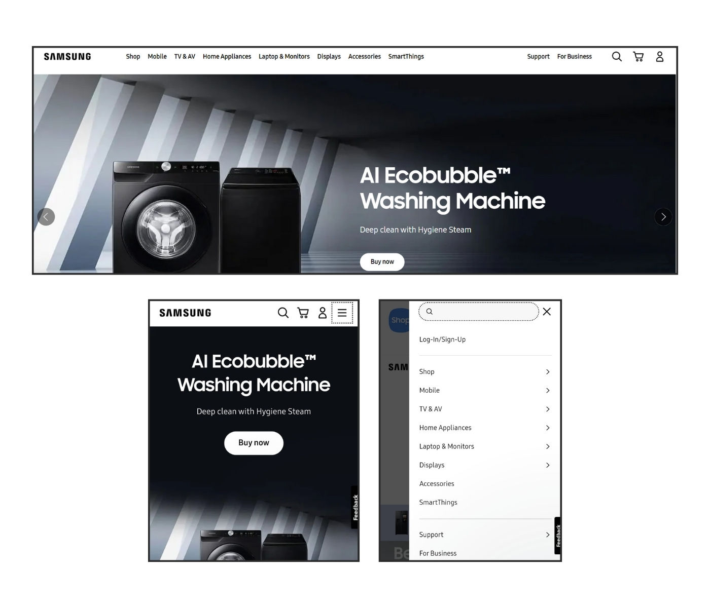
Samsung’s mobile website uses a hamburger menu to keep the mobile interface clutter free. Since its desktop website includes enough white space, the brand opted for a tab bar.
© Samsung, Fair Use
Samsung's website demonstrates a smart use of the hamburger menu on mobile devices. Users can see search and cart options on the desktop alongside the menu—yet, on mobile, Samsung streamlines the interface.
The hamburger menu icon neatly conceals various sections like “Shop,” “Mobile,” “Home Appliances” and more—which allows for a clean, focused presentation of products on the home page. When you tap the hamburger menu, it expands to show all options and keeps the user experience tidy and efficient.
Samsung's approach makes features accessible without overwhelming the main content. This design balances simplicity with depth so that users can easily navigate while it maintains a sleek look.
Dribbble
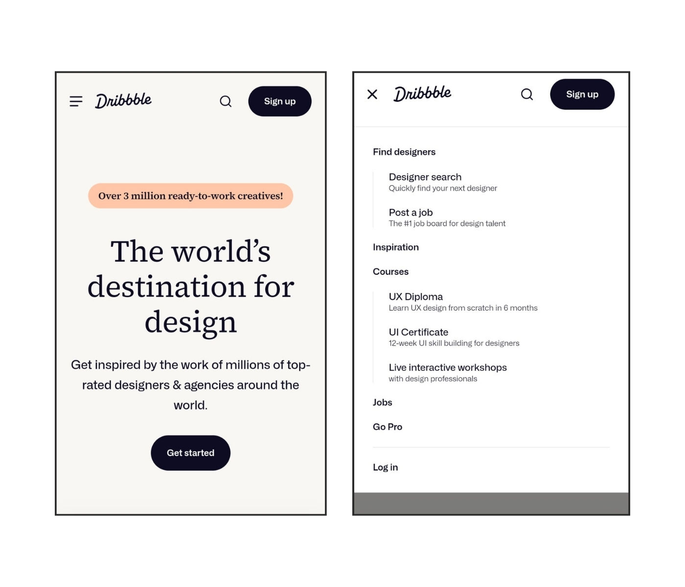
Dribbble’s user interface on mobile shows a good use of the hamburger menu. When you click it, the animation changes the hamburger menu to X.
© Dribbble, Fair Use
The menu icon at the top of Dribbble's mobile site animates into an “X” when users click upon it. This visual transition signals to users that they can close the expanded menu. Dribbble's animation adds a layer of interaction that makes navigation more engaging.
The menu neatly categorizes different options to keep the interface uncluttered. This design choice showcases a blend of function and aesthetics. It prioritizes content while it provides easy access to resources.
The Take Away
Many apps and websites use the hamburger menu thanks to its simple three-line design. It neatly tucks away various sections to provide a clean, minimalist look. However, its use can sometimes obscure important content and slow user interaction. The key to effective design is to know when to use it and explore alternatives for specific user needs. Consider these four things while you design the hamburger menu:
The hamburger menu is a compact navigation tool that can simplify user interfaces—particularly useful for mobile and minimalist designs.
It may reduce discoverability and slow navigation. So, you’ve got to test with real users to make sure it suits your audience’s needs.
You can consider alternatives like tab bars, floating menus or mega menus to improve visibility and user engagement.
The decision to use a hamburger menu should involve considering the specific context and user group. It's essential to think about user familiarity and the nature of the task at hand.
Ultimately, design is about making informed choices. Remember, the hamburger menu is a tool, not a rule; so, test and understand your audience to get the best navigation solution.
Where to Learn More
Take our course Visual Design: The Ultimate Guide to understand how to effectively use visual design elements and principles in your work.
Read CXL’s study on Testing the Hamburger Icon for More Revenue.
Take inspiration for designing your hamburger menu from Dribbble’s top hamburger menu designs.


