Search functions are the foremost tool to navigate applications and the internet. The mobile user experience relies just as much on effective search patterns as the desktop. Here we explore eight mobile search patterns to help you design easily navigable experiences.
With the efficiency of modern search engines, led by Google, the search pattern has become the top way to get around the internet. That means mobile applications also need to take advantage of the search functionality to deliver user experiences of a sufficient standard.
The Eight Patterns of Mobile Search
The good news is that search is a well-understood area of functionality. Here we look at eight common patterns you can apply to mobile search. You can use them individually or with each other for maximum effect:
Auto-Complete
Explicit Search
Dynamic Search
Scoped Search
Faceted Search
Saved and Recent
Search Forms
Search Results
Auto-Complete
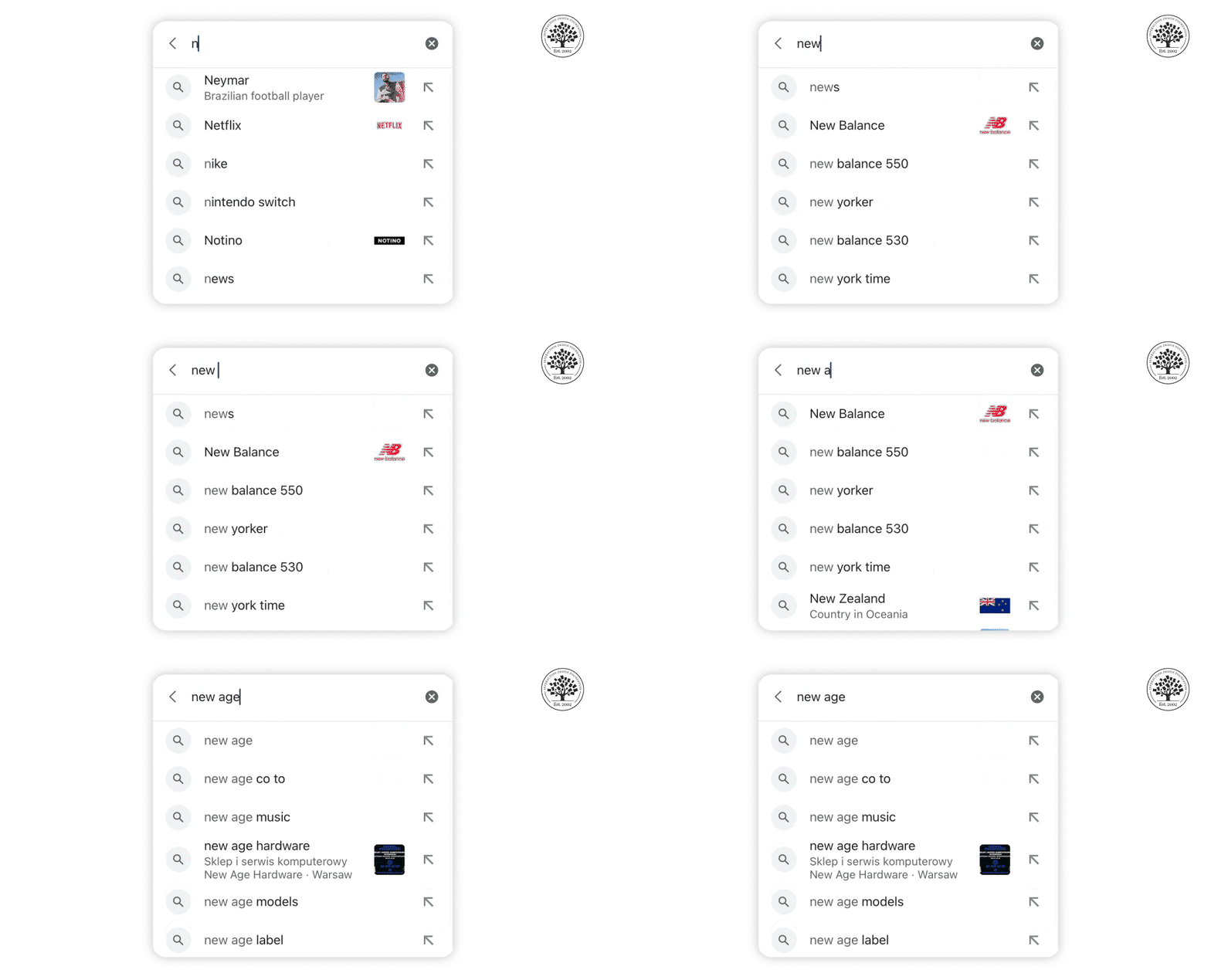
The Google Search app for iOS utilizes auto-complete to provide a convenient way to search the web quickly and easily.
© Google App on iOS, Fair Use
Auto-complete is often used with explicit search; it’s the idea that when a user begins to type a word, the software looks to complete it for them. This is particularly important on the mobile platform, where typing is a matter of thumb presses rather than using a keyboard.
Explicit Search
In explicit search, the user must complete an action to start the search process, such as tap a button on the display or use a keyboard control. Results from the search typically appear directly below the search bar.
You can use explicit search with auto-complete for better UX on mobile devices.
Dynamic Search
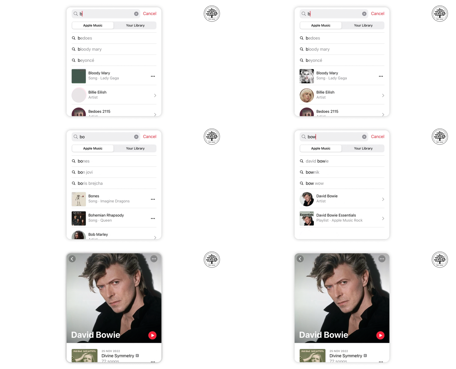
Apple Music uses dynamic search to help users easily find their favorite songs and artists by typing just a few keywords.
© Apple Music, Fair Use
Dynamic search uses a form of filter, so that when a user enters data, the content already on the screen changes in real-time. This can be very useful when a user has to wade through large volumes of data, for example, a list of hotels in a particular area.
Scoped Search
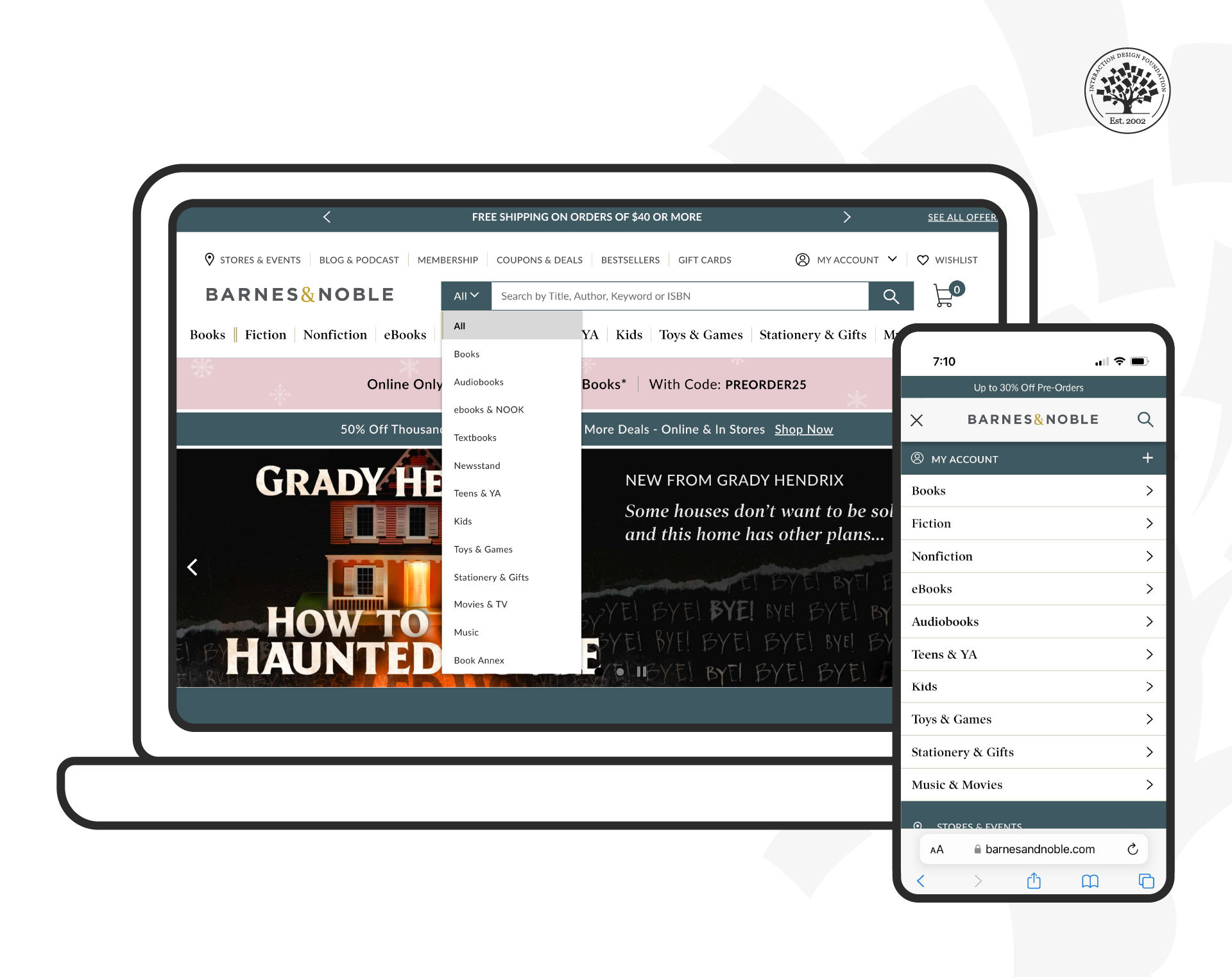
The Barnes and Noble website is not only mobile-friendly, but it also uses scoped search to help users find what they need more efficiently.
© Barnes and Noble, Fair Use
A scoped search allows the user to limit their search's realms to a particular website area. For example, the Barnes and Noble website allows users to choose between book categories before they enter the data.
Remember the limited screen real estate on mobile and try to keep the number of filters to a minimum while delivering value.
Faceted Search
Faceted Search is a more complex version of scoped (or filtered) search. Facets and filters differ in that filters omit results based on the initial criteria and do not change with every subsequent search, as opposed to facets, which are more specific and change with every new search. This pattern tries to deliver many search-filtering criteria and allows the user to tweak multiple filters to narrow down substantial data sets. Designers implement faceted search in a tray pattern that enables users to set filters.
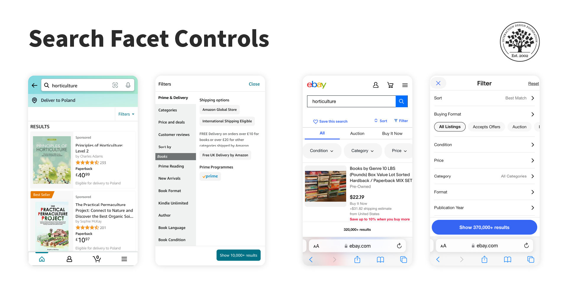
Amazon’s iPhone application (left) and eBay’s mobile website (right) display search facet controls on the same screen as the search results.
© Amazon, eBay, Fair Use
Saved and Recent
This search pattern recognizes that users often want to return to a search that they have used in the past. It allows the user to save their searches (or does this automatically on behalf of the user) and then recall them later.
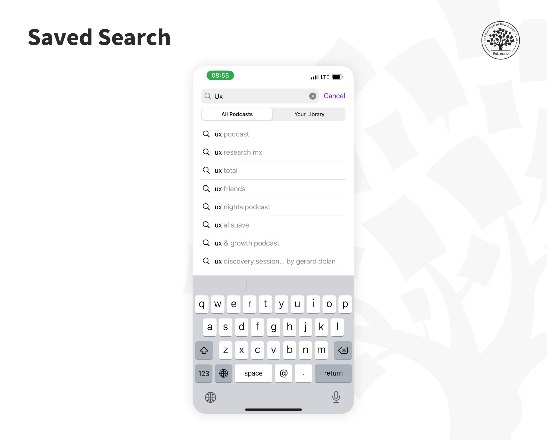
Saved search allows users to save their frequently searched queries so they can easily access them in the future without the need to retype them every time.
© Apple Podcasts, Fair Use
A saved search will generally require user action to retain the search for later use; a recent search will usually be stored automatically by the app with no action required by the user.
Search Forms
Suppose you need a variety of data to conduct a search, for example, a flight-booking service. You should know the date of departure, return date, number of people flying and seat preferences or destinations. Then you can use a simple form to collect all the data to deliver quality search results.
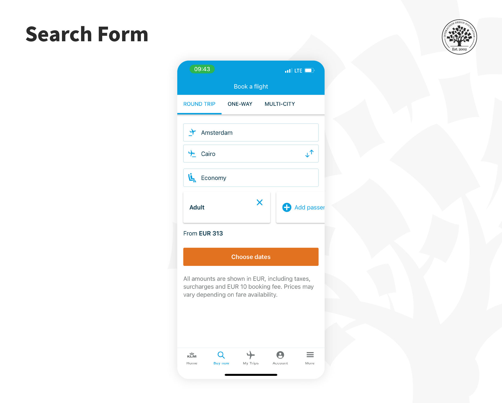
Travel-related services such as airline websites and apps ask travelers to add all information in a form and then serve the results based on those inputs.
© KLM, Fair Use
The idea is to keep this as simple as possible to maintain the quality of results. Only use the necessary and don’t waste screen real estate or inconvenience the mobile user with a limited amount of patience to type. To focus on operating system input techniques when you design mobile forms can also be valuable.
You should, as always, follow form design best practices to ensure that forms deliver maximum usability and utility.
Search Results
You can share search results with the user in many ways:
Thumbnail images of relevant results—for products, pictures, and more.
Tabulated results—ideal for flights, hotels, etc.
List results—a standard search result for data-based pages and the like.
Map results—where location matters.
Additionally, you can offer the user the ability to switch between result formats. The ideal practice is to find a default display that most users prefer and then to offer transitions to less popular choices.
You can provide a small handful of results and allow the user to extend the results list if they cannot find what they want in the initial results. This will help the user save data costs and take up less mobile bandwidth.
It is also valuable to indicate the total number of results found so that the user can decide whether to scroll through the list or, if it is dauntingly large, to refine their search before they explore the list.
The Take Away
People rely extensively on search functions to navigate the online space. Hence, it is crucial to implement search effectively within your mobile site or application. You can choose from any of the eight search patterns (auto-complete, explicit, dynamic, scoped, faceted, saved and recent, search forms and search results) individually or in combination with each other to support user tasks and deliver a better experience.
References and Where to Learn More
Find some great designs for mobile search UIs here at Design Your Way.
Get some guidance from experts on designing successful mobile applications using UI patterns.
Learn how to apply the Faceted Search pattern from the Nielsen Norman Group.
Hero image: © Envato Elements, Commercial license, Interaction Design Foundation, CC BY-SA 4.0


