
Now that we’ve seen some grids at work in the Rule of Thirds article, let’s examine them a little more deeply. As a concept that deals so fundamentally with the fabric and background of our work as designers, it’s easy to overlook the power of grids and think more about the elements we want to create. Many traditional artists still paint their masterpieces over a faint series of intersecting lines. To help us make the most of our work surfaces and create with precision, we designers have a tool that echoes this. We call it the Grid System.
The Story of the Grid
One of the easiest ways to achieve an organized design is to apply a grid system. It’s a tried and tested technique that first found favor in print layout. Low-tech and cheap, this is a great resource for you as a designer – consider it a top-ten tool in your office. Grids in interactive design can also help provide a consistent experience across multiple devices with different screen sizes. Users are happy when they see familiar features laid out as they would expect to find them.
The grid system helps align page elements based on sequenced columns and rows. We use this column-based structure to place text, images, and functions in a consistent way throughout the design. Every element has its place that we can see instantly and reproduce elsewhere. Consider the grids we find in maps. Islands, towns, lakes will appear on an exact part of a map, on a set of North-South/East-West coordinates. They will always appear in the same place on other maps. A GPS accesses these coordinates to help guide us; imagine the chaos if there were no grid system for it to latch on to and keep us right on the road!
The grid system was first used to arrange handwriting on paper and then in publishing to organize the layout of printed pages. Given that the printed page and the virtual page have much in common,it should come as no surprise that we also use it in web and app design. Creating a grid system for the virtual page is a little more complex than for the physical page – browsers handle information differently, and screens vary in size.Happily, however, the principle remains the same.
That’s not to say that there’s no resistance to using the grid system. Some designers feel that the grid limits creativity.While this may be true, it’s important to recognize that many designers employ the grid system regularly because it is so effective at organizing information.
The best layout is one which provides no distraction from the content. Thanks to its mathematical precision, the grid system is a great example of this kind of layout.
Grid as a Design Principle
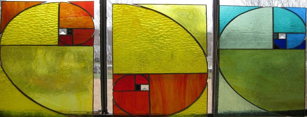
Villard De Honnecourt, a 13th-century French artist, merged the grid system with the golden ratio to produce printed page layouts with margins based on fixed ratios. That methodology continues to the present day, as the majority of printed books and magazines prove. Publishers, editors and designers place so much effort on keeping the tradition, not only because it’s known to be the best way but for another large reason. The readers (i.e., the users) expect to find everything in its proper place. Remember, the human eye is drawn to elements; it is also easily upset if it is confused or made to work out a problem it was not expecting to encounter.
Author/Copyright holder: Jason Prini. Copyright terms and licence: CC BY-NC-SA 2
Let’s try a quick experiment to see just how effective a grid can be. If you have two blank sheets of paper handy, draw about four or five shapes at random on one of them. Don’t worry about neatness and geometry – it’s just a simple illustration. When you’re finished, try to copy them as they appear on the second blank page (please don’t “cheat” by putting the second page under the first and drawing over the shapes again to trace them). Even if you have a very sharp eye and sure hand, you’ll notice that it’s practically impossible to replicate the first design, with everything appearing in the same place.
The second part of this experiment is optional, but it will help to drive home the point. If you have squared or graph paper lying around, take two pages and repeat the procedure. Do you notice how copying your original is so much easier when you can guide your hand? The grid made by the intersecting lines of this special paper gives us the gift of making truly accurate copies. By training our eye on the number of columns across and rows down, we can duplicate in free hand almost as perfectly as a photocopier.
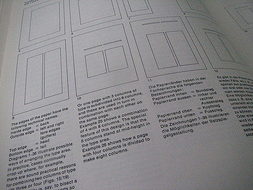
The image at the top of our article illustrates the components of the printed page: a header, footer, as well as right and left margins. Inside the margins, a designer has created equal-sized columns with a space between them, known as a gutter. Knowing that the page can include one or more columns, the designer can place elements such as images and text within these columns to provide alignment with the rest of the content. The image and paragraph areas may overlap in one or more columns.
Similar to the way in which vertical grid lines create these useful columns, horizontal grid lines guide the height of elements in the design. These portions of the grid are known as rows. As designers, we want to make the height of each row as a proportion of the width of the columns. For example, the ratio of column width to row height is 3:2, 4:3, etc.
Notice how we arrange the rows equally within the page layout, and how we insert gutter space between each row. We can then place elements of the page content in one or more rows, as shown in the figure at the top.
Grids in Interactive Design
In the digital world, the grid system acts similarly to the print layout in organizing the elements on the page. Additionally, it provides a guide for designers to create multiple layouts that support responsive themes for different screen sizes.
We divide the web page layout into columns that we separate with margins, using whitespace, between them. The width of the columns and the margins are equal, and we can place content in one or more columns based on the layout of the design.
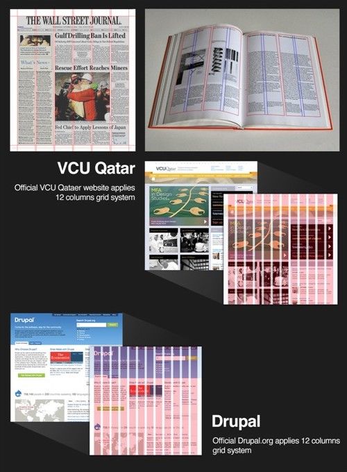
The application of a grid means that the design can be divided into multiple columns that can help designers organize content. For example,we can have one, two, three, six, twelve, or more columns. Today's screen resolutions reach very large sizes compared with what was available in the early days of computers. Even so, using a 960-pixel width can ensure that the design is properly displayed on many computer screens. It can also help designers modify the layout for mobile devices.
The examples above show grid systems that are based on the 960-pixel resolution from http://960.gs, which provides a useful guide for building your own grid-based web layouts.
There are other helpful tools for building grid layouts available online, too:
http://1200px.com/1200px: This website helps you build a grid system for much wider website designs than the 960-pixel style.
Golden Grid System: This website can help you build a grid system and optimize it for mobile-responsive display.
If you want to explore further grid systems for different purposes, you can find some at the following websites:
RWDGrid (responsive grid system)
The Take Away
The Grid System has been helping artists of all types (including writers) for a long time. First utilized by a 13th-Century artist, who merged it with the golden ratio, the grid system has been a tried, tested, and trusted methodology for centuries. It firstly empowered writers to position their handwriting neatly on paper; later on, it became a universal standard in the publishing industry. Publishing houses everywhere retain strict observance of the grid system in producing copy that users find both pleasing to the eye and in line with what they would expect to see.
Author/Copyright holder: Lauren Manning. Copyright terms and licence: CC BY 2.0
Regarding setting out elements, grids afford superb precision. We can see this principle most prominently in maps, noting how locations are pinpointed with grid lines that represent coordinates. The pursuit of accurate cartography would enable navigators to discover new places in the great unknown parts of the world. Now, with the grid lines that mark both longitude and latitude, GPS devices allow us to get wherever we wish to go.
However, cartographer’s maps represent fixed “designs” that change only imperceptibly over many years. Cartography might be a science, but grids, with their mathematical precision, are brilliant and much-needed tools of artists, too. Throughout history, artists have been making use of grid lines to plan and paint images of their own, which capture the best, most pleasing proportions.
Easy to create and practically free of charge, grids also give us web and app designers the ability to lay out our work in an organized and precise manner. By enabling us to insert elements in boxes created by their intersecting lines, grids enable us to make a consistent user experience across multiple devices. For example, the dimensions and layouts of our computer and smartphone screens differ. Planning our work so that it can adjust to appear on different platforms keeps our designs intact, in proportion and in the places where our user expects to find them.
Designers use columns and rows, shaped according to set column width and row height proportions (such as 3:2 or 4:3), and gutters (the spaces between these “boxes”) to present elements of our designs in the best way.
Although we have the luxury of very high screen resolutions that allow us to show ever-more impressive and realistic designs, by using a grid based on a width of 960 pixels, we can make sure that our designs will translate properly to be displayed on many computer screens and mobile devices such as cell phones. However, we have a wealth of resources at our disposal to help us fine-tune our choice of grid system to match the design we want.
However you use the grid system to build your design, you should keep in mind other principles, such as the Golden Ratio. Aiming to create a consistent user experience also involves creating a pleasing user experience that will be consistent across many devices. If you keep in mind that your choices will be working in concert with the known tendencies of the user’s eye, you will be able to create eye-catching designs that are better organized, as seen by your users on computer, tablet, or cell phone screens.
Reference List
Bigman, A. History of the Design Grid. 99 Designs. Retrieved from: http://99designs.com/designer-blog/2013/03/21/history-of-the-grid-part-1. [2014, Oct 1]
Friedman, V. Designing With Grid-Based Approach. Smashing Magazine. Retrieved from: http://www.smashingmagazine.com/2007/04/14/designi... [2014, Oct 1]
Shillcock, R. (2013) All About Grid Systems. Web Design Tuts Plus. Retrieved from: http://webdesign.tutsplus.com/articles/all-about-grid-systems--webdesign-14471. [2015, May]
Hero Image: Author/Copyright holder: Jeremy Keith. Copyright terms and licence: CC BY 2.0


