
Over 4.3 billion people use smartphones—and the shift towards mobile is worldwide. In mobile user experience (UX) design, more importantly, successful mobile experiences are paramount. Smaller screens with limited space call for a tailored approach to UX design. It's not a one-size-fits-all solution. Explore the world of mobile UX in our Mobile UX Design: The Beginner’s Guide course. Find out how to use mobile design elements to improve your work and immediately grab users' attention.
Imagine you create the perfect desktop design for your product or service—only to then find that it falls short on mobile devices. With over half the world’s internet traffic coming from mobile, mobile user experiences are precious items that no designer can really afford to overlook. What’s more, your mobile UX designs should make your product or service all the more accessible and inclusive.
It’s fair to say that mobile devices act as extensions of our lives in the digital era. They shape how we communicate, learn and interact with the world around us . Enter mobile UX design. It's not about scaling down desktop designs to fit smaller screens—no, you’ve got to rethink the user experience from the ground up. Mobile UX design requires a unique blend of simplicity, intuitiveness and engagement. You really have to create seamless interactions on the go.
“People ignore design that ignores people.”
— Frank Chimero, Designer
Good design on mobile isn't a luxury—it's a necessity, for sure. As mobile usage continues to climb, your design has got to meet the needs and expectations of mobile users as it'll impact your product’s success.
If you want to know more about mobile UX design, here are the top five things you’ve got to learn.
1. Understand Mobile User Experience in Detail
Mobile UX is what shapes how we interact with the digital world through smartphones and tablets. It's the bridge between technology and human behavior. Through mobile UX, we make our interactions as intuitive and satisfying as possible. So, in this section, we’ll discuss the fundamentals of mobile UX.
Optimize Design for Smartphones and Tablets
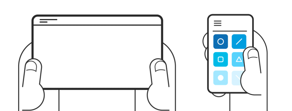
Before you optimize design for smartphones and tablets, you’ve got to understand the difference between smartphones and tablets. You have to balance their unique uses if you’re going to design for both devices. Smartphones need designs that suit quick, on-the-go access; meanwhile, tablets allow for more considered and immersive experiences. Effective designs meet these distinct needs and provide a good, solid understanding of any device.
© Interaction Design Foundation, CC BY-SA 4.0
Smartphones have smaller screens. You’ve got to pay close attention to every detail. Users often access smartphones while they’re moving. It’s something that calls for quick, precise information delivery. Keep the navigation simple—it helps users find what they need, fast.
Tablets provide more screen space. This allows for a more detailed design, and users typically use tablets at home or in the office. Tablet designs can include more complex elements and be closer to a desktop experience.
In this video, Frank Spillers, CEO at Experience Dynamics, explains the key differences between smartphones and tablets.
Show
Hide
video transcript
- Transcript loading…
How to Evaluate Mobile User Experience Design
Mobile UX design involves much more than visual appeal—and the experience must feel appropriate. When you focus on these parameters, you can create apps that are more than functional. They help you create memorable, enjoyable experiences for every user.
The visual aspect
Interruptible
Playful
2. Mobile UX Guidelines
Let’s look at simple yet effective guidelines for mobile UX design. This will teach you how to create user-friendly, efficient and engaging mobile interfaces.
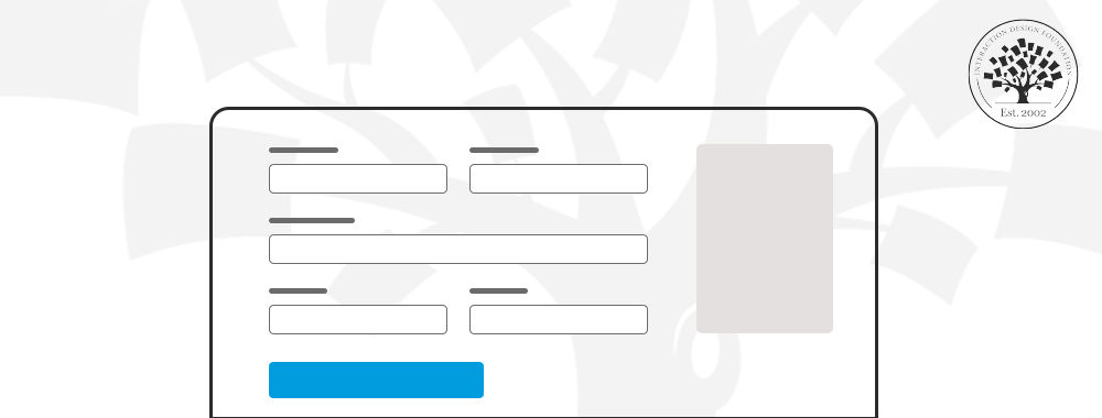
Design for Small Screens
Design with the "mobile first" mindset. Small screens mean that you need a clean layout that adapts to various devices. Group devices by screen size. It’s important to define clear rules for content and design adaptation. Plus, stick to web standards for a seamless user experience.
Prioritize the Primary Task
Make the main task obvious to users—and the design should focus on a single, large button for the primary function. This strategy clarifies the app's purpose and enhances user-friendliness—vital items. Consider the central action you want users to perform in your app, and highlight this action with a clear, accessible feature. This approach simplifies interaction. What’s more, it guides users directly to what they’re after.
Keep Navigation Simple
Navigation on mobile should be nice and straightforward. You can follow these five guidelines to make navigation simple:
Keep content to a minimum: Respect the small screen; limit content and make sure all devices support it. Keep descriptions short and to the point, too.
Reduce inputs required from users: Minimize the need for typing, and offer alternatives like voice input. Keep form inputs to a minimum. You’ve got to allow users to stay signed in for convenience.
Remember the instability of mobile connections: Mobile connections can be unpredictable. It’s something that can lead to challenges in maintaining a seamless user experience—and seamless experiences are essential. To combat this, focus on these things:
Continuous integrated experiences: A seamless transition between mobile and desktop is essential. It makes sure there’s continuity, consistency and brand identity across all platforms. This approach offers a unified experience that aligns with users' expectations on any device. You’ve got to meet this standard to maintain user engagement and loyalty.
Design for micro-moments: Micro-moments happen when individuals instinctively use their mobile device to look up information, find something new, research or purchase something. People experience these high-intent moments where they form preferences and make choices.
Google spotlighted the concept of micro-moments in 2015. It noted smartphones as the go-to "first screen." These moments capture instant decisions or needs—like when users want to find a nearby cafe or check a quick fact. Imagine someone walking through a city in search of coffee; they pull out their phone and search for "coffee near me." This is a micro-moment—the user seeks fast, relevant answers.
You design for micro-moments to make your content instantly accessible while it answers users' immediate needs. A few tricks work better when you design for micro-moments.
Prioritize speed and relevance. Make sure your site or app loads quickly and provides direct answers to common queries.
Optimize for local searches if your business has got a physical location.
Simplify the user journey. A few taps should offer the solution a user wants.
Make sure you address these micro-moments so you can meet users’ needs at these crucial junctures.
3. Start Your Mobile UX Design Journey
Your mobile UX design journey begins with understanding what users need and how mobile devices shape their experiences. You’ll learn to design for touch, navigate the challenges of smaller screens and make easy and engaging interfaces. This section offers you guidance on the foundational steps to start mobile UX design well.
Native, Web or Hybrid App: Which One Should You Prefer?
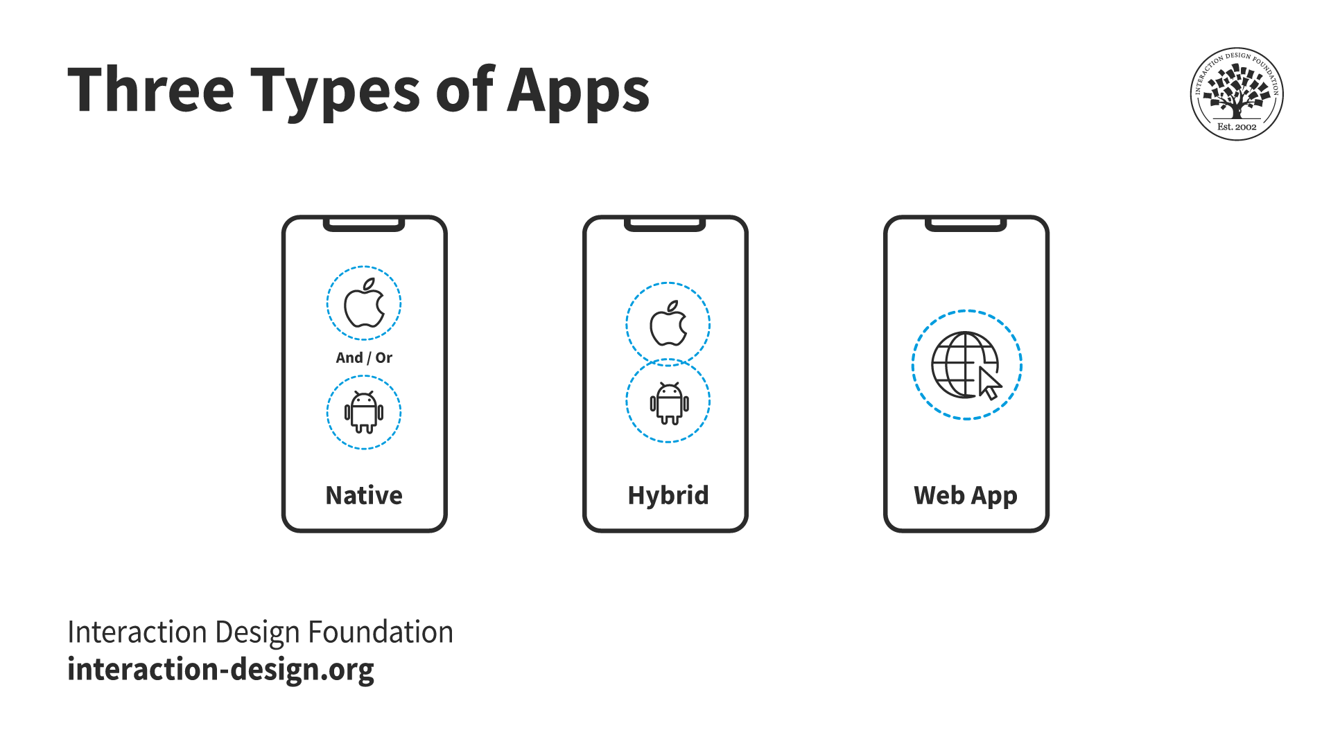
Three primary types stand out in app development: Native Apps, Hybrid Apps and Web Apps. Each one carries its unique set of features, advantages and challenges.
© Interaction Design Foundation, CC BY-SA 4.0
Native Apps
Developers build native apps for specific mobile systems, like iOS or Android, and these are apps that use the device's full hardware and software. This means better performance and user experience. Even so, it takes more time and money to make apps for different platforms.
Web Apps
True to their name, web apps operate within a web browser. They offer cross-platform compatibility without the need for app store approvals, and they receive straightforward updates as developers push them on the server side.
Hybrid Apps
Hybrid apps work across multiple platforms through a single codebase. It makes them more cost-effective than native apps. They blend web and native app features so they can balance performance and development efficiency.
While hybrid apps can't always match the performance or full device integration of native apps, they provide a solid user experience with a broader reach. However, maintenance and complex device interactions of hybrid apps can present challenges.
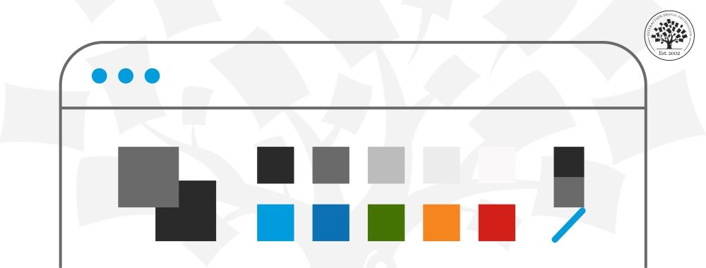
Focus on Responsive Design in Mobile
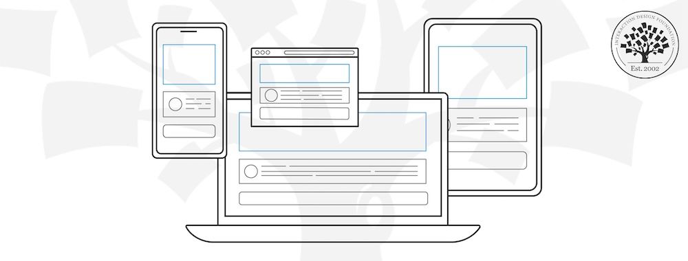
Responsive mobile design ensures your website or app looks great and functions well on any device, from smartphones to tablets. This approach automatically adjusts the layout based on the screen size and orientation.
© Interaction Design Foundation, CC BY-SA 4.0
The key to responsive design lies in flexible grids, images and CSS media queries. You aim for a seamless experience, and that’s whether a user browses on a desktop or swipes through on a mobile device. To excel in responsive design, follow these guidelines:
Use flexible grids: Layouts should adapt to any screen size. Don’t have fixed-width designs.
Optimize images: Ensure images resize and load properly across devices. High-resolution images can slow down your site on mobile and impair the UX.
Simplify navigation: Mobile screens offer limited space, so be sure to design a simple and intuitive navigation system for smaller screens.
Prioritize content: Decide what the most important content is and make it immediately accessible to users on smaller screens.
Enhance User Experience with Adaptive Design
Adaptive design tailors user interfaces to various screen sizes. It includes multiple fixed layouts and uses the layout that’s closest to the user's device—and this applies to phones, tablets, computers or other devices.
Adaptive design shares similarities with responsive design—both check the device size to decide on the content layout. Even so, adaptive design sticks to fixed layouts. It doesn't shift content to fit the device size, but instead loads a particular design for that device.
To implement adaptive design effectively:
Design for specific devices: Create layouts for the most common screen sizes and devices. This will provide optimal performance and usability.
Focus on load times: Adaptive sites serve device-specific versions. You’ve got to focus on loading speed. Optimize content and images for fast delivery.
Enhance interactivity: Tailor interactive elements and animations to suit the capabilities of each device.
Test extensively: Thoroughly test on various devices to make sure each version of your site or app delivers a smooth user experience.
Choose Between Responsive and Adaptive Design
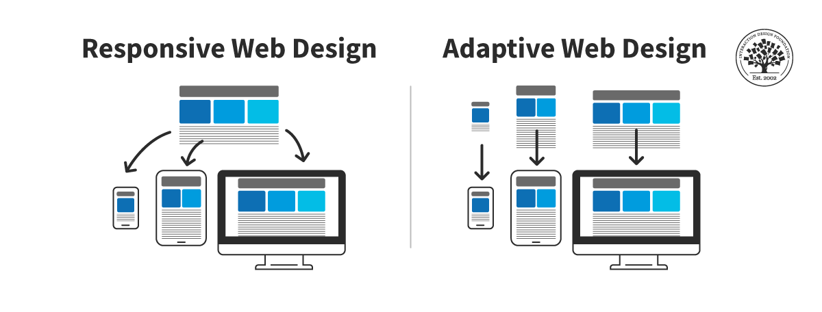
Comparison between the responsive design approach and the adaptive design approach.
© Interaction Design Foundation, CC BY-SA 4.0
Whether you should use responsive or adaptive design depends on your project's goals, budget and audience needs. So, here’s an overview of the pros and cons of each design practice to help you make an informed decision.
Pros of Responsive Design | Cons of Responsive Design |
Easier to create and maintain than adaptive design. | Developers need to write more code. |
Works for any screen size, ideal for the variety of devices today. | Hard to ensure the layout works perfectly on every device. |
Improves search engine rankings because it’s mobile-friendly. | The same code loads for every device, which can slow down the site. |
You can pick responsive design if you want your website to work across different devices especially for new, content-rich sites.
Pros of Adaptive Design | Cons of Adaptive Design |
UX designers can create specific experiences for each screen size. | Designing for each screen size can be demanding. |
Possible to vary content by device for a tailored user experience. | Designing for two or three screen sizes might not cover all user needs. |
Only loads the code needed for the viewer’s device, making sites faster. | Best suited for updates or new mobile layouts on existing sites. |
Adaptive design simply shines when you need to enhance an existing site or add a mobile version. It neatly offers tailored experiences for each device.
Balance Usability and Desirability in Mobile UX
Usability and desirability are critical components of mobile UX—something that’s impossible to overstate. Usability ensures that users can easily navigate and interact with your app or website. It helps the users achieve their goals with minimal frustration. Desirability, though, focuses on an enjoyable and engaging experience—it creates an emotional connection and encourages them to return.
Tips to improve usability:
Provide clarity: Users should understand how to use your app or site without confusion.
Speed up load times: Optimize your content to load quickly even on slower connections.
Make text readable: Use legible fonts and sizes that users can easily read on small screens.
Design for touch: Buttons and interactive elements should be easy to tap without accidental presses happening.
Tips to increase desirability:
Incorporate engaging visuals: Use attractive design elements that really draw users in.
Personalize the experience: Offer personalized content or features. They’ve got to cater to individual user preferences.
Create emotional connections: Use storytelling, imagery and interactions. They’ll help your product resonate with users on that all-important emotional level.
Provide value: Your app or site should offer clear, tangible benefits that fulfill users’ needs and desires every time.
4. Steps to Design a Good Mobile UX
Frank Spillers explains the five steps for human-centered mobile design in this quick video.
Show
Hide
video transcript
- Transcript loading…
You follow a five-step process to create a mobile user experience design—and here’s an overview of the steps:
Start with the Initial Assessment
First, you’ve got to examine your current situation. Review any existing mobile designs. Find out what works and the areas that need improvement. If you know your starting point, you can move forward in a focused direction. It’s crucial to have a benchmark for progress.
This step involves understanding your product's niche within the competition. So, be sure to look at direct competitors and note their strengths and weaknesses.
Pinpoint What Users Want
It’s essential to understand your audience so you can make sure that your design meets their actual needs and preferences. If you know your target users, you can create experiences that truly resonate with them. This way, you can solve their specific problems and enhance their satisfaction. This insight leads to higher engagement, loyalty and, ultimately, the success of your product.
You can use surveys, interviews and data analytics to collect insights into their behaviors and needs. Key points to discover include:
What users look for in your app or website.
Common issues they encounter.
Features they value the most.
Use user-centered design techniques to address real needs and improve user satisfaction—precious points to bear in mind.
Define Your Unique Offer
You define your value proposition and emotional value to clarify what differentiates your mobile UX design out there in the marketplace. It answers why users should choose your app over others through its unique benefits and solutions to their problems. Answer these questions in this step:
What benefits does your app provide?
How does it solve users’ problems better than others?
What positive emotions or experiences does your app evoke?
A strong emotional connection can transform casual users into loyal advocates who come back for more and tell others about it. A well-articulated value proposition and emotional resonance will make sure that your app meets functional needs and enriches users' lives.
Innovate Your Design Approach
With many products on the market, it calls for innovation and a unique touch to truly stand out.
When you look at competitors, it’s vital not to mimic designs from your research. Sometimes, they mightn’t use the best practices. Just let their work inspire you and adapt these ideas to fit your brand and user needs.
Your design should show who you really are. You’ve got many ways to make your mobile UX stand out, including:
Innovative features: Introduce functionalities that add value to the user's experience. For example, you can make daily tasks easier or more enjoyable.
Design excellence: Focus on aesthetic appeal and usability. A visually stunning app that's easy to navigate can make a big difference.
Personalization: Tailor experiences to individual users. Use data analytics to offer personalized content, recommendations and settings to them.
Speed and efficiency: Your app must perform well even on slower networks. Remember that quick loading times and smooth transitions keep users engaged.
Interactive elements: Incorporate interactive components like touch gestures, animations and feedback loops to boost engagement.
If you differentiate your app, it attracts users and turns them into supporters. So, consider every aspect—from tech innovations to creative design—to offer a great user experience.
Finalize Your Design Through Iteration
You’ll sketch, review and refine the mobile UX design in the final phase. This step helps you create a design that meets and exceeds user expectations. Here's what it includes:
Sketch: Draw initial designs to visualize your ideas.
Review: Collect feedback from users and stakeholders.
Refine: Make improvements based on the feedback you get.
Focus on user feedback during this step. It's really crucial to identify areas that need adjustment. Create an intuitive design that aligns with user needs—something they’ll go for and enjoy. This iterative process transforms good designs into great ones, and it makes the final product more engaging and effective.
5. How to Validate Your Mobile UX Designs
Validation helps bridge the gap between your assumptions and users’ realities. This makes it an essential component of the mobile UX design process. So, now, in this section, learn how to validate your mobile UX designs.
Apply Nielsen’s 10 Usability Heuristics to Mobile Design
In 1994, Jakob Nielsen introduced ten key principles for designing interactions—known as usability heuristics. These principles come from extensive experience in how people interact with computers. They guide designers as they work to create easy-to-use interfaces.
A user-friendly design is vital for a successful app. These heuristics can help you improve the user experience.
Let's look at how each principle can make mobile UX better:
Visibility of system status: Provide users with feedback within a reasonable time. For mobile, this means you’ve got to show loading indicators and confirmation messages.
Match between the system and the real world: Use language and symbols that are familiar to your users. Make the icons and terms intuitive and grounded in real-world conventions.
User control and freedom: Offer easy navigation back and forth and include an undo option. Mobile users appreciate it when they can correct mistakes easily.
Consistency and standards: Follow platform conventions—buttons and gestures should work the same across your app.
Error prevention: Design forms and interfaces to minimize errors. Use input masks in forms to keep invalid entries from happening.
Recognition rather than recall: Make objects, actions and options visible. The user should not have to remember information from one part of the interface to another.
Flexibility and efficiency of use: Accelerate interactions for frequent users without hindering new users. Include shortcuts and customizable features for them.
Aesthetic and minimalist design: Keep interfaces simple, and be sure to remove unnecessary elements that don’t support user tasks.
Help users recognize, diagnose and recover from errors: Error messages should be clear and offer solutions. Be sure to use plain language for your messages.
Help and documentation: Even though the goal is an intuitive design, provide users with help and FAQs. Make sure that the help is easy to search and tailored to the user’s current task.
Leverage the USE scorecard to evaluate Mobile UX
You can leverage the USE Scorecard to check Mobile UX. It means you can look at your app in three key areas: Usefulness, Satisfaction and Ease of use. This method gives a clear way to see if your mobile app meets what users want and expect. So, here's how to use the USE Scorecard in your review:
Usefulness
Identify key features: List the main features of your app and their intended benefits.
Measure relevance: Determine how each feature addresses actual user needs. Use surveys or interviews to gather user feedback on the perceived value of these features.
Satisfaction
Gather user feedback: Use surveys and direct user interviews to ask users about how satisfied they are with your app. Questions should cover overall satisfaction, the likelihood of recommending the app and their enjoyment of the app experience.
Analyze reviews: Look at app store reviews and ratings for additional insights into user satisfaction.
Ease of Use
Conduct usability tests: Conduct task-based usability testing to observe users interacting with your app and note any difficulties or obstacles they encounter as they do that.
Evaluate navigation and layout: Assess how intuitively users can navigate your app and find information or features.
After you’ve checked these areas, score each one (1 to 5) to measure your mobile UX. This will help you understand your areas of strength and weakness. The USE Scorecard combines qualitative insights with quantitative data. It helps you make specific upgrades to improve the mobile user experience.
About Mobile UX Design: The Beginner's Guide Course
Mobile UX Design: The Beginner's Guide is a 6-week course where you’ll learn everything discussed here in more detail. The course provides deep insights that help you understand everything you need at the beginner’s level.
This course covers crucial aspects such as design considerations for mobile devices, adaptive vs. responsive design and the importance of context and a human-centered design process. You'll explore the entire lifecycle of mobile UX design from research to launch. You’ll also learn how to evaluate mobile interfaces with specific heuristics and design for inclusivity.
By the end of this course, you will have the skills to set your mobile UX strategy apart and make informed design choices. You can build upon what you learned.
This course is perfect for:
UX, UI and Web Designers seeking to enhance their careers with industry expertise.
Marketing teams and management aiming to use mobile for branding.
Web and App Developers wishing to increase their products' usability.
UX Team Leaders and Product Managers looking to refine product strategies with human-centered design.
Operations Managers and anyone involved with mobile experiences aiming to boost product performance for users and stakeholders.
Your instructor is Frank Spillers, CEO of ExperienceDynamics.com. He is an author, speaker and internationally recognized expert in usability. Frank brings a wealth of knowledge in mobile UX design. You'll learn from proven research and real-life examples. This course will teach you how to use these ideas to improve mobile user experiences.
Mobile UX Design: The Beginner's Guide includes a "Build Your Portfolio" project. In it, you'll practice what you've learned through practical exercises. This hands-on work will deepen your knowledge and help you create a detailed case study for your portfolio.
References and Where to Learn More
Enrollment for the Mobile UX Design: The Beginner's Guide course is now open. It’s included in an IxDF membership.
To become a member, sign up here.
For more practical tips on Mobile UX, read A Comprehensive Guide to Mobile App Design.
Take the Mobile User Interface (UI) Design Course if you want to level up from Mobile UX Design.
Learn more about Mobile UX in our piece, What is Mobile User Experience (UX) Design
Read “Smartphone owners are now the global majority, New GSMA report reveals” for some interesting statistics on mobile users.
Read “Percentage of mobile device website traffic worldwide from 1st quarter 2015 to 4th quarter 2023” to know about the global mobile traffic.
Learn more about Web standards here.


