
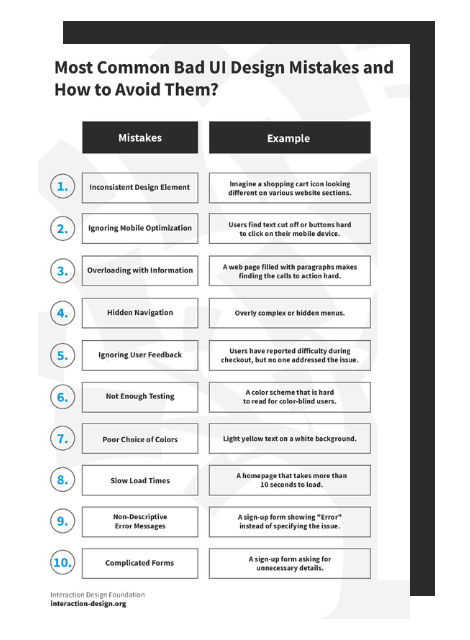
Looking at examples of bad design alongside counter-examples of good design is not only fun but also draws important lessons for designers. They highlight pitfalls for designers to avoid and let us understand how to translate design theories into solutions that work in the real world. Jared Spool, the American writer, researcher and usability expert, once said: “Good design, when it’s done well, becomes invisible. It’s only when it’s done poorly that we notice it.” So, let’s look at five examples of obviously bad designs, shine the light on how good design makes it work, and distill some lessons so we can all create great and invisible experiences for our users.
1. Information Overload
The Bad: Parking Signs in Los Angeles
Parking signs in Los Angeles (LA) have been the epitome of information overload for decades. They’ve always been notoriously hard to understand because the traffic rules are complex, resulting in the need to convey a lot of information in a small area.
How confusing are these signs? Traditionally, very—look at this example from the 2010s:
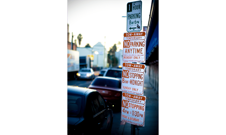
As LA parking signs go, this example is already a pretty simple one.
© Jorge Gonzalez, CC BY-SA 2.0
Imagine you are a driver along this road on a Tuesday morning at 9 a.m. Can you park at this spot? What sounds like a simple question takes a lot of mental processing to answer.
As designers, we’re often faced with situations where we have to design for a lot of information to be displayed in a small space. The parking signs in LA might be an extreme case, but many times designing for mobile apps means facing the same problems. Is there a way out for both the parking signs and designers in general?
The Good: Nikki Sylianteng’s Parking Sign
Designing a sign that displays all the information while being easy to understand sounds like an impossible task. But that’s exactly what Brooklyn designer Nikki Sylianteng did.
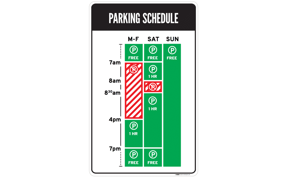
Nikki’s proposed parking sign was eventually used in LA as part of a trial run.
© Nikki Sylianteng, CC BY-NC-SA 4.0
Nikki’s design works well because it’s user-centered. Nikki realized that drivers simply want to know whether they can park at a spot. Yes or no—that’s all drivers needed, and that’s all the parking sign shows.
Her design uses visuals, rather than text, to convey information. The result is incredibly intuitive—green for OK, red for No Parking. It’s even designed for the colour blind, with stripes for No Parking.
Now when you look at the sign, you’ll know that on Tuesday at 9 a.m., parking is not allowed. The bars show what’s what at a glance—simple.
Lessons Learned: Best Practice
Understand what your users need, then design based on that. This helps reduce information overload.
If you have a lot of information to convey, try using visuals instead of text. Learn more about data visualization here.
2. Mystery Meat Navigation
The Bad: LazorOffice.com
Coined in 1998 by Vincent Flanders of Web Pages That Suck, the Mystery Meat Navigation (MMN) refers to cases where the destination of a link is not visible until the user clicks on it or points the cursor at it. The term “mystery meat” was a reference to meat served in American public school cafeterias that are so processed that their exact type is no longer discernible.
MMN is bad because it reduces the discoverability of navigation elements. This adds cognitive load to users because they now have to guess how to navigate or what clicking something does.
While most MMN are found in older websites, they’re surprisingly prevalent in modern websites. Take Lazor Office, for example, a design firm that creates pre-fabricated homes.
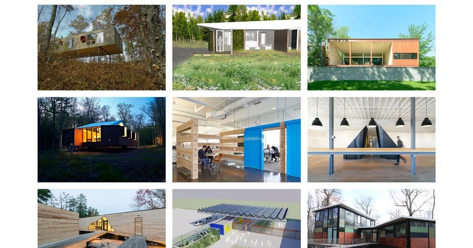
LazorOffice.com has a grid of MMN images on its home page. As you can see, this tableau gives precious little indication as to where to go. Instead, nine images just sit, leaving some of us pondering an enigma rather than interacting with a page.
© Lazor Office, LLC , Fair Use
Below the fold of their home page, a grid of image thumbnails lies waiting. Are they clickable? Well, yes—if you move your mouse cursor over an image, it changes to a pointer. But what happens when you click on an image?
“Click to find out!” is never a good User Experience (UX) solution. Chances are, your users are going to abandon their navigation and find an alternative solution on a competitor’s site.
The Good: Course Cards on Interaction Design Foundation’s website
Thankfully, MMN problems are easy to solve. The key is to be aware that you must clearly label links. Simply adding “View project” that appears on mouse hover will improve the usability of Lazor Office’s page above.

Our course cards are as un-mysterious as links go.
© Interaction Design Foundation, Fair Use
For the Interaction Design Foundation’s course cards, we not only have “View Course” at the bottom of each card to indicate the action that will happen, but we also have a hover state with the text “Go to course.” Many websites follow a similar convention, and you should, too, to maximize your website’s usability.
Lesson Learned: Best Practice
Always label your links! You wouldn’t like to eat mystery meat—and similarly, your users wouldn’t like to click on mystery links.
3. Adding Friction to User Actions
The Bad: iFly50.com
As designers, we should add friction to user actions with extreme caution, unless the point is to dissuade users from performing that action. Sometimes, however, we might even unintentionally add friction to user actions (mostly due to aesthetic or novelty reasons) that result in detrimental UX.
One example is iFly50.com, created by KLM for the anniversary of the iFly magazine. iFly 50 is a vertical scrolling website showcasing 50 travel destinations, and in some destinations (such as the one below), a button near the bottom asks users to click and hold for a few seconds to view more photos.
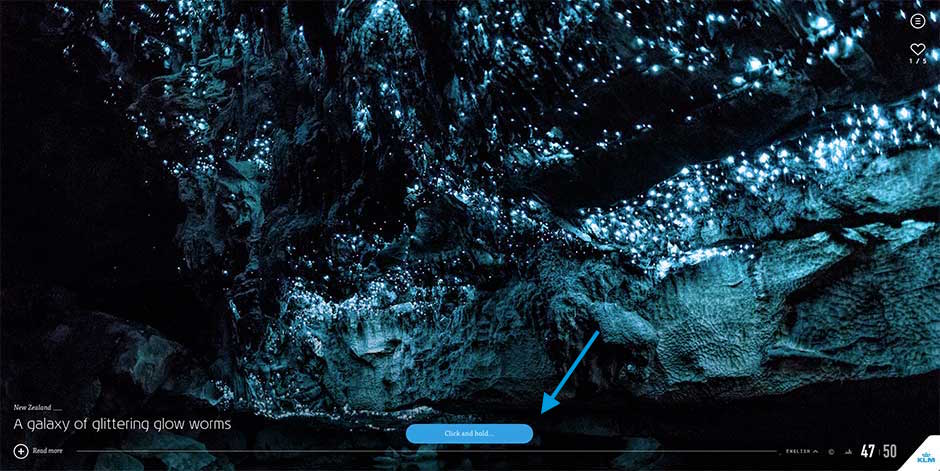
iFly 50 expects its users to click and hold for a few seconds every time they want to see more photos.
© Koninklijke Luchtvaart Maatschappij NV (KLM Royal Dutch Airlines), Fair Use.
The act of adding a few seconds of friction to each action can result in tremendously poorer UX. Imagine if, instead of clicking to load a page instantly, you’ve now got to click and hold for two seconds for every link you clicked in your browser. You’ll quit exploring the internet altogether after a few click-and-holds.
We designers often get carried away with the newest interaction styles or actions, but it is critical to always exercise caution when your design could add friction to user actions. Most of the time, tried-and-tested conventions (for example, simple clicks or swipes) work perfectly.
The Good: Elastic Scrolling on iOS
Interestingly, mindfully adding friction to user actions can result in great design. One of Apple’s most popular inventions in their mobile operating system, iOS, is the creation of elastic scrolling, where in certain situations (such as at the end of a webpage) scrolling becomes increasingly difficult.
In iOS’s elastic scrolling, friction is deliberately added in some situations.
© Interaction Design Foundation, Fair Use
You can see this in action above, where increased friction occurs when the user scrolls to the end of the webpage. Friction was added to indicate situations where scrolling is no longer allowed—the result is an intuitive experience.
Lesson Learned: Best Practice
Avoid adding any kind of friction to user actions as much as possible—and carefully implement it when you have no alternative.
4. “Clever” Design that Ignores Usability
The Bad: Bolden.nl
Sometimes, clever designs can be detrimental to UX. What makes this mistake more dangerous is that we designers love clever designs. They’re tiny graphical wonders that bring a smile to our faces. Sadly, the majority of humans are not designers. Even sadder, not all clever designs are good designs, especially when they create accessibility, discoverability or usability problems.
Take Dutch strategic design and development studio Bolden’s website, for example:
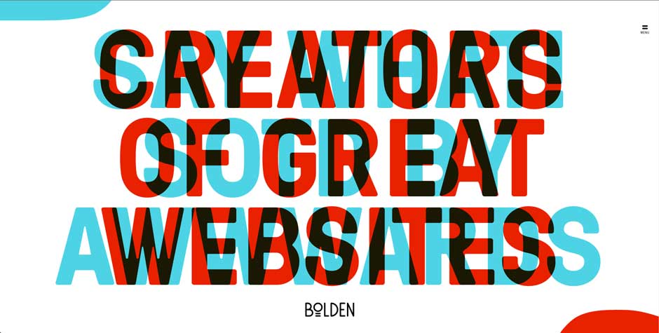
Can you tell what their home page is trying to say? No? Well, that’s because you’ll have to move your mouse to the corner of the page so as to see the messages properly.
© Bolden, Fair Use
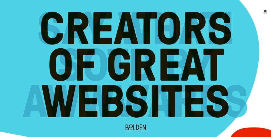
Is this a clever design? Yes, definitely. But is this bad design? Absolutely!
Bolden, Fair Use
This is a great example of designing for the designer rather than the user—the website seriously reduced the legibility of its headlines in its creators’ determination to deliver a novel design. Whoever designed this also left out text to tell users that they’re supposed to move their mouse to the corners, which means the discovery of the headlines relies on happenstance. Furthermore, even when the headline is revealed, the contrast between the text and the background is poor due to the point that you can still see overlapping text. This all adds up to create a user-unfriendly website.
The Good: CultivatedWit.com
Cultivated Wit’s website is a great counter-example of how clever design need not put a strain on usability.
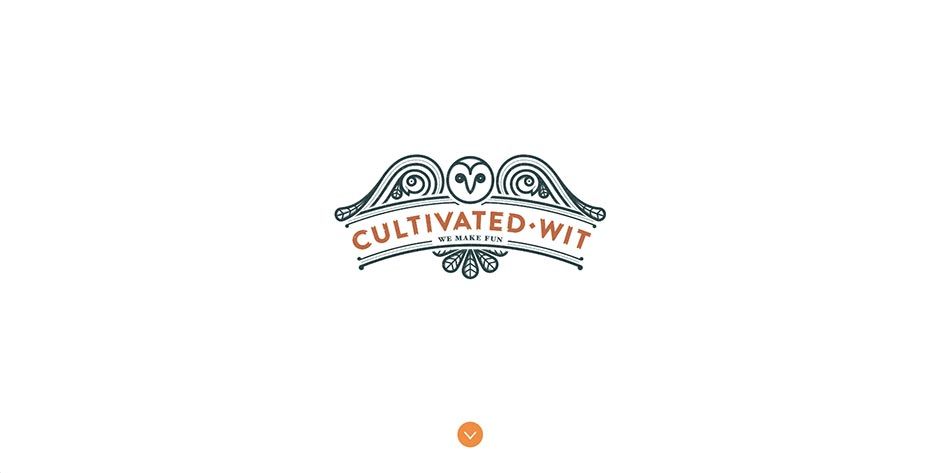
Cultivated Wit’s homepage displays an illustrated owl.
© Cultivated Wit, Fair Use
In Cultivated Wit’s homepage, the illustration of the owl winks when your mouse moves over it:
Surprise! The owl winks at you when you point the cursor at it. Note the wise allocation of whitespace, too.
© Cultivated Wit, Fair Use
The key difference here is that this does not form an essential part of the website, so it does not diminish the usability even if the user does not discover this clever design element.
Furthermore, they have a clear downward-pointing arrow to suggest something lies below the fold. And when you scroll down, you’ll see this:
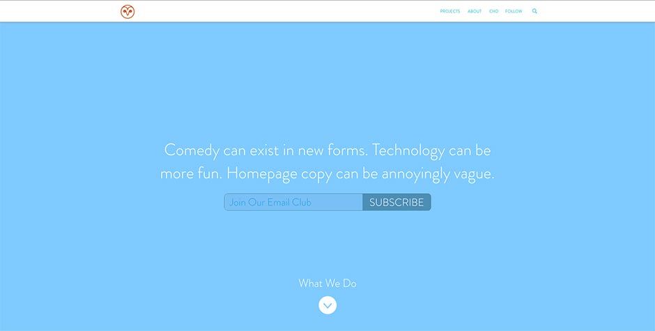
Websites can be clever without sacrificing UX.
© Cultivated Wit, Fair Use
The copy (which is legible and has good contrast) creates a sense of wit—not unlike what Bolden was trying to achieve—without diminishing the user experience of the website. The only small problem is the text “Join our email club” should be more visible, but taken as a whole, Cultivated Wit’s website is a great example of delivering a clever design without creating poor UX.
Lesson Learned: Best Practice
Clever designs should always be made as foolproof as possible and/or tested on actual users. Sometimes, clever designs can backfire, and hurt usability.
5. Superfluous Animations
The Bad: PayPal Receipt Concept on Dribbble
Animations are a crucial element of interaction design, but they should always serve a purpose. They should never be done for animation’s sake. Unfortunately, designers tend to have a love affair with animations, partly because animations are so fun to create that we might not know when to stop.
Vladyslav Tyzun’s animation concept for a PayPal email receipt, posted on Dribbble, is an example of animation done wrong:
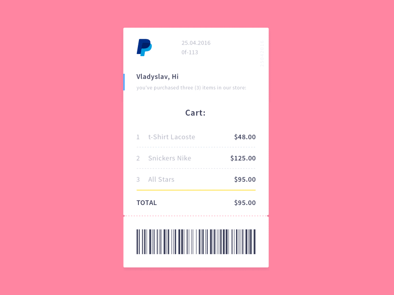
The animation is pretty, but superfluous. In total, it takes a whopping 3.5 seconds to see the transaction details. A simple fade-in of the receipt would be more elegant, and because it takes up less time, better for the user as well.
© Vladyslav Tyzun, Fair Use
This problem becomes dangerous when designers seemingly can’t get enough of animations. As of 2016, Vladyslav’s animation would receive more than 500 likes and 8,000 views. This shows a misguided appreciation that designers have towards animation for animation’s sake. Having insight into the designer’s tendency to prefer swooping epics over more direct representations and catching yourself before you give in to animations will save you a lot of time and prevent many headaches. Remember, users come to sites for a purpose—we want to show them what they are after in a short space and time, not detain them in a grand tour of the gallery.
The Good: Stripe Checkout’s Animation
When we do animation purposefully, however, the results can be great. Look at Stripe Checkout’s animation when the user receives a verification code:
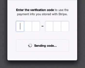
Stripe uses animations to make things seem faster than they are: it provides users with updates (like “Sent”) even though they might not have received the SMS yet. This prevents users from feeling frustrated at having to wait, and provides assurance that an SMS is on its way right now.
© Stripe, Inc., Fair Use
Rachel Nabors, a web animations expert at the W3C, suggests five principles to keep in mind when designing animations:
Animate deliberately: Think through each animation before you create it.
It takes more than 12 principles: Disney’s 12 principles of animation work for films, but not necessarily for websites and apps.
Useful and necessary, then beautiful: Aesthetics should take the back seat to UX.
Go four times faster: Good animations are unobtrusive, which means they run fast.
Install a kill switch: For large animations such as parallax effects, create an opt-out button.
Lesson Learned: Best Practice
Always make your animation purposeful—too much can kill the UX of a product. Beauty has to pull its weight and be functional.
The Take Away
Isn’t it fun looking at examples of bad design? Thankfully, it’s educational as well. Here are the key lessons and best practices from the five examples of good and bad designs:
Understand what your users need, then deliver that information.
If you’ve got lots of information to convey, try using visuals instead of text.
Always label your links! Users don’t like mystery links.
Avoid adding any kind of friction to user actions unless they’re meant to dissuade the action.
Test your clever designs and include them cautiously.
Animation is like cursing. If you overuse it, it loses all its impact.
The next time you frown at an instance of bad design, stop to think: understand why the design failed, find examples of designs that did things right, and make a mental note of the lesson you’ve learned. And then share the love: share your lesson with other designers in our discussions forum!

