
In today’s vibrant digital design landscape, creating meaningful connections with users goes beyond offering innovative products or services. It leads us into the world of user experience design (or UX design). This critical factor shapes our interaction with the users and plays a big role in making our designs digitally inclusive and successful.
Think of UX design as the behind-the-scenes director of digital performance. It sets the stage for how users feel and interact with your website, app, or online service. A well-directed, intuitive design can captivate users, make them feel part of the story, and invite them to play on.
Beautiful visuals or trendy interfaces don’t themselves make good UX design. Good design is about creating seamless, user-friendly experiences that meet users' needs and expectations. It's about making it easy for users to find what they're looking for and accomplish their goals. A well-crafted UX not only promotes user satisfaction but also bolsters business success. It can increase engagement, boost conversions, and foster customer loyalty.
But what happens:
When UX design goes awry?
When the user journey is more of a maze than a straight path?
When interfaces are cluttered, information is hard to find, or pages take forever to load?
That's when we venture into the world of bad UX.
Bad UX design often results from a lack of understanding or consideration of the user's needs and expectations. It can be due to oversight, a misguided focus on aesthetics over functionality, or a need to invest more time and resources into UX design. But whatever the reason, the consequences can be severe.
Bad UX can frustrate users, driving them away from your website or app. It can ruin trust, tarnish your brand image, decrease conversions, and negatively impact your business. In a world where users are presented with abundant digital options, bad UX can be the deciding factor that leads users to your competitors.
Here, we’ll go into the good, bad, and ugly UX design world. We'll explore bad UX design and UI examples, the impact of UX design problems on the business, and tips for transforming a bad UX into a great one.
As we navigate these topics, we aim to provide the insights and strategies needed to elevate your UX design and enhance user satisfaction and business success.
Note: While the websites and apps featured in this article may have been updated since its publication, they still serve as valuable examples of bad UX design to learn from and avoid. Since platforms—especially popular ones—are constantly evolving, you may want to revisit their current versions to identify any new UX issues.
Real-World Examples of Bad UX
1. Apple Music
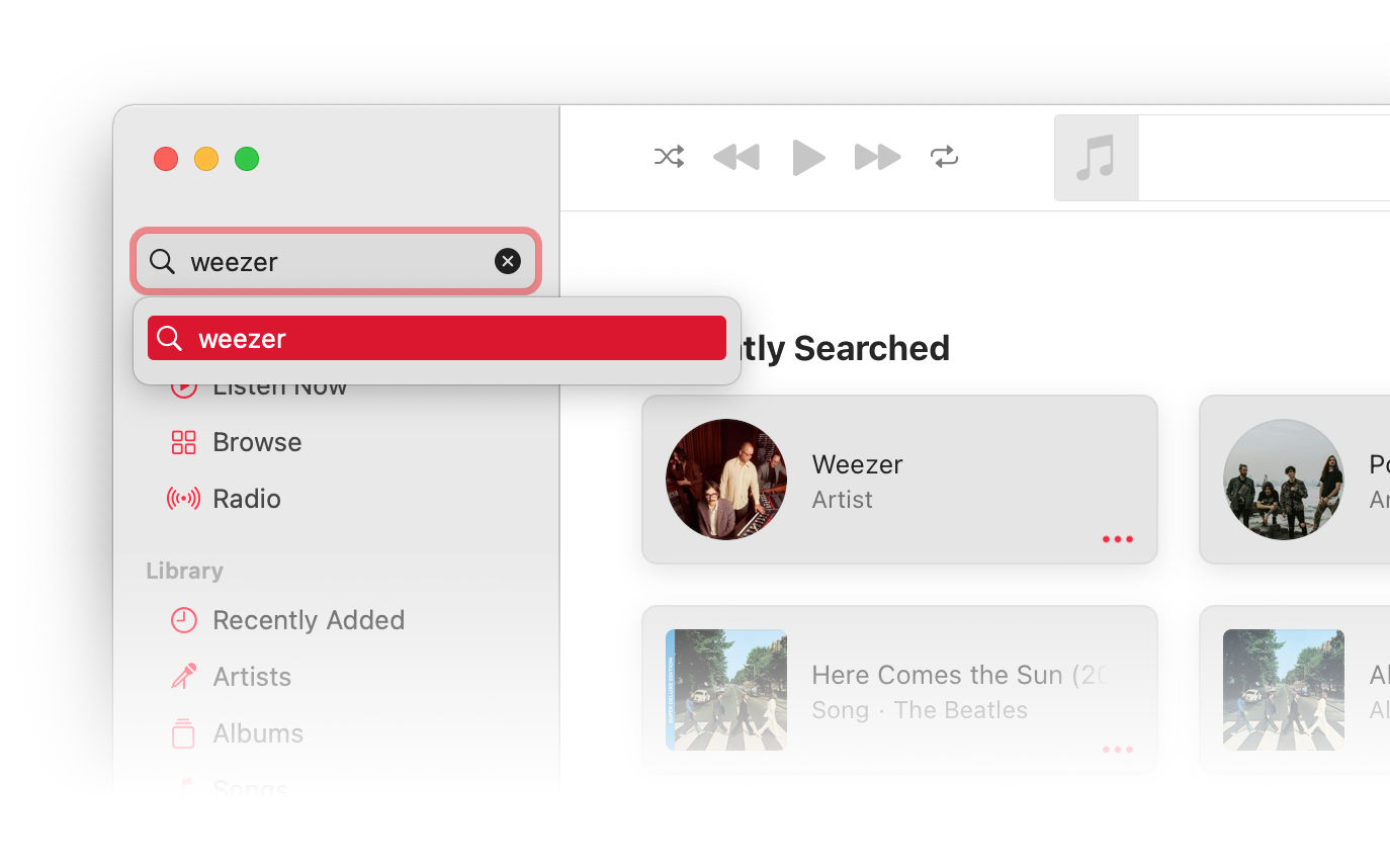
Apple Music is a comprehensive music and video streaming service by Apple Inc. It offers on-demand, ad-free access to a vast media library, live radio, and curated playlists.
© Apple Inc, Fair Use
UX Problem
Apple Music suffers from confusing navigation and unresponsive elements, which create a disorienting user experience. This includes poor autocomplete suggestions, a lack of a universal back button, non-interactive elements, slow page transitions, and the inability to remember the user's last session.
Impact
These UX hurdles put unnecessary strain on the user, turning a simple music search into a complex puzzle. This can lead to frustration and even force users to abandon the app. For Apple, this translates into potential drops in subscriptions and user engagement, ultimately affecting the profitability of Apple Music.
2. YouTube

YouTube, the behemoth of video-sharing platforms, needs no introduction. It boasts billions of users and offers an array of video content. An integral feature of the platform is the "Autoplay" feature. This function automatically queues up and plays the next video once you finish the current one.
© Youtube, Fair Use (sourced from Mint)
UX Problems
With autoplay, YouTube takes the reins of your viewing experience, often leading you down unexpected paths. The feature can disrupt your intention and push unsolicited content that might not align with your mood or interests.
Autoplay can quickly drain these resources on a device with limited battery life or internet data by playing unwanted videos. It can overwhelm viewers with constant content, leaving no breathing space between videos.
YouTube also makes it difficult for users to pick up where they left off. In the app, viewing history is hidden under the less-than-obvious Library tab.
Impact
These UX issues can lead to a less-than-satisfactory user experience, potentially causing irritation, frustration, or user attrition. Users may feel they need more control over their viewing experience. Over time, this could erode user satisfaction and trust, affecting YouTube's engagement and retention rates. It's a delicate balance between ensuring seamless content delivery and respecting user preferences.
3. Next
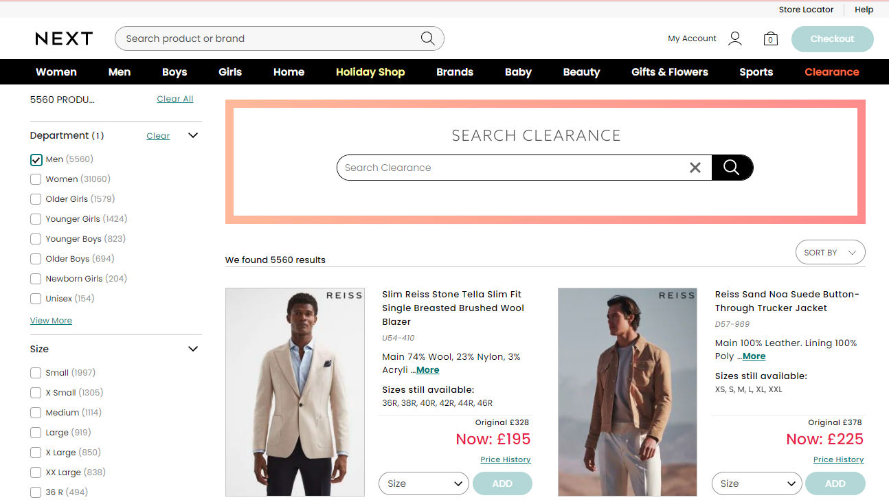
Next is a major online clothing retailer in the US and UK. But unlike many sites, they provide scant information on their products.
© Next Retail Ltd, Fair Use
UX Problem
When shopping online, users need information to decide whether a product is suitable and how it compares with others. The site is improving, but this page of clearance items demonstrates the dearth of detail. The single photo (enlarged when clicked) is the only view provided, and the details shown in the adjacent are all that’s available.
Impact
Customers are always taking risks when ordering clothes online. Will they fit? What weight is the fabric? Can I wear it on a summer evening? Does the jacket have side vents? While the minimalist approach can be appropriate in UI design, it usually doesn’t help to hold back on product details. Next could take clues from retailers like Zappos and Lands’ End, who provide copious descriptions and even videos of some of their products.
4. Wayfair.com
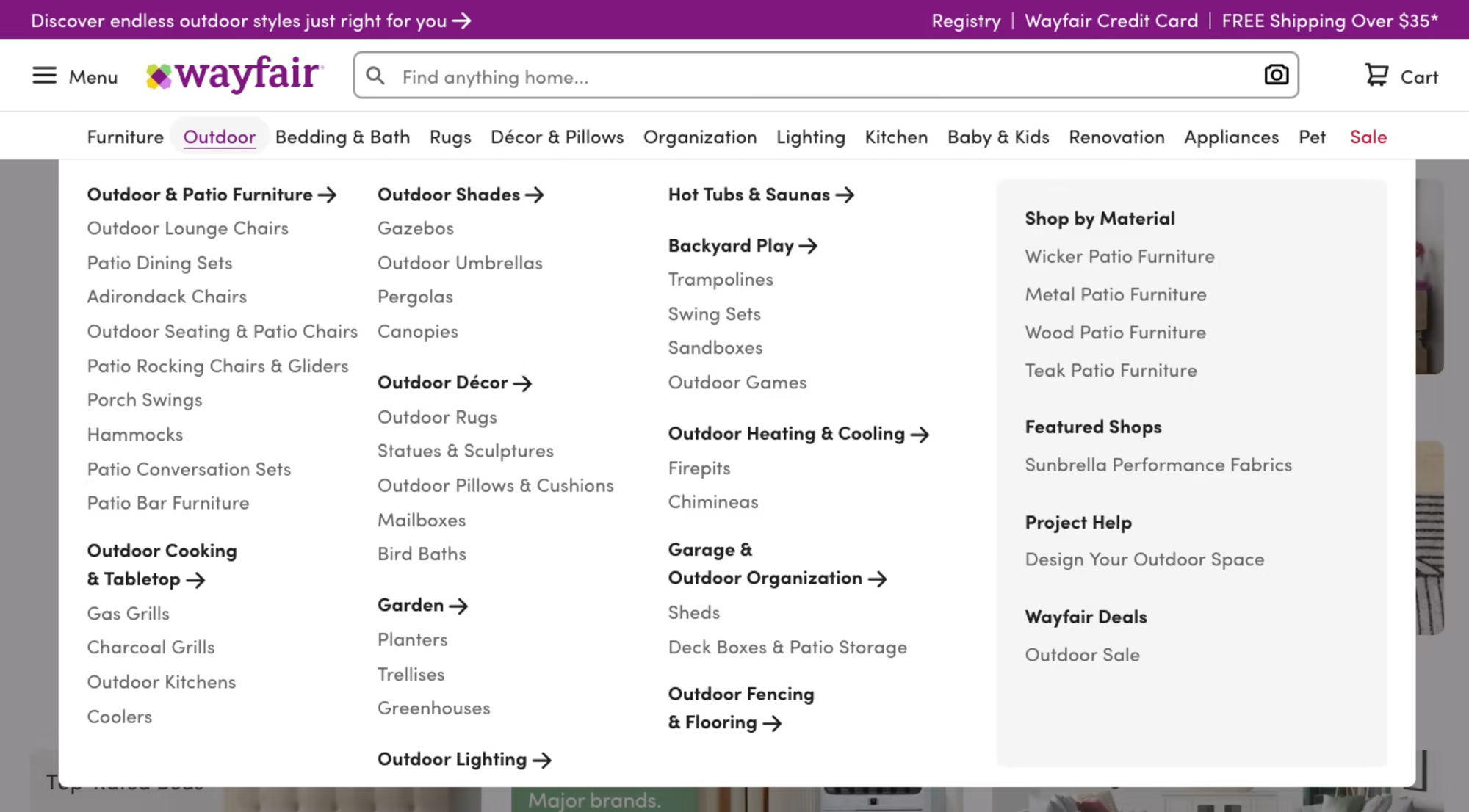
Wayfair.com is a major online platform for home goods. It thrives on its wide-ranging selection of furniture, decor, and more. It navigates this vast array through a long dropdown menu on its website. However, the execution falls short.
© Wayfair LLC, Fair Use
UX Problem
Wayfair's long dropdowns are designed to simplify the shopping experience by making every category accessible. But instead, it leads to navigation fatigue. Users may accidentally open the menu or other items on the homepage due to the website’s hover-based interface.
The mega menu is also overwhelming due to its size and content density. Its layered sub-menus requires users to navigate the same path repeatedly to explore similar items.
Impact
These design shortcomings potentially hinder the customer's shopping experience. Users may feel overwhelmed, confused, or frustrated. It can lead to decreased site interaction, reduced purchases, and decreased customer satisfaction. A simpler, less overwhelming design would greatly improve the user experience.
5. Looker Studio
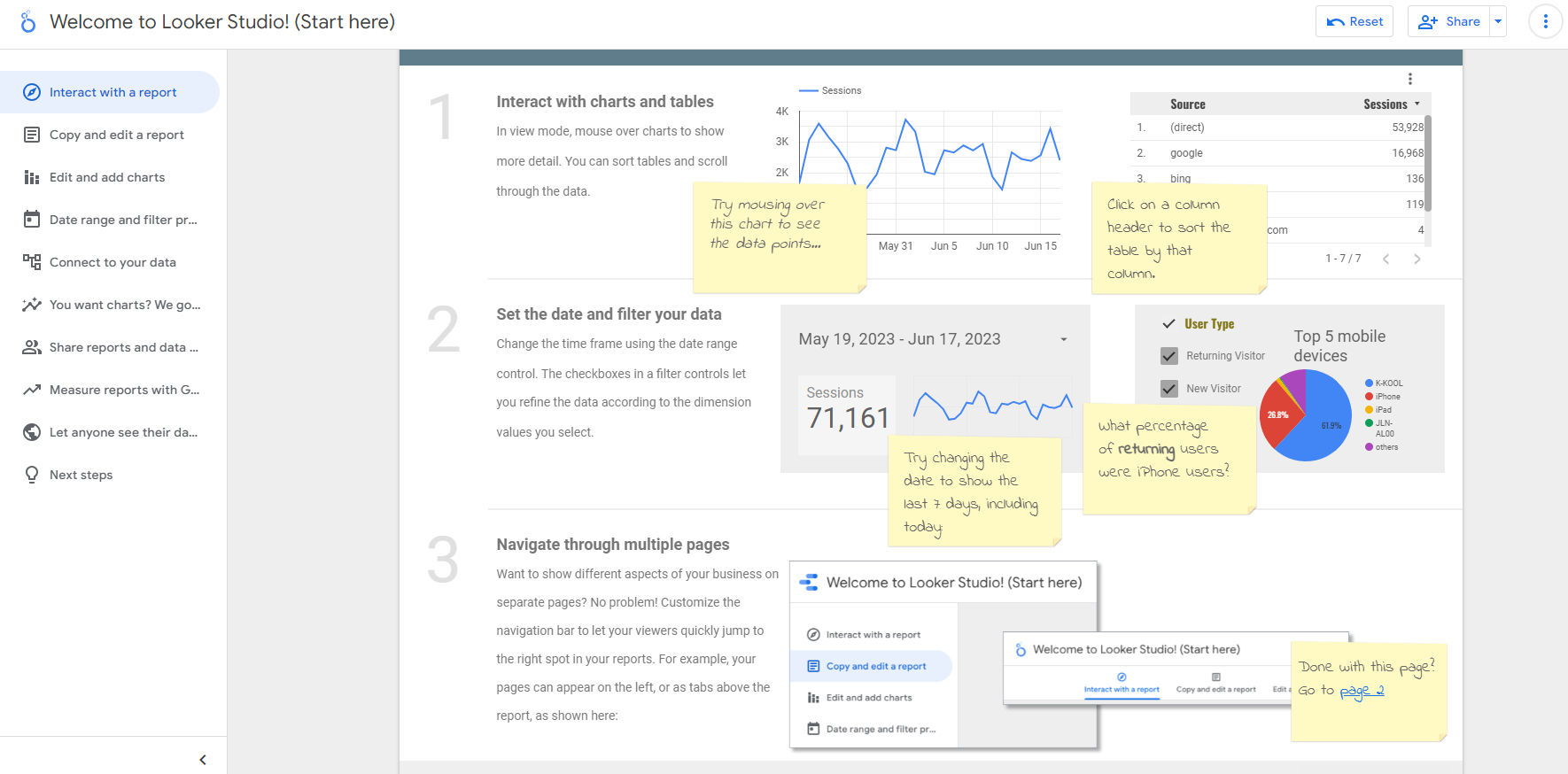
Formerly known as Google Data Studio, Looker Studio is a powerful visualization tool, but its onboarding tutorial leaves much to be desired. The tutorial is designed to guide new users. However, it is far from the concise and clear instructions we've come to expect from Google's product tours.
© Google, Fair Use
UX Problem
The main issue lies in the overwhelming amount of information. Numerous directions, annotations, and a 6-step tour all fight for the user's attention.
The already easy-to-use design, with a clear navigation bar and side panel, makes the extensive tutorial redundant. This confuses the user. They might be unsure where to start, proceed, or focus their attention.
Impact
Excessive guidance can lead to information overload for the users, causing them to abandon the tutorial before completion. This potentially hinders their understanding of the tool and affects their overall experience and usage. Simplifying the tutorial to three steps and utilizing principles like the Gestalt figure-ground principle can significantly improve user engagement and tutorial completion rates.
6. Amazon Web Services
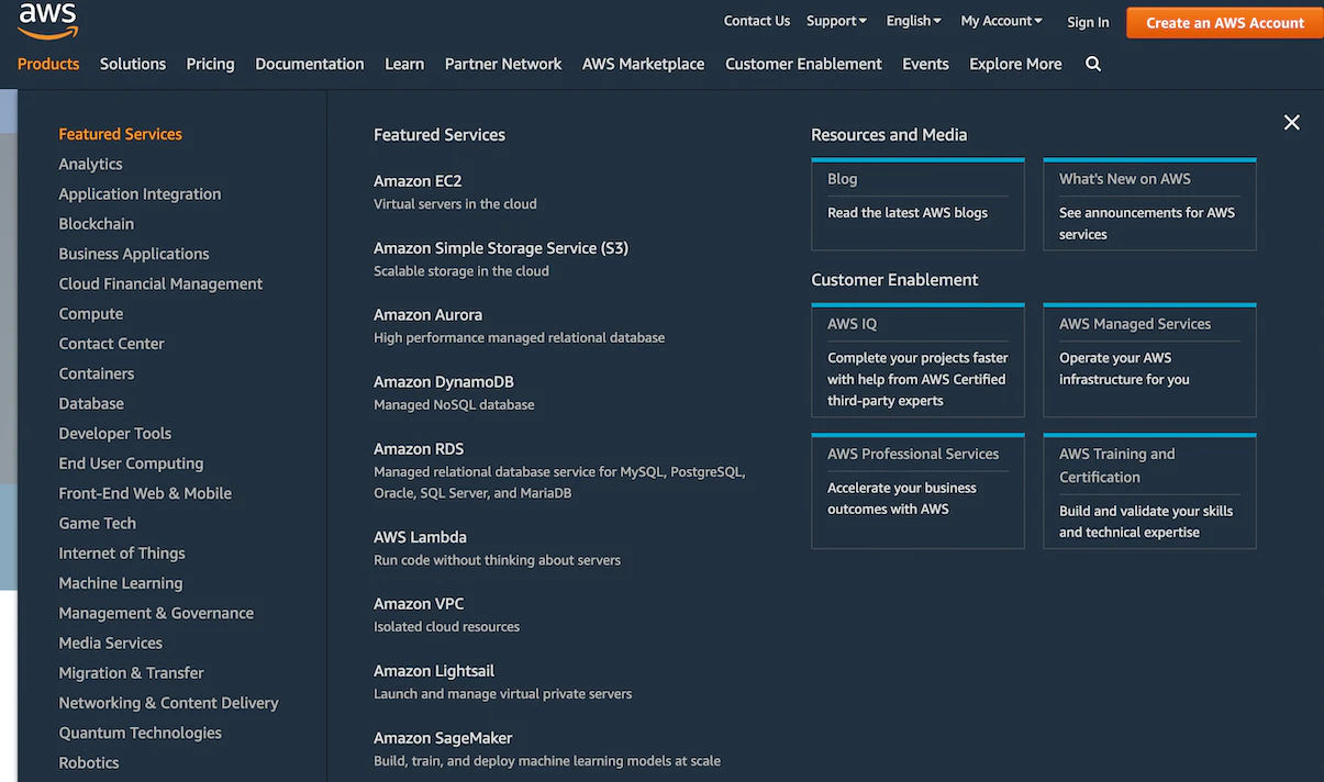
Amazon Web Services (AWS) is a comprehensive and widely-used platform boasting many unique features and services. However, the platform's website presents specific navigational challenges that can hinder the user experience.
© Amazon Web Services, Fair Use.
UX Problem
AWS's main navigation has too many options. This makes it hard to navigate, especially on smaller screens. Scrolling becomes a necessity. Although the design is visually nice and well-organized, there are too many choices.
Impact
The complex navigation can confuse users, who might struggle to locate the information they need promptly. Despite the aesthetic appeal and structured data, the dense navigation can overwhelm users. This, in turn, could lead to a poor user interface experience, with users feeling lost amidst a sea of options. So, it’d be better to simplify the main menu.
7. Facebook
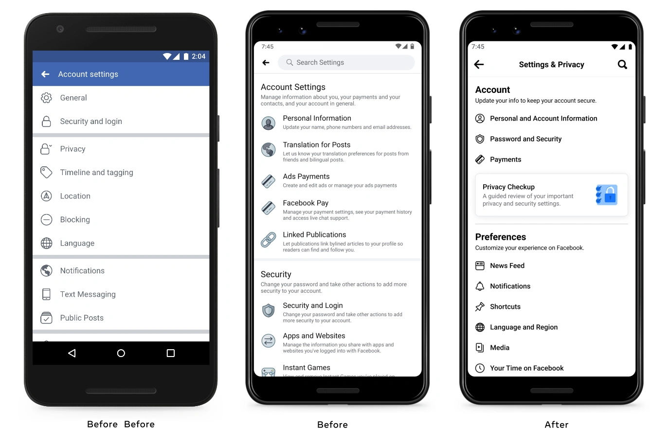
Facebook is a popular social networking platform with numerous settings and options for user customization. One area of concern is that Facebook has a maze of settings. All three of these screenshots refer to account settings of different types.
© Facebook, Fair Use (sourced from 9to5Mac)
UX Problem
Facebook's privacy settings are incredibly complex. The settings are presented as macro-categories, each housing a range of additional sub-menus, external links, and multiple choices. The settings configuration is such that it becomes overwhelming and confusing, even for regular users. It becomes a maze of choices and decisions that need to be better placed or easy to find.
Impact
The complexity creates a significant barrier for users attempting to control their privacy settings. It becomes so daunting that many users may give up or be unaware of such options. This opacity is particularly challenging for non-tech natives or less tech-savvy individuals. It is an unfair user experience.
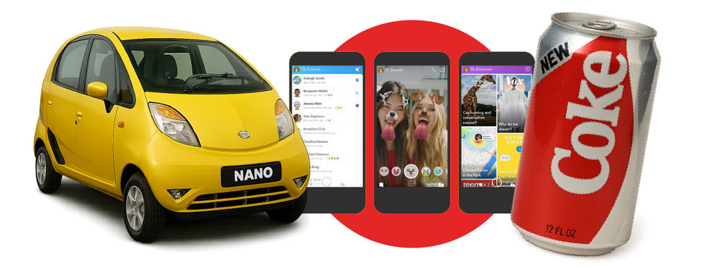
8. Snapchat
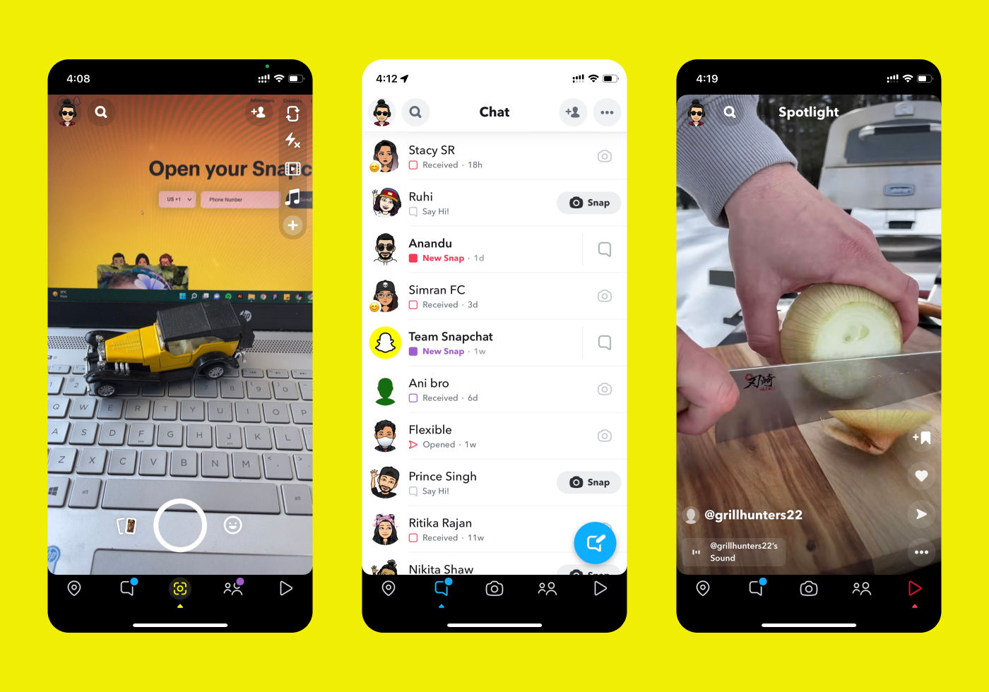
Snapchat is a social media platform best known for its self-deleting messages and creative image filters. It provides an engaging, dynamic way to share daily moments through snaps and stories. Snapchat’s target audience is Gen Z, and the platform has been designed accordingly.
© Snap Inc., Fair Use
UX Problem
Snapchat's user interface can be confusing, especially for new or non-tech-savvy users. The platform relies heavily on icon-based navigation and gesture controls, which lack clear labeling. It is challenging to discover and remember various features and settings.
Impact
The cryptic interface design creates a learning barrier, potentially deterring new users or frustrating existing ones. Clearer signposting and instructions could significantly improve Snapchat's accessibility and user-friendliness. It can promote a more inclusive user experience.
9. Annoying CAPTCHA

CAPTCHA is a widely employed security feature that distinguishes human users from bots. It essentially helps prevent automated abuse on websites. While it is helpful for businesses, it’s a different case for users.
© Google, Fair Use (sourced from Image Flip Captcha Research Paper)
UX Problem
The issue arises when Captcha is poorly configured, treating each new visitor as a potential bot. This leads to users being forced to solve complex and often hard-to-decipher puzzles before accessing the site's content. Captcha’s excessively lengthy or malfunctioning codes intensify the problem, causing undue user frustration.
Captchas also become very challenging for older users and those with (even minor) vision issues.
Impact
Captcha annoyances can lead to a significant deterioration of the user experience. It may cause a site to lose its target audience and witness reduced conversion rates. You can conduct a usability analysis of your site and optimize the Captcha to fix the problem. Consider looking at visitor statistics to discover how many potential users are giving up at a Captcha and consider experimenting with alternatives.
10. Spotify
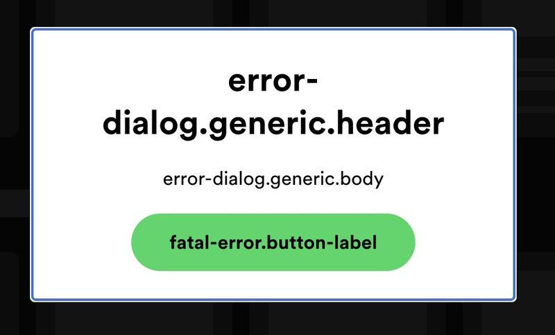
Spotify is a popular music streaming service with millions of users worldwide. It offers an expansive library of songs, playlists, and podcasts. They made a reasonable effort to create an error-free experience for the users but fell short when it came to delivering the message of error.
© Spotify, Fair Use (sourced from Spotify Community)
UX Problem
An issue arises when there's a critical failure, such as a login error. The app fails to provide clear, instructive feedback to the user in situations like these. A generic error message shows up informing the recipient, and that’s it.
Impact
Overlooking such edge cases can lead to frustration and confusion. It's essential to remember that maintaining users is a privilege, and they should feel reassured and well-guided, even when encountering problems. In such situations, instead of displaying an abstract error message, Spotify could provide a more guided response, like this: "Uh oh, something went wrong. We're going to restart Spotify for you."
11. ZARA

ZARA's website has a visually striking aesthetic, like browsing a fashion magazine. However, due to its unconventional design, the site's primary purpose, shopping, becomes more challenging for users.
© Inditex, Fair Use
UX Problem
The site's homepage features small text and a navigation menu hidden behind a hamburger button, lacking a clear call-to-action. This ambiguity can lead to confusion and frustration. The site offers a non-standard navigation menu on mobile with no direct "Clothing" option. It leaves users to sift through an extensive list to find their desired items. The site lacks breadcrumbs and sorting options, making browsing laborious.
Impact
Due to the complexities, users may abandon the site in favor of more traditionally structured e-commerce sites. It can negatively impact Zara's potential sales and user satisfaction.
12. eBay
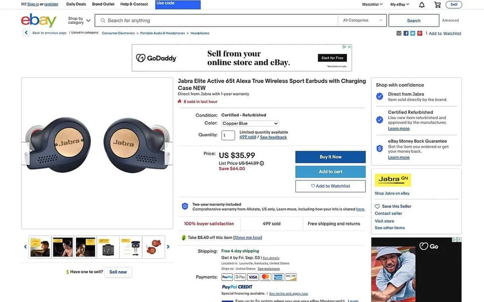
eBay is a global online marketplace that facilitates consumer-to-consumer and business-to-consumer sales. It's a platform where users can purchase various products from different sellers. However, the product pages on eBay are considerably more complex. It leads to a sense of information overload for users.
© eBay, Fair Use
UX Problem
eBay's product pages contain excess information, all presented above the fold. Additionally, there's another section that reveals even more information when toggled. This approach overwhelms the user with an overload of details, making the decision-making process harder.
Impact
Over-complexity can paralyze visitors, causing confusion and making it difficult for them to proceed with a purchase. This could lead to increased bounce rates and a potential loss of sales for eBay. eBay should simplify its product pages with less clutter and a proper visual hierarchy.
13. Lipton
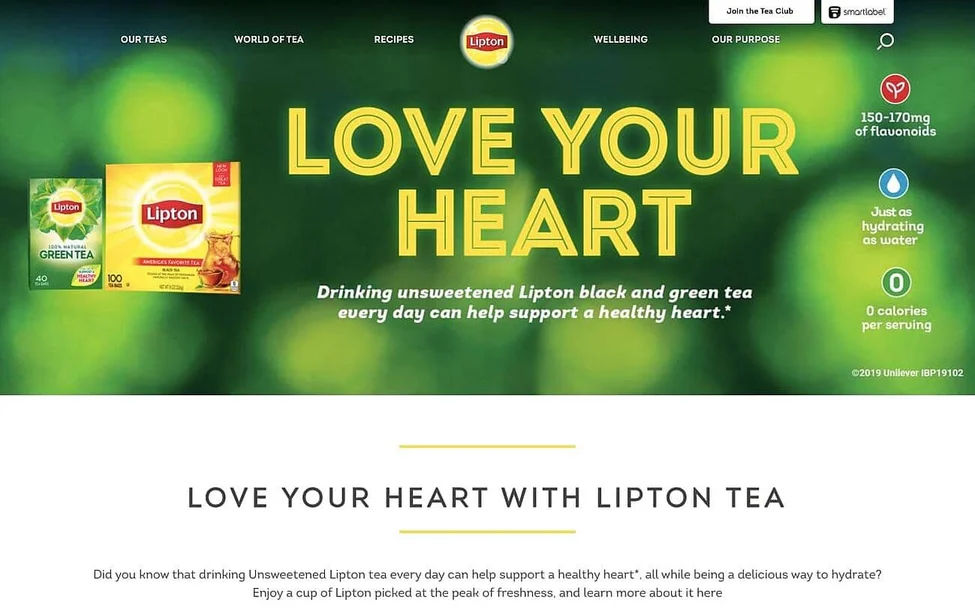
Lipton is a widely recognized tea brand that uses its website to showcase its products and engage with customers. However, the quality of the images on their site leaves room for improvement.
© Unilever, Fair Use
UX Problem
Lipton's website uses noticeably low-resolution images, resulting in a fuzzy appearance. Moreover, the images are primarily stock photos or packaging pictures. They need to adequately capture the unique appeal of Lipton tea or its community of consumers.
Impact
Poor image quality undermines the perceived professionalism of the site and fails to foster trust in the brand's messaging. This visual misstep may create a negative impression, potentially leading visitors to question the quality of Lipton's products. Lipton should replace the existing images with high-resolution ones that load quickly and accurately depict their uniqueness.
14. IMDb
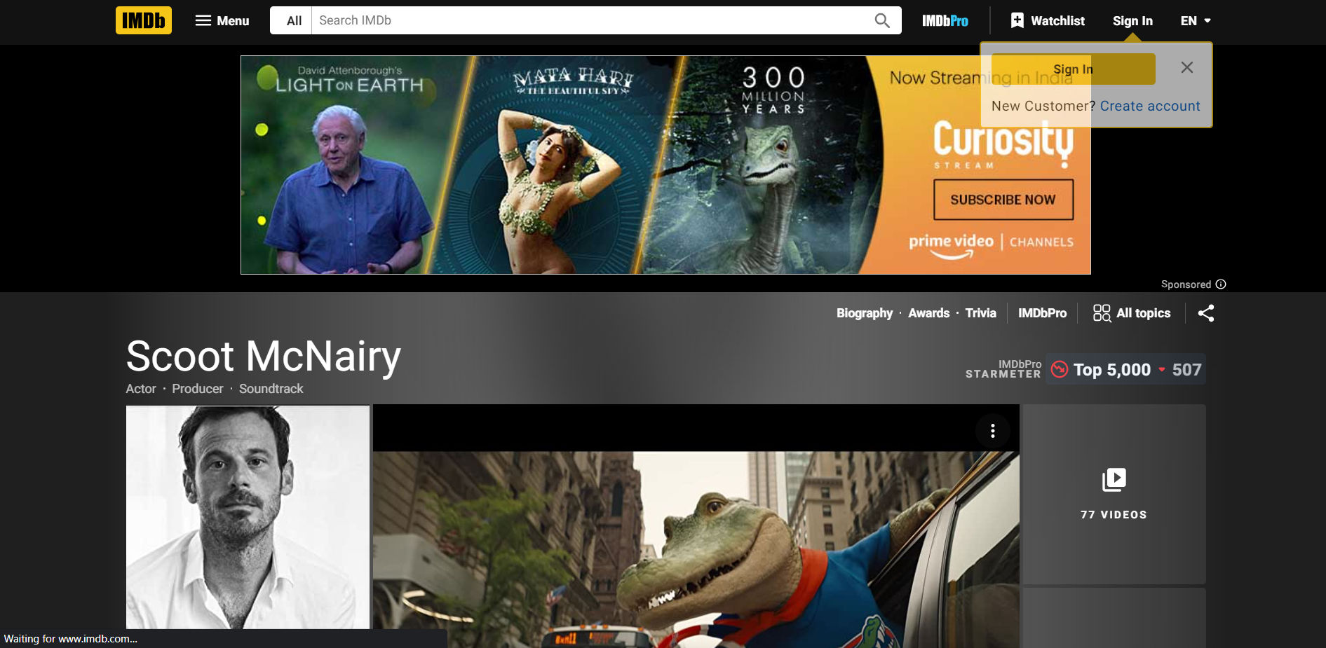
IMDb is a renowned film and TV database that has made strides in modernizing its website. Yet, some pages retain an older design that can be less user-friendly.
© IMDb Inc, Fair Use
UX Problem
The design of the older pages, such as actor biographies, is marked by a lack of white space and color, a small font size, and a high volume of ads and other content. This contributes to a cluttered appearance that can make it challenging for users to locate desired information (in this case, details about actor Scoot McNairy). Without clear navigation options, users must scroll through extensive content to reach their target information.
Impact
The complexity and clutter of the pages may discourage new users and frustrate regular visitors. It undermines the ease of use essential for a practical user experience. IMDb should improve the organization of its website layout to enhance the website’s usability and cater to both new and existing users.
15. Yahoo!
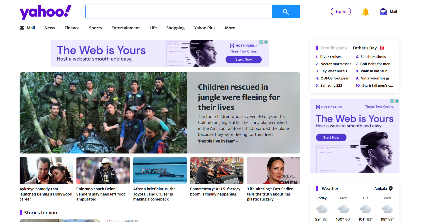
Yahoo! is a recognized digital media hub, hosting an impressive collection of articles spanning numerous categories. However, their attempt to display this array of content results in an overloaded homepage that can bewilder users.
© Yahoo, Fair Use
UX Problem
The Yahoo! site suffers from imbalances in white space utilization, with excess negative space above the fold on the desktop version and insufficient white space during scrolling. Coupled with small fonts and ad clutter, this leads to an exhausting reading experience that can feel cramped and disorienting.
Impact
The complicated layout can deter users from exploring the variety of content. They might feel overwhelmed by the crowded display and leave for a less chaotic news platform. Yahoo! can better manage its white space and reduce ad interference to enhance its user experience. It’ll make the browsing experience more pleasant and less overwhelming.
16. CNN
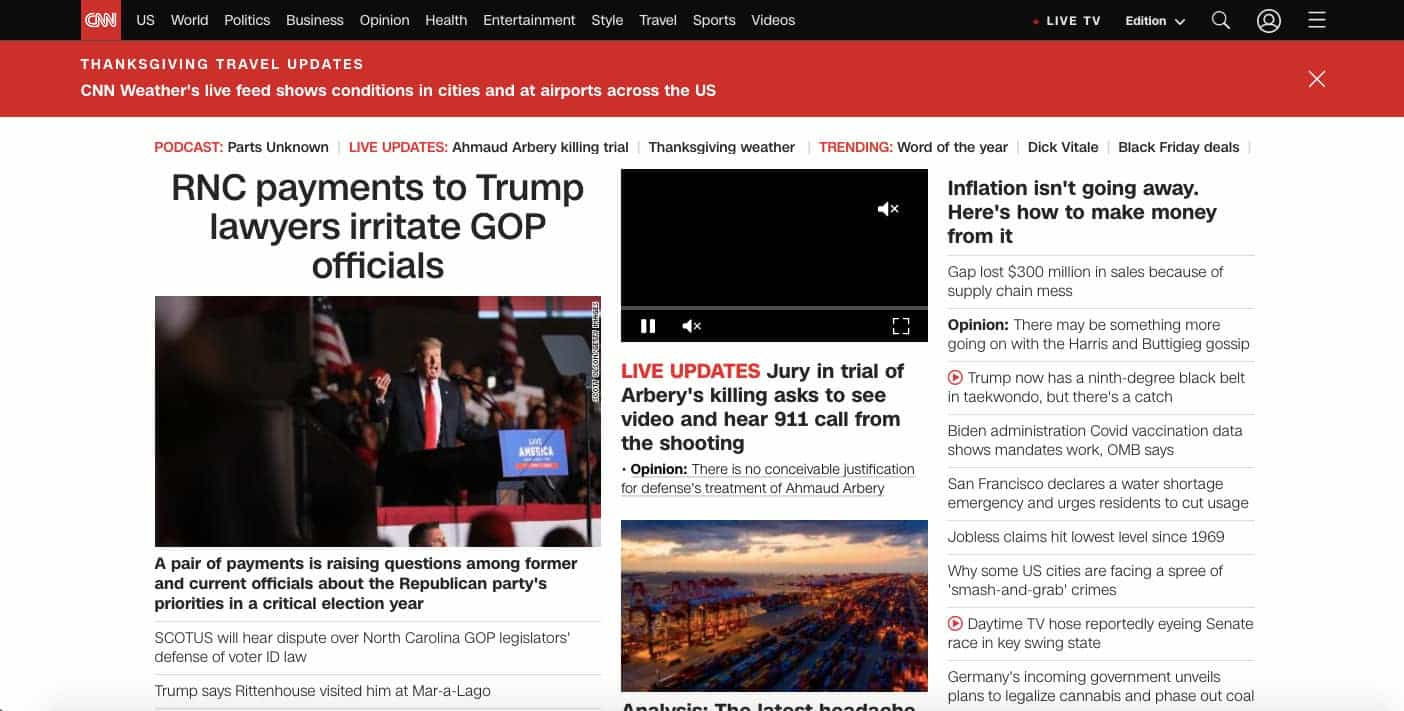
CNN is one of the world's leading news organizations. It hosts a broad array of content, including articles, images, and videos. Yet its extensive content library has a downside, as it contributes to a painfully slow load time.
© Cable News Network, Fair Use
UX Problem
The load time for CNN's site is excruciatingly slow. It is identified as one of the slowest sites on the internet by SpeedMonitor.io. Sluggish load times can significantly impair the user experience, causing impatience and frustration.
Impact
The slow load time is a critical hindrance for CNN. More than half of mobile website visitors will abandon a site if it takes over three seconds to load. Consequently, CNN is likely losing many visitors due to its slow load time. Improving the load speed by streamlining the amount of text, images, and videos could potentially enhance the user experience and boost their SERP rankings.
17. ODC/Dance

ODC is a vibrant website dedicated to dance and art. However, the site has significant accessibility issues including problematic video control and color choices, which may restrict its ability to reach a wider audience.
© ODC, Fair Use
UX Problem
The website's homepage features an auto-playing video that lacks the necessary controls for users to pause or stop it, violating WCAG guidelines. The site also struggles with color accessibility issues. Text headings and CTAs are difficult to see against image backgrounds, and white text on semi-transparent navigation bars and banners is challenging to read.
Impact
Accessibility problems can deter users. It may lead to fewer clicks on CTAs or navigation links and potentially higher bounce rates. Addressing the issues would help ODC adhere to WCAG guidelines and improve the user experience, engagement, and overall site reach.
18. Hacker News
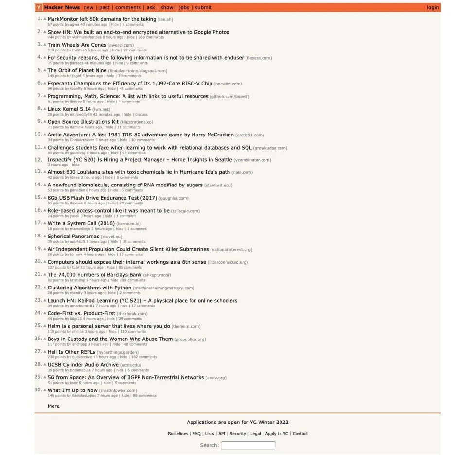
Hacker News is a premier destination for the latest tech and cybersecurity updates. However, it has substantial readability issues that make it one of our bad usability examples.
© Y Combinator, Fair Use
UX Problem
The site's presentation of various actions like upvoting, sorting, commenting, and visiting stories is complex due to the small font size and muted colors. Additionally, the lack of whitespace, icons, and hover effects makes it challenging for users to distinguish between these actions.
Impact
These readability issues could impede user interaction, reduce user engagement, and reduce site visit duration. Enhancements in typography, color, placement, and white space could significantly augment the site's readability, usability, and user engagement.
19. Goodreads
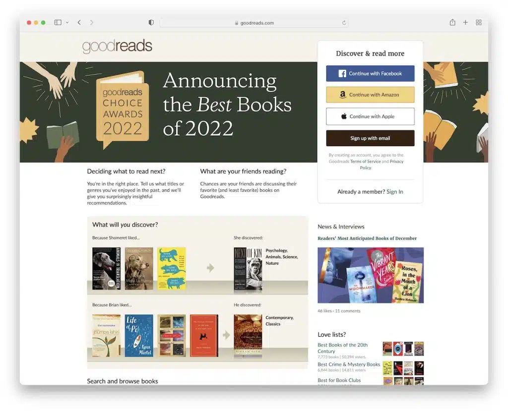
Goodreads is a massive platform for book enthusiasts to explore and review books. However, a rudimentary and user-unfriendly desktop design plagues the platform.
© Goodreads, Fair Use
UX Problem
Despite being a large-scale business, Goodreads suffers from a poorly executed desktop interface marked by basic design and terrible navigation. Users may find locating and accessing desired sections difficult due to unclear navigational cues.
Impact
The lackluster user experience could deter users from fully engaging with the platform, potentially leading to lower user retention and reduced activity. While the mobile layout and the app offer some relief, the desktop version's inadequacy could still tarnish the overall perception of Goodreads, impacting its brand reputation.
20. Berkshire Hathaway
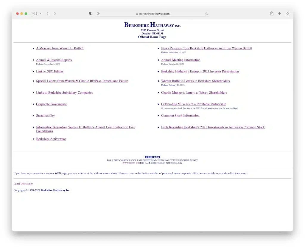
Berkshire Hathaway is a global holding company. Its website, however, feels like a basic directory. It has no visuals, only hyperlinks.
© Berkshire Hathaway Inc., Fair Use
UX Problem
The Berkshire Hathaway website offers a subpar user experience due to its outdated design. It lacks images and relies solely on hyperlinks, making it challenging for users to find what they want. You need to know the company well to find anything.
Impact
The design is off-putting. Users might not find what they need. Despite decent mobile performance, the poor layout can reduce user satisfaction and the overall experience.
21. Craigslist
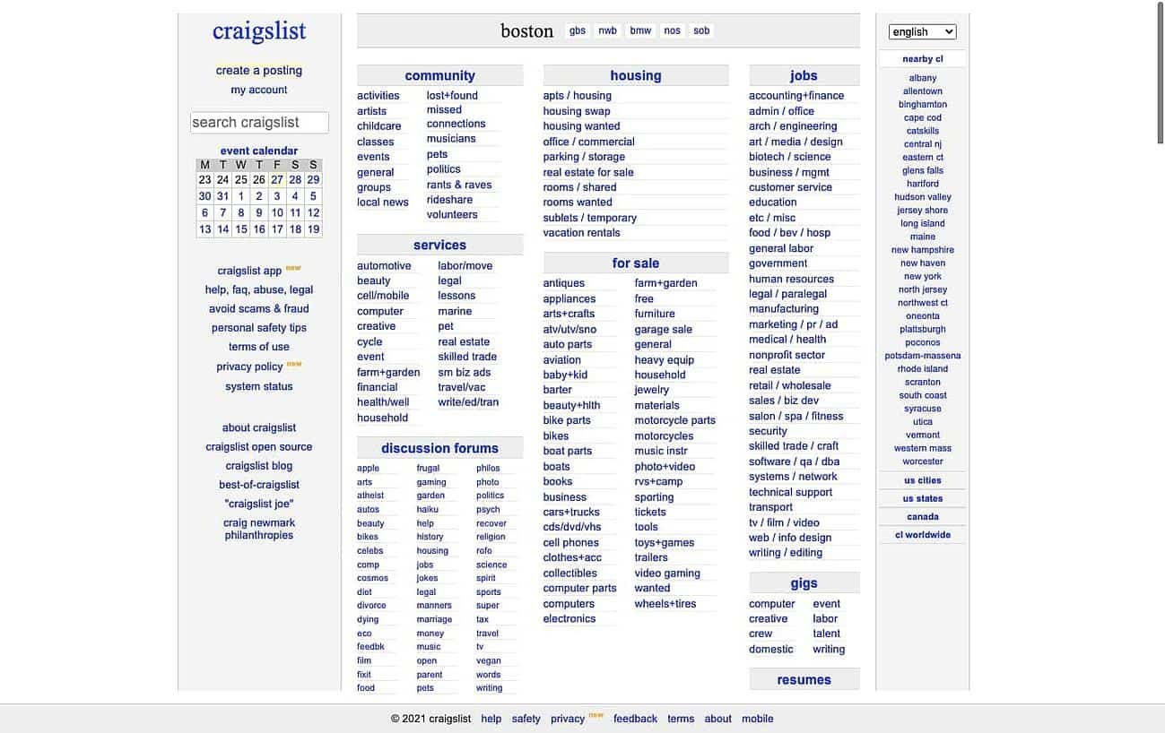
Craigslist is an immensely popular platform to buy, sell, and connect. Yet, it suffers from a major design issue: it lacks responsive design.
© craigslist, Fair Use
UX Problem
The site's non-responsiveness means that when users try to resize the Craigslist window on a desktop or laptop, a significant amount of content gets hidden. This issue directly violates today's standard, where users anticipate a seamless browsing experience across all devices and screen sizes.
Impact
A lack of responsive design might result in reduced traffic and higher bounce rates, as visitors may feel frustrated by the impaired user experience. Craigslist could substantially improve user satisfaction by investing in a more responsive design. It can potentially lead to increased traffic and decreased bounce rates.
22. Paper Source
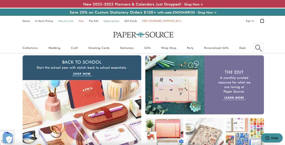
Paper Source, a stationery retailer established in 1983, faces challenges with an outdated website design. Its layout, cluttered with images, text boxes, and CTAs, feels old-fashioned.
© Paper Source, Fair Use
UX Problem
This antiquated design can confuse users, especially with the double CTAs positioned above the logo. It can cause a feeling of information overload, leading to user paralysis.
Impact
The outdated look and complex layout may cause users to perceive the brand as old-fashioned. It could lead them to choose trendier alternatives with more user-friendly designs. Consequently, due to design issues, Paper Source may lose potential customers and sales.
23. Yale School of Art
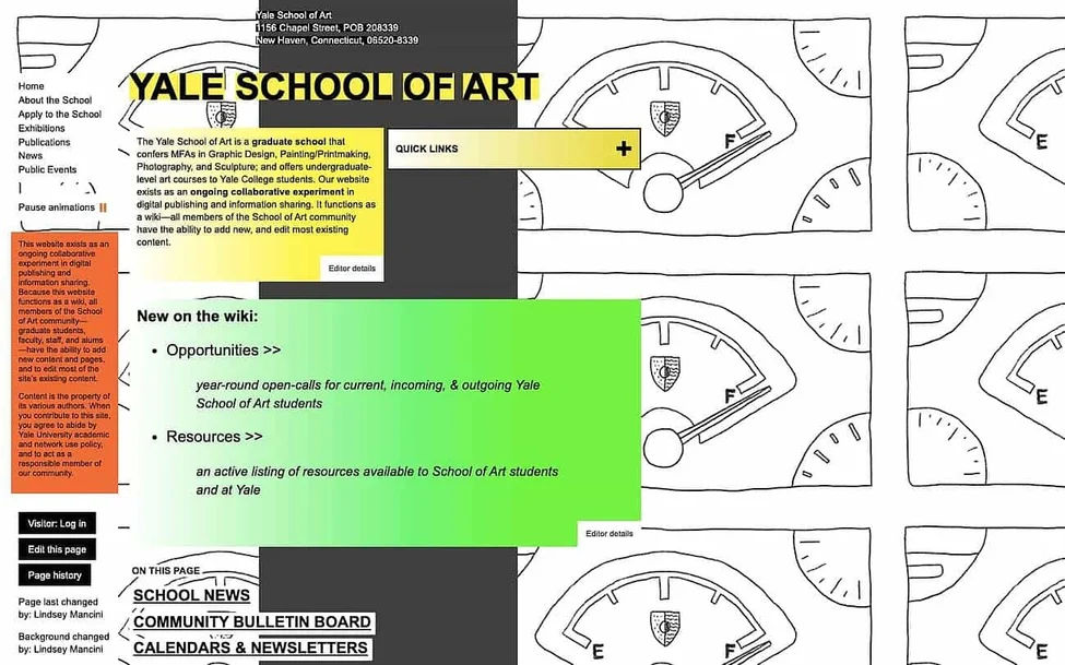
The Yale School of Art's website stands out for its bold design. It includes elements like an animated background and various color schemes, font styles, and effects. However, these elements come at the cost of the user experience.
© Yale School of Art, Fair Use
UX Problem
The animation speed and glitch effect detract from the core content. The inconsistent application of color schemes, font styles, and effects creates distractions.
Impact
The confusing design elements disrupt user engagement, likely leading to frustration. This could affect the site's ability to attract and retain users. The Yale School of Art must improve its layout and style to enhance readability and user experience.
24. NYU
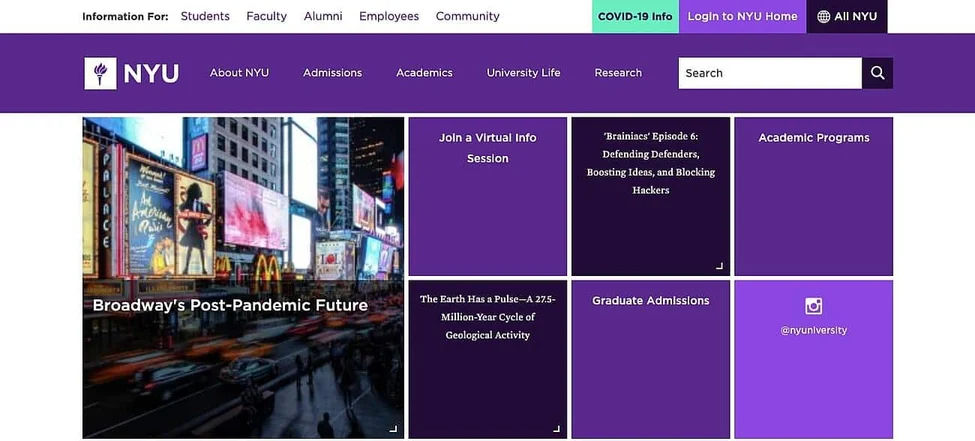
NYU's website features a unique grid layout. However, it overuses the color purple in its three primary components – the navbar, body, and footer.
© New York University, Fair Use
UX Problem
The similar shades of purple cause a lack of contrast. This makes it hard to distinguish one section from another, resulting in a confusing navigation experience. Limited images and solid color blocks with text on the grid layout give the impression of an incomplete web page load.
Impact
The confusing design could cause frustration for users and make it harder to find the information they need. NYU should enhance contrast, use color more wisely, and consider a visual hierarchy instead of a grid for a better user experience.
25. New Century Chamber Orchestra
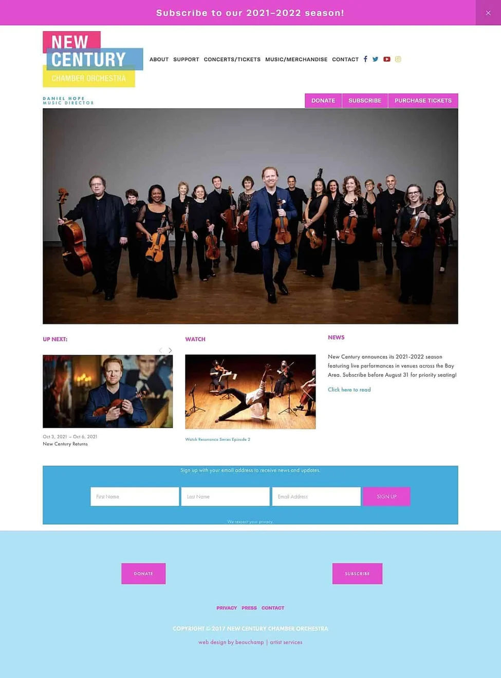
The New Century Chamber Orchestra's website features a vibrant pink, blue, and yellow logo. Yet, throughout the site, these colors appear in varying shades.
© New Century Chamber Orchestra, Fair Use
UX Problem
The headings, opt-in email forms, and footer use different shades of blue. On the other hand, the site has CTA buttons in neon pink, yellow, and blue. This results in a lack of visual harmony.
For accessibility, most of the colors have inadequate color contrast when used with white text. According to WCAG guidelines, the only exception is the pink, which would be acceptable for text that is 18 pt or larger.
Impact
The inconsistent color choices might confuse users and dilute the brand's identity. Adhering to a cohesive color palette could significantly enhance the user experience and reinforce the brand's identity. To comply with accessibility guidelines, the pink, blue, and yellow colors should not be used with white text to convey meaningful information. They should be used for decorative purposes only.
Common UX Mistakes and How to Avoid Them
When creating a good user experience for users, it's easy to fall into traps. A bad UX design can cost a company valuable users and lower its conversion rate. Here, we'll walk you through common UX blunders from the top UX design fails and how to sidestep them.
1. Slow Load Times
One crucial aspect often overlooked in UX is load times. Users won't wait for a slow-loading page; it's a cardinal sin of UX design. Consider this: a one-second delay in page response can reduce conversions by 7%. A study by Google found that 53% of mobile users will abandon a site if it takes more than three seconds to load. Imagine the damage that a slow load does to the overall user experience.
How to avoid slow load times?
Optimize website code and content to avoid slow loading times. Implement techniques like compression, caching, lazy loading, and image optimization. Regularly test your website's speed and work with developers to ensure efficient performance.
2. Complicated User Flows
A good user flow allows users to achieve their goals efficiently and quickly. This adds up to usability issues if things are complicated. Users won't stick around if the path to the desired action is long and intricate. An example of poor usability is a checkout process that requires numerous steps.
(Learn more about user flow and how it helps enhance the user experience.)
How to avoid complicated user flows?
Simplify. Start by sketching a simple roadmap. Each box you draw represents a user action step. It is helpful to divide your roadmap into three main parts: the beginning, the middle steps, and the end. The end is when the user completes a task, or the final interaction happens.
Test. Conduct usability evaluations or use A/B testing to optimize flow with real users.
3. Graphics Mismanagement
Small and low-resolution graphics can negatively impact the customer experience. Clear, high-quality visuals are a cornerstone of user-friendly interfaces, as they help with navigation and understanding. Low-quality graphics, however, can confuse users and make a website seem unprofessional.
How to avoid graphics mismanagement?
To avoid a bad user experience due to graphics, ensure images and graphics are optimized for the platform they're displayed on and allow users to see suitable details. You need to maintain high resolution without sacrificing load times.
4. Poor Information Architecture
Information architecture refers to making the information findable and understandable on a site. Often, designers need to do more than arrange information logically. This leads to a messy content setup. Users can find this confusing and need help locating the information they need.
(Learn everything you need to know about Information Architecture.)
How to avoid bad content architecture?
To avoid this, plan your content architecture carefully. Arrange information logically and ensure smooth navigation for a better user experience. Use card sorting to discover how users think about the problem domain and test your IA before you even begin designing pages using tools like tree sorting.
See our course Data-Driven Design to learn about early-design testing.
5. Poor Landing Page Design
A landing page is the first interaction point between a user and your website. If it’s hard to navigate, users will leave. A good landing page should be user-friendly and easy to understand. It also needs to confirm that users are in the right place.
How to avoid creating a poor landing page design?
Prioritize clarity. Keep design and copy simple, relevant, and clear. Make sure that page titles and headings correctly reflect the content and that links to a landing page are consistent with users’ expectations. Also, consider relevant video content. Statistics show that landing pages featuring appropriate embedded videos can boost conversions by 86%.
6. Lack of Negative Space
Negative space, or the white space surrounding objects or text in a design, is often underutilized in UX. Ignoring negative space can lead to cluttered, overwhelming interfaces that hinder user comprehension and navigation.
How to avoid having a lack of negative space?
Plan your design layout carefully. You need to ensure that there’s breathing space for all the design elements you use and that designs work well regardless of screen size. Prioritize simplicity over excessive details and make good use of margins and padding. This promotes a clean and balanced look.
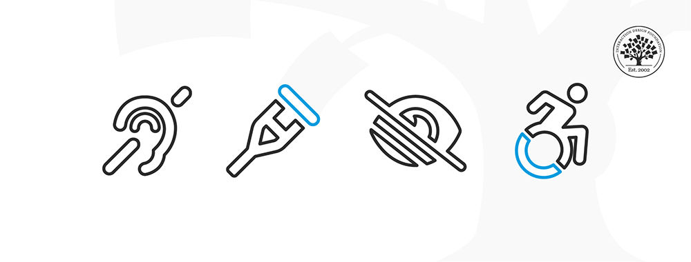
7. Poor Accessibility
Many bad UX examples stem from overlooking accessibility. Regardless of their abilities, all users should be able to interact with your product easily.
Show
Hide
video transcript
- Transcript loading…
Watch this video to learn about accessibility and how it affects usability and SEO.
How to avoid accessibility issues?
Follow accessibility guidelines, such as those provided by the Web Content Accessibility Guidelines (WCAG).
Prevention Is Better than Cure
The best way to avoid bad UX is to focus on user-centered design from the start. Invest time in understanding your users' needs, behaviors, and frustrations. This knowledge helps shape an experience that’s tailored to their needs.
Usability testing is another powerful tool in your arsenal. Regular testing uncovers issues before they become problems. And remember, it’s not a one-time thing. Regular tests help keep your UX current as user behaviors and technologies evolve.
User research, usability testing, and a keen focus on the users’ needs are the pillars of good UX design. They help avoid bad UX design, enhance the overall user experience, and ultimately increase your conversion rate in the battle for good UX design.
UX Design Is an Ongoing Process
UX Design isn't a one-and-done endeavor. It's an ongoing process that requires constant evaluation and improvement. Minor issues, like slow load times or a poorly placed 'delete message' feature, can significantly impact the overall user experience and conversion rate.
UX mistakes can be costly, but they're also an opportunity for learning and improvement. You can avoid these common pitfalls if you keep user needs at the heart of your design process and follow standard UX practices.
Ultimately, it's all about ensuring your users feel understood, respected, and valued when interacting with a product. And that's a surefire way to turn a bad UX design into a good one. Remember, users win when the design is right. You want to create an experience that's not only easy to navigate but also enjoyable and rewarding.
Ensuring good UX isn't all about avoiding mistakes. It's about creating an environment where users can flourish. Keep testing, refining, and keeping your users at the forefront of every decision. After all, good UX isn't just good business. It's good practice.
How Bad UX Can Impact Your Business
Bad UX design doesn't frustrate users. It has real-world repercussions for your business. From tarnishing your reputation to causing dwindling sales, poor UX can wreak havoc on your bottom line. Let's explore these impacts in more detail to help you understand how to identify bad UX design.
1. Lower Customer Satisfaction
Customer satisfaction is deeply intertwined with UX. A Microsoft report found that 56% of consumers have stopped doing business with a brand due to poor customer service, which includes digital interactions.
Whether it's a cluttered layout, difficult navigation, or a lack of accessibility, a bad UX design can leave users feeling frustrated and undervalued. For instance, some common mistakes that a web designer may make can lead to these issues. This dissatisfaction can lead to lower customer retention rates, especially on mobile devices. Dissatisfied users may seek better experiences from competitors.
2. Decreased Sales
At its core, a product's UX directly impacts its conversion rate. A user-friendly experience can push customers toward purchasing or signing up for a service. However, bad UX design can have the opposite effect.
For instance, a Baymard Institute study found that 69.8% of shopping carts are abandoned. Much of this can be attributed to poor UX, like the complicated checkout process, a lack of payment options, or slow load times. These factors can frustrate users, causing them to abandon their carts and diminishing potential sales.
3. Reduced Business Credibility
In the digital world, your website is often the first point of contact between you and potential customers. A poorly designed, hard-to-navigate website creates a wrong first impression, reducing your business's credibility. According to a Stanford study, 75% of users admit to judging a company's credibility based on their website's design.
4. Higher Customer Acquisition Costs
Bad UX design can inflate customer acquisition costs. If users leave your site due to poor UX, you'll need to invest more in marketing to attract new ones. A Forrester report shows that a well-designed user interface could increase your website's conversion rate by up to 200%. Enhancing your site's entry point can organically attract and retain more customers. It reduces the need for costly marketing campaigns.
5. Increased Customer Support Costs
A bad UX design can confuse users, leading to an influx of customer support requests. Each query adds to your business costs and pulls resources from other areas. For instance, according to Gartner, reducing customer effort can reduce costs by up to 37%.
6. Lost Competitive Advantage
Bad UX isn't just a customer problem; it can also affect employees. A study by Robert Half Technology found that workers lose an average of 22 minutes per day due to IT-related issues.
For example, complex flow charts or flow diagrams in these tools can lead to confusion. Multiply this by the number of employees and the days in a year, and how bad UX can lead to significant productivity loss becomes evident.
Transforming Bad UX into Great UX
Turning a bad UX into a great one isn't an insurmountable task. It takes insight, creativity, and commitment. Here, we offer some practical tips and best practices to aid your UX design journey.
Tips and Best Practices for Improving UX Design
1. Know Your Users
Understand your users’ needs, behaviors, and pain points through user research. This includes methods like user interviews, surveys, and usability testing.
2. Utilize White Space
White space or negative space is a crucial element of UX design. It enhances readability, guides users' attention, and makes your interface look clean and uncluttered.
3. Use Consistent Design Elements
Consistency in design elements like colors, fonts, and buttons can significantly improve the UX by making your product easier to use.
(Learn about the Key Elements & Principles of Visual Design.)
4. Simplify Navigation
A simplified navigation structure helps users find what they're looking for more easily. Use breadcrumb navigation, dropdown menus, and a search bar to aid navigation.
5. Use Responsive Design
Ensure your product works seamlessly across all device types, whether desktop, tablet, or mobile. A responsive design enhances the user's experience no matter how they access your product.
6. Incorporate User Feedback
Create a feedback loop to regularly gather user feedback and make iterative improvements. This helps you stay aligned with your users' needs and expectations.
7. Prioritize Accessibility
Make your product accessible to everyone, including users with disabilities. Use colors, fonts, and layouts that are easy to understand and interact with.
Real-Life Examples Illustrating Successful UX Problem Resolutions
Airbnb
Airbnb addressed a significant issue in their group booking process to enhance user experience. Users often found it challenging to share potential accommodations with group members. Airbnb introduced an efficient feature allowing users to annotate and share multiple property links directly from the platform. This organized, fuss-free solution significantly streamlined the group booking experience.
Google Maps
Earlier, Google Maps had a cluttered interface with too much information that confused users. Google introduced a cleaner interface and adaptive maps showing only relevant information based on the user's activity. This resulted in an improved user experience and increased usage of the app.
Slack
Slack faced a UX challenge with its notification system. Users found it difficult to keep up with the large volume of notifications. Slack introduced a smart notification system that prioritizes notifications based on the user's activity, interactions, and settings. The result was a significant decrease in notification overload and an improved user experience.
Apply Resolution Strategies in Your Own UX Design Efforts
Transforming bad UX into great UX is not a one-time task. It’s a continuous process that requires ongoing user research and iterative improvements. It’s also crucial to identify and resolve failed onboarding experiences, which can act as a deterrent for new users.
Here's how you can apply these strategies to your UX design efforts:
Continuous User Research: Regularly conduct user interviews, surveys, and usability tests to understand your users' needs and expectations.
Iterative Design Process: Implement a continuous and iterative design process where you make small changes based on user feedback and test them for effectiveness.
Collaboration: Collaborate with all stakeholders, including designers, developers, and users, throughout the UX design process. This ensures that all perspectives are considered, and the final product meets everyone's needs.
Human-Centered Design: Always keep the user at the center of your design process. Make decisions based on what would be best for the user, not what would be easiest for you to design or develop.
Accessibility: Remember that accessibility is a part of UX. Ensure that your product is accessible to everyone, including users with disabilities.
Show
Hide
video transcript
- Transcript loading…
Video copyright info
Airplane Cockpit by Riik@mctr (CC BY-SA 2.0)
https://www.flickr.com/photos/riikkeary/24184808394/

Cognitive Science building at UC San Diego. by AndyrooP (CC-BY-SA-4.0)
https://commons.wikimedia.org/wiki/File:Cognitive_Science.jpg

Pseudo-commands to illustrate how line-by-line text editing works. by Charlie42 (CC BY-SA 3.0)
https://en.wikipedia.org/wiki/Ed_(text_editor)#/media/File:Ed_lines.jpg
Watch this video to understand why human-centered design is essential for real users.
Duolingo, a language-learning app, continuously improves its UX based on user feedback. They regularly conduct user research and make small changes to the app based on the feedback. They test these changes for effectiveness before implementing them in the app. This continuous and iterative design process has led to an improved user experience. As a result, Duolingo experienced a massive 62% year-on-year growth in Q1 2023.
Conclusion
We took you through the fascinating world of user experience (UX) design, a field that’s becoming increasingly crucial in today's digital era.
A good UX design isn't merely a one-time effort; it's a continuous process of learning, adapting, and innovating. It's about:
Staying attuned to users' needs and wants.
Keeping up with technological trends.
Delivering seamless experiences that make people want to return to your website or app.
However, the path to perfecting UX design is often laden with mistakes. Yet, these mistakes are valuable learning opportunities. With instances of bad UX like the examples we've discussed, you can gain insights into what not to do and, more importantly, how to correct flaws.
We've also outlined key strategies to improve UX design. These include keeping the design and copy simple, straightforward, and relevant while incorporating elements like videos that can significantly boost conversions.
A bad UX can lead to lost traffic, decreased customer satisfaction, and even a drop in revenue. But with a committed focus on enhancing the user experience, you can avoid potential UX design pitfalls.
We encourage you to share your own experiences and examples of bad UX. Engaging with others in the field can broaden your perspective and enrich your knowledge.
If you want to delve deeper into the world of UX/UI, we have a range of courses that can help. Whether you're looking for a beginner course to explore this field or an intermediate course for upskilling, our carefully curated courses can guide you on your journey.
So why wait?
Invest in your future and embark on your journey to becoming a UX design expert today!


#/media/File:Ed_lines.jpg)