Your constantly-updated definition of Mega Menus and
collection of videos and articles. Be a conversation starter: Share this page and inspire others!
98shares
What are Mega Menus?
Mega menus are panel-like dropdown menus that appear when users hover or click on a navigation option. They are typically seen on websites with a wide range of content and categories. Mega menus are particularly useful in UX design as they can provide an overview of all available options within a site's complex information architecture.
In this video, Vitaly Friedman, Senior UX Consultant and Creative Lead of Smashing Magazine, discusses when mega menus should be used and other important considerations:
Mega menus display many choices at once, often organized into groups and subcategories, which makes it easier for users to see the breadth of content without navigating away from their current page. Mega menus can enhance the user experience by reducing the number of clicks needed to reach a destination and by presenting information in a visually structured and accessible manner.
Mega Menus vs Regular Dropdown Menus: What’s the Difference?
The difference between a mega menu and a regular dropdown menu lies in their structure, content capacity, and user interaction:
Structure: Mega menus are typically wider and can display all available options in one large panel—items will be organized items into columns and rows. Regular dropdown menus are narrower and usually display items in a single column that lists options vertically.
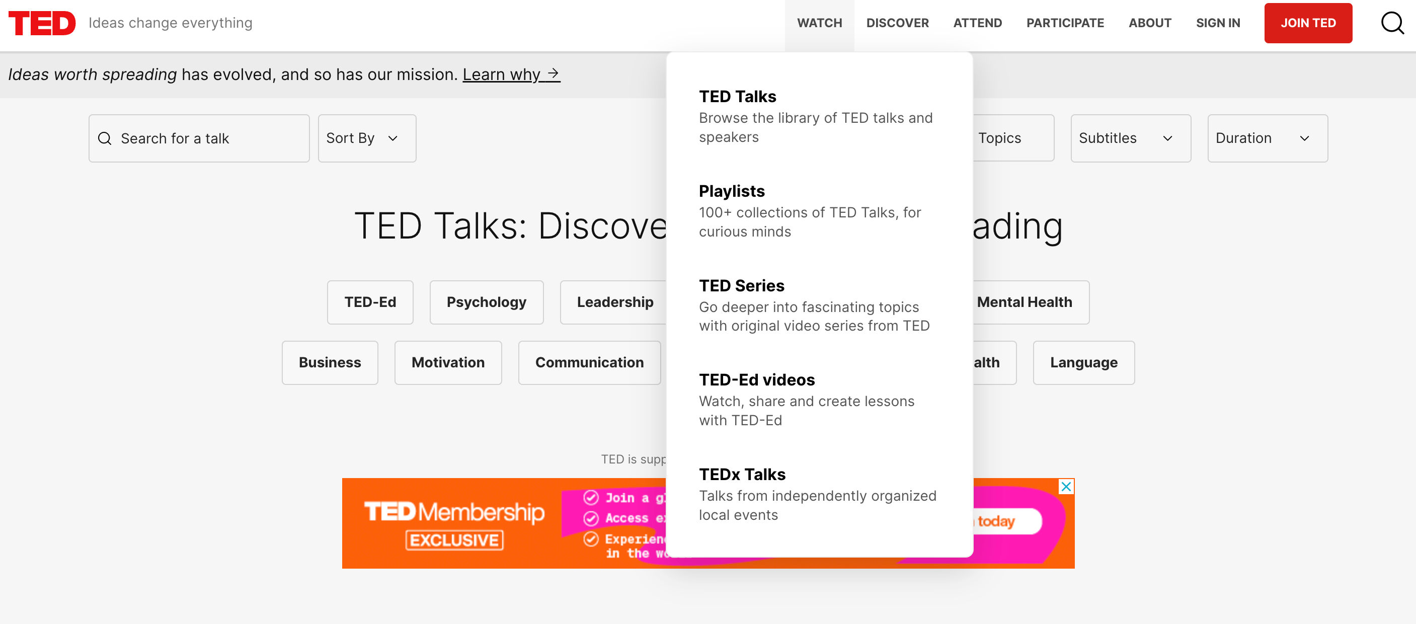
The TED website’s dropdown menu is narrow and has a single column listed vertically—typical of a regular dropdown menu.
Content capacity: Mega menus are designed to accommodate a large amount of content, including text, images, and sometimes even widgets, without the need to scroll. They can showcase multiple levels of hierarchy at once. Regular dropdown menus are simpler and generally suited for shorter lists of options without additional content or media.
User interaction: A mega menu often appears as part of a site-wide navigation bar and can be triggered by hover or click actions. It is best suited for websites with extensive content and categories. A regular dropdown menu is more suitable for straightforward navigation with fewer options, minimizing cognitive load and decision-making time for the user.
Information architecture: Mega menus are useful for complex sites with deep information architecture. They allow users to see the scope of the site's content at a glance and navigate directly to sub-sections. Regular dropdown menus are more appropriate for simpler sites with flat architecture.
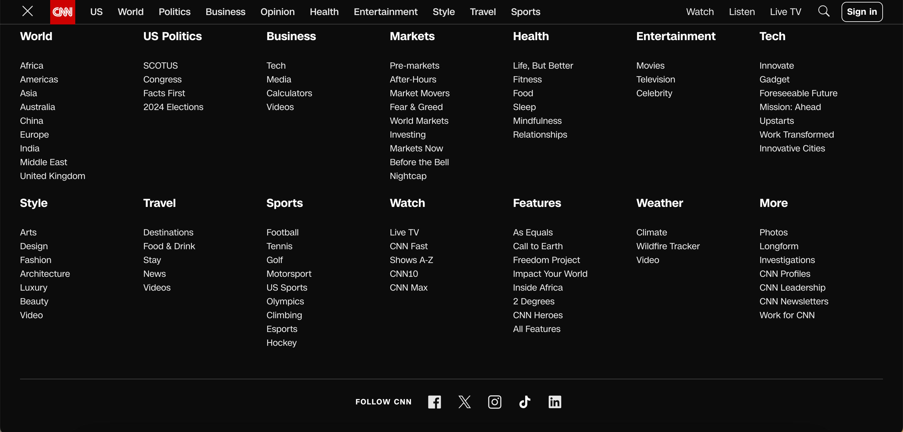
Websites with a lot of content, like CNN, opt for mega menus due to their complexity and extensive information architecture.
Visual presentation: Mega menus can use different types of content presentation, such as headings, icons, and images, to create an engaging and informative menu. Regular dropdowns typically use a text-based list format.
How to Use Mega Menus in UX Design
For desktop platforms, mega menus offer an attractive alternative to layered navigation. If they are designed to meet users’ expectations, users can do a quick visual scan and single click away from most pages in a site. But to achieve this the many menu items shown in a single popup have to be well organized. On mobile platforms, mega menus are somewhat limited, although certainly not impossible, because of the typically-vertical orientation. The John Lewis website does not attempt mega menus on a mobile, for example—not even in landscape mode.
Mega menus can be intimidating, so meaningful grouping is important.
johnlewis.com, Fair Use
Mega menus work best in problem areas that are well understood, such as e-commerce for household items. For online grocery websites, they can quickly become nightmarish because of the sheer number of categories. In domains with more abstract or overlapping categories, users may need the reassurance provided by “incremental” navigation. This involves the more traditional loading of a new page for the menu category selected where users will see examples, illustrations and descriptive text that provides navigational feedback.
Important UX Design Considerations for Mega Menus
UX designers should review the following key points to ensure that mega menus are user-friendly and effective.
Clarity and organization: Ensure the mega menu's content is well-organized with clear headings and logical groupings that help users quickly understand their options.
In this video, HCI Professor Alan Dix talks about the importance of structure in mega menus
ShowHide
video transcript
Transcript loading…
Responsive design: Mega menus should be adaptable to different screen sizes, ensuring a seamless experience on desktops, tablets, and smartphones.
Accessibility: Implement accessibility standards, such as keyboard navigability and ARIA roles, to make mega menus usable for everyone, including people with disabilities.
Simplicity: While mega menus can display more information than standard dropdowns, it's important to avoid overcrowding. Keep options concise and to the point.
Visual hierarchy: Use typography, color, and spacing to establish a visual hierarchy that guides users to the most important or commonly used items.
Hover and click behavior: Decide whether the menu appears on hover or click, considering that hover can sometimes lead to accidental activation, whereas click ensures a deliberate action.
Performance: Optimize for quick loading times; a slow mega menu can frustrate users and detract from the overall experience.
Consistent navigation: Keep the navigation experience consistent across the site, so users don't get confused when they switch between pages with and without mega menus.
Use of imagery: When applicable, incorporate imagery or icons that can help users quickly identify content, but ensure they don't overwhelm or distract from the menu's main purpose.
Testing and iteration: Conduct user testing to gather feedback on the mega menu's usability, making iterative improvements based on real user interactions.
Alternatives to Mega Menus
Mega menus can be daunting for some users. If the grouping is not clear or not as expected, users can struggle to find the item they’re after. Consider providing additional or alternative approaches to navigation, particularly if you need to consider mobile platforms. The two most likely are…
Search: The world’s most successful online retailer, Amazon, does not make use of mega menus. Their sites rely primarily on search and cascading menus. However, be sure that your search is effective for users. Too many results are just as bad as too few.
Cascading menus: These are the traditional pop-out (horizontal) or pull-down (vertical) menus found in many, if not most, desktop interfaces. They are less-frequently used on mobile platforms because of screen limitations. Their advantage is that users are only shown further choices relevant to their earlier selections, thereby making more efficient use of the screen space.
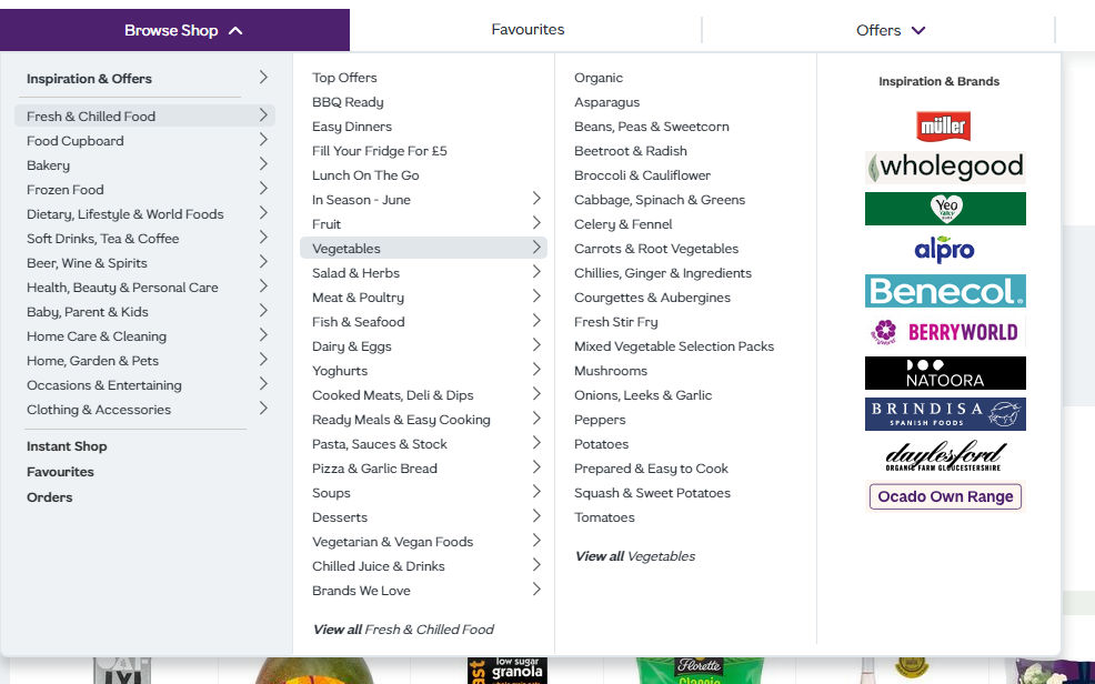
This is a cascading menu from ocado.com, but it occupies half of the screen width when fully extended. Notice that the right-hand column has nothing to do with the vegetables menu.
Are there any disadvantages or drawbacks to using mega menus?
Mega menus can present several disadvantages that may affect user experience and site navigation efficiency. One major drawback is that they can overwhelm users with too much information at once, particularly if not well-organized. A cluttered or overly complex mega menu can confuse users or slow down the process of finding specific items, especially on websites with a vast range of content or products. This information overload can lead to choice paralysis, where users may feel overwhelmed by the options and have difficulty making a decision.
Additionally, mega menus can pose challenges in terms of accessibility and responsiveness. They often require precise mouse control, which can be difficult for users with motor impairments or those using touch devices like smartphones and tablets. On smaller screens, mega menus may not render correctly or may take up too much screen space, which detracts from the overall user experience. Proper design and testing across different devices and user abilities are crucial to ensure that mega menus enhance rather than hinder navigation and accessibility.
How should content be organized within a mega menu for optimal user experience?
For optimal user experience, content within a mega menu should be organized logically and hierarchically, grouping related items together to facilitate quick scanning and navigation. Start by categorizing content into clearly defined sections or columns that reflect the user’s expectations and the site's information architecture. Use headings to label these sections clearly, making it easy for users to identify areas of interest at a glance. This structured approach helps minimize the cognitive load on users as they navigate through the options, improving the speed and efficiency of the navigation process.
Additionally, consider the visual design and layout of the mega menu to enhance usability. Ensure that the design is clean and uncluttered, with sufficient spacing between items to prevent accidental clicks and to accommodate users with motor difficulties. Utilize typography, icons, and color strategically to differentiate sections and highlight important or popular items. Keeping the design consistent with the overall website aesthetic also contributes to a seamless user experience. By carefully planning both the organization and design of a mega menu, you can significantly enhance usability and ensure that users find the information they need without frustration.
What are the best practices for designing a responsive mega menu for mobile devices?
It’s crucial to prioritize simplicity and usability when designing a responsive mega menu for mobile devices. Start by adapting the layout to fit smaller screens and ensure that the menu is easily navigable with touch controls. Opt for a collapsible or accordion-style menu that expands when tapped, keeping the interface uncluttered and conserving valuable screen space. This approach allows users to explore deeper menu levels one at a time without overwhelming them with too much information all at once. It’s also essential to ensure that interactive elements are large enough to be tapped easily, avoiding closely packed links that can lead to accidental selections.
Furthermore, integrate a clear and accessible way to close the menu, such as a large “X” icon or swipe gesture, to allow users to exit the menu smoothly. Given the limited space on mobile devices, consider highlighting the most important menu items or using icons alongside text for quick recognition. Use a search feature within the mega menu can also enhance user experience by allowing users to quickly find specific items without navigating through multiple levels. You can create a responsive mega menu that enhances the mobile browsing experience by focusing on a user-friendly layout and streamlined navigation.
How can mega menus be made accessible to all users, including those with disabilities?
To make mega menus accessible to all users, including those with disabilities, start with keyboard navigability. Users should be able to navigate through all menu items using keyboard shortcuts alone, such as the Tab key to move forward and Shift+Tab to move backward. Implement clear focus indicators, like borders or color changes, that visually highlight which menu item is currently selected. This feature is crucial for users with visual impairments who rely on screen readers and those who do not use a mouse.
Additionally, ensure that all textual content within the mega menu is readable by screen readers. This involves using proper HTML structures, such as <nav> for navigation blocks and ARIA roles to describe the function of menu components. Consider the timing of how submenus open and close, providing ample time for users to make selections without the menu closing unexpectedly, which can be essential for users with motor impairments. Including options to adjust text size and contrast within the menu can further enhance accessibility, accommodating users with varying levels of visual acuity. By focusing on these aspects, designers can create mega menus that are inclusive and navigable for everyone.
What are some common mistakes to avoid when implementing mega menus?
Avoid these common mistakes when implementing mega menus
Overload of options: One of the biggest mistakes is cramming too many options into the mega menu. This can overwhelm users and make it difficult to locate specific items quickly. Prioritize content by relevance and popularity, ensuring that users can easily navigate through options without feeling overwhelmed.
Poor organization: Illogical organization of content within the menu can lead to confusion and frustration. Group similar items together under clear, concise headings to help users find what they need through intuitive navigation paths.
Inconsistent design: Mega menus should be visually consistent with the rest of the website. An inconsistent design can disorient users and detract from the overall user experience. Ensure that the design of the mega menu reflects the site’s aesthetic and brand identity.
Overlook mobile users: It’s an oversight not to optimize mega menus for mobile devices. A complex mega menu can become unusable on smaller screens. Adapt mega menus for touch interactions and consider simpler, more compact navigation structures for mobile users.
Ignore accessibility: Mega menus must be accessible to all users, including those with disabilities. Ensure that the menu is navigable via keyboard and screen readers, and use ARIA roles and properties to enhance accessibility.
Slow performance: Mega menus that are heavy with images, animations, or dynamic content can slow down site performance, particularly on mobile devices. Optimize content for quick loading times to prevent user drop-off due to impatience.
Lack of testing: Failing to test the mega menu on different devices and under various user conditions can lead to a poor rollout. Comprehensive testing ensures that all users have a positive experience, regardless of how they access the menu.
The use of mega menus can impact SEO (Search Engine Optimization) in several ways, both positively and negatively:
Improved user engagement and site navigation: Mega menus can enhance user engagement by making it easier for users to find information and navigate a website efficiently. Search engines favor websites with good usability and user experience, which can indirectly boost SEO rankings through reduced bounce rates and increased time on site.
Site structure and crawlability: Well-organized mega menus help search engines understand the website's structure by clearly presenting the relationships between different parts of the site. This organization can aid in better page indexing, as search engines can easily crawl and map out the content hierarchy, which is crucial for SEO.
Potential overuse of links: However, mega menus that contain excessive links can dilute link equity across a site. This occurs when too many links on a single page spread the page’s authority too thin, which can potentially reduce the ranking power of important pages. It’s essential to strategically use links in mega menus to avoid overwhelming both users and search engines.
Keyword optimization: Mega menus also offer an opportunity to include relevant keywords in navigation links, which can help improve the SEO if done correctly. These keywords can give search engines more context about the linked pages, which enhances the relevancy of those pages for specific search queries.
Mobile optimization issues: If mega menus are not properly optimized for mobile devices, they can lead to a poor user experience, which negatively impacts mobile SEO. Since mobile-friendliness is a ranking factor, ensuring that mega menus are responsive and easy to use on all devices is critical.
Loading speed: Large mega menus, especially those loaded with images or complex scripts, can slow down page loading times. Since page speed is a ranking factor for Google, slow-loading mega menus can negatively impact SEO.
Can mega menus be integrated with e-commerce platforms effectively, and if so, how?
Mega menus can be effectively integrated with e-commerce platforms to enhance user navigation and improve the shopping experience. E-commerce sites allow customers to see the breadth of available products at a glance through the organization of extensive product categories and subcategories within a single, expansive menu which speeds up the browsing process. It’s crucial to design these menus with clear, logical categorization and to use visual cues such as icons and images, which help users quickly identify the type of products they are interested in. This setup reduces the number of clicks needed to reach desired products, facilitating a smoother and faster shopping journey.
To implement mega menus effectively on e-commerce platforms, ensure they are responsive and load efficiently to maintain a high level of user experience across all devices, especially mobile. Including features such as dynamic product highlights, promotions, and new arrivals within the mega menu can also drive attention to specific items or deals. Additionally, integrating search functionality within the mega menu can allow users to find specific products directly which will enhance the utility of the menu. If you focus on user-friendly design and quick access to products, a mega menu can significantly boost usability and satisfaction on an e-commerce site.
What metrics should be used to evaluate the effectiveness of a mega menu?
Focus on metrics that measure user interaction and navigation efficiency to evaluate the effectiveness of a mega menu. Key metrics include click-through rates (CTR) on menu items, which indicate how effectively the menu draws user interest and guides them deeper into the site. Also, monitor the average time users spend navigating the menu and the number of clicks required to reach desired content; fewer clicks and efficient navigation typically signify a well-structured menu.
Additionally, analyze bounce rates for pages accessed through the mega menu to assess if users find the content relevant and engaging. High bounce rates might suggest mismatches between menu labels and content. Conversion rates stemming from menu interactions also provide insights into whether the menu setup effectively drives business goals, such as sales or sign-ups. When you combine this quantitative data with user feedback on the menu's usability and satisfaction can comprehensively evaluate and refine the mega menu's design.
It's Easy to Fast-Track Your Career with the World's Best Experts
Master complex skills effortlessly with proven best practices and toolkits directly from the world's top design experts. Meet your expert for this course:
Alan Dix: Author of the bestselling book “Human-Computer Interaction” and Director of the Computational Foundry at Swansea University.
User Interface Design Guidelines: 10 Rules of Thumb
Learn to design with your user’s needs and expectations in mind by applying Jakob Nielsen and Rolf Molich’s Ten User Int
1.4k shares
3 mths ago
Open Access—Link to us!
We believe in Open Access and the democratization of knowledge. Unfortunately, world-class educational materials such as this page are normally hidden behind paywalls or in expensive textbooks.

