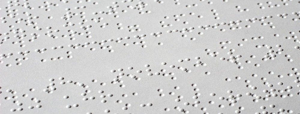
Having a good understanding of your users’ needs and wants is crucial in all design processes. Guessing at user needs is dangerous, since it’s nearly impossible to separate your own experience and point of view from those of your users. This is especially true when designing for accessibility, since a disabled person often has vastly different interaction possibilities from those of a designer. You can try to imagine what it’s like to be a blind person navigating a website and what needs that person would have, but it’s likely that you would miss important aspects. Obviously, user research with the relevant user group is the best way to gain an understanding of your users’ needs; however, if you are not in a position to conduct research, the second-best thing you can do is to be aware of the most common designer biases and to know the most important rules of thumb when creating accessible web designs. In this video, that’s exactly what you will learn!
Show
Hide
video transcript
- Transcript loading…
The Takeaway
When designing for accessibility, be aware of the blind spots created by your biases. The most important bias is the visual bias – it’s difficult to understand what interaction a visual layout will create for someone using a screen reader. You should also be aware that designing a lot of point and click interaction will make your designs difficult for some users. Finally, remember that about 10 percent of all males are color-blind, so be aware of which colors you use.
Besides being aware of your biases, follow these rules of thumb early in your design process to create accessible webpages that are digitally inclusive:
Make sure your typography is defined with accessibility in mind.
Always use high contrast.
Ensure that you have high link visibility and a large target size.
Make sure that labels are close to the elements they relate to.
Ensure that navigation is consistent and predictable.
Use visual focus indicators.
Clearly separate blocks of content.
References and Where to Learn More
Web content accessibility guidelines
Hero Image: © Florian Voggeneder, CC BY-NC-ND 2.0