Gestalt is a German word that carries much importance, especially for us as designers. Let’s have a close look at its principles so that we can see how much information this little word encompasses!
The central principle to the Gestalt theory was neatly summarized by the Gestalt psychologist Kurt Koffka: "The whole is other than the sum of the parts." The human eye and brain perceive a unified shape in a different way to the way they perceive the individual parts of those shapes. This global whole is a separate entity that is not necessarily formed by the sum of its parts.
When we fully understand Gestalt design principles, we can utilize them to create more interesting and engaging visual experiences for website and app users. You can take advantage of these laws to design more thoughtfully and effectively, knowing exactly how your work can impact your users.
What Are Gestalt Principles?
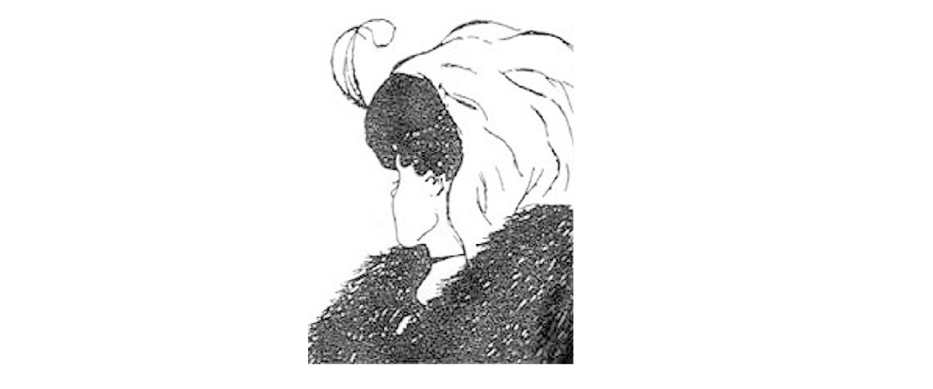
![]()
Author/Copyright holder: Impronta. Copyright terms and licence: CC BY-SA 3.0
Gestalt principles or laws are rules that describe how the human eye perceives visual elements. These principles aim to show how complex scenes can be reduced to more simple shapes. They also aim to explain how the eyes perceive the shapes as a single, united form rather than the separate simpler elements involved.
“Gestalt” refers to “shape” or “form” in German; the principles – originally developed by Max Wertheimer (1880-1943), an Austro-Hungarian-born psychologist. – were improved later by Wolfgang Köhler (1929), Kurt Koffka (1935), and Wolfgang Metzger (1936).
Researchers have integrated all of these theories to show how people unconsciously connect and link design elements.
This article covers one of the Gestalt Principles (the Law of Similarity). The rest of the principles will be covered in upcoming articles:
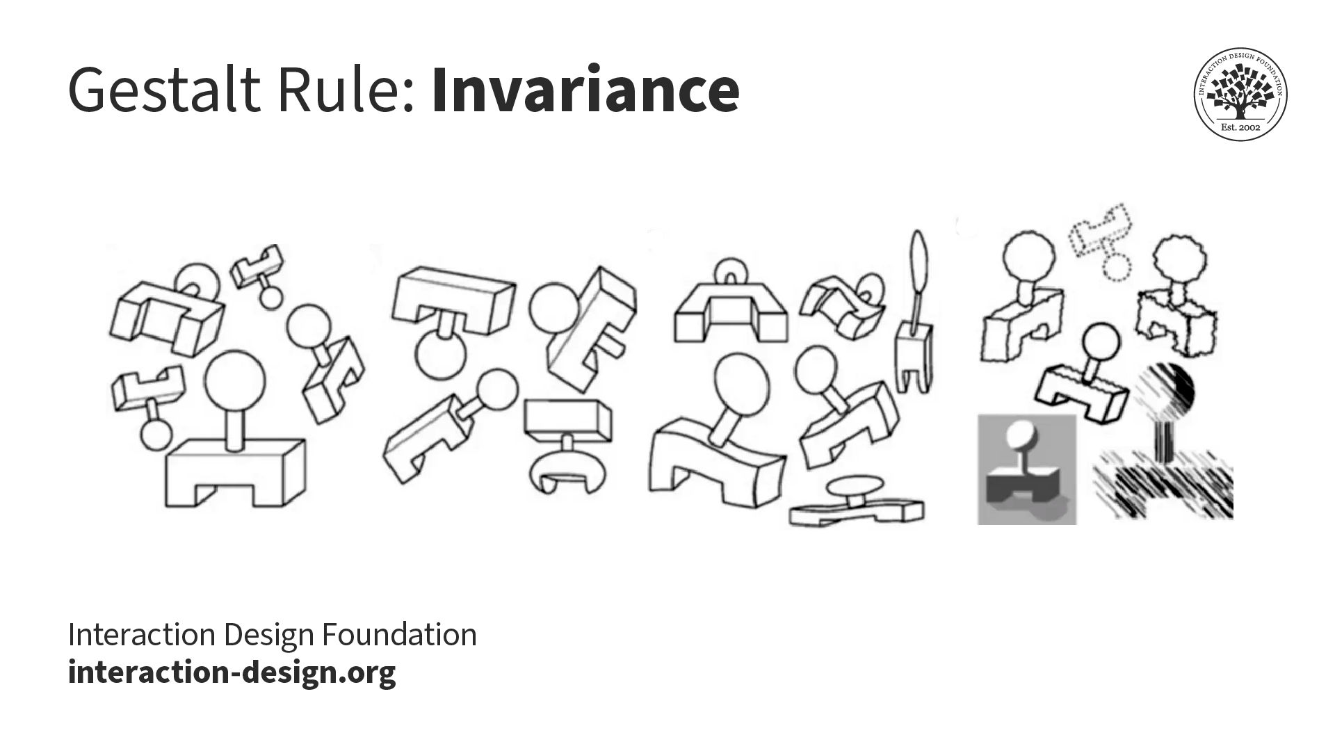
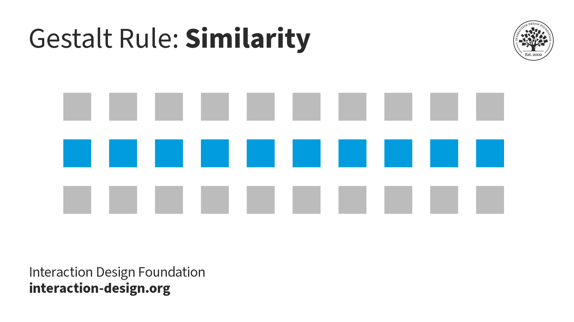
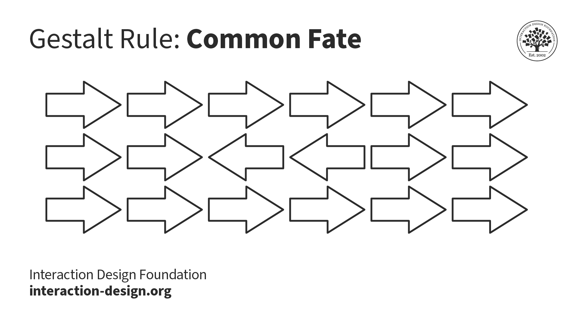
Similarity (also known as Invariance): The human eye tends to build a relationship between similar elements within a design. Similarity can be achieved using basic elements such as shapes, colors, and size.
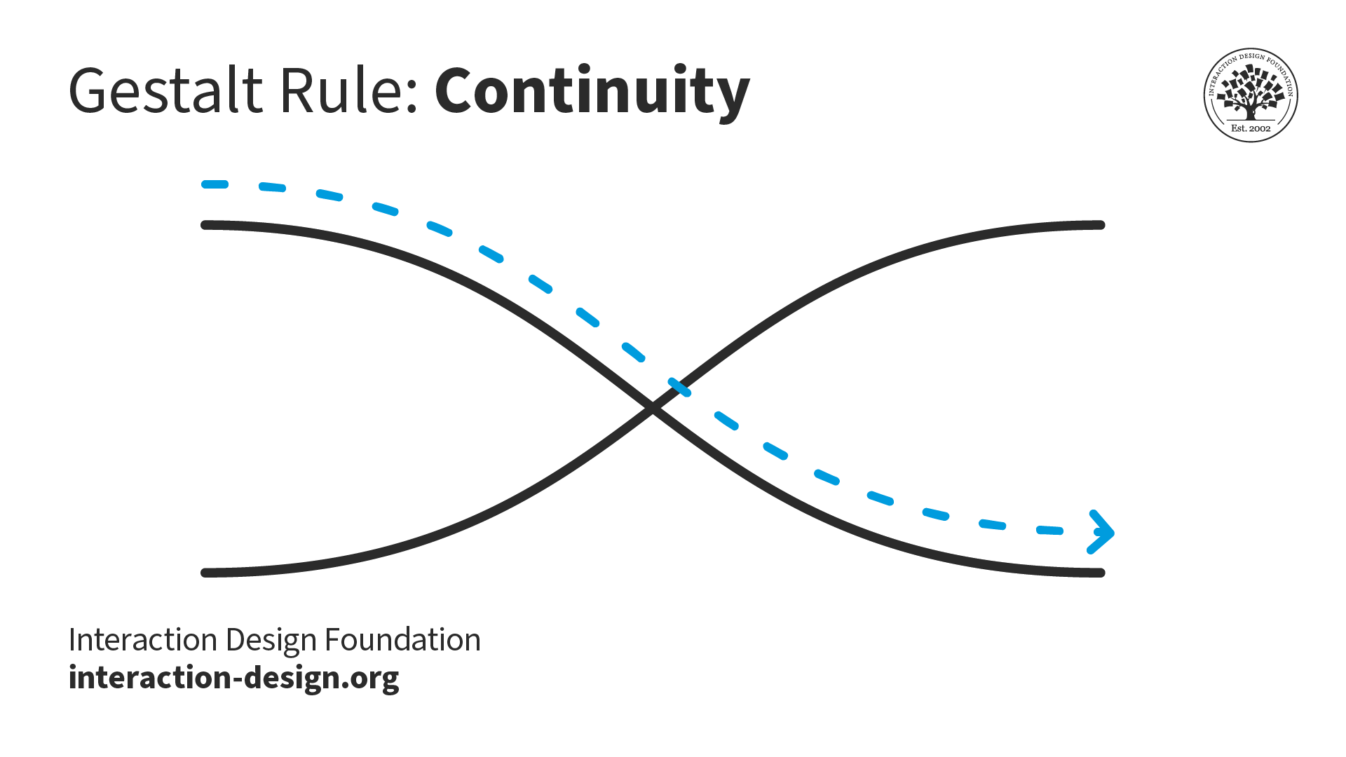
Continuation: The human eye follows the paths, lines, and curves of a design, and prefers to see a continuous flow of visual elements rather than separated objects.
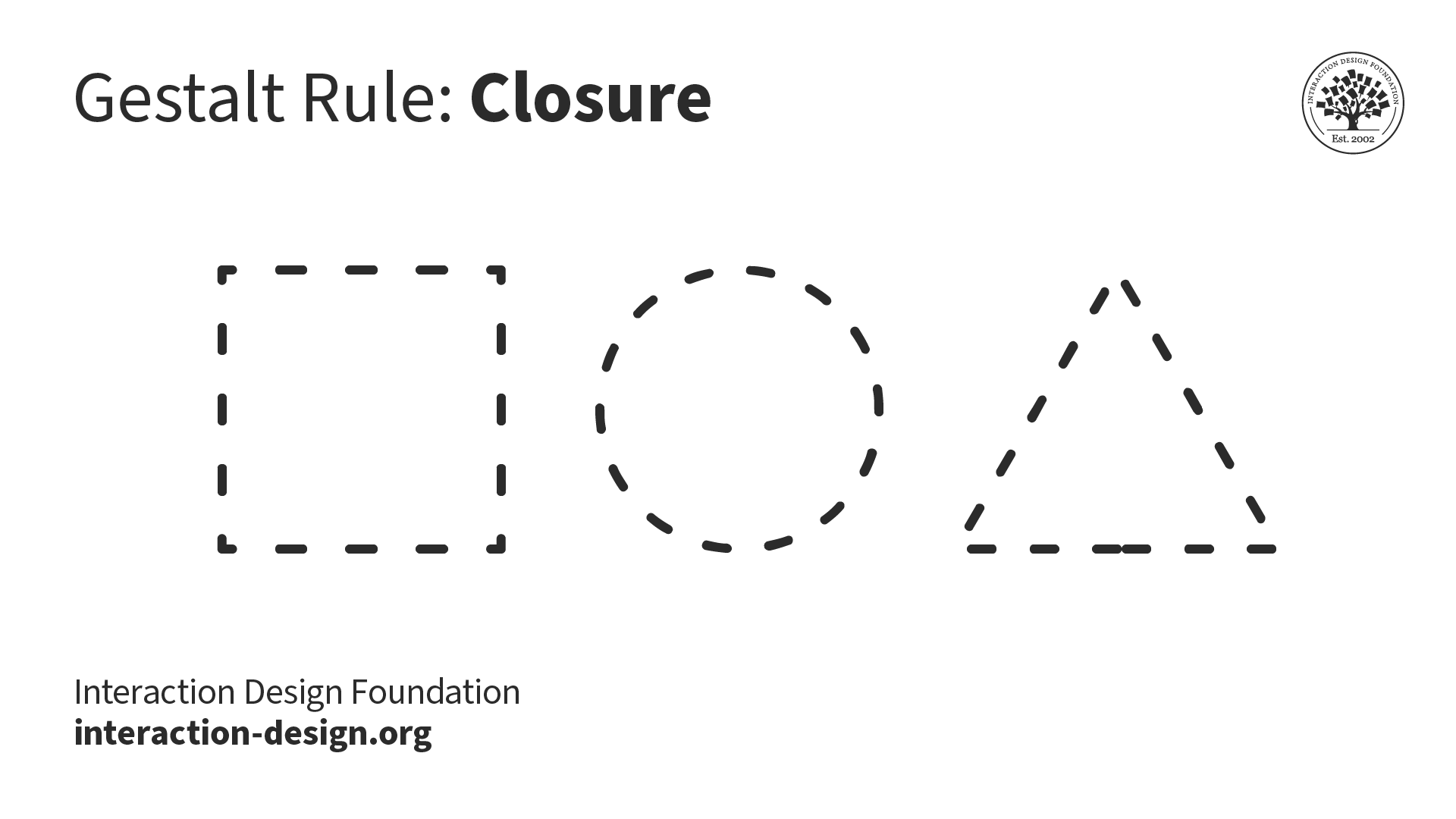
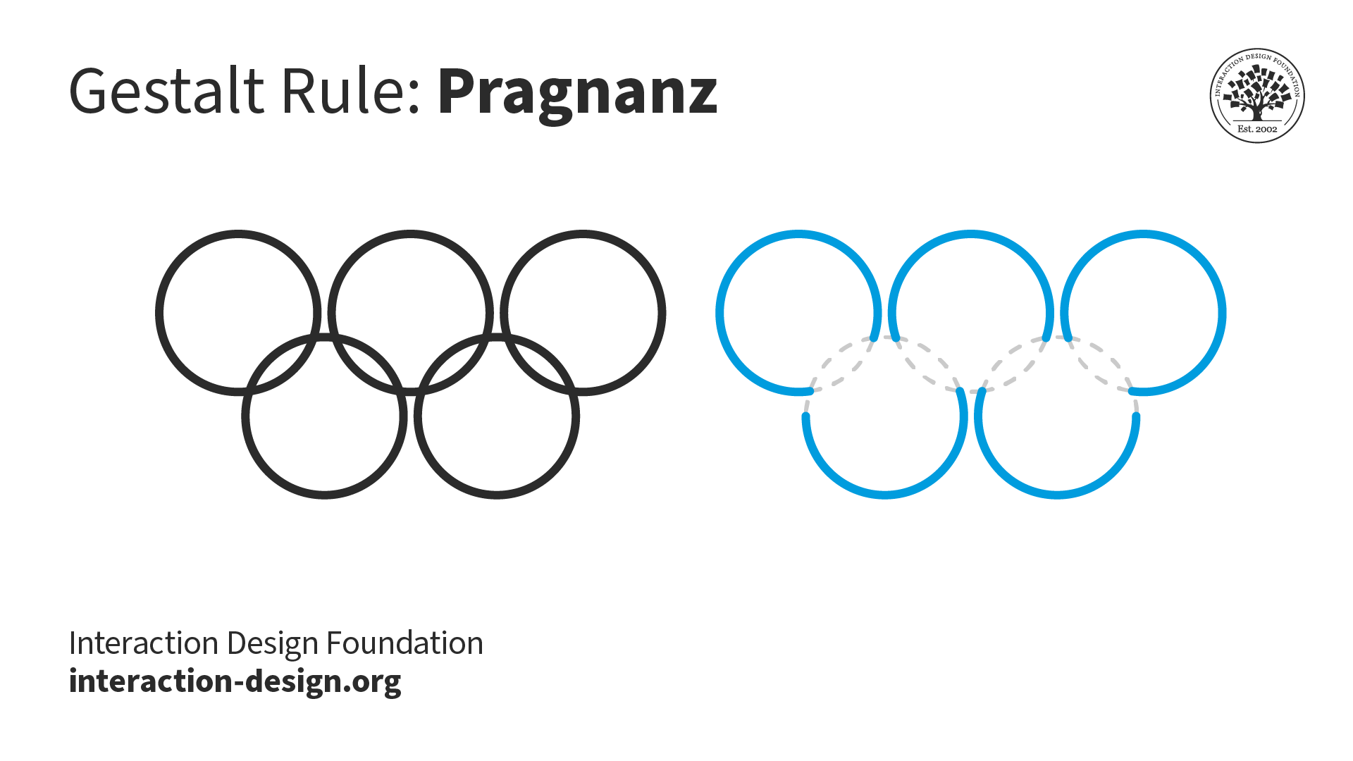
Closure (also known as Reification): The human eye prefers to see complete shapes. If the visual elements are not complete, the user can perceive a complete shape by filling in missing visual information.
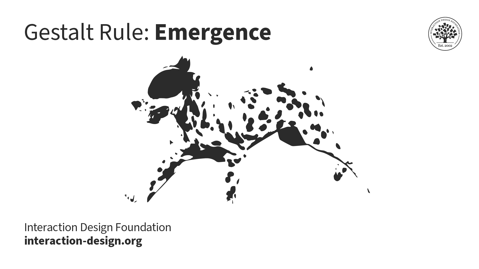
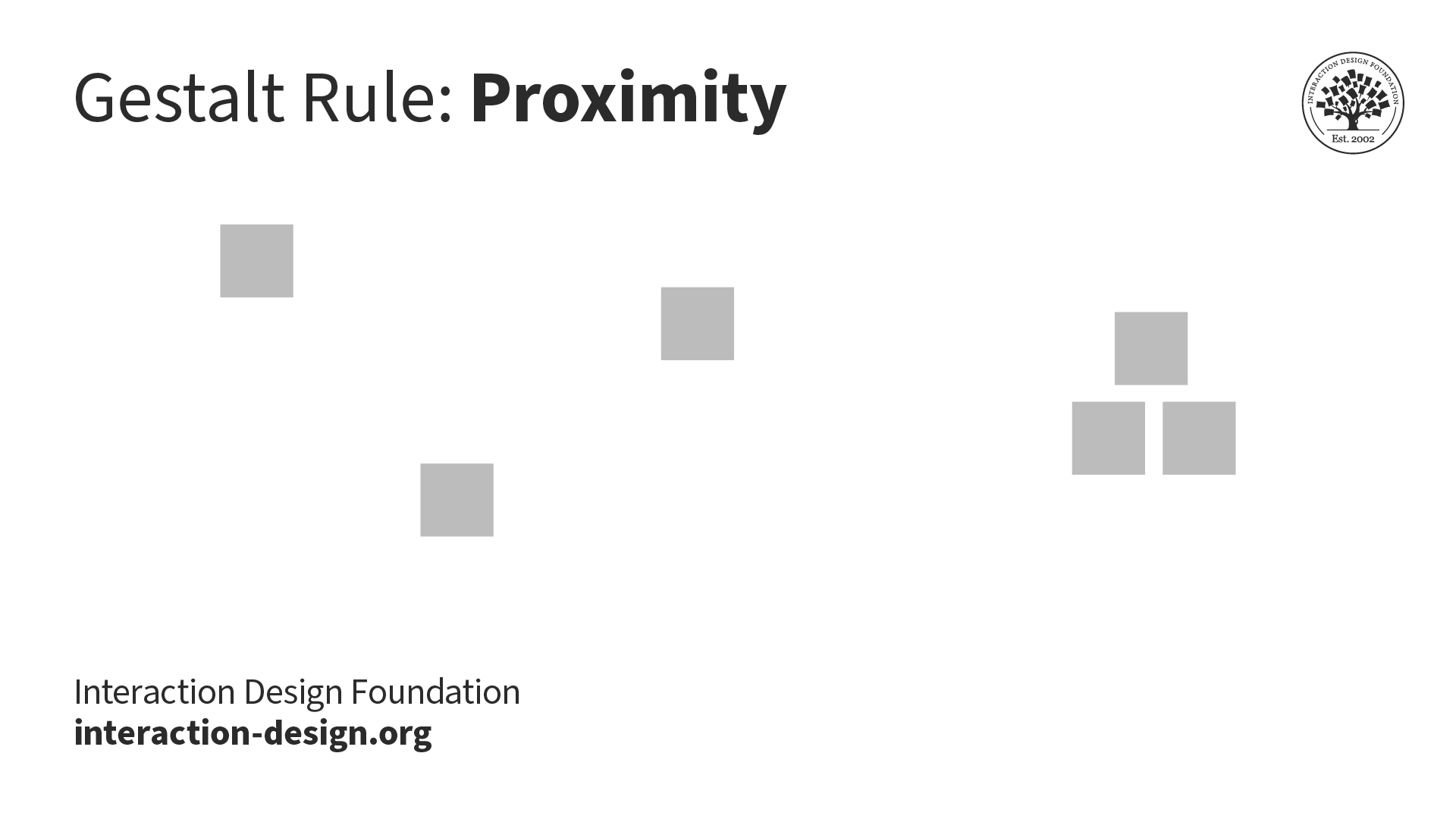
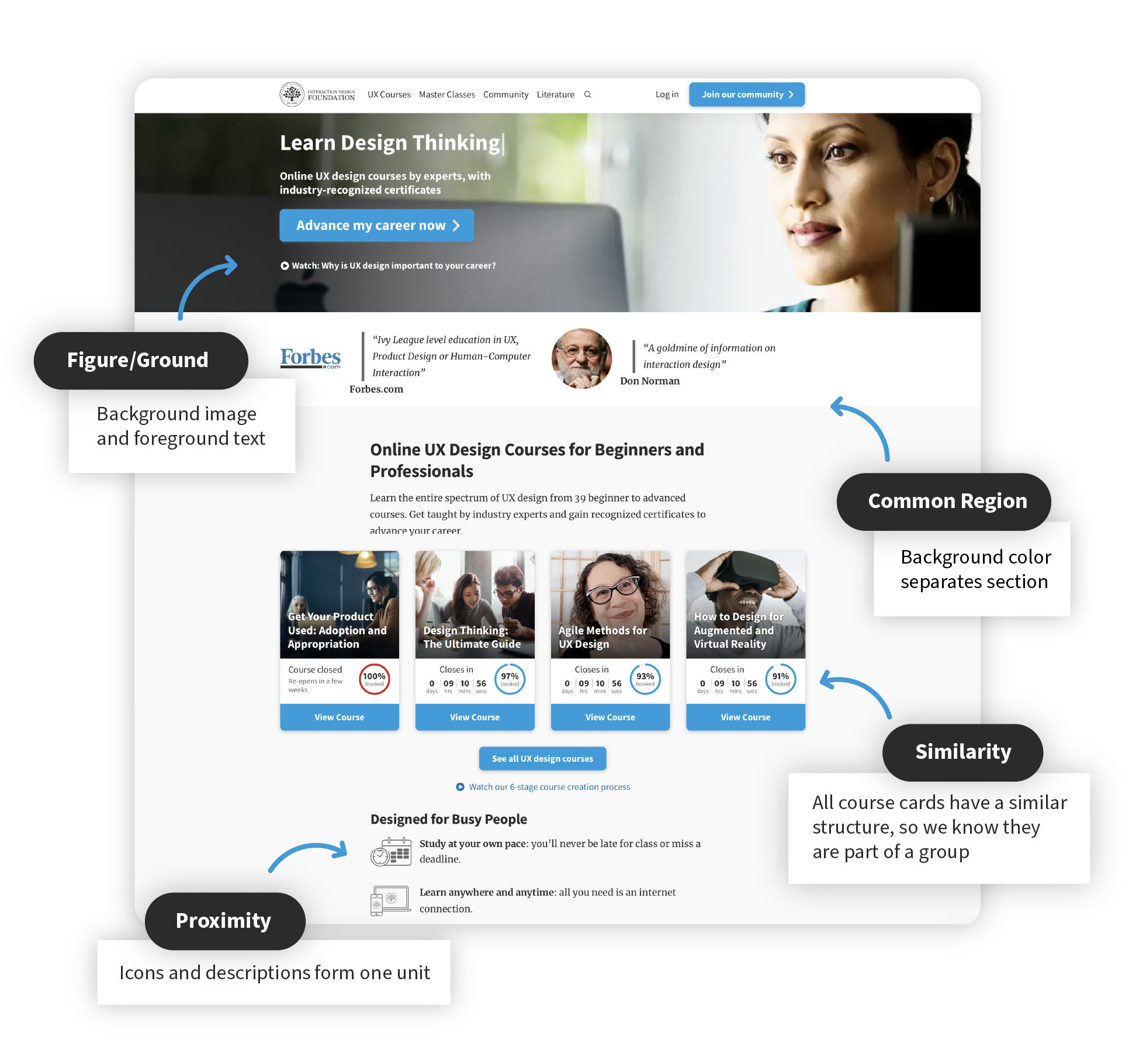
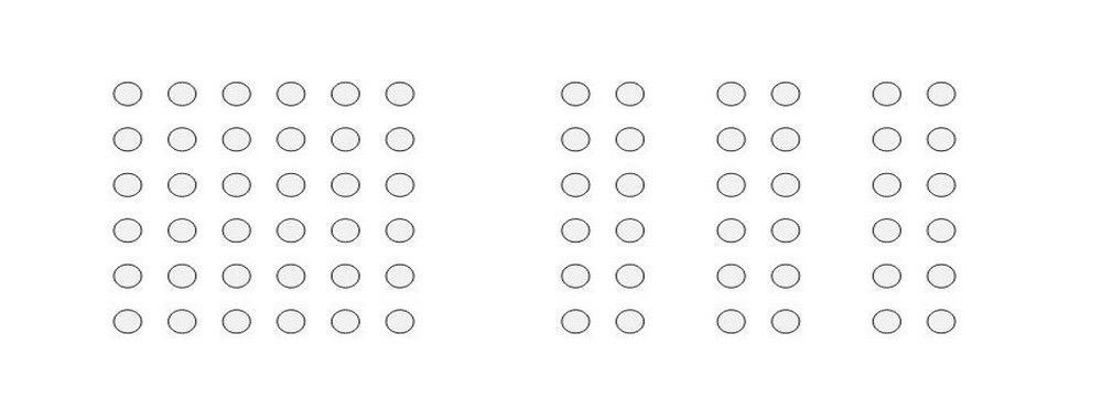
Proximity (also known as Emergence): Simple shapes arranged together can create a more complex image.
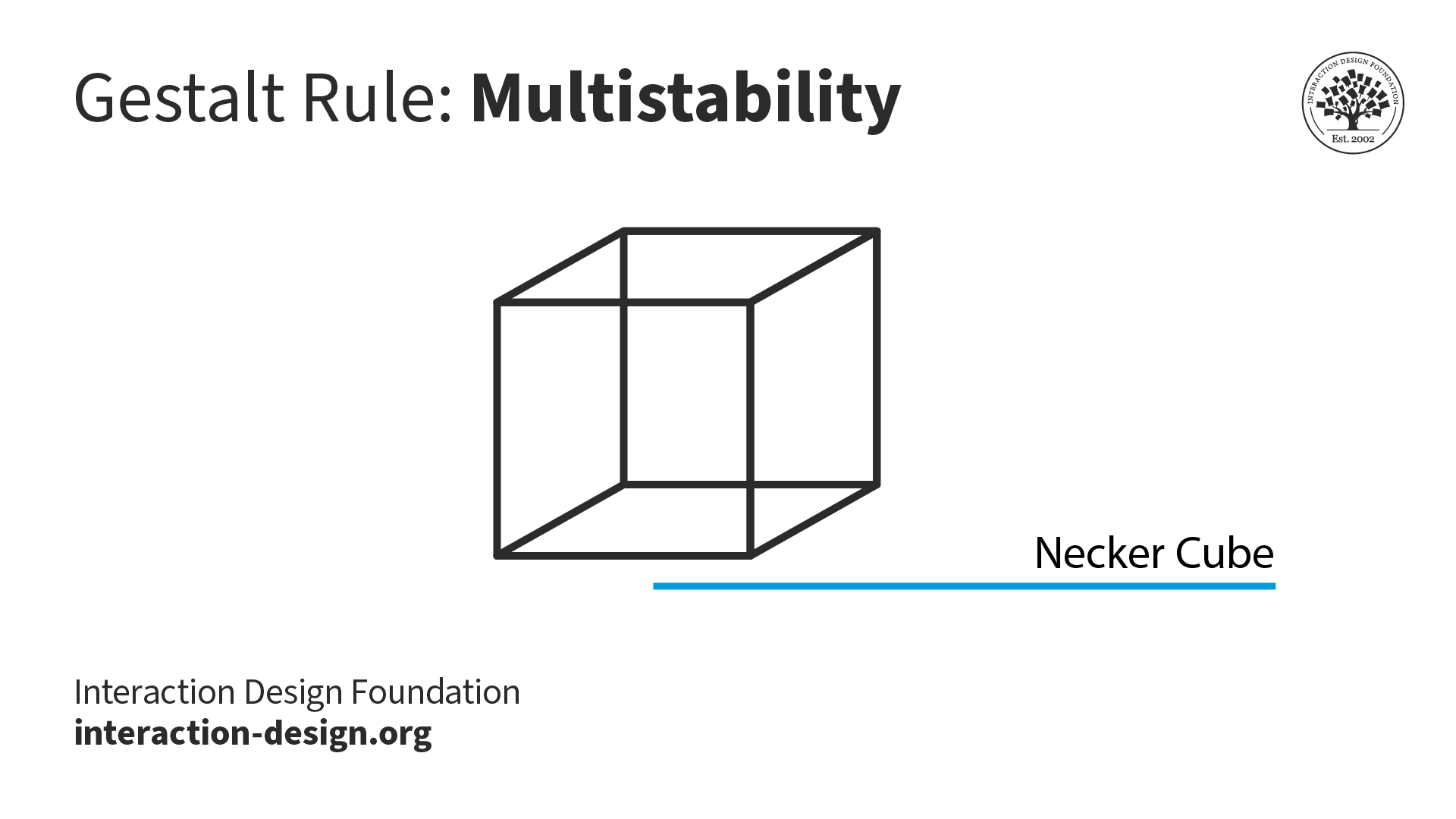
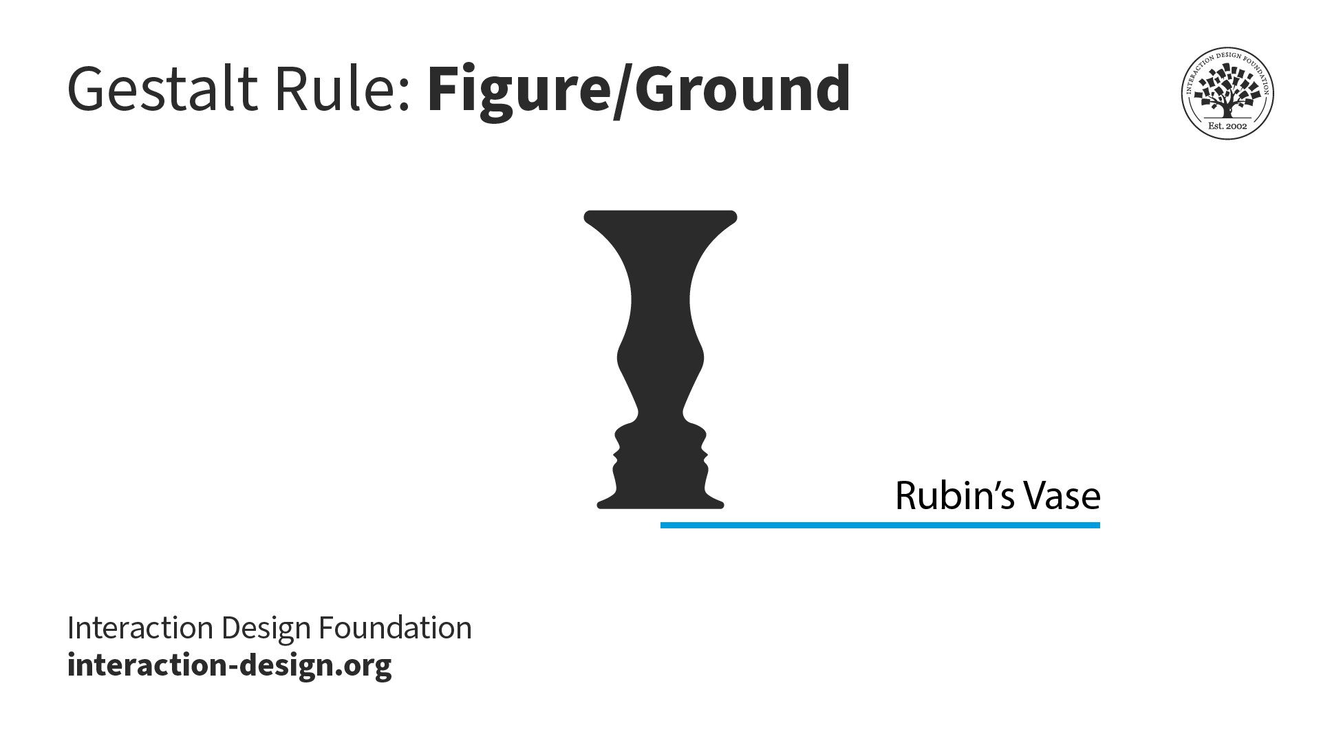
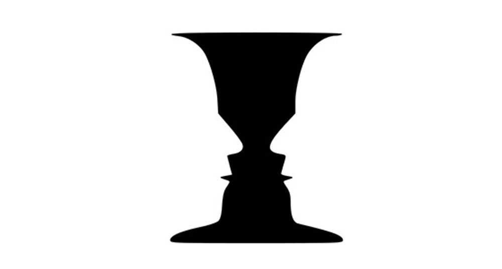
Figure/Ground (also known as Multi-stability): The human eye isolates shapes from backgrounds.
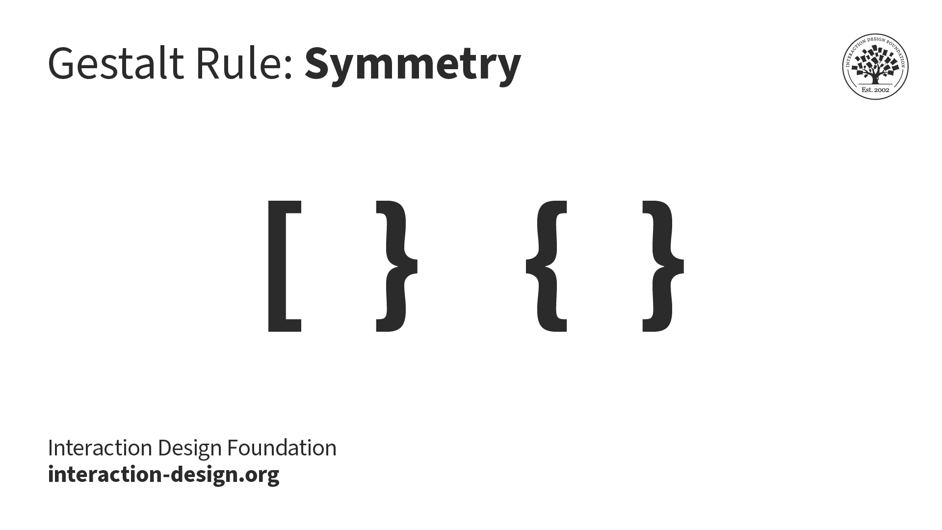
Symmetry and order: The design should be balanced and complete; otherwise, the user will spend time and effort trying to perceive an overall picture.
The Law of Similarity
The human eye tends to perceive similar elements in a design as a complete picture, shape, or group, even if those elements are separated. The brain seems to craft a link between elements of a similar nature. Then, we perceive them in a relationship with each other, separating them from other elements in a design. Human eyes are good at filling in “gaps” or connecting “dots”. It happens naturally.
![]()
Similarity is influenced by the shape, size and color of the elements. When you mix objects with high degrees of similarity to each other with a group of dissimilar objects, the brain then devotes time and energy to creating a link between them so that it can try to understand their relationship with each other.
Let’s try a quick experiment to check this out. If you’ve got a pencil and paper handy, draw about ten, rough circles on a page (spreading them across the page), leaving enough space between them to fit shapes of a similar size. Now, anywhere in those gaps, draw five or six triangles. Don't worry about geometric perfection: it doesn't matter in this simple illustration. Then, put about three dots anywhere between these shapes. Look away and stand back for a moment. Now, return to your sketch.
Do you notice anything? Your eye takes you right to the dots, doesn’t it? This is because the dots are points, while the shapes are made up of lines.
Designing with Similarity in Mind
In web and interactive design, the similarity law can be used to contribute to building connections between linked elements. This relationship may be either physical or conceptual. You can make the most of this natural human inclination by helping your user’s eye to discern parts of your design you want to accentuate.
Using this linkage might improve the user experience as follows:
Links
Links and navigation systems are essential to allow users to view website content and navigate between different pages.
While links are embedded inside the content, they must certainly be presented uniformly to allow users to identify linked text.
Thus, text links should be differentiated by color and usually shape as well. No matter how you do it, the important thing is that links should be clearly identifiable as such. Make them stand out. Many users will typically consider a link to be any text that is blue and underlined.
The use of the principle of similarity in menus and navigation helps users see the relationship between each group of navigation links. They will then perceive similar navigation items as being related or having a similar place in the site’s data hierarchy.
Content
We can also use color, font size and type, highlighting, etc. to distinguish between and mark the types of content before a user reads them.
For example, quotes that appear in boxes, in a slightly bigger font, with an italic emphasis, are easily recognizable as such. The law of similarity carries our recognition of this standard from one website to another. Each site may use a variant on this theme, but, overall, the pattern is incredibly similar.
Breaking the law of similarity can also help draw a user’s attention to a specific piece of content – such as a call to action. That’s right; we can make use of both sides of the line or border the law makes. The user’s eye is a remarkably easy tool to manipulate; you just need to figure out what parts of your design you want to bring out or tie together.
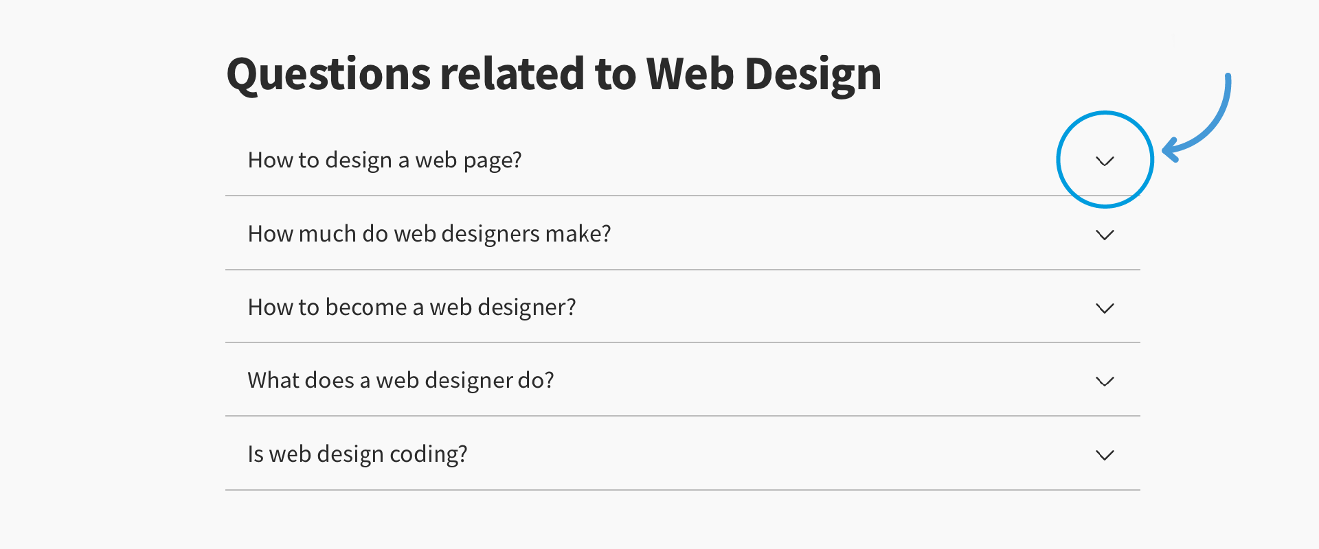
Headers
Website headers play another essential role in organizing and building well-structured content for search engine crawling and for the reader.
We normally place headers above content in a different font, color, size, etc. from the body of the content. They assist the reader in finding the relevant points in content and help control the overall flow of the work. They’re great milestones and using them wisely (which isn’t hard) will keep your users on your page.
Remember that a user’s eye will activate the brain to work to interpret your design in a certain way. Nothing is more tiring than a solid block of text on a page, with no discernable features to draw the reader’s eye. If you’re near an old literary classic, why not open it and look at a spread of pages?
For example, let’s try Victor Hugo’s immortal Les Misérables on for size. Flicking forward six pages finally brought me to a new chapter heading, which my eye instantly noticed and read. None of the other text had stood out for me before I saw that.
The Take Away
Gestalt psychology is a theory of the mind which has been applied to a number of different aspects of human thought, action and perception. In particular, Gestalt theorists and researchers attempt to understand visual perception in terms of the way the underlying processes are organized to help us make sense of the world.
The organization of these cognitive processes is important to our understanding of how we interpret the constant stream of visual information entering our eyes into a cohesive, meaningful and usable representation of the world. Over the last twenty years, interaction designers and other professionals involved in the development of products for human users have adopted the work of Gestalt psychologists.
Realizing the potential for applying Gestalt thinking helps us create (literally!) eye-catching works. Suddenly, we have new insights and ways of approaching problems and challenges. This is a gift – we can tailor our work according to the ”engineering” of the human eye and brain.
Starting with the Law of Similarity, we find that we can make use of the following to draw a user’s attention and let his or her brain do the rest:
These three short articles will provide you with a first approach to these laws. However, if you want to cement in your own mind the many ways you can organize visual information and improve your designs for all users, we suggest that you take the course explained below!
Where to Learn More
Interested in delving into the Gestalt principles? Check our “Gestalt Psychology and Web Design: The Ultimate Guide” course.
References:
Hero Image: Author/Copyright holder: Eumedemito. Copyright terms and licence: Public Domain.