Your message is ready, your delivery honed. Now, how do you put that brilliance on slides? Discover how to structure your slide deck strategically so that it supports your message, whether you present live or share it for independent review.
Whether you're pitching to stakeholders, leading a team meeting, or sending your deck to decision-makers, the way you structure your slides determines whether your message lands—or gets lost. Messy decks get ignored. Strategic ones make people listen, take action, and remember you.
In the next video, Morgane Peng, Head of Product Design & AI Transformation at Societe Generale, explains how to structure your slides in a way that does more than just look good—they speak clearly, build trust, and help you stand out.
Show
Hide
video transcript
- Transcript loading…
Once you’ve researched your audience, defined messages, and planned your structure, it’s time to turn strategy into visuals. Here's how to make your deck do its job.
Visual Consistency Equals Instant Credibility
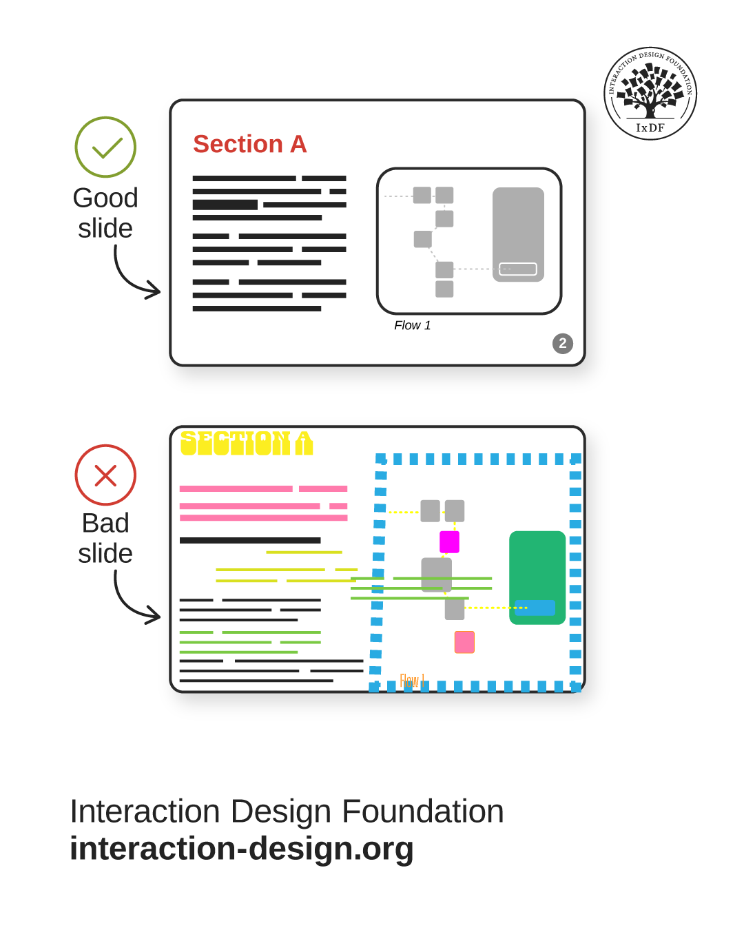
Remember the last time you saw a slide deck that was all over the place? That makes us lose trust instantly the same way users lose trust in your designs if they are not visually consistent. Visual inconsistency creates subtle disorganization, which the brain reads as a red flag. We naturally look for patterns to decide what’s safe and reliable—so when something breaks the pattern, it feels careless. That hint of carelessness implies unreliability, which then erodes credibility and makes it harder for your audience to trust your message.
© Interaction Design Foundation, CC BY-SA 4.0
All slide decks should be visually consistent and coherent. Your design expertise comes in handy here:
Visuals: Use consistent fonts, color systems, and consider contrast ratios and accessibility.
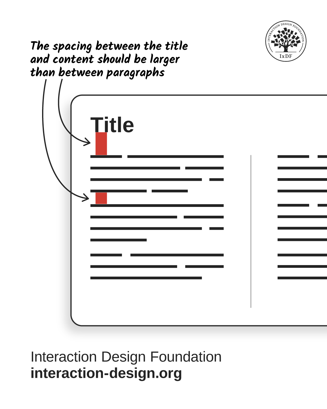
Layout: Follow Gestalt laws for spacing and information grouping. For example, make spacing between title and content larger than between paragraphs. Make it scannable, intuitive, and easy on the eyes. For example, on your slides, the spacing between the title and content should be larger than between paragraphs:
© Interaction Design Foundation, CC BY-SA 4.0
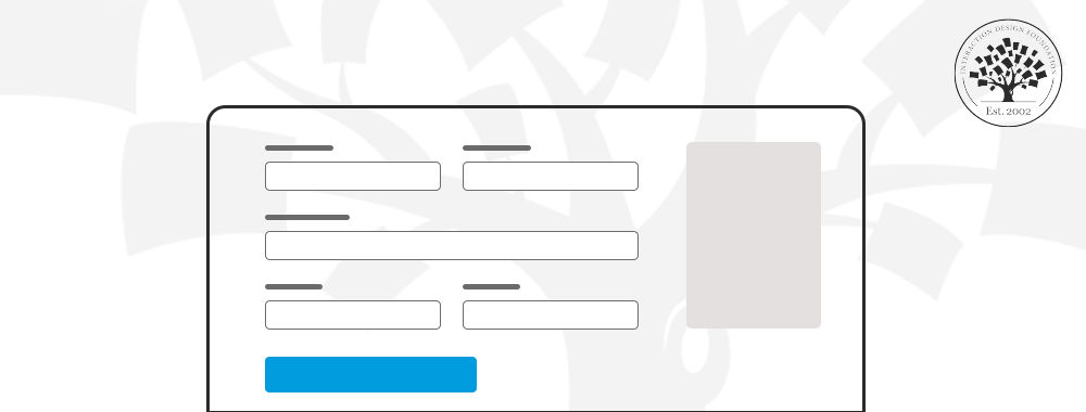
Cover page: Include a title, optional subtitle, date, and presenter name.

© Interaction Design Foundation, CC BY-SA 4.0
A clear and credible slide deck has a title, optional subtitle, date, and the presenter’s name.
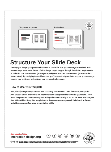
Choose the Right Slide Deck Type
© Interaction Design Foundation, CC BY-SA 4.0
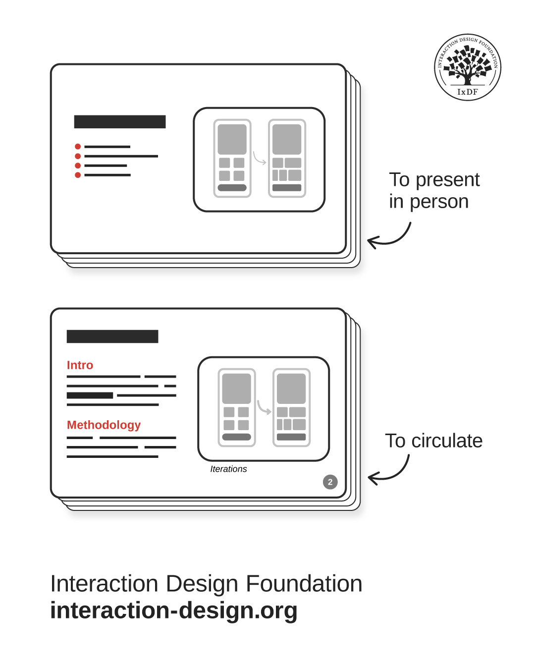
Your project context will usually dictate the format—oral or written. It’s useful to prepare two decks—one written for circulation, one oral for presentation. For example, you’d send a written portfolio to recruiters, then use a lighter oral version for interviews.
Create Slides That Support, Don’t Distract for Oral Presentations
When you present live, your slides are your sidekick—not the main act. Oral presentations should have these specific traits:
Simplicity: Use minimal text to support you, not compete for attention.
Progressive disclosure: Reveal content gradually with animations to match your speaking pace.
Live interactivity: Incorporate questions, polls, or reactions as you control the flow. Engage your audience, don’t lecture them.
Let Slides Speak for You in Written Presentations
If you’re not in the room, your slides need to do all the talking. Make sure that your slides are self-sufficient:
Self-support: Use full sentences and paragraphs, not just bullet points. Bold key information.
Structure and pages: Require clear sections and pagination for easy navigation.
Meaningful headlines: Convey key facts immediately, e.g., "56% of users feel lost..." instead of "Key findings...".
Asynchronous links: Embed links within or to external resources.
To help you apply these principles and strategically structure your slides, use the template below. This practical tool guides you to design slides that elevate your message and command your audience's attention.
The Take Away
A sharp deck makes your message clear and makes you look sharp, too. All your slide decks should be visually consistent through fonts, colors, and design principles like Gestalt laws.
Your project context guides your choice of slide deck type, and often, preparing two versions (one written, one oral) proves most useful. For oral presentations, prioritize simplicity and minimal text to support your talk, not compete. Reveal content progressively with animations and use live interactivity. In contrast, written presentations must be self-supporting—use full sentences, clear layouts with pagination, and meaningful headlines to convey information instantly. Include asynchronous links for added resources.
When you build decks with clear structure, you remove friction. Your message becomes easier to digest, your audience stays engaged, and you come across as prepared and credible—which is ultimately what gets people to believe you and act on what you share.
References and Where to Learn More
Watch the Master Class, Win Clients, Pitches and Approval: Present Your Designs Effectively presented by Author, Speaker and Leadership Coach, Todd Zaki Warfel.
Check out MIT’s Comm Lab’s article, Structuring a Slide Presentation.
Read Pitch’s Presentation best practices.
Hero Image: © Interaction Design Foundation, CC BY-SA 4.0