
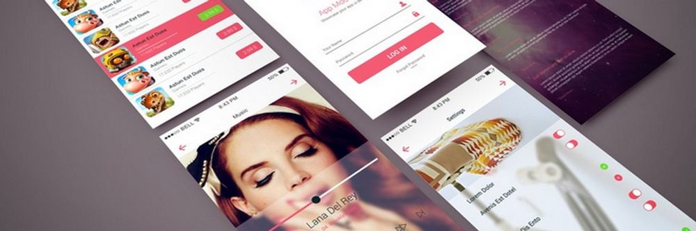
What makes a great user interface (UI) on a website is more than just a collection of pretty images arranged well—the websites that pluck chords, drive effective user experiences, and resonate with users are ones that ignite them to stay on board and enjoy the brand experience. Meanwhile, these sites serve as prime examples of innovation and well-executed design work where the designers have applied design principles so well that they’re there to learn from, too, and some main points—or benefits—are there for the taking for you, dear designer of the UI or UX (user experience) type.
In this video, Alan Dix, Author of the bestselling book Human-Computer Interaction and Director of the Computational Foundry at Swansea University, explains how emotion influences great UI design. He shows you how interfaces that balance feeling and function can both delight users and enhance usability, making the overall experience more engaging and memorable.
Show
Hide
video transcript
- Transcript loading…
What is The Power of Great Web UI Design Examples?
For one thing, look on them as problem-solving solutions, and that’s because every single element in a website UI example that’s worth featuring as such—from buttons to color choices to layout decisions—is something the designer behind it designed with a purpose. Look deep into these and you’ll get to understand the thought process behind these design decisions, plus you can arrive at fresh approaches to tackle design challenges of your own. From seeing how others did it, you might stumble upon a novel way to handle navigation—or an inventive method to display information.
Secondly, design trends are perpetually evolving—along with the tech and the rest of the digital world—so you’ve got to keep up with trends, if you’re going to be relevant to your digital product’s users and customers, and hence why it’s such a good idea to come back and review website UI examples on a regular basis.
Another big benefit is how you can learn from successes and failures; as in, see what works from what other designers have done—and apply them as successful strategies (but not talking “copycat” here!)—and avoid doing what (definitely) doesn’t work. More or less following on from that big plus comes the point that a designer can get a source of creativity ignition—and feel stimulated from seeing how others have addressed design challenges.
And—last, but by no means least—is how you as a designer get to leverage the lessons from seeing great examples to improve user experiences in your own digital designs and interfaces—namely ones that are easy to use, engaging, and satisfying for users.
What are Key Elements of Exceptional Web UI Design?
1. Usability and Intuitive Navigation
One of the most vital components of any web UI—let alone a top-notch one—is its usability and navigation, and it’s something (we’re treating these two things together here) that takes careful thought and planning. So, what you want to do is to make good and sure that users can easily find what they’re after and get on with and complete their intended tasks without confusion or frustration rearing their heads and wrecking what should be a beautiful experience. And what the key to the enterprise for that “magic” to happen is for you, dear designer, to put in clear labels, logical pathways, and familiar patterns—as they’ll pull together to contribute to effective navigation.
“Making every page or screen self-evident is like having good lighting in a store: it just makes everything seem better.”
– Steve Krug, Author of Don’t Make Me Think
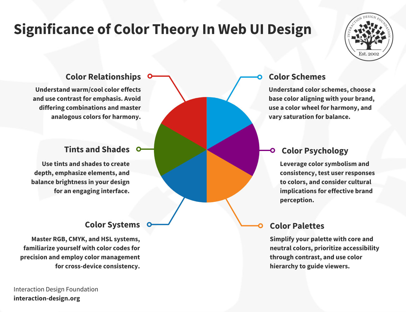
2. Color Theory and Strategic Use of Color Palette
© Interaction Design Foundation, CC BY-SA 4.0
There’s more to color than may meet the eye (and note that this isn’t about the point that colors come out from wavelengths of light being emitted), and what it’s down to here is the fact that colors evoke emotions and can they ever influence users’ perceptions and actions, even to deal-breaker levels, and that is why understanding color theory lets designers use colors—strategically—so they can highlight key elements, create the desired mood, and guide user behavior. What’s more, consistency in the color palette across different parts of your website or application also contributes to a unified and harmonious user experience—and users can enjoy it more, too.
In this video, Joann and Arielle Eckstut, leading color consultants and authors, give six tips to help designers choose colors.
Show
Hide
video transcript
- Transcript loading…
3. Visual Hierarchy and Effective Layout
Why a well-considered layout with a solid visual hierarchy is vital for a UI is in how it guides users’ eyes to the most critical elements first, and you can manipulate size, color, contrast, and placement to achieve this—yes, it’s a strategy, but apart from that, a good layout makes your design more pleasing to the eye, anyway.
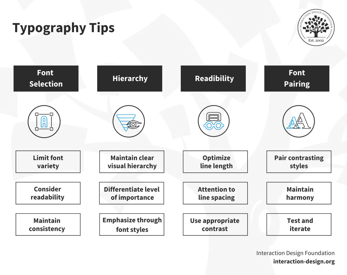
4. Typography and Font Choices
Then there are the words, and—like color—typography plays a crucial role in aesthetics and usability, so not just the words but how they appear, and the right font choice can enhance readability, convey mood, and reinforce your brand’s personality, and so strike a “home run” with already interested users. So, do pay attention to font size, line spacing, and contrast with the background to make sure that your text is easy to read.
In this video, Mia Cinelli, Associate Professor of Art Studio and Digital Design, University of Kentucky, explains how Gestalt principles apply to typography, showing how alignment and flow affect readability.
Show
Hide
video transcript
- Transcript loading…
5. Accessibility Considerations
Next—and note these aren’t in order of importance—accessibility is a crucial consideration in web UI design, and accessible design is serious business—and a legal requirement in many jurisdictions the world over to make sure everyone, including users with disabilities can access and enjoy designs. What that means is you do things like provide alternative text (alt text, for short) for meaningful images, ensure good color contrast, and make your interface navigable with a keyboard for those users who can’t use a mouse.
6. Interaction Design and Intuitive User Feedback
Interaction design is—pretty much like it sounds—about creating a dialogue between your interface and its users, and that means to design how your interface responds to user actions; something that could be as simple as a button changing color whenever it’s clicked or a form displaying a confirmation message after a user submits it. Effective interaction design lets users know what’s happening whenever they perform an action, and—this way—it helps the users understand how the system is reacting to their actions, and so they feel more involved, and valued because of it.
Watch this video to learn more about what interaction design is and the role of interaction designers.
Show
Hide
video transcript
- Transcript loading…
6 Reasons It’s Important to Explore Web UI Design Trends
1. Minimalism and Clean Interfaces
Minimalism in web UI design is—pretty much to mirror what you’d think about rooms in a house—about getting on point with neatness and cleanness and means you use only essential elements and keep a clean, clutter-free interface going. And that’s rather in neat keeping with a “less is more” mantra that shaves down on cognitive load while it gives the UX a nice boost with simplicity and functionality, plenty of white space—aka negative space—and a limited color palette to boot.
2. Microinteractions and Subtle Animations
Now we’re on to microinteractions and “happeningness”—and mircointeractions are small, subtle animations or design elements that react to the user’s actions. They’re things that can be as simple as a button changing color whenever you hover over it, or as complex as a loading animation that keeps you entertained—or maybe “distracted” in a nice way or “de-stressing” way at least—while you’re waiting for the content to load.
Above all, microinteractions provide feedback, guide users, and add a touch of delight to the user experience—and they’re too important to not do anything but become more innovative in how designers use them to find new ways to bolster interactivity.
3. Dark Mode and Alternative Color Schemes
The dark mode is more than a trendy feature or “screen fashion” preference—it’s a practical design choice that reduces eye strain in low-light conditions and can even save on battery life on OLED screens, and, sure, alternative color schemes offer users a personalized experience through their aesthetic appeal and more, so they can customize the interface how they need or want to.
4. 3D Elements and Depth Effects
One of the best benefits of technology advancing—and showing no signs of stagnating, ever!—is how designers get to have more tools to create immersive and interactive experiences. One tool is 3D design, which can (like its 3D movie counterpart) add depth and realism to web UIs. Three-dimensional web design just refers to the art of positioning objects along the x-axis, y-axis, and z-axis—so, three—and so adding depth and movement, which creates a more engaging user experience. And this plays well into the rise of virtual and augmented reality in that 3D elements are almost certainly going to become even more prevalent.
5. Immersive Experiences and Storytelling
Storytelling in web design is as gripping—and important—as it is in books, movies, the spoken word, or you name it, and it means creating a narrative through visuals, text, and interactions to engage users and get a message across to them so the user’s experience is more immersive and memorable. Think of how a website could use animations and interactive elements to guide users through a story as they scroll down the page—and it makes for more engaging online experiences, so storytelling through design is here to stay and grow stronger.
6. Responsive and Adaptive Design Techniques
Responsive and adaptive design approaches or techniques are essential for modern web design—and for modern web UI designs to look right on whatever the device. As people use many devices—from desktops to smartphones and smartwatches—these techniques ensure websites look good—and work well—on any device. Responsive design adjusts to different screen sizes, while adaptive design uses specific layouts for each device—so, they’re massive considerations to make websites more user-friendly and accessible, and for you to think about when you set out a UI.
What Inspiring Web UI Design Examples Have You Got?
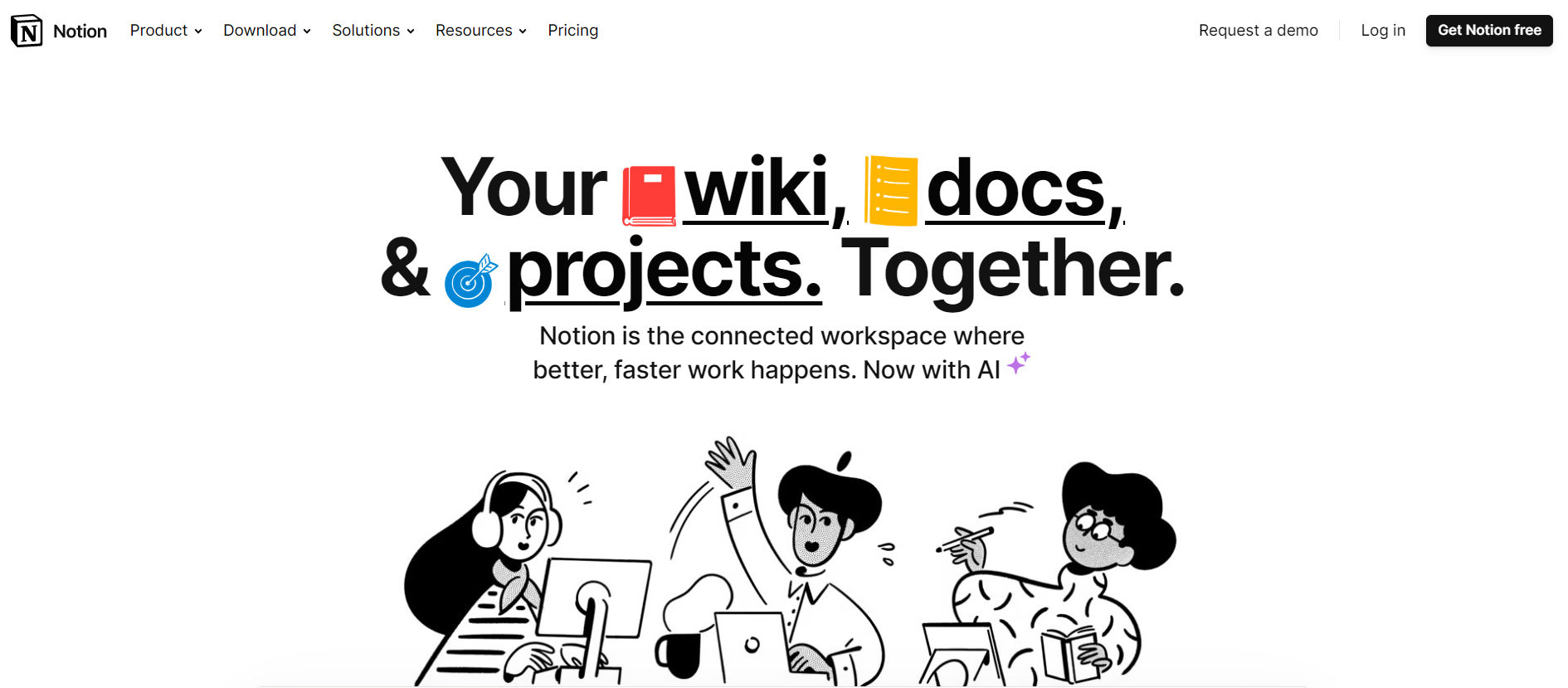
1. Minimal Design: Notion
© Notion, Fair Use
Notion is a versatile productivity app that came out in 2016, and it’s garnered a great deal of recognition as a fine example of user interface design—for good reason—what with the many juicy plusses it’s got. For one thing, it’s got quite an array of functions—ones that include project management, task tracking, note-taking, and documentation storage—and what the result is is a wonderful kind of “Swiss Army knife” of productivity tools. Notion does get a great deal of kudos for its multitude of features, and what’s neat here is how these elements come together so well in a user-friendly interface that lets users tailor the app to their specific needs.
Key Features and Design Highlights
Simplicity: Notion’s got a streamlined, clean, and intuitive design to it, and how easy it is to format pages and content, reference pages, and navigate with the keyboard makes it accessible for first-time users to take to right away while it keeps enough depth going for experienced users to enjoy.
Customizability: It’s a neat application through and through, and it offers a nice and big wide array of layout and component options—a juicy bonus that lets users add elements like media, tables, and Gantt charts fast, and users can personalize notes, files, and navigation structures, all meaning they get to enjoy what is a highly tailored user experience.
Versatility: Notion can replace various tools—from Trello’s Kanban boards to Google Docs’ text editing capabilities—and it integrates well with other tools, like email notifications and Slack, and empowers you to create checklists and submenus fast.
Collaborativeness: But it doesn’t end there—and yet another reason to fete the app is the “working-together factor,” since real-time collaboration is another one of Notion’s strong suits, one that lets multiple users work on a single document and gives visibility as to who edited a document last.
Templates: Notion offers a wide range of templates for various tasks, and it does a considerate thing by easing the learning curve for new users and expedites the task completion process for everyone, to boot.
File management: It’s nice and straightforward to import and structure information in Notion, and it includes an easy-to-use block system.
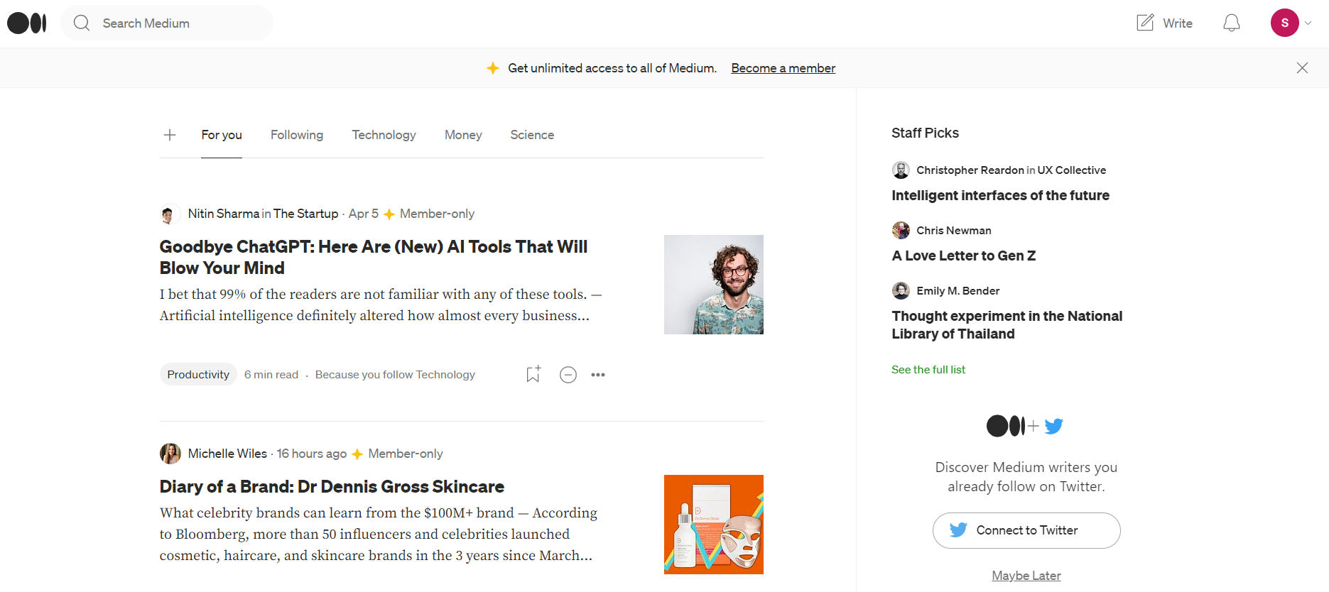
2. Typography-focused Design: Medium
© Medium, Fair Use
Medium is an online publishing platform (established in 2012), and what it exemplifies in our curated pantheon here is typography-focused design in the digital content industry. The platform earns its recognition for its minimalist aesthetic, which prioritizes readability and user engagement in an ultra-neat way, where a smooth reading experience for readers happens, one that helps them understand what they’re reading, and encourages them to engage with the material as well.
Key Features and Design Highlights
Typography-centered: The primary element of Medium’s design is its typography, and Medium uses clean, clear, and highly legible typefaces to enhance the reading experience, and—what’s more—the scale, line spacing, and font choice make the text nice and comfortable to read.
Minimalist layout: On top of that, Medium’s got a minimalist, clutter-free design, and this design approach is one that lets users concentrate on the content without distractions from unnecessary design elements, and another big plus on the minimalist front is the generous use of white space—and it further enhances readability and readers’ concentration.
User-friendly navigation: Another thing is how the design lets readers navigate through the site with ease—nice and straightforward—and with a simplified menu and a search bar at the top of the page, readers can find content fast and explore content that interests them with comfort and ease.
Intuitive interaction: Medium does a neat thing in how it incorporates features that encourage user interaction—things like highlighting text for commenting or sharing, plus the scroll progress bar is another unique feature that provides visual feedback on how far they’re along in an article.
Responsive design: Last—but not least—Medium’s responsive design adjusts to different screen sizes—a nifty plus that ensures that the typography remains readable and visually appealing across devices.
© Interaction Design Foundation, CC BY-SA 4.0
3. Animated Design: Jitter
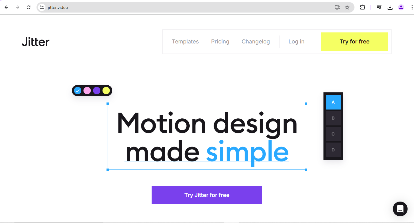
© Jitter, Fair Use
Jitter has marked its presence as a comprehensive and browser-based tool to create animated motion designs, and this one is really neat in how it embodies simplicity in its design in how its platform offers an intuitive interface that makes quick and efficient work an easy thing to get on with. Jitter gets praised as the “Figma for motion design,” which is nice and in line with its goal of enabling creators and teams to produce stunning animated content and interfaces without effort.
The tool’s straightforward and intuitive design—together with its powerful features—gives it a distinctive position in the design tool landscape, a nifty distinction that’s mirrored in Jitter's achievements, such as winning the #3 spot in the design tool category in the Golden Kitty Awards 2021 and the Product of the Week in 2023.
Key Features and Design Highlights
Engaging animation and illustrations: One of Jitter’s neat defining traits is what you can find in its vibrant and interactive animations and illustrations—in that they don’t just capture users’ attention but guide users through the platform’s primary features, too.
Streamlined layout: And, with its user-friendly interface and a neat layout, the Jitter website is one that promotes seamless navigation, and the simplicity that you’ve got in the design enables easy exploration and comprehension of the tool’s nifty offerings.
Harmonized navigation: Jitter’s homepage is an artistic amalgamation of text, straightforward design, and card-based elements—and this blend is nice and visibly prominent as you navigate down the site to create a visually appealing and functional user experience that’s fun to stay on.
5 Best Practices for Creating Remarkable Web UI Designs
1. Conduct User Research and Gather Insights
Before getting right down into diving into design work in earnest, you’re going to have to know your users and their needs pretty much “inside out,” and that’s where your user research—or UX research—needs to come into play (and to “save the day” one could say!). You’re trying to understand your users’ behavior, likes and dislikes, and what they expect from your design.
Show
Hide
video transcript
- Transcript loading…
Different techniques can help you get this crucial information in, and you’ve got surveys as one thing to use—for instance—which can give you a broad overview of users’ opinions and habits. Direct user interviews can give up deeper, more personal insights, and observation methods can reveal how users interact with existing products in real-life situations. From this research, you gather valuable insights, you get to understand the problems your users face, and you learn what they prefer—and you can take all these insights and with them guide your design decisions to great effect.
2. Create Effective Wireframes and Prototypes
Now you’ve got your research done—wonderful!—and so it’s on to wireframing and prototyping, being the good and handy activities they are, with wireframes being like the blueprint of a design (akin to how you’d have one for a house). Wireframes are basic sketches of how your web page is going to look, and they show where you’re going to place elements like buttons, images, and text. What they don’t include are things like colors or specific design details, but they don’t need to, anyway, as their goal is to give a clear view of the structure and layout of your interface.
© Interaction Design Foundation, CC BY-SA 4.0
Then comes the prototype or prototypes, plural—kind of like a test model of your final product when it’s high-fidelity (but you can, and should, start with low-fidelity prototypes so you can test and revisit them before costs start mounting). A hi-fi prototype gives a sense of how your design will work in practice, which means you can click buttons, navigate menus, and more.
At any rate, both wireframes and prototypes let you try your ideas before spending time and resources on their development—and they’re like safety nets in that they can help catch potential issues early on and so prevent costly changes from coming about.
3. Do Iterative Design and Usability Testing
Design sure isn’t a one-time thing—it’s a loop and you sketch a design, test it, collect feedback, make improvements, and then test it over again, and that’s a cycle that repeats until you’ve got a polished design that meets user needs, what we call the iterative design process. For example, some elements may end up being unnecessary and you’ll need to remove them; other ones may need tweaking or even insertion if users are having trouble performing tasks and doing what they want. They shouldn’t have to pause to think about the digital product you’re giving them—that hesitation can break the “magic” of a seamless experience, and you don’t want that.
Note that “testing” part well—not least because usability testing is a key part of this process, and you’ll find that when you observe real users interacting with your design it’ll be eye-opening, rewarding, and even enjoyable, to say nothing of the relief you can feel. Through usability testing, you can spot problems that you, as the designer, might miss—and that’s because you might be too close to the design to see some issues, but users, who see the design with fresh eyes, can quickly identify areas that need improvement. Like, for instance, if tests show users do a great deal of backtracking instead of getting to the feature they’re after right away, the information architecture (IA) may well want a revisit from you.
4. Incorporate User Feedback and Continuously Improve
Imagine for a moment if you could read your users’ minds—well, maybe you’d want to read their minds for longer than a moment, but you get the idea—and how it would make your design process a whole lot easier. Still, at least user feedback is the next best thing to try for—and it’s far more “gettable” than telepathy attempts—and it’s a treasure trove of information that can guide you in improving your design so it is indeed all about user-centered design. What’s more, they’ll tell you what they love about your design, too—something that’s just as important (not to mention a great morale booster!).
Then, when you get to incorporate users’ feedback into your design, you make it better from how you fix issues, enhance the positive aspects you now know that work, and—a major key point—boost the user experience overall. Something else “magical” happens, though, and that’s that you show your users that you’re listening to them—and show them how you validate their experience, and show them their opinions do count and then some in shaping the design. And, in that way, user feedback isn’t just about enhancing your design—it’s about feeding and fostering a relationship with your users, and about creating a dialogue that leads to continuous improvement and growth.
Watch this video, where UX Design Pioneer and Author, Don Norman explains important points about User Centered Design and what it involves.
Show
Hide
video transcript
- Transcript loading…
5. Collaborate with Developers and Stakeholders
As great as your design skills are, a design project is pretty much like a team sport—and you can’t win all alone, but—as a designer—you’re bound to be part of a larger team that includes developers (the “techy” folks who’ll bring your design to life and so need to “get” your design intentions) and stakeholders (typically, the business and brand people).
You want things to come out right, and apart from doing regular check-ins with the dev people, be sure to get with the stakeholders—not least as they’re the ones who define the business goals and so you’ll need to make sure that your design runs in line with those goals. That’s why it’s vital to stay in touch with stakeholders, to understand their expectations, and to incorporate their feedback so things come out right for them, too, and to be able to present to them so they “get” what you're getting at.
Other things that help are to keep a clear record of all your design decisions—and particularly document, for instance, why you picked a certain color or placed a button in a specific spot, and in this way everyone on the team can understand the reasoning behind your design choices.
© Interaction Design Foundation, CC BY-SA 4.0
The Take Away
These web UI examples are to serve as a great source of inspiration, and if you take your UI or UX designer’s skillset—including a creative nature and solid grasp of design principles and more—you can adapt and customize these concepts to fit your project’s specific needs, and so use them as a kind of foundation to create your unique solution. From the user research and wireframing and prototyping you do, through when you usability test and iterate on your design, then incorporating what you find from users continuously, and then to collaborating with developers and making sure your design solution is spot on with what the brand’s stakeholders are after as well, you’ve got a solid “runway” from which to launch the ideas you develop.
Each great design example follows consistency, user-centricity, or simplicity, so be sure to identify these principles and think about how they can guide your design process—which could mean you create a consistent visual language, prioritize usability over aesthetics, or keep your design simple and intuitive for the unique and effective design solution you end up tailoring for your target audience. Get a solid grasp of your users, the users’ contexts, and business goals and you’ll be able to create a delightful experience that meets those goals and marries creativity and functionality in a design that may itself become a source of inspiration to other designers.
Join our beginner-level UX courses designed to ground you in the essentials. And for those ready to take their skills a notch higher, our intermediate courses are readily available. These have been curated to propel you toward your next professional milestone. Step into this exciting world of design with us and let your learning journey commence.


