
Color is vital in UI (User Interface) design because not only does it enhance the aesthetics on screens, but it shapes the UX (User Experience), stirs emotions, and influences the decision-making of users who arrive on those screens. Color creates an impactful dialog between what you design for your brand and the target audience so the right message gets across, and that’s why it’s important to understand what a UI color palette is and what it can do, including the theory dimension, best practices and tips, and the latest design trends.
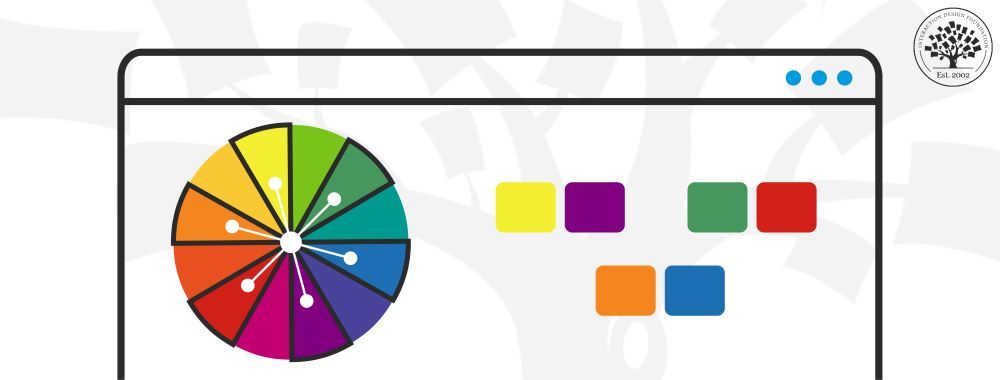
What Are UI Color Palettes?
A UI color palette is like a designer’s paint box: A carefully chosen set of colors that shape how an app or website feels. It creates visual harmony for your target users and brings your brand to life, keeping its look and personality consistent across the entire interface. Another main idea with color use is to create a seamless and cohesive visual experience for users while the brand’s message flows across to them, and they feel guided to do what they’re there to do without needing to hesitate to think about the interface.
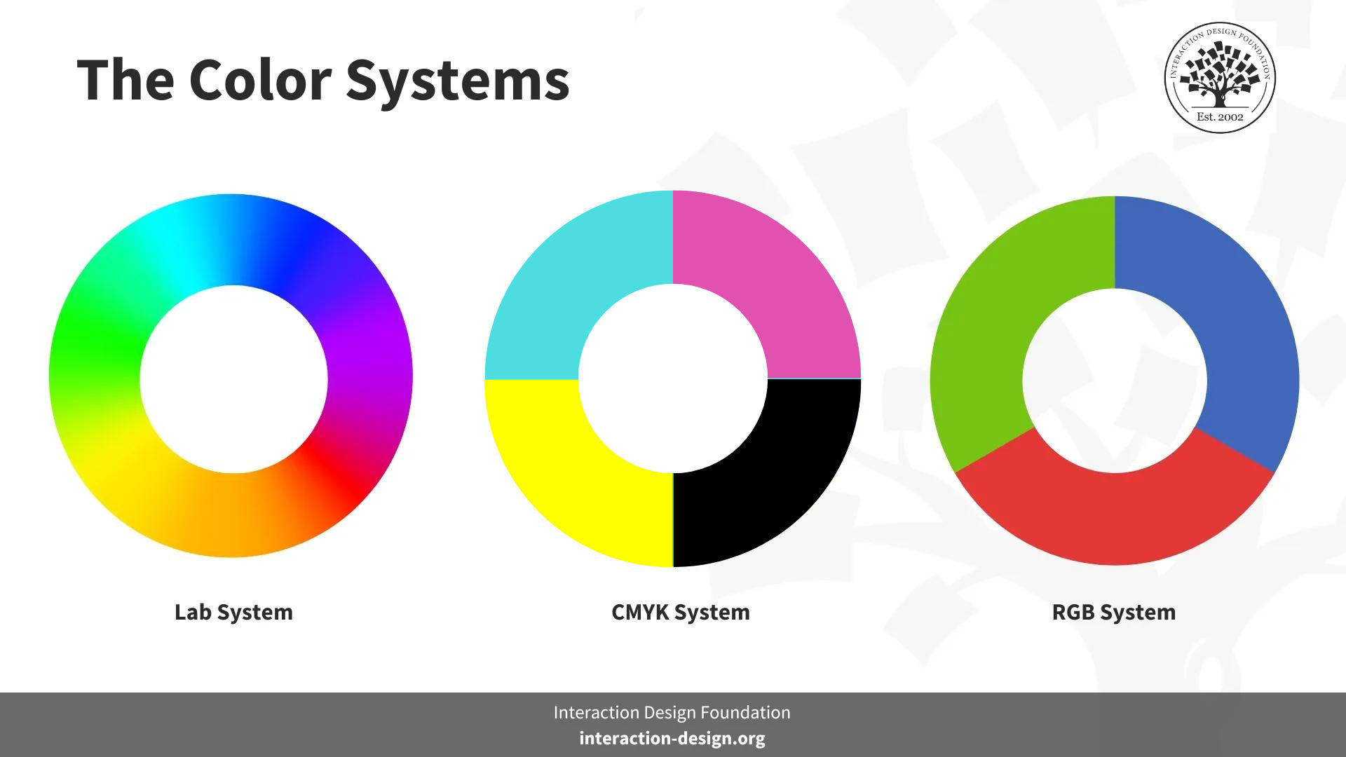
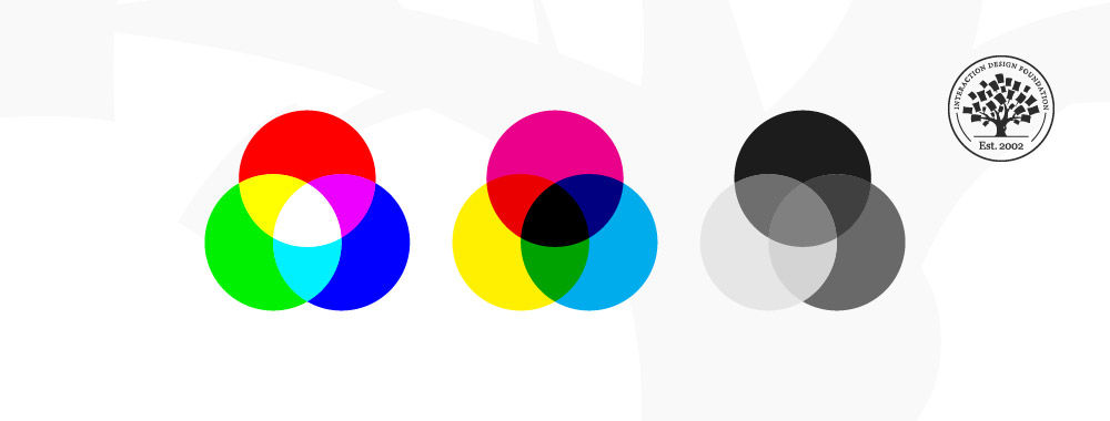
Something else that’s fundamental to understand is how a color palette works with a color system. A color system is a standardized and structured way of defining and organizing colors, with examples like RGB (red, green, blue, which is what UI designers use with these three as the primary colors), CMYK (cyan, magenta, yellow, key or black), and Lab. Color systems and color palettes work hand in hand.
© Interaction Design Foundation, CC BY-SA 4.0
Learn how to use color to prevent confusion and help your users.
What Are The Basics of Color Theory in UI Design?
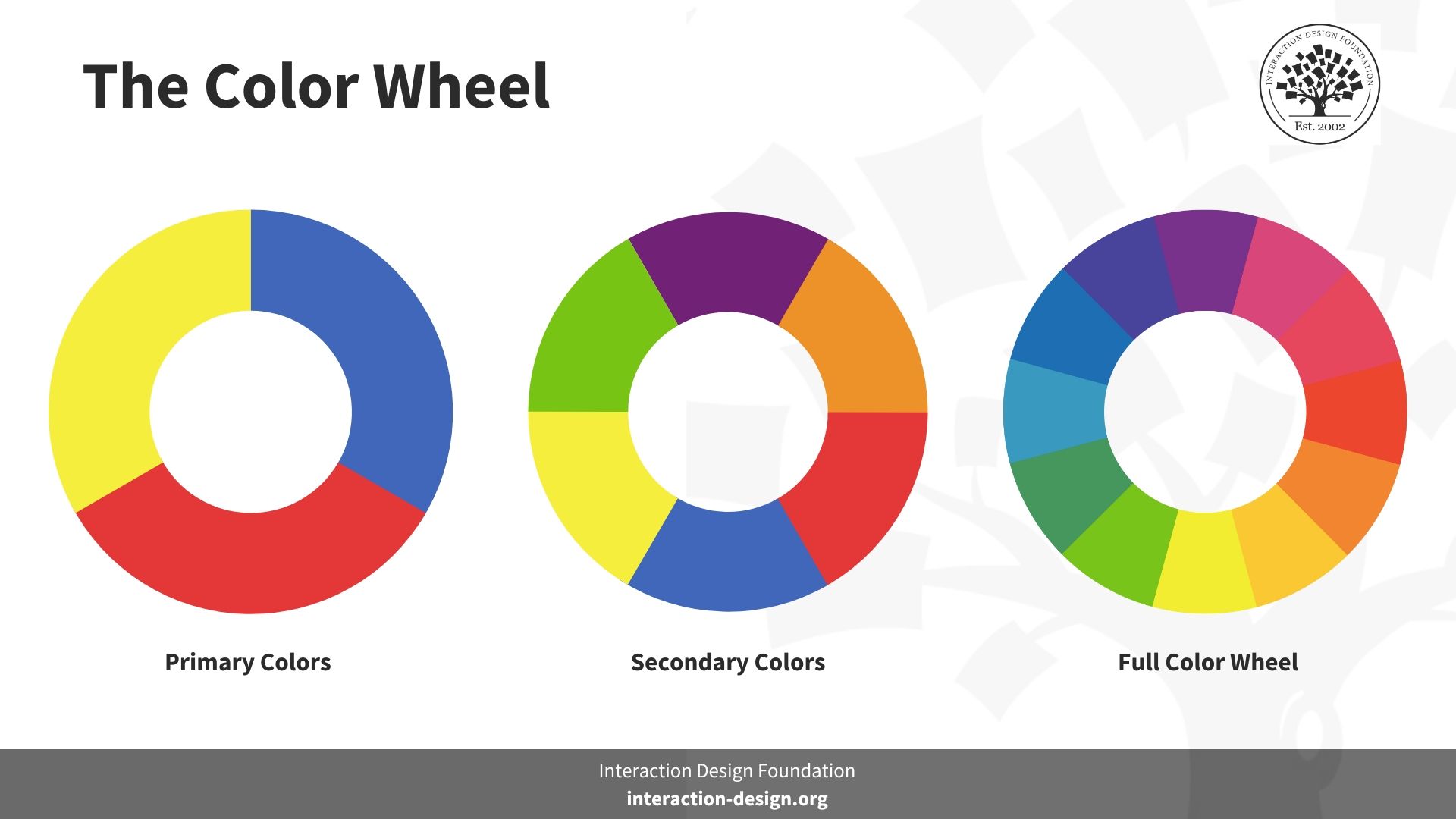
Color theory is the force behind how designers use color in UI design, graphic design, and art. History-wise, when Sir Isaac Newton invented the color wheel in 1666, that’s what established the theory of color that UI designers, graphic designers, artists, and others use.
© Interaction Design Foundation, CC BY-SA 4.0
Michel-Eugène Chevreul, a French chemist, then came up with Principles of Color Harmony (1839), and his simple yet effective rule explains the visual effect known as simultaneous contrast in all kinds of situations. It’s when an observer sees two colors that are side by side or sees one after the other, and each color seems to change in hue and brightness as though it had been mixed with the opposite color from the color wheel. Chevreul’s theory had a great deal of influence in the French Impressionist movement.
Those are the historical foundations, so let’s fast-forward to the present and get right into a breakdown of the critical components of color, which fall under the term HSL (hue, saturation, and lightness).
Hue is the color you pick from a wheel, and it goes by a number that corresponds to a degree marker (as in, degrees of a circle), where 0 or 360 is red.
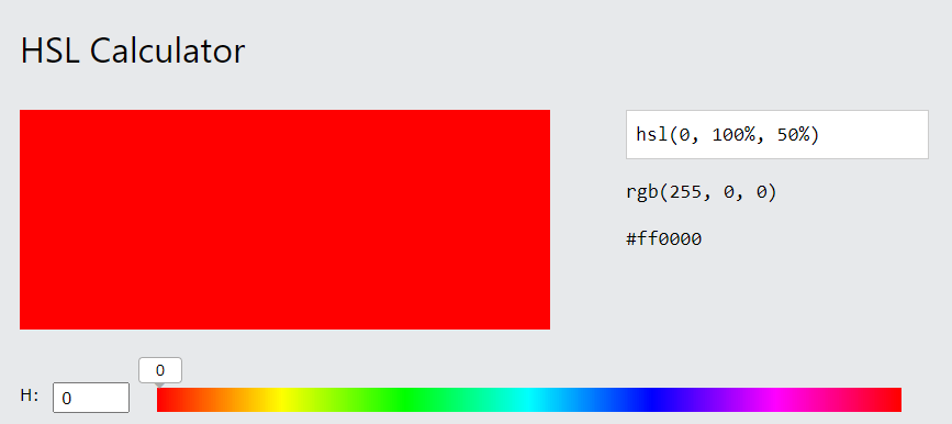
© W3schools, Fair Use
120 is green.
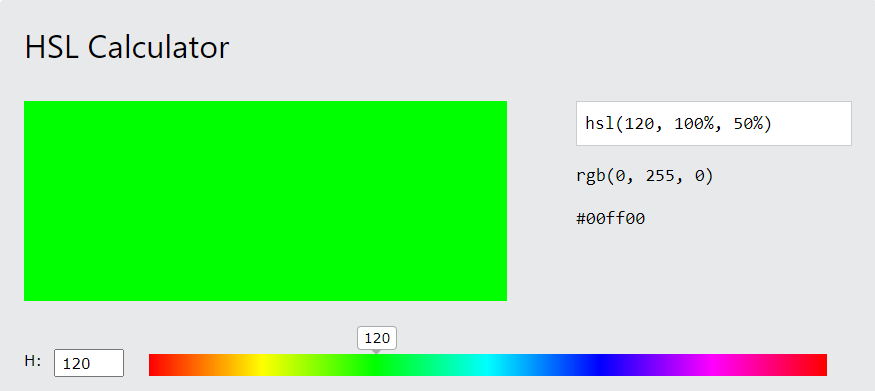
© W3schools, Fair Use
240 is blue.
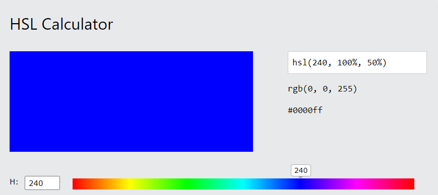
© W3schools, Fair Use
Saturation comes next, and it’s how strong the color you have picked is.
100% means the color is bright, pure, and full.
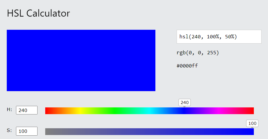
© W3schools, Fair Use
50% means the color has gray mixed in with it.
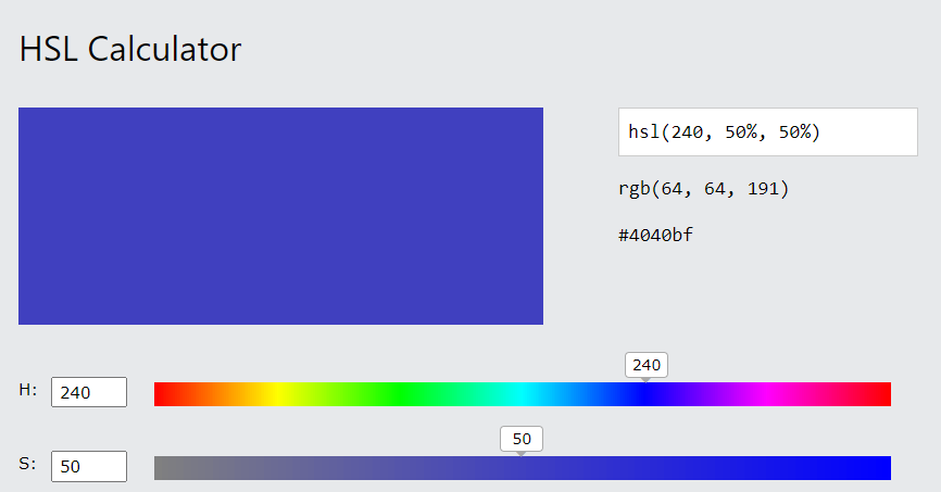
© W3schools, Fair Use
0% means you see only gray: No color (as in, no color other than this very neutral one).
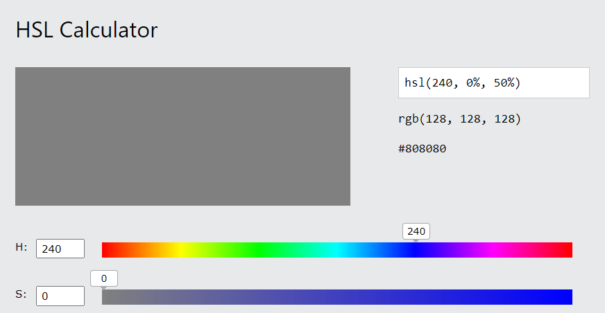
© W3schools, Fair Use
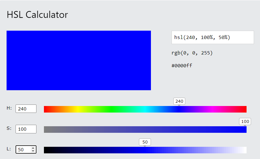
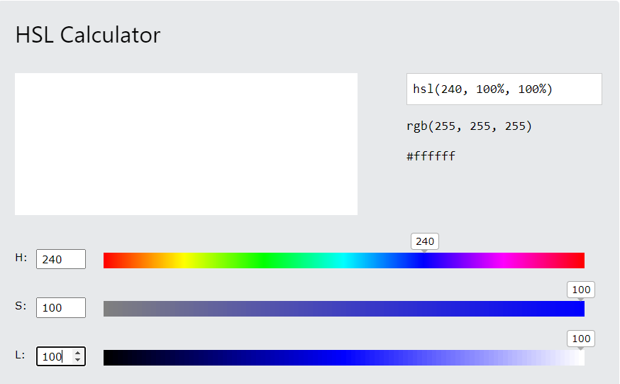
Lightness is, just as it sounds, how much light the color you’ve picked has got in it.
0% is very dark.
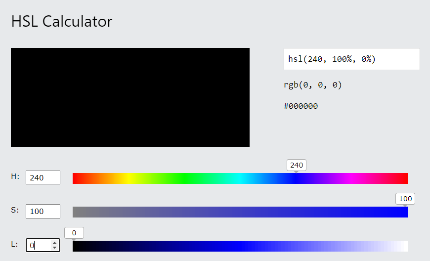
© W3schools, Fair Use
50% is in the middle, and it’s not too dark or too light.
© W3schools, Fair Use
100% is full-power lightness, so a very light or bright color.
© W3schools, Fair Use
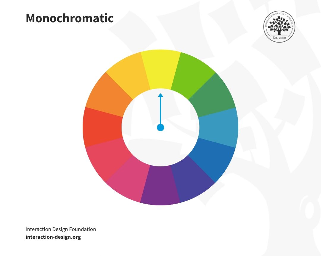
These components are critical things to understand for designers, but the question “How does color theory in UI design play out in practice?” is something we can answer here in that one way to practically apply color theory is to create and use color schemes that work for design harmony. A color scheme is a set of colors that work well together, and you’ve got several main color schemes to choose from for your designs:
Monochromatic: To use a monochromatic scheme, you take one hue and create other design elements from shades and tints of this single color.
© Interaction Design Foundation, CC BY-SA 4.0
Analogous: For an analogous color scheme, you take three colors that are next to each other on the color wheel (for example, blue, blue-violet, and violet) and use them.
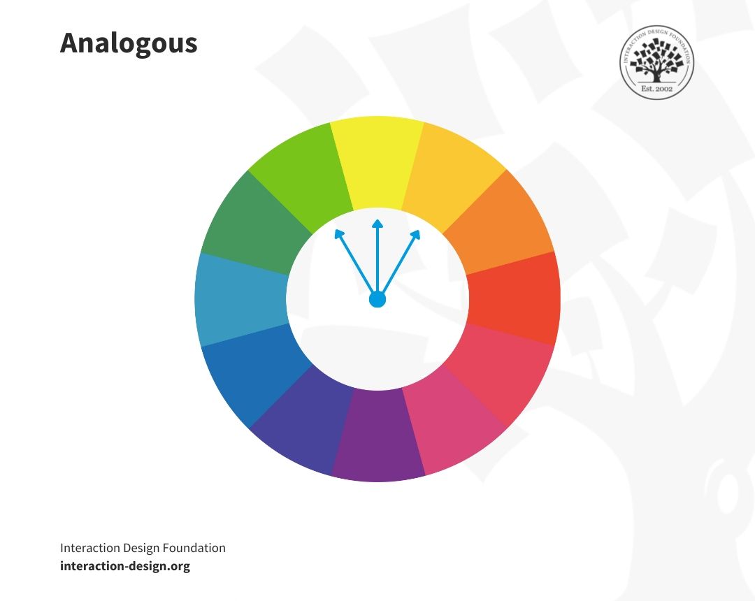
© Interaction Design Foundation, CC BY-SA 4.0
Complementary: For a complementary color scheme, you use “opposite color” pairs (like blue and yellow, below) to maximize contrast.
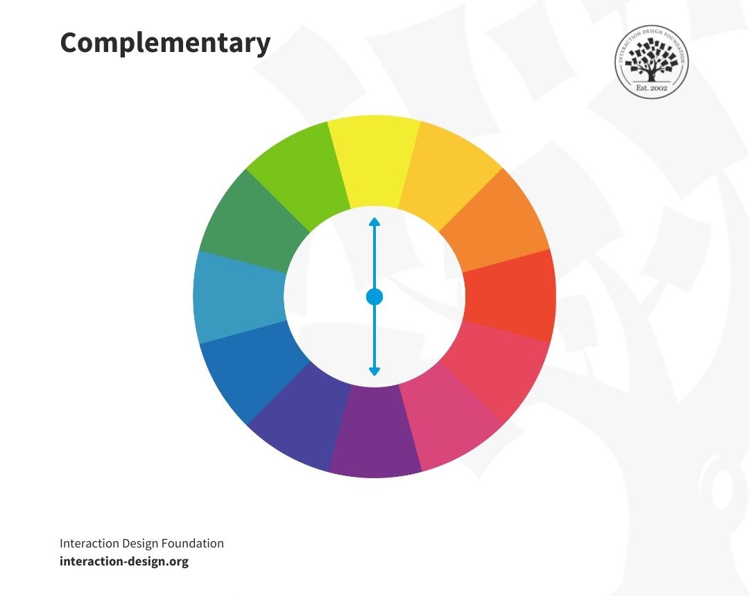
© Interaction Design Foundation, CC BY-SA 4.0
Split-complementary: This one uses colors from either side of your complementary color pair, and it’s a good one to soften the contrast, just go to the opposite of one color and then select the colors that are immediately adjacent to it.
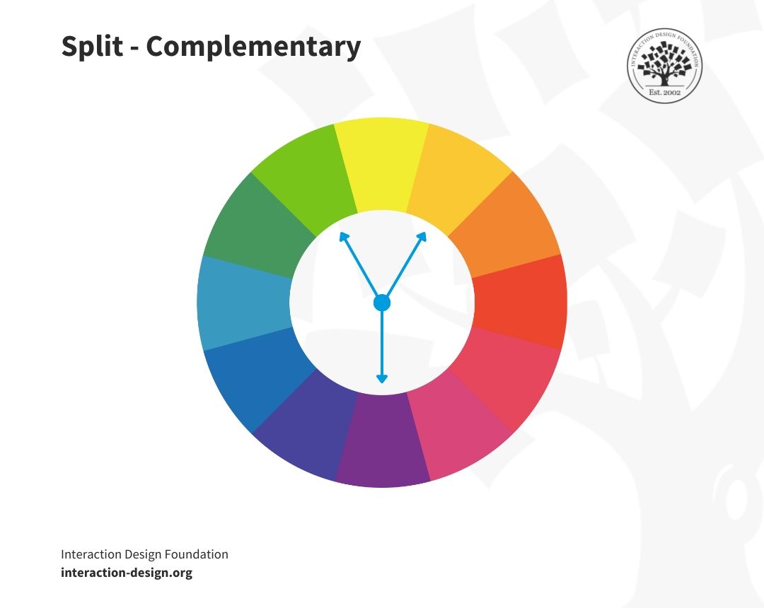
© Interaction Design Foundation, CC BY-SA 4.0
Triadic: For a triadic color scheme, you use three colors that are equally distant on the color wheel. This is an effective color scheme for harmony and high contrast.

© Interaction Design Foundation, CC BY-SA 4.0
Tetradic: For a tetradic color scheme, you use four colors that form two sets of complementary pairs but have one color dominating.
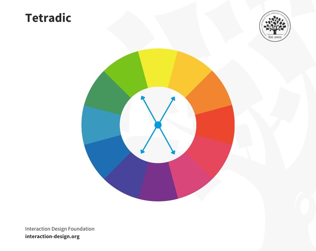
© Interaction Design Foundation, CC BY-SA 4.0
Square: It’s a variant of tetradic, with four colors evenly spaced on the color wheel, and you can think of where the four corners of a rotatable imaginary square touch on the wheel, and these are the colors you use.
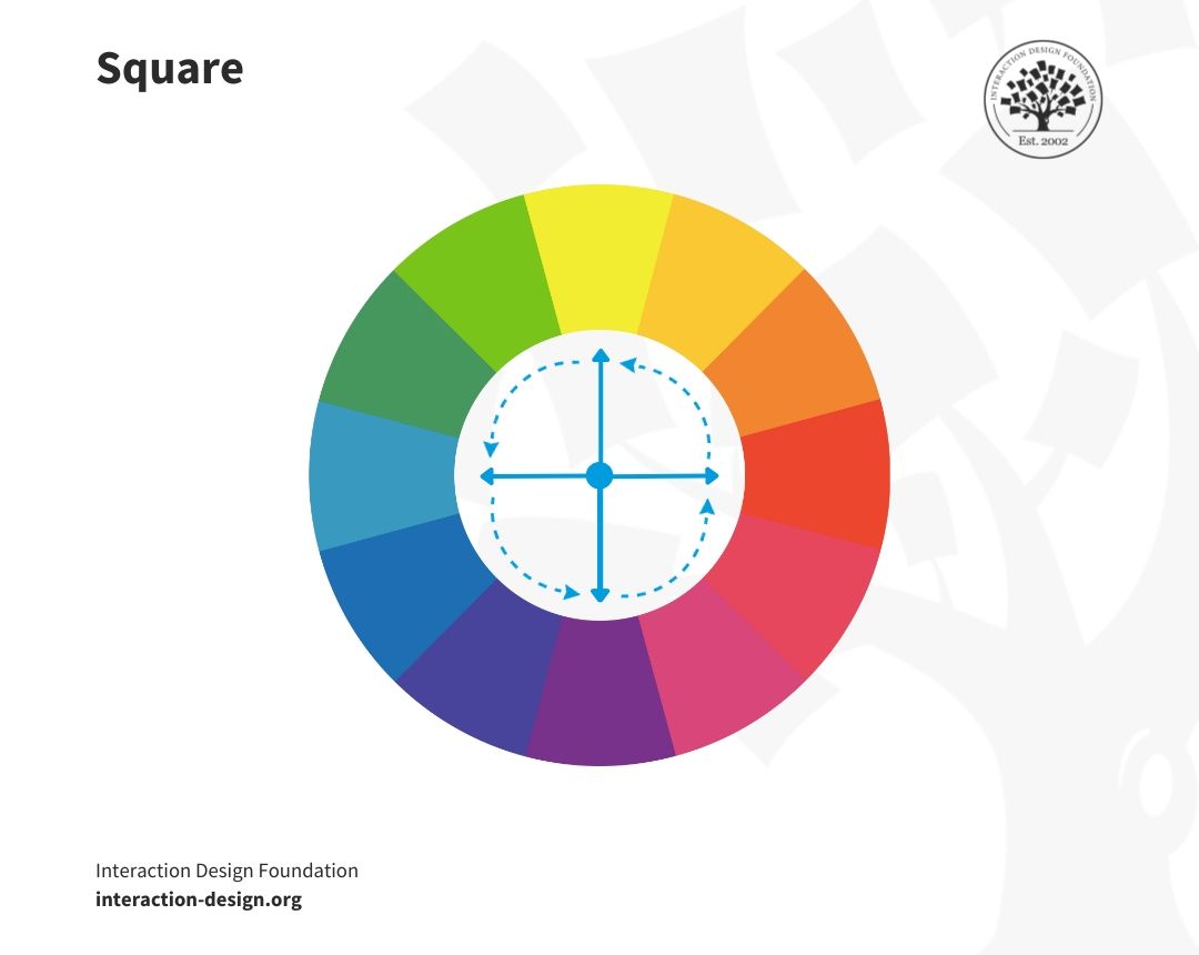
© Interaction Design Foundation, CC BY-SA 4.0
Learn about color theory keywords and their significance.
Color is a powerful communication tool in the digital space, like in print and paintings, to help distinguish elements on a page, contribute to visual hierarchy, draw attention to key elements, improve usability, increase user engagement, and create an aesthetically pleasing user experience overall. For an effective color scheme, you’ll need to think about your brand’s personality, design goal, and the best color temperatures, too, to get the right message across, and it’s helpful if you know color theory keywords and understand why they’re important.

What’s Behind The Psychology of Color in UI Design?
How people interpret colors can vary a great deal from culture to culture, and colors carry a diverse spectrum of associations and feelings (something you’ll need to know as a designer) like these:
Red: Red has an interesting split in potential perceptions from place to place; for instance, it can carry overtones of danger, revolution, passion, or sexiness in the West, but it connotes happiness or good fortune in the East.
Blue: Users (or viewers) the world over can see blue as a peaceful or calming color, although it carries conservative and authoritative meanings in the West, but these can combine to give the sense of trust that you’d find in a banking website, for example.
White: Purity and innocence are what white conveys in the West, but it can symbolize death or the supernatural in Eastern cultures.
Learn more about color symbolism and why it matters so much in design.
How to Create a UI Color Palette: Trends and Best Practices
The short answer is it takes a mix of creativity, a firm grasp of the “timeless” matters (as in, the impact color has on user behavior), and an awareness of current design trends. For a deeper delve into how to make a UI color palette contribute to shaping the entire UX:
1. Choose Primary, Secondary, and Accent/Supplementary Colors Wisely
Your primary color choice is the color that appears most often on the screens you design to guide users toward the key points of the UI, and it’s the color that’s most strongly associated with your brand (for example, Facebook or Meta’s blue). You use secondary and accent colors to highlight and distinguish different parts of the interface, and these color picks need to work well with the primary color choice if you’re going to create an interface that will resonate with your target audience.
A vital point for when you choose a primary color is color contrast, and the Web Content Accessibility Guidelines (WCAG) give standards about color contrast ratio between the foreground and background so it’s high enough to be easily readable for most users. These guidelines state a recommended contrast ratio of at least 4.5:1 for normal text and 3:1 for large text.
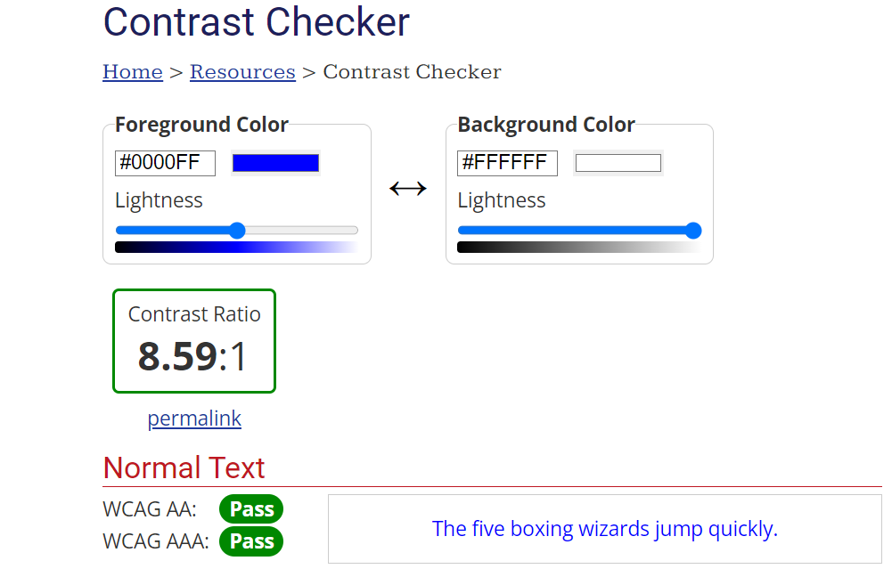
© WebAIM, Fair Use
Primary colors: Pick your primary color, and it should ideally be one of the main colors that’s associated with your brand (your brand guidelines will likely decide this).
Avoid absolute white or black: They can strain the eyes due to their extreme contrast, so go for a grayscale palette from neutral black and white tints instead.
Keep things consistent: Use the same colors for similar interactive elements (like buttons) in your color scheme to help users spot interactive components easily.

Spotify’s UI design is a masterpiece of minimalism, and it’s got its iconic green-and-black color scheme (part of a high-contrast palette that allows easy navigation and boosts the user experience).
© Spotify, Fair Use
2. Follow the 60-30-10 Rule
The 60-30-10 rule is an effective guideline to help you put balance and visual comfort in your design, and the proportions split between primary, secondary, and accent colors, respectively.
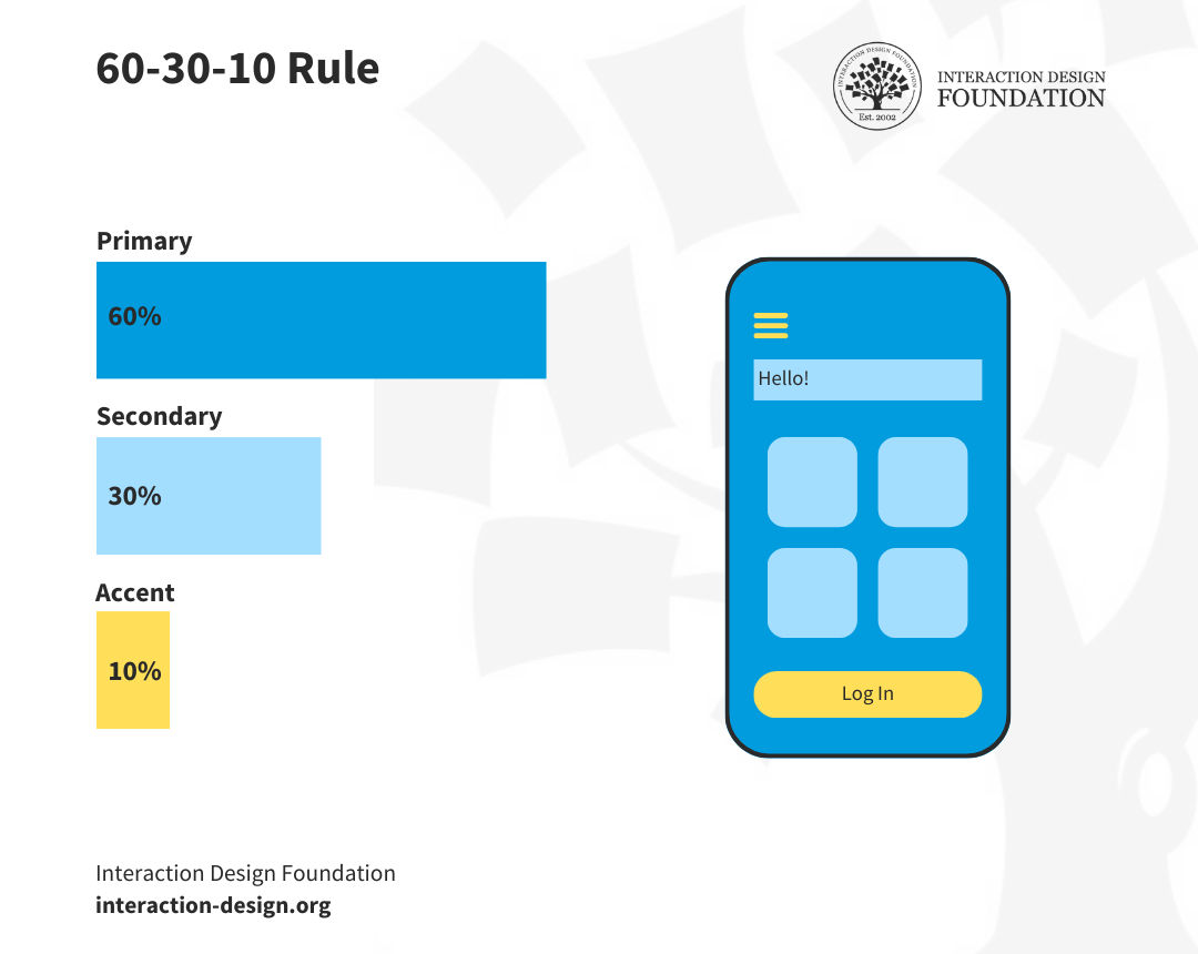
© Interaction Design Foundation, CC BY-SA 4.0
3. Understand Your Audience
As with other parts of design (like information architecture and microcopy) you’re going to have to understand your target audience and what these target users’ needs are if you want to make a successful UI color palette, so always do your user research first.
Watch as UX Consultant and Strategist, William Hudson explains important points about when to do user research and how it helps your design process.
Show
Hide
video transcript
- Transcript loading…
4. Use Photos to Create Your Palette
Nature and architecture can be great inspirational sources for a unique website color scheme, and some online tools and plugins can help you generate a color palette from an image, and so make the process simple and fun.
5. Use Contrast Effectively
Contrast is a vital factor, but too much can make a UI hard to scan, so you’ll need to be sure to strike a balance and test your design on different screens to make sure things work right contrast-wise.

Asana’s multi-color palette represents different tasks and priorities in their project management tool, and the variety in color allows for better organization, categorization, and visual distinction of tasks, too, and it’s a neat factor that enhances usability to higher levels.
© Asana, Fair Use
Best Practices for Accessibility in UI Color Palettes
One part of the puzzle of an effective UI is to create an attractive UI color scheme for your design, and then it’s another whole piece to make sure that it’s accessible for all users. Accessibility in UI design (as is in user experience (UX) design) is a big deal, and a legal requirement in many jurisdictions, and it includes how to get color palettes right so your digital platforms are usable and enjoyable for everyone, including people with visual impairments or any type of color blindness.
What’s more, screen and lighting variations are a big deal, too, and that’s because low-contrast color palettes can mean harder-to-read, and -see, screens in bright sunlight, for example. In any case, have sufficient color contrast (tools like WebAIM's Contrast Checker can check the contrast ratio) and don’t have color-dependent information (but support it through patterns, textures, labels, icons, or changes in size alongside colors, for example, so users with color-blindness can notice what you’re signaling). What’s more, it’s good to test in grayscale to see if your design makes sense and looks good there. Stay away from colors that might trigger seizures from users who may have photosensitive reactions.
Tools for Building UI Color Palettes
You’ve got several online tools that can help build practical, attractive, and accessible UI color palettes:
1. Adobe Color
© Adobe Color, Fair Use
Adobe Color is a favorite in the industry, and it features the option to upload an image and generate a color palette based on it, and a noteworthy feature is how it can check color accessibility, too.
2. Coolors
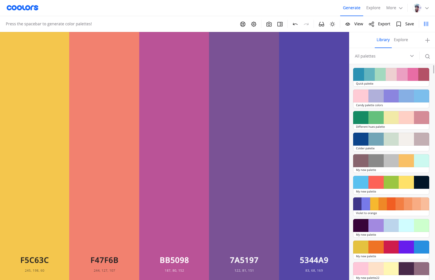
© Coolors, Fair Use
Coolors is an intuitive, fast, and easy-to-use tool for generating color palettes, and you can create, save, and share color schemes with just a single click. What's more, you can explore trending palettes and find inspiration for your designs.
3. Color Hunt
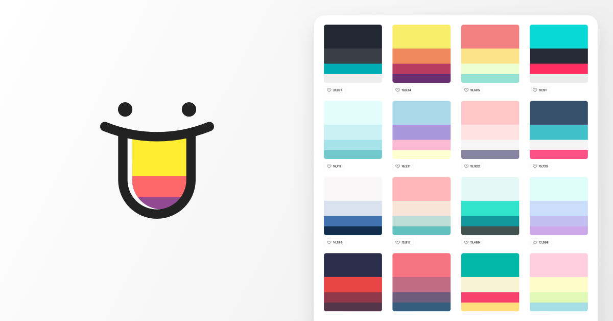
© Color Hunt, Fair Use
Color Hunt offers numerous color palettes that designers around the world create, and it’s a great place to get inspiration and find color combinations other creatives have successfully used, too.
4. Paletton
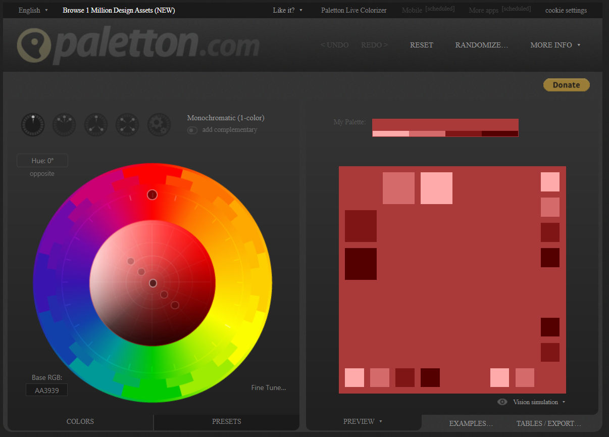
© Paletton, Fair Use
Paletton helps create color combinations based on a selected base color, and it provides a variety of color harmonies you can pick from. What’s more, it gives a preview of how your chosen palette would look in a real-life design.
5. Colormind
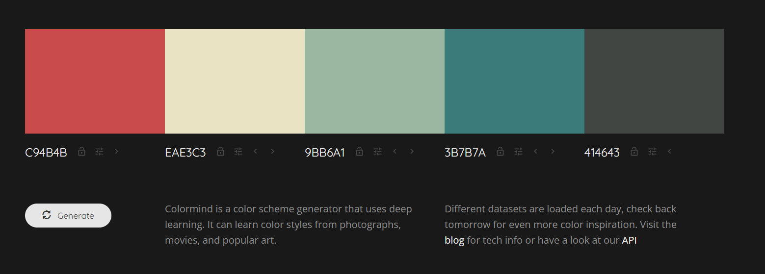
© Colormind, Fair Use
Colormind uses AI to generate color palettes, so you can pick your starting color and then the tool will suggest complementary colors. Plus, it lets you generate color schemes from images or famous movie stills.
6. Contrast Checker
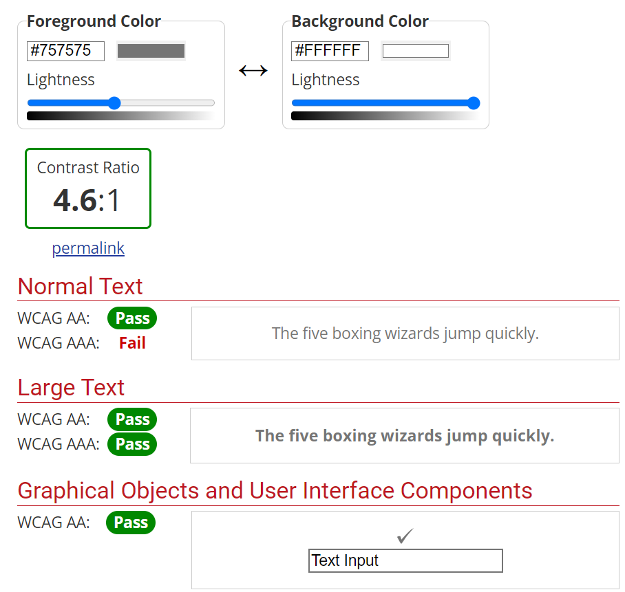
© WebAIM, Fair Use
The Contrast Checker is an essential tool to make sure your color scheme truly is accessible, and it checks the contrast ratio between two colors and lets you know if it passes WCAG (Web Content Accessibility Guidelines) standards.
7. Canva Color Palette Generator
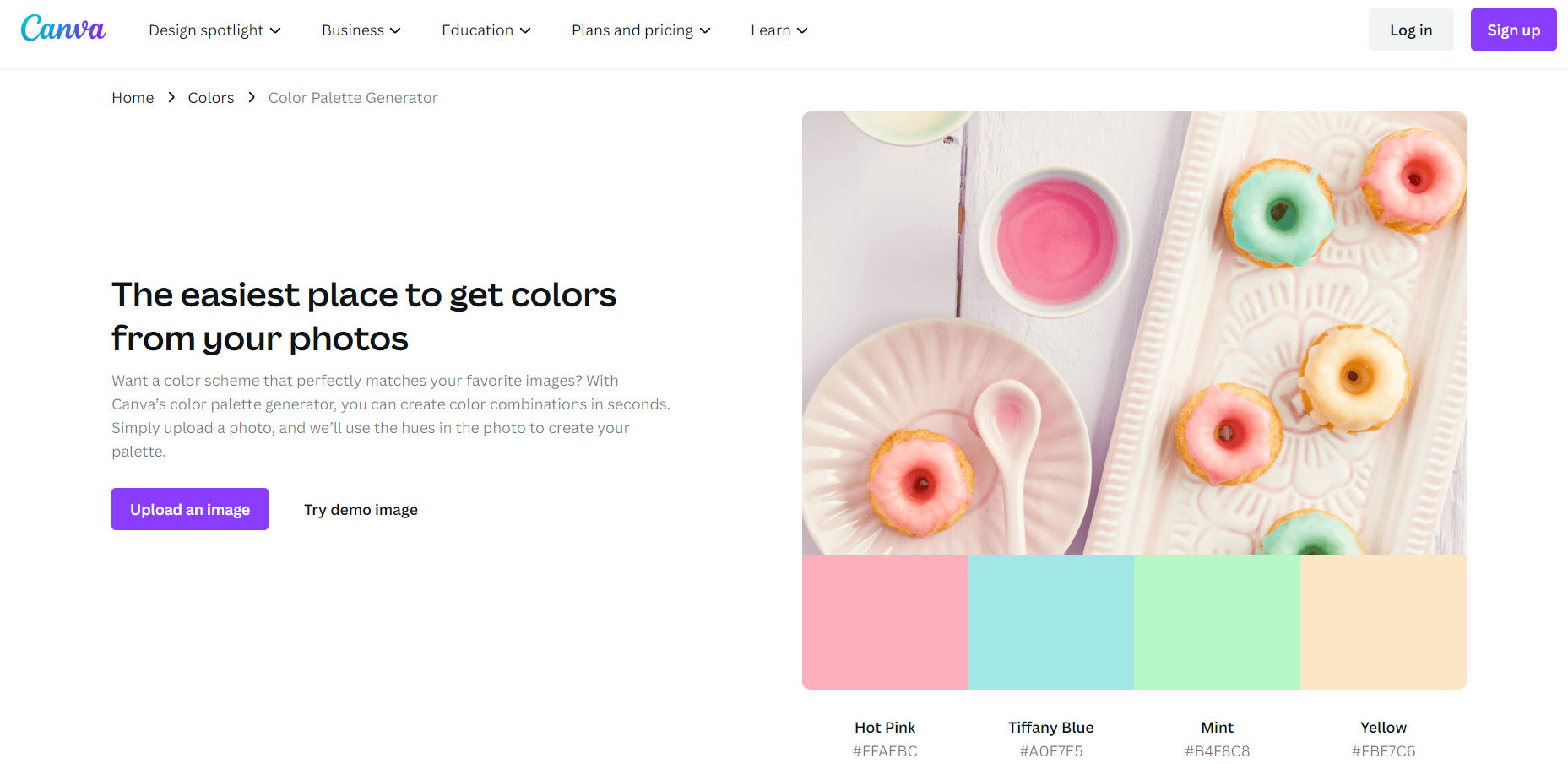
© Canva, Fair Use
Canva’s tool lets you upload an image and generate a color palette based on it, and it's especially handy when you want to create a color scheme that matches a photo or a branding element.
The Take Away
A UI color palette is like your designer’s paint box, and it contains a certain set of colors which you can use to design interfaces with. To build your UI color palette, you’ll first need to understand color theory and recognize the psychological impact that colors have on users around the world, and their culture will also be a deciding factor for them. You’ll also need to carefully select colors that align with your brand’s identity, and then there is the issue of accessibility for users with disabilities, which calls for you to factor in important concepts such as good contrast to help all users.
Color theory itself may be timeless and vital to understand, but it’s wise to keep yourself updated with the latest research and trends and learn from successful examples. You can use online tools to streamline your design process and generate effective, inclusive, and appealing website color schemes.
References and Where to Learn More
Dive deeper into color theory with the Visual Design: The Ultimate Guide course.
Take your UI skills to the next level with our curated UI Designer learning path.
Color can also be used deceptively. Find out how to avoid falling into these color traps in Use Color to Prevent Confusion and Help Your Users
Short on time for a full course? Watch this Master Class webinar by Color consultants and authors Arielle and Joann Eckstut, How To Use Color Theory To Enhance Your Designs.


