Visual aesthetics, as discussed in this chapter, refers to the beauty or the pleasing appearance of things. We discuss the importance of visual aesthetics in the context of interactive systems and products, present how it has been studied in the field of Human-Computer Interaction (HCI), and suggest directions for future work in this field.
19.1 Introduction
To scholars and practitioners in the field of HCI at the early 1990’s, the idea that aesthetics matter in information technology sounded heretic. Two decades later, in the early 2010s, this thought has conquered a solid place in both academia and industry. While experimentation with computers’ ability to generate visual art dates back to the 1960’s (Nake, 2005), systematic research on visual aesthetics of interactive systems can only be traced to the mid-1990’s (Kurosu and Kashimura, 1995; Tractinsky, 1997). Since then, a steady stream of studies has explored various aspects of this area. The timeline of this research has roughly corresponded to even more dramatic developments in the information technology industry. Since the later 1990’s, a strong shift towards visual aesthetics has swarmed the industry. The increased interest in aesthetics among the industrial and academic communities reflects the maturation of the HCI field and the overcoming of many of its growing pains as a discipline that struggles with unreliable technology on the one hand and with the need to satisfy users’ basic requirements on the other hand. Additionally, broader societal processes emphasizing design and style emerged at about the same time (Gibney and Luscombe, 2000; Postrel, 2002), further reinforcing shifts towards aesthetics of products in general (Bloch, 2011) and specifically of interactive systems. A more detailed account of this process is provided in Tractinsky (2004) and Tractinsky (2006).
Udsen and Jørgensen (2005) identified several approaches to the study of aesthetics in HCI. “Visual aesthetics”, as described in this chapter, correspond roughly to the approach which Udsen and Jørgensen identified as “Functionalist”. To be specific, and to distinguish the subject of this chapter from other similar terms, I use the term “aesthetics” in its fairly ordinary and common sense as reflected in dictionary definitions such as “an artistically beautiful or pleasing appearance” (The American Heritage Dictionary of the English Language), or as “a pleasing appearance or effect: Beauty” (Merriam-Webster’s Collegiate Dictionary). The term “visual” indicates concentration on the visual sense, which is the central human sense, occupying “almost half the brain” (Ware, 2008, ix). Thus, this chapter is not about various other phenomena studied under the “aesthetics” heading, such as literary aesthetics, abstract forms of aesthetic experiences or criteria (e.g., the elegance of mathematical proofs), or reactions to object qualities that do not immediately and primarily stem from its visual attributes.
In addition, a few other characteristics that describe research in the field can be listed. These characteristics describe how researchers in the field approach their subject matter. First, the approach of researchers in visual aesthetics reveals a bias towards positive effects of visual design, an issue to which I will return later in this chapter. Hence, research in this area commonly studies the beautiful and pleasing appearance of artifacts, or designed objects that are based on computing technology, rather than the effects of their ugly and displeasing counterparts. Second, at a Dagstuhl workshop on visual aesthetics in HCI, held in 2008, a majority of the participants adopted an interactionist approach to the study of visual aesthetics, noting that the aesthetic experience consists of people’s reactions to objects as opposed to aesthetics that are inherent in the object per se (Hassenzahl et al., 2008). These reactions include both individual idiosyncrasies and tastes, but also considerable agreement between individuals and experts, to a point where they may be considered “quasi-objective” (Hoyer and Stokburger-Sauer, 2011). Third, while the Dagstuhl workshop mentioned above failed to reach a consensus over the time frame that appears relevant to visual aesthetic reactions, my own position is that it can encompass the entire range from very quick, visceral reactions to very long, contemplative evaluations. Fourth, the processes involved in designing and evaluating visual aesthetics are both affective and cognitive. Finally, research in the field of visual aesthetics is primarily empirical and is characteristically descriptive (i.e., “what is considered beautiful”) rather than normative (i.e., what should be considered “beautiful”) (Hassenzahl, 2004b). This important distinction stresses its roots in applied research and differentiates the field from artistic or philosophical writing on the subject.
The objective of this chapter is to survey the field of visual aesthetics in HCI. We start by delineating the importance of visual aesthetics to HCI from three perspectives. We then present a research framework that serves us in reviewing key findings in the field. These aspects include issues such as what makes systems look aesthetic, what are the effects of visually aesthetic systems, and what mechanisms are involved in people’s judgment of aesthetics in the context of interactive systems. We also discuss methodological aspects and challenges for further research.
19.1.1 The importance of visual aesthetics in HCI
The importance of visual aesthetics to the field of HCI can be argued from various perspectives. Here I present three such perspectives - the design perspective, the psychological perspective, and the practical perspective. Although these perspectives are not meant to be exhaustive, I believe that, taken together they cover the lion share of arguments for the inclusion of visual aesthetics as a major aspect of HCI practice, research and education (Tractinsky and Hassenzahl, 2005). While these are distinctive perspectives, they may overlap at certain points. Finally, to some it may seem somewhat redundant to submit these arguments, as they have gained considerable acceptance in the HCI community in recent years. Still, I believe that it is important to present them in an organized fashion to clarify my point of view and to provide people in the community a set of arguments that can be used to make a case for visual aesthetics before other audiences (e.g., software and hardware engineers, product managers, etc.).
19.1.2 The Design Perspective
Despite being one of the youngest design disciplines, the development of interactive technology has quickly become one of the most salient design activities. The mutual relevance of HCI and Design has long been recognized (e.g., Winograd, 1996), but what are the implications of this to the research, practice and education in HCI? Here, I would like to point out two such implications. The first implication is the recognition that aesthetics constitutes an important and integral part of any design discipline. The importance of aesthetics increases as the interface between the artifact and the affected people (e.g., in terms of visual saliency, length of interaction or co-habitation) becomes more comprehensive. The second implication is that visual aesthetics is often related to other design aspects. Thus, not only should we not worry about trading off aesthetic and other qualities of interactive systems; we should embrace aesthetics as a dimension that augments other aspects of the design and the overall interactive experience.
19.1.2.1 The Vitruvian design principles
Vitruvius (1st century BC) is probably the first person to lay forth systematic and elaborated principles of design. It is not surprising that architecture was the subject of his elaborated writings, being the most salient and complex design discipline, which has affected human life ubiquitously. In addition to the fact that information technology and interactive systems have now become just as ubiquitous, it is not difficult to see that there is much in common for architecture and information technology (e.g., Brooks, 1975; Hooper, 1986; Lee, 1991; Kim et al., 2002; Visser, 2009). It is reflected by the term “information architecture,” used by professionals to designate the process of creating information-based environments and systems. The similarities between these two disciplines can be illustrated by considering Vitruvius’s three core principles of sound architectural work. Firmitas, which is the strength and durability of the building; utilitas - the utility of the building, its usefulness and its suitability for the needs of its intended inhabitants and users; and venustas - the building’s beauty. In architecture, the Vitruvian principles have been influential since their rediscovery in the 15th century (Johnson, 1994; Kruft, 1994). Today, for example, they serve as a basis for the Design Quality Indicator, developed by the Construction Industry Council in the U.K. to evaluate the design quality of buildings (Whyte et al, 2003).
It is straightforward for the various computing and IT disciplines to recognize firmitas as the core principle of their research and practice. The need for robust, reliable and dependable software, hardware, systems and products has occupied the field since its inception. We might say that, just as firmitas serves as a prerequisite for designing structure, so do we consider it a precondition for any IT system or product.
Whereas there is little disagreement about the importance of firmitas principle, the computing community was originally much less enthused about the utilitas principle. In the context of IT, this principle deals with designing to meet individual and organizational needs and goals, with emphasis on the efficiency and the effectiveness of the interaction between people and artifacts. In fact, the HCI community can take much of the credit for incorporating the utilitas principle into mainstream practices in the computing industry (cf. Tractinsky, 2006). The field of HCI has its roots in attempts to study and design systems and product that will allow people to use them efficiently (Card et al, 1983). The notion of usability, for example, which has served as a centerpiece of the HCI community has permeated not only other parts of the IT industry, but have gained almost universal recognition and support for the values of human-centered design. One of the most widely referenced models on people’s relationships with information technology - the technology acceptance model (TAM) - suggests that a system which is easy to use and provides more useful features is more likely to be adopted by its intended users (Davis, 1989).
With firmitas and utilitas in place, the computing community in general, and the area of HCI in particular, are still missing a key Vitruvian principle. For years, beauty and delight were considered by the HCI community as gratuity, often to be avoided. The emergence of beautiful interactive products during the first decade of the 21st century , which led to commercial success and to academic research (e.g., Kim et al., 2002; Liu, 2003; Tractinsky, 2004), has demonstrated quite convincingly, that as in other design disciplines, the third Vitruvian leg, venustas, should be fully embraced as cornerstone of designing interactive technology (see also, Fishwick, 2006).
Author/Copyright holder: Courtesy of Mark Pellegrini. Copyright terms and licence: CC-Att-SA-2 (Creative Commons Attribution-ShareAlike 2.0 Unported).
Figure 19.1
Copyright terms and licence: pd (Public Domain (information that is common property and contains no original authorship)).
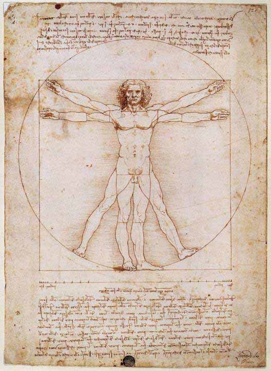
Figure 19.2: The Vitruvian Man drawing was created by Leonardo da Vinci circa 1487 based on the work of Vitruvius. By empirically measuring and calculating the proportions of the human body, Vitruvius may also be considered the first student of ergonomics.
19.1.2.2 Aesthetics and other design principles overlap
HCI and usability experts used to warn against putting too much emphasis on aesthetics (e.g., Norman, 1988; Nielsen, 1993). Their warnings seem to reflect a concern about the ability of these two design aspects to coexist. Beauty was a hurdle on the road to good design. If designers emphasize aesthetics they by default sacrifice usability. This viewpoint has been changing gradually, thanks in part to a stream of research findings that suggest that at least in terms of perceived design attributes, aesthetics and usability can be viewed as positively correlated (Tractinsky et al., 2000; Lavie and Tractinsky, 2004, Cawthon and Moere, 2007; Sonderegger and Sauer, 2010). Moreover, a closer look at usability guidelines suggests that there is no inherent conflict between usability and aesthetic principles. Guidelines for usable computer applications rely heavily on Gestalt laws of perception in recommending, for example, orderly displays, keeping elements aligned, grouping elements that belong together, clearly separating them from other elements, etc.
Of course, these principles were applied as well to explain and promote the theory and practice of art and design, suggesting that they affect aesthetic impressions (Arnheim, 1966). One of my favorite demonstrations of this point is the following screens which appeared in a study by Parush et al (1998). Participants in that study were asked to evaluate an interface quality of two screens (Figure 3). The participants rated the quality of the left screen as better than the quality of the right screen. But which design quality were they referring to? Usability? Visual aesthetics? Time and again, when I pose this question during class or in invited lectures, the distribution of answers remain almost the same: They are evenly distributed between “usability,” “aesthetics” and “both”!
Author/Copyright holder: Parush et al. Copyright terms and licence: All Rights Reserved. Reproduced with permission. See section "Exceptions" in the copyright terms below.
Figure 19.3: Two screens from Parush et al (1998). The left screen represents good design. The right screen represents bad design.
This example illustrates the findings of another study (Lavie and Tractinsky, 2004) in which web pages were characterized along two perceived dimensions. We used the terms “classical” aesthetics to denote the dimension that communicated a sense of order and good proportions. This subdimension was highly correlated with usability. The other dimension represented originality and creativity aspects of the design and was accordingly labeled “expressive” aesthetics. Not surprisingly, perceived website usability was highly correlated with classical aesthetics but only moderately with expressive aesthetics. Thus, it is important to realize that (a) people can distinguish among different aesthetic aspects of interactive systems, and that (b) at least some aspects enhance, rather than negate, usability.
19.1.3 The Psychological Perspective
In the early days of the HCI discipline, researchers and practitioners emphasized task-related criteria, such as ease of use and efficiency as the ultimate goals of interactive design. Aesthetics was considered gratuitous at best or even harmful (e.g., Norman, 1988). However, as interactive technology became so ingrained in everyday life, touching on almost all aspects of it, it became apparent that this position should be reevaluated (Norman, 2002, Hassenzahl, 2007). To a large extent, the emergence of visual aesthetic research in HCI had its roots in the “positive psychology” movement (Seligman and Csikszentmihalyi, 2000) that called for a shift towards dealing with human strengths and well-being instead of with weaknesses and their remedies. This sentiment was enthusiastically embraced in the field of HCI in the context of studying the user experience (Hassenzahl and Tractinsky, 2006; Law and Schaik, 2010)
This section provides three arguments, from a psychological perspective, for the importance of aesthetic design. The basic idea is that aesthetic design positively influences both emotional and cognitive processes (Norman, 2004; Leder et al., 2004). This, in turn improves people’s experience with the technology, their appraisal of it and their attitudes towards it (e.g., Hartmann et al., 2007, 2008; Thuring and Mahlke, 2007). In this chapter we first discuss the emotional and motivational aspects: aesthetics pleases us and improve our well-being. We then discuss cognitive processes by which visual stimuli are easily recognized and thus are essential to subsequent evaluation of products and environments.
19.1.3.1 Aesthetics satisfies basic human needs and is a source of pleasure
Early HCI writings appear to belittle the need for aesthetic design. Such a perspective may have been motivated mainly by the need to promote the more pressing values of usable design. Still, given our knowledge about human nature, this position was not sustainable in the long run. It is argued that the value of visual aesthetics stems from its contribution to pleasure and well-being (e.g., Santayana, 1896; Postrel, 2002), and from its role as a basic human need (Maslow, 1954), perhaps due to evolutionary processes (Dutton, 2008).
Author/Copyright holder: Ninety9mall. Copyright terms and licence: All Rights Reserved. Used without permission under the Fair Use Doctrine (as permission could not be obtained). See the "Exceptions" section (and subsection "allRightsReserved-UsedWithoutPermission") on the page copyright notice.
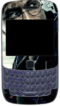
Figure 19.4: Aesthetics as an extension of the Self: Harry Potter skin for a Blackberry smartphone
Visual aesthetics may temporarily take a side seat to other design aspects when other needs are more pressing; some people may be less sensitive or less in a need for aesthetic environments (Bloch et al., 2003); and aesthetic tastes, reactions to aesthetic stimuli vary between people (Santayana, 1896; Hoyer and Stokburger-Sauer, 2011). Still the universality of visual arts across cultures and the pleasures induced by it are cited by evolutionary psychologists as evidence for the fundamental role of aesthetics in the psyche of modern Homo sapience (Dutton, 2008). Aesthetic experiences are associated with affective responses and reflective thought (Leder et al., 2004). Research using functional magnetic resonance imaging (fMRI) found further neurophysiologic support for this association in the context of product packaging (Reimann et al., 2010). Whereas task-related criteria are often based on extrinsic motivation, aesthetics, through pleasure and engagement, primarily contributes to intrinsic motivation. Thus, there is little reason to believe that the need for aesthetics disappears in front of the computer. Visually pleasing design enriches our experiences with interactive systems just like they do with any other environment (Hassenzahl, 2007). There is empirical evidence that aesthetic design of interactive technology increases users’ pleasure and engagement (e.g., Thuring and Mahlke, 2007; Porat and Tractinsky, 2012; Angeli et al., 2006). Consequently, we expect pleasurable interactions to make us happier and thus to improve our well-being (Lyubomirsky et al., 2005). Furthermore, they may make us more tolerable of other design imperfections (Norman, 2004) and improve our task performance under certain conditions (Moshagen et al., 2009).
19.1.3.2 Aesthetics as an extension of the Self
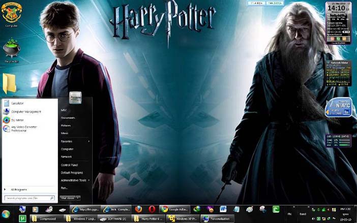
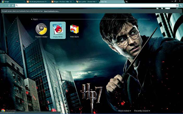
Belk (1988) argues that “it seems an inescapable fact of modern life that we learn, define, and remind ourselves who we are by our possessions” (p. 160) This process of self-extension by possessions is manifested in the realm of HCI in the ways that people modify their computer desktops, screen savers, their websites, and various standard applications. These forms of idiosyncratic attachments (Kleine et al., 1995) are served well by the flexibility and plasticity of IT. The appearance of modern software applications can be personalized to suit users’ tastes. This trend, though on a smaller scale, can be found in hardware - e.g., in the abundance of various cell phone covers, charms and other ornaments. Software skins can be downloaded, for free or pay, for most popular applications. Indeed, studies have shown that the major factor influencing users’ selection of skins was the aesthetic aspect of its design (Tractinsky and Lavie, 2002; Tractinsky and Zmiri, 2006). The proliferation of such features could be explained in large part by individuals’ desire to express themselves, and to be seen in specific ways by others (Hassenzahl, 2003) and as part of an ongoing process of identity formation, through which people “express who they are and communicate affiliation with others” (Venkatesh and Meamber, 2008, p. 51). These are manifestations not only of who those individuals are, their past and present, and their affiliations (Kleine et al., 1995) but also of the social context within which so many interactive products are used today (Turkle, 2005).
Copyright terms and licence: All Rights Reserved. Used without permission under the Fair Use Doctrine (as permission could not be obtained). See the "Exceptions" section (and subsection "allRightsReserved-UsedWithoutPermission") on the page copyright notice.
Figure 19.5: Aesthetics as an extension of the Self: Harry Potter skin for the Windows 7 operating system
Copyright terms and licence: All Rights Reserved. Used without permission under the Fair Use Doctrine (as permission could not be obtained). See the "Exceptions" section (and subsection "allRightsReserved-UsedWithoutPermission") on the page copyright notice.
Figure 19.6: Aesthetics as an extension of the Self: Harry Potter skin for the Google Chrome browser
19.1.3.3 Aesthetic impressions are fast, enduring and consequential
Whereas the previous arguments discuss psychological needs for aesthetic environments and motivation to possess, buy and use aesthetic products, the current argument is based on the consequences of aesthetic stimuli. Those consequences are based on the idea that aesthetic impressions can be very fast. Studies of brain activity suggests that aesthetic impressions form within 300ms to 600ms (Höfel and Jacobsen, 2007). Research on people’s impressions of web pages demonstrated that reliable and consistent aesthetic judgments are formed with exposure of less than 500 milliseconds (Lindgaard et al., 2006; Tractinsky et al., 2006). These very fast impressions are the first opportunity we have to form an attitude towards an object (e.g., an interactive system), whose other qualities are usually concealed until later time when opportunities to evaluate them arise (e.g., when trying to accomplish a task with the system). Those initial attitudes are likely to form at a relatively subconscious level and therefore may be relatively uniform across people, relative to more elaborated evaluations (Kumara and Gargb, 2010).
The primacy of first impression on attitudes is well documented in social science research. Its most salient manifestation is expressed by the “what is beautiful is good” stereotype (Dion et al., 1972), which suggests that a person’s physical appearance affects how others view the person’s hidden qualities (e.g., personality traits). Such preferences for aesthetic appearance may be the result of evolutionary adaptation (Rhodes, 2006). Research has documented numerous contexts in which people with good looks enjoy preferential treatment in the labor market (Hamermesh and Biddle, 1994), in credit markets (Ravina, 2008), and even in the classroom (Hamermesh and Parker, 2003).
We also know that people try to actively improve how they appear to others in order to gain benefits or to avoid sanctions (Jones, 1990). Such attempts can be found, for example, in how people try to improve information about things under their responsibility (e.g., at work) by presenting the information in more attractive formats (Tractinsky and Meyer, 1999). Such aesthetic improvements may pay off: research suggests that under ordinary conditions, aesthetic financial reports increase both novice and professional investors’ valuation of a firm (Townsend and Shu, 2010). Similarly, the way things appear may influence our attitudes towards them. By “things” we may refer to natural settings and objects such as landscapes (Porteous, 1996; Carlson, 2000) or to various sorts of designed environments (Gilboa and Rafaeli, 2003) and artifacts (Rafaeli and Vilnai-Yavetz, 2004). For example, Reimann et al (2010) found that products with aesthetic packages are chosen over less expensive products with well-known brands in standardized packages.
Thus, it should come as no surprise that the visual aesthetics of interactive systems, both hardware and software, may affect our evaluation of other system attributes. Hence, the suggestion that “beautiful is usable” that is, beautiful systems are considered by users to be more usable (Tractinsky et al., 2000).
19.1.4 The Practical Perspective
Finally, I would like to suggest that even if you are not convinced that aesthetics is a pillar of good design or that aesthetics fulfill psychological needs and influence attitudes and decision making, its practical significance is hard to deny. There is ample daily life evidence that illustrate this point. Here, I would like to suggest two aspects of this perspective. The first describes the importance of aesthetics as a differentiating factor between similar products. The second argument suggests that aesthetics and information technology are already profoundly intertwined in current socio-technical processes. Thus, not only is it unwise to ignore aesthetics in information technology, we are in fact required to pay more attention to it, to further study its relationships with other relevant aspects of the HCI field, and to improve its integration in the design of interactive systems.
19.1.4.1 Aesthetics as a differentiating factor
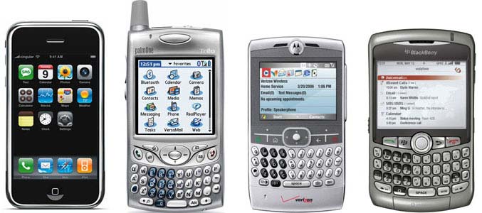
The weight of the IT industry has shifted over the last fifty years from emphasizing organizational number crunching to supporting organizational and personal decision making and productivity to being fully integrated in consumer and entertainment products. The list of successive companies that dominated the IT industry during this time frame - IBM, Microsoft and Apple - tells the story succinctly. The accelerated process of consumer-centeredness and commoditization of interactive technologies, partially described already byNorman (1998), increases the importance of aesthetics as a differentiating factor between competing products increases. The digital watch industry served as a classic example of such a process during the 1970’s and 1980’s, as functionality and performance met very high standards of accuracy and reliability. In that industry, much of the differentiation between brands and models is now based on aesthetic creativity or imitations of aesthetic exemplars. Today we are surrounded by similarly high-performance interactive consumer products - such as smart phones and tablet computers. These products are more oriented towards enhancing the user experience, and much of the battle involves attempts to catch the consumer’s eye and heart with appearance and design-based symbolic value. Thus, aesthetic design is gaining acceptance as a differentiating strategy or tactic (Simonson and Schmitt, 1997; Luchs and Swan, 2011; Reimann et al., 2011) in various markets.
Author/Copyright holder: Courtesy of Marco Arment. Copyright terms and licence: CC-Att-SA-3 (Creative Commons Attribution-ShareAlike 3.0)
Figure 19.7: The first version of the iPhone, released in 2007 (left) compared to its contemporaries. The iPhone is a good example of how a phone manufacturer uses visual aesthetics as a differentiating factor - in everything from the actual phone to its packaging
Copyright terms and licence: pd (Public Domain (information that is common property and contains no original authorship)).
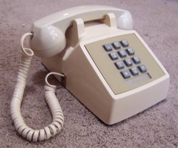
Figure 19.8.A: The hugely popular Western Electric Model 2500 (12 button Touch-Tone) telephone, manufactured in 1980.
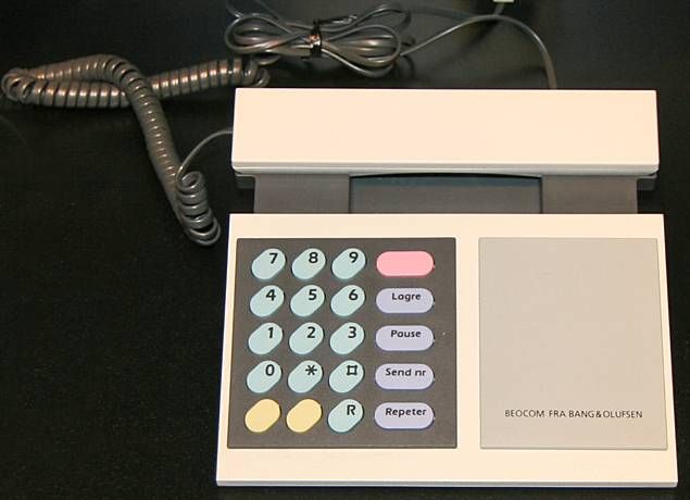
Copyright terms and licence: pd (Public Domain (information that is common property and contains no original authorship)).
Figure 19.8.B: The BeoCom 1000 corded analogue telephone used visual aesthetics to differentiate itself from and compete against popular telephones like the Western Electric Model 2500.
19.1.4.2 Aesthetics is pervasive
There is a long tradition of relationship between aesthetics and technology (Petroski, 1992; Norman, 2004), which became more pronounced during the rapid technological developments of the 20th century. Advanced technologies helped in producing aesthetic forms that could not have been made before (at least not on a mass scale), and aesthetic concepts were borrowed from one technological field (e.g., aircraft design) into another (e.g., locomotive design or a structure of an airport terminal) with the aid of new design, manufacturing or building technologies. Today, it is common for design trends to appear at the same time in multiple industries (Gladwell, 2000). In the age of information technology, such relationships become more symbiotic than ever. One of the unique characteristics of information technology is that it is particularly friendly to aesthetic applications (Postrel, 2002). Relative to traditional methods it supports effortless creation, manipulation, and transmission of aesthetic materials. Consider, for example, the photography market’s shift from film-based cameras to digital cameras within merely a decade. Today, images and photos, major elements of visual aesthetics comprise about 2/3 of the volume of web pages transmitted through the internet (Rabbat, 2010). Digital technology and applications enable designers in various industries many more design options, and much more time to explore all of those options in order to create more appealing products. Perhaps even more importantly, these technologies offer ordinary people tools that help creating and communicating aesthetics on a revolutionary scale. The interlacing of aesthetics and information technology thus creates an aesthetic cycle in which constant supply of visually aesthetic stimuli increases people’s aesthetic sensitivity, which in turn motivates people to seek aesthetics everywhere, including in interactive products (Postrel, 2002).
19.1.4.3 A note on the moral aspect of practical considerations
Lest our position be misconstrued to mean that advocating aesthetic design implies that practical concerns should prevail over all other considerations, it is important to note that the reality depicted above also carries a moral dimension. Aesthetic and ethic considerations in design need not contradict (Liu, 2003). Aesthetic design implies that the designer or the organization respects their audience, is sensitive to people’s needs and desires and puts thought and effort into the design of the product and the environment. For example, Ulrich’s (Ulrich 1984) seminal study on hospital patients recovering after cholecystectomy found that patients in rooms with window view of natural settings recovered faster and needed fewer potent analgesics relative to patients in rooms with windows facing a brick building wall. A quarter of a century later, Postrel (2008) laments the disregards for aesthetic design in today’s health care institutions. In turn, feeling respected and appreciated, people will be more inclined to take care of an aesthetic and well maintained environment (Saito, 2008). In short, aesthetic design works for the betterment of our lives.
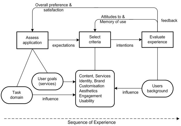
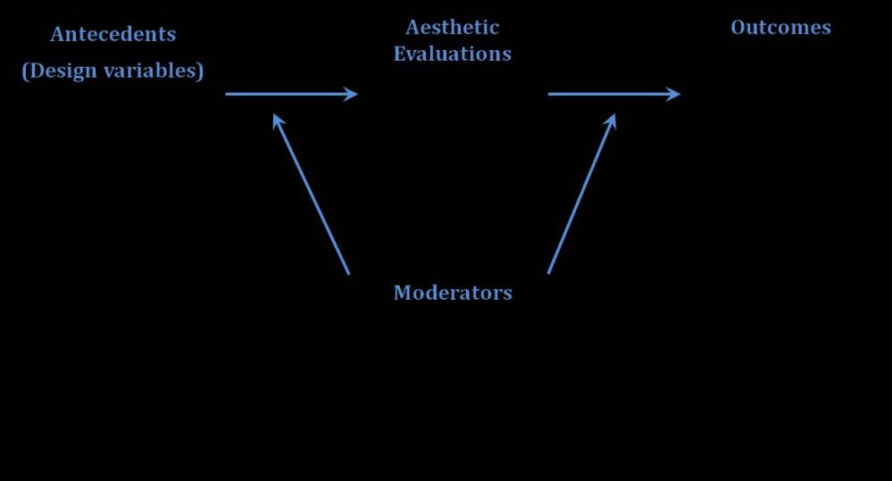
19.2 Research on visual aesthetics in HCI
Research on and around the various aspects of visual aesthetics in HCI can be roughly divided into four main categories that deal with various aspects of the aesthetic process:
Antecedents of the aesthetic evaluation, that is, what makes people engage in aesthetic evaluations, and perhaps more importantly, what causes variations in aesthetic evaluations;
The aesthetic evaluation itself and the psychological processes that are involved in it;
Outcomes or consequences of aesthetic evaluations;
Moderating variables, or intervening factors that influence how the antecedence operate on the aesthetic evaluations and how the evaluations affect the outcomes.
These categories can be seen as part of the schematic process described in Figure 8. I will elaborate on each of these elements below and present empirical studies that have handled these issues.
Author/Copyright holder: Unknown (pending investigation). Copyright terms and licence: Unknown (pending investigation). See section "Exceptions" in the copyright terms below.
Figure 19.9: A general framework for the study of visual aesthetics in HCI. Some relevant research issues for each category are included
19.2.1 Antecedents of visual aesthetics
What makes an interactive system look more or less aesthetic? What makes one system look aesthetic in a particular way and another system look aesthetic in a different way? These are questions of the utmost practical importance. If we could only decipher the aesthetic code! Fortunately, the quest for the Holy Grail of visual aesthetics is beyond our reach for at least the foreseeable future, so there is plenty of room for experimentation, new approaches and ample research. In studying this category, we naturally look first at design guidelines and insights. However, the very broad scope of design possibilities, the creative nature of design work, and the almost unbounded relationships between design elements make it extremely difficult to isolate specific design aspects which may be considered aesthetic or which may influence aesthetic perceptions one way or another. It is probably possible to categorize aesthetic design guidelines from the very broad and abstract (e.g., “form follows function”) to the very specific (e.g., “use colours with different hues between background and menu bar” (Kim et al., 2003), with mid-range guidelines in between (e.g., “visual layout should be symmetrical” (Sutcliffe, 2002). They can be expressed in terms of object properties or in terms of motivational and emotional mediators (e.g., Berlyne’s (Berlyne 1971) collative variables).
At the beginning of this section, we posed two different questions. The first question -- what makes a system look more or less aesthetic -- has probably been more central to aesthetic and design research over the years. Park et al. (2005) have collected and listed 11 visual attributes that can potentially answer this question. Other, more high-level responses to this question include contrasting attributes such as novelty and typicality (Veryzer and Hutchinson, 1998; Hekkert et al., 2010) and the related idea of processing fluency (Reber et al., 2004). Hekkert et al.’s results suggest that a balanced dose of typicality and novelty increase aesthetic evaluations (see also Kumara and Gargb, 2010, Tractinsky et al., 2011a). Similarly, van Schaik and Ling (2011) suggest that design qualities, which they term pragmatic and hedonic, affect perceptions of overall beauty.
Some researchers argue for the prospect of identifying formal, objective, attributes that determine aesthetic judgment, and which will ultimately lead to automatic composition or checks of displays such as web pages (e.g., Ngo et al., 2003). This approach has been criticized on the grounds that aesthetic laws engrained in the object are “universalist” (Krippendorff, 2005) would not survive individual, cultural and context differences (Martindale et al., 1990; Krippendorff, 2005). Similarly, Csikszentmihalyi (1991) argues that formal aspects only rarely make objects valuable to their owners. He speculates that people do not perceive formal attributes such as order or disorder in design according to mathematical principles. Still, despite the apparent subjective and context-dependent nature of aesthetic processes, studies have continued the quest for basic and formal principles of aesthetic properties of interactive systems. Such principles can be expressed as computational models aimed at achieving optimal design spaces. For example, Bauerly and Liu (2006) suggest that in basic images, symmetry and balance affect aesthetic appeal ratings. However, they also found that the strong relationship found between symmetry and aesthetic appeal diminished when tested with more realistic (i.e., context-dependent) web pages. Other approaches to predicting aesthetic evaluations have been proposed in the context of photographs. For example, the Aquine project (Datta et al., 2006, Datta et al., 2008) proposes to combine various algorithmic approaches to classifying photographs according to various visual properties.
However, as mentioned above, the problem of finding universal visual aesthetic guidelines and laws is further exacerbated in the field of HCI because of the variety of applications and products and the uniqueness of so many use contexts. In addition, the dynamic nature of contemporary society and fashion-like approach to the design of many interactive devices and applications make aesthetics a moving and often unpredictable target (Korman-Golander, 2011).
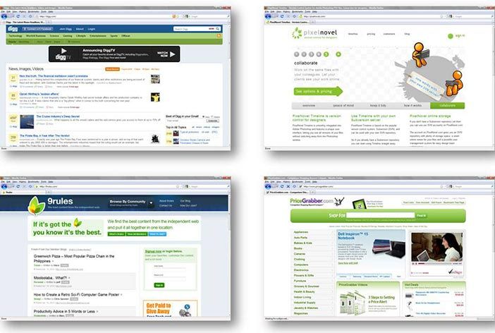
Author/Copyright holder: Gili Korman Golander. Copyright terms and licence: All Rights Reserved. Reproduced with permission. See section "Exceptions" in the copyright terms below.
Figure 19.10: Website design fashion changes continuously. The popularity of the “Web 2.0” design trend peaked around 2007 and has been on the decline since then (Korman-Golander, 2011)
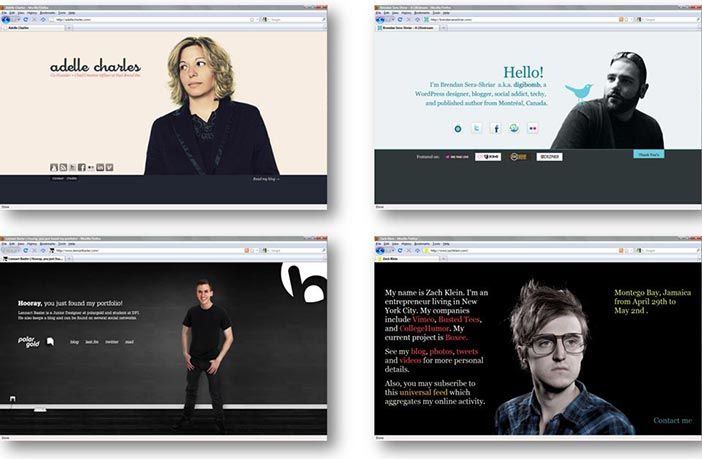
Author/Copyright holder: Gili Korman Golander. Copyright terms and licence: All Rights Reserved. Reproduced with permission. See section "Exceptions" in the copyright terms below.
Figure 19.11: The “One-Page Layout” website design trend became popular in 2008 (Korman-Golander, 2011)
These constraints lead us to the second question. Here, researchers have tried to break down the aesthetic stimuli to sub-dimensions which may be more or less suitable for various contexts or to individual tastes. Such dimensions often emerged out of subjective evaluations of aesthetic stimuli. For example, Park et al. (2004) identified thirteen aesthetic dimensions of web pages. A more parsimonious approach to dimensionality was taken by Lavie and Tractinsky (2004), who identified two perceived dimensions of visual aesthetic, “classical” and “expressive,” in the context of website design. Classical aesthetics corresponds to traditional views of aesthetic - symmetrical, clean and organized design. The expressive dimension relates to the designer’s creativity and originality. One of the important aspects of that study was the demonstration that these aesthetic dimensions are correlated as expected with various interaction outcomes such as perceived usability, pleasing interaction and perception of service quality. Similarly, Moshagen and Thielsch (2010) have suggested four aesthetic dimensions: Simplicity, diversity, colorfulness and craftsmanship. The first two dimensions were highly correlated with Lavie and Tractinsky’s classical and expressive aesthetics, respectively. All four dimensions were associated with appeal. Commensurate with Lavie and Tractinsky’s results, all dimensions were positively, but differentially correlated with various outcome measures.
19.2.2 Perceiving and evaluating visual aesthetics
This category deals with one of the most basic questions in the field of visual aesthetics: How people process and evaluate visual stimuli in aesthetic terms? Detailed accounts of such processes are likely not specific to HCI, and thus have been and probably will be left to researchers in more basic research fields. Findings from such research are presented below to inform the readers about developments in this field. One of the most influential accounts of aesthetic processes was articulated by Norman (2004), who suggested that aesthetic perceptions and evaluations can be explained by considering cognitive and emotional processes at three different levels, which he termed visceral, behavioral and reflective. Visceral reactions to stimuli in the environment (including aesthetic stimuli) have developed to a large extent through evolutionary mechanisms, are performed very rapidly at almost instinct level, with little or no cognitive processing (Ortony et al., 2005). Thus, reactions at this level are quite automatic. The other two levels are characterized by increasingly more elaborated and distinct motivational, emotional and cognitive structures and processes, as well as by slower reactions to stimuli, tendency towards more optimal (as opposed to satisficing) responses and greater individual variability (Ortony et al., 2005).
Studies of aesthetic reaction have been performed on all levels (e.g., Csikszentmihalyi 1991; Leder et al., 2004; Winkielman et al., 2006; Jacobsen, 2010). Low level research is characterized by processes that last a few tenths of a second. At this level, research suggests that the evaluative aesthetic judgment involves a two-step process of an early impression formation and a later evaluative categorization process (Höfel and Jacobsen, 2007). Another finding at this level argues for a positive effect of prototypicality on aesthetic evaluations through the ease (fluency) of information processing (Winkielman et al., 2006). In the field of HCI, several studies have examined aesthetic evaluations after very short exposure to web pages. One of the differences between the basic research and HCI research at this level is that the latter usually involves more ecologically representative (i.e., “real”) stimuli. Lindgaard and colleagues (Lindgaard et al., 2011) suggest that stable aesthetic evaluations can be formed even after being exposed to a design for only 50 milliseconds. While some research questions the robustness of these findings, other research supports the notion that we do not need more than half a second to form first, and stable, aesthetic impressions of the web page (Lindgaard et al., 2006; Tractinsky et al., 2006)
Research on aesthetic processing at higher levels involves more elaborated considerations. In general, Leder et al. (2004) have proposed a model of aesthetic appreciation and aesthetic judgment. The model includes various categories of aesthetic processing, including “automatic” and “deliberate” stages and cognitive and emotional reactions. Although studying higher-level processes of aesthetic evaluations may be of interest to the HCI community, research thus far has concentrated more on the role of aesthetic processing as a mediator between design stimuli and outcome variables such as user engagement and trust (e.g., Hartmann et al., 2008, Lindgaard et al., 2011). Similarly, Thuring and Mahlke (2007) propose a model which integrates the effects of perceived system qualities, including visual aesthetics, on emotions and on appraisal of the system. Research on more long-term, reflective aesthetic evaluation is even scarcer. An example for such research in a general context is Csikszentmihalyi’s (Csikszentmihalyi 1991) study on household objects. Recently studies on aesthetic aspects of interactive systems began to adopt a more time-dependent approach (Schaik and Ling, 2008) and to employ longitudinal methods (e.g., Karapanos et al., 2010).
19.2.3 Outcome Variables
This section deals with what is probably the most practical question in relation to visual aesthetics in HCI: What are the effects of aesthetic perceptions and evaluations on HCI-related variables? Whereas the question of how aesthetic evaluations are formed is relatively general, the consequences of these evaluations can be highly domain-specific. Indeed, research in HCI primarily views the value of visual aesthetics, whether explicitly or implicitly, not as an end in itself but rather as a mediating force between (1) characteristics of the designed system or product, and (2a) other perceived attributes of the product or (2b) behavioral consequences of aesthetic evaluations. Early studies (Kurasu and Kashimura, 1995, Tractinsky, 1997) offered intriguing findings regarding positive association between visual aesthetics and a focal HCI variable - usability. Despite the lack of clear indication about cause and effect, these studies hinted at what subsequent studies explored more directly: that people’s perceptions of a system’s beauty may impact perceptions of other system attributes, such as ease of use (Heijden, 2003; Cyr et al., 2006), overall satisfaction (Tractinsky et al., 2000; Lindgaard and Dudek, 2003; Cyr, 2008), preferences (Schmidt and Liu, 2009; Lee and Koubek, 2010) and even performance (Quinn and Tran, 2010, Sonderegger and Sauer, 2010).
While early research appeared to accept intuitively the premise that aesthetic evaluations are fast enough to precede evaluations of other related variables, later research has demonstrated that this is indeed the case (Lindgaard et al., 2006, Lindgaard et al. 2011; Tractinsky et al., 2006; see also Section 2.2 above). These findings have further motivated the exploration of potential consequences of aesthetic design, a research area which have probably been the busiest of the four categories outlined in our framework. The range of variables covered by these studies includes evaluations of other system attributes, overall evaluations of the system, attitudes towards organizations represented by the system, and satisfaction from the interaction. Studies have also begun exploring the role of affect and emotions in mediating how perceived aesthetics influence those outcomes. Below I survey several studies that examined visual aesthetics’ effects on various variables. The studies represent a partial and probably arbitrary list.
Affect and emotions are oft-cited corollaries of visual aesthetics. The effects of attractive and appealing design on emotions were demonstrated in various studies, including Thuring and Mahlke (2007) in the domain of portable music players, Porat and Tractinsky (2012) and Cai and Xu (2011) in the domain of online shopping. The importance of aesthetics’ effects on emotions is twofold. First, as mentioned earlier, positive affect contributes to positive experience and well-being, and as such is an end in itself. Second, emotions have a role in affecting subsequent information processing, appraisal of other system attributes, and forming attitudes towards the system (Sun and Zhang, 2006).
Trustworthiness was a variable that was studied early as an outcome of visual design in the domain of online banking (Kim and Moon, 1998). In other studies on website design, Cyr et al. (2010) found that web-site color appeal is a significant determinant of website trust, and Lindgaard et al. (2011) also found strong correlations between visual appeal and trust in websites. A related variable to trust- reputation of an academic department - was correlated with aesthetics in a study of websites (Hartmann et al., 2007).
The effects of visual appeal on perceived usability was examined in several studies. Lee and Koubek (2010) found high positive correlations between usability and aesthetics before and after use. Like Tractinsky et al. (2000), they found that the effect of perceived aesthetics on perceived usability was stronger than the effect of objective performance on usability. Similar findings were obtained by Sauer and Sonderegger (2009). In another study, Sonderegger and Sauer (2010) found that participants using cell phones with high visual appeal rated them as more usable than participants using the unappealing devices. In a study of mobile phones, Quinn and Tran (2010) found that attractiveness accounted for as much variance in the SUS scores as effectiveness and efficiency. On the other hand, various studies found weaker or no such associations between visual aesthetics and usability (e.g., Lindgaard and Dudek, 2003, study 2; Hassenzahl, 2004a, Hassenzahl 2010; Thuring and Mahlke, 2007). The mixed findings suggest that the presumed association between perceptions of aesthetics and usability may not be universal. We elaborate on this point when we discuss the next category.
Visual aesthetics are considered a major force influencing perceptions of product character (Hassenzahl, 2003; Krippendorff, 2005) or brand personality (Park et al., 2005). It doesn’t come as a surprise, then, that in a study on product choice, most participants mentioned aesthetic and symbolic roles most often as affecting product choice (Creusen and Schoormans, 2005). Still in online environments, Mandel and Johnson (2002) found hat color and image-based priming influenced online consumers’ product choice. And Schmitt and Liu (2009) found that users are willing to sacrifice loading speed for a more aesthetically appealing webpage.
Following Norman’s (Norman 2004) claim that “attractive things work better,” perhaps the most intriguing question regarding the outcomes of visual aesthetic is whether it influences not only users’ perceptions and evaluations of the system, but also their Performance. Recent studies have started looking for empirical evidence regarding this question (e.g., Moshagen et al., 2009). In a study of 11 data visualization techniques, Cawthon and Moere (2007) found positive relation between aesthetic data visualizations and performance of data retrieval tasks. Sonderegger and Sauer (2010) and Quinn and Tran (2010) similarly found more effective task performance when using attractive versus unattractive mobile phones. Van Schaik and Ling (2009), however, did not find relation between perceptions of classical and expressive aesthetics and performance measures.
Finally, it is important to note that visual aesthetics is considered a prominent antecedent of the concept of “User Experience” (Hassenzahl and Tractinsky, 2006; Sutcliffe, 2009; Law and Schaik, 2010). In a recent survey of the user experience (UX) literature, Bargas-Avila and Hornbaek (2011) found that emotions, enjoyment and aesthetics are the most frequently assessed dimensions of UX. Considering that aesthetics is also an antecedent of the other two dimensions, it appears that its role in influencing the UX is large indeed. To a large extent, it is related to almost all the ideas expressed in this chapter.
19.2.4 Moderating Variables
Linkages between perceived beauty and various outcomes or between design attributes and aesthetic perceptions, even if backed up by solid research evidence, common sense, or philosophical arguments, should not be considered universal or deterministic (Sutcliffe, 2010). First, as mentioned in the previous subsection, against studies that empirically found associations between aesthetic evaluations and evaluations of other perceived system attributes, such as usability, there are studies that found weaker or no such associations, indicating that at least under certain circumstances they do not hold. Second, in social settings, where research on the “beautiful is good” phenomenon accumulated evidence earlier and for much longer than in our field, findings suggest that the associations between attractiveness and perceptions of other human attributes are not unqualified (Eagly et al., 1991). Third, for all we know about socio-technical phenomena, it makes little sense that such deterministic relationships exist in a complex reality that involves individual, social and technological forces. Thus, adopting a contingent approach to the study of visual aesthetics would probably be more productive in describing if and how aesthetic evaluations mediate between various antecedents and consequences.
The challenge is then, to identify and examine how various factors serve to alter or moderate the aesthetic process. In Tractinsky (2006) I have provided a partial list of such potential moderators. The list included the type of system used (a typology that can span multiple dimensions such as consumer product vs. a computer application; small vs. large display; personal vs. public; hedonic vs. utilitarian, etc.), the use context (e.g., work vs. entertainment), cultural differences (national, sub-cultural, idiological), and so on. Individual differences constitute an interesting group of potential moderators, because people vary greatly in their sensitivity to aesthetic stimuli and in their aesthetic preferences (e.g., Bloch et al., 2003; Hoyer and Stokburger-Sauer, 2011). Jacobsen (2004) study found consistent intra-individual aesthetic judgments but strong inter-individual differences in beauty judgments. In addition, the group model of aesthetic judgment misrepresented about half of the study’s participants. Pandir and Knight (2006) also found disagreement on aesthetic preferences in a study of different websites.
Contextual factors, such as domain and type of task are mentioned by Norman (2004) as important considerations for the type of aesthetic design required for users’ performance and satisfaction. He argues that in certain domains (e.g., control rooms) attractive design may not necessarily be desired. Ben-Bassat et al (2006) found that people weighed more usability over aesthetic factors when faced with a performance-oriented task, and Van Schaik and Ling (2008) demonstrated that attractiveness ratings were affected by providing context for the evaluation task. In online shopping environments Cai and Xu (2011) found that the effect of expressive aesthetics on shopping enjoyment was stronger when shopping for hedonic products compared to utilitarian products.
Individual factors may also affect how anteceding variables (e.g., objective design attributes) are perceived differently by people with different aesthetic tastes (Hoyer and Stokburger-Sauer, 2011). In the domain of web-site design, Park et al., (2004) found that variability in user tastes is associated with aesthetic fidelity (i.e., the degree to which users felt the target impressions intended by designers). Individual differences were also found to affect the relative importance of aesthetics in people’s preference of web-sites (Hartmann et al., 2008).
Attributes of the choice process were found to moderate the relation between aesthetic evaluation and product choice, especially when users are required to trade-off aesthetic for other system qualities. For example, Ben-Bassat et al (2006) found that system preference or choice were affected by aesthetics under ordinary conditions (e.g., questionnaires) but not when the participants had to bid for a system with which they will perform competitive tasks. Diefenbach and Hassenzahl (2007) showed that under a beauty-usability trade-off, although people may prefer more beautiful products to more usable ones, they choose the more usable product if they cannot justify choosing the more beautiful one.
Cross cultural studies have shown that national and professional cultures affect various relationships between aesthetic evaluations, their antecedents and their consequences. Several studies have demonstrated this moderating effect in the context of websites. For example, Cyr (2008) found effects of visual design on trust in China but not in Canada or Germany, and Cyr et al (2010) found different reactions to web-site color appeal in Canada, Germany and Japan. Hartmann et al (2007) found that the aesthetic evaluations and the importance of aesthetics are contingent on users’ background (design vs. technical; Western vs. Asian).
The contingent nature of the aesthetic process is exemplified by Moshagen et al’s finding that high visual aesthetics improved performance under poor usability but had no effect under high usability. Consequently, they quoted Liu’s (Liu 2003) principle that “. . . ergo-aesthetic design does not imply that workplace or product designers should only use designs that are pleasing or attractive. On the contrary, ergo-aesthetic design advocates the careful and proper selection of aesthetic levels of design to fit the needs and characteristics of the intended use” (p. 1298).
19.3 Future Directions
The review above presented the results of empirical studies that examined antecedents and effects of visual aesthetics in HCI and various contingencies that moderate the relationship along this aesthetic process. In this section I would like to discuss several methodological issues and suggestions for future research in this area.
19.3.1 Methodological Issues
The review of research in the field uncovered several methodological issues that may also be involved in masking effects along the aesthetic process. One such aspect concerns evaluations that are more nuanced than overall aesthetic evaluations, which are quite common in the studies surveyed in this chapter. Studies that look for evaluations of aesthetic sub dimensions (e.g., Kim et al., 2003; Lavie and Tractinsky, 2004; Moshagen and Thielsch, 2010) can potentially yield richer accounts of the influence of design on aesthetic processes and on subsequent evaluations of the interactive system, attitudes towards it and interactions with it.
A related issue deals with the measurement of visual aesthetics evaluations or judgment. In the field of HCI, aesthetic evaluations were measured by a single item and by multiple-item scales. For example, Kurosu and Kashimura (1995) Tractinsky (1997), Schenkman and Jonsson (2000), Hassenzahl and Monk (2010), and Sonderegger and Sauer (2010) have used a single item asking about the beauty of the various applications and interactive products. Others, such as Schenkman and Jonsson (2000), Van der Heijden (2003) ,Moshagen et al., (2009) employed multiple-item scales to measure attractiveness. While multiple item scales are generally regarded as more reliable measures, single item scales have some practical advantages. In general, the main advantage if that single items make questionnaires shorter, reducing participants’ fatigue and tendency to skip some of the items. In particular, the use of single items in the study of aesthetics allows quicker responses to stimuli in studies that focus on swift aesthetic responses (Lindgaard et al., 2006; Lindgaard et al., 2011; Tractinsky et al., 2006). The tension between scientific directives and practical constraints may not be as severe as it first appears. Studies suggest that when dealing with a concrete object (e.g., the application or product to be evaluated) and a concrete attribute of the object then single item measures are as valid as multiple-item scales (Gardner et al., 1998; Bergkvist and Rossiter, 2007). While the scientific community may have a hard time defining what is meant by the concepts of “aesthetics” or “beauty” - perhaps due to the multiple disciplines that deal with these concepts and which attach different meanings to them, my experience is that ordinary people’s intuitive interpretation of the terms correspond closely to the dictionary definition provided above, which guides research on visual beauty in HCI. This point may be worth further research for corroboration, but if correct, future scientific and practical studies would be able to safely use single item measures of visual aesthetics.
Research on visual aesthetics in HCI has employed a mix of experimental and correlational designs. Because some of the most interesting aspects of visual aesthetics research involve questions of cause and effect, experimental studies would appear to provide the most conclusive evidence. It is straightforward to study basic and relatively simple design effects (e.g., symmetry using basic patterns) on aesthetic perceptions using experimental designs (Bauerly and Liu, 2006; Winkielman et al., 2006). However, it becomes increasingly more difficult if we want to study the effects of aesthetic design using more complex and ecologically valid stimuli, like those used in correlational studies (e.g., Lindgaard et al., 2006; Hassenzahl and Monk, 2010). Thus, employing experimental designs using elaborated and realistic stimuli is a major challenge. Ideally, to test causal effects studies would manipulate design attributes independently of each other to separate aesthetic perceptions from perceptions of other system attributes. In practice, however, this is very difficult to accomplish due to the a priori association of these attributes (Moshagen et al., 2009). One frequent consequence of attempting to achieve this independent aesthetic manipulation is that it creates a relatively small variance in the manipulated stimuli (otherwise, strong aesthetic manipulations might also cause differences in other experimental factors). The danger is that small variance and the lack of strong aesthetic condition would in turn weaken the effects of visual aesthetics. Another challenge in manipulating or selecting aesthetic stimuli in experimental designs relate to whether the degree of aesthetic stimuli is defined “on average” (e.g., by a pilot study or manipulation check) or is defined separately for each individually (e.g., in a procedure described by Tractinsky et al., 2000). The advantage of the latter approach is improved probability that individuals who are assigned to various aesthetic groups in the experiment indeed perceived the stimulus in a way that corresponds to their group (as opposed to a stimulus that may belong to that group on average, but which doesn’t match the participant’s aesthetic taste). This would increase the effect size of the aesthetic manipulation. On the other hand, such a procedure usually requires pre-experimental exposure to a set of potential aesthetic stimuli. This process may later interact with the experiment (e.g., by creating expectations towards the experiment), and may create undesirable noise.
19.3.2 Future Research
This chapter has reaffirmed that visual aesthetics is associated with a range of HCI-related variables. However, it is also apparent that our understanding of the contingent nature of the processes that surround visual aesthetics is still limited. Thus, further exploring these contingencies (i.e., the conditions under which perceptions of visual aesthetics or its effects change due to contextual factors) appears to be more beneficial to the advancement of knowledge in the field than attempting to confirm direct relationships along the visual aesthetics process chain.
Most studies to date have concentrated on people’s first reactions to visual aesthetics or to short term impact of aesthetic design. Studies are also characterized by providing participants a limited set of aesthetic stimuli to choose from. The problem with such sets is that they do not necessarily include designs that are viewed by the participants as beautiful. In addition, such studies rarely represent reflective aesthetic value to individual participants. Such stimuli may be adequate for creating short term impressions, but they are hardly adequate for assessing contemplative evaluations and longer term evolvement of aesthetic processes. Thus, to expand the picture of visual aesthetics in HCI, future research should emphasize more reflective evaluation and contemplation of designed products and environments.
Another research topic that has yet to receive attention is the (dis)connect between designers and users. In other design disciplines, studies have found significant differences in aesthetic evaluation between laypeople and designers (e.g., Nasar, 1997 and Gifford et al, 2000, in the field of architecture). In HCI such differences were found by Korman-Golander (2011) between designers and software engineering students in assessments of web-site design trends. Similarly, Inbar et al. (2007) and Bateman et al. (2010) found that the minimalist design recommendations for charts made by Tufte’s (1983) influential critique of “chartjunk” practices do not resonate with people’s actual preference of chart types. To date, I am aware of only a few studies (e.g., Park et al. (2004) and Bateman et al, 2010) that have tried to tease out the sources of those differences, and to offer methods that would help bridge the gap between designers and other members of the development team and between the development team and intended users.
In his seminal work on the extended self, Belk (1988) listed various product categories in which there is significant image congruity between a brand or a product category and self images of owners. The list does not include IT products, but there are good reasons to expect that such congruity holds, for example, in the choice of personal computing, smart phones, media players, software, etc. We may then explore what role visual aesthetics plays in motivating people to choose those interactive media.
In discussing our early work on the relationships between aesthetic and perceived attributes of the system we called on researchers “to shed more light on the cognitive and/or affective processes that lead users to associate interface aesthetics with other system attributes” (Tractinsky et al., 2000, p. 140). Several studies have recently taken on this challenge. For example, Hassenzahl and Monk (2010) suggest that perceived aesthetics affects users’ evaluation of the system’s goodness, which in turn influences evaluations of the system’s usability. Similarly, Lindgaard et al. (2011) suggest that the initial attraction generated by a system’s aesthetics forms “a general attitude” of aesthetic, which is later refined through further use of the system and reflection based on high level emotional and cognitive processing. However, it seems that there is ample room for continuous research on the mechanisms that underlie these relationships. In particular, studies about the interplay of emotional and cognitive factors (Sun and Zhang, 2006; Thuring and Mahlke, 2007) at the three levels of processing (Norman, 2004) are sorely needed.
Studies of visual aesthetics in HCI have for the most part concentrated on the relatively stable properties of the user interface design. Thus, studies have used website screenshots, interactive products’ hardware design, or general aesthetic features of systems. Little attention was paid to dynamic aspects of visual aesthetics. With the increased embedding of dynamic visualizations , video clips and various animations in interactive systems we need to have a better grasp of their aesthetic qualities (Chen, 2005). Some initial steps in this direction can be found in a study of perceived aesthetic dimensions of animations, done in the context of in-car presentation of eco-driving information (Tractinsky et al., 2011b)
Finally, much of the variability in people’s assessment of visual design and the effects of visual design can be attributed to individual and cultural factors. These factors may include differences in sensitivity to visual aesthetics, different weighing of visual aesthetics when appraising systems and products, and different notions of what is considered beautiful. Such studies could explore why and how people personalize interactive systems and products (e.g., Tractinsky and Lavie, 2002, Tractinsky and Zmiri, 2006); why some people prefer ornamented charts or web pages while others prefer minimalist styles (e.g., Inbar et al, 2007; Bateman et al., 2010); why reactions to website color treatments differ among different cultures (Cyr et al., 2010); and whether people belonging to different trend and fashion adoption groups prefer different website designs (Korman-Golander 2011).
19.4 Conclusion
Interest in visual aesthetics in HCI has grown considerably over the last 15 years. From a short conference paper that reported correlations between perceived aesthetics and apparent usability (Korosu and Kashimura, 1995) to a rich field of inquiry. It is possible that the interest in the field was motivated by provocative titles such as “What is beautiful is usable” (Tractinsky et al., 2000) and “Attractive things work better” (Norman, 2004). It is more likely, however, that it corresponded to technological and societal changes that have swept our lives over that time and reshaped the field of human-computer interaction.
19.5 References
Angeli, Antonella De, Sutcliffe, Alistair G. and Hartmann, Jan (2006): Interaction, usability and aesthetics: what influences users' preferences?. In: Proceedings of DIS06: Designing Interactive Systems: Processes, Practices, Methods, & Techniques 2006. pp. 271-280
Arnheim, Rudolf (1966): Order and complexity in landscape design. In: Arnheim, Rudolf (ed.). "Toward a Psychology of Art". University of California Press
Bargas-Avila, Javier A. and Hornbæk, Kasper (2011): Old wine in new bottles or novel challenges: a critical analysis of empirical studies of user experience. In: Proceedings of ACM CHI 2011 Conference on Human Factors in Computing Systems 2011. pp. 2689-2698
Bateman, Scott, Mandryk, Regan L., Gutwin, Carl, Genest, Aaron, McDine, David and Brooks, Christopher (2010): Useful junk?: the effects of visual embellishment on comprehension and memorability of charts. In: Proceedings of ACM CHI 2010 Conference on Human Factors in Computing Systems 2010. pp. 2573-2582
Bauerly, Michael and Liu, Yili (2006): Computational modeling and experimental investigation of effects of compositional elements on interface and design aesthetics. In International Journal of Human-Computer Studies, 64 (8) pp. 670-682
Belk, Russell W. (1988): Possessions and the Extended Self. In Journal of Consumer Research, 15 (2) pp. 139-168
Ben-Bassat, Tamar, Meyer, Joachim and Tractinsky, Noam (2006): Economic and subjective measures of the perceived value of aesthetics and usability. In ACM Transactions on Computer-Human Interaction, 13 (2) pp. 210-234
Bergkvist, Lars and Rossiter, John R (2007): The Predictive Validity of Multiple-Item Versus Single-Item Measures of the Same Constructs. In Journal of Marketing Research, 44 (2) pp. 175-184
Berlyne, D. E. (1971): Aesthetics and psychobiology. Appleton-Century-Crofts
Bloch, Peter H. (2011): Product Design and Marketing: Reflections After Fifteen Years. In Design, 28 (3) pp. 378-380
Bloch, Peter H., Brunel, F. F. and Arnold, T. J. (2003): Individual Differences in the Centrality of Visual Product Aesthetics: Concept and Measurement. In Journal of Consumer Research, 29 (4) pp. 551-565
Brooks, Fred (1975): The Mythical Man-Month: Essays on Software Engineering. Addison-Wesley Publishing
Cai, Shun and Xu, Yunjie (Calvin) (2011): Designing Not Just for Pleasure: Effects of Web Site Aesthetics on Consumer Shopping Value. In International Journal of Electronic Commerce, 15 (4) p. 159–187
Card, Stuart K., Moran, Thomas P. and Newell, Allen (1983): The Psychology of Human-Computer Interaction.Hillsdale, NJ, Lawrence Erlbaum Associates
Carlson, Allen (2000): Aesthetics and the Environment: The Appreciation of Nature, Art and Architecture.Routledge
Cawthon, Nick and Moere, Andrew Vande (2007): The Effect of Aesthetic on the Usability of Data Visualization. In:Proceedings of the 11th International Conference Information Visualization 2007. pp. 637-648
Chen, Chaomei (2005): Top 10 unsolved information visualization problems. In IEEE Computer Graphics and Applications, 25 (4) pp. 12-16
Creusen, Marielle E. H. and Schoormans, Jan P. L. (2005): The Different Roles of Product Appearance in Consumer Choice. In Journal of Product Innovation Management, 22 (1) pp. 63-81
Csikszentmihalyi, Mihaly (1991): Design and Order in Everyday Life. In Design Issues, 8 (1) pp. 26-34
Cyr, Dianne (2008): Modeling Web Site Design Across Cultures: Relationships to Trust, Satisfaction, and E-Loyalty. In Journal of Management Information Systems, 24 (4) pp. 47-72
Cyr, Dianne, Head, Milena M. and Ivanov, Alex (2006): Design aesthetics leading to m-loyalty in mobile commerce. In Information & Management, 43 (8) pp. 950-963
Cyr, Dianne, Kindra, Gurprit S. and Dash, Satyabhusan (2008): Web site design, trust, satisfaction and e-loyalty: the Indian experience. In Online Information Review, 32 (6) pp. 773-790
Cyr, Dianne, Head, Milena and Larios, Hector (2010): Colour appeal in website design within and across cultures: A multi-method evaluation. In International Journal of Human-Computer Studies, 68 (1) pp. 1-21
Datta, Ritendra, Li, Jia and Wang, J. Z. (2008): Algorithmic inferencing of aesthetics and emotion in natural images: An exposition. In: Image Processing, 2008. ICIP 2008. 15th IEEE International Conference on 2008. pp. 105-108
Datta, Ritendra, Joshi, D., Li, J. and Wang, James Z. (2006): Studying aesthetics in photographic images using a computational approach. In Distribution, 3953 pp. 288-301
Davis, Fred D. (1989): Perceived Usefulness, Perceived Ease of Use, and User Acceptance of Information Technology. In MIS Quarterly, 13 (3) pp. 319-340
Dion, Karen, Berscheid, Ellen and Walster, Elaine (1972): What is beautiful is good. In Journal of Personality and Social Psychology, 24 (3) pp. 285-290
Dutton, Denis (2008): The Art Instinct: Beauty, Pleasure, and Human Evolution. Bloomsbury Press
Eagly, Alice H., Ashmore, Richard D., Makhijani, Mona G. and Longo, Laura C. (1991): What is beautiful is good, but..: A meta-analytic review of research on the physical attractiveness stereotype. In Psychological Bulletin, 110 (1) pp. 109-128
Fishwick, Paul A. (ed.) (2006): Aesthetic Computing. The MIT Press
Forlizzi, Jodi (2008): The product ecology: Understanding social product use and supporting design culture. InInternational Journal of Design, 2 (1) pp. 11-20
Gardner, D. G., Cummings, L. L., Dunham, R. B. and Pierce, J. L. (1998): Single-Item Versus Multiple-Item Measurement Scales: An Empirical Comparison. In Educational and Psychological Measurement, 58 (6) pp. 898-915
Gifford, Robert, Hine, Donald W, Muller-Clemm, Werner, Reynolds, D'arcy J. and Shaw, Kelly T. (2000): Decoding Modern Architecture: A Lens Model Approach for Understanding the Aesthetic Differences of Architects and Laypersons. In Environment And Behavior, 32 (2) pp. 163-187
Gladwell, Malcolm (2000): The Tipping Point: How Little Things Can Make a Big Difference. Back Bay Books
Hamermesh, Daniel S. and Biddle, Jeff E. (1994): Beauty and the Labor Market. In American Economic Review, 84 (5) pp. 1174-1194
Hamermesh, Daniel S. and Parker, Amy M. (2003): Beauty in the Classroom: Professors' Pulchritude and Putative Pedagogical Productivity. In National Bureau of Economic Research Working Paper Series, 9853 (4) pp. 369-376
Hartmann, Jan, Sutcliffe, Alistair G. and Angeli, Antonella De (2008): Towards a theory of user judgment of aesthetics and user interface quality. In ACM Transactions on Computer-Human Interaction, 15 (4) p. 15
Hartmann, Jan, Sutcliffe, Alistair G. and Angeli, Antonella De (2007): Investigating attractiveness in web user interfaces. In: Proceedings of ACM CHI 2007 Conference on Human Factors in Computing Systems 2007. pp. 387-396
Hassenzahl, Marc (2007): Aesthetics in interactive products: Correlates and consequences of beauty. In: Schifferstein, Hendrik N. J. and Hekkert, Paul (eds.). "Product Experience". Elsevier Science
Hassenzahl, Marc (2003): The Thing and I: Understanding the Relationship Between User and Product. In: Blythe, Mark.A., Overbeeke, Kees, Monk, Andrew F. and Wright, Peter C. (eds.). "Funology: From Usability to Enjoyment". Springerpp. 31-42
Hassenzahl, Marc (2004b): Beautiful Objects as an Extension of the Self: A Reply. In Human-Computer Interaction, 19 (4) pp. 377-386
Hassenzahl, Marc (2004a): The Interplay of Beauty, Goodness, and Usability in Interactive Products. In Human-Computer Interaction, 19 (4) pp. 319-349
Hassenzahl, Marc and Monk, Andrew (2010): The Inference of Perceived Usability From Beauty. In Human Computer Interaction, 25 (3) pp. 235-260
Hassenzahl, Marc and Tractinsky, Noam (2006): User experience - a research agenda. In Behaviour and Information Technology, 25 (2) pp. 91-97
Heijden, Hans van der (2003): Factors influencing the usage of websites: the case of a generic portal in The Netherlands. In Information and Management, 40 (6) pp. 541-549
Hekkert, Paul, Snelders, Dirk and Wieringen, Piet C. W. (2010): "Most advanced, yet acceptable": Typicality and novelty as joint predictors of aesthetic preference in industrial design. In British Journal of Psychology, 94 (1) pp. 111-124
Hooper, Kristina (1986): Architectural design: an analogy. In: Norman, Donald A. and Draper, Stephen W. (eds.). "User Centered System Design: New Perspectives on Human-Computer Interaction". Hillsdale, NJ: Lawrence Erlbaum Associates
Hoyer, Wayne and Stokburger-Sauer, Nicola (2011): The role of aesthetic taste in consumer behavior. In Journal of the Academy of Marketing Science,
Höfela, Lea and Jacobsena, Thomas (2007): Electrophysiological Indices of Processing Symmetry and Aesthetics: A Result of Judgment Categorization or Judgment Report?. In Journal of Psychophysiology, 21 (1) pp. 9-21
Inbar, Ohad, Tractinsky, Noam and Meyer, Joachim (2007): Minimalism in information visualization: attitudes towards maximizing the data-ink ratio. In: Brinkman, Willem-Paul, Ham, Dong-Han and Wong, B. L. William (eds.) ECCE 2007 - Proceedings of the 14th European Conference on Cognitive Ergonomics August 28-31, 2007, London, UK. pp. 185-188
Jacobsen, Thomas (2004): Individual and group modelling of aesthetic judgment strategies. In British journal of psychology London England 1953, 95 (0) pp. 41-56
Jacobsen, Thomas (2010): Beauty and the brain: culture, history and individual differences in aesthetic appreciation. In Journal of Anatomy, 216 (2) pp. 184-191
Johnson, Paul-Alan (1994): The Theory of Architecture: Concepts, Themes & Practices. Van Nostrand Reinhold
Jones, Edward Ellsworth (1990): Interpersonal Perception. W H Freeman and Co (Sd)
Jr., Frank Gibney and Luscombe, Belinda (2008). The Redesigning Of America. Retrieved 1 December 2011 from Times.com: http://www.time.com/time/magazine/article/0,9171,9...
Karapanos, Evangelos, Zimmerman, John, Forlizzi, Jodi and Martens, Jean-Bernard (2010): Measuring the dynamics of remembered experience over time. In Interacting with Computers, 22 (5) pp. 328-335
Kim, Jinwoo and Moon, Jae Yun (1998): Designing Towards Emotional Usability in Customer Interfaces -- Trustworthiness of Cyber-Banking System Interfaces. In Interacting with Computers, 10 (1) pp. 1-29
Kim, Jinwoo, Lee, Jungwon, Han, Kwanghee and Lee, Moonkyu (2002): Businesses as Buildings: Metrics for the Architectural Quality of Internet Businesses. In Information Systems Research, 13 (3) pp. 239-254
Kim, Jinwoo, Lee, Jooeun and Choi, Dongseong (2003): Designing emotionally evocative homepages: an empirical study of the quantitative relations between design factors and emotional dimensions. In International Journal of Human-Computer Studies, 59 (6) pp. 899-940
Kleine, Susan Schultz, Kleine, Robert E. and Allen, Chris T. (1995): How Is a Possession "Me" or "Not Me"? Characterizing Types and an Antecedent of Material Possession Attachment. In Journal of Consumer Research, 22 (3) pp. 327-43
Korman-Golander, Gili (2011). Aspects of Fashion/Trends in Web Design, M.Sc. Thesis. Ben-Gurion Univerity of the Negev http://aranne5.lib.ad.bgu.ac.il/others/KormanGolanderGili.pdf
Krippendorff, Klaus (2005): The Semantic Turn: A New Foundation for Design. CRC Press
Kruft, Hanno-Walter (1994): A History of Architectural Theory: From Vitruvius to the Present. Zwemmer
Kumara, Minu and Gargb, Nitika (2010): Aesthetic principles and cognitive emotion appraisals: How much of the beauty lies in the eye of the beholder?. In Journal of Consumer Psychology, 20 (4) pp. 485-494
Kurosu, Masaaki and Kashimura, Kaori (1995): Apparent usability vs. inherent usability: experimental analysis on the determinants of the apparent usability. In: CHI 95 Conference Companion 1995 1995. pp. 292-293
Lavie, Talia and Tractinsky, Noam (2004): Assessing dimensions of perceived visual aesthetics of web sites. InInternational Journal of Human-Computer Studies, 60 (3) pp. 269-298
Law, Effie L.-C. and Schaik, Paul Van (2010): Modelling user experience -- An agenda for research and practice. InInteracting with Computers, 22 (5) pp. 313-322
Leder, Helmut, Belke, Benno, Oeberst, Andries and Augustin, Dorothee (2004): A model of aesthetic appreciation and aesthetic judgments. In British Journal of Psychology, 95 (0) pp. 489-508
Lee, Allen S. (1991): Architecture as a reference discipline for MIS. In: Nissen, H. E., Klein, H. K. and Hirschheim, R. (eds.). "Information Systems Research: Contemporary Approaches & Emergent Traditions". North Hollandp. 573–592.
Lee, Sangwon and Koubek, Richard J. (2010): Understanding user preferences based on usability and aesthetics before and after actual use. In Interacting with Computers, 22 (6) pp. 530-543
Lindgaard, Gitte and Dudek, Cathy (2003): What is this evasive beast we call user satisfaction?. In Interacting with Computers, 15 (3) pp. 429-452
Lindgaard, Gitte, Dudek, Cathy, Sen, Devjani, Sumegi, Livia and Noonan, Patrick (2011): An exploration of relations between visual appeal, trustworthiness and perceived usability of homepages. In ACM Transactions on Computer-Human Interaction (TOCHI), 18 (1)
Lindgaard, Gitte, Fernandes, Gary, Dudek, Cathy and Brown, J. (2006): Attention web designers: You have 50 milliseconds to make a good first impression. In Behaviour and Information Technology, 25 (2) pp. 115-126
Liu, Yili (2003): Engineering aesthetics and aesthetic ergonomics: theoretical foundations and a dual-process research methodology. In Ergonomics, 46 (13) pp. 1273-1292
Luchs, Michael and Swan, K. Scott (2011): Perspective: The Emergence of Product Design as a Field of Marketing Inquiry. In Journal of Product Innovation Management, 28 (3) pp. 327-345
Lyubomirsky, Sonja, King, Laura and Diener, Ed (2005): The benefits of frequent positive affect: does happiness lead to success?. In Psychological Bulletin, 131 (6)
Mandel, Naomi and Johnson, E. J. (2002): When Web Pages Influence Choice: Effects of Visual Primes on Experts and Novices. In Journal of Consumer Research, 29 (2) pp. 235-245
Martindale, Colin, Moore, Kathleen and Borkum, Jonathan (1990): Aesthetic Preference: Anomalous Findings for Berlyne's Psychobiological Theory. In The American Journal of Psychology, 103 (1)
Maslow, Abraham H. (1954): Motivation and Personality. HarperCollins Publishers
Maslow, Abraham Harold (1987): Motivation and Personality. HarperCollins Publishers
Moshagen, Morten and Thielsch, Meinald T. (2010): Facets of visual aesthetics. In International Journal of Human-Computer Studies, 68 (10) pp. 689-709
Moshagen, Morten, Musch, Jochen and Göritz, Anja S (2009): A blessing, not a curse: experimental evidence for beneficial effects of visual aesthetics on performance. In Ergonomics, 52 (10) pp. 1311-1320
Nake, Frieder (2005): Computer art: a personal recollection. In Proceedings of the 5th conference on Creativity cognition,
Nasar, Jack L. (1997): The Evaluative Image of the City. Sage Publications, Inc
Ngo, David Chek Ling, Teo, Lian Seng and Byrne, John G. (2003): Modelling interface aesthetics. In Information Sciences, 152 pp. 25-46
Nielsen, Jakob (1993): Usability Engineering. Boston, MA, Morgan Kaufmann
Norman, Donald A. (1988): The Psychology of Everyday Things. New York, Basic Books
Norman, Donald A. (1998): The Invisible Computer: Why Good Products Can Fail, the Personal Computer Is So Complex and Information Appliances Are the Solution. MIT Press
Norman, Donald A. (2004): Emotional Design: Why We Love (Or Hate) Everyday Things. Basic Books
Ortony, Andrew, Norman, Donald A. and Revelle, William (2005): The role of affect and proto-affect in effective functioning. In: Fellous, Jean-Marc and Arbib, Michael A. (eds.). "Who Needs Emotions?: The Brain Meets the Robot (Series in Affective Science)". Oxford University Press
Pandir, Muzeyyen and Knight, John (2006): Homepage aesthetics: The search for preference factors and the challenges of subjectivity. In Interacting with Computers, 18 (6) pp. 1351-1370
Park, Su-e, Choi, Dongsung and Kim, Jinwoo (2004): Critical factors for the aesthetic fidelity of web pages: empirical studies with professional web designers and users. In Interacting with Computers, 16 (2) pp. 351-37
Park, Su-e, Choi, Dongsung and Kim, Jinwoo (2005): Visualizing E-Brand Personality: Exploratory Studies on Visual Attributes and E-Brand Personalities in Korea. In International Journal of Human-Computer Interaction, 19 (1) pp. 7-34
Parush, Avraham, Nadir, Ronen and Shtub, Avraham (1998): Evaluating the Layout of Graphical User Interface Screens: Validation of a Numerical Computerized Model. In International Journal of Human-Computer Interaction, 10 (4) pp. 343-360
Porteous, J. Douglas (1996): Environmental Aesthetics: Ideas, Politics and Planning. Routledge
Postrel, Virginia (2002): The Substance of Style: How the Rise of Aesthetic Value Is Remaking Commerce, Culture, and Consciousness. HarperCollins
Postrel, Virginia (2008). The Art of Healing - Magazine - The Atlantic. Retrieved 1 January 2011 from
Postrel, Virginia (2003): The Substance of Style: How the Rise of Aesthetic Value Is Remaking Commerce, Culture, and Consciousness. HarperCollins
Quinn, Jeffrey M. and Tran, Tuan Q. (2010): Attractive phones don't have to work better: independent effects of attractiveness, effectiveness, and efficiency on perceived usability. In: Proceedings of ACM CHI 2010 Conference on Human Factors in Computing Systems 2010. pp. 353-362
Rafaeli, Anat and Vilnai-Yavetz, Iris (2004): Emotion as a Connection of Physical Artifacts and Organizations. InOrganization Science, 15 (6) pp. 671-686
Ravina, Enrichetta (2008). Love & Loans: The Effect of Beauty and Personal Characteristics in Credit Markets. Columbia Business School
Reber, Rolf, Schwarz, Norbert and Winkielman, Piotr (2004): Processing fluency and aesthetic pleasure: is beauty in the perceiver's processing experience?. In Personality and social psychology review an official journal of the Society for Personality and Social Psychology Inc, 8 (4) pp. 364-382
Reimann, M., Zaichkowsky, J., Neuhaus, C., Bender, T. and Weber, B. (2010): Aesthetic package design: A behavioral, neural, and psychological investigation. In Journal of Consumer Psychology, 20 (4) pp. 431-441
Rhodes, Gillian (2006): The evolutionary psychology of facial beauty. In Annual Review of Psychology, 57 (1) pp. 199-226
Santayana, George (1955): The Sense of Beauty: Being the Outline of Aesthetic Theory. Dover Publications
Sauer, Juergen and Sonderegger, Andreas (2009): The influence of prototype fidelity and aesthetics of design in usability tests: effects on user behaviour, subjective evaluation and emotion. In Applied Ergonomics, 40 (4)
Schaik, Paul Van and Ling, Jonathan (2009): The role of context in perceptions of the aesthetics of web pages over time. In International Journal of Human-Computer Studies, 67 (1) pp. 79-89
Schaik, Paul Van and Ling, Jonathan (2011): An integrated model of interaction experience for information retrieval in a Web-based encyclopaedia. In Interacting with Computers, 23 (1) pp. 18-32
Schenkman, Bo N. and Jonsson, Fredrik U. (2000): Aesthetics and preferences of web pages. In Behaviour & Information Technology, 19 (5) pp. 367-377
Seligman, Martin E. P. and Csikszentmihalyi, Mihaly (2000): Positive Psychology: An Introduction. [Article]. InAmerican Psychologist, 55 (1) pp. 5-14
Shaked, Gilboa, and Rafael, Anat (2003): Store environment, emotions and approach behaviour: applying environmental aesthetics to retailing. In The International Review of Retail, Distribution and Consumer Research, 13 (2) pp. 195-211
Simonson, Alex and Schmitt, Bernd H. (1997): Marketing Aesthetics: The Strategic Management of Brands, Identity and Image. Free Press
Sonderegger, Andreas and Sauer, Juergen (2010): The influence of design aesthetics in usability testing: effects on user performance and perceived usability. In Applied Ergonomics, 41 (3) pp. 403-410
Sun, Heshan and Zhang, Ping (2006): The role of affect in Information systems research. In: Zhang, Ping andGalletta, Dennis (eds.). "Human-Computer Interaction and Management Information Systems: Foundations (Advances in Management Information Systems)". M.E. Sharpe
Sutcliffe, Aiistair (2009): Designing for User Engagement: Aesthetic and Attractive User Interfaces. In Synthesis Lectures on HumanCentered Informatics, 2 (1) pp. 1-55
Sutcliffe, Alistair G. (2002): Assessing the Reliability of Heuristic Evaluation for Website Attractiveness and Usability. In: HICSS 2002 2002. p. 137
The Chromium Blog (2009). WebP, a new image format for the Web. Retrieved 1 December 2011 from The Chromium Blog: http://blog.chromium.org/2010/09/webp-new-image-fo...
Thuring, Manfred and Mahlke, Sascha (2007): Usability, aesthetics and emotions in human-technology interaction. In International Journal of Psychology, 42 (4) pp. 253-264
Townsend, Claudia and Shu, Suzanne B. (2010): When and how aesthetics influences financial decisions. In Journal of Consumer Psychology, 20 (4) pp. 452-458
Tractinsky, Noam (1997): Aesthetics and apparent usability: empirically assessing cultural and methodological issues. In: Proceedings of the SIGCHI conference on Human factors in computing systems 1997. pp. 115-122
Tractinsky, Noam (2004): Toward the study of aesthetics in information technology. In: Proceedings of the 25th International Conference on Information Systems December 12-15, 2004, Washington, DC, USA. pp. 771-780
Tractinsky, Noam (2006): Aesthetics in Information Technology: Motivation and Future Research Directions. In:Zhang, Ping and Galletta, Dennis (eds.). "Human-Computer Interaction and Management Information Systems: Foundations (Advances in Management Information Systems)". M.E. Sharpe
Tractinsky, Noam and Hassenzahl, Marc (2005): Arguing for Aesthetics in Human-Computer Interaction. In i-com Zeitschrift für interaktive und kooperative Medien, 4 (3) p. 66–68
Tractinsky, Noam and Meyer, Joachim (1999): Junkchart or Goldgraph? Effects of Presentation Objectives and Content Desirability on Information Presentation. In MIS Quarterly, 23 pp. 397-420
Tractinsky, Noam and Zmiri, Dror (2006): Exploring Attributes of Skins as Potential Antecedents of Emotion in HCI. In: Fishwick, Paul A. (ed.). "Aesthetic Computing". The MIT Press
Tractinsky, Noam, Katz, A. S. and Ikar, D. (2000): What is Beautiful is Usable. In Interacting with Computers, 13 (2) pp. 127-145
Tractinsky, Noam, Inbar, Ohad, Tsimhoni, Omer and Seder, Thomas (2011): Slow down, you move too fast: Examining animation aesthetics to promote eco-driving. In: 3rd International Conference on Automotive User Interfaces and Interactive Vehicular Applications AutomotiveUI 2011 November 30th-December 2nd, 2011, Salzburg, Austria.
Tractinsky, Noam, Cokhavi, Avivit, Kirschenbaum, Moti and Sharfi, Tal (2006): Evaluating the consistency of immediate aesthetic perceptions of web pages. In International Journal of Human-Computer Studies, 64 (11) pp. 1071-1083
Tractinsky, Noam, Abdu, Rotem, Forlizzi, Jodi and Seder, Thomas (2011a): Towards personalisation of the driver environment: investigating responses to instrument cluster design. In International Journal of Vehicle Design, 55 (2) pp. 208-236
Tufte, Edward R. (1992): The Visual Display of Quantitative Information. Graphics Press
Turkle, Sherry (2005): The Second Self: Computers and the Human Spirit - Twentieth Anniversary Edition. The MIT Press
Udsen, Lars Erik and Jørgensen, Anker Helms (2005): The aesthetic turn: unravelling recent aesthetic approaches to human-computer interaction. In Digital Creativity, 16 (4) pp. 205-216
Ulrich, R. S. (1984): View through a window may influence recovery from surgery. In Science, 224 (4647) pp. 420-421
Venkatesh, Alladi and Meamber, Laurie (2008): The aesthetics of consumption and the consumer as an aesthetic subject. In Consumption Markets Culture, 11 (1) pp. 45-70
Veryzer, Robert W. and Hutchinson, J Wesley (1998): The Influence of Unity and Prototypicality on Aesthetic Responses to New Product Designs. In Journal of Consumer Research, 24 (4) pp. 374-385
Visser, Willemien (2009): Design: one, but in different forms. In Design Studies, 30 (3) pp. 187-223
Ware, Colin (2008): Visual Thinking: for Design. Morgan Kaufmann
Whyte, Jennifer, Gann, D. and Salter, A. (2003): Design quality indicator as a tool for thinking. In Building Research Information, 31 (5) pp. 318-333
Winkielman, Piotr, Halberstadt, Jamin, Fazendeiro, Tedra and Catty, Steve (2006): Prototypes are attractive because they are easy on the mind. In Psychological Science, 17 (9) pp. 799-806
Winograd, Terry (1996): Bringing Design to Software. ACM Press