The following chapter describes a variety of ways in which Tactile Interaction may be used to enhance the human computer interface, i.e. the design of interactive products. Opening with a general discussion on a broad range of potential applications for Tactile Interaction, the chapter quickly moves onto to consider the key physical, perceptual and technological issues that are likely to influence the ways in which we can tap into this potentially rich source of interaction. A broad range of research topics are visited along the way with suggestions being offered for the fundamental design principles that should be considered within any interface that seeks to harness some level of tactile interaction.
20.1 Introduction
Let us consider why we might be interested in exploring tactile interaction within the design process at all? After all, is it not generally the visual channel that features most prominently within any given interface? In terms of display and feedback, this is often true; as users we perhaps expect to first see our available controls and options before we begin to interact with them, and similarly we probably expect to see the results of any actions we take. Interface design has long embraced the notion of offering additional methods of reinforcement where possible, with particular emphasis on the use of auditory feedback. So, any given action is likely to be reinforced through a combination of visual and auditory feedback, indeed, in an ever-expanding market for music and audio software, the feedback may be primarily auditory anyway; the music or sound itself. This undoubtedly powerful combination enables rich forms of both display and feedback, but the interaction that takes us from one to the other will generally be supported through touch.
The manner in which we select and manipulate these various physical and virtual objects will be through a combination of movement and touch or haptic interaction. This is perhaps where things begin to become interesting for though there is a considerable body of research and well documented 'good' practice on interface-design in terms of visual and auditory feedback, there is still very little on the specifics of 'good' design for haptic interaction. So, a first answer to our opening question could be that tactile interaction is perhaps being undervalued in terms of the potential source of feedback that it might offer. The primary focus has perhaps been too firmly fixed on the 'doing' rather than the 'receiving'. So, in a world where visual displays are already quite cluttered, off-loading some of that information to the auditory channel could be of real benefit, but it might also be that some of this feedback is more immediately meaningful to our sense of touch. By way of example, the action of selecting and positioning a virtual on-screen fader might simply feel more meaningful than it can ever sound.
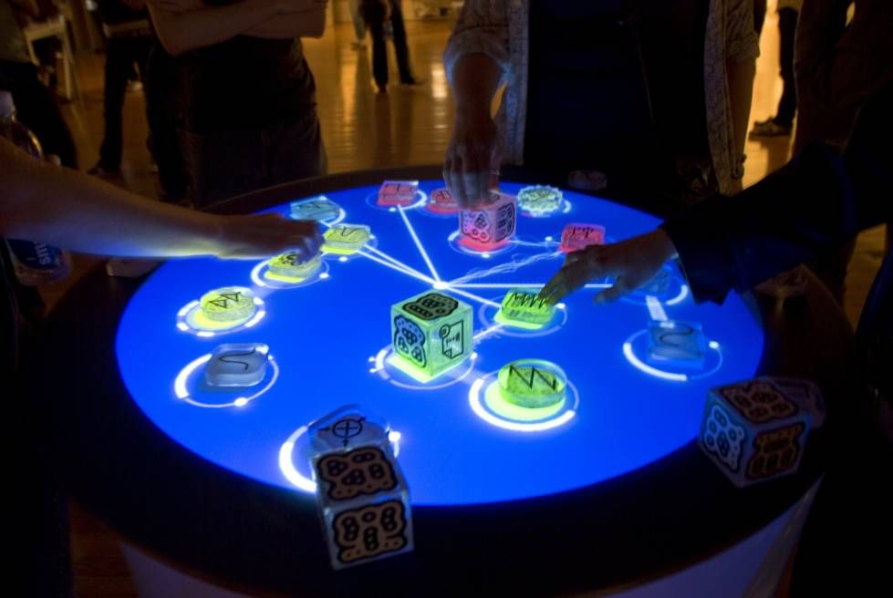
Author/Copyright holder: Courtesy of Daniel Williams. Copyright terms and licence: CC-Att-SA-2 (Creative Commons Attribution-ShareAlike 2.0 Unported).
Figure 20.1: An example of tangible interaction design for "doing" - the "Reactable". Note informational cues that inform the user of what each block does are visual, the tactility is how users take action.
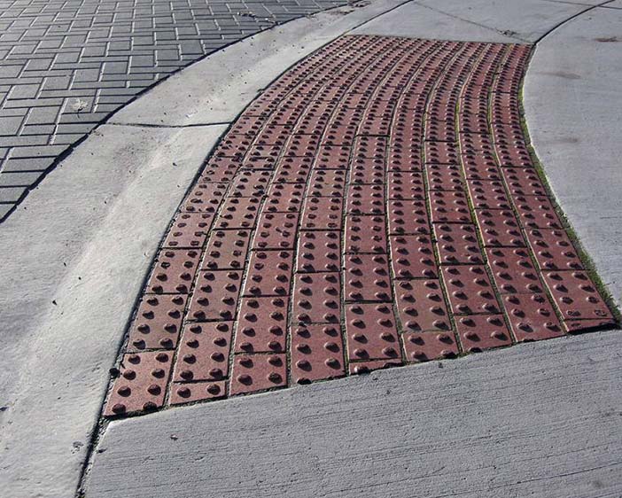
Author/Copyright holder: Courtesy of Richard Drdul. Copyright terms and licence: CC-Att-SA-2 (Creative Commons Attribution-ShareAlike 2.0 Unported).

Author/Copyright holder: Courtesy of Mailer Diablo. Copyright terms and licence: CC-Att-SA-3 (Creative Commons Attribution-ShareAlike 3.0).
Figure 20.2 A-B: Examples of tactile design for "receiving". These different textures feel different beneath the feet, and that change in texture informs blind (or texting) pedestrians when to stop or when to pay attention.
This argument alone is quite compelling, but let us now consider the numerous situations and environments in which a visually dominant display is either impractical or impossible. Perhaps the most immediately apparent example would be the design of non-visual interfaces for users who are blind. There are many issues to consider here, and some of these will surface later in this chapter. However, the key point for now is that the graphical user interface (GUI) will need to be translated and communicated effectively using non-visual means. There are some aids to draw upon here, screen-readers can use synthetic speech to read on-screen text or to describe a structural layout — but might it not be faster and more informing to display structural components in such a way that the user can 'feel' the controls? So, there are extraordinary needs for some computer users where a significant move away from a visually dominant interface is likely to be of benefit. However, there are all manner of occasions where the same is likely to be true for users who do not have additional individual needs. When controlling a vehicle, for example, or operating specialist machinery, it might simply be 'safer' to be able to maintain near-constant visual contact with our surroundings. Indeed, the location of controls for in-car entertainment systems is now often found on the steering column — within easy reach and with no requirement to look away from the road. In some situations, the immediate environment may not offer enough light to easily see what is happening. At the extreme end of these scenarios, perhaps an environment is currently under emergency lighting, and at the less safety-critical end, perhaps the living room is a little too dark to easily control the home-cinema by remote control.
So, there is a broad range of reasons why, as designers, we might wish to explore non-visual modes of communication. Our interest within the context of this chapter, though, is with tactile interaction, and later we will consider the various technologies (existing and emerging) that can be drawn upon to make this happen. However, as with all other forms of interaction and feedback there are physical and perceptual limits and boundaries that will influence how effective any new design might be.
20.2 The Psychology of Touch
To begin to appreciate how tactual interaction might be successfully integrated into the human-computer interface, it is essential to understand how the human body retrieves and processes information about its immediate surroundings. This happens at two levels: physical and perceptual. At the physical level, our peripheral nervous systems gather information using a number of different nerve types each of which is sensitive to a particular type of stimulus. All the information gathered by the peripheral nervous system is conveyed through the central nervous system to its ultimate focal point: the brain. It is here that the information is interpreted and then acted upon, and it is this process of interpretation that constitutes the perceptual level. For the purposes of this chapter, we shall avoid any further discussion on the physiological make-up of the human nervous system, but for anyone considering exploring tactile interaction within a design context, this really should feature as part of your recommended further reading.
Loomis and Lederman (1986) provide a useful overview of the three aspects of interpreting information through touch that could be referred to collectively as tactual perception. They state that there are two fundamental and distinct senses that together provide us with a sense of touch: the cutaneous sense and kinesthesis. The cutaneous sense provides an awareness of the stimulation of the receptors within the skin, whereas the kinesthetic sense provides an awareness of the relative positioning of the body (head, torso, limbs etc.). Perception that involves one or more of these can be regarded as tactual perception and there are, therefore, three forms of such perception.
Tactile perception is solely dependent upon variations in cutaneous stimulation by such actions as tracing a pattern upon an individual's skin. Tactile perception alone means that the individual in question must be static; otherwise the kinesthetic sense will be incorporated.
Kinesthetic perception is concerned with variations in kinesthetic stimulation. However, tactual perception without contribution from the cutaneous sense can only really be achieved under contrived circumstances such as using anaesthetic to suppress the cutaneous contribution.
Haptic perception is the form of tactual perception that involves both tactile and kinesthetic perception, and it is this that we use on an everyday basis to explore and understand our surroundings using touch.
The level of control that an individual has at any given time over the collection of information by either the cutaneous or kinesthetic sense leads to the following five tactual modes, where for the first three modes there is no control. Indeed, it can be seen from these definitions that of the five modes only the last, active haptic perception, is likely to be of real significance within the design of interfaces that employ tactile interaction.
Tactile perception - Cutaneous information alone.
Passive kinesthetic perception - Afferent kinesthesis.
Passive haptic perception - Cutaneous information and afferent kinesthesis.
Active kinesthetic perception - Afferent kinesthesis and efference copy.
Active haptic perception - Cutaneous information, afferent kinesthesis and efference copy.
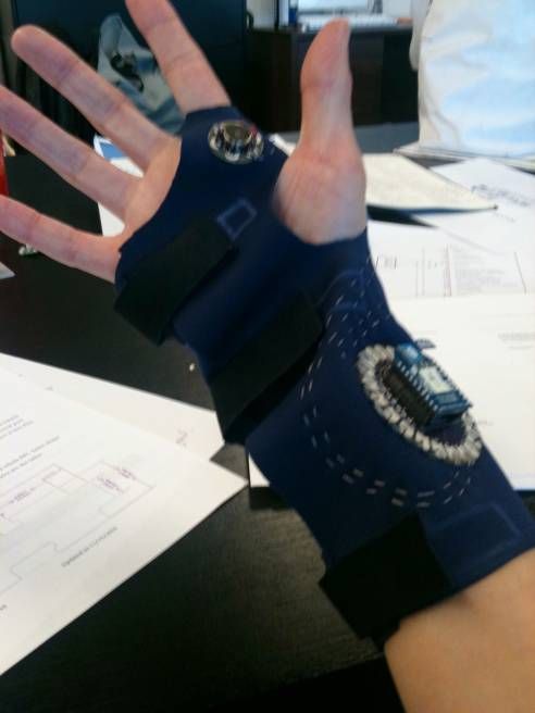
Author/Copyright holder: Courtesy of Amanda M. Williams. Copyright terms and licence: CC-Att-SA-3 (Creative Commons Attribution-ShareAlike 3.0).
Author/Copyright holder: Courtesy of Amanda M. Williams. Copyright terms and licence: CC-Att-SA-3 (Creative Commons Attribution-ShareAlike 3.0).
Figure 20.3 A-B: Vibrotactile feedback, such as this prototype glove uses, takes advantage of the user's cutaneous sense.

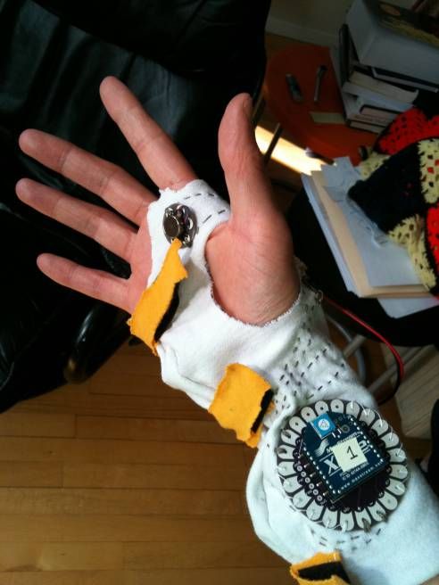
Author/Copyright holder: Courtesy of Maria Ly. Copyright terms and licence: CC-Att-SA-2 (Creative Commons Attribution-ShareAlike 2.0 Unported).
Figure 20.4: The kinesthetic sense provides an awareness of the relative positioning of the body
20.3 The Practicalities of Tactile Interaction
Ultimately, the design of any human-computer interface that incorporates tactile interaction is bound to share many of the same considerations over construction that need to be made when designing, for example, tactile diagrams, and there is a considerable body of research within this area that we can turn to. Before we consider some of these perceptual properties in depth, let us first quickly consider the relationship between touch and sight.
20.3.1 Vision versus Touch
Our general reliance on vision suggests that if a conflict were to arise between our sense of touch and our sense of sight, it would be the visual aspect that becomes dominant. Such conflict of sensory information formed the basis for research by Rock and Victor (1964) who used an optical cylinder to give a subject group the visual impression that a solid square object was really rectangular. To the subjects in the experiment, the tactual impression was unchanged. Subjects who were presented with such conflicts generally made similar judgements on size and shape as those members of a control group who were only presented with visual information.
However, McDonnell and Duffett (1972) suggest that Rock and Victor's experiment may have had methodological failings that could have produced a bias in favour of vision. In their reworking of the original experiment, subjects were asked to examine blocks of wood on the top surface of a table. To examine the lower part of the blocks, the subjects had to feel beneath the table. The impression that the subjects were given was that the blocks went through the table, whereas there were really two blocks being used to give that impression. In effect, each block that the subjects examined was a pair of blocks where the width of the wood and the protrusion on either side of the table was the same but the lengths could be different. Five pairs of blocks were used with the discrepancy ratios of 1:1, 1.29:1, 1.67:1, 2.2:1 and 3:1. After examining each block, the subjects would have to choose the best match from a group of comparison blocks that had no length discrepancy. The mean scores for the group showed that the subjects had chosen a comparison block that was a compromise between their visual and tactual impression. However, closer examination showed that the subjects had made their choice conform to either the visual or tactual impression and that there was considerable diversity of response pattern such that visual dominance could not be regarded as significant.
Heller (1992) has also shown that Rock and Victor's original findings should not have been applied so generally as to state that vision will always be the more dominant sense when there is conflict between touch and vision. In Heller's experiment, subjects were required to explore the embossed letters p, q, b, d, w and m whilst looking at them in a mirror. A subject would, for example, be exploring the letter w whilst looking at the letter m. When asked to identify the letters, there were a wide range of responses where the majority relied on touch, some on a compromise between the two and only one relied on vision.
It seems, therefore, that visual dominance versus tactual dominance should not be thought of as a dichotomy as there is evidence of compromise between the two senses when they are in conflict. In addition, this level of compromise is likely to be highly individual and will also be affected by a bias towards the suitability of one or both senses to the nature of the task.
20.3.2 Visual to Tactile Mapping
Klatzky and Lederman (1987) argues that many tactile diagrams will probably have problems due to the limiting nature of spatial resolution describing, for example, line drawings that are seen well might not be felt that well because the scale simply becomes too small for such limited bandwidth. Klatzky and Lederman also suggest that a fundamentally flawed model of haptic processing is often employed in the design of tactile graphics displays. Referred to as the image mediation model, the "hand functions like a roving eye that is badly in need of glasses" (Klatzky and Lederman 1987). The assumption made is that a spatial image is produced which is equivalent to one produced using vision. However, this image is affected by factors such as the low resolution of the haptic sensors along with demand placed upon memory due to the nature of exploring an 'image' over time. This image is then passed to the visual system's image interpreters resulting in a mental-image which perhaps seems like the original diagram was examined visually by someone with poor eyesight.
In contrast to this model, Klatzky and Lederman suggest that the haptic system has its own perceptual system and interpretive processors. Haptics and vision are simply different ways of perceiving, although at a much higher cognitive level there may be some convergence of the haptic system into the visual. Perhaps the most significant suggestion from Klatzky and Lederman is that the haptic system is not an efficient mediator of images. By way of example, it is described that if an individual is asked to think of looking at a cat, he/she is likely to visualise the shape of its body and perhaps the colour and pattern of its fur. However, if the same person is then asked to think of touching a cat, a very different image will result; the softness of its fur and perhaps the warmth of its body.
During studies by Klatzky and Lederman into exploration of three-dimensional objects, a series of methods for exploration were recorded. Of particular interest was that substance dimensions (e.g. hardness and texture) can be extracted quickly and reliably, whereas structural information is extracted slowly and is error prone. If it is assumed that the haptic system will favour encoding mechanisms which produce maximum return for minimum effort, then it would be expected that an economical system would favour substance based exploration and encoding. One particular study involved subjects sorting objects that varied along four dimensions: hardness, surface-roughness, size and shape. There were three variations for each dimension, and all possible combinations were covered within the whole group. The subjects were simply asked to place objects that were similar into a common bin. By examining the objects within each bin, the dimension that had proved most salient could be established. For example, had all the rough objects been in one bin, the medium rough in another and the smooth in another, then surface texture would have been the most salient dimension.
The results varied depending on the exploratory conditions which were allowed such that when denied sight, the subjects would prefer the substance dimensions of either hardness or texture. This pattern was unchanged when similarity was defined as how objects 'felt', but there was a large shift towards reliance on structural dimensions when similarity was defined in terms of objects being similar 'visually'. Finally, when the subjects were allowed to see the objects, the structural dimensions were the strongest again. Although these studies were carried out using three-dimensional objects, the findings might be just as valid within tactile diagram design although only contour and texture would apply. In particular, if a display is to be partly visual but also reinforced with some tactile elements, Klatzky and Lederman's findings might help establish how best to distribute the information between the visual and haptic channels.
20.3.3 Line Symbols
Perhaps the simplest tactile object is that which represents the drawing primitive of a line. Straight and curved lines could be considered as the building blocks of most graphical representations, and graphs, maps, and other diagrams can rely heavily on the use of lines within their construction. There are two issues that quickly become apparent when using raised lines as tactile substitutes for visual ones:
How easily can they be traced?
How easily can different line widths be distinguished from one another?
On the traceability of lines, a comparison study has been made by Bentzen and Peck (1979) which addressed the issue of which styles of lines are easiest to follow by tracing with a finger. Four line styles were used: single continuous (smooth), double continuous, single dotted (rough) and double dotted. These were chosen because they seem to be accepted as the four most commonly used, but without any supporting evidence as to which is superior. Other than identifying which lines are generally the easiest to trace, Bentzen was also interested in how tracing can be affected within two particular scenarios:
Displays in which lines do not have intersections.
Displays in which lines do have intersections. Rough against smooth and single against double.
Two displays were created using embossed plastic sheets. A simple display used all four line types, without intersection, which all included a right angle, an obtuse angle and an acute angle and a semicircle of 1.5in. These were connected using three straight-line sections of 3in and three of 1.5in. The complex display had the four line styles using the same tracing components, but each line intersected the other three at some point.
The conclusions reached were that the performance of rough against smooth lines is not significantly different and is therefore not a real design issue in the use of tactile diagrams. Single lines, rough or smooth, are preferable to double lines (0.25in apart) in tactile displays that do not have intersecting lines. No real conclusion was found with double over single lines, other than double did perform better than single at intersections. This, however, was believed to be particular to the design of the displays used and was therefore not significant at this stage. One final observation was that a single narrow line intersected by a double is an undesirable feature.
An experiment by Lederman and Campbell (1983) explored the use of raised lines with tangible graph displays for blind people. Four different methods of presenting the graphs were used.
No-grid - besides the tics on the major axes, there were no grid lines to be found in the main graph-area.
Grid-on-graph - the tics extended across the main area in a grid format.
Grid-on-overlay - the grid was an overlay to the no grid version. The subject could keep dropping the overlay down onto the graph.
Grid-on-underlay - the opposite to grid-on-overlay. Here, the grid was the underlay part, and the graph could be dropped down onto the grid.
Three line styles were used: smooth, large-dotted and small-dotted. From a traceability perspective, the results were encouraging, but with graphs where all three line-types were present in close proximity, a significantly longer time was taken to perform tasks and these were more likely to be inaccurate. Some notes by the investigators mention that when initially presented with a graph, a subject would tend to explore its general format such as major axes, symbols and labels. Sandpaper squares at the corners were used to great effect in that by checking the squares and major axes, a broad sweep of the hand allowed the subject to become swiftly familiar with the graph's dimensions and proportions. Individual differences were observed as some people would use both hands to explore, whilst others would prefer to keep one hand on the origin as a point of reference. It also appeared that both the no-grid and grid-on-graph formats were preferred to the other options; both seemed to be equally easy to use.
One other exploration of the factors that affect the discriminability of tactile lines concerned the perception of one line as being wider than another (Berla and Murr 1975). In essence, five standard line thicknesses were each compared with a set of lines half of which were narrower and the rest thicker. The five standard line thicknesses used were 0.1, 0.15, 0.2, 0.25 and 0.3cm wide. The 0.1cm line had six progressively narrower lines and six wider, in steps of 0.01cm, whereas all the other lines used steps of 0.013cm. Each line was approximately 0.64cm in height. When presented with one standard line and one variable, the subject had to indicate which was widest. The results showed that the percentage of extra width that was required for an individual to perceive a line as wider than the standard decreased as the standard increased. For example, the thinnest standard line (0.1cm) needed to be 20% to 48% wider, whereas the thickest line (0.3cm) needed to be 11% to 27% thicker. However, this trend did not continue without finish. When the standard lines included thicknesses of 0.64cm and 1.27cm, performance began to diminish. This was attributed to the line width beginning to extend beyond the width of an average fingertip with the result being that both sides (or edges) to the line could not easily be perceived. As the results stand, though, there is a very useful set of highly distinguishable line widths that can safely be employed where difference in line width will play a significant part in a tactile display.
Nolan and Morris (1971) suggested that only around eight tactile linear symbols could be in use at any given time before similarities would occur and that there was likely to only be a maximum of ten. A study by James and Gill (1975) showed there to be ten such distinguishable linear symbols, but they were unable to progress beyond Nolan and Morris's upper limit.
20.3.4 Point Symbols
Point symbols are probably best described as those symbols which are designed to be explored with only minimal movement of the fingertip. An important aspect of the use of such symbols is how well they can be perceived in contrast to the background. This is commonly referred to as the figure-ground problem. One aspect of this is whether raised symbols are easier to recognise than incised. An assumption that there is no particular difference between either has been tested (Nolan and Morris 1971) and in contrast to popular belief it seems that there is a significant difference. Braille readers were asked to trace a tactile symbol and then find that same symbol from a set of five possibilities. This was carried out using a set of raised figures and an equivalent set of incised figures. Nolan's result showed that, in fact, raised figures are significantly superior to incised figures. Although there was an increase in error rate with the incised symbols, the significant result was that there was a required increase in reading time of around 38%. This implies that most tactile symbols will be read faster and more accurately if raised figures are used.
Research by Lambert and Lederman (1989) into the relative legibility and meaningfulness of tactile map symbols has shown that there are three categories of tactile symbol to be used. Some symbols have inherent meanings such as a telephone shape, some can imply a meaning such as a pointed symbol for stop and some can have quite arbitrary meanings such as using a square to represent a washroom. The size of the symbols used was between 0.635cm and 1.27cm per side. These were based on previous observations and studies with blind people. The notable feature that Lederman discusses is that, although some people will instantly prefer or recognise certain symbols, the question of whether a symbol possesses inherent meaning is not paramount. With prolonged use, any symbol will begin to imply a specific meaning and to that effect there will be a learning overhead expected in the successful implementation of any tactile diagram.
20.3.5 Areal Symbols
The term areal symbol is used to describe those areas of a tactile diagram which use either a texture or a tactile pattern to communicate information. The term tactile-pattern perhaps implies an area covered with incised or raised symbols which can easily be perceived as being identifiable and distinguishable from similar patterns. However, Lederman (1982) makes the point that a fundamental aspect of tactile pattern perception is the perception of texture. She uses examples of the 'smoothness' of a baby's skin, 'roughness' of sandpaper, 'softness' of cashmere, 'rubberiness' of elastic and the 'slipperiness' of ice. Texture alone provides much of the tactual feedback that we need to decide whether one areal tactile pattern is highly distinguishable from other areal patterns.
Author/Copyright holder: Unknown (pending investigation). Copyright terms and licence: Unknown (pending investigation). See section "Exceptions" in the copyright terms below.
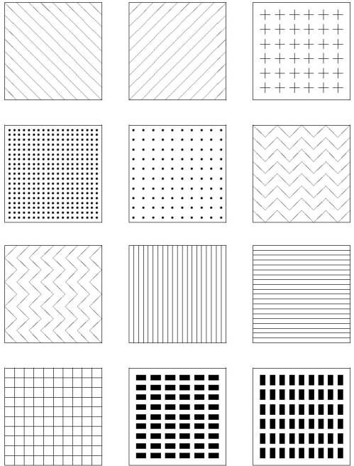
Figure 20.5: Some examples of possible areal tactile symbols
Lederman discusses some of the known issues with the perception of texture outlining how she has studied the perception of roughness using aluminium plates with linear grooves cut into the surface. Her results have shown that the main factor affecting the perception of roughness is the width of the groove cuts in relation to their spacing. However, she has also shown that applied force is the next most significant factor, followed by hand speed. A greater applied force produces results that show a higher ratio of perceived roughness, and this can be shown to be true with a gradually decreased hand speed. These findings are significant in that they could play an important part in the design of appropriate tactile patterns to employ as areal symbols.
Loomis (1981) describes a series of limitations that affect tactile pattern perception: spatial resolution, interactions between stimuli more widely spaced than the resolution limit (interference), temporal resolution, perceptual integration and limited attention.
Spatial resolution - This is normally associated with the two-point limen test where the two points of a draftsman's compass are placed onto an individual's skin in close proximity to each other. The distance of interest is the threshold at which the two points are perceived as one. However, Loomis breaks spatial resolution into three further factors. Firstly, there is the mechanical property of the skin. When a point is placed on the skin, the gradient of skin deformation will be considerably less than that of the stimulus. Secondly, there is the property of mechanical wave spreading. When a point is stimulated, travelling waves are produced which, when picked up by other mechanoreceptors, result in a 'blurring' effect. Lastly, there is the neural organisation that means that spatial resolution is dependent upon:
The density of mechanoreceptive units in a particular area of the skin.
The size and sensitivity of these units.
The number of neurons in the cortical projection areas that represent that same field.
Interactions between widely spaced stimuli - The two-point limen test is a clear example of this, but the focus is to assess the distance at which two stimuli are perceived as one. Having two such stimuli presented to body locations that are wide apart, such as separate hands, can lead to a phantom sensation at a point between the two. Another example of phantom sensations occurs when rapid stimuli are presented to one point and then immediately to another. The resulting feeling is of an evenly spaced series of sensations travelling from one location to the other. Cutaneous masking can also occur in that one stimulus can be completely masked by the presence of another much stronger stimulus.
Temporal resolution - The minimum period with which an individual can still clearly perceive two brief pulses as being separate. Loomis states that a number of experiments into this have arrived at estimates ranging from 2ms to 40ms.
Perceptual integration - The way in which all this information is used at a cortical stage even if it were to arrive there with no significant loss of detail. The suggestion is that, unlike with visual perception, the information from a stimulus pattern may fail to be recognised.
Limited attention - Even if the information was perceived without loss and integrated cortically, the individual might still not perceive the pattern as a result of insufficient attentional capacity. With the visual channel, it is widely acknowledged that people possess the ability to focus their attention when the quantity of information begins to exceed their processing capacity. The tactual channel does not seem as efficient for this form of focused attention.
When it comes to the practical application of tactile patterns as part of a display, Lederman and Kinch (1979) have provided a review of existing work in the field. A general conclusion that can be reached is that although there are around forty tactile patterns that can be found that are easy to recognise only up to eight can be used together. It is very difficult to find any more than eight patterns that can be used as a group without ambiguities creeping in. As an example, a typical poor choice of patterns would be the use of diagonal lines in opposing directions to signify separate functions. So, within the example set of twelve areal symbols shown earlier in Figure 5, there are already ambiguities beginning to creep in such that rapid distinction between certain pairs of symbols will be inhibited. A significant effect that Lederman discusses is the use of height to provide a filtering method within a tactile display. Symbols could be presented at one of three heights to provide an indication of significance, and through using a sweeping hand movement, this could be used as way of filtering out unwanted information.
Author/Copyright holder: Unknown (pending investigation). Copyright terms and licence: Unknown (pending investigation). See section "Exceptions" in the copyright terms below.
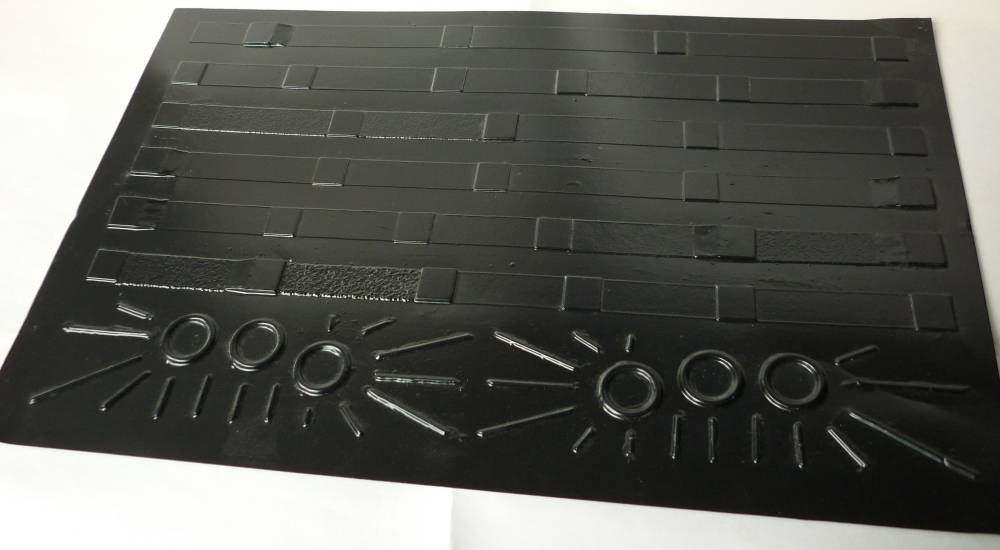
Figure 20.6: A tactile overlay for conveying the structural information from a page of music notation. Made from vacuum-formed pvc, the overlay displays key elements such as bars, lines to a page, repeat marks etc. Similar overlays were used within an experimental system for providing access to music notation for blind people (Challis and Edwards 2000). Interacting with the overlay would allow the user to extract speech and audio descriptions of rhythmic and melodic content.
Author/Copyright holder: Unknown (pending investigation). Copyright terms and licence: Unknown (pending investigation). See section "Exceptions" in the copyright terms below.
Author/Copyright holder: Unknown (pending investigation). Copyright terms and licence: Unknown (pending investigation). See section "Exceptions" in the copyright terms below.
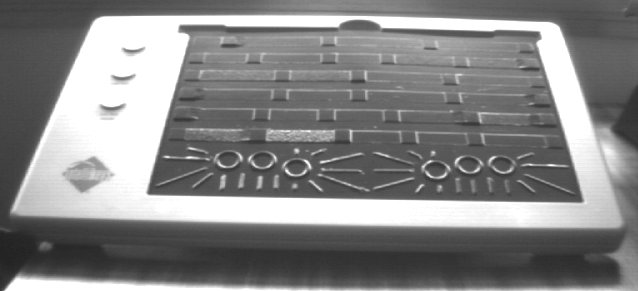
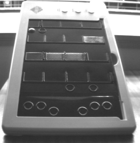
Figure 20.7 A-B: Examples of other overlays from the 'Weasel' non-visual music notation system. Here, each overlay is housed within an Intellikeys touch-sensitive tablet; a device used quite commonly in special needs education.
Author/Copyright holder: Unknown (pending investigation). Copyright terms and licence: Unknown (pending investigation). See section "Exceptions" in the copyright terms below.
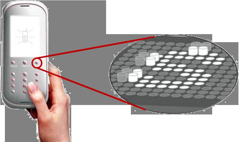
Figure 20.8: Taxels can be thought of as being tactile equivalents to pixels. The illustration here suggests how an array of taxels might be used to create a dynamic interface for a mobile phone.
20.3.6 Strategies for Exploration
Berla (1972) defines three problem areas in the use of tactile diagrams by blind people: legibility, organisation and strategies for exploration. Of these three problems, the last is of particular interest as it is concerned with how individuals adopt different methods for exploring diagrams. The results of an experiment in this area by Berla showed that some individuals will use a one-handed scanning strategy and others would use two. Those who used two hands proved to maintain a superior sense of orientation and position within the diagram than those who used only one hand. He suggests that this is the result of being able to use one hand as a reference point. The strategies that Berla identified can be described as:
Horizontal-unidirectional - where a hand is moved horizontally across the page and is returned to the beginning of the line before progressing down or up the page for the next scan.
Horizontal-bidirectional - where a hand traces in one direction across the page, is lowered or raised to the next line of scanning and then scans back across the page.
Asymmetrical horizontal scan - where both hands are placed at the centre of the diagram and then moved outwards in opposite directions and then brought back to the centre again. The hands are then lowered or raised to the next scan line.
Vertical-unidirectional - where a hand traces vertically across the page and is returned to the beginning of the line before progressing right or left for the next line of scanning.
Vertical-bidirectional - where a hand traces vertically across the page, is moved left or right to the next line of scanning and then scans back vertically across the page.
Perimeter or 'clock-face' scan - where a hand traces the full perimeter of the diagram and then is moved successively closer to the middle, scanning the smaller, inner perimeters.
Bounded search - where arbitrarily sized 'boxes' are superimposed onto the diagram by the reader. Searches will be limited to particular boxes.
Density distribution scan - where a hand is used to swiftly determine in which areas the majority of symbols can be found. The least populated areas are then explored first.
Spoked wheel scan — where one hand is used as a reference point for the other hand which scans from the centre outwards, gradually moving around the diagram.
Berla concludes that these strategies all have relative merits and disadvantages which, therefore, make it difficult to suggest the 'ideal' strategy to adopt. He also describes how the most appropriate approach might be to teach all of these strategies to people who will be working with such diagrams. They will then be able to apply the most suitable strategy to any given exploration task. Berla and Butterfield (1977) has also suggested that individuals will probably need to be trained how to use a particular type of tactile diagram before any significant level of success can be attained. In his studies, he showed that a student's performance at distinguishing between, and understanding, tactile symbols increased if the student was first trained in line tracing and distinctive features analysis. There can be, perhaps, an expectancy for an individual to simply understand such tactile diagrams without any prior experience. This is an area that Berla underlines as being important when intending to design and implement a tactile display.
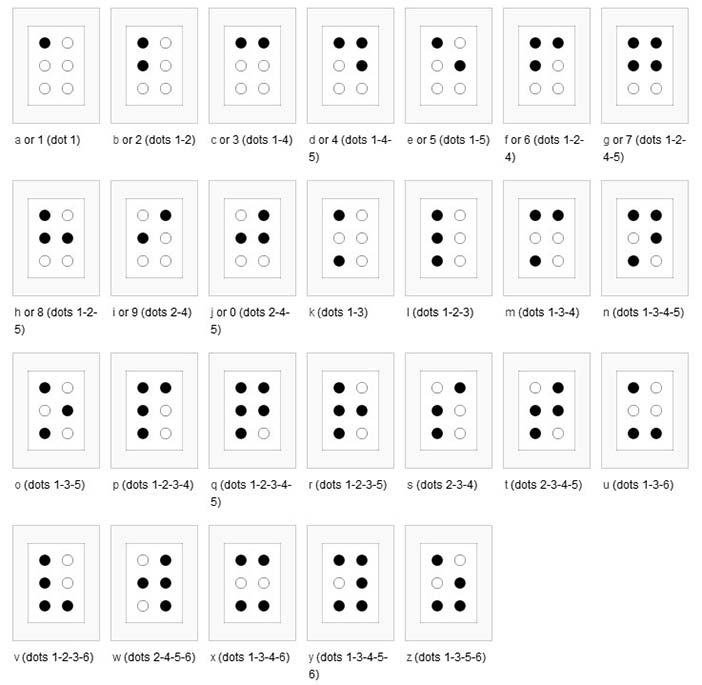
20.3.7 Braille Symbols
The Braille system is a method widely used by people who are visually impaired to read and write. Braille was devised in 1825 by Louis Braille, a blind Frenchman. Each Braille character, or cell, is made up of six dot positions, arranged in a rectangle containing two columns of three dots each.
Author/Copyright holder: Unknown (pending investigation). Copyright terms and licence: Unknown (pending investigation). See section "Exceptions" in the copyright terms below.
Figure 20.9: The Braille symbols
Although braille symbols are not an integral aspect of tactile diagram design, each cell is effectively a tactile symbol, and factors that affect the legibility and perception of such cells could therefore be of interest. One particular piece of research into braille and pattern perception studied whether braille cells are perceived as groups of individual dots or as outline shapes. A series of experiments by Millar (1985) used partial outlines to represent the letters that would normally be shown in braille. These were not tactile outlines of the ordinary printed letters; instead they were joined up versions of the braille cells. Millar's results showed that braille letters can be read and recognised significantly faster with cells of dots rather than joined lines. This implies that small tactile symbols might also benefit from being made of patterns of dots rather than outlines.
Author/Copyright holder: Unknown (pending investigation). Copyright terms and licence: Unknown (pending investigation). See section "Exceptions" in the copyright terms below.
Figure 20.10: Examples of the outline shapes used to replace braille cells by Millar (1985)
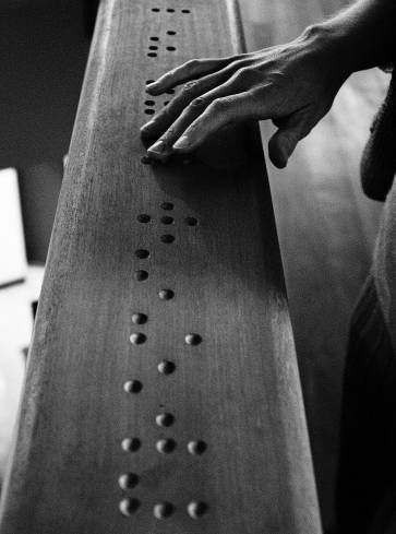
Author/Copyright holder: Courtesy of Christophe Moustier. Copyright terms and licence: pd (Public Domain (information that is common property and contains no original authorship)).
Figure 20.11: Wood-carved braille code of the word 'premier' (French for "first")
20.3.8 Design Principles for Tactile Interaction
A preliminary set of design principles for including tactile information within the human-computer interface has been proposed (Challis and Edwards 2000, Challis and Edwards 2000). Using music notation as an example of a complex graphical information type, an experimental system was developed that could enable blind music-learners to adopt a non-visual multi-modal approach to reading music notation. Static overlays were used in conjunction with a resistive touch-pad to create interactive pages where a user could 'feel' the structure of the page layout and then select appropriate levels of information retrieval using audio and synthetic speech. Three founding principles were adopted at the outset of the study covering consistency of mapping, the use of height and the use of static data with additional principles being identified within the study to address aspects such as size of display, visual-to-tactile mapping, simplicity of symbol design and perhaps most significantly empty space; this simply introduces areas where the user has no information on where or how to explore. One simple but key observation put forward was that tactile diagrams might not look that good and that the design is not likely to benefit from over-reliance on direct visual-to-tactile mapping.
20.4 Tactile Interaction in the Human Computer Interface
When employing technologies for harnessing tactile interaction, there are three broad approaches that might be considered: static tactile displays, dynamic tactile displays and force-feedback technology. There are clear merits and constraints associated with each such that the nature of interaction task will dictate which category will be most effective. Indeed, Oakley et al. (2000) have suggested definitions by which such different technologies can be categorised, this being based on the sensory system that is most affected by the interaction.
Haptic - Relating to the sense of touch.
Proprioceptive - Relating to the sensory information about the state of the body (including cutaneous, kinesthetic and vestibular sensations.)
Vestibular - Pertaining to the perception of head position, acceleration and deceleration.
Kinesthetic - Meaning the feeling of motion. Relating to sensations originating in muscles, tendons and joints.
Cutaneous - Pertaining to the skin itself or the skin as a sense organ. Includes sensation of pressure, temperature and pain.
Tactile - Pertaining to the cutaneous sense, but more specifically the sensation of pressure rather than temperature or pain.
Force Feedback - Relating to the mechanical production of information sensed by the human kinesthetic system.
20.4.1 Static and Dynamic Tactile Displays
Where a permanent display is appropriate, an interactive information display, for example, or the controls on a dedicated device, then a static overlay superimposed upon an appropriate touch-responsive surface (e.g. resistive, capacitive, infrared, acoustic wave or force-sensing) will be practical whilst offering fine level of detail if required. In contrast, a dynamic display can offer increased flexibility as the interface is not 'tied' to a particular layout. Refreshable braille displays go some way towards offering this flexibility, but the size of the technology currently available does not lend itself to the creation of tactile symbols of a useful resolution.
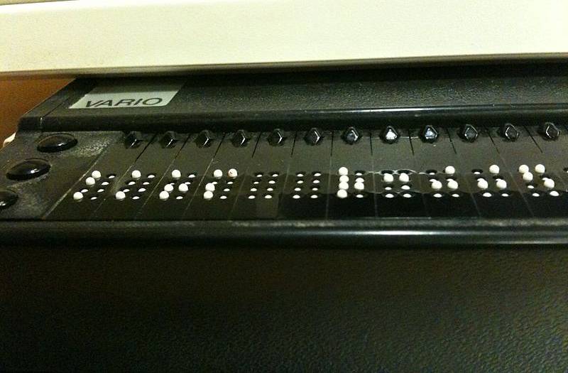
Author/Copyright holder: Unknown (pending investigation). Copyright terms and licence: Unknown (pending investigation). See section "Exceptions" in the copyright terms below.
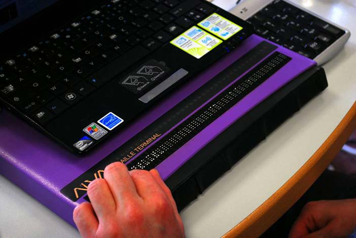
Author/Copyright holder: Courtesy of Sebastien Delorme. Copyright terms and licence: CC-Att-SA-3 (Creative Commons Attribution-ShareAlike 3.0).
Figure 20.12 A-B: Braille displays
For example, to achieve the sensation of tracing an unbroken line, a resolution of 20 dpi is required (Fricke and Bahring 1992, Fricke 1997). Even at this resolution, a display area of 20 inches by 15 inches will require 120,000 elements, and yet diagonal lines will still feel broken. Assuming that such technology was available to achieve a higher and more accurate resolution, the technology must be even smaller still. Each of these elements would need to be controlled separately; the system would have to be capable of addressing 120,000 elements individually, but also incredibly quickly. Mechanical technology for this purpose and of this size is simply not available yet, and even the most basic technology that is available is very expensive. One alternative solution to this compound problem has been explored within the Heidelberg Tactile Vision Substitution System (Maucher et al 2000) which greatly reduces the number of required taxels by using a virtual display area (think of taxels as tactile counterparts to visual pixels). To achieve this, 48 such taxels have been mounted on a carriage that is moved across the larger display area that would have required 2600 taxels; still a very low resolution in terms of overall definition.
20.4.2 Haptic Display Technology
Partly influenced by the rapid expansion of the computer games market and general interest in virtual environments, affordable force-feedback and haptic-technology has been available for some time now (force-feedback joysticks, 'rumble-pads', vibro-tactile mice etc.). Based on similar technology to that developed within the Phantom series of force-feedback devices from SensAble Technologies, sophisticated games devices such as the Novint Falcon are being used to offer a rich and immersive sense of physical presence within computer games. Offering three degrees of freedom, a motor controlled arm is used to convey sensations like recoil, impact or different levels of resistance to a player's hand held control device that might take the form of, for example, a gun or bat. The Phantom devices are similar, and like the Falcon can take control of the user's hand or limb, creating a rich variety of virtual textures and other effects. Remember though, haptics implies a combination of both tactile and kinesthetic feedback; however, the devices described here do not really provide much feedback at a tactile level. In this sense, haptic perception within the domain of virtual displays is unlikely to be active and therefore does not match the definition provided earlier. To that extent, the usefulness in such displays lies in their dynamic nature rather than in the richness of haptic interaction that can be achieved.
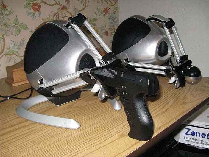
Author/Copyright holder: Courtesy of Lapsus Antepedis. Copyright terms and licence: CC-Att-SA-3 (Creative Commons Attribution-ShareAlike 3.0).
Figure 20.13: A Pair of black Novint Falcons sitting on a table, with the Pistol and Ball grip attachments
Building on their initial ventures with force-feedback and vibro-tactile feedback gaming devices, the company Immersion is now producing multi-actuator controllers aimed at bringing haptic interaction to the now ubiquitous touch-screen interface on smart-phones and 'tablets'. Designed to be placed behind or around the screen-area, up to 16 actuators can be programmed to produce various vibratory effects that can reinforce user actions. Pressing an onscreen button, for example, can be accompanied by an effect that will go some way towards informing the user that the action has been achieved. Again, this is useful feedback, and the dynamic nature of the display brings considerable flexibility to the interface, but the user, for example, will not be able to feel outline or detailed texture in the way that a static display can offer; the 'display' as such is still predominantly visual.
Copyright terms and licence: pd (Public Domain (information that is common property and contains no original authorship)).
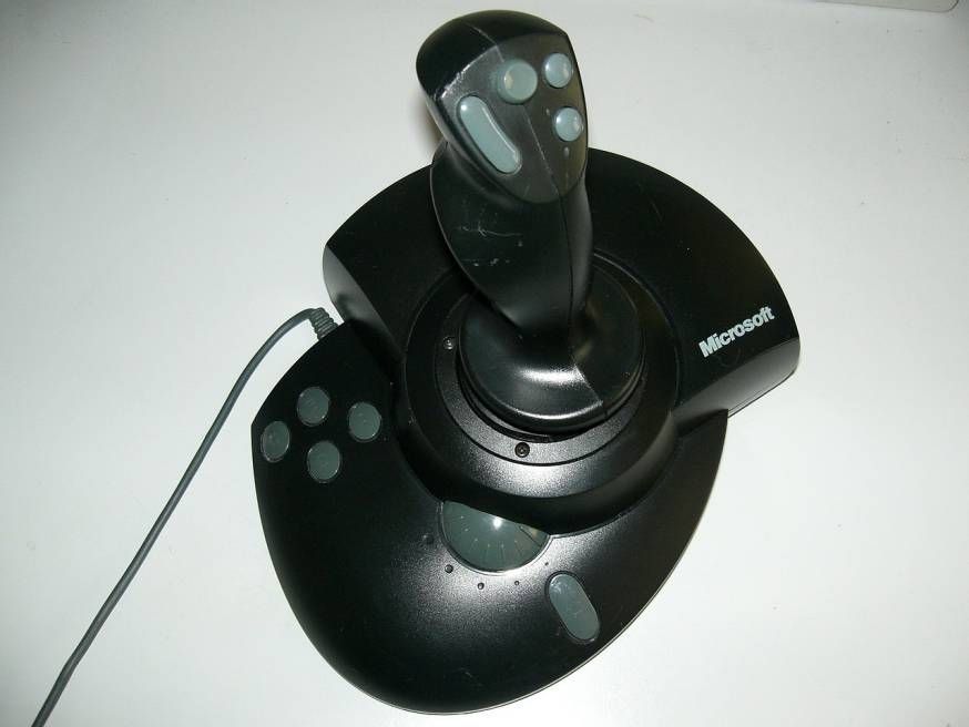
Figure 20.14: Video gaming devices can make effective use of force feedback to bring immersive qualities to game-play. These range from vibratory 'rumble' pads, to simulate collisions and shockwaves for example, to more physical interactions from a force-feedback joystick like the one pictured here (the Sidewinder Force-feedback Pro from Microsoft) where the hand is controlled and moved, perhaps to suggest resistance from obstacles, or actions like the recoil from shooting a gun.
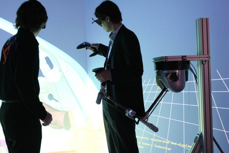
Author/Copyright holder: Courtesy of HAPTION. Copyright terms and licence: CC-Att-SA-3 (Creative Commons Attribution-ShareAlike 3.0).
Figure 20.15: More sophisticated force-feedback systems (like those manufactured by Haption) can be used to bring rich haptic-reinforcement into virtual environments.
Author/Copyright holder: Courtesy of Chris Desmond US Navy. Copyright terms and licence: pd (Public Domain (information that is common property and contains no original authorship)).
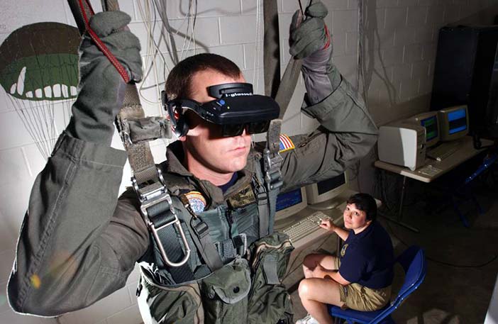
Figure 20.16: Virtual Reality (VR) parachute trainer. Students wear the VR glasses while suspended in a parachute harness, and then learn to control their movements through a series of computer-simulated scenarios. The computer receives signals from the student as they pull on the risers that control the parachute. The VR trainer also teaches aircrew personnel how to handle a parachute in different weather conditions and during possible equipment malfunctions.
20.5 Future Directions
It is clear that current technologies cannot yet facilitate dynamic tactile displays that offer the same richness of detail and contrast that we experience with the objects around us on a daily basis. However, as much as this would be an obvious ultimate aim within a context of augmented reality or virtual environments, there are perhaps much more attainable targets that will still be of significant use. Access to information for visually impaired (VI) users has been a strong feature within our discussion, and it is clear that a truly dynamic and rich tactile display could bring considerable benefits to this area. For example, e-books are now commonplace, but how about e-books where the user can explore and interact with braille and tactile diagrams? Might there be other more mainstream uses for similar technology? At a personal level, my background is shared between technology and music, and though I have considerable enthusiasm for virtual synthesisers and music environments, I still much prefer the sensation of touch and 'feel' with real controls to those afforded by a touch-screen. In this context, which would be more useful to me, a rich colourful and graphical interface with no meaningful tactile interaction or a simple graphical display that allows me to touch and feel the controls? After all, both will be controlling and producing the same sonic output, and that will always be my main concern. Realistically, I imagine that I would probably benefit from a little bit of both. So, how close are we to having such an immersive level of dynamic tactile display? We considered earlier how the size of the mechanical parts creates restrictions in both control and resolution, but there have been significant breakthroughs in this area with the exploration of gel-based pixels that respond to heat. Measuring just 300 microns across, such a pixel will respond to heat from a fine light source and shrink to just half its original height of 0.5mm; the pixel also becomes opaque such that the change is quite visible. The experimental display contains over 4000 of these pixels with about 297 being available within each square centimetre such that fine resolution tactile graphics can be achieved. However, the refresh rate is still slow compared to a standard LCD display, for example, but so is that of a typical e-book. This is still an emerging technology, but one that if developed fully could easily lead to the creation of the tactile e-book that we just considered. If this same technology can be further enhanced to enable input on the part of the user, then this really could be the gateway to enabling rich haptic interaction within all kinds of novel tactile-interfaces.
20.6 Where to Learn More
It may come as little surprise that much of the information referenced within this chapter has been drawn from research into non-visual approaches for enabling access to information for visually impaired users. Though there is significant interest in the application of tactile interaction within mainstream devices there is already a considerable body of knowledge that has been established because of research into accessibility through new technologies. There are a number of conferences that address non-visual interaction within a broader range of disability related topics and these include:
ICCHP - International Conference on Computers Helping People with Special Needs
CSUN - Annual International Technology and Persons with Disabilities Conference
ASSETS - International ACM SIGACCESS Conference on Computers and Accessibility
ICDVRAT - International Conference on Disability, Virtual Reality and Associated Technologies
Conferences on Human Computer Interaction should also be included as potential sources of further information:
CHI — ACM Conference on Human Factors in Computing Systems
HCI — British Computer Society HCI Conference
There are also a number of journals that will occasionally address the notion of Tactile Interaction though perhaps within a wider of interactivity. These include:
Journal of Visual Impairment and Blindness
Perception
Digital Creativity
Technology and Disability
International Journal of Arts and Technology
Computer Music Journal
20.7 References
Bentzen, Billie Louise and Peck, Alec F. (1979): Factors Affecting the Traceability of Lines for Tactile Graphics. InJournal of Visual Impairment and Blindness, 73 (7) pp. 264-269
Berla, Edward P. (1972): Behavioral Strategies and Problems in Scanning and Interpreting Tactual Displays. InNew Outlook for the Blind, 66 (6) pp. 277-286
Berla, Edward P. and Butterfield, Lawrence H. (1977): Tactual Distinctive Features Analysis: Training Blind Students in Shape Recognition and in Locating Shapes On a Map. In The Journal of Special Education, 11 (3) pp. 335-346
Berla, Edward P. and Murr, Marvin J. (1975): Psychophysical functions for active tactual discrimination of line width by blind children. In Perception and Psychophysics, 17 (6) pp. 607-612
Challis, Ben (2002): Designing Interactive Tactile Diagrams. In: Miesenberger, Klaus, Klaus, Joachim and Zagler, Wolfgang L. (eds.) ICCHP 2002 - Computers Helping People with Special Needs - 8th International ConferenceJuly 15-20, 2002, Linz, Austria. pp. 559-561
Challis, Ben and Edwards, Alistair D. N. (2000): Design Principles for Tactile Interaction. In: Proceedings of the First International Workshop on Haptic Human-Computer Interaction 2000. pp. 17-24
Challis, Ben and Edwards, Alistair D. N. (2000): Weasel: A System for the Non-Visual Presentation of Music Notation. In: Proceedings of 6th International Conference on Computers Helping People with Special Needs. ICCHP 2000 2000.
Fricke, Joerg and Baehring, Helmut (1993): Design of a tactile graphic I/O tablet and its integration into a personal computer system for blind users. In Journal of Microcomputer Applications, 16 (3) pp. 259-269
Fricke, Joerg and Bahring, H. A. (1992): A Graphic Input/Output Tablet for Blind Users. In: Proceedings of 3rd International Conference on Computers for Handicapped People 1992.
Fricke, J. and Edwards, Alistair D. N. (2000): Tactile Displays Based on Modulated Electromagnetic Radiation. In:Proceedings of 6th International Conference on Computers Helping People with Special Needs. ICCHP 20002000.
Heller, Morton A. (1992): Haptic dominance in form perception: vision versus proprioception. In Perception, 21 (5) pp. 655-660
James, G. A. and Gill, J. M. (1975): A pilot study on the discriminability of tactile areal and line symbols for the blind. In Research Bulletin of the American Foundation for the Blind, 29 pp. 23-31
Klatzky, Roberta L. and Lederman, Susan J. (1987): The Representation of Objects in Memory: Contrasting Perspectives from Vision and Touch. In: Gruneberg, M. M., Morris, P. E. and Sykes, R. N. (eds.). "Practical Aspects of Memory: Current Research and Issues". Wiley
Lambert, L. M. and Lederman, Susan J. (1989): An evaluation of the legibility and meaningfulness of potential map symbols. In Journal of Visual Impairment and Blindness, 83 pp. 397-403
Lederman, Susan J. (1982): The Perception of Texture by Touch. In: Schiff, William and Foulke, Emerson (eds.). "Tactual Perception: A Sourcebook". Cambridge University Press
Lederman, Susan J. and Campbell, J. I. (1983): Tangible line graphs: An evaluation and some systematic strategies for exploration. In Journal of Visual Impairment and Blindness, 77
Lederman, Susan J. and Kinch, Denise H. (1979): Texture in Tactual Maps and Graphics for the Visually Handicapped. In Journal of Visual Impairment and Blindness, 73 (6) pp. 217-227
Loomis, Jack M. (1981): Tactile pattern perception. In Perception, 10 (1) pp. 5-27
Loomis, Jack. M. and Lederman, Susan J. (1986): Tactual Perception. In: Boff, Kenneth R. (ed.). "Handbook of Perception and Human Performance". New York: John Wiley and Sons
Maucher, Thorsten, Schemmel, Johannes and Meier, Karlheinz (2000): The Heidelberg Tactile Vision Substitution System. In: Proceedings of 6th International Conference on Computers Helping People with Special Needs, ICCHP 2000 2000.
McDonnell, Paul M. and Duffett, James (1972): Vision and touch: a reconsideration of conflict between the two senses. In Canadian Journal Of Psychology, 26 (2) pp. 171-180
Millar, Susanna (1985): The perception of complex patterns by touch. In Perception, 14 (3) pp. 293-303
Nolan, Carson Y. (1971): Relative Legibility of Raised and Incised Tactual Figures. In Education of the Visually Handicapped, 3 (2) pp. 33-36
Nolan, Carson Y. and Morris, June E. (1971): Improvement of tactual symbols for blind children: 1 June 1964--28 February 1969 : final report. American Printing House for the Blind
Oakley, Ian, McGee, Marilyn Rose, Brewster, Stephen A. and Gray, Philip D. (2000): Putting the Feel in 'Look and Feel'. In: Turner, Thea, Szwillus, Gerd, Czerwinski, Mary, Peterno, Fabio and Pemberton, Steven (eds.)Proceedings of the ACM CHI 2000 Human Factors in Computing Systems Conference April 1-6, 2000, The Hague, The Netherlands. pp. 415-422
Richter, Andreas and Paschew, Georgi (2009): Optoelectrothermic Control of Highly Integrated Polymer-Based MEMS Applied in an Artificial Skin. In Advanced Materials, 21 (9) pp. 979-983
Rock, Irvin and Victor, Jack (1964): Vision and Touch: An Experimentally Created Conflict between the Two Senses. In Science, 143 (3606) pp. 594-596
