Your constantly-updated definition of Color Harmony and
collection of videos and articles. Be a conversation starter: Share this page and inspire others!
98shares
What is Color Harmony?
Color harmony in design refers to the balanced and aesthetically pleasing interaction of colors. Designers use color harmony to influence user experiences, create brand identity, and enhance accessibility. Color harmony is not only about attractive colors but their impact on the overall design.
In this video, Joann and Arielle Eckstut, leading color consultants and authors, give six tips to help designers choose colors:
ShowHide
video transcript
Transcript loading…
The Basics of Color Theory: Where Does Color Harmony Fit In?
Color harmony is an application of color theory principles that focuses on the creation of visually pleasing combinations of colors. Color theory is a set of principles and guidelines that explores the relationships and interactions between colors. It provides a systematic way to understand how colors work together and how they affect emotions.
Color theory consists of these fundamental elements:
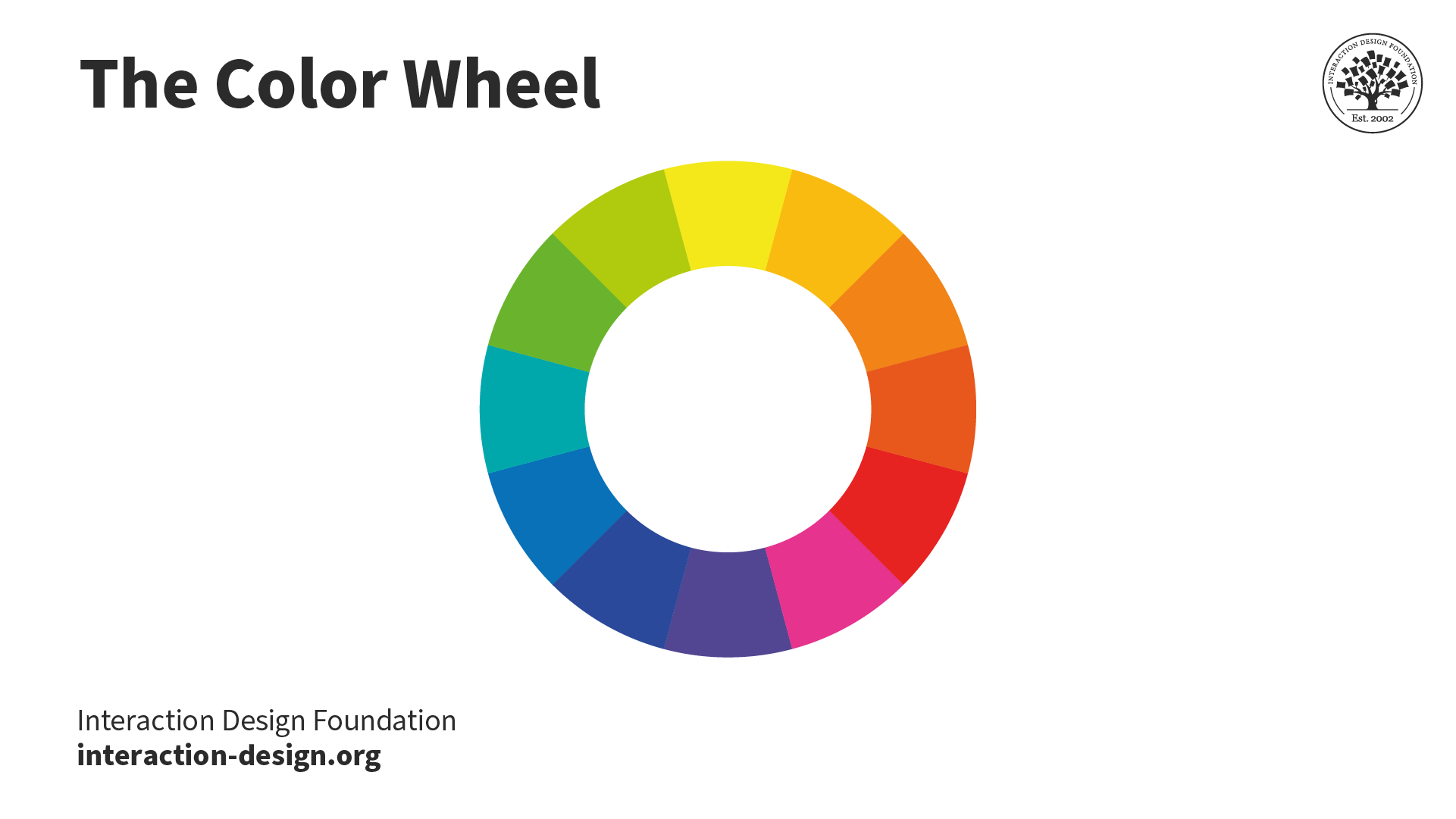
The Color Wheel
The color wheel comprises the primary, secondary, and tertiary colors.
Secondary colors: colors formed by mixing two primary colors. These are green, orange, and purple.
Tertiary colors: colors formed by mixing primary with secondary colors. Examples of tertiary colors are blue-green (often called teal) and red-purple (often called magenta).
The color wheel visualizes how colors relate and is an essential tool to choose color schemes.
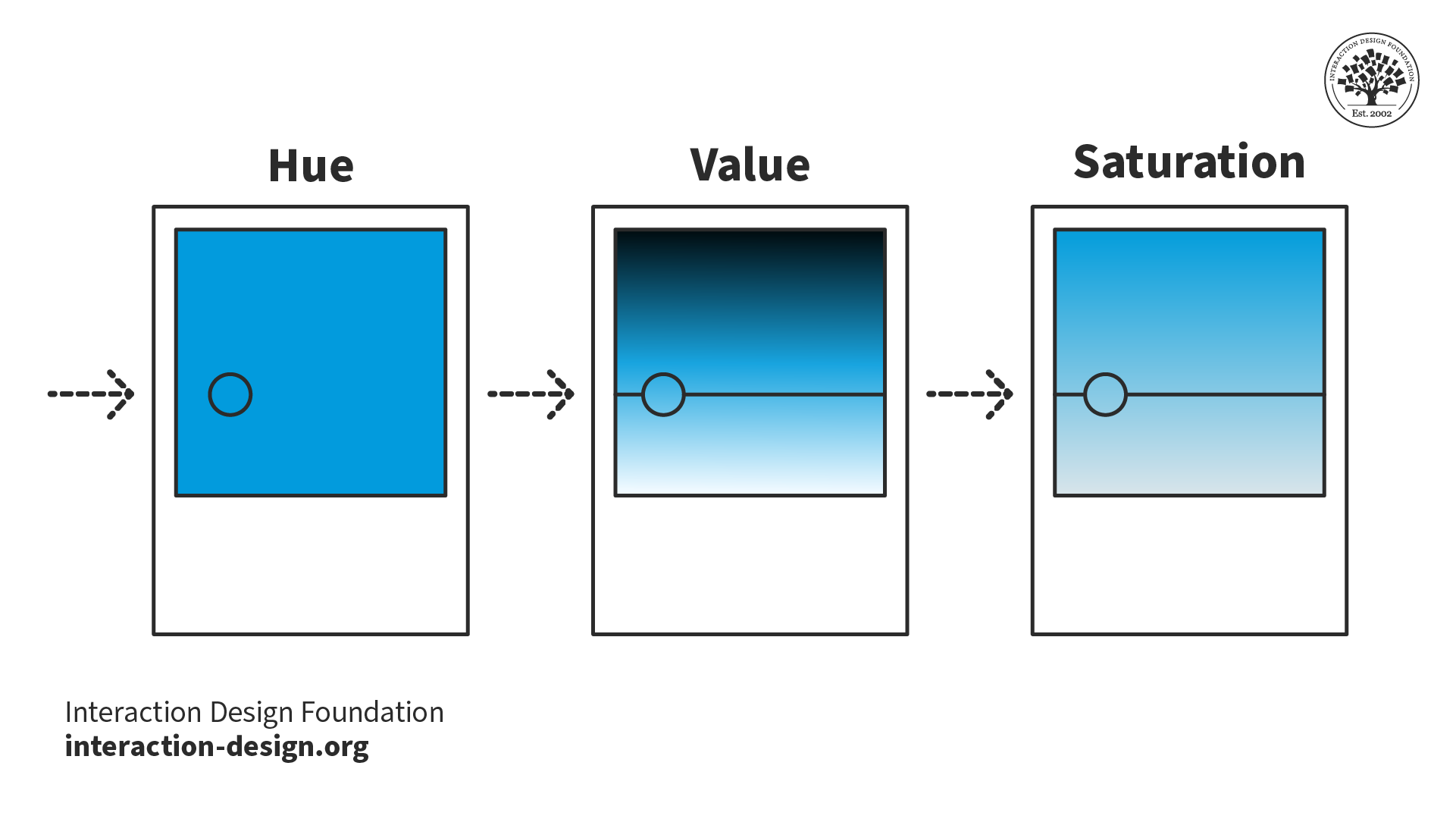
Hue, Value, and Saturation
In the RGB color model, hue, value, and saturation are the three components of color.
Hue is the specific color that makes it different from other colors on the color wheel.
Value represents a color's relative lightness or darkness in grayscale. Value is essential to establish contrast and depth in visual art.
Saturation, also called chroma or intensity, describes the purity and vividness of a color. Saturation can vary from fully saturated (vibrant) to desaturated (grayed).
Using these three components, designers define their color schemes.
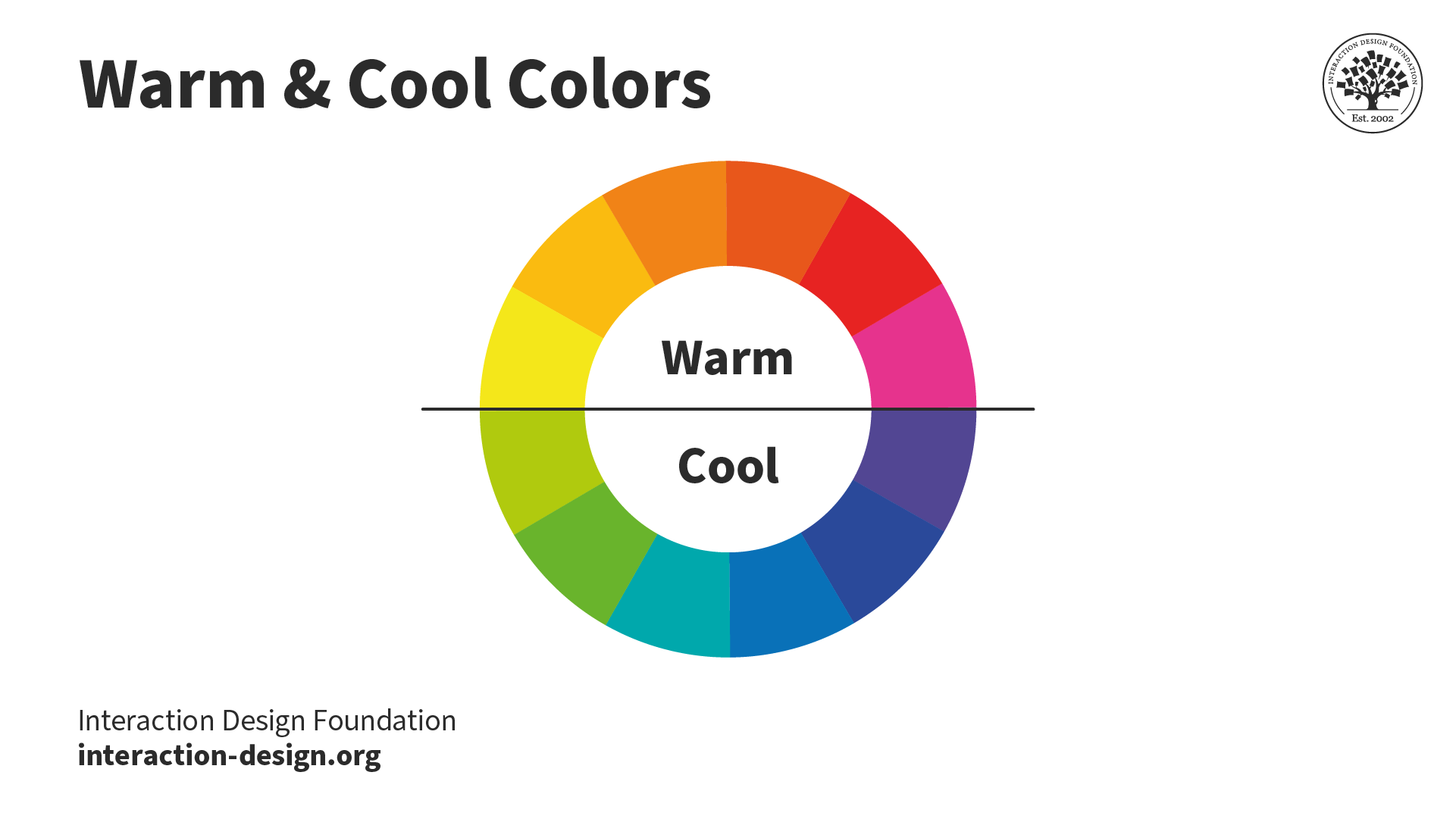
Color Temperature
Each color on the color wheel has its own perceived temperature. Yellow to red-purple are warm colors, while purple to green-yellow are cool.
Color temperature refers to the perceived warmth or coolness of a color. Warm colors (reds, yellows) and cool colors (blues, greens) can dramatically affect the color harmony in a design. Color temperature can influence the mood and emotions of the user.
What Is the Impact of Color Harmony on UX?
Color harmony significantly enhances User Experience (UX) in the following ways:
Draw Attention and Engage Users
An interface's balanced and attractive color scheme can hold the user's attention. For example, an online learning platform might use a subdued, monochromatic color scheme interspersed with vibrant, contrasting colors for important elements. Beyond aesthetics, a serene color palette can minimize visual fatigue, making study sessions more comfortable. This color harmony enhances user engagement over more extended periods.
The IxDF course platform primarily uses a monochromatic grayscale scheme to help users stay immersed as they learn. The use of blue as a highlight helps users quickly identify their progress in the course and get any support they might need.
Designers use color harmony techniques to create contrast in their designs. Contrast aids users by clearly separating content types and functionalities. For example, Ryanair uses color harmony techniques to make essential elements more prominent. This use of color makes it easier for customers to navigate the site, easily understand where they are, and find what they’re looking for.
Ryanair uses a complementary blue and yellow-orange color scheme across its website. A yellow-orange line indicates the current page the user is on. The search button's use of color makes its purpose clear and draws attention to the search function as a whole.
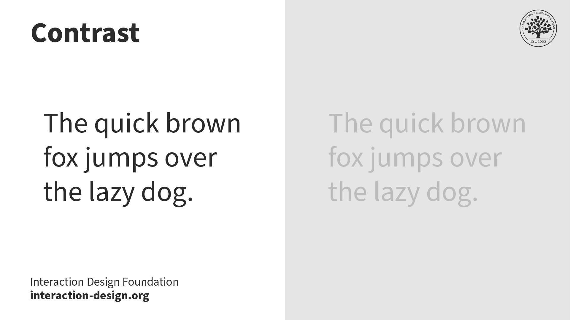
Colors with poor contrast can blur elements together and create a confusing user interaction path, the opposite of color harmony. A typical example of poor color balance is when the colors used for text and background make it difficult for users to read the content. Faced with such poor balance, users often choose to leave the site.
In this example, the gray-on-gray text is more difficult to read than the black-on-white text. Text with high contrast against its background vastly improves readability.
Colors can symbolize emotions that align with a brand's persona. Brands that promote environmental care often use shades of green and earth tones, which represent tranquility and eco-friendliness. Another example is fast food brands, many of which use red in their color schemes. For some people, the color red stimulates hunger.
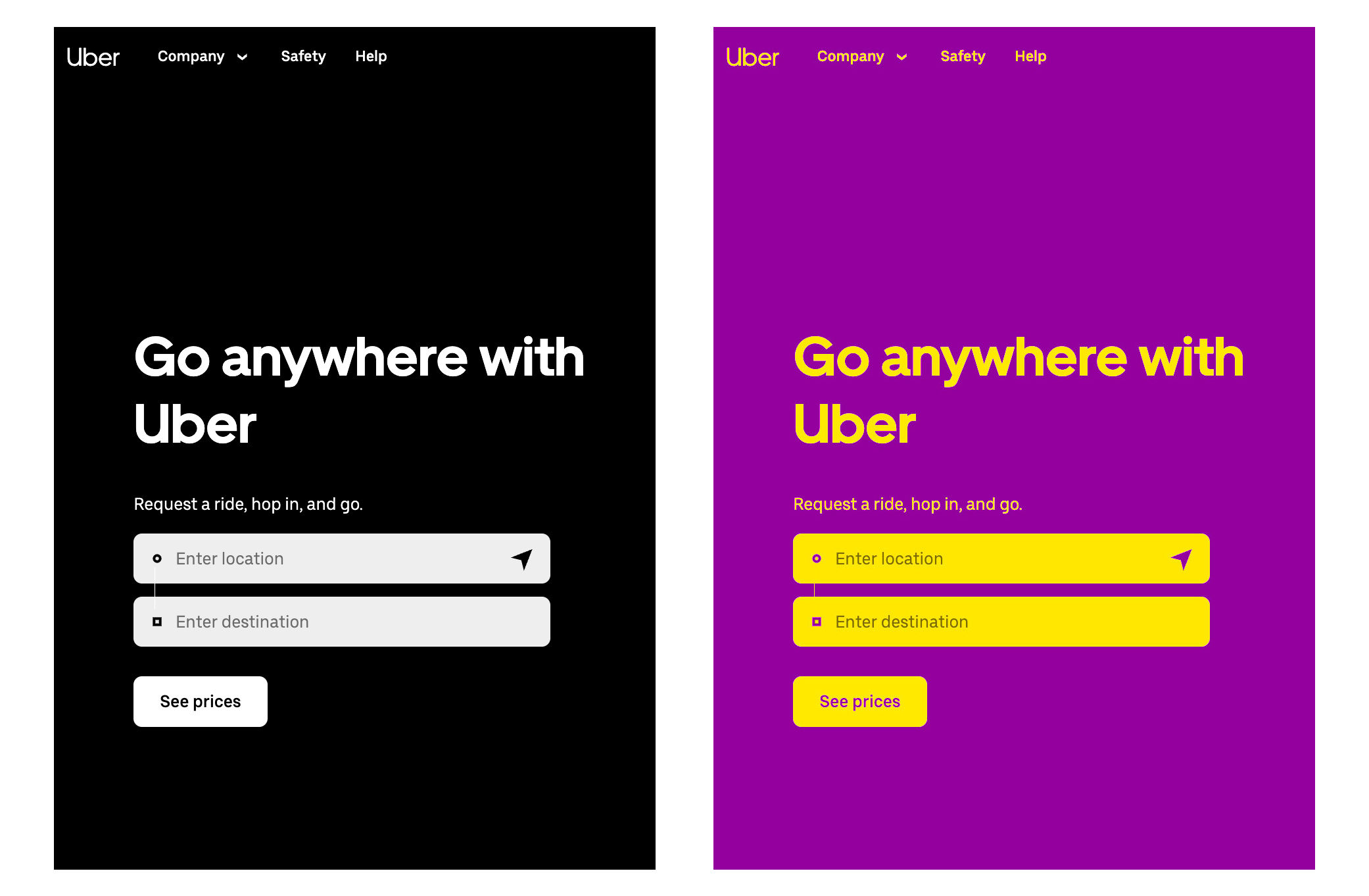
The ride-hailing app Uber uses black and white as its primary colors—a monochromatic harmony. The example on the right shows a different color scheme applied—yellow and purple, a complementary color harmony. In this example, the Uber website feels vibrant and almost regal. However, Uber chose black and white to imply elegance and simplicity, which is not symbolized by the yellow and purple scheme.
Designers use a step-by-step process to choose colors that create harmony in their designs. While intuition and taste are involved when selecting colors, there are defined steps, tools, techniques, and tests that designers use to ensure color harmony:
Find Inspiration: Start with broad visual brainstorming. Take cues from nature, art, architecture, or even fashion. Review successful designs within your industry that achieve color harmony. Assemble these inspirations to spot themes and spark potential color ideas.
Select a Dominant Color: This color should align with crucial aspects such as brand ethos, target user group, or the emotions you want to convey. This color forms the foundation of your palette.
Consult the Color Wheel: Use your chosen color as a compass to see different color harmonies on the color wheel. If red is your selected color, an analogous harmony will add red-orange and red-purple to your scheme, while a triadic harmony will add yellow and blue.
Use a Tool or Template: Use color scheme generators or pre-made templates to create harmonious color combinations. These can streamline the creation process and serve as a source of inspiration.
Keep It Simple: Creating complex color schemes with many different colors can be tempting. The more colors you add, the more complex color harmony is to achieve. Start with a simple scheme, and see if it fits your design needs before adding more colors.
Define Color Hierarchy: With your colors identified, assign functional roles to each. The dominant color takes center stage, secondary colors support, and accent colors highlight essential elements such as call-to-actions.
Implement Contrast: Pair contrasting colors for important functionalities and contents, ensuring readability and visual guidance throughout the interface.
Be Mindful of Cultural Contexts: Keep users' cultural color-related attitudes and perceptions in mind. Make sure your chosen palette reads as intended to your target audience.
Iterate and Refine: Based on feedback, continuously adjust your palette. Ensure it remains relevant to your brand, attractive to your users, and functional within your interface.
What Are the 7 Main Color Schemes?
These 7 schemes serve as a guide for designers to choose harmonious colors. Designers use these schemes as they are or as a foundation to build their color palettes. Remember, while the color wheel consists of 12 main colors—primary, secondary, and tertiary—there are millions of colors with different hues, values, and saturations. Experiment with these color schemes and the array of colors available to you as a designer.
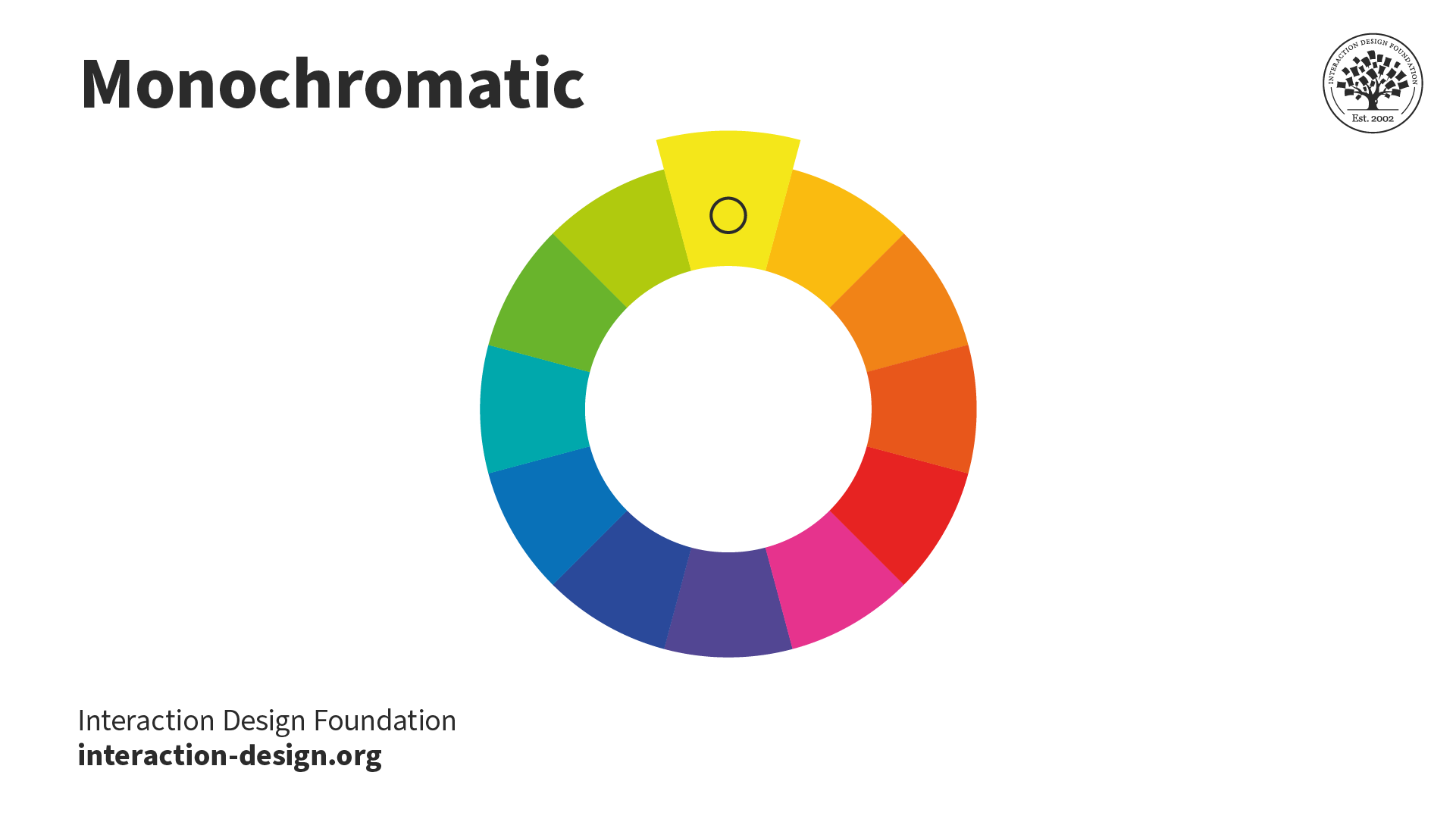
When designers use monochromatic schemes, they combine different versions of the same color to create a unified and elegant look. Designers must maintain contrast in these schemes to prevent monotony.
Designers often employ monochromatic schemes in minimalist designs, as using one color reduces distractions. However, the simplicity of monochromatic schemes comes with a limitation: designers cannot utilize multiple colors to aid in visualizing information.
The Uber logo uses the most simplistic monochromatic color schemes—black and white.
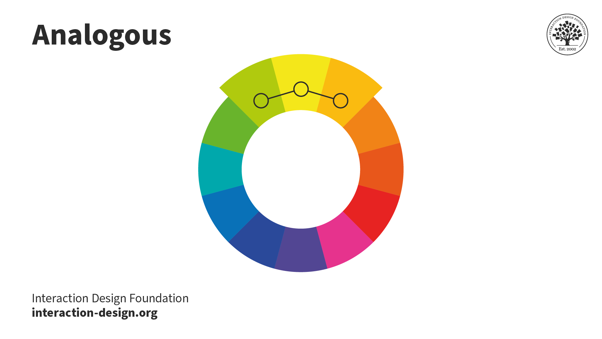
An analogous color scheme involves three adjacent colors on the color wheel. This scheme is often seen in nature, like autumn leaves, as they change colors. There's a variation known as the "high-key" analogous color scheme, created by blending analogous colors with white.
Impressionist artists frequently use this scheme. The result is a shimmering, blurring effect of colors merging. From afar, a high-key analogous scheme might give the impression of being a single color.
The MasterCard logo uses an analogous color scheme—red, orange, and yellow.
Complementary color schemes pair colors that neutralize each other when mixed, typically resulting in white, black, or a grayscale shade. This approach, also called the "opposite color" scheme, creates a high contrast. Modern color theory identifies these pairs as red/cyan, green/magenta, and blue/yellow.
The Ryanair logo uses a blue-purple and yellow-orange complementary color harmony.
A triadic color scheme consists of three colors spaced evenly around the color wheel. To identify these colors, you can place an equilateral triangle on the wheel; each corner will point to a color 120° apart from the others.
Triadic schemes offer a harmonious yet visually striking contrast. They appear vibrant, even if the individual hues lack vibrancy.
Many artists prefer using triadic color schemes in their work. Compared to complementary schemes, triadic ones make it simpler for artists to achieve visually appealing results.
The Airtable logo uses a triadic color harmony—red-purple, yellow-orange, and blue-green.
In split-complementary color schemes, designers blend the principles of complementary and analogous colors. They select the complementary color to their primary and then include the adjacent colors on the color wheel.
This approach moderates the often bold or harsh effect of using complementary colors alone, making it easier on the viewer's eye.
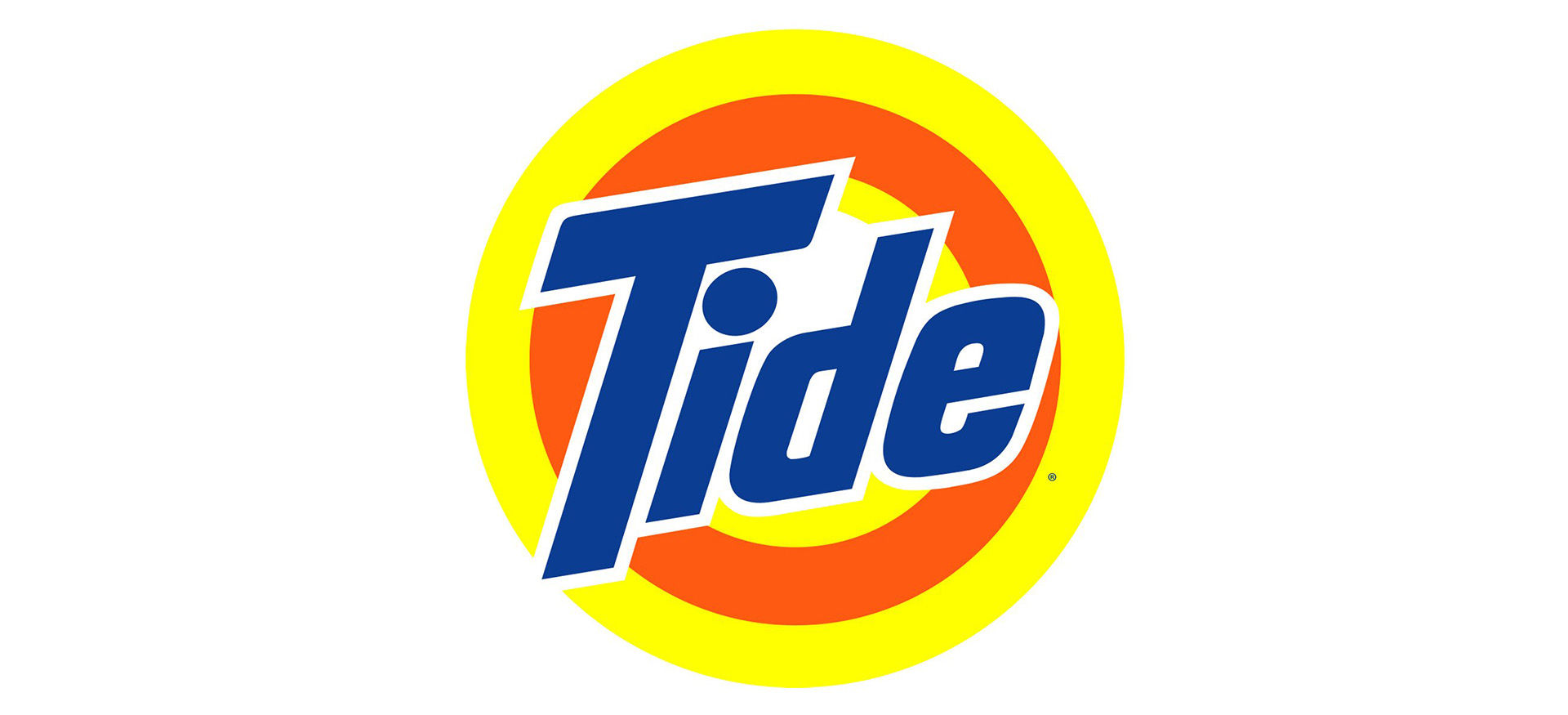
Tide uses a blue-purple, yellow, and orange split complementary color scheme. The blue has a lower intensity contrast against the two other colors compared to a blue-purple and yellow-orange complementary color scheme.
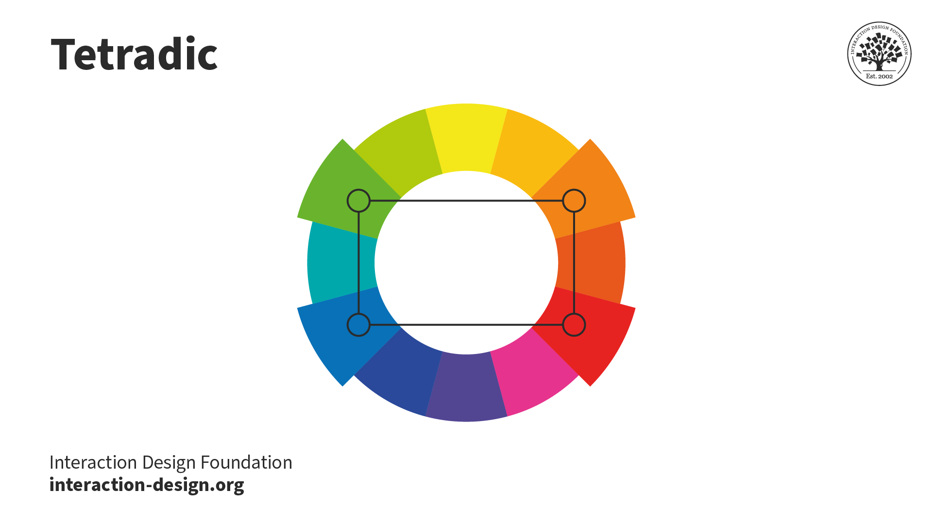
The tetradic color scheme includes two complementary color pairs. This scheme can produce vibrant visuals, yet designers find it challenging to achieve balance.
In a tetradic scheme, designers must choose a dominant color, ensuring it doesn't overpower the others and cause imbalance. If designers use equal amounts of each color, it can result in an unappealing appearance, which they aim to avoid.
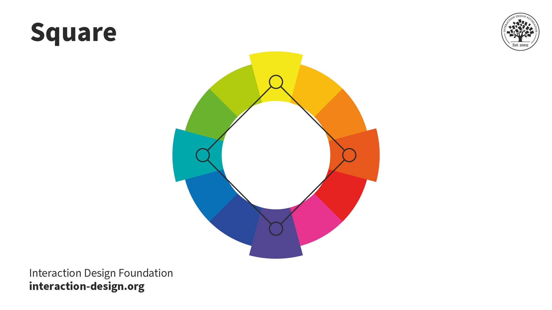
In the square scheme, a variant of the tetradic scheme, designers select four colors by positioning a square on the color wheel. These colors offer a balanced palette when spaced equally at 90° intervals. The design typically looks best when the designer incorporates all four colors uniformly.
Color Harmony: Key Considerations
Depending on what a design is for, who will be using it, and where it will be used, designers must consider several factors when creating color harmony.
Established Color Schemes
Brands employ defined colors to resonate with their audience, emanate their brand persona, and enhance recall value. Therefore, established brands may limit designers' choice of color based on existing brand color schemes.
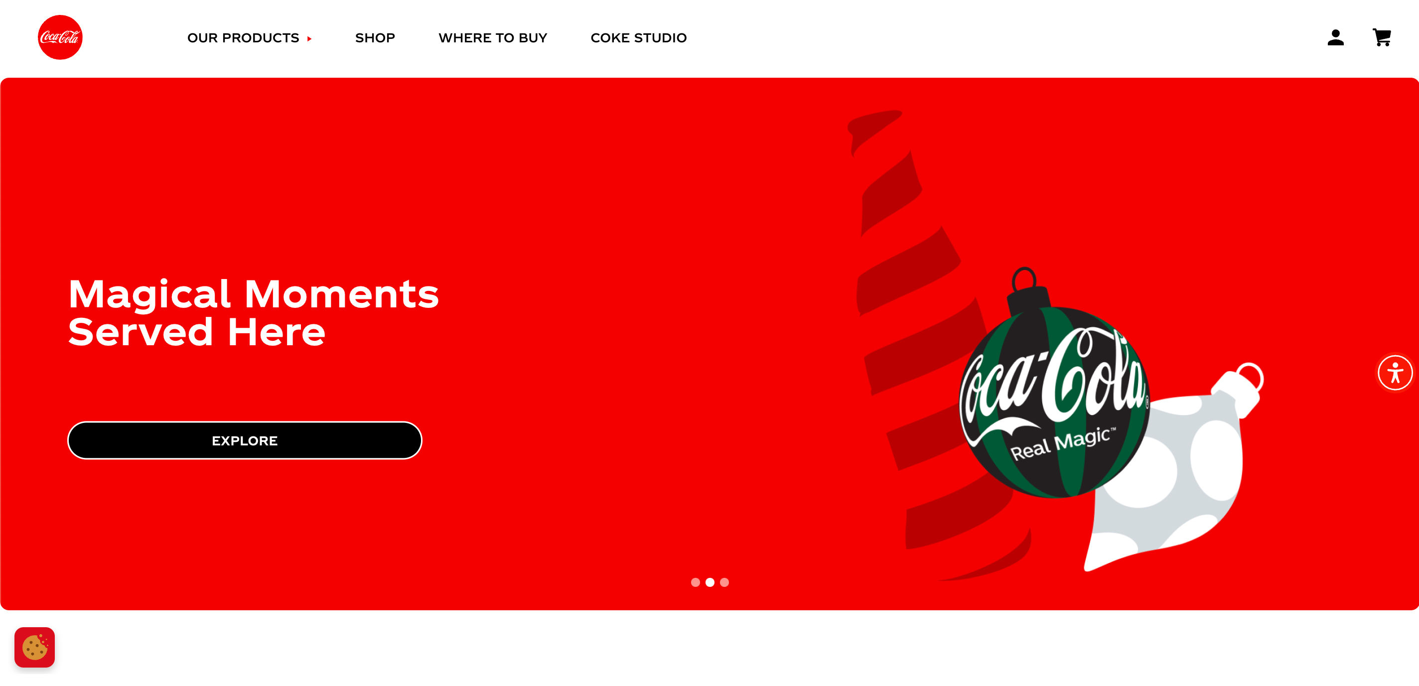
For example, Coca-Cola relies heavily on red and white, a monochromatic color harmony. The vibrant red symbolizes energy and passion, while the pure white offers balance. This color harmony represents Coca-Cola’s dynamic yet universal appeal.
Designers working with Coca-Cola must consider the brand color scheme in their work.
The Coca-Cola website uses the brand’s red and white color scheme for its primary colors. The cookies and accessibility widgets also use this color scheme. The headline image introduces additional colors as part of Coca-Cola’s holiday campaign. Green is one of the colors used, which forms a complementary color harmony with red.
Our relationship with color is complex and rooted in biological, cultural and personal associations. Designers must use research and investigate cultural values to create good designs.
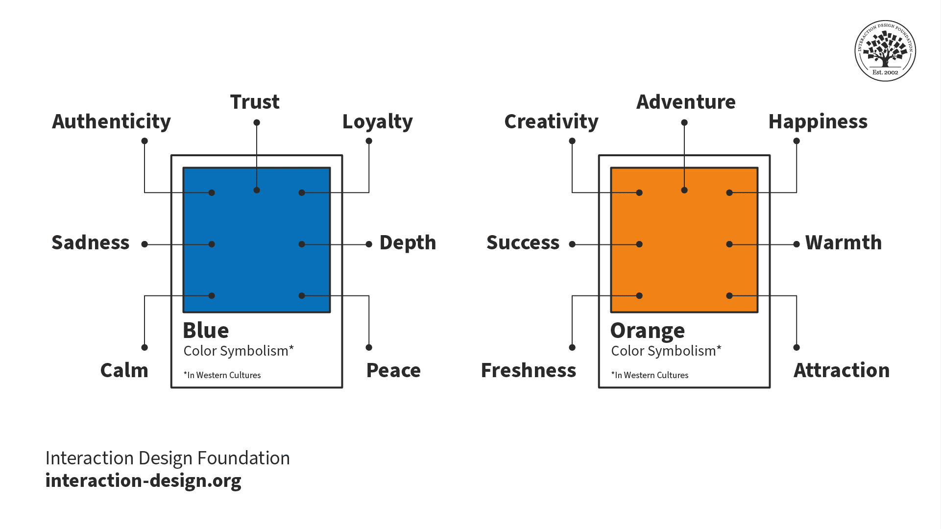
Every color carries different symbolisms that should inform color choices. While designers may choose a specific color to evoke certain feelings in users, all our experiences differ. Yellow may make one person feel happy while representing danger to another. That said, here are some common color symbolisms in Western cultures:
Designers commonly use the blue and orange color scheme to create a complementary harmony. However, while a blue/orange scheme can symbolize trust and warmth, it can also symbolize sadness and success. For this reason, designers always test their color schemes with their target users. This testing ensures their chosen color scheme pleases their users instead of repelling them.
Designers must consider the significance of colors in different cultures. The perception of colors can vary depending on the region where their users are and the customs of that region.
For example, in the 1950s, Pepsi changed the color of its vending machines in Southeast Asia from royal blue to light blue. In this region, the designers did not realize light blue is associated with death and mourning. As a result, Pepsi saw a notable decrease in sales.
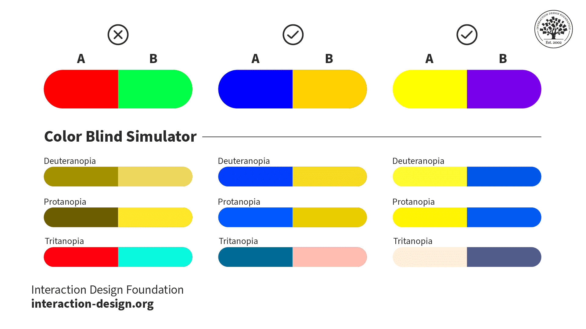
Color Blindness
Color blindness affects a considerable portion of the population and presents unique challenges. Forms of color blindness include:
Protanomaly and deuteranomaly: certain shades of green look more red, and vice versa.
Protanopia and deuteranopia: unable to tell the difference between red and green.
Tritanomaly: it’s difficult to tell the difference between blue and green and yellow and red.
Tritanopia: unable to distinguish between blue and green, purple and red, and yellow and pink.
Red and green together create a complementary color scheme. However, people with color blindness perceive these two colors differently. There is very little, or often no, contrast between red and green for people with protanopia and deuteranopia. On the other hand, blue and yellow-orange, and yellow and purple complementary color schemes retain contrast for users with protanopia, deuteranopia, and tritanopia.
If a color scheme primarily relies on colors that color-blind users find challenging, they may miss essential elements. To improve accessibility, designers use:
Colorblind-friendly palettes, such as blue and yellow-orange, and yellow and purple.
Tools that simulate different types of color vision deficiency.
Color should not be the sole indicator of meaning. If color is the only indicator used for error fields in a form, those with color blindness may not recognize the difference. Designers supplement colors with icons, text prompts, and other visual cues. This way, users with color vision deficiency can still understand the information.
What are some highly cited scientific research about color harmony?
Some highly cited research on color harmony and related topics includes:
Burchett, K. E. (2002). Color harmony. Color Research & Application.
Burchett's publication discusses color harmony and its application, providing insights into the principles and practices of color combination and their visual effects. Its comprehensive exploration of color harmony has influenced researchers and practitioners in the field, making it a valuable resource.
Westland, S., Laycock, K., Cheung, V., Henry, P., & Mahyar, F. (2007). Colour Harmony. Color: Design & Creativity, 1(1), 1–15.
This article explores the main theories of color harmony, addressing the search for its rules and fundamental laws. It thoroughly examines color harmony theory, including historical and systematic concepts, making it a significant contribution to understanding color harmony principles and their applications.
Chevreul and Martel's classic work lays the foundation for the principles of harmony and contrast of colors. Its early exploration of color harmony and its applications to the arts have been influential.
Designers consider this book the only color guide they will ever need. This book provides a complete update with Pantone colors and new text. It is an essential resource for professionals who use color harmony.
Joann and Arielle thoroughly investigate the role of color in every aspect of life on our planet. The book delves into the physics, chemistry, and perception of color and its presence in art and nature.
This book is an essential guide to changing our perception of colors depending on their nearby hues. It explains how colors can appear to morph and change shades depending on how you arrange them. It is a fundamental resource for understanding color theory and harmony.
Johannes Itten. (1973). The Art of Color: The Subjective Experience and Objective Rationale of Color. John Wiley & Sons.
The Art of Color explores color theory, examining the subjective experience and objective rationale of color. Itten, a prominent color theorist, offers clear explanations and illustrations. This book is a valuable resource for artists, designers, and psychologists.
Kassia St Clair. (2017). The Secret Lives of Colour. John Murray.
This book uncovers the surprising history behind the theory of color. It offers a fascinating and in-depth exploration of different shades and tones. It is an influential resource for understanding the cultural and historical significance of color harmony.
What are some of the most common mistakes in color harmony?
Designers use color harmony to transform a good design into a great one. However, navigating the spectrum of colors requires a keen eye and understanding of some common mistakes:
Making color schemes too complicated.
Ignoring contrast.
Neglecting cultural implications.
Disregarding emotional and psychological implications.
Overlooking color blindness.
For an overview of why accessibility is important in design, watch this video from Elana Chapman, Accessibility Research Manager at Fable:
What are some of the best practices in color harmony?
In design, mastering color harmony is crucial to creating compelling, appealing compositions. Designers understand the interactions, psychological impacts, and cultural significance of different types of color harmony.
Start with a simple color scheme. Expand as needed.
Use high contrast for visibility and readability in text.
Analyze cultural context and the psychological implications of color.
Test and iterate; your first color choice isn’t final.
Discover in this video how maintaining strong color contrast and clear typography enhances accessibility, helping you design interfaces that are both visually engaging and usable for everyone.
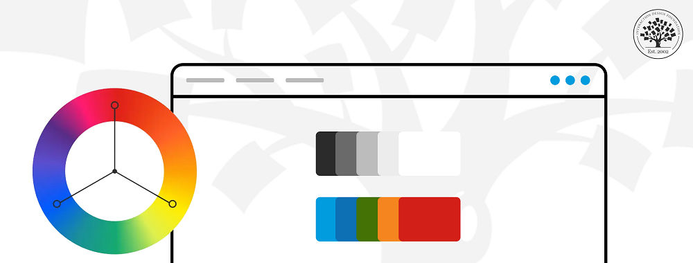
Designers and artists use various tools to achieve color harmony in their work. These tools help select and combine colors effectively:
Color Wheel: Essential to understand and choose colors.
Color Palettes: Predefined schemes for harmonious design.
Digital Software: Tools to select harmonious color schemes.
Online Tools: Website and apps to generate color schemes.
Pantone Guides: Ensure color consistency across media.
Physical Swatches: Match and select colors in real-world applications.
Mobile Apps: Capture environmental colors and create palettes.
These tools serve as a guide to mix and match colors effectively. Designers use tools to ensure their final design is aesthetically pleasing while delivering the intended message or mood.
Many AI tools are available to aid in creating color schemes and palettes. Ioana Telenu, Senior Product Designer, AI at Miro, recommends setting aside a few hours each week to test and play with AI tools:
ShowHide
video transcript
Transcript loading…
Our course, AI for Designers, teaches you how to make the most of AI and your human skills to future-proof your career.
What are the 3 basic color principles?
Three of the main principles of color theory are:
The color wheel.
Color harmony.
Color context.
The color wheel is vital for designers to mix colors effectively. Primary colors form the basis for secondary and tertiary hues.
Designers create color harmony using schemes like analogous and complementary, influencing mood and viewer perception.
Color perception varies based on context, culture, and trends. Designers must consider these factors for impactful use.
Understanding color theory aids designers in creating compositions that enhance user experience and emotional impact.
Joan Eckstut, a leading color consultant and author, explains why colors change based on context:
Harmonious design colors depend on context and desired emotions. For example, analogous colors create serenity, while complementary colors offer vibrancy. Examples include blue-green-teal (analogous) and blue-orange (complementary) pairings.
Color harmony involves balancing saturation, value, and warmth. Pastel palettes offer calmness, whereas bright, saturated colors suit energetic designs, emphasizing the importance of balance.
Color choice for harmony should consider cultural perceptions and emotional responses. For instance, blue can symbolize trust and calm, while red can suggest passion or urgency.
Designers use color harmony in UX/UI, interior design, and marketing to:
Guide behavior.
Set moods.
Convey brand personality.
Designers try different combinations, make changes based on the situation, and improve their work with the help of suggestions.
Arielle and Joan Eckstut explain how many alleged emotional responses to colors are not based on science. These emotional responses are unreliable indicators of how a color may make someone feel:
When designers select two colors that work well together, they often choose complementary colors. A complementary color scheme consists of two colors that sit opposite each other on the color wheel.
Complementary colors like blue and orange are popular in design for their high contrast and visual harmony. These characteristics draw attention and highlight key elements.
Blue and orange balance each other:
Blue can evoke calmness and stability
Orange can add energy and enthusiasm.
This combination enables a diverse emotional response in design.
With any color scheme, designers consider cultural, accessibility, and contextual implications.
Designers refer to a family of colors as a color scheme or palette, selecting harmonious colors for aesthetic appeal in various contexts.
Using color theory, designers create schemes like monochromatic or complementary for unique visual effects and emotional responses in design.
In UI/UX and product design, designers use color palettes for consistency, usability, and branding, enhancing user engagement and product appeal.
Colors have psychological effects; for instance, blue evokes calmness and trust, commonly used in corporate designs.
Designers should choose color palettes considering context, audience, brand identity, and accessibility, ensuring readability and alignment with the design's message.
Artists use color harmonies for visually appealing, balanced compositions. These harmonies combine colors aesthetically, creating order and balance in art.
Monochromatic harmony uses a single color's variations, offering a soothing, cohesive look.
Analogous harmony employs adjacent colors on the color wheel, found in nature, harmonious and eye-pleasing.
Complementary harmony pairs opposite wheel colors for a vibrant, high-contrast appearance.
Split-complementary harmony, a complementary variation, uses a base color and adjacent complements, reducing tension.
Triadic harmony selects evenly spaced wheel colors, vibrant even with unsaturated hues.
Tetradic harmony uses two complementary pairs, offering a rich, variable color scheme.
Artists apply these mood, message, and emotional response principles, enhancing design effectiveness.
Are you an artist who wants to transition into user experience design? Cory Lebson, author of The UX Careers Handbook, advises how to reframe your past professional experience for UX design.
It's Easy to Fast-Track Your Career with the World's Best Experts
Master complex skills effortlessly with proven best practices and toolkits directly from the world's top design experts. Meet your experts for this course:
Mia Cinelli: Associate Professor of Art Studio and Digital Design at the University of Kentucky.
Joann Eckstut: Color Consultant, Founder of The Roomworks, and one of the 12 designers chosen by the Color Association of the USA to create the yearly forecast used by industries to keep up with color trends.
Arielle Eckstut: Author, Agent-at-large at the Levine Greenberg Rostan Literary Agency, and Co-Founder of The Book Doctors and LittleMissMatched.
Here’s a handy statistic that’s worth remembering: over 60% of people accept or reject new products based on color, and
1.1k shares
2 mths ago
Open Access—Link to us!
We believe in Open Access and the democratization of knowledge. Unfortunately, world-class educational materials such as this page are normally hidden behind paywalls or in expensive textbooks.


