Basak, A., & Roy, S. T. (2022). Visual ergonomics for colourblindness: Applying universal design principles in graphical user interface to provide affordance to the colourblind users. Proceedings of the Design Society: DESIGN Conference, 2, 2055–2066.
This study investigates the challenges faced by colorblind users when interacting with graphical user interfaces (GUIs), focusing on the iconography of the Microsoft Windows operating system. The authors aim to develop an inclusive icon design solution that is visually ergonomic for colorblind users, thereby integrating them as mainstream users in computer interfaces. By applying universal design principles, the research emphasizes the importance of designing GUIs that are accessible to users with color vision deficiencies. The paper contributes to the field of inclusive design by highlighting the necessity of considering colorblind users in the development of user interfaces.
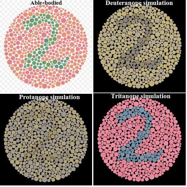
Jamil, A., & Denes, G. (2024). Investigating color-blind user-interface accessibility via simulated interfaces. Computers, 13(2), 53.
This study presents a novel approach to evaluating user interface (UI) accessibility for individuals with color vision deficiency (CVD). Recognizing the challenges in recruiting participants with CVD, the authors employed physiologically-based CVD simulations, allowing non-CVD participants to assess the aesthetics and functionality of 20 popular websites under simulated CVD conditions. The findings indicate a positive correlation between perceived aesthetics and functionality, with high-contrast modes potentially diminishing both. The research offers a practical methodology for designers to assess and improve UI accessibility for users with CVD.
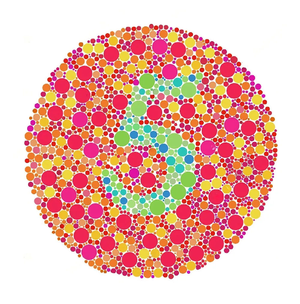
Iqbal, M. W., Ahmad, N., Shahzad, S. K., Naqvi, M. R., & Feroz, I. (2018). Usability aspects of adaptive mobile interfaces for colour-blind and vision deficient users. International Journal of Computer Science and Network Security, 18(10), 179–187.
This study explores the effectiveness of adaptive mobile interfaces tailored for users with colour vision deficiencies (CVD). The researchers developed an application that employs the Ishihara test to detect types of colour-blindness, subsequently adjusting the user interface to accommodate specific visual needs. Through experiments involving 30 participants, the study assessed usability metrics—effectiveness, efficiency, and satisfaction—comparing adaptive and non-adaptive environments. Results indicated significant improvements in user performance and satisfaction within adaptive settings, particularly for individuals with Protanopia and Tritanopia. This research underscores the importance of adaptive design in enhancing accessibility, offering valuable insights for developers aiming to create inclusive mobile applications for users with visual impairments.