You may well have seen the “Rule of Thirds” plenty of times at work in a photograph or image on a website and not even realized it; it’s a well-known (and well-applied!) photography technique that’s been making pictures more captivating for a long time—including making websites have more harmonious layouts—and has much to offer designers, as you’ll find.
What Is the Rule of Thirds?
The rule of thirds inhabits the same zone of visual magic as the Golden Ratio, or golden ratio—and note that capitalization is optional; it’s just nice to intro these terms once like that to show they pack a great deal of power—but it’s unique in what it does. It’s a composition technique that empowers artists, photographers, user experience (UX) designers, and user interface (UI) designers to make stunning visuals with—ones that aren’t just aesthetically pleasing but that appeal to the emotions at a deeper level as well.
Imagine dividing an image into nine equal parts with the help of two vertical and two horizontal lines—so you end up with a grid with three rows and three columns. What you do is place your subject on the left or right according to the proportions of this grid, along the lines or at the points where they intersect, which leaves more room for the other objects too. Other forms of composition exist as well, but the rule of thirds helps you get the most well-composed shots—shots that can communicate far more because they speak to the viewers, or users, and tell them far more than if you didn’t use this rule.

© Interaction Design Foundation, CC BY-SA 4.0
By the way, the best part of all is that there’s a rule-of-thirds setting that’s readily available on most cameras and mobile phones—and that pretty much underlines the point that the rule of thirds is one of the most helpful tools that can empower you to balance your main subject and the white space inside of your image. That white space or negative space—which is a calming zone of serenity to help set off what is going on in a picture or design—has got an important job to do too, after all, but in any case the rule of thirds is something that’s got a lot going for it, and it can do wonders for the graphics you include. That’s the good news, and there’s even better news: there’s only one way to master it, and that’s practice so you get a sharp eye for what it can do, and is it ever fun to play with and see what comes out.
“If you are tuned in to the imagery we see around us, I feel like you sort of absorb [the rule of thirds] even if you can’t put your finger on it.”
— Khara Plicanic, Photographer, Author, and Instructor.
What Is the Rule of Thirds In UI Design?
To branch over into the graphic design trade first, it’s also—for many decades—been a handy design tool there, one that’s helped graphic designers to align and position graphic elements to create balance, add interest to their work, and make the most of how viewers perceive content in visually striking designs. What’s key about how it “works”—and so to do—is to divide a page into a tic-tac-toe (naughts and crosses) board so as to make a three-by-three grid that’s got nine equal sections. To use—or, rather, apply—the rule of thirds, designers take the lines that cross at four points in the middle of the page, and they’re the “sweet spots” in a design, and they’re where people tend to look first—it’s a natural thing.
Just like it is in graphic design, rule of thirds in UI (user interface) design is a fundamental principle that helps structure and organize elements on a screen with all-but guaranteed results. Put main subjects—like elements, text, images, or icons—here and it can make your work so much more interesting and dynamic; it just takes knowing what can work where best.
Usually, the four intersections are themselves the ideal spots for placing crucial elements—like, for example, this website template from Wix below, where it places important elements like the hero Image, titles or CTAs (calls to action) along the horizontal grid lines. It works a treat on this, although bear in mind before you head out and “sweet spot” using the intersections for everything, since UIs have a responsive nature—due to responsive design—that placing things with the intersections works best on only some screen sizes; the purpose of this rule is for you to make your designs look interesting and be more effective.
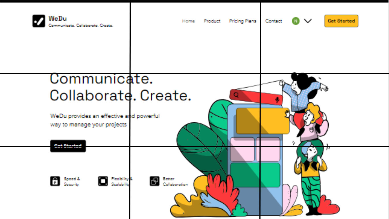
© WIX, Fair Use
How to Use the Rule of Thirds for Images
The rule of thirds gets easier once you understand it well, and the more you practice it, the more you’ll find how it’s a superb help for you to capture better outcomes—and there are four essential guidelines in mind, tactics that will improve the aesthetic of your photos, and, by association, not just the images you put in your websites and other UI layouts, but those digital solutions overall too.
1. Align the Subject With Lines or Intersections
When you’re about to take a photograph, you can enable a 3x3 grid on your digital camera screen and add it as an overlay. Then you focus on the four intersections that the grid lines form and align your subject with one of these—though, you can also align it with the vertical or horizontal lines. The image below is an example, one where the human figure is the subject or the focal point, and appears along the right line, and, this way, the focus remains on the subject—but, rather than detract from it, the other visual elements complement it and set the scene.
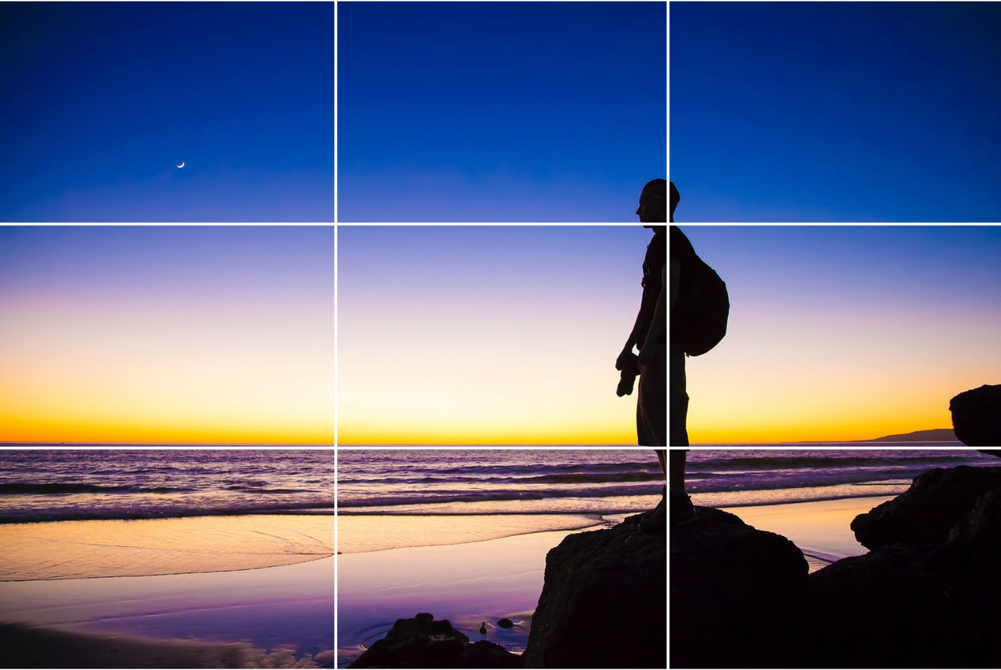
© Unsplash, Unsplash Licence
2. Align the Linear Elements With Grid Lines
You can also align your elements with either the vertical or horizontal axis—a nifty effect that can work best in different ways for different subjects—and we’ll mention another common program that includes a mobile application is Lightroom. The orientation of your objects and the scene are what will decide which line you can use here. For instance, objects in a landscape—such as horizons, trees/forests, beaches, and cityscapes—work best aligned with horizontal grid lines.
That’s most of the “great outdoors,” sure, but what about things like doors, pillars, waterfalls, and people in standing positions (not that people are things, but you get the point)? What those items (and persons) have in common is verticality, so they’re going to be elements that look better when you align them with the vertical grid lines and make a photo more aesthetically pleasing to the eye. But there’s a bonus with the rule of the thirds as well, and it’s that—at the same time as you’re pleasing your viewers’ eyes—you can emphasize the whole scene’s interesting elements all the more , and that’s because the scene can “function” better as a scene, and if there isn’t a story going on in there already, many a beholder will be able to imagine some kind of storytelling power at work.
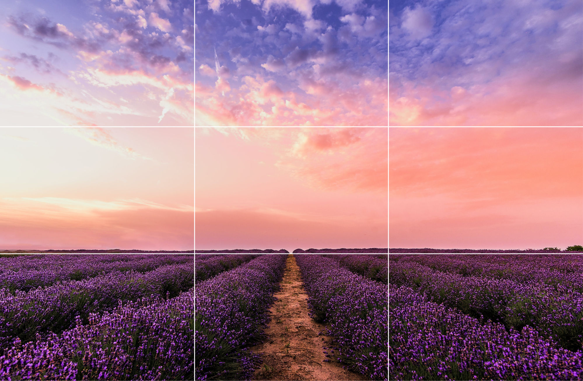
Instead of placing the horizon line at the center, align it with one of the grid lines. Aligning it with the lower grid line, such as in this image brings more focus to the sky.
© Pexels, CC0
3. Align Objects Diagonally
It may sound—or look, to be more precise—counterintuitive with all this “x” and “y” axis (or left-right and up-down) linearity going on, to tilt things, but another advanced tactic that you’ll find can be a big help is if you line elements up diagonally. It’s not for everything, to be sure, but it’s a tactic that does work well whenever you want to capture objects that have got irregular shapes—things like paths, roads, and rivers being good examples, and especially ones that “snake” in wonderful ways. Put the central element on a diagonal and then, to make sure they’re aligned right, check for the diagonal intersection points, as it’ll help the viewer’s eyes wander around the image and take it in in a way that is bound to have a more impressive effect on them.
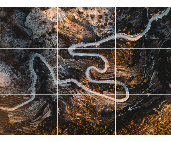
Consider aligning subjects diagonally, instead of horizontally or vertically—for example, this winding river makes for a more dynamic composition when it diagonally splits the image.
© Unsplash, Unsplash Licence
4. Break the Rule of Thirds
Yes, you read that right (and, no, we’re not sabotaging our piece about how to use this rule at all!), and it kind of goes in step with the famous Picasso saying about learning the rules like a pro so one can break them like an artist. With that said, though, it’s a rare case when this “anti” (or “non”) tactic works better than the rule of thirds itself and you can get away with completely disregarding the rule—but that’s just in a few cases, we hasten to repeat. For instance, if you see a balance already happily at work (or play) in the scene, then there’s no real need for the rule of thirds to come into play. Have a look at the picture below and you may well find there’s symmetry in landscapes with lake and river reflections, seas, and wet roads; so, no further action from you (or anyone else) is needed.
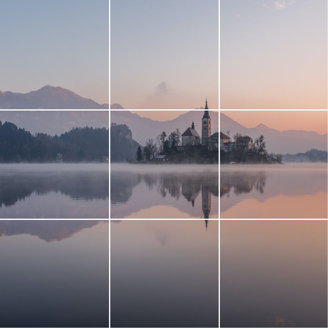
In this image, the buildings along with their reflection form one unit, and so make the rule of thirds tricky to implement. With that said, even with the image split neatly into two, what—or where—does your eye focus on? Chances are, along one of the intersection points.
© Pexels, CC0
All right, so that’s the “breaking the rule” approach that can come into play in a few instances, for sure, but there are various other scenarios in photography—and working with images and designs generally—where something else comes up, and it may be challenging to use the rule of thirds at all, and you can dismiss even thinking about it.
1. Small Subject
If you want to take or click a picture where the subject is too small, the rule of thirds breaks and won’t be much use. How small “too small” is is something you’ll notice at the time, so if you want to highlight the subject, keep the rule of thirds aside and place the distant building, bird, ant, or whatever small target is there that you want at the center of the image.
2. Frame-Filling Portraits
Then, when you want to click or take a picture where all the parts of an image aren’t entirely in the frame or when the subject is in the foreground, it might get complicated to apply the rule of thirds. That’s a phenomenon that happens due to the fact that if the subject occupies most of the frame, there’s only one thing to focus on: it—or the person who’s there—so there’s no need to apply the rule of thirds; you’ve got what you want right there and up close.
Rule of Thirds Examples
Example 1
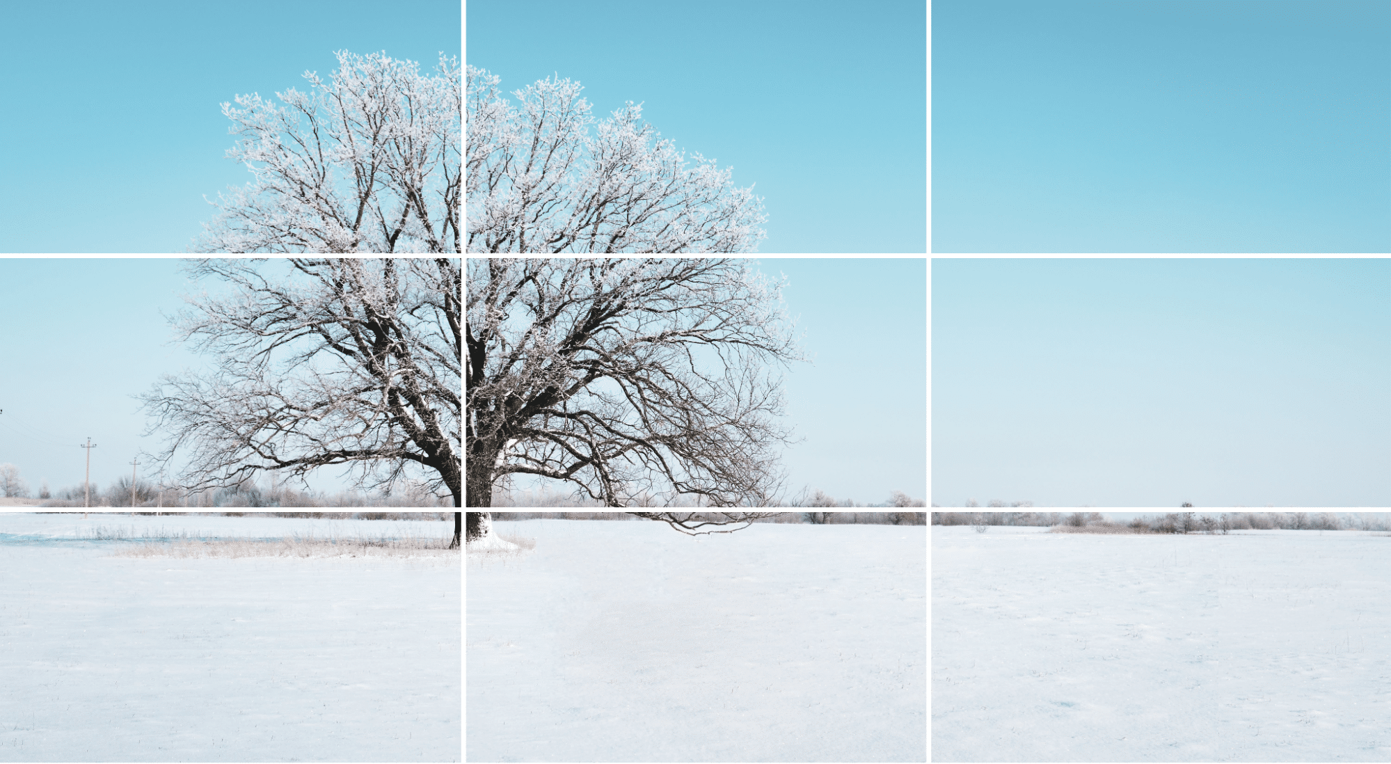
A tree aligned along the left vertical grid line with the horizon aligned along the lower horizontal grid line.
© Pexels, CC0
This photograph is a perfect example of good composition, starting with how the tree—the main subject—lines up in a perfect way with the left vertical line and is well positioned with the help of the intersections, and so this leaves negative space on the right to set the scene. The picture-taker's also divided this photo into two parts, with the ground cleanly aligned to the horizontal grid line, so a third of the picture is the foreground while two-thirds of the photograph make up the background—adding depth. There’s no object or element on the right, so what that means is no distractions are in the way, and the focus stays on the subject—a tree in a wintry scene, and there’s more of a story waiting to come out from there than there’d be if it were front and center.
Example 2
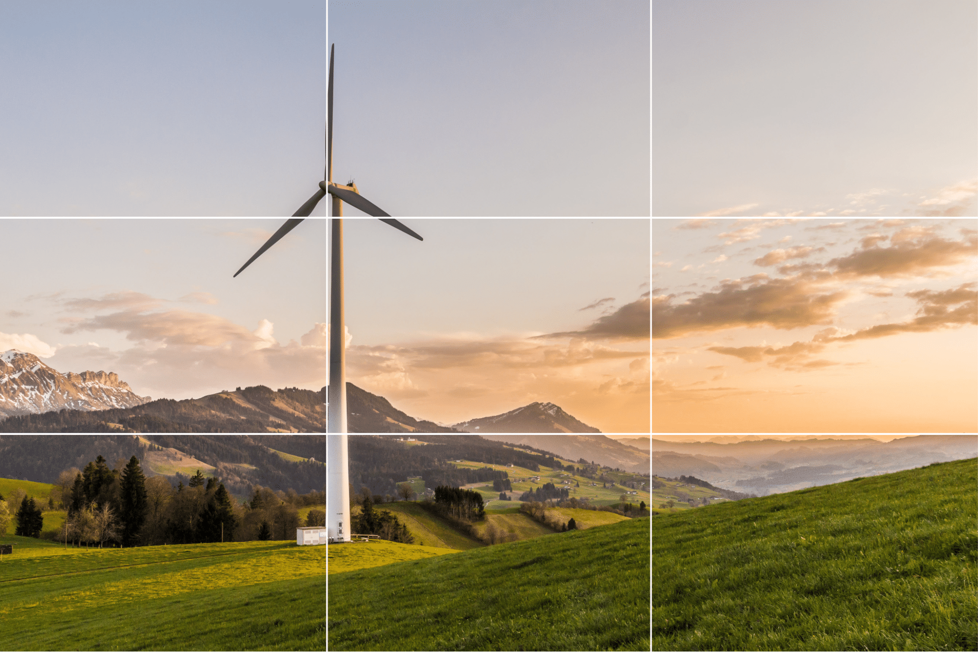
© Pexels, CC0
This example looks similar to the previous one, but only partially, and there are three points to pick up from it as an example. For one thing, the horizon in this image isn’t complete, or you might say that there even isn’t one. Next, the rule of thirds is loosely followed in this picture, positioning only the subject (the windmill) on the left with the aid of intersections. And last—but not least—the photographer has tried to align the limited horizon with the bottom horizontal gridline to maintain the balance and proportions.
Example 3
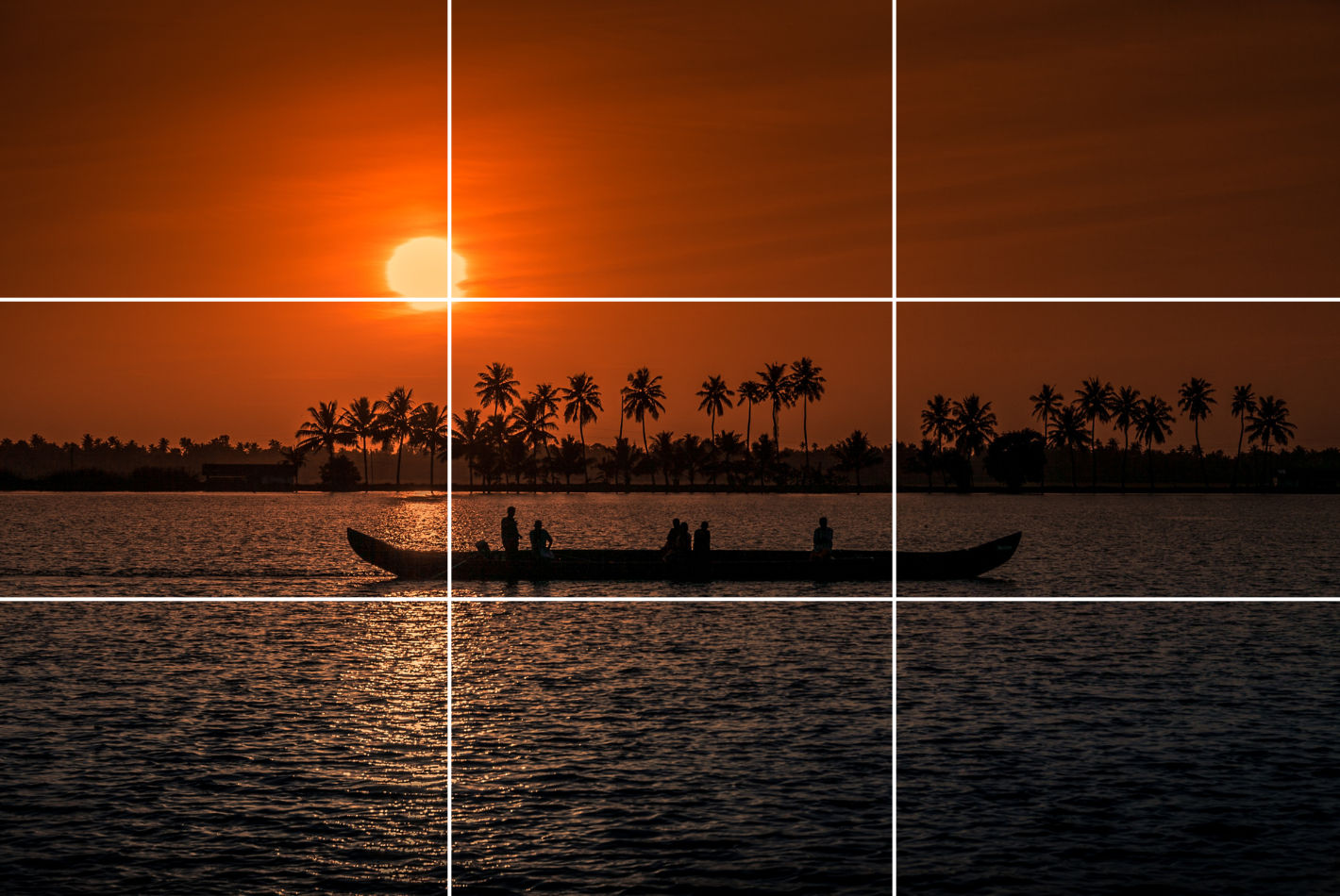
© Pixabay, CC0
In this one, the photographer has used the rule of thirds loosely—almost to the point of breaking it—but there sure is a great deal to learn from this type of composition. For one thing, the photographer has divided the image into two almost equal halves in a horizontal way by positioning the coastline at the center. Then note how the photo’s main subject is the boat, which is itself nearly at the center—and since it’s smaller, it leaves room for the essential details—and also how the image splits into three parts: the river (the foreground), the horizon, the subject (the central element of the picture), and the trees and the sun (the background).
Example 4
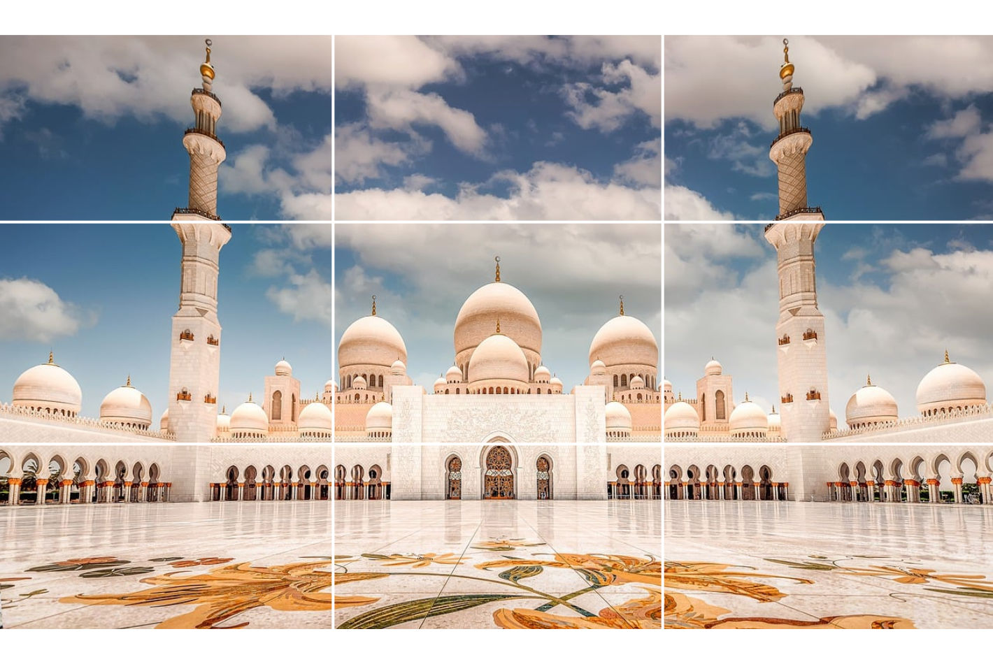
© Pixabay, CC0
This example is not something one would come across all that often at all, and—in fact—it’s more than a little rare to find such symmetry in objects or landscapes, but this example has got a great deal to teach. A clear thing here is how the subject—the façade of the mosque—covers most of the frame, but note how close this picture is to a perfect alignment with the grid and how the positioning is so balanced that the spacing around the subject is almost equal on both sides, and how the center alignment of the subject leaves room for additional details—like the sky and design on the floor—and how the photograph splits into three parts, with the designer floor (the foreground), the subject (the mosque’s façade), and the sky (the background).
Example 5
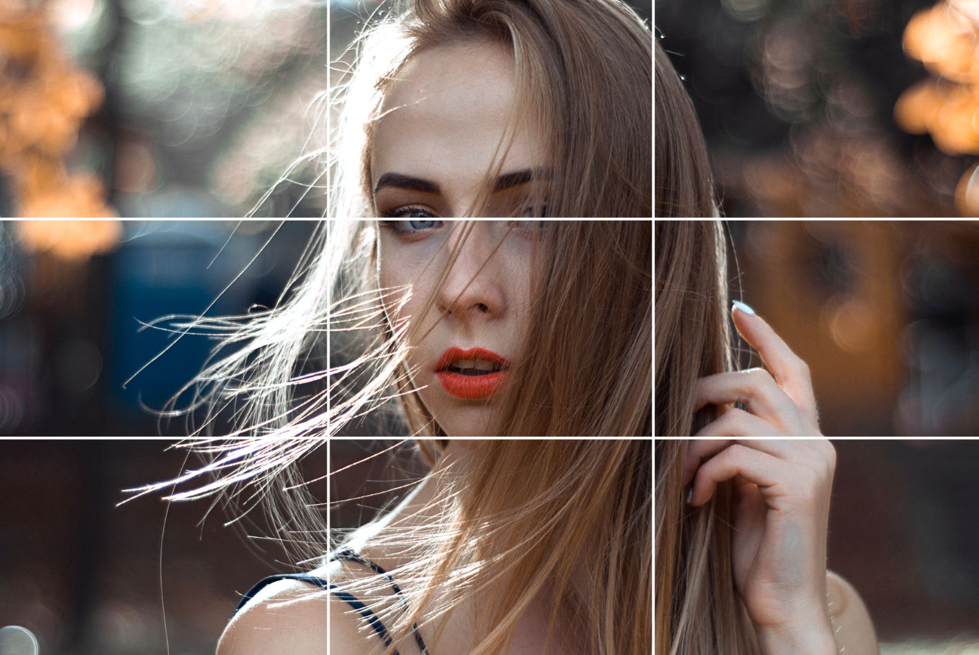
© Pexels, CC0
Last—but, again, not least!—come portraits and people, and in comparative terms it’s more accessible to use the rule of thirds in portrait photography than it is in landscape photography. For example, in the portrait of the person above, the photographer has done a great job of keeping the subject in the center and focus, and what the best way to get the right alignment there is is to place the eyes on the upper horizontal grid line. Then, the additional parts—like shoulders—have got to stay within the lower grid line for the rule of thirds to “work,” which it does well here. As a final point, the picture-taker has also made sure that the face is at the center—and voilà, the rule-of-thirds magic happens!
Learn more about grid systems in How To Use Grid Systems
Best Tools for Editing Using the Rule of Thirds
If you can’t use the rule of thirds correctly while you’re clicking pictures, you can improve the composition while editing your photos afterwards. Every piece of editing software has got the option to use grids, and here’s how you can use it in different software:
1. Adobe Photoshop
There are two ways to apply the rule of thirds in Adobe Photoshop:
Way 1
Open Photoshop and place the photo you want to edit.
Next, on the top toolbar, click on the icon next to the home and select any one of the crop options.
Look for the little grid icon in the top bar and select the first option, Rule of Thirds.
Next, check the box for Always Show Overlay in the same menu.
Way 2
Go to Edit > Preferences > Guides, Grids & Slices, then navigate to the submenu.
Set Gridline Every to 100 > Click on the navigation next to it, select Percent > Set the subdivisions as 3 and click OK.
If you still can’t see the gridlines, go to view and enable the extras.
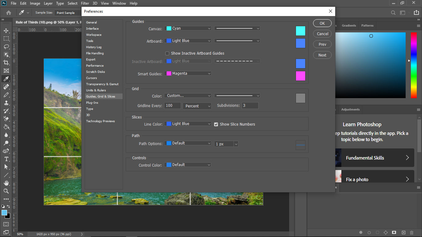
Screenshot of Adobe Photoshop's Guides, Grid & Slices section of Preferences.
© Adobe, Fair Use
2. Lightroom
Another popular software that also has a mobile app is Lightroom. It is one of the most preferred pieces of photo editing software. To use the rule of thirds grid in Lightroom, follow these steps:
Import your photo into Lightroom.
Go to the Develop module > click on Crop Overlay option.
Go to Tool > Crop Guide Overlay > Thirds to enable the three-by-three grid in Lightroom.
3. GIMP
To use the rule of thirds while editing in GIMP, follow these steps:
To enable the grid in GIMP, choose View, then Show Grid.
The default grid appears on the screen as a series of solid lines, each set 10 pixels apart.
You can change the appearance and spacing of the grid lines. To do that, choose Image < Configure Grid. You can divide the width and height of the image by 3 to obtain the correct values to enter in the dialog box.
Next, choose a line style of your liking, color, and spacing to customize.
4. Canva
Although Canva is a popular cloud software for graphic designing, many people also use it for photo editing. Therefore, using the rule of thirds grid in Canva is simple. But this feature is only available in a pro account. If you have a Canva Pro account, here’s how you can enable it in Canva:
Create a custom-sized art board according to the image you want to edit.
Add your photo to the uploads and place it on the artboard.
Next, select 'Files' in the top-left corner and select ‘View Settings.’
In ‘View Settings,’ select ‘Add guides.’
Once selected, you can customize the number of rows and columns you want on your artboard.
Go to ‘Custom,’ add the number of rows and columns (3X3), and you’ll have the rule of thirds grid on your artboard.
The Take Away
The rule of thirds is a powerful, well-established, and tried-and-tested visual design tool—and principle—where you apply a 3x3 grid with nine equal spaces within it and align subject material along the appropriate intersection lines or at intersecting points and sweet spots. It’s a “preset” that comes more or less standard on equipment like phones and cameras, and the power it can deliver to make images “speak” more to viewers—including the users of one of your websites, dear designer, for example—can be phenomenal.
With the many examples of how, when, and when not to use the rule of thirds (as well as when to break it!)—plus the software guidance on how to bring the best out of your images—you’ve got before you a legion of fine points that can spill over from photography into UI design.
If you’re after yet more insights—which is understandable, given how compelling this topic is—there’s indeed more that we’ve got to help you with, and you can take courses on visual perception by the IxDF to understand the anatomy of the eye, theories of human color vision, and other essential principles that can take your designs into overdrive while you broaden your skillset.