Your constantly-updated definition of Complementary Colors and
collection of videos and articles. Be a conversation starter: Share this page and inspire others!
97shares
What are Complementary Colors?
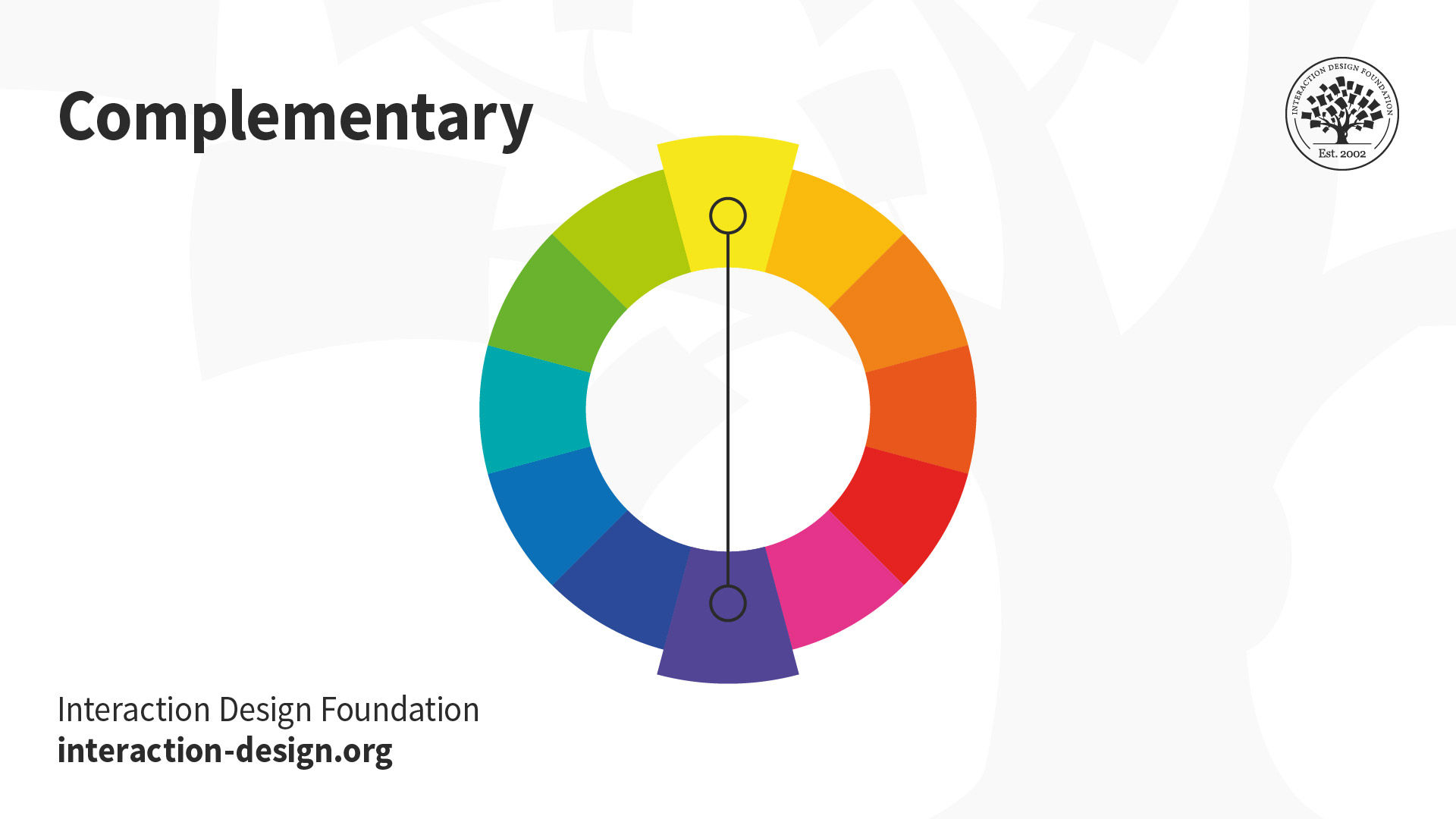
Complementary colors are the colors that sit opposite to each other on the color wheel. As the name suggests (complementary and not complimentary), these colors help each other stand out. They bring out the best in each other by making their complement more vibrant or noticeable. Complementary colors also work together to elevate the overall visual experience.
ShowHide
video transcript
Transcript loading…
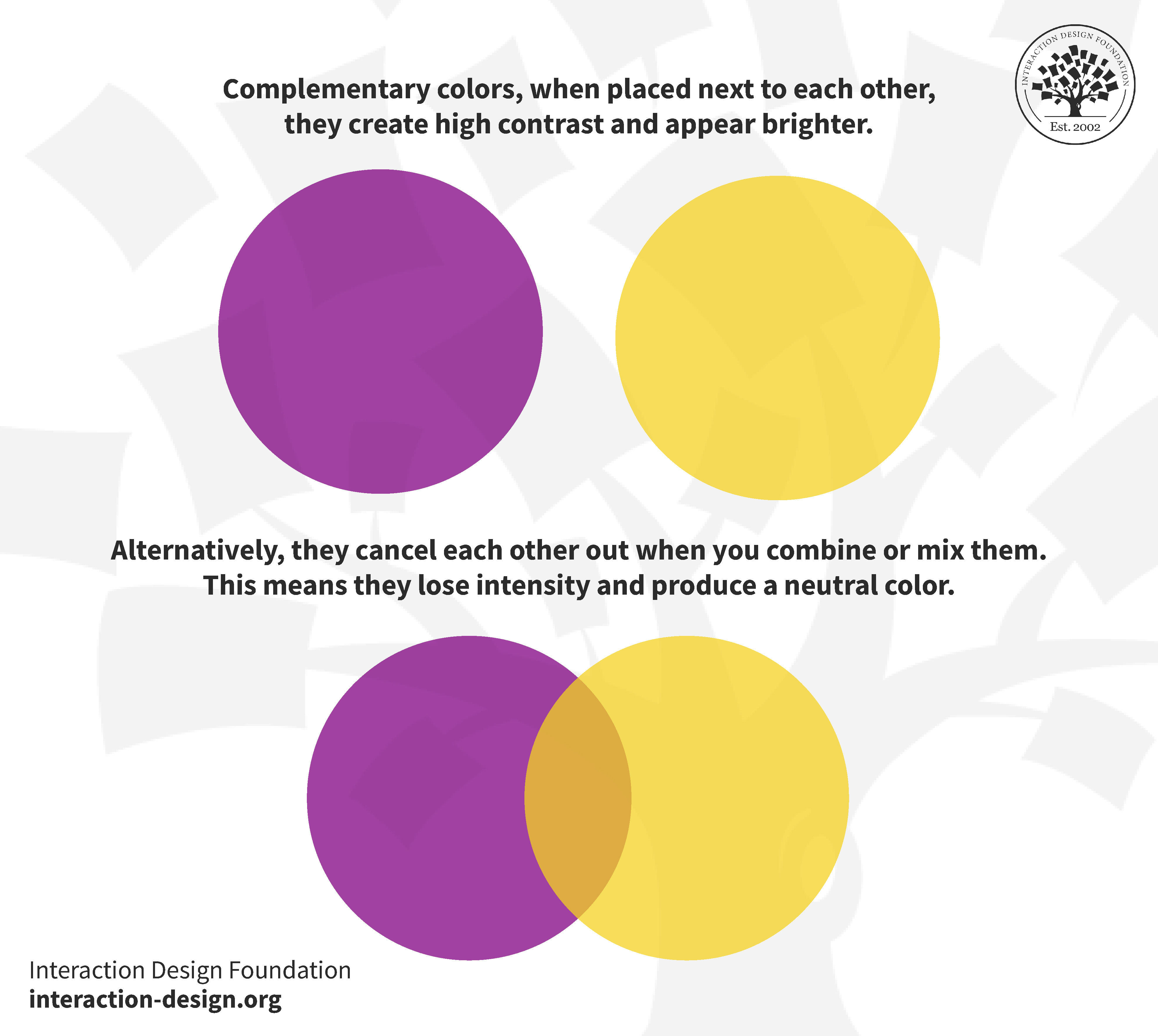
When you place complementary colors next to each other, they create high contrast and appear brighter. Alternatively, they cancel each other out when you combine or mix them. This means they lose intensity and produce a neutral color.
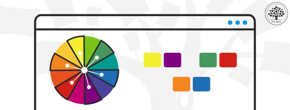
Complementary colors sit equally apart on a color wheel. This image illustrates that yellow and purple are complementary colors because they sit on opposite ends.
Foundations of Complementary Colors: The Color Wheel, Color Theory and Design Principles
Color theory studies how colors work together and affect emotions and perceptions. It is a combination of art and science that determines what colors look good together.
In this video, Arielle Eckstut, the author of "What Is Color?” shares the idea that color is a product of our imagination. Our brains play a significant role to process visual information and inform us about the world.
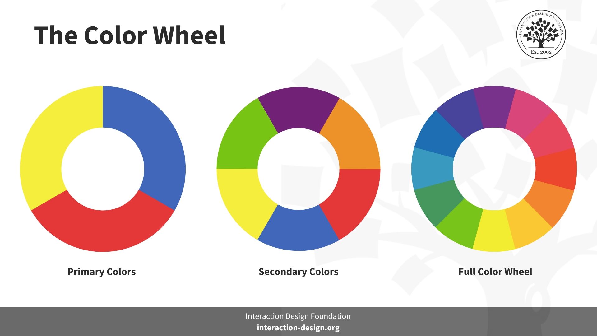
There are three primary colors, namely red, yellow, and blue. Mixing them yields three secondary colors (green, orange and violet, shown in the second wheel), and combining secondary colors yields six tertiary colors, presented on the full 12-color wheel.
Based on the primary colors of RYB—Red, Yellow, and Blue. RYB are primary colors for subtractive (pigment-based) color theory. In subtractive color theory, mixing colors removes certain wavelengths of light and reflects others. A mixture of all primary colors results in a muddy brown, almost black color.
Based on RGB color—Red, Green, and Blue. RGB are primary colors for additive (light-based) color theory. In the additive color theory, primary colors combine to form new colors. A mixture of all the primary colors creates white light.
Color harmony refers to the relationship between colors. Designers use geometric relationships on the color wheel to create pleasing color combinations. You can use a color wheel to determine the relative positions of different colors. Additionally, you can find color combinations that create a pleasing effect. You must also know about different color schemes other than complementary.
Get your free template for “Color Schemes”
Appropriate color combinations must be combined with sound design principles to guide user attention and enhance user experience. Ensure that your color choices follow the principles of unity, Gestalt, hierarchy, balance, contrast, scale, and dominance.
Complementary Color Combinations
Think of complementary colors as "opposites attract." The classic examples of complementary color combinations are:
Red and green
Orange and blue
Yellow and purple
If you include the variants of these primary colors, red, green, and blue (RGB), you may get another three complementary color examples:
Blue-purple and yellow-orange
Red-purple and yellow-green
Red-orange and blue-green
Using the full 12-color wheel, we get six pairs of complementary colors that you can use to design pleasing experiences. These six color combinations can work wonders if you're designing a website or a digital presentation:
Red and cyan
Green and magenta
Blue and yellow
Orange and azure
Chartreuse green and violet
Spring green and rose
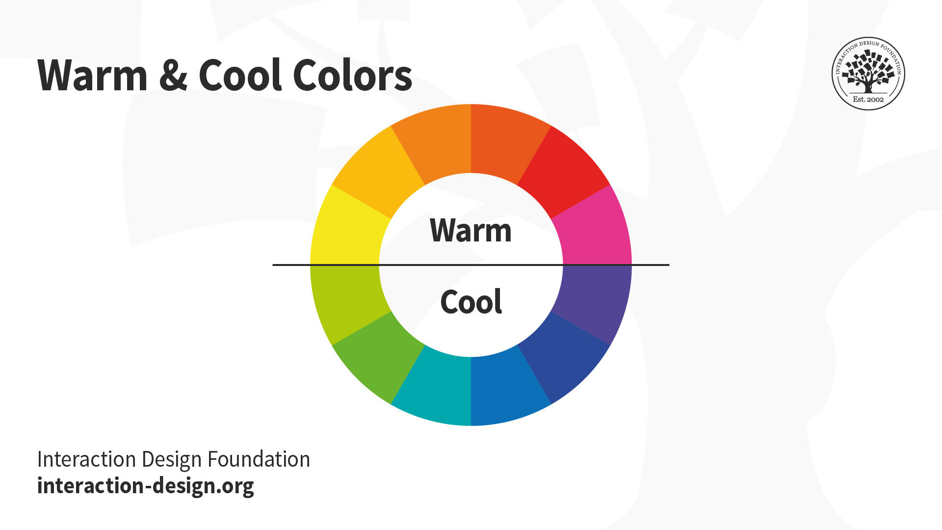
Typically, a pair of complementary colors comprises one warm color and one cool color. For example, yellow is a warm color, and purple is a cool color.
No matter the complementary color combination, one color will always be warm, and the other will be cool. These colors have opposite temperatures. This is the main reason behind the high contrast.
Visual perception plays an essential role in what we see. The perception of colors results from how our eyes and brain process different wavelengths of light. Color is a perception of energy and specific wavelengths of light that reach our eyes.
Arielle Eckstut explains the significance of color in our perception and how designers use it to convey information effectively.
ShowHide
video transcript
Transcript loading…
Our eyes have three types of color receptors. These special cells, known as photoreceptors, respond to color in only three varieties: 'red,' 'green,' and 'blue.' To simplify, here's an exercise to help you learn how complementary colors work in visual perception.
Look at a green light for a while. After 30 seconds, suddenly turn to look at a white wall. You'll see a magenta light on the wall for a split second, which is green's complementary color. (Try it!)
When you look at a green light for a while, the green cells get tired, while the red and blue cells take a break. After 30 seconds, when you look at a white wall, the area with the tired green cells gets lit up by red, green, and blue light. The red and blue cells respond strongly, but the green cells respond weakly. Hence, we mostly see a mix of red and blue, creating a magenta color.
The above phenomenon is also called the afterimage phenomenon. It highlights the importance of color choices. Pleasing combinations attract attention and evoke positive emotions. Similarly, unpleasant combinations can put your users off. This shows how important it is to pick colors carefully. Pleasing color combinations can catch the viewer's eye and evoke certain emotions. Similarly, colors that don't go well together might not look good and could make people lose interest.
Complementary colors look great together because they make each other stand out and look balanced. They do this by stimulating different parts of our eyes equally. It's a natural illusion that adds energy and draws the eye. However, the nature of color is transitory. Our perceptions of color can shift under different lighting conditions. Joann Eckstut, a leading color consultant and interior designer, explains why colors change in this video.
ShowHide
video transcript
Transcript loading…
How to Use Complementary Colors?
Complementary colors are perfect to catch the viewer's attention. They can make a composition bolder, prouder, and more charismatic. There is no reason you should not utilize the power of complementary colors in UX design. However, nailing it requires a keen eye.
The key to using complementary colors well is to make one color more dominant.
There are several ways to do this. Let's see how you can use complementary colors in the design:
1. Create Shadows and Gradients
You can create shadows using a color's complementary color. It creates an interesting shadow instead of using black or gray. Complementary colors' gradient effects can add depth and visual interest to your design. This contributes to a more engaging and dynamic user experience.
For instance, let's say you have a weather app with a blue background representing the sky. You have a card that displays current weather conditions, like temperature and forecast. Instead of using a neutral gray, opt for an orange shadow to create a shadow for this card. This can enhance the realism and visual appeal of your app.
2. Grab Attention
Use complementary colors to draw attention to essential elements. This can include alerts, notifications, or CTAs. Using complementary colors can make the information stand out. It ensures users notice critical details.
Take an example of the IxDF website layout. The orange CTA with the primary color blue is an excellent example of contrast in action.
This Interaction Design Foundation website screenshot features the dynamic contrast between orange and cool blue. The intentional complementary color combination of these two colors creates a visually compelling and harmonious design.
You can apply complementary colors to different interface elements. The contrast between complementary colors makes certain elements stand out. Hence, you can use it for effective differentiation and emphasis. It helps your users understand the structure of your digital product.
An appropriate example is Agendrix—a staff scheduling and workforce management software. The dark teal color for the main background of their website gives a sense of calm professionalism. They also chose the perfect complementary shade of peach to emphasize key elements. Agendrix uses these two colors to distinguish calls to action to strategically guide users through the website.
An appropriate example is Agendrix—a staff scheduling and workforce management software. The dark teal color for the main background of their website gives a sense of calm professionalism. They also chose the perfect complementary shade of peach to emphasize key elements. Agendrix uses these two colors to distinguish calls to action to strategically guide users through the website.
Experiment with complementary colors for background and foreground elements. If the background is in one complementary color, the foreground elements (text or images) can be in its complement. This creates a striking visual effect.
Dollar Shave Club, a personal grooming company, uses deep blue as the background and coral red as its complement. The selective application of coral red as the foreground element makes important elements more noticeable. This combination is aesthetically pleasing and provides users with clear visual cues.
Again, you must exercise caution. The contrast you aim to create must be enough to draw attention. At the same time, it should create a clear hierarchy while keeping the design balanced. Put simply, striking the right balance is key.
5. Navigational Guidance
Complementary colors minimize eye fatigue. Hence, they're ideal for a website's navigation menu. Use complementary colors for dropdown menus, text, icons, and hover and active states. For instance, when users hover over or select a menu, the color changes to its complement. This switch gives users quick feedback, indicating the menu's interactive nature. It makes the website more fun and easier to use.
For example, A Short Journey is an interactive one-page website. It uses an orange and blue color website palette. This website uses different shades of orange for the background. This dominant color gives the website more depth. The foreground objects mainly use blue. This contrasting color lets visitors focus on the website’s interactable elements. This makes the navigation more intuitive and enjoyable.
The above screenshot from an interactive one-page website takes users on an animated holiday adventure. It uses a combination of orange and blue to let visitors focus on the website’s interactable elements.
Tips to Make Your Complementary Color Combination Stand Out
Complementary colors in design can create visual interest, balance, and harmony. Here are some tips to make your complementary color combination stand out.
1. Understand the Basics
To create excellent combinations, you must understand the following:
Color modes: The different ways designers use colors in digital and print media. Common modes include RGB (Red, Green, Blue) for digital products and CMYK (Cyan, Magenta, Yellow, Black) for print.
Color symbolism: The symbolic meanings and different cultural associations of colors.
Color theory: The principles and guidelines that govern color combinations.
Knowing the fundamentals can help you create compelling and emotionally resonant designs.
2. Consider the Emotional Impact
Think about the mood or emotion you want to convey. Complementary colors can create a strong contrast even when you reduce their intensity. So, decide if you want a vibrant and energetic feel or a more subdued and balanced atmosphere.
Different color combinations resonate differently with various demographics. For instance, a red and green combination can signify the "holidays." But it can also represent energy and rejuvenation. Consider the cultural associations, preferences, and emotions your color combination seeks to elicit.
3. Use a Dominant Color
Choose one color as dominant and the other as an accent. This can help to create emphasis and guide the viewer's focus. The dominant color should align with your main message or theme.
In this video, Joann and Arielle give you their six top tips for picking colors.
ShowHide
video transcript
Transcript loading…
4. Selective Application
It is best to use complementary color pairs in specific areas or elements of a design. Instead of using the combination in every design element, identify certain elements critical to the design's message. Selective application ensures the contrast attracts users without overwhelming them.
You might be designing a website, an app, or marketing collateral. Making color choices accessible means the broadest possible audience can understand your design. It also makes it more likely that your products or services will comply with equality legislation. Use contrast-checking tools to ensure that text will be legible. You should also use usability testing to confirm your color combinations.
How can I use complementary colors in UI design effectively?
In UI design, complementary colors can enhance the visual appeal and user experience. Complementary colors sit opposite each other on the color wheel, creating a vibrant and dynamic contrast. They can highlight key elements when used strategically. These key elements include call-to-action buttons or essential information. The goal is to make them visually prominent.
Consider using one color predominantly and the complementary color for accents. This will create a harmonious and balanced composition.
Ensure enough contrast for readability and accessibility.
Align the use of complementary colors with the desired user experience. Warm tones are energizing and vibrant, while cool tones are calming and formal.
The integration of complementary colors can improve the UI design's aesthetics. It can also make it easier to use.
What is the importance of complementary colors in branding?
Complementary colors are crucial in branding. They evoke emotions and leave a lasting visual impact. Intelligent use of these color pairings enhances brand recognition. It also establishes a unique identity for the brand. Complementary colors create dynamic contrast. It makes brand elements more noticeable and prominent.
Complementary colors can also shape brand perception and influence the target audience. A brand can express its personality and values through colors. These colors can help it stand out in a competitive market. This heightened visibility contributes to brand recall, a critical aspect of consumer loyalty. One notable example of a famous brand employing a complementary color scheme in its branding is Heineken. The brand's combination of red and green creates a visually appealing and iconic design.
How do complementary colors affect user experience in UX design?
Complementary colors greatly affect user experience in UX design. They can create visual harmony and help with effective communication. Complementary colors make digital products stand out. They help create a visual hierarchy and help users navigate the interface and find important information easily. It makes it easier for users to focus on important things like buttons or calls to action.
Can complementary colors improve website accessibility?
Yes, complementary colors can improve website accessibility. Using complementary colors is an important part of accessible web design. Designers can make text easier to read and see by using contrasting colors. Opposite colors on the color wheel create a strong contrast. The contrast makes it easier to tell text apart from the background. It also makes buttons stand out from other things, so the content is easier to see.
Complementary color schemes also make websites inclusive. They are a good choice for people with different visual abilities and help create a digital environment that includes everyone.
What are some common mistakes when using complementary colors in design?
When using complementary colors in design, there are some common mistakes to avoid.
Using too many colors that go well together can tire out users and make the design less attractive.
Not having enough difference between the color of the text and the background can make it hard to read and affect how users feel about the design.
Ensure the colors used look the same on different devices, so everyone can see the design as intended.
Using both complementary colors equally might create a clash and make the design look too flashy.
What tools can help me find complementary color schemes?
To find complementary color schemes easily, one can use complementary color generators. These online tools simplify identifying colors opposite each other on the color wheel. Designers can find perfect color pairs by clicking on colors opposite the selected hue. Adding a complementary color generator to the toolkit makes the design process smoother. It helps one create visually appealing and harmonious color palettes. Designers can use this tool to create impactful designs.
What are the psychological effects of complementary colors?
Complementary colors, which are opposite each other on the color wheel, have distinct psychological effects:
Complementary pairs create visual harmony and balance. They engage viewers and provide a pleasing aesthetic experience.
Combinations of complementary colors influence emotions.
Complementary colors have a harmonious yet contrasting nature. Visually pleasing designs often captivate users and leave a lasting impression.
Using complementary colors reinforces brand identity. It helps with recognition and recall.
Properly chosen complementary colors can enhance the legibility of text and graphics.
How can complementary colors enhance mobile app design?
Complementary colors are important in mobile app design. They make the applications visually appealing, help with navigation, and reinforce brand identity. The colors can highlight essential elements such as call-to-action prompts or buttons. This makes it easier for users to know what to do. The colors can also evoke certain emotions or moods. This helps create a memorable brand image. Designers can use complementary colors to make the app aesthetically pleasing and easy to use.
Can complementary colors impact the readability of text?
Yes! Using complementary colors in designs can impact the text readability. It's best to aim for a harmonious balance between complementary colors. For example, deep green text against a light coral background is a good choice. However, text in a vivid green hue against a bright red background, or vice versa, may prove excessively vibrant, hampering readability.
Designers should prioritize readability by ensuring the contrast ratio between text and background meets accessibility standards. They can also improve readability by choosing clear, legible typography and adjusting font size and weight.
Are complementary colors effective in minimalist design?
Yes, complementary colors work well in minimalist design. They add interest and depth without making it complicated. In minimalist design, every element is important. Complementary colors help important elements stand out. They create a focal point in a simple palette. Complementary colors look good in minimalist design because they don't overpower the composition.
How to adjust complementary colors for color blindness?
To help people with color blindness, here are some adjustments to consider:
Increase the contrast and adjust the brightness so that the differences between colors are easier to see.
Use patterns or textures along with colors to convey information. This way, even people with color vision problems can still understand.
Clearly label things and use symbols to show meaning. This gives extra clues beyond just using color.
Pick complementary colors that have enough contrast. This makes them easier to see, even for people with color vision problems.
By using these strategies, designs become more inclusive and accessible for everyone.
Earn a Gift, Answer a Short Quiz!
Question 1
Question 2
Question 3
Get Your Gift
Try Again! IxDF Cheers For You!
0 out of 3 questions answered correctly
Remember, the more you learn about design, the more you make yourself valuable.
It's Easy to Fast-Track Your Career with the World's Best Experts
Master complex skills effortlessly with proven best practices and toolkits directly from the world's top design experts. Meet your experts for this course:
Mia Cinelli: Associate Professor of Art Studio and Digital Design at the University of Kentucky.
Joann Eckstut: Color Consultant, Founder of The Roomworks, and one of the 12 designers chosen by the Color Association of the USA to create the yearly forecast used by industries to keep up with color trends.
Arielle Eckstut: Author, Agent-at-large at the Levine Greenberg Rostan Literary Agency, and Co-Founder of The Book Doctors and LittleMissMatched.
Part of the magic of how colors work together in impressive designs lies in the art of color selection. Designers often
1.1k shares
3 weeks ago
Open Access—Link to us!
We believe in Open Access and the democratization of knowledge. Unfortunately, world-class educational materials such as this page are normally hidden behind paywalls or in expensive textbooks.