
As designers, we can use color to guide our users in the right direction to accomplish a task effectively and efficiently. But some designers who focus more on their company’s needs than their users’ can twist things so that colors turn into a bewildering nightmare, hiding buttons and information users actually need. Here, you’ll see how color choices are a vital ingredient to help your users and prevent confusion.
Take a look at this old email newsletter message below; the colors could confuse the user and make the job of finding out how to unsubscribe harder. With a grey font for the email address on a slightly lighter grey background, it would be very difficult for the user to see exactly what it says. Likewise, although the “subscription settings” text is underlined, the user would not necessarily recognize the link—and that’s thanks to the confusing nature of the colors used in the display. As the designer did not follow the convention of using distinctly blue underlined text for inline links, the user may not have noticed that the text was actually clickable and linked.
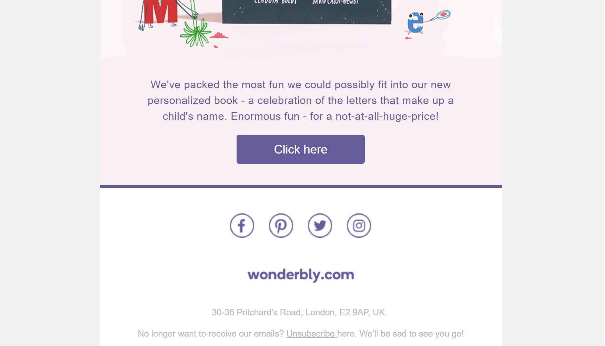
Many email newsletter messages have a layout similar to this historical one from wonderbly.com. The option to unsubscribe had a color with little contrast to the background, thereby making the option difficult to find.
© Wonderbly, Fair Use
Why is this classed as a dark pattern?
Color is one of the pre-attentive attributes; those of us with full color vision can use this element of visual arrays to distinguish items and extract information immediately. However, when certain colors are combined, we find it extremely difficult to read text and gain an instant understanding of the presented information. In view of this, we run into a problem where we can confuse our users in not just one way but two:
The colors of text have low contrast to the background. This way, the text doesn’t stand out to the user sufficiently to get noticed. What’s more, users will find the text hard to read once they have finally discovered it.
The colors of inline links are the same as the colors of non-interactive text. This way, users will likely not be able to distinguish clickable links and will likely overlook the possibility to find relevant information.
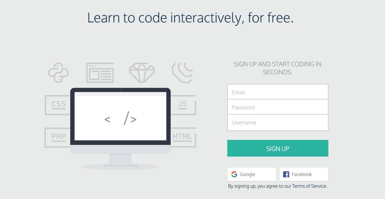
In this old example from Codecademy, the text “Terms of Service” didn’t stand out as clickable at first sight. Combining it with an implied consent design pattern, this solution might persuade users to sign up without reading these terms.
© Codecademy, Fair Use
If you’re thinking about camouflage here, you’re on the right track. For designers, the risk is that we can twist and warp the elements of pretty much anything we create, be it to mask items or bring them out. The user’s eye is putty in our hands, because we know how the human eye works and how it can, along with the brain, go along with hints, cues, and illusions (as the Gestalt Principles attest). If we want to, we can draw our users’ attention to elements, prompting them to take action. And we can mute and bury messages—often called “the fine print”—so users will carry on regardless. It is here where we have to ask ourselves if the user is likely to suffer some form of loss. If the answer is a ‘no’, we can breathe more easily, and consider how we might guide our users in a more positive—or at least a harmless—sense and really help them achieve what they want on our product.
“Color does not add a pleasant quality to design – it reinforces it.”
— Pierre Bonnard, French painter, printmaker, and founding member of the Post-Impressionist group of avant-garde painters Les Nabis
When you use a similar color background to the text, the user must devote more attention to the display to read what it says. If you do not want users to see, then combining colors in this way can be a very underhanded way of sneaking information past them. The information is still there; it’s just that designers can conceal it, somewhat like writing on a page with a worn-out yellow highlighter.
Then there are designers who do not want users to miss the information but merely make it a little harder for them to commit to a certain action. This could be, for example, opting out of a newsletter. These designers might consider another dark pattern or self-serving maneuver, such as placing the command out of the usual position or adding an extra, laborious step to the procedure. Consider an opt-out checkbox where users must consciously check it so they don’t share their information or sign up to a subscription. Or uncheck the box. A designer can set the default option for users to automatically subscribe to, say, a newsletter by clicking “OK” without having read and unchecked the box. And if the designer uses colors that don’t stand out, that lack of contrast can also confuse the user into unintentionally subscribing to something they did not want.
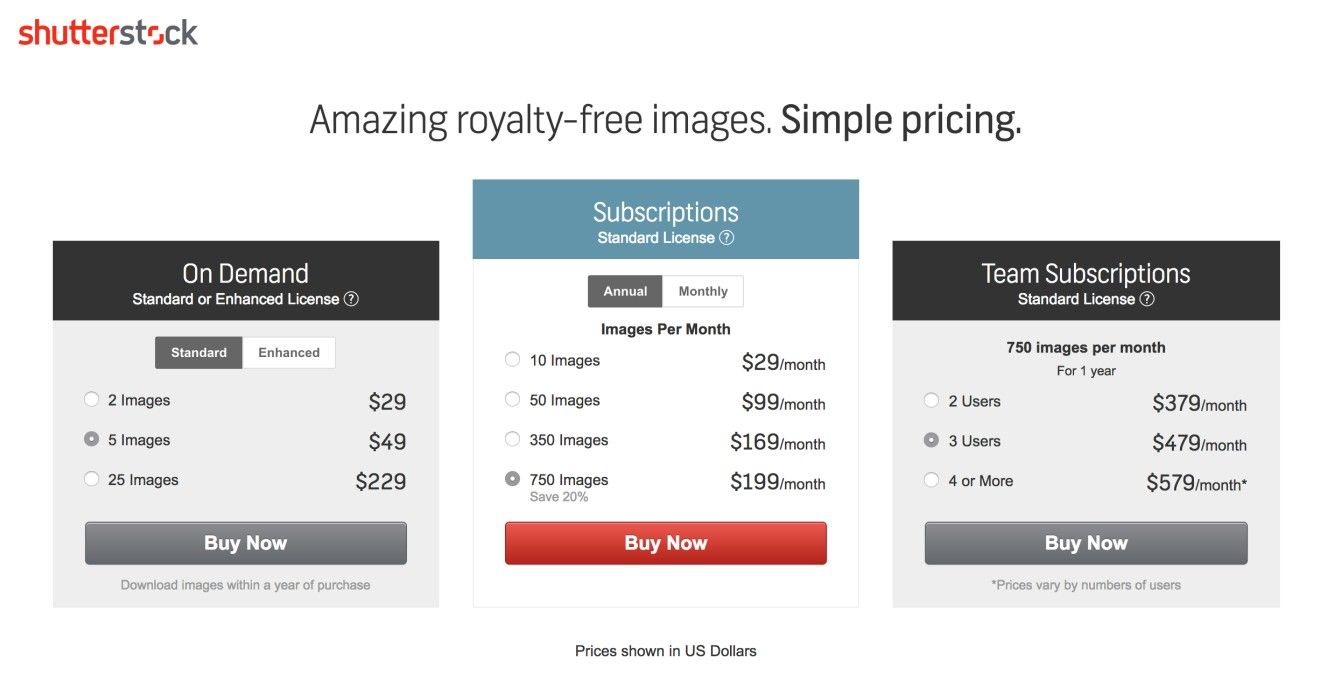
In another old example, Shutterstock used color here to make a particular subscription stand out. The other subscriptions appear to be inactive, due to the greyscale that is used.
© Shutterstock, Fair Use
Sometimes, it’s about making desirable subscriptions or deals stand out. As you can see above, color is an innocent ally. A sensible use of it can bulls-eye a target as well as it can conceal something you don’t want users to take much stock of. As long as your client is an ethical organization, you should have ample leeway to plan how you can add value for them by cleverly accentuating desired targets while making color choices that will not catch their eye when it comes to including required (if less desired) elements or information.
As you consider the wealth of possibilities for playing with color, bear one further consideration in mind. Aside from steering well clear of “epic fail” selections, such as red-on-blue or blue-on-red interplay, remember your users who have some form of color blindness, particularly with red and green elements, for example. Always ask yourself “What do I want to show and why?” and “Is there anything I want to de-emphasize and why?”, and balance these against ethical considerations such as accessibility and likely outcomes for users. That said, you may just surprise yourself at how, with the right color choices, you can nudge users towards conversion territory while helping them get what they want and where they want, with zero trickery involved.
The Take Away
Color can enhance the usability of an interface. With the correct contrast, you can help users find content that is relevant to their tasks quickly. But interface creators can also use color for less noble purposes. When companies want to trick users into selecting the more expensive option of a subscription, or want to make finding certain ‘unsubscribe’ options more difficult, the designers can use the same knowledge about colors in a dark way. They can select low contrasts to keep attention away, or bright colors to attract users and guide their actions. So, be a responsible designer – do users zero harm while you maximize the benefits for whomever you turn your hand to help, and make a win-win situation for all concerned.
References and Where to Learn More
Hero Image: © Unsplash, CC0.
Jenifer Tidwell, Designing Interfaces: Patterns for Effective Interaction Design, 2010
Martijn van Welie, Pattern Library, 2008
Harry Brignull’s website dedicated to dark patterns.


