
Learn to design with consistency and standards in mind and understand the reasons why they’re important to incorporate them into your work. Derived from Jakob Nielsen and Rolf Molich’s Ten User Interface (UI) Guidelines, ‘Consistency and Standards’ are evident in many of the widely-used products created by some of the most successful companies. Products like Adobe Photoshop, originally released in the 1990s, and Google Gmail, released in the mid-2000s, are just a few of the widely popular products that exhibit this important rule of thumb. This article will teach you how to recognize consistency and standards and explain why they’re important in user interface design.
Two Key Reasons for Consistency and Standards in User Interface Design
As you design the user interface, it is important to keep in mind the interactions that take place between the human cognition and the screen you’re designing for. Making things easier for your users means not forcing them to learn new representations or toolsets for each task. Reducing the length of the thinking process by eliminating confusion is also a sure bet when it comes to improving user experience.
1. Reduce Learning
Consistency limits the number of ways actions and operations are represented, ensuring that users do not have to learn new representations for each task. Further, establishing design norms like following platform conventions allow users to complete new tasks without having to learn a whole new toolset. This may sound like a simple concept, but there are many examples out there that exhibit a lack of consistency in their designs. One such example that portrays this issue is the website for Xfinity by Comcast Corporation, an American mass media company. In their website, not only is the secondary menu inconsistent almost every time the user clicks into another page, but it is also inconsistent for the primary menu as well. Let’s take a look and compare the three different pages of the website: Homepage, My Xfinity, and TV.
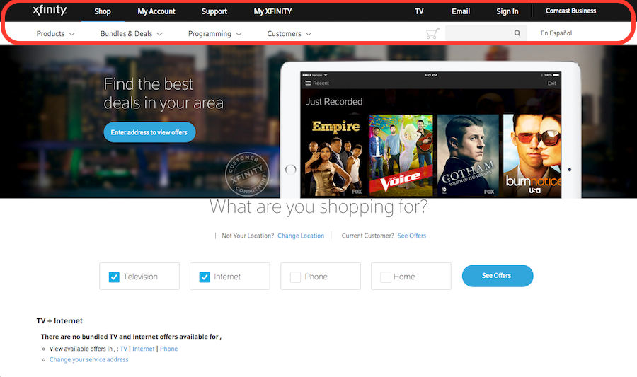 Author/Copyright holder: Comcast Corporation. Copyright terms and licence: Fair Use.
This is the homepage of the Xfinity website. Notice how the annotated area highlighting both the primary and secondary menu bars will differ as the user clicks into other pages.
 Author/Copyright holder: Comcast Corporation. Copyright terms and licence: Fair Use.
This is the TV page of the Xfinity website. What makes it confusing for the user is how the colors, layout, and font-styles look different from the home page.
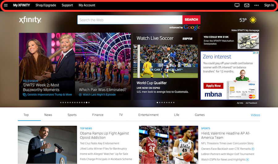 Author/Copyright holder: Comcast Corporation. Copyright terms and licence: Fair Use.
This is the My Xfinity page of the Xfinity website. All three pages examined above have very different colors, layout, and font-styles in their navigation menu. These differences make it confusing and disorienting for the user as it no longer feels like one website, as if they are three different companies.
2. Eliminate Confusion
Users tend to apply rules they’ve experienced outside of your website or product, bringing in a set of their own expectations. Knowing that, we should be mindful of whether or not we’re causing confusion and alienation when we deviate from design standards and conventions. Further, users should not have to spend time wondering whether different words, interactions, or actions actually mean the same thing within the context of your product. Confusion occurs when people are unable to ‘piece together’ information, and at times, obstructing them from achieving something. When the user is hindered from achieving their goal, it’s understandable that they can feel angry or frustrated. It’s no secret that confusion generally causes frustration, and frustration leads to poor user experience. Therefore, you should always aim to eliminate confusion at every touch point wherever possible.
Five Ways You Can Achieve Consistency in Your Work
There are many aspects to achieving consistency within your user interface. Here are 5 things you can look at to improve consistency in your designs:
1. Your Choice of Language
The language you use in both marketing copy as well as the wording used throughout the user flow can not only influence your user’s perception of your product, but also be a point of confusion when you use different terminology to represent the same thing. This concerns not only in the terms you choose but also the tone in which you convey your message.
Scaring your user with a serious and threatening error message when they’re browsing an ecommerce site that exhibits an overall friendly tone will be sure to kill an otherwise good user experience, for instance.
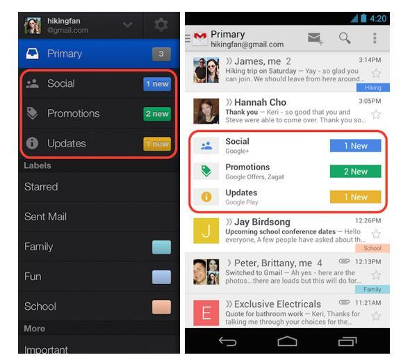
When things mean the same or perform the same operation they should be represented in the same way, as is the case in Google's email facility, Gmail. Based on the organization style of client email applications, Gmail’s folders are labelled 'Inbox', 'Drafts', 'Sent Mail', etc. The language used for these folders shows familiarity and consistency to anyone who have used email applications in the past.
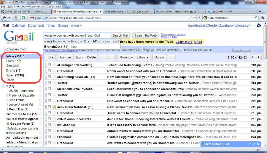 Author/Copyright holder: David Bruce Jr. 2011. Copyright terms and licence: CC BY 2.0
The folder labels in the 2011 version of Gmail displays a variety of familiar options. The language used for these folders shows consistency as it uses the labels “Inbox”, “Drafts”, and “Spam” – all of which are familiar to anyone who have used email applications in the past.
2. Apply UI Elements as They are Originally Defined
UI elements that are commonly used, such as message windows, menu bars, icons, scrollbars, and radio buttons, are graphic elements that are typically consistent and have representations that are widely understood by users. For instance, radio buttons are meant to be used when there is only one option allowed. Checkboxes on the other hand should be used only when the user is allowed more than one option. In many ways, we can see how HTML5 beat out Flash technology as of late 2014. One of the reasons is arguably the ease of application and ease of use that developers, designers, and users can enjoy as a result of HTML5’s consistency and standards in defining their UI elements.
Radio buttons only allow one option. Therefore, it only makes sense for HTML’s built-in radio buttons to behave that way in functionality as well.
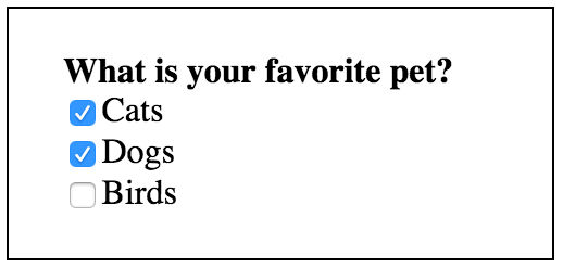
Checkboxes allow more than one option. Therefore, it only makes sense for HTML’s built-in checkboxes to behave that way in functionality as well.
A bad example of consistency in the choice of UI elements appears in the comments section that BBC’s news website used to have in the past. The highest rated user comments are denoted by a south-facing arrow, yet users must click on the north-facing arrow to increase a comments rating. Using a south-facing arrow to represent the highest rated comments is also unintuitive; increasing numbers go up, not down. When users scan the comments section of a web page they may simply act according to the arrows, not reading the action labels, which may induce incorrect selections.
Failing to utilize commonly used visual representations will force the user to consciously engage with the user interface in a way that is uncomfortable, which reduces the speed at which they could be navigating and performing desired tasks.
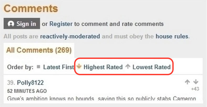
Author/Copyright holder: BBC. Copyright terms and licence: Fair Use.
BBC Comment section displays a down arrow for ‘Highest Rated’ and up arrow for ‘Lowest Rated’. This representation is inconsistent and confusing for your users, as the concept “higher” is generally synonymous with an up arrow and “lower” is synonymous with a down arrow.
3. Consider Various Well-established Conventions When Deciding on Layout
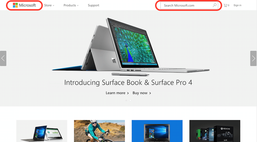
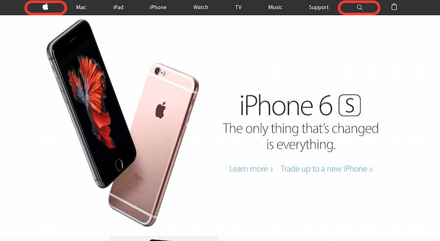
It is certainly debatable whether a designer should “copy” how other people lay out their websites or apps. However, when you design with the user’s perspective and cognition in mind, it is important to understand that humans have a strong memory for where things are visually located on the screen. You should leverage this characteristic by reserving commonly used locations for various graphical elements such as having the logo on the top left, search field on the top right, exit icon on the top right, etc.
 Author/Copyright holder: Microsoft Corporation. Copyright terms and licence: Fair Use.
 Author/Copyright holder: Apple Inc. Copyright terms and licence: Fair Use.
Both Microsoft and Apple place their logo on the top left, and the search field on the top right of their websites. This form of consistency in layout helps users feel less disoriented when they browse a new and unfamiliar site.
4. Design for your User’s Expectations
Make sure you have the features and functionalities users would expect to see on your site. For example, an airline site should have a ticket-booking system, while a music-sharing site should have a media player.
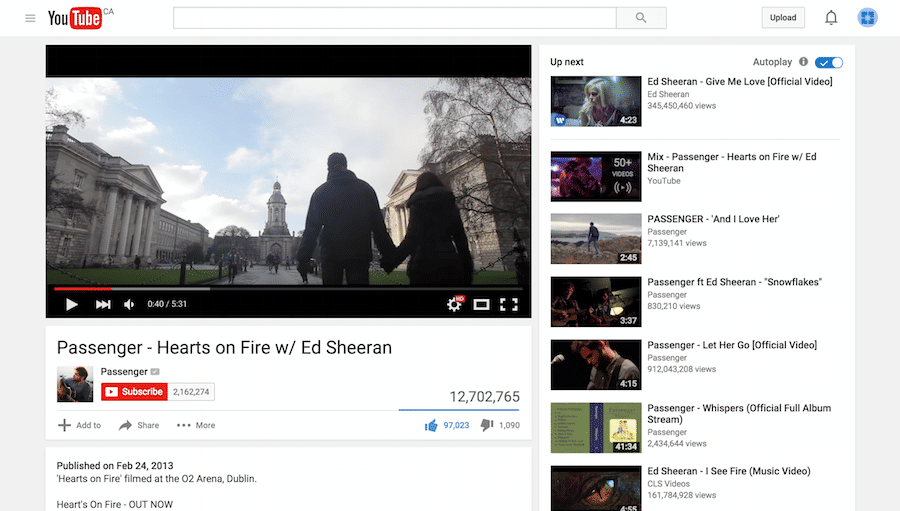 Author/Copyright holder: Youtube. Copyright terms and licence: Fair Use.
A video-sharing website like YouTube is obviously expected to have a video player. This is a great example of consistency in that the features and functionality of the site supports what the user expects.
5. Create Consistent Visual Elements throughout Your Site
Make sure visual elements are consistent throughout your site.The content, the UI elements, fonts, backgrounds and colors should be in harmony and feel consistent at every touch point. As mentioned above, sticking to technical conventions that exist in the form of HTML5 and CSS3 is one way to keep consistency. Meanwhile, having a branding and style guide to follow helps when faced with design decisions such as colors and fonts.
 Author/Copyright holder: Jan-Alfred Barclay. Behance. Copyright terms and licence: CC BY-NC 4.0
An example of a style guide and branding manual designed for the company, ‘Goodnyt’. Having a style and branding manual can help you make sure your visual elements are consistent throughout your site.
A bad example of consistency in the choice of colors and fonts can be seen in the 2013 version of Google’s Gmail mobile user interface. Although it can be argued that the ‘meaning’ isn’t affected in this case, it is undeniable that user experience almost always worsens as a result of any strange differences in visual elements between screens.
Author/Copyright holder: Google Inc. Copyright terms and licence: Fair Use.
A screenshot of the Gmail app’s mobile user interface when it was first rolled out in 2013 shows the inconsistency in choice of colored boxes and font styles.
The Take Away
Consistency and standards is acknowledged as an essential design principle and should be applied throughout the content and interactions within your product. There are several aspects of consistency that we can look at when improving our designs, this includes the language we use, the UI elements we choose, the way we lay out our site, the functions and features we include, as well as the visual components we decide on like color and font.
While consistency helps improve user experience by eliminating unnecessary learning and confusion for your users, it is important to keep in mind that you should use it when necessary but not let it constrict you from innovating on design ideas where it makes sense.
Following standards and conventions and being consistent should be something that you can use to your advantage. It will free you from relatively trivial design decisions. This will help you save time and free up your mind so you can further improve your designs and its user experience for your users.
References & Where to Learn More:
Course: UI Design Patterns for Successful Software
Find more information on Jakob Nielsen’s ‘Enhancing the Explanatory Power of Usability Heuristics.’
To see more information on the difference between art and design, check out this cool blog.
To learn more about the different aspects of consistency, read this blog post: Why Consistency is Critical
To learn more about balancing consistency and innovation, check out: Achieving and Balancing Consistency in User Interface Design
Hero Image: Author/Copyright holder: GraphBerry. Deviant Art. Copyright terms and license: CC BY-SA 3.0


