
Learn to design with your user’s needs and expectations in mind by applying Jakob Nielsen and Rolf Molich’s Ten User Interface Guidelines. These heuristics have been reflected in many of the products designed by some of the most successful companies in the world such as Apple, Google, and Adobe. Further evidence of how their design teams incorporate these rules into their design process is reflected in the user interface guidelines published and shared by these companies. This article will teach you how to follow the ten rules of thumb in your design work so you can further improve the usability, utility, and desirability of your designs.
Nielsen and Molich's 10 User Interface Design Guidelines
Jakob Nielsen, a renowned web usability consultant and partner in the Nielsen Norman Group, and Rolf Molich, another prominent usability expert, established a list of ten user interface design guidelines in the 1990s. Note that there is considerable overlap between Nielsen and Molich's heuristics and Ben Shneiderman’s 'eight golden rules'. These 10 rules of thumb further iterate upon Shneiderman’s eight golden rules 4 years after Shneiderman’s initial publication.
Visibility of system status. Users should always be informed of system operations with easy to understand and highly visible status displayed on the screen within a reasonable amount of time.
Match between system and the real world. Designers should endeavor to mirror the language and concepts users would find in the real world based on who their target users are. Presenting information in logical order and piggybacking on user’s expectations derived from their real-world experiences will reduce cognitive strain and make systems easier to use.
User control and freedom. Offer users a digital space where backward steps are possible, including undoing and redoing previous actions.
Consistency and standards. Interface designers should ensure that both the graphic elements and terminology are maintained across similar platforms. For example, an icon that represents one category or concept should not represent a different concept when used on a different screen.
Error prevention. Whenever possible, design systems so that potential errors are kept to a minimum. Users do not like being called upon to detect and remedy problems, which may on occasion be beyond their level of expertise. Eliminating or flagging actions that may result in errors are two possible means of achieving error prevention.
Recognition rather than recall. Minimize cognitive load by maintaining task-relevant information within the display while users explore the interface. Human attention is limited and we are only capable of maintaining around five items in our short-term memory at one time. Due to the limitations of short-term memory, designers should ensure users can simply employ recognition instead of recalling information across parts of the dialogue. Recognizing something is always easier than recall because recognition involves perceiving cues that help us reach into our vast memory and allowing relevant information to surface. For example, we often find the format of multiple choice questions easier than short answer questions on a test because it only requires us to recognize the answer rather than recall it from our memory.
Flexibility and efficiency of use. With increased use comes the demand for less interactions that allow faster navigation. This can be achieved by using abbreviations, function keys, hidden commands and macro facilities. Users should be able to customize or tailor the interface to suit their needs so that frequent actions can be achieved through more convenient means.
Aesthetic and minimalist design. Keep clutter to a minimum. All unnecessary information competes for the user's limited attentional resources, which could inhibit user’s memory retrieval of relevant information. Therefore, the display must be reduced to only the necessary components for the current tasks, whilst providing clearly visible and unambiguous means of navigating to other content.
Help users recognize, diagnose and recover from errors. Designers should assume users are unable to understand technical terminology, therefore, error messages should almost always be expressed in plain language to ensure nothing gets lost in translation.
Help and documentation. Ideally, we want users to navigate the system without having to resort to documentation. However, depending on the type of solution, documentation may be necessary. When users require help, ensure it is easily located, specific to the task at hand and worded in a way that will guide them through the necessary steps towards a solution to the issue they are facing.
Google Inc., the multibillion-dollar technology company, certainly produces designs that reflect the above heuristics. Jon Wiley, the head designer of Google Search in 2012 once said:
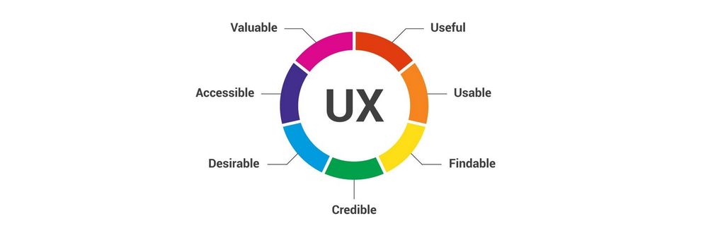
“When I think of design and creating great user experiences, I generally think of it in terms of three things: usability, utility and desirability.”
Nielsen and Molich’s 10 user interface guidelines cover these three key components of user experience quite nicely, which means you can likely improve the user experience of your designs by following these guidelines!
Learn How Adobe Integrates Nielsen and Molich's Ten User Interface Design Guidelines
Adobe Systems Incorporated, the large North American computer software company, is a great example of how designs reflecting Nielsen and Molich’s ten user interface guidelines can lead to success for a company. One of their most popular products, Adobe Photoshop, which is a raster graphics editor exhibits the characteristics of a well designed user interface that reflects these guidelines.
We will take a closer look at how Adobe Photoshop reflects each of these guidelines in order to inspire you to improve the usability, utility, and desirability of your own designs by incorporating the 10 rules of thumb into your own work.
1. Visibility of System Status
Photoshop does a great job of letting the user know what’s happening with the program by visually showing the user what their actions have led to whenever possible. For example, when users move layers around in the Layers palette, they can visually see the layer being represented as physically dragged within the space.
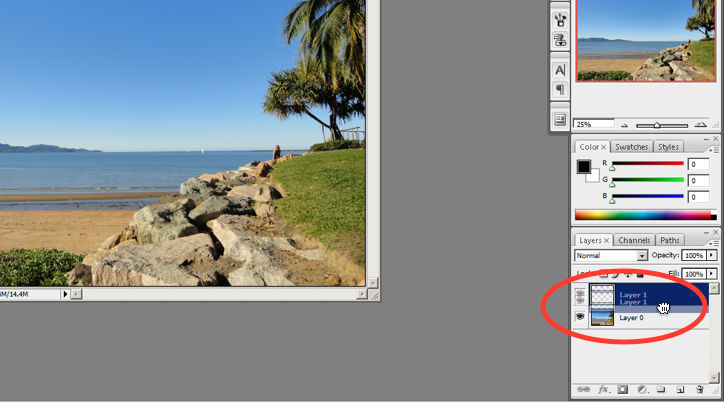
The cursor graphic goes from representing an open-hand to a gripped hand when the user drags a layer around within the Layers palette. This makes it easier to instantly understand the system status. Additionally, Adobe’s choice of using a ‘hand’ is a great example of the second guideline where the system matches the real world.
© Adobe Systems Incorporated, Fair Use
2. System Match to the Real World
An example of Photoshop mimicking the real world in terms and representations that their target users would understand, is where they design the information structure and terminology to mirror the same wording we would use in the world of photography or print media. Familiar concepts and terms like RGB, Hue/Saturation/Brightness and CMYK are used to represent color, while various tools like the dodge tool and the burn tool mimics a traditional darkroom technique for photographs.
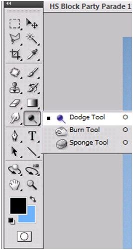
Photoshop’s Dodge Tool and Burn Tool mimics a traditional darkroom technique for photographs
© Adobe Systems Incorporated, Fair Use
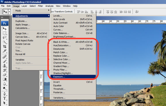
Photoshop utilizes the term, “Exposure”, as commonly used in the world of photography.
© Adobe Systems Incorporated, Fair Use
3. User Control and Freedom
Photoshop is very good at providing users with control every step of the way. As the user makes changes to an image or adds various artistic effects, they are able to quickly and easily take a step backwards if they make an error, for instance.
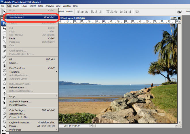
The users are in control as they can take a Step Backward or Step Forward under the Edit menu, or alternatively they can use Photoshop’s keyboard shortcuts like Alt+Ctrl+Z, for example.
© Adobe Systems Incorporated, Fair Use
4. Consistency and Standards
Photoshop maintains a standard layout and look and feel when it comes to the menu bar. They also utilize commonly known terminology such as “New…”, “Open…”, “Save As…”, etc.
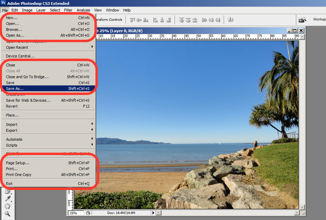
The File menu in Photoshop displays a variety of highly familiar options.
© Adobe Systems Incorporated, Fair Use
5. Error Prevention
To prevent users from making errors, Photoshop provides a brief description or label of the tools when a user hovers over it to help make sure users are using the proper tool for the task at hand.
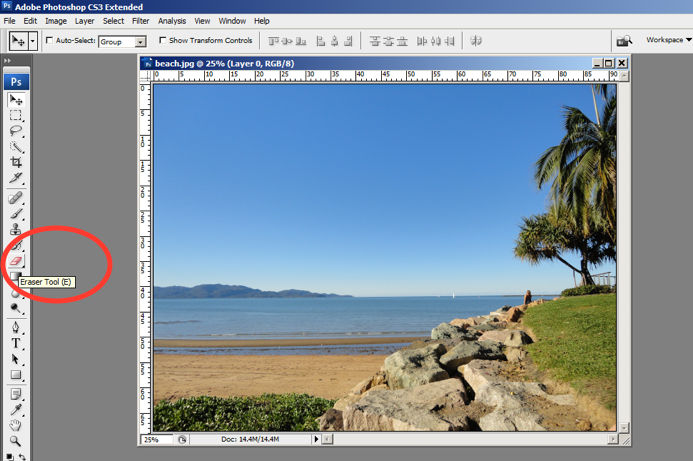
The user hovers over the eraser icon and Photoshop displays the “Eraser Tool” label.
© Adobe Systems Incorporated, Fair Use
6. Recognition rather than Recall
Whether it be making a selection from the artistic filters menu, or opening a new image file, Photoshop provides a sample view for users to make the right choice. This allows for the user to visually recognize what they’re looking for instead of having to recall the name or typing it in to search for it. Perhaps you have encountered other photo editing programs which ask you to recall and type the name of the file you want to work on. This can indeed be really difficult to recall as it is often something to the effect of: 29412_09342.JPG.
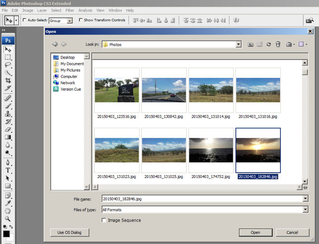
The user is able to visually recognize the sunset image by its thumbnail and select it.
© Adobe Systems Incorporated, Fair Use
7. Flexibility and Efficiency of Use
One of the many reasons for frequent users to love Photoshop is for its flexibility and efficiency. Users are able to utilize its flexibility by organizing and adding to their Workspace, as well as making things more efficient by saving it for future use.
Photoshop gives frequent users the ability to save their preferred workspace-setup.
© Adobe Systems Incorporated, Fair Use
8. Aesthetic and Minimalist Design
The toolbar in Photoshop only displays the icons and is neatly tucked to the side to help keep clutter to a minimum, and maintain a minimalist aesthetic.
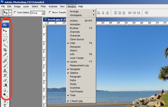
The Photoshop toolbar is minimalist and avoids clutter by representing the tools with icons only.
© Adobe Systems Incorporated, Fair Use
9. Help Users Recognize, Diagnose and Recover from Errors
Whenever there is an error, Photoshop provides dialogue that lets the user know what went wrong and how to fix it.
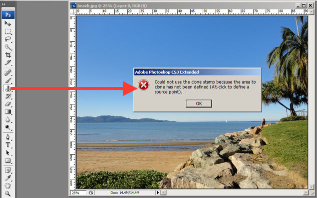
In this error message for the user’s misuse of the clone stamp, Photoshop explains what went wrong, the reason why and how the user should proceed from there.
© Adobe Systems Incorporated, Fair Use
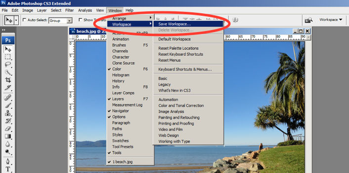
10. Help and documentation
Help and documentation can be accessed easily via the main menu bar. From there, you can find a wide variety of help topics and tutorials on how to make full use of the program.
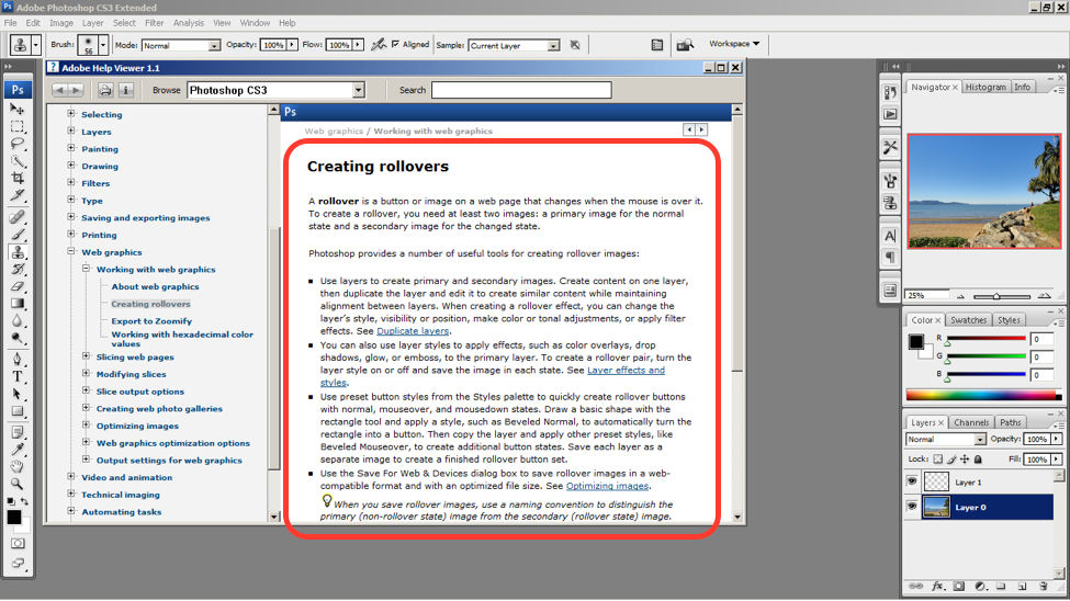
The window displays information on how to create rollovers in the context of web graphics. The user is also able to see a list of topics on the side menu.
© Adobe Systems Incorporated, Fair Use
10 Steps to Improve Usability, Utility, and Desirability by Implementing Nielsen and Molich’s User Interface Design Guidelines
As a designer, you should have the ability to critique the designs of your own as well as the work of others with well supported reasoning. Applying Nielsen and Molich’s 10 rules of thumb in evaluating interface design will help you recognize any potential issues as well as guide you and your team in creating better experiences for your users. Here’s a worksheet for you to practice with as you learn the skill of recognizing whether or not these rules have been applied and when these rules have been violated. Finally, it’s time to improve the website or app by further implementing the 10 guidelines.
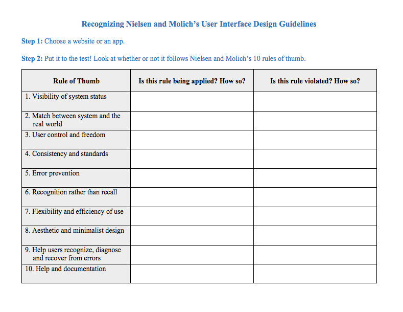
Download PDF here.
The Take Away
When you follow Nielsen and Molich’s 10 user interface guidelines you will design with usability, utility and desirability in mind. Just as the designers of successful companies like Apple, Google, and Adobe, you’ll be able to support your design decisions with well researched heuristics and be confident in creating designs that are both usable and beautiful. To practice recognizing these 10 rules of thumb, go ahead and work through the exercise outlined in the attached file from the above section.
References and Where to Learn More
To find more information on Jakob Nielsen’s ‘Enhancing the Explanatory Power of Usability Heuristics’ please see
Course: UI Design Patterns for Successful Software
Hero Image: Barry Schwartz. Flickr, CC BY-NC 2.0


