Users’ first impressions typically form in 50 milliseconds, and visual design plays a substantial role in whether users get a good or a bad one. Good first impressions are essential to engage new users and ensure the success of a product or experience. Studies show that visual appeal—what we see—is a crucial element to generate trust, and trust is the first step to achieving greater user engagement, loyalty and advocacy.
Master the art of first impressions in the Visual Design: The Ultimate Guide course. Find out how to harness the power of visual design to hook users from the very first second. In this piece, you will find the main highlights of this course.
Have you ever disliked a particular food even though you had never tasted it? We have all been there. How the food looks, its color, its texture and so on play a significant role in how you perceive it and feel about it. We are naturally drawn to things we believe are beautiful and aesthetically pleasing.
The word “aesthetics” derives from the Greek word “aisthētikos,” which means “relating to perception by the senses.” Visual design aims to improve a product's aesthetic appeal and usability with color, typography, space and layout, and it is closely related to perception. However, perception is subjective. Where we live, our past experiences and our personalities profoundly shape how we perceive the world around us.
"Beauty is bought by judgement of the eye."
— William Shakespeare
Visual design is an essential part of the user experience, and it will determine to a great extent the all-important first impression that new users have of our product. Moreover, first impressions are hard to change, and thus, we need to take advantage of good visual design to help us get them right. We can think about visual design as a language to communicate with our users without words. What are the first things we want them to feel and think when they see our product for the first time? If you understand the building blocks of visual design and how to arrange them properly, you can conquer the covetable good first impression.
“You never get a second chance to make a first impression.”— Will Rogers
If you're looking to get started with visual design, here are the top 4 things you should definitely learn.
1. Master the Elements and Principles of Visual Design
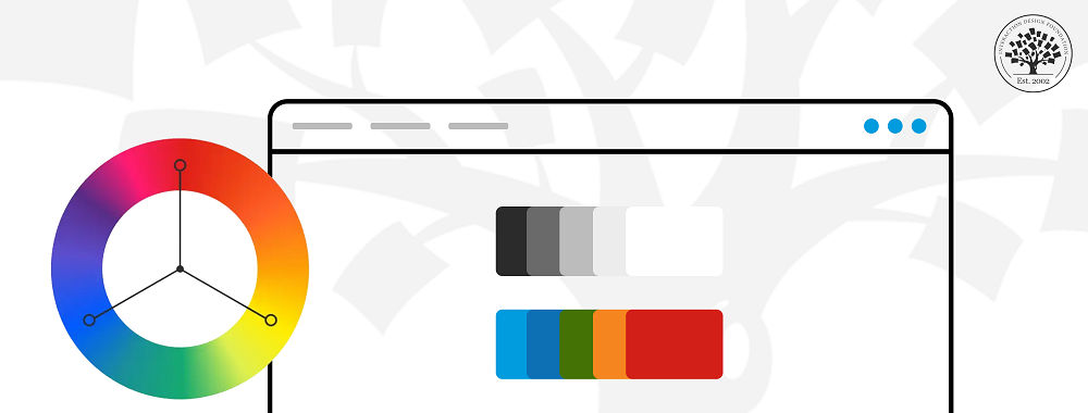
The elements of visual design—line, shape, negative/white space, volume, value, color and texture—are the building blocks of any successful design. We can think of these elements as the vocabulary of our visual language, the specific words available to us. However, these elements are not enough to establish a conversation per se. We need a standard system of rules and principles—in other words, grammar—to use our vocabulary properly and create understanding. Similarly, this is the role of the design principles, which include unity, Gestalt, hierarchy, balance, contrast, scale and dominance.
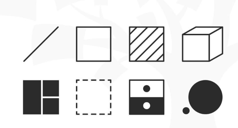
Illustration of visual design elements and principles.
© Daniel Skrok and Interaction Design Foundation, CC BY-SA 3.0
The combination of these visual design elements and principles establishes a solid base to build successful designs and convey the right message. Think about the last time you went to a library; what made you stop and look at a particular book and not the one next to it? You probably can’t pinpoint what made you focus on that specific book. Possibly, the color or the type of the book cover had something to do with it. What do you remember about this book? Even though we try not to, a part of ourselves judges a book by its cover, and to some extent, it can’t get more human than that.
Book covers will differ depending on the topic of the book, but a cover’s main role is to give us essential information about what we will find inside. If we think a book might be about horror, some of us will pick it up—because we’re in the mood to feel fear—and if we then realize it’s a love story, we will probably feel disappointed and not buy the book. Our job as visual designers is to use all the tools in our toolbox to communicate properly with our users and ensure that our product makes not only an excellent first impression, but also the right impression.
2. Use the Right Colors
Have you ever heard about the art installation “Room for one color” by the Icelandic–Danish artist Olafur Eliasson? In this installation, monofrequency lamps mounted in a white room emitted yellow light that reduced the viewers' spectral range to yellow and black. In this room, the audience felt like they were inside a black and white movie (or, to be precise, yellow and black). In the Netflix documentary “ABSTRACT: the art of design,” the artist further explains the relationship between color, light and emotions, and the color theory behind the “Room for one color” installation.
In this video, we can see the reaction of visitors to the “Room for one color” installation.
© The National Gallery, London, Fair-use (Link)
Color is intrinsically tied to perception, and it has a significant influence on generating emotions. As Arielle Eckstut, co-founder of The Book Doctors, says: “Colors don’t exist until we see them.” Moreover, color helps us navigate the world around us and distinguish one thing from another, and, whether we realize it or not, color clues us into the internal state of an object. For instance, the color of an avocado tells us if it is ripe and whether we can make some spicy and delicious guacamole with it.
Good visual design can improve the everyday lives of millions of people and, to some extent, can save lives. Imagine driving a car and suddenly seeing a red sign; instantly, you would feel more alert and drive more carefully or prepare to stop. The first impression of that sign must read as “danger.” As we can see, the choice of colors should be taken seriously and not be arbitrary because color is not a fixed entity. Some questions that can help when choosing a color palette are: Will users interact with our product in broad daylight? Will they be inside or outside? Are there any cultural connotations of these colors that I should consider? The answers to these questions will help you take your designs to a whole new level, improve the user experience and create a magical and accurate first impression.
3. Choose Type Wisely
Type is everywhere. Look around and count how many elements with it you can spot. From T-shirts to books, from websites to board games. Type is the style or appearance of text, and its anatomy can help us tell the story of a product. Therefore, learning the building blocks of typography is essential if you want to apply it effectively within your designs. However, the world of type can be overwhelming, there are many options to consider, and we can quickly become paralyzed by the “Paradox of Choice.” The fundamental elements of typography and how they relate to the message can give you the confidence to choose your typeface wisely and boost the quality of your designs.
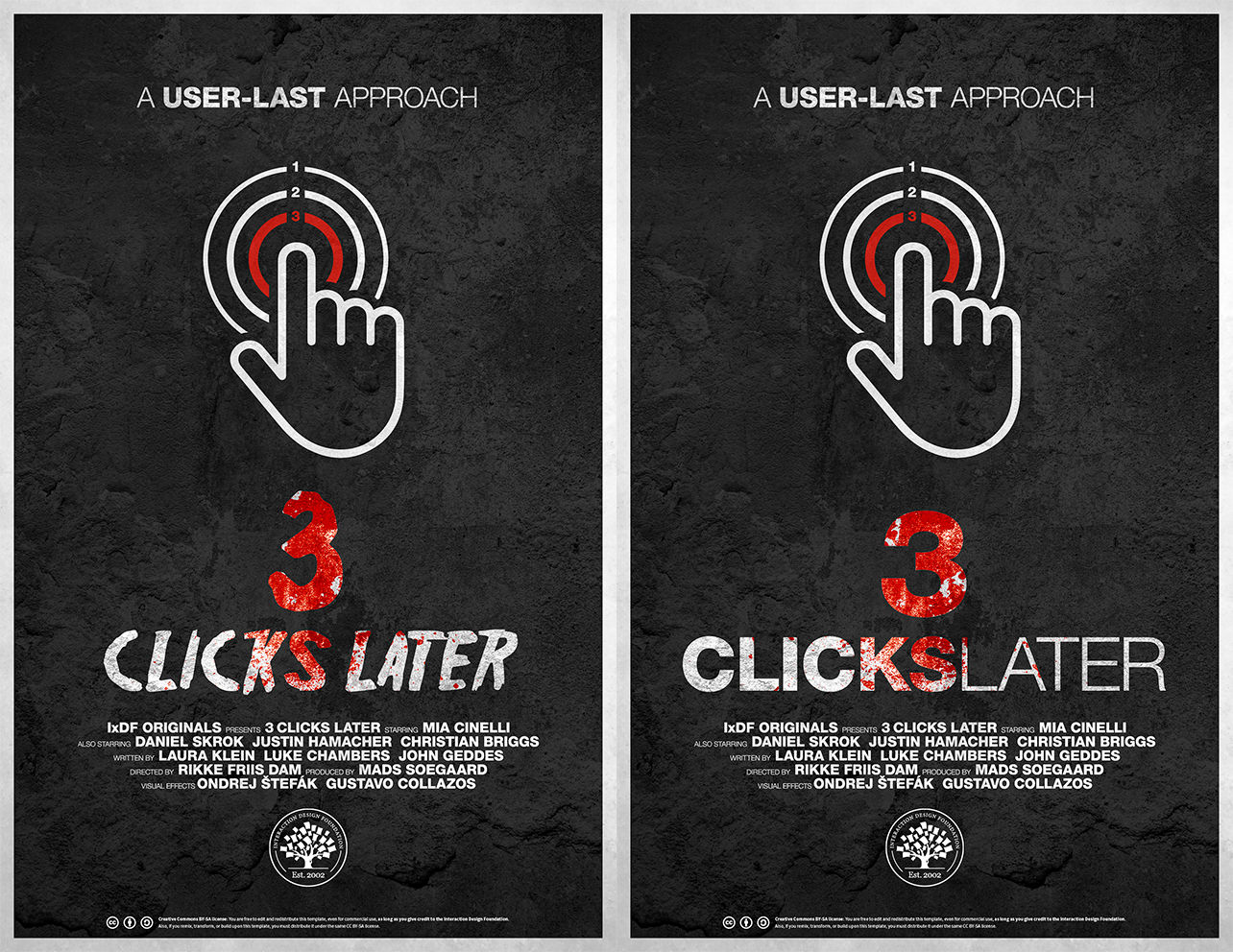
How do the different type choices affect your first impression of the poster?
© Daniel Skrok and Interaction Design Foundation, CC BY-SA 3.0
Let’s see an example: the day has finally arrived! You have been asked to design a poster for an upcoming movie. To make sure that your poster makes the right first impression and catches the eye of the target audience, you may need to ask yourself some of these questions: What is the movie about? What emotion do I want to convey? The answer to these questions will help you narrow down your options and keep the focus on the story you want to tell. Think of two of your favorite films, look at the posters and pay close attention to the typefaces. Could you tell what the story is about only by looking at the posters? Do they look alike, or do they have nothing to do with each other? The more you train your eye, the easier it will be to master the power of type.
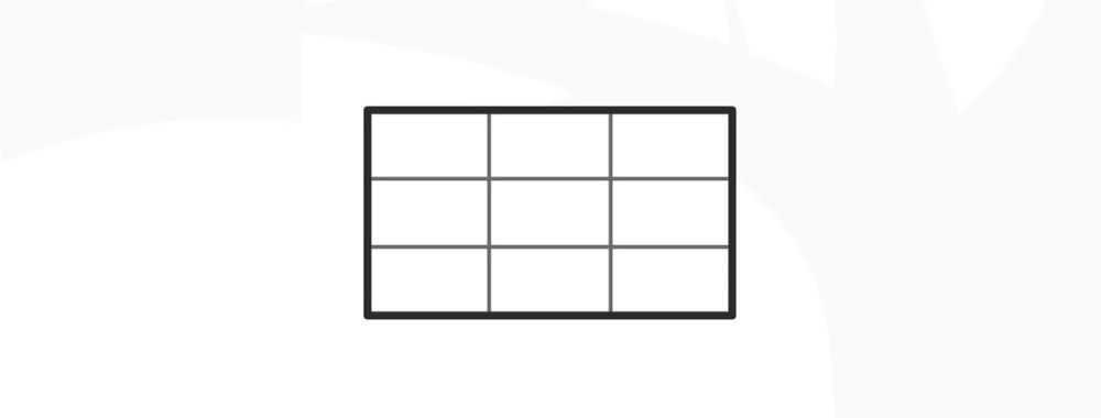
4. Don’t Forget about Grids
Grids are probably one of the more undervalued visual design fundamentals. Just because we can’t explicitly see them in final designs doesn’t mean they are not necessary. That’s because we can see—or notice—when they are not there. Users might feel discomfort or sense chaos when they interact with products that were designed without a grid, but they may not know how to express it. Grids provide a sense of order in the world around us.
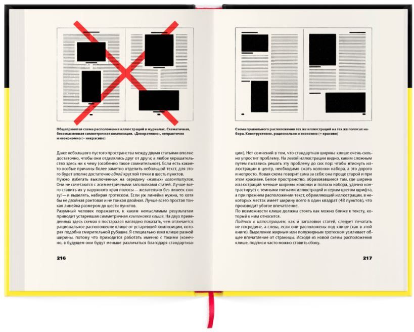
A section of the book The New Typography by Jan Tschichold in 1928.
© Jan Tschichold, Fair-Use
There is a lot of discussion among designers about whether grids hinder creativity. However, as usual, if you know the rules perfectly, you also know when to break them. Moreover, there are many types of grids besides the well-known multi-column grid, which can inspire you to try new compositions while maintaining order and consistency for users.
Grids are used everywhere, in books, movies, product design, websites, and many other areas, and each type of grid serves a purpose which—once again—helps you tell the story of your product. All design is based on a structural system. Mastering all the possibilities within the different systems will give you the extra skill to create genuinely successful products and create a good first impression.
Think of a closet; to keep your clothes organized, you need different sections within it. Depending on which kinds of clothes you have, you will need more or less space for sweaters, pants, dresses, etc. IKEA knows this well, and therefore they allow you to choose the structural system for your closet that works best for you. Don’t try to fit the content into the structure, but choose the layout that honors the content the best. As you can see here, you have more options than you may think!
In the Visual Design: The Ultimate Guide course you will learn the difference between elements and principles of visual design, and advance your skills in color theory, typography and grid systems.
About the Visual Design: The Ultimate Guide Course
Visual Design: The Ultimate Guide is a 4-week course where you will gain a holistic understanding of visual design and increase your knowledge of visual principles, color theory, typography, grid systems and history. You’ll also learn what good design is and how to create it, how to effectively use visual design elements and principles, color theory, the importance of type, how to use it and all the secrets about grid systems.
This course is ideal for anyone who wants to understand the foundations of visual design and improve the quality of their work, including UX designers, UI designers, visual designers, graphic designers, junior designers and students.
Throughout this course, you will learn from the industry experts:
Vignelli Distinguished Professor of Design Emeritus at RIT R. Roger Remington, author of American Modernism: Graphic Design, 1920 to 1960.
Co-founder of The Book Doctors Arielle Eckstut and leading color consultant Joann Eckstut, co-authors of What Is Color? and The Secret Language of Color.
Award-winning designer and educator Mia Cinelli, TEDx speaker of “The Power of Typography.”
Betty Cooke and William O. Steinmetz Design Chair at MICA Ellen Lupton, author of Thinking with Type.
Chair of the Graphic + Interactive communication department at the Ringling School of Art and Design Kimberly Elam, author of Grid Systems: Principles of Organizing Type.
Visual Design: The Ultimate Guide includes a portfolio project to strengthen your learnings. It also includes downloadable templates that you can use in your projects with your team long after you have completed the course! Enroll today to level up your product design skills and design better experiences for your users!
Where to Learn More
The course Visual Design: The Ultimate Guide is now open for enrollment and is included in your IxDF membership.
Still undecided? You can sneak a peek into lesson 1. Simply scroll down the page and hit the preview links when you see them!
To become a member, sign up here.
Hero Image: © UnSplash, CC BY-SA 4.0