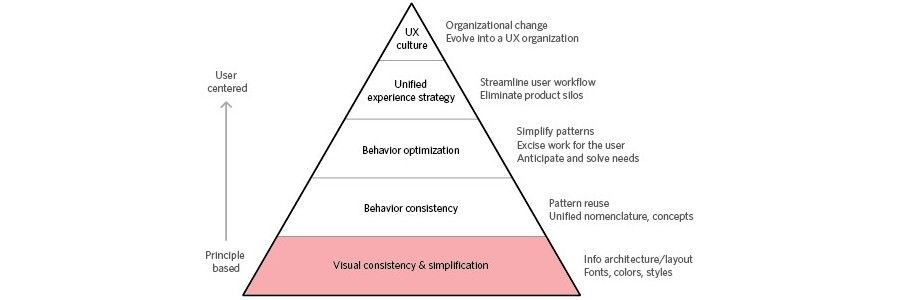
The need for consistency is a principle of design common to all lists of user interface design guidelines (e.g. Shneiderman's 'Eight Golden Rules' and Nielsen and Molich's Ten UI Design Heuristics) for a reason; it underpins immersion. The ability to move freely through any display with little consideration given to the major questions (i.e. 'what?', 'where?', 'when?', 'how?' and 'why?') means the user is able to lose themselves in the very activities that have attracted them to your product. When there are inconsistencies, the user is forced from their immersive state, as they must analyse the interface to answer the questions shown above.
What do we mean by 'Consistency in design'?
Consistency is a general term used within design, which refers to the use of similar or the same representations for all instances of a particular element, page, or window. There are three major areas to consider when assessing user interfaces for consistency. These three areas are aesthetic, behavioural and feedback consistency.

Aesthetic Consistency
Aesthetic consistency refers to the use of consistent representations, styles, structures, layouts and any other visual elements within a display. Aesthetics encompasses all visuals, including logos, non-interactive aspects of the user interface, such as the borders, colours, and background seen in the ESPNcricinfo homepage shown above, as well as the interactive elements (e.g. inline links, command buttons, and icons) and the data-carrying parts of the display (e.g. text and images).
Consistent visuals are essential when you are trying to establish a clear identity in your design. Branding will miss the target unless there is aesthetic consistency. When using a website, changing certain peripheral and background styles, from page to page, might not have a significant impact on user experience, but aesthetic consistency works at an unconscious level to influence our perception of a particular product, service or service provider.

Inconsistency gives off a bad impression. Aesthetic changes between pages disorient the user and, depending on the level of change, they may even wonder whether they have inadvertently navigated away from the website. While aesthetic consistency is dependent upon the use of matching visual from page to page, you can make the task easier by limiting complexity. Selecting a limited palette of colours, using simple designs and choosing a regular font are three basic steps to simplifying the task of maintaining aesthetic consistency. While the context of each page might change, the core set of visuals should be sufficient if they are uncomplicated and standardised.
Behavioural Consistency
Behavioural consistency refers to the use of a specific action or set of actions to execute a single function, regardless of where it appears within a user interface. Behavioural inconsistency in design forces the user to carry out different actions to produce the same effect. This can be frustrating and needlessly time-consuming; especially when carrying out repetitive actions. To ensure users are able to interact with your displays with the minimum of effort, implement consistent representations and actions for the same functions; otherwise, users may abort their current operations and avoid the product altogether.
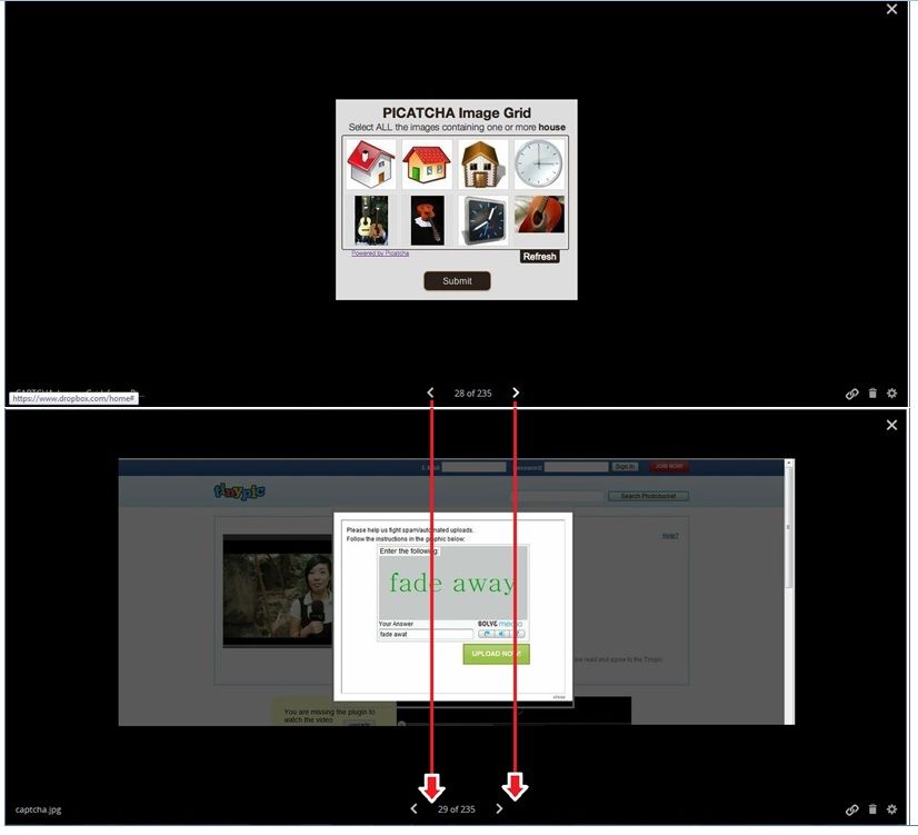
An example of behavioural inconsistency can be seen in the dropbox image viewer below. The ever changing position of 'next' and 'back' buttons (highlighted with red arrows) when progressing through a sequence of images is a common bugbear. The user is forced to play a game of 'cat and mouse' with the arrows, rather than being able to move seamlessly from image to image (the design has subsequently been changed; clear indication that it was an unpopular feature).

Making users check the whereabouts of items in the user interface when performing repetitive actions is frustrating, unnecessarily time-demanding and, perhaps worst of all, forces the user to devote their attention to the usability of the page. Attention is a limited resource; poor usability issues, such as inconsistency, generally mean the user must shift focus from their main objective to assess the display. When the user is forced to continually interpret their aims according to the constraints and quirks of the display, the central task suffers as a result. And as the central task gets harder, the effect on the user's performance is more pronounced.
Although the user is able to navigate through the images using the directional keys on their computer keyboard, to inexperienced users this is not apparent. When designing displays where users come with varying levels of experience, consistency acts as a guide. If we are able to use the same actions to achieve the same results wherever we are on a user interface, then we can quickly apply our understanding of how we are to behave from point to point.
New actions for the same results are cognitively demanding. We must not only memorise each specific action, but then we also have to remember when each of these actions is appropriate. This is a particularly unfriendly feature for users, as most interfaces place considerable burden on us cognitively. Every measure to reduce this burden is likely to free cognitive resources so they can be allocated, once again, to the user's primary activities.
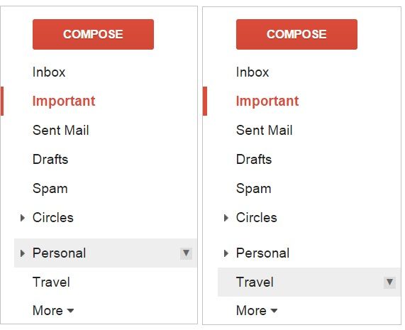
An example of good design in this respect can be seen in the design of the Google mail inbox folders. As you have probably experienced, and can see below, there are sub-options within certain folders, which are accessed using arrows on the far-right of each folder title. They are aesthetically the same and behave in the same way (i.e. the user clicks on the south-facing arrow to access a dropdown menu). If the user had to click on the folder title before the sub-set of options were revealed for one, but not the other, this would force them to memorise the two actions and their corresponding folder names.

Feedback Consistency
Feedback can be any detectable change in a display that occurs as a result of the user's actions. For example, hovering the cursor over an option in a dropdown menu typically results in that particular option being highlighted in some way (see the MS Word dropdown menu below).

Every action should have a reaction; otherwise, the user is unable to tell if their chosen approach has had the intended outcome. And to go even further, every reaction must be used consistently throughout the design. If linked text is underlined when the cursor is on it then maintain this feedback method. If commands change colour when selected, maintain this feedback method (but make sure the colour change is the same for all instances, like the heading style selection menu below). If the user submits information, make sure there is some clear and visible feedback to confirm the successful submission, and maintain the chosen method at all similar points.

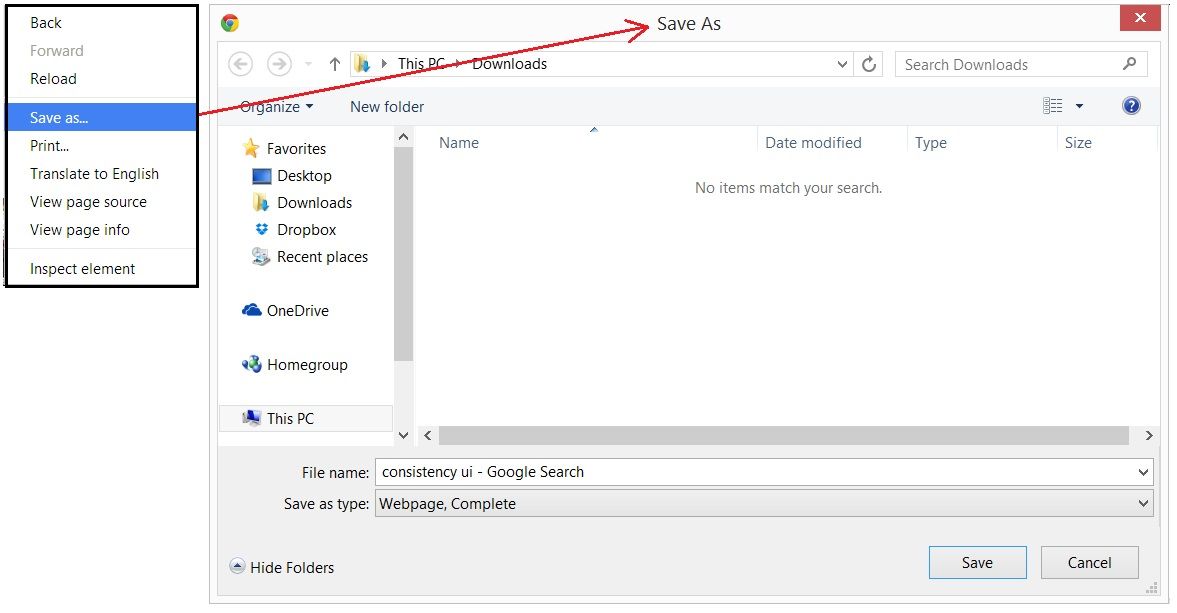
In addition, it is important to highlight alternative methods wherever possible in a consistent manner. For example, tooltips and subtle instructions can be used to gently lead users through the interface, but again these should also be aesthetically (e.g. use the same styles, colours, and layouts) and behaviourally consistent (e.g. the user simply places the cursor over an option to reveal the tooltip). Subtle cues can be invaluable for users, and it is often surprising how easy it is to lose ones way when moving through a sequence of tasks when there are very few changes or visible cues to direct behaviour. When one action leads to some prominent change in the interface, this must be consistent with the previous action. For example, the title of menu options should be consistent with the title on the corresponding window panel or page (Johnson (2008) Designing With the Mind in Mind), like the 'save as...' example below.

(For those readers looking to learn more about the important design considerations, like consistency, you might be interested in our course User Experience: The Beginners Guide)
In Summary
Consistent design isn't a consideration for individual elements within user interfaces; it must be maintained across all aesthetic and behavioural aspects of the design, as well as the feedback provided once the user has interacted with the display. It is not sufficient to maintain consistency on a single page of a website, within a solitary dialog box, or across some of the sections in your displays. Consistency is a global consideration affecting every aspect of your design.
There are three main areas of consistency to consider when assessing your designs according to this principle: aesthetic, behavioural, and feedback consistency. Aesthetic consistency refers to the maintenance of chosen styles, structures, layouts, and all other visual elements across every part of the display. Behavioural consistency is the need for consistent actions for specific functions, to reduce cognitive load. Feedback consistency refers to the standardisation of outcomes that occur as a result specific actions. Embrace these three forms of consistency, and your users will embrace your products.
(Book) Jakob Nielsen (1989) Coordinating User Interfaces for Consistency
Consistency in labels
Smashing Magazine: Fixing Broken User Experience
Design Shack: Maintaining Consistency in UI Design
Header Image: Author/Copyright holder: Smashing Magazine. Copyright terms and licence: All rights reserved. Img


