The highly competitive landscape of UX design demands a portfolio that will be your passport to success. It's your stage to unveil your expertise, innovation, and problem-solving prowess. Irrespective of your expertise, crafting a compelling UX design portfolio is essential to thrive in this exciting field. The easy way out of this is referring to UX portfolio examples.
94% of first impressions gained by websites are due to the platform’s design and web UI. Apart from the budding UX designers and the business masters, the clients and hiring managers are aware of these stats as well. Hence, to stand out and get the best business, designers must showcase their work in the best way possible. A well-designed product designer portfolio is the solution.
This article uncovers the secrets of creating the best UX portfolios. With a list of the top 10 UX portfolio examples, you will get valuable insights and inspiration to transform your portfolio into a masterpiece.
Best UX Design Portfolio Examples
1. Pratibha Joshi: Cover the Vital Elements of an Attractive Portfolio
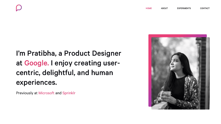
Pratibha Joshi’s landing page with her introduction and current designation.
© Pratibha Joshi Portfolio, Fair Use
Who and Why?
Pratibha Joshi is a product designer working in the field of UI/UX design. She also has a degree in UX design and has worked with Microsoft, Sprinklr, and Google.
Pratibha’s UX portfolio is an ideal example of UX design portfolios. It is a captivating blend of design finesse and compelling narratives, a masterpiece that both novices and experts in the UX realm can refer to. Her portfolio is unique in that it seamlessly intertwines design projects with captivating stories while incorporating all the essential elements, making it a good UX portfolio.
Unique and Inspirational Factor
This portfolio stands out due to its perfect combination of design and depth. It expertly blends fascinating stories into her design projects, making it an inspiring resource for UX designers and hiring managers. Her ability to convey the design process and decision-making behind each project is a source of inspiration.
Differentiator and Major Takeaways
Pratibha’s portfolio is unique in its use of thorough case studies, which showcase her problem-solving abilities and meticulous design approach. It goes beyond merely showing the finished product; it reveals the entire design process. The key takeaways include a strong focus on user-centered design and a structured presentation of her work.
Pratibha covers all elements of a UX portfolio through her case studies.
© Pratibha Joshi Portfolio, Fair Use
What can beginners and experts learn from this?
Newcomers can learn the art of storytelling and cohesive presentation, while seasoned professionals can admire the depth and detail of her case studies. This portfolio is a benchmark for effectively communicating the value of UX design work and is a perfect example of a good UX portfolio.
2. Gloria Lo: Land the Landing Page Game
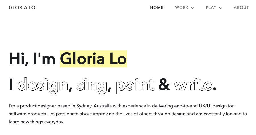
Gloria Lo’s landing page with her introduction, designation and hobbies.
© Gloria Lo Portfolio, Fair Use
Who and Why?
As the landing page shows, Gloria Lo is a Sydney-based UI/UX product designer.
She also dabbles in singing, painting, and writing. She has very smartly incorporated it into her landing page, giving visitors a quick overview of her likes and skills.
This portfolio is an excellent example of effective landing page design and personal introduction in the digital world. It is a compelling model for those seeking to make a powerful first impression.
Unique and Inspirational Factor
What distinguishes Gloria’s portfolio is its meticulous attention to the landing page. The design is visually captivating and highly functional. These attributes offer seamless navigation to the designer's work. Attention to detail is inspirational for those who seek to make a striking first impression and communicate their unique personality.
Differentiator and Major Takeaways
Gloria’s portfolio stands out from the competition through its well-thought-out landing page that provides clear signposts to the designer's skills, personality, case studies, and projects. The major takeaway is the importance of balancing aesthetics and user-friendliness in the design of the landing page, ensuring that visitors can quickly access the heart of the portfolio.
What can beginners and experts learn from this?
The professionalism in this portfolio is evident in the precision of the landing page, where design elements harmonize with user experience. Beginners can learn how to craft a landing page that makes an immediate impact, while experts can appreciate the meticulous design decisions that contribute to a seamless and engaging user journey.
Writer, designer and educator Ellen Lupton shows examples of visual storytelling and the importance of storytelling in design.
3. Jeff Shibasaki: Establish Expertise as a Novice
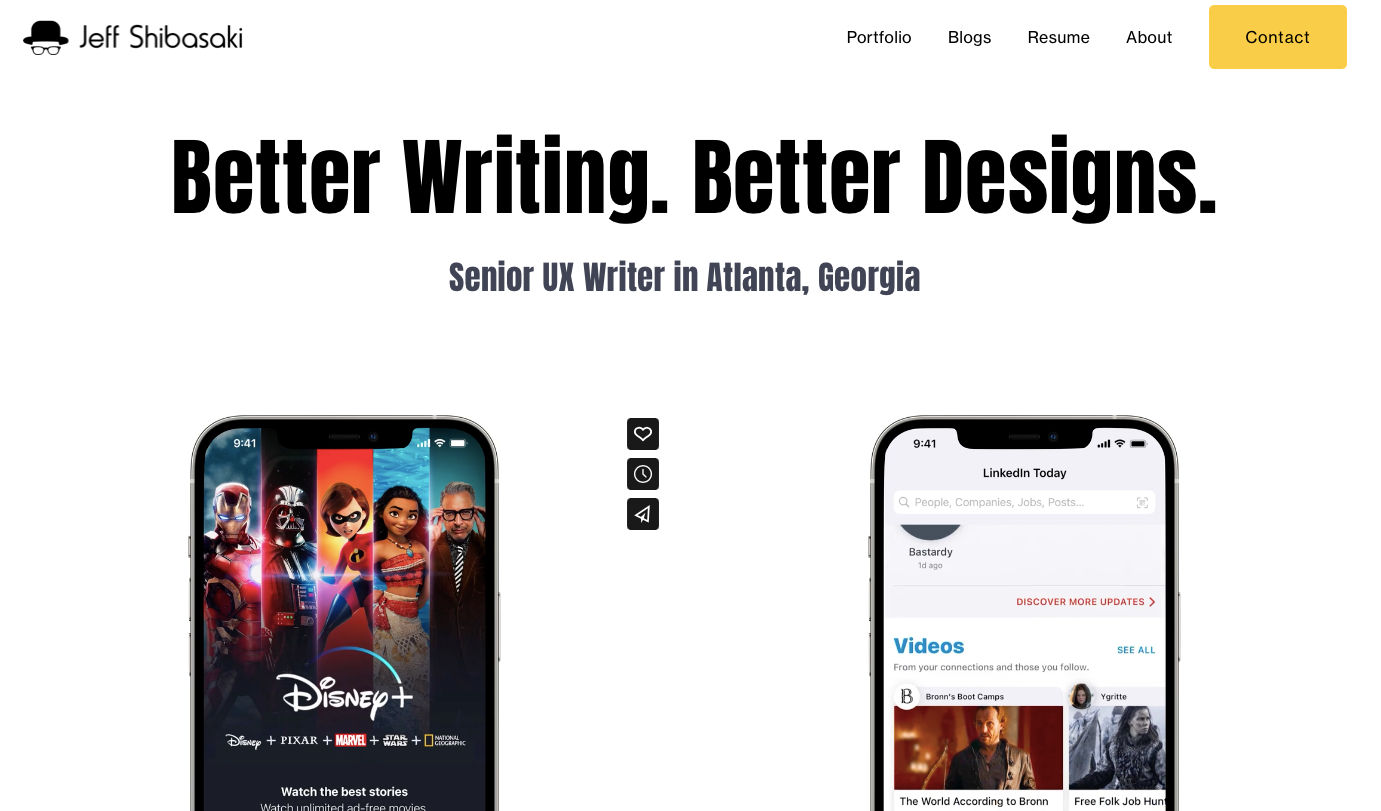
Jeff displaying his work experiences through case studies.
© Jeff Shibasaki Portfolio, Fair Use
Who and Why?
Jeff Shibasaki is a professional UX writer and a budding UX designer from Atlanta.
Jeff’s UX portfolio inspires new entrants with limited hands-on experience in the UX design field. It demonstrates how to effectively utilize imagined case studies, work testimonies, and other creative elements to showcase one's potential and build a compelling portfolio.
Unique and Inspirational Factor
The portfolio's uniqueness lies in transforming limited real-world experience into a powerful display of skills and potential. The creator boldly showcases their creativity and problem-solving abilities through imagined projects.
Jeff’s innovative approach sets his portfolio apart in a competitive field.
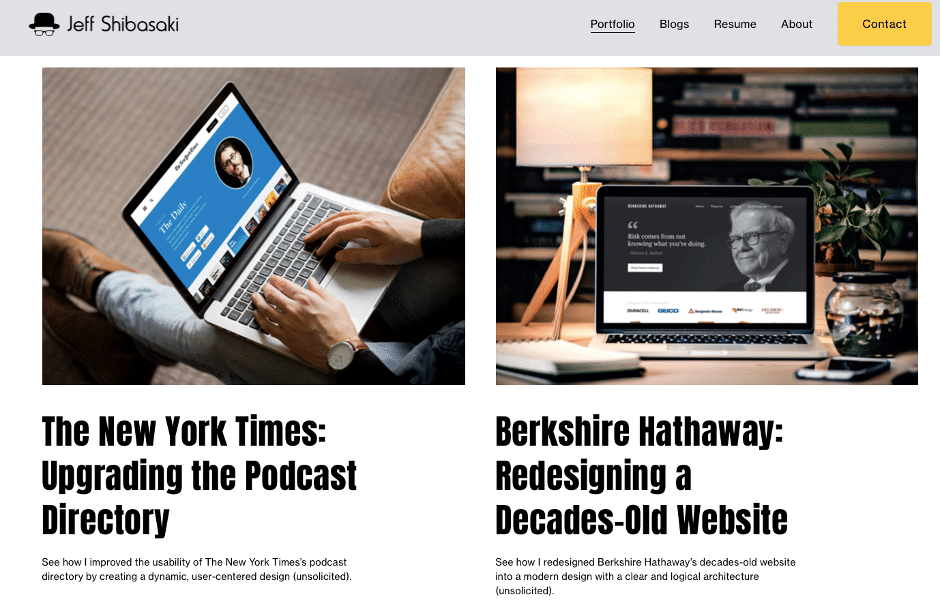
Imagined case studies used by Jeff to show his design prowess and cover up for lesser experience.
© Jeff Shibasaki Portfolio, Fair Use
Differentiator and Major Takeaways
Key takeaways from Jeff’s portfolio include the importance of creative storytelling, effectively using imagined case studies, and showcasing one's ability to solve real-world design problems. The portfolio's professionalism lies in its capacity to transform limited hands-on experience into core highlights. Jeff utilizes his design skills to make this possible. This proves that imagination can be a powerful asset in UX design.
Jeff has also highlighted his UX writing skills through the multiple work experiences he has completed.
What can beginners and experts learn from this?
Beginners can learn the power of storytelling and creatively demonstrating their skills, even without extensive experience. For experts, this example serves as a reminder that creativity and ingenuity can be as important as a long list of past projects. Jeff’s portfolio is perfect if you’re looking for beginner UX portfolio examples.
Stephen Gay, UX Design Lean at Google One, walks us through his criteria for evaluating a UX portfolio.
4. Lola Jiang: Leverage the Power of Measurable Metrics
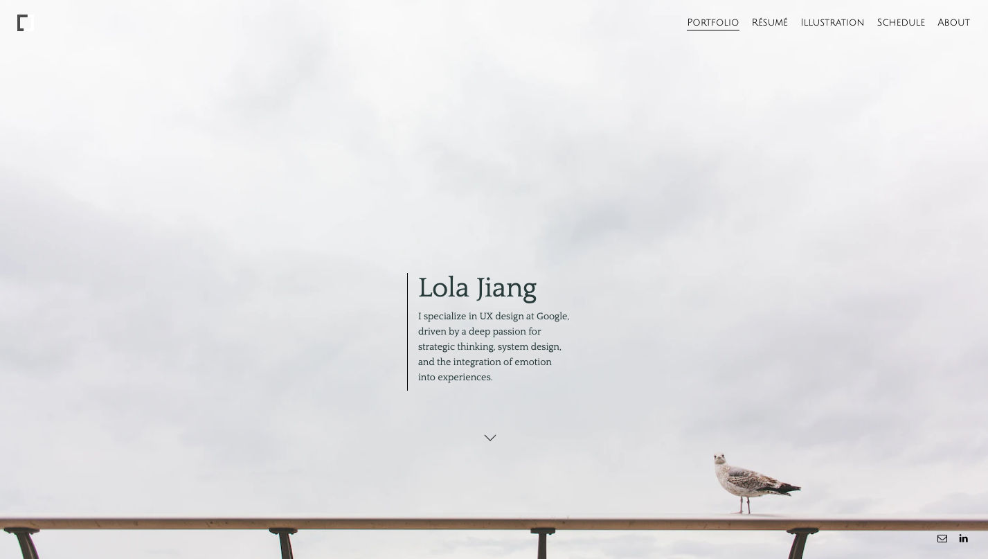
Homepage of Lola Jiang shows her UX portfolio in a subtle way.
© Lola Jiang Portfolio, Fair Use
Who and Why?
Lola Jiang is an experienced UX designer working at Google. She is a professional designer who also provides feedback on other’s portfolios.
What sets her work apart is her unique approach of exhibiting her accomplishments. Jiang presents case studies in a detailed manner using the correct data.
Unique and Inspirational Factor
Jiang’s UX portfolio example stands out by emphasizing metrics and showcasing the tangible impact of her design projects. It is inspirational because it goes beyond design aesthetics and highlights how design decisions lead to measurable results. This makes it a valuable resource for aspiring UX designers who want to emphasize the practical value of their work.
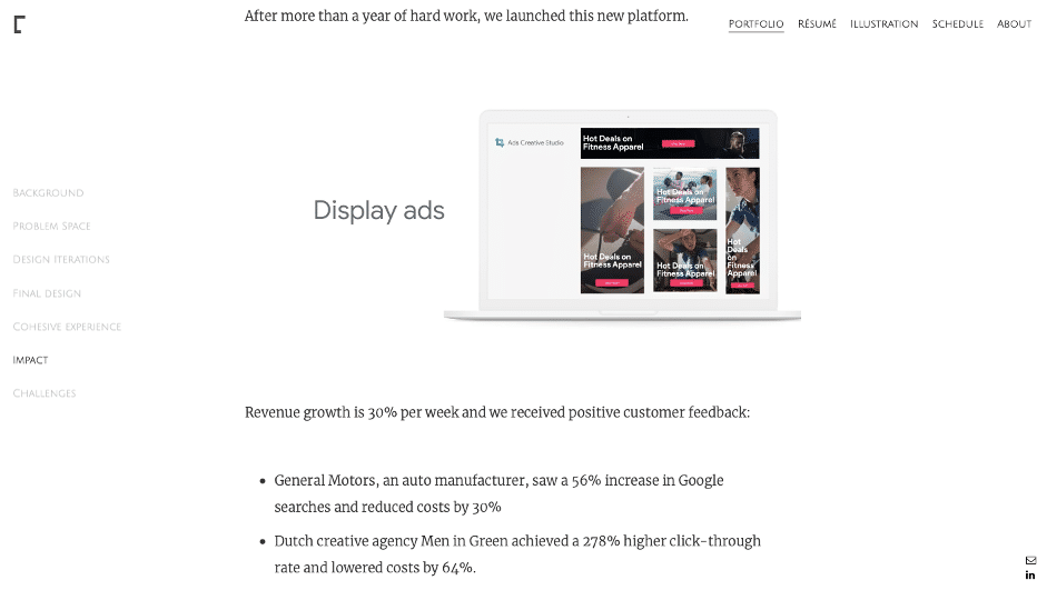
Lola’s work with Google ads where she uses metrics to show the impact of her design work.
© Lola Jiang Portfolio, Fair Use
Differentiator and Major Takeaways
Clients are always on the lookout for details that are result-oriented. Lola Jiang, through her UX portfolio, has been able to highlight the impact of a UX designer. Her emphasis on metrics and quantifiable results shows the effects of design decisions.
What can beginners and experts learn from this?
Beginners can learn the value of data-driven decision-making, while experts can appreciate the thoroughness of her case studies. Lola's portfolio serves as a reminder of the power of metrics in UX design. It also signifies how design choices can drive meaningful and measurable results.
5. Moritz Oesterlau: Case Studies, a Vital Element
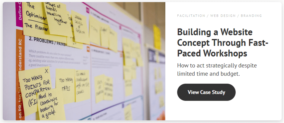
Case study by Moritz about his work on building a website concept.
© Moritz Oesterlau Portfolio, Fair Use
Who and Why?
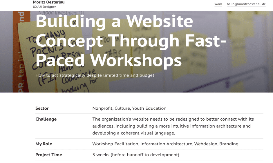
Moritz Oesterlau is a tenured UX/UI designer. He has six years of experience and also works as a tutor.
His portfolio is a compelling example of how to present UX design work in a comprehensive and accessible manner. It serves as a reference for those looking to craft a portfolio that showcases their work with clarity and precision.
Unique and Inspirational Factor
This UX design portfolio example stands out for its user-friendly design and comprehensive case studies. It is an informative and easy-to-navigate resource for anyone interested in Moritz’s work. He highlights the importance of providing easy access to essential portfolio details, making it a user-centric example. About Moritz, his work, and his contact details are all made visible in a connected way.
Differentiator and Major Takeaways
Moritz's portfolio is one of the best UX portfolio case study examples. It is exceptional due to its well-structured case studies that showcase his design process, from initial ideas to final implementation. He has also mentioned the time he took to complete each project. It provides easy navigation to critical information and projects, making it an exceptionally user-friendly resource.
Case study details represented by Moritz in his portfolio.
© Moritz Oesterlau Portfolio, Fair Use
What can beginners and experts learn from this?
Beginners can learn from Moritz's portfolio by understanding the significance of presenting their work in an organized and accessible manner, ensuring that essential details are easily discoverable. For experts, Moritz's portfolio serves as a reminder of the importance of effectively portraying your UX design case studies in a detailed and structured manner.

6. Jessica Hische: Use Design to Showcase Your Personality
Attractive and vibrant homepage of Jessica Hische’s portfolio.
© Jessica Hische Portfolio, Fair Use
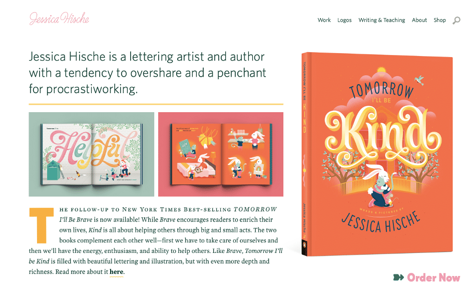
Who and Why?
Jessica Hische is a lettering artist, author, logo specialist, and UI/UX designer. She has drafted letterforms, worked in advertising, for books & films, and many more.
Her portfolio is one of the most captivating UX writer portfolio examples of how to infuse creativity and personal expression into your portfolio. Her work inspires anyone looking to go beyond the ordinary and use their portfolio as a canvas for self-expression.
Unique and Inspirational Factor
What sets Jessica Hische's portfolio apart is its artistic flair and unique approach to presenting her work. It's inspirational because it showcases the potential of a portfolio as not just a professional representation but as a canvas for artistic expression. Her portfolio is a true embodiment of the fusion of art and design.

Typography, Illustrative and Lettering work by Jessica as displayed on her portfolio.
© Jessica Hische Portfolio, Fair Use
Differentiator and Major Takeaways
Jessica's portfolio uniquely showcases her design skills and highlights her artistic expression and creativity. It goes beyond traditional portfolio formats and demonstrates that a portfolio can be an art form. Key takeaways from Jessica's portfolio include the importance of personal branding, creative exploration, and the idea that a portfolio can serve as a platform for self-expression.
What can beginners and experts learn from this?
Jessica Hische's UX portfolio example highlights the ability to balance creativity and professionalism. She demonstrates how your portfolio can be a creative expression while effectively communicating one's design skills. It is a valuable resource for beginners and experts, offering insights into personal branding, creative exploration, and the art of merging creativity with professionalism.
Michal Malewicz, co-founder of HYPE4 explains the importance of visual skills and shares some tips in this video.
7. Daniel Autry: Best Foot Forward
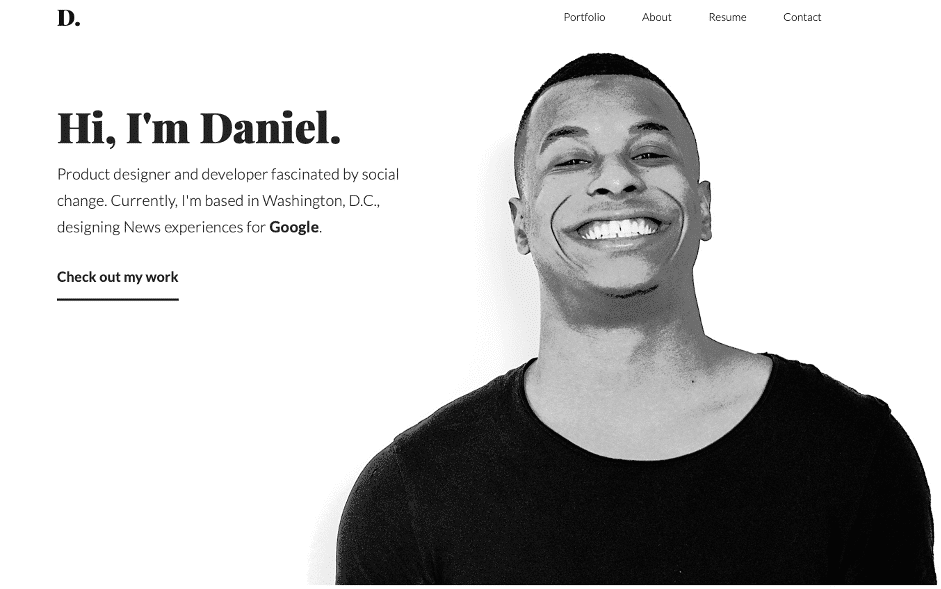
Daniel Autry’s introduction on his UX portfolio.
© Daniel Autry Portfolio, Fair Use
Who and Why?
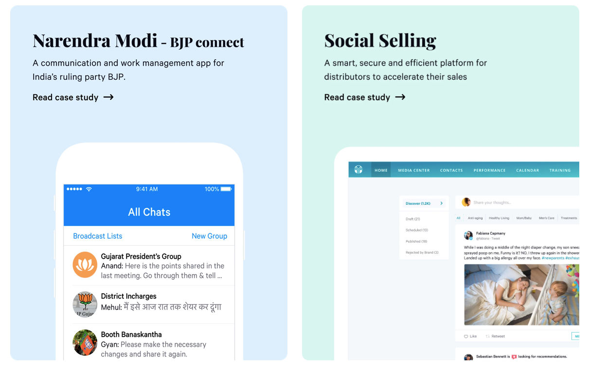
Daniel Autry is a product designer and developer who works for Google, specifically on news experiences.
Daniel’s portfolio is an excellent demonstration of strategic curation when it comes to UX design portfolio examples. It is an ideal reference for those seeking to present their best works with clarity and impact.
Unique and Inspirational Factor
What distinguishes Daniel Autry's portfolio is his selective approach to showcasing work. It's inspirational because it emphasizes the art of restraint—each case study is a portfolio in itself. This portfolio proves that quality, not quantity, is the key to creating a lasting impression.
Differentiator and Major Takeaways
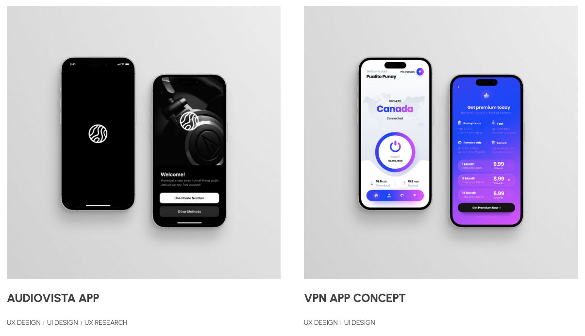
Daniel's portfolio stands out by its focused approach, presenting a carefully curated selection of his best works. He has included his best results under the featured tab and mentioned the key areas he worked on in the project. He also concisely mentions his other works in the later part of the portfolio. The major takeaways include the importance of selecting quality over quantity, strategic curation highlighting strengths, and a reminder that a concise portfolio can significantly impact a competitive field.
What can beginners and experts learn from this?
Beginners can learn the value of strategic selection and how showcasing fewer, high-quality projects can leave a more memorable impression. Experts can appreciate the art of presenting a portfolio that prioritizes the viewer's experience, making it easy to navigate and absorb the essence of each project.
Cory Lebson, Principal and Owner of Lebsontech LLC, talks about how you can reframe your professional experience in your UX portfolio in this next video.
8. Kyle Kovacs: Minimalism And Consistency
Kyle Kovacs UX portfolio uses minimalism to display his design work.
© Kyle Kovacs Portfolio, Fair Use
Who & Why?
Kyle Kovacs is a computer science graduate who stepped into UX design due to his passion for design.
Kyle shows how consistency and minimalist design can elevate the user experience in a UX portfolio. It is a reference for creating a professional and visually attractive presentation.
Unique and Inspirational Factor
What sets Kyle Kovacs' portfolio apart is its regularity in both design and content. It's inspirational because it demonstrates how a minimalist approach can still convey depth and impact, showcasing the power of simplicity in UX design presentation. Kyle uses the same font and design styles throughout his portfolio and has kept the text and design elements minimal yet impactful.
Differentiator and Major Takeaways
Kyle's UX design portfolio example stands out through its consistent design language and minimalist writing style, creating a seamless and engaging user journey. The major takeaways include the importance of visual continuity, minimalist writing, and the ability to convey complex design concepts.
What can beginners and experts learn from this?
Beginners can learn the significance of maintaining a visual theme throughout their portfolio, while experts can appreciate the art of simplifying complex ideas. Kyle's portfolio serves as a reminder that a minimalist approach can be both professional and impactful.
9. Yu-Hsuan: Illustrative Touch To Make Up For Locked Projects
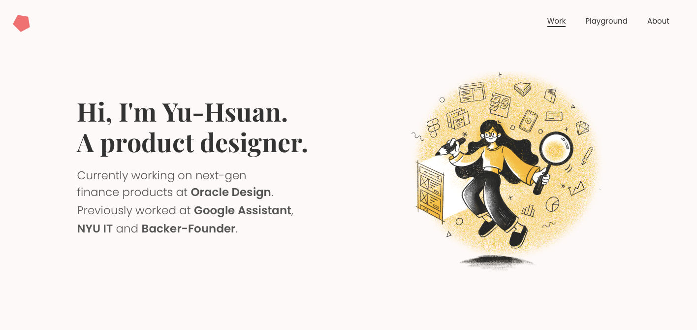
Homepage of Yu Hsuan’s UX portfolio, a product designer at Oracle design.
© Yu Hsuan Portfolio, Fair Use
Who and Why?
Yu Hsuan is a product and UI/UX designer working on financial products at Oracle Design. She has previously worked at Google Assistant, NYU IT, and Backer-Founder.
Yu has seamlessly blended UX design with an illustrative touch. It is an inspiring reference for those looking to infuse creativity into their portfolios, primarily through visual storytelling.
Unique and Inspirational Factor
Yu Hsuan's portfolio harmonizes UX design and illustration, creating a cohesive narrative for her work. Many UX designers face the confidentiality factor associated with their projects while curating their portfolios. Yu has managed to leverage her design skills to her benefit to tackle this problem. With an illustrative touch, Yu has tried to add depth and personality to her UX projects.
Differentiator and Major Takeaways
Yu's portfolio offers a glimpse into her UX projects through password-protected case studies while creatively showcasing side projects with an illustrative flair. The major takeaways include the importance of storytelling, the integration of illustration to convey personality, and how a mix of locked and visually accessible projects can create a sense of mystery and engagement. Yu has tried to incorporate and showcase whatever is missing in the locked projects using her illustrative skills in her side projects, which she calls Playground.
What can beginners and experts learn from this?
Beginners can learn the power of storytelling through visuals, while experts can appreciate the strategic use of locked projects to build anticipation and curiosity. Yu's portfolio is a reminder that creativity and a personal touch can coexist with professionalism.
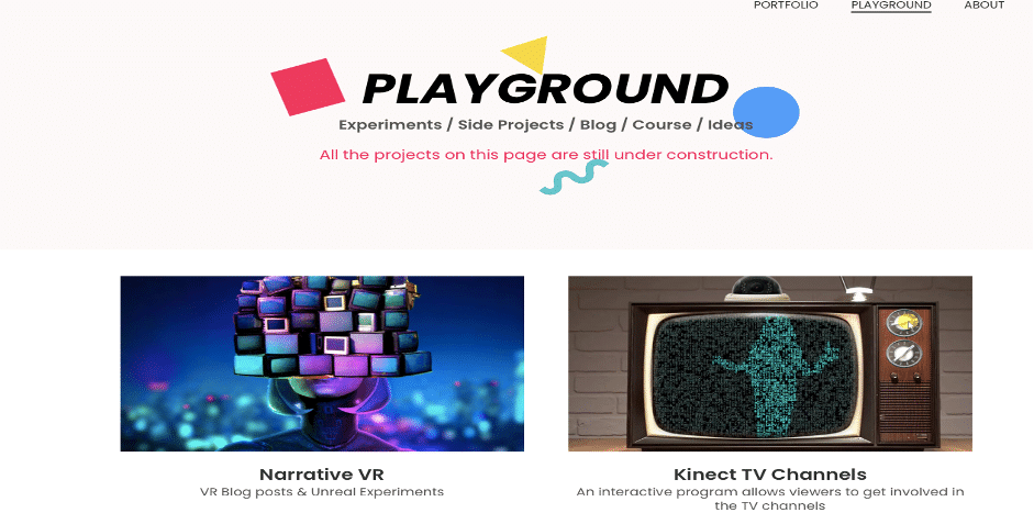
Side projects and experimental design work by Yu Hsuan as displayed on her portfolio.
© Yu Hsuan Portfolio, Fair Use
10. Run Wild: Interactive Design and Seamless Navigation
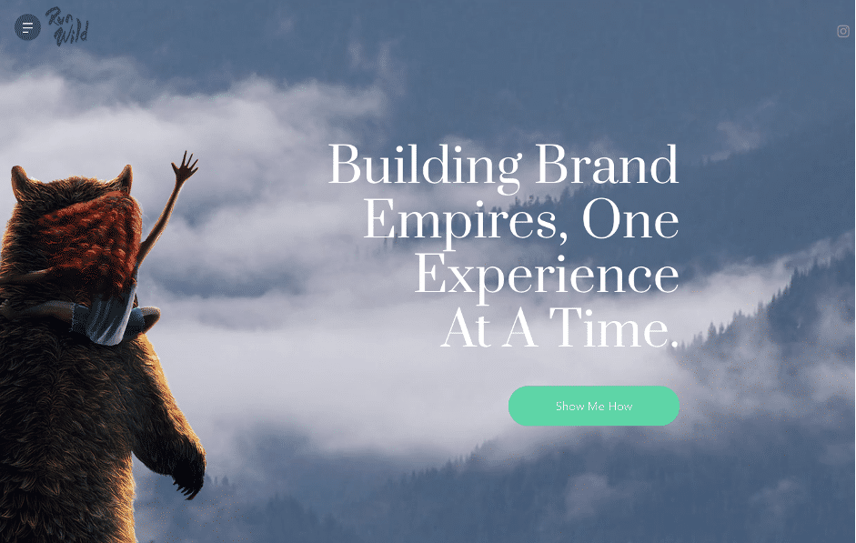
Run wild design’s interactive and appealing landing page on his portfolio.
© RunWild Portfolio, Fair Use
Who and Why?
RunWild Design, aka Chris, is a designer who has worked for over 12 years with brands on their products, websites, apps, and UI/UX designs. He also does illustrative and graphic work.
Chris introduces a refreshing take on UX design presentation, emphasizing interactive brilliance. He has created an immersive experience that aptly integrates design work.
Unique and Inspirational Factor
Its innovative interactive design and easy navigation set Run Wild’s portfolio apart. It's inspirational because it transforms the typical UX portfolio into an engaging journey, allowing visitors to explore projects effortlessly. This portfolio inspires by demonstrating that UX design can extend beyond projects, creating an immersive and memorable experience.
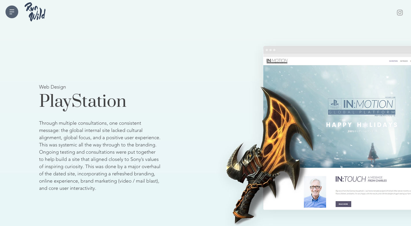
Run wild design’s portfolio inroprates seamless navigation by highlighting cire elements of his design work in his portfolio.
© RunWild Portfolio, Fair Use
Differentiator and Major Takeaways
Run Wild's portfolio stands out through its commitment to user experience, leveraging vital elements of its design work (Logos & illustrations) and user-friendly navigation. Chris understands the importance of the ease users seek, even if it is a client trying to find the best designers. He has successfully incorporated interactive design and smooth navigation to present diverse work.
What can beginners and experts learn from this?
The innovative portfolio of Run Wild can teach beginners the value of incorporating interactive elements to make their portfolios more memorable. Expert designers with more experience can note the strategic use of easy navigation to guide visitors through diverse projects.
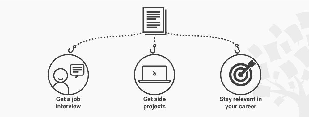
Takeaway: So, What Makes a Good UX Portfolio?
Crafting a stellar UX portfolio is more than just showcasing your design projects; it's about storytelling that resonates with your audience. All the remarkable UX portfolio examples from across the world have shown us that irrespective of your tenure or experience, paying attention to crafting an innovative UX portfolio can push you toward success very fast. The portfolio is a testimony of your design skills if crafted with a specific vision, keeping in mind the key elements that the industry looks for.
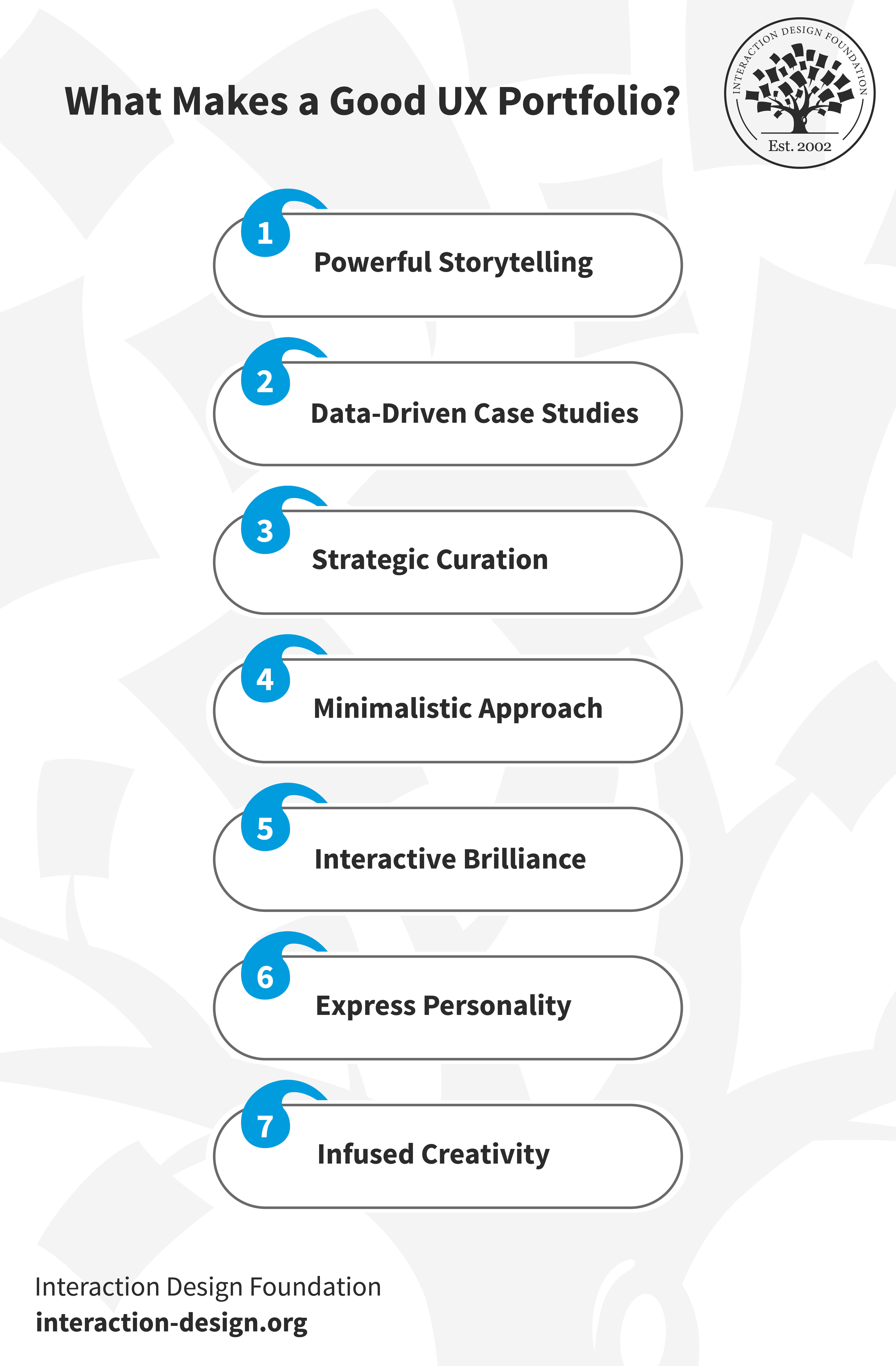
The essential elements of a good UX Portfolio: Powerful storytelling, Data-driven case studies, Strategic Curation, Minimalistic Approach, Interactive Brilliance, Personality and Creativity.
© Interaction Design Foundation, CC BY-SA 4.0
Let's revise the key takeaways from these inspiring UX portfolios to understand what makes a portfolio stand out:
1. Powerful Storytelling: Explain the design journey from concept to execution by seamlessly blending captivating stories with design projects.
2. Data-Driven Case Studies: Try to showcase the tangible impact of your design decisions through data to convey real value and highlight the importance of organized presentations.
3. Strategic Curation: Make your portfolio stand out with its selective approach by strategically showcasing your best work.
4. Minimalistic Approach: Demonstrate the power of minimalism in your portfolio by using simple and crisp design elements.
5. Interactive Brilliance: Use interactive design and seamless navigation to create an immersive experience for your visitors.
6. Express Personality: Make your portfolio a canvas for self-expression by going beyond showcasing skills and finding ways to infuse creativity into your portfolio.
7. Infused Creativity: You can showcase your skills with an out-of-the-box creative approach to make your portfolio stand out among competitors.
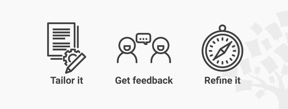
Want to Create a Stunning UX Portfolio?
Beginning the journey to create a UX portfolio that impresses and captivates your potential clients can be daunting. Whether you're just starting or looking to enhance your existing portfolio, the path to excellence lies in understanding the art of presentation.
Gain insights from industry experts, refine your storytelling techniques, and learn how to showcase your work with IxDF's course on creating a UX portfolio. This course is the ideal option if you’re looking to elevate your design narrative to new heights!
References and Where to Learn More
We’ve used the following UX design portfolios of these great designers:
We’ve also used the hilarious The Worst Portfolio Ever, created by Alex Cornell. You can check out Alex’s explanation of his parody portfolio here.
More Inspirational UX portfolios here.