The term card sorting applies to a wide variety of activities involving the grouping and/or naming of objects or concepts. These may be represented on physical cards; virtual cards on computer screens; or photos in either physical or computer form. Occasionally, objects themselves may be sorted. The results can be expressed in a number of ways, with the primary focus being which items were most frequently grouped together by participants and the names given to the resulting categories.
For the purpose of interaction design, the sorting process — usually performed by potential users of an interactive solution — provides:
Terminology (what people call things)
Relationships (proximity, similarity)
Categories (groups and their names)
We can use this information to decide which items should be grouped together in displays; how menu contents should be organized and labelled; and perhaps most fundamentally, what words we should employ to describe the objects of our users' attention.
22.1 A practical example
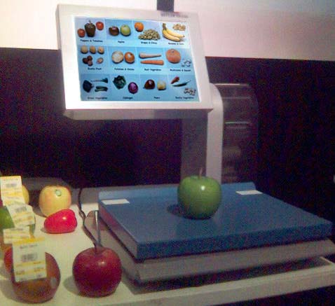
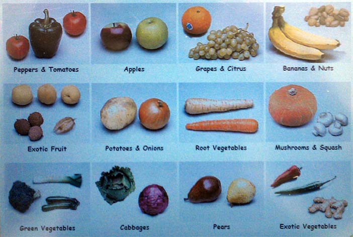
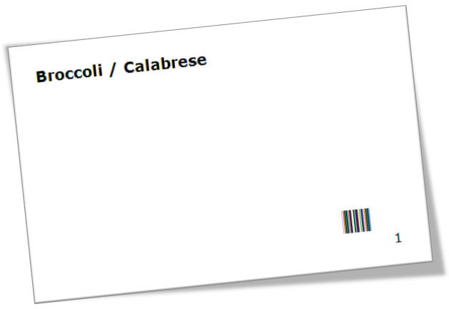
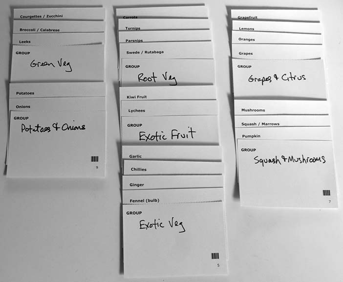
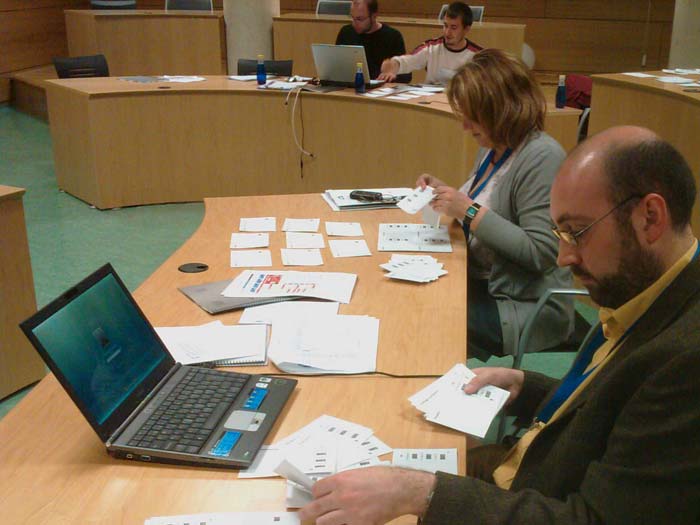
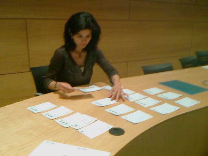
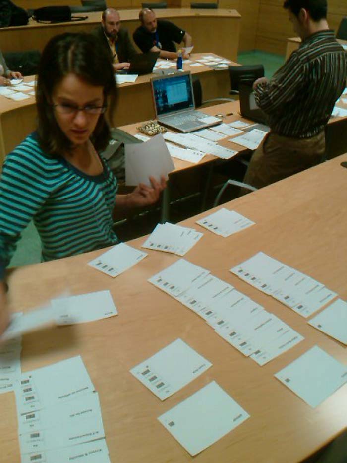
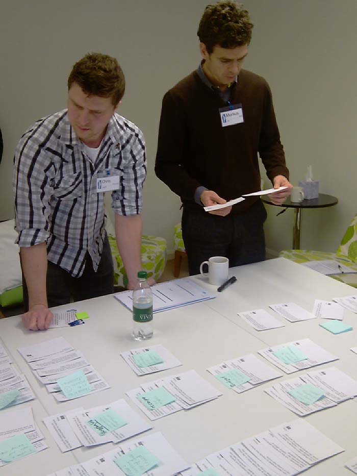
Imagine that you are responsible for the information architecture of computerized touch-screen scales of the kind increasingly common in large supermarkets, shown in Figure 1. The screen displays 12 images and captions at a time. There have been some complaints that customers are spending a long time at the scales and are frustrated by how the categories are organized. Table 1 shows a list of sample items that customers need to find. These have been printed on cards with bar codes for easy data capture (see Figure 2 and the Syntagm web site). Figure 3 shows an example of the cards organized into groups. Since this is an 'open' sort, users make up their own groups and names for them. This particular grouping represents the current solution implemented in the scales, referred to as a 'reference sort', discussed later in this chapter.
Author/Copyright holder: William Hudson. Copyright terms and license: All Rights Reserved. Reproduced with permission. See section "Exceptions" in the copyright terms below.
Author/Copyright holder: William Hudson. Copyright terms and license: All Rights Reserved. Reproduced with permission. See section "Exceptions" in the copyright terms below.
Figure 22.1 A-B: Computerized supermarket scales (touch-screen) showing categories of fruits and vegetables
Broccoli / Calabrese
Lemons
Carrots
Lychees
Chillies
Mushrooms
Courgettes / Zucchini
Onions
Fennel (bulb)
Oranges
Garlic
Parsnips
Ginger
Potatoes
Grapefruit
Pumpkin
Grapes
Squash / Marrows
Kiwi Fruit
Swede / Rutabaga
Leeks
Turnips
Table 22.1: Sample item list of items to be found on the supermarket scales (c.f. Figure 1)
Author/Copyright holder: William Hudson. Copyright terms and license: All Rights Reserved. Reproduced with permission. See section "Exceptions" in the copyright terms below.
Figure 22.2: Sample card with bar codes to simplify data capture
(the bar code provides the item number in machine-readable form)
Author/Copyright holder: William Hudson. Copyright terms and license: All Rights Reserved. Reproduced with permission. See section "Exceptions" in the copyright terms below.
Figure 22.3: Sample cards organized into groups
Take a moment to consider how you might organize these items yourself. For most people, there are at least two groups — fruit and vegetables. But in a large supermarket two groups would contain very long lists of items which would not be helpful without further subdivision. Also, there may be some terms that are unfamiliar to you. Courgette is the French name for the long, green marrow (squash) seen in British supermarkets, while zucchini is the Italian name found in the US. Conversely, what is known as rutabaga in the US is called a swede in the UK as it was introduced to Scotland by the Swedes. Where simple language differences like these are known in advance, listing the alternatives on a single card is probably a satisfactory solution. However, in novel problem domains or in multicultural/multilingual situations where terminology is a larger issue, it may be better for participants to sort photographs or even the objects themselves (with a barcode label attached).
Whatever you are sorting, you will end up with some things (items) arranged in groups, ideally with group names. The next challenge is how to make sense of these, particularly when you have tens or hundreds of participants. No matter how the analysis is done, there are at least two things we want to know:
What were the groups called and what was in each?
Which items were grouped together most often?
Be careful to note that these are two separate sets of information. That grapefruit and oranges were always grouped together in the sample study is not affected by the fact that several different group names were used. Also, not surprisingly, other items were grouped with grapefruit and oranges — but the nature of these items varied with the approach taken by participants. If the group was called simply 'fruit' it contained apples, pears and other fruits as well as grapefruit and oranges. If it was called 'citrus', the only addition was lemons. So, to get a good idea of what the sort is telling us, we use different kinds of analysis. The first two correspond to the things we wanted to know:
An items by groups chart shows what the groups were called and what was in each
An items by items chart shows which items were grouped together most often
22.1.1 Items by groups chart
You can produce simple versions of the charts yourself with pencil and paper or a spreadsheet and printer. First, the items by groups chart:
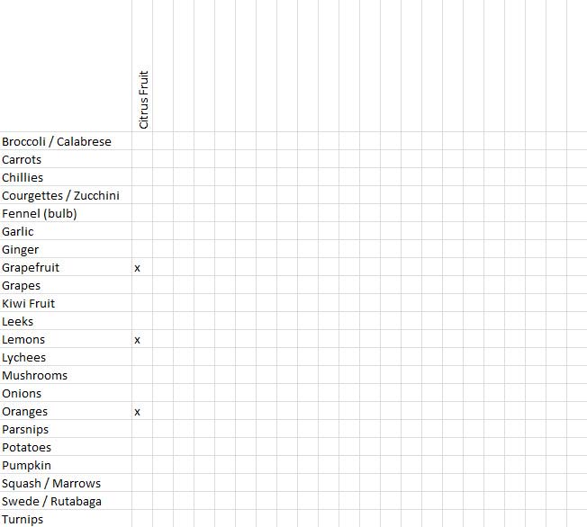
List all of the items that were sorted down the left-hand side of the page. As this needs to be done so that you can find each item quickly, alphabetic order is probably best (a word processing or spreadsheet package can help with sorting).
Scanning through the sort results, for each new group write its name as a column heading. Place a mark in each item cell that is contained within the group. So if the first group is called 'Citrus Fruit', we would write this as a column heading and then mark the cells for oranges, lemons and grapefruit . Figure 4 shows this example.
Author/Copyright holder: William Hudson. Copyright terms and license: All Rights Reserved. Reproduced with permission. See section "Exceptions" in the copyright terms below.
Figure 22.4: Partially completed items by groups worksheet (for a single group - Citrus Fruit)
If another participant uses the same group name (or if it is a 'closed' sort where you have provided all of the group names), you will only need to write the column headings once. However, for open sorts, be prepared for many variations in spelling and wording. For example, 'soft fruit' versus 'berries'. It is generally best to keep such different terms separate during data capture and decide whether to merge the results at a later stage.
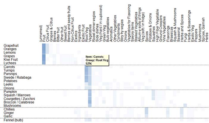
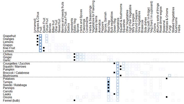
If we were to reorder the items using cluster analysis (discussed later), a chart similar to that shown in Figure 5 would result. This has the same layout as the worksheet in Figure 4 — items are listed down the left-hand side and groups across the top. In the body of the chart, the square cells represent the number of times each item appeared in the named group, expressed as a shade of a chosen colour — this corresponds to the number of marks you would have made in your hand-generated version. (Percentage values are available in the application by clicking on a cell; the figure shows the result for ‘Carrots’ in the ‘Root Veg’ group.) Table 2 provides more details of the shading used.
Author/Copyright holder: William Hudson. Copyright terms and license: All Rights Reserved. Reproduced with permission. See section "Exceptions" in the copyright terms below.
Figure 22.5: Items by groups chart of fruit & vegetables sample with 26 participants (SynCaps V2)
Table 22.2: Items by groups chart of fruit & vegetables sample with 26 participants (SynCaps V2)
22.1.2 Items by items chart
The items by items chart is a little more challenging to produce:
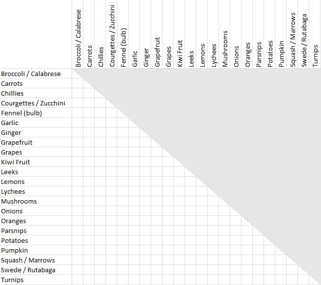
List all of the items your participants sorted down the left-hand side of the page in alphabetic order. Repeat the list in the same order across the top of the page. You now have a matrix of items. To avoid confusion and duplicated effort, draw a line through the diagonal — from the top-left to the bottom-right, where each item meets itself, and decide which half of the matrix you are going to use. Then shade the other half. This is so you are forced to put ‘Oranges’ x ‘Grapefruit’ into the same place as ‘Grapefruit’ x ‘Oranges’. You should end up with something similar to the worksheet shown in Figure 6. The top-right of the matrix has been greyed-out and will not be used.
Author/Copyright holder: William Hudson. Copyright terms and license: All Rights Reserved. Reproduced with permission. See section "Exceptions" in the copyright terms below.
Figure 22.6: Worksheet for items by items chart (created with MS Excel)
Author/Copyright holder: William Hudson. Copyright terms and license: All Rights Reserved. Reproduced with permission. See section "Exceptions" in the copyright terms below.
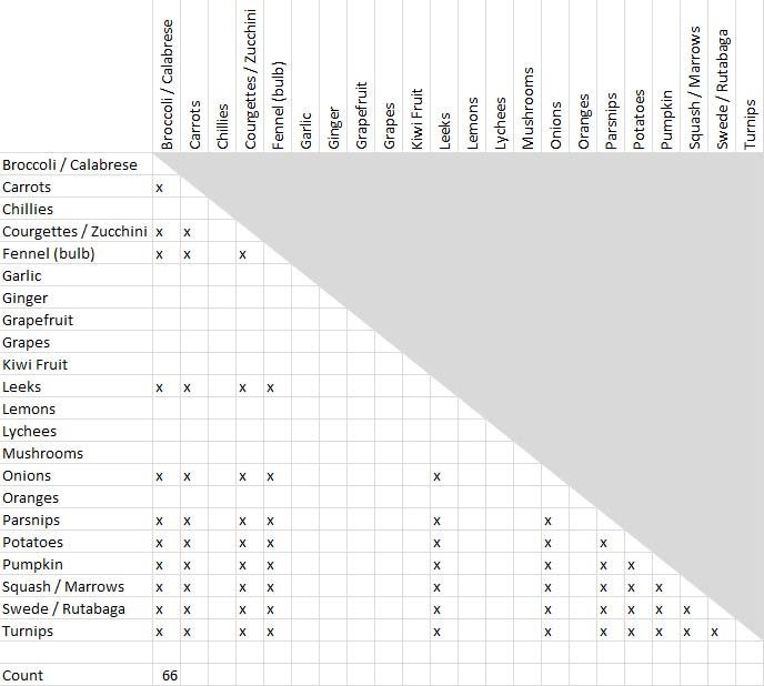
Figure 22.7: Item pairings for a group of 12 items ('Vegetables')
Using the sorted cards, place a mark in each cell for every pair of items that appears in the same group. For example, if we came across a group called 'citrus' we would probably find it contained grapefruit, oranges and lemons, so we would mark the cells grapefruit x oranges, grapefruit x lemons and oranges x lemons. This is a simple case; for larger groups there are many marks to make: (n2 — n) / 2. This is because we want all possible pairings (n2) excluding items paired with themselves (-n), plus we don't need to distinguish between the order of pairs — so apples x pears is the same as pears x apples. This allows us to halve the matrix and consequently the number of marks to be made (/2 in the formula). So if you have a group of 8 items, sharpen your pencil and get ready to make marks in 28 cells. Twelve items yield 66 marks, as shown in Figure 7. (Bear in mind that these are the values for a single participant. Either keep a running total in each cell or add additional marks as you process subsequent participants. Alternatively, use a single sheet for each participant and simply add the results together at the end. This approach has the distinct advantage of allowing you to find and fix errors as well as making visual comparisons of participants’ sorting methods.)
Repeat for all participants. When completed, the number of marks in each cell represents how often participants grouped item pairs together. This is called an 'items by items' (or 'pairs') chart. Figure 8 shows a computer-generated version, with the items reordered using cluster analysis. Rather than labelling the rows and columns separately, the item names are shown on the diagonal. Note that because we have removed half the matrix, most items are folded at the diagonal. For example, 'Carrots' starts as a row on the left and then continues as a column running down the page at the diagonal. The dashed lines in the figure separate the clusters — based on the average number of groups created by participants (four).
As for the items by groups chart (Figure 5), the square cells represent the percentages of participants as a shade of the selected colour as detailed in Table 2. In the items x items chart, however, each cell represents a pair of items that were placed together in the same group.
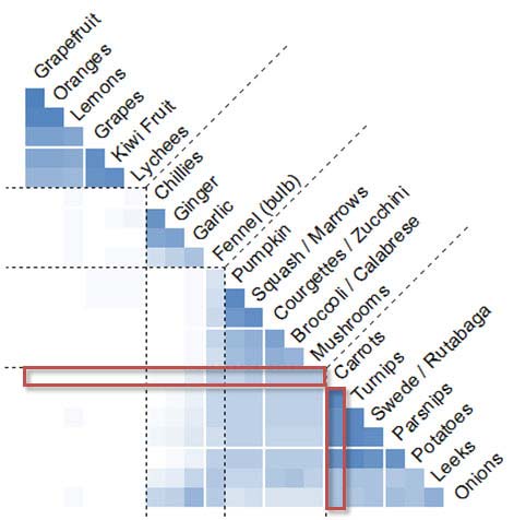
Author/Copyright holder: William Hudson. Copyright terms and license: All Rights Reserved. Reproduced with permission. See section "Exceptions" in the copyright terms below.
Figure 22.8: Items by items chart of fruit & vegetable sample with 26 participants (SynCaps V2) (red boxes show the complete data for 'Carrots')
22.2 What the analyses mean
While it is tempting to think that a card sorting project is going to immediately provide a navigation hierarchy, this is rarely the case. The results inform a design process; they do not provide a packaged solution. The sample fruit-and-vegetable project described here provides a realistic case in point — the results are far from conclusive.
What do we know for sure from the analyses? Refer back to Figure 5 and Figure 8 and see what conclusions you can draw before proceeding.
Both charts include the results of a cluster analysis that divide the items into four groups. The items by groups chart (Figure 5) shows that the most popular names for the four groups were 'Fruit', 'Spices', 'Vegetables' and 'Root Veg'. 'Citrus Fruit' was a strong contender for grapefruit, oranges and lemons, while some participants (about a third) did not distinguish between 'Root veg' and 'Vegetables'.
Anything else? What about fennel? In both charts it should be possible to see that fennel has been grouped with a wide variety of other items. Although the cluster analysis placed it in the group called 'Spices' almost 20% of participants sorted it into the 'Vegetables' group. There may be nothing we can do about this other than providing access to fennel from both groups — easily done on a computerized scale or web site.
Focussing on the items by items chart for a moment, we see an important feature of the items themselves — independent of group names. Very few participants attempted to group the fruits with any of the vegetables. This shows a clear understanding of and the distinction between these two main categories that we certainly should build on when designing a suitable information hierarchy. In contrast, the charts show a good deal of participant ambiguity over onions and leeks. These were frequently grouped with root vegetables, but the items by items chart shows an affinity — particularly for onions — with the group most commonly referred to as 'spices'.
What conclusions can we draw from this example? The first is that while we have learned a great deal about our participant's appreciation of the terminology, categories and concepts, the exercise was too limited for the results to be applied to a larger information space. Specifically, the small number of fruits provided in the example encouraged participants to place them in a single group. This may not be realistic in practice, although we do have some suggestions for refinement — 'Citrus Fruits' and 'Berries' from Figure 5. One solution would be to provide participants with a larger range of fruits, including what are called exemplars (representative types) of the categories we expect. An alternative approach would be to brief and monitor participants more closely. This is difficult to do in an online sorting activity — even if the briefing is very detailed, participants may fail to see it, read it or act on it. Most of these issues can be overcome in face-to-face sorting. If facilitators see participants producing too few categories, they can simply cajole them to create more.
So far we have touched on two popular methods of analysing card sorts — there are others that will be discussed later. But first a little background...
22.3 The History of card sorting
Card sorting has a surprisingly long history, especially if the concept of categorization is included. The ancient Greeks are credited with the early development of categories, with Aristotle providing the foundations for the categorization scheme that we use today for plants and animals (Sachs 2002). The practice of sorting cards in the social sciences is somewhat more recent, but still well over 100 years old. Initially, printed playing cards were used for a variety of experiments in the nascent field of psychology (Jastrow 1886), but these were joined relatively quickly by blank cards on which researchers would write words to be categorized by subjects (Bergström 1893). Early card sorting activities were primarily concerned with establishing characteristics of the subjects — the speed of sorting used as an indicator of mental processes and reaction time (Jastrow 1886; Jastrow 1898); memory function (Bergström 1893; Bergström 1894) and imagination — using inkblots on cards (Dearborn 1898). Some of these experiments developed into what is now considered to be a standard test for neurological damage in patients who have suffered head injuries, the Wisconsin Card Sorting Test (Eling et al. 2008). In fact, card sorting was so well received in psychology that an article appeared in Science as early as 1914 espousing the virtues of various types of card-based activities (Kline and Kellogg 1914).
Card sorting also made its way into other fields: criminology (Galton 1891), market research (Dubois 1949), semantics (Miller 1969) and as a standard qualitative tool in the social sciences (Weller and Romney 1988; Bernard and Ryan 2009). However, it was not until the emergence of the World Wide Web in the early 1990's that card sorting was applied to the task of organizing information spaces (Nielsen and Sano 1995), with the rare exception that Tom Tullis applied card sorting to the design of menus for an operating system in the early 1980's (Tullis 1985).
22.3.1 Card sorting and the design of interactive products
Despite the popularity of the web, card sorting remains an under-used tool in the design of interactive products. In a survey of 217 attendees of Usability Week 2008, Nielsen Norman Group reported that the average number of card sorts conducted per year was 2. While this is twice as frequent as eye-tracking studies in the survey (average 1 per year), this is a surprisingly low number given that there are no large up-front investments required. In fact, card sorting has had only a peripheral role in interactive product design since its inception — perhaps reflecting the limited uptake of user-centred design methods in general. Peter Morville and Louis Rosenfeld devote only a few pages to card sorting in their seminal work, Information Architecture — now in its third edition (Morville and Rosenfeld 2006). And at the time of writing, there is only one book available on the topic of card sorting for interactive systems design, Donna Spencer's Card Sorting: Designing Usable Categories (Spencer 2009), which tends to be fairly conservative in terms of analysis.
22.4 Benefits of card sorting
For interaction design, customer research or research in the social sciences, few investigative techniques are as effective as card sorting in dealing with large numbers of concepts. In face-to-face settings, handling and annotating physical cards is a fairly natural and unintimidating process: observing users engaged in this process can result in many insights for researchers and provide a fertile source of questions and conversations about the problem domain being studied and, of course, users themselves. These outcomes and opportunities are hard to obtain through interviews, questionnaires and usability evaluations, although each of these alternatives has its strengths for more limited scopes of investigation. For example, it is relatively easy to discover that a single menu item is mislabelled in a usability study, but prohibitively expensive for several dozen items.
22.5 Qualitative versus quantitative outcomes
At one extreme, card sorts can be conducted on a one-to-one basis as a tool for discovery (knowledge elicitation) and a means of generating meaningful discussion between participants and researchers (Weller and Romney 1988; Bernard and Ryan 2009). The outcomes here are generally a better understanding of the problem domain from a user's perspective with terms, relationships and categories expressed in the resulting groups. At the other extreme, it is very easy to organize online sorts with hundreds of participants to discover whether the terminology and concepts presented are well understood across a large user population (Fincher and Tenenberg 2005). While results in the one-to-one approach are primarily qualitative, those of the large-scale online studies are mostly quantitative. (Note that it is not impossible to obtain qualitative information from online studies; there simply are not as many opportunities to persuade or allow online participants to provide useful feedback.)
22.6 What to sort
Not surprisingly, the choice of what to have participants sort depends largely on what a researcher, information architect or interaction designer is trying to discover. For 'green-field' projects — those that lack any constraints imposed by prior work — a first priority would be to establish a vocabulary. In this context, users could be presented with objects, images or descriptions of items and asked to name them. Once named, they could be grouped, with the groups in turn also named. This is fairly easy to do in face-to-face settings, where numbered or bar-coded labels can be applied to objects or photos (see, for example, the card sorting templates for Microsoft Word at the Syntagm web site). Note that some web-based sorting packages, such as websort.net, do allow photos to be sorted, but provide no means for users to apply names to the items depicted.
Fixed Items: If terminology is already established and immutable (such as product names), then basic research as described above is unnecessary. The primary goal of a sorting activity would be to discover which items should be grouped together and what these groups should be called. This is a relatively straightforward undertaking for either face-to-face or online approaches. The choice would largely be determined by whether qualitative feedback is desired (for which face-to-face sorting with paper cards would be most appropriate) or if qualitative feedback using larger numbers of participants would be beneficial. Good quality results can be obtained from 15-30 participants in a face-to-face context (Nielsen 2004; Tullis and Wood 2004) while online sorts can be conducted for hundreds of participants at no additional cost except for recruitment. Also, large-scale studies can be useful for increasing engagement within an organization or ensuring that a diverse collection of users have a similar understanding of a problem domain.
User Goals: Card sorting is frequently applied to navigation design. However, simply listing the names of documents, pages or features that will be present in a solution does not guarantee that users will be able to reach their goals, even if they are organized optimally. Starting with user goals helps to ensure that navigation design is effective. So rather than asking participants to sort items such as “Employee Manual”, “Staff Policies” and “HR Guide” (all of which confusingly overlap), consider instead the goals that users have in accessing these documents: “Find holiday entitlement”, “Can I work at home?”, “How much time can I take off for a new baby?” and so on. (Tom Tullis employed user goals in his design of operating system menus — (See Tullis 1985)). Server logs, particularly search phrases; content audits; and user research can be used to build a list of user goals, with card sorting providing grouping and category names.
Multilevel Hierarchies: Most sorting and analysis tools do not support the kind of multiple-level hierarchies found in all but the simplest interactive solutions. Even the produce scales used in the sample card sort could use a multilevel hierarchy. For example, a top-level category called 'Fruit' might lead to 'Citrus Fruit', 'Apples and Pears', 'Exotic Fruit' and so on. However, the lack of analysis support for multilevel hierarchies is not an insurmountable problem. In fact, multilevel hierarchies at the analysis stage can increase the complexity of a sorting activity substantially, thereby making it a daunting undertaking for many participants. Instead, conduct multiple single-level sorting activities. Focus on the lowest levels (the 'leaves' of the navigation tree) since category names provided by participants often vary considerably in their levels of abstraction, as we saw in the example. Participants' category names included 'Fruit', 'Soft fruit' and 'Berries'. Each of these could be appropriate for higher-level navigation headings. (Multilevel sorting is discussed in more detail under Section 9, Advanced analysis.)
22.7 How to do a card sort
22.7.1 Choosing an approach
Face-to-face sorting methods are generally better for qualitative research, while online methods (web-based or desktop) are more appropriate for quantitative results. However, this is not always true; for example, it would be possible to sit with a participant or share their desktop while they conducted an online sort. This could result in good qualitative data, but it would be more intimidating for participants and much harder work for the facilitator. Remote desktop sharing can also be technically challenging, especially in the presence of corporate firewalls and security policies.
Researchers or interaction designers can also choose between
open sorting, where users make up their own categories
closed sorting, where categories are predefined
hybrid sorting; some combination of the two
For most purposes, open sorting is the best choice, although supplying some predefined categories is always helpful to participants and is supported by most sorting and analysis tools. Closed sorting can be used when trying to establish changes required to an existing structure, particularly with analysis tools that provide comparisons between a 'reference sort' (such as an existing or proposed solution) and participants' results — see Figure 9.
Author/Copyright holder: William Hudson. Copyright terms and license: All Rights Reserved. Reproduced with permission. See section "Exceptions" in the copyright terms below.
Figure 22.9: Fruit & vegetable example with reference sort showing existing solution (SynCaps V2)
In this items by groups chart, Figure 9, the current solution is shown with black squares in a cell. So while most participants choose to group all fruit together, the computerized scales used two unusual groups; 'Grapes & Citrus' and 'Exotic Fruit'. However, there were some areas of correspondence: many participants agreed with the current design for the 'root veg' group towards the bottom-centre of the chart.
22.7.2 Recruiting and briefing participants
As with any other form of user-centred design, participants of a card sorting activity should be representative of the users envisaged for the solution. However, given the difficulties that some members of the population may have with technology (older users for example), it is often beneficial to over-sample these groups to ensure that the resulting design is effective for as broad an audience as possible. Where possible, try to use participants who are motivated to participate by interests that are more than purely monetary — existing users or customers for example.
When briefing participants for a sorting activity, it does not pay to be too vague in stating the requirements. In navigation design, the number of categories needed for a set of items is not a complete mystery. There is usually a balance to be struck between the number and size of groups (Kiger 1984). Consequently, it is important to provide participants with adequate information about the number and level of groups you require. If you are trying to devise menus for our computerized produce scale having space for 12 items on the screen, do not be shy about letting participants know that. Similarly, horizontal menu bars on websites or desktop applications rarely have space for more than 6 or 8 items. Allowing participants to generate 20 or 30 categories in these cases is potentially a waste of their time and yours.
Similarly, if you have group names that you know, or at least strongly suspect you need, provide those to participants. This can be done in both face-to-face and online settings. But do encourage participants to make up their own group names if they prefer.
Participants should also be advised on how to deal with items they do not understand. While some researchers or interaction designers suggest that all items should be sorted — leaving participants simply to guess at those they do not recognize — this can lead to spurious groupings. Consider asking users simply not to sort items they do not recognize or create a specific 'unknown' group to receive them. These can then be excluded from the results. Most online sorting tools now do allow items to remain unsorted. However, make sure that analysis results are based on the number of participants rather than the number of times that an item was sorted.
22.7.3 Time to sort
The amount of time required to perform a sort can vary considerably from person to person, but is largely dependent on the number of items to be sorted:
Approximately 20 minutes for 30 items
30 minutes for 50 items
60 minutes for 100 items
However, other factors include how familiar the terms and concepts are to participants and how motivated they are to provide results conscientiously. Also, it is possible to sort up to 150 cards in single sessions, but higher quality results might be obtained by splitting such a large project into smaller parts.
22.7.4 Preparing a sort
For face-to-face (paper-based) sorting, getting items and group names onto cards can be a tedious undertaking. Happily, standard mail-merge software can be used to make this task easier, meaning that items can be printed either directly onto cards or self-adhesive labels. Free mail-merge templates for Microsoft Word can be found on the Syntagm web site for both North American and European paper sizes. These also include bar codes that can be used to simplify data collection: instead of typing in an item name or number, the bar codes allow them to be read directly using a simple USB scanner. This is both quicker and less error-prone than manual entry — it makes it relatively easy to process 120 cards or more per minute (full instructions are included on the web page referred to).
Preparation for online sorting is relatively straightforward, requiring only lists of the items and group names (if any) to be uploaded.
However, regardless of the method of sorting, be aware that superficial similarities in the names used can produce unhelpful results. Consider these menu item names from an intranet:
Manage absence and holidays
Manage difficult colleagues
Change management
If faced with a large number of items to sort, participants may simply group similar names together. This is called a superficial match. To overcome this, consider modifying the item names:
Absence and holidays
Coping with difficult colleagues
Change management
In the first two items the word 'manage' was not an essential part of the name. Removing it or using a synonym prevents unwanted grouping.
22.7.5 Choosing names
Apart from the issue of superficial similarities mentioned above, be careful to choose names that are in common use, especially where interactive solutions are being designed for a broad range of abilities. This is not just common sense, but also a requirement of disability discrimination legislation in many countries. Put simply, language should be no more complex than needed to convey the required information. In English, longer words (measured in syllables) are used much less frequently than shorter ones (Klare 1963). And even though participants in a card sort might suggest unusual names for items or groups — such as 'brassicas' — most people will go into their local supermarket or green grocers asking for cabbage rather than use its Latin genus. If in doubt, consult a reference on common words such as the Corpus of Contemporary American English, the British National Corpus or similar sources for other languages.
22.8 How to understand the results
For very small projects, just leafing through the sorted cards or listing of online results can provide useful insights into groupings. However, larger projects will require some form of analysis, ranging from simple tabulation through to cluster analysis. Note that while cluster analysis is potentially a very complex subject (Romesburg 2004; Bernard and Ryan 2009), most card sorting tools use a fairly simple form of cluster analysis that could easily be replicated manually. It is known as 'hierarchical cluster analysis'. The 'hierarchy' in this case refers to the way in which smaller clusters are aggregated to form larger ones until all are included.
22.8.1 Simple analysis
Simple tabulation of items by groups can be performed manually (as described above) or by using a spreadsheet package. However, online sorting tools will do this analysis for you. For printed cards using the Microsoft Word mail-merge templates described earlier, SynCaps V2 and later will produce items by items, items by groups and dendrogram analyses.
Author/Copyright holder: William Hudson. Copyright terms and license: All Rights Reserved. Reproduced with permission. See section "Exceptions" in the copyright terms below.
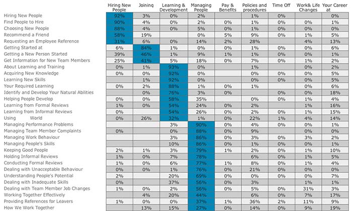
Figure 22.10: Items by groups chart for intranet navigation created using the web-based optimal sort software
Figure 10 is an items by groups chart showing an alternative presentation to that of Figure 5. In both cases, the items are listed down the left-hand side of the chart with the group names across the top. A cluster analysis has been performed to determine which items are most closely related, producing an item ordering that moves from one cluster to the next. The only significant difference between the two figures is that Figure 5 uses shading to show the relative strength of each relationship (figures are available by clicking on a cell) while Figure 10 presents the percentage figures with blue shading only to highlight the most significant results.
22.8.2 Cluster analysis
The type of cluster analysis performed by most card sorting tools is 'hierarchical cluster analysis' or HCA. The usual result is a graphical display called a dendrogram, or sometimes 'dendrogram', which has its roots (literally) in the Greek word for 'tree', which is 'dendron'.
Author/Copyright holder: William Hudson. Copyright terms and license: All Rights Reserved. Reproduced with permission. See section "Exceptions" in the copyright terms below.
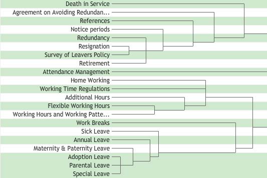
Figure 22.11: Dendrogram of Intranet Navigation created using the web-based Websort software
Figure 11 shows a hierarchical cluster analysis in the form of a dendrogram. The example is taken from an intranet navigation sorting activity. The hierarchical nature of the dendrogram is related to the strength of the relationships between items, as measured by how frequently they appeared in the same groups. And as in real trees, shorter branches are stronger. In Figure 11, the six items at the bottom all include the word 'leave'. However, participants have primarily grouped 'Adoption -', 'Parental -' and 'Special' Leave as being closely related, but were less consistent with 'Maternity & Paternity - ', 'Annual -' and 'Sick' Leave. Finally, 'Work Breaks' was sometimes grouped with the leave items, but this relationship is fairly weak compared with the others. If you wanted to know why the work breaks item relationship is weaker, you would need to consult an items by items chart, an items by groups chart or the raw proximity matrix if available — the latter simply showing the number of times each pairing of items appeared together in the same groups.
The dendrogram also gives some insight to the way the cluster analysis works. The method used is called 'agglomerative clustering', meaning simply that we build the clusters from the bottom up. So in the intranet example, the first cluster would have started with the last three 'leave' items — they have the shortest branches — with 'Maternity & Paternity Leave' subsequently subsumed. Then, looking again at Figure 11, the next strongest relationship appears towards the top of the chart, as 'Resignation' and 'Survey of leavers policy'.
As items are agglomerated into clusters, an average score (based again on the number of times pairs of items appeared in the same groups) is calculated. This is shown in the dendrogram by how far the vertical connecting lines are from the labels. As mentioned above, the resulting branches reflect stronger relationships when they are shorter — that is, when the vertical connecting lines are closer to the labels, as for the bottom three items in Figure 11.
In a dendrogram, clusters are joined together into branches until all items have been included. This means that the weakest relationships — between dissimilar clusters — can be found furthest from the item labels. Although Figure 11 does not show a complete dendrogram, it does include three long branches that are continued off to the right. These represent three dissimilar clusters; each will require their own category labels (which could be derived from an items by groups chart). Note that dendrograms take no account of group names; it may well be that even though ‘Adoption -’, ‘Parental -’ and ‘Special Leave’ were grouped together frequently, participants may have applied a wide variety of names to that grouping. Also be aware that in a dendrogram, items can appear in only one place. Therefore, if an item was split equally by participants between two different groups, it would appear only as a weak relationship in one of them. You would need to visit the items by groups chart to notice this.
22.9 Advanced analysis
In trying to make sense of card sorting results, there are two problems that frequently recur. The first is that not all participants have the same motivation, experience or needs. This means that we may have participants whose sort results are simply 'noise' — particularly for online sorts with an attractive incentive. In other cases we may believe we have one relatively homogenous group of participants, when in fact we have multiple. This can be due to general factors such as experience — in which case we need to accommodate these multiple groups in our designs; or it may be due to different contexts of use. In the latter case we should try to understand the differences and to decide whether separate designs are warranted. Unfortunately, traditional card sorting analysis tools are not much help here. But some of this information can be obtained manually — by examining the number and size of groups produced by each participant, for example: those in a hurry tend to have fewer groups and a large number of items in unhelpful categories such as 'don't know' or 'miscellaneous', while those who have a substantially different view of the problem domain may produce an unusual number of groups (relative to the average). Optimal Workshop has added some participant-oriented results to their web-based service. Fairly detailed participant and item spreadsheets can be found in all versions of SynCaps.
The second recurring problem is related to the basic principle of cluster analysis: every item is assigned to exactly one cluster. To a certain extent, this can be worked-around by careful inspection of the items by items and items by groups analyses. For example, an item such as a cucumber might be split equally between 'green vegetables' and 'salad vegetables'. It will appear in the dendrogram in either of these groups — the choice will be arbitrary if the split is exactly 50:50 — with a fairly weak relationship. However, the weakness of the relationship is not because participants were confused about where it should go; they just did not agree. The items by items and items by groups charts would show this clearly. However, because of this limitation of cluster analysis, some researchers have explored other advanced statistical techniques; most notably factor analysis. See Capra 2005 and Giovannini 2012. A more detailed account of card sorting analysis methods can be found in (Corter 1996) and (Coxon 1999).
22.9.1 Multilevel sorting
The primary method of sorting discussed in this chapter can be described as single-level or 'flat'. Participants are given a set of items which they should sort into a single level of groups. So while it might be tempting to nest groups — 'leaf vegetables' within 'green vegetables' within 'vegetables', for example — there are two issues to be aware of:
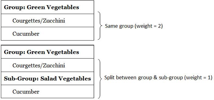
Limitations of analysis: The most common methods of analysis use a single measure of closeness or proximity of related items. This is based on how frequently items were placed together by participants. It is not practical to perform a cluster analysis on multiple group levels, but it is relatively straightforward to apply weightings to item proximities according to whether they appeared in the same group, a sub-group, a sub-sub-group and so on. Items that appear together in the same group would receive the highest weighting, pairs split between immediate subgroups a slightly lower weighting; and those split between second-order sub-groups lower still (and so on). For example, cucumber and courgette/zucchini would receive the maximum weighting if they both appeared in a 'Green Vegetables' group but a lower weighting if courgettes/zucchini appeared in a group named 'Green Vegetables' and cucumber in a sub-group named 'Salad Vegetables' (illustrated in Figure 12 using a maximum weighting of 2). This is the approach taken by the (now defunct) EZsort/Usort (Dong et al. 2001) and the free SynCaps V1 packages in their anonymous single-level sub-groups implementation. (Anonymous sub-groups are simply unnamed.) This has been extended to multiple levels by packages such as UXsort (uxsort.com) and SynCaps V3 (Syntagm Ltd). SynCaps V3 also provides an analysis of sub-group names used at each level. See Harloff 2005 for a further discussion of weighted multilevel sorts.
Author/Copyright holder: William Hudson. Copyright terms and license: All Rights Reserved. Reproduced with permission. See section "Exceptions" in the copyright terms below.
Figure 22.12: Example of multilevel weighting
Scale and complexity: One of the biggest challenges with multilevel card sorting is the considerable increase in the number of items to be sorted and the resulting solutions (Wood and Wood 2008). Consequently, it would be inadvisable to give participants the entire navigation hierarchy of a large intranet or e-commerce site and ask them to organize these as they see fit. Participants in card sorts are users, not information architects. Multilevel card sorting is much more likely to be effective when the potential solutions are partially defined or constrained. Even then, researchers and designers may get more useful information from a series of single-level sorting activities where this is practical.
22.10 Tree Sorting
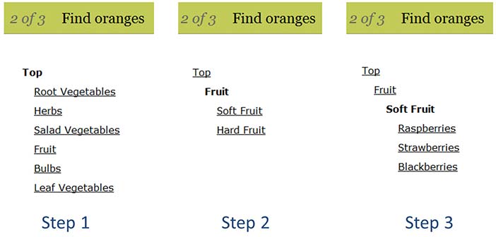
Tree sorting (also called 'tree testing' and 'reverse card sorting') is a concept related to card sorting, but in many respects quite different. In essence it is a simulation of a navigation tree that would be found in a software application or web site. Online participants are presented with goals and then asked to navigate using the tree simulation. Figure 13 illustrates the process across several screens (step 1 is the first screen; step 2 is the second and so on). In step 1, the participant has chosen 'Fruit', while in step 2 'Soft Fruit' was selected. If the wrong selections are made, participants will need to back-track to find a more appropriate menu. A large number of tasks can be made available, with only a random subset displayed to each participant if required.
On completion of a project, researchers and designers can be presented with success rates, error rates and time taken (or related variations). While closed card sorting can be of some help in validating a navigation design, tree sorting is a more effective approach in most cases. (See plainframe.com and optimalworkshop.com)
Author/Copyright holder: William Hudson. Copyright terms and license: All Rights Reserved. Reproduced with permission. See section "Exceptions" in the copyright terms below.
Figure 22.13: Tree sorting example with a task of 'find oranges' from optimalworkshop.com
22.11 Where to learn more
Aside from the references listed below and particularly Donna Spencer's on card sorting (Spencer 2009), there are a number of helpful web resources:
22.12 References
Bergström, John A. (0000b): An Experimental Study of Some of the Conditions of Mental Activity. In The American Journal of Psychology, 6 (2) pp. 247-274
Bergström, John A. (0000a): Experiments upon Physiological Memory by Means of the Interference of Associations. In The American Journal of Psychology, pp. 356-369
Bernard, H. Russell and Ryan, Gery W. (2009): Analyzing Qualitative Data: Systematic Approaches. Sage Publications, Inc
Capra, Miranda G. (2005): Factor analysis of card sort data: an alternative to hierarchical cluster analysis. InHuman Factors, 49 (5) pp. 691-695
Corter, James E. (1996): Tree Models of Similarity and Association (Quantitative Applications in the Social Sciences). Sage Publications, Inc
Coxon, Anthony P. M. (1999): Sorting Data: Collection and Analysis (Quantitative Applications in the Social Sciences). Sage Publications, Inc
Dong, Jianming, Martin, Shirley and Waldo, Paul (2001): A user input and analysis tool for information architecture. In CHI 01 extended abstracts on Human factors in computing systems CHI 01,
Dubois, Cornelius (1949): The Card-Sorting or Psychophysical Interview. In Public Opinion Quarterly, 13 (4) pp. 619-628
Eling, Paul, Derckx, Kristianne and Maes, Roald (2008): On the historical and conceptual background of the Wisconsin Card Sorting Test. In Brain and Cognition, 67 (3) pp. 247-253
Fincher, Sally and Tenenberg, Josh (2005): Making sense of card sorting data. In Expert Systems, 22 (3) pp. 89-93
Giovannini, Peter (2012). How to carry out pile sorting and how to analyse the data with Anthropac: a tutorial. Retrieved 2 January 2012 from http://petergiovannini.com/ethnobotany-methods/how...
Harloff, Joachim (2005): Multiple Level Weighted Card Sorting. In Methodology: European Journal of Research Methods for the Behavioral and Social Sciences, 1 (4) pp. 119-128
Jastrow, Joseph (0000): A sorting apparatus for the study of reaction-times. In Psychological Review, 5 (3) pp. 279-285
Kiger, John I. (1984): The Depth/Breadth Trade-Off in the Design of Menu-Driven User Interfaces. In International Journal of Man-Machine Studies, 20 (2) pp. 201-213
Klare, George R. (1963): Measurement of Readability. Umi Research Pr
Kline, Linus W. and Kellogg, Chester E. (1914): Cards as Psychological Apparatus. In Science, 39 pp. 657-659
Miller, George A. (1969): A psychological method to investigate verbal concepts. In Journal of Mathematical Psychology, 6 (2) pp. 169-191
Morville, Peter and Rosenfeld, Louis (2006): Information Architecture for the World Wide Web: Designing Large-Scale Web Sites. OReilly Media
Nielsen, Jakob (2004): Card Sorting : How Many Users to Test. In Useit Alertbox, (0) pp. 3-7
Nielsen, Jakob and Sano, Darrell (1995): SunWeb: user interface design for Sun Microsystem's internal Web. InComputer Networks and ISDN Systems, 28 (1) pp. 179-188
Romesburg, Charles (2004): Cluster Analysis for Researchers. Lulu.com
Sachs, Joe (2002): Aristotle's Metaphysics. Green Lion Press
Spencer, Donna (2009): Card Sorting. Rosenfeld Media
Tullis, Thomas S. (1985): Designing a Menu-Based Interface to an Operating System. In: Borman, Lorraine andCurtis, Bill (eds.) Proceedings of the ACM CHI 85 Human Factors in Computing Systems Conference April 14-18, 1985, San Francisco, California. pp. 79-84
Tullis, Tom and Wood, Larry E. (2004): How Many Users Are Enough for a Card-Sorting Study? The Card-sorting Study. In Learning, pp. 1-10
Weller, Susan C. and Romney, A. Kimball (1988): Systematic Data Collection (Qualitative Research Methods Series 10). Sage Publications, Inc
Wood, Jed R. and Wood, Larry E. (2008): Card Sorting: Current Practices and Beyond. In Journal of Usability Studies, 4 (1) pp. 1-6