
“Productivity is never an accident. It is always the result of a commitment to excellence, intelligent planning and focused effort.”
— Paul J. Meyer, premier international authority on goal setting, motivation, time management, and personal and professional development
Accessibility is not the first item we consider when we start designing a website. It is often a hidden need that we don't think about until something goes wrong. For example, let’s say you are in the middle of a design project and one of your test users tells you he can’t read the text on the screen. Then, you start analyzing what happened, and it turns out that he is one of the 8% of males in the world who has color blindness—and he could not differentiate the green font from the red background. Okay, we’ll admit that we often don’t see green text on a red background, but you get the point, don’t you?
Accessibility issues can creep in throughout the project life cycle. In fact, the most expensive accessibility issues often come after the completion of a project. In countries with strong accessibility legislations, companies can find themselves in costly lawsuits. In general, companies and federal agencies are accountable to provide equal access to all users. Besides legal matters, accessibility can benefit your users and also improve the brand of your product. That’s why, here, we will teach you to plan for and focus your efforts to design for accessibility in the first place.
Learn to Apply the 7 Principles of Universal Design
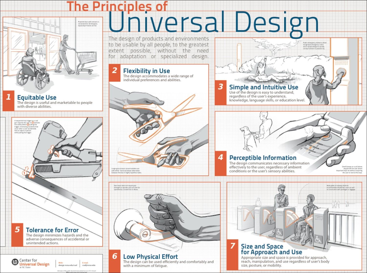
The Principles of Universal Design was created by Ron Mace and a group of design researchers and practitioners across the United States. It was published in 1997 by NC State University, The Center for Visual Design. The Principles of Universal Design is an invaluable resource you can use to plan and guide your design process intelligently. This will benefit the company you work for and the people who’re going to use your designs in the end.
© Center for Universal Design, NC State. 2011, All rights reserved.
The Principles of Universal Design is a foundation for designers who set out to create Universal Design products. The principles were created to guide a wide range of design disciplines including environments, products, and communications. You can apply these principles to any design style or trend; they are timeless and adaptable. You will be proactively taking on accessibility by incorporating these principles at the beginning of a project.
There are seven principles, and they all include guidelines with actionable approaches for Universal Design. Each principle captures a key concept. Whenever you are using the guidelines to plan and evaluate your design, an important thing to note is that sometimes only a few of the seven principles will be relevant to your current design. In the following section, you'll learn about each of the seven principles and its guidelines. Additionally, we will look at design examples for each principle so you can apply these immediately to your projects.
Principle 1: Equitable Use
“The design is useful and marketable to people with diverse abilities.”
Equitable use is the first principle because it is the driver for accessibility. The principle promotes you to think about users with different abilities. When you use this principle, you must consider all users, instead of only the target users. When you design for all users, you will also improve the experience for your target users and increase the brand value of your company.
Guidelines for Equitable Use
1a. Provide the same means of use for all users: identical whenever possible, equivalent when not.
1b. Avoid segregating or stigmatizing any users.
1c. Provisions for privacy, security, and safety should be equally available to all users.
1d. Make the design appealing to all users.
Design Example: Use strong color contrast to avoid stigmatizing users with color blindness
Colour blindness affects approximately 1 in 12 men (8%) and 1 in 200 women (0.5%) in the world. You can avoid segregating or stigmatizing your users by designing color palettes with strong contrast. One of the common myths about accessibility is if you design for accessibility, then you would be sacrificing the visual design. This is incorrect. A design with strong color contrast can be aesthetically appealing to all users.
Color blindness - deuteranomaly (red/green distinction). On the left are two pictures as seen by a person with "normal" vision. On the right, the same pictures are simulated as seen by a person with deuteranomaly. When you choose colors for your design, make sure to avoid red/green combinations.
© Johannes Ahlmann. 2011, CC BY 2.0.
Principle 2: Flexibility in Use
“The design accommodates a wide range of individual preferences and abilities.”
No one person is the same as another. A static and inflexible design will never be able to accommodate all users. The Flexibility in Use principle encourages flexible, adaptable and/or customizable design. It takes into account individual preferences and lets the users choose how they will use a product. When you provide choices for your users, they will feel more free and more in control of their experience on your website.
Guidelines for Flexibility in Use
2a. Provide choice in methods of use.
2b. Accommodate right- or left-handed access and use.
2c. Facilitate the user's accuracy and precision.
2d. Provide adaptability to the user's pace.
Design Example: Provide customization for dashboards
Customization is a technique to accommodate a wide range of individual preferences and abilities. It enables users to choose and organize what they see on a website and how they will use it. Dashboards are good examples for customization. Many enterprise systems and project management applications have customizable dashboards. Depending on their various work tasks and needs, users can select what they want to see on the dashboard and how they want to use it.
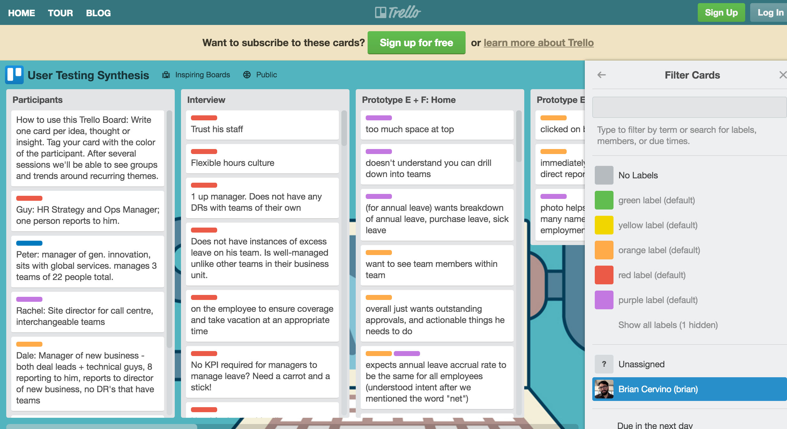
Trello is a web-based project management application. It uses boards, lists and cards to help users to organize and prioritize their projects with flexibility. It offers a range of customizable dashboard options. Here, the user can choose the color of the cards to display on a board.
© Trello, LLC. All rights reserved, Fair Use.
Principle 3: Simple and Intuitive Use
“Use of the design is easy to understand, regardless of the user's experience, knowledge, language skills, or current concentration level.”
Simple and intuitive use is one of the goals of user experience design. It’s not surprising this is also one of the universal design principles. This principle aims to reduce complexity and mental or cognitive loads. According to the cognitive load theory, humans can handle only 3–9 items in a short amount of time when processing information. So as to reduce complexity and reduce cognitive loads, you should always aim to present information between 3 and 9 items.
Guidelines for Simple and Intuitive Use
3a. Eliminate unnecessary complexity.
3b. Be consistent with user expectations and intuition.
3c. Accommodate a wide range of literacy and language skills.
3d. Arrange information to be consistent with its importance.
3e. Provide effective prompting and feedback during and after task completion.
Design Example: Reduce visual clutter with Progressive Disclosure
Progressive Disclosure is an interaction design technique. It reduces visual clutter and removes irrelevant information on the screen. It prioritizes information to display on the screen based on user needs and interactions. On top of that, it allows the user to drill in for more information, usually without a page load. Progressive Disclosure reduces users’ cognitive loads and helps them focus on the tasks at hand.
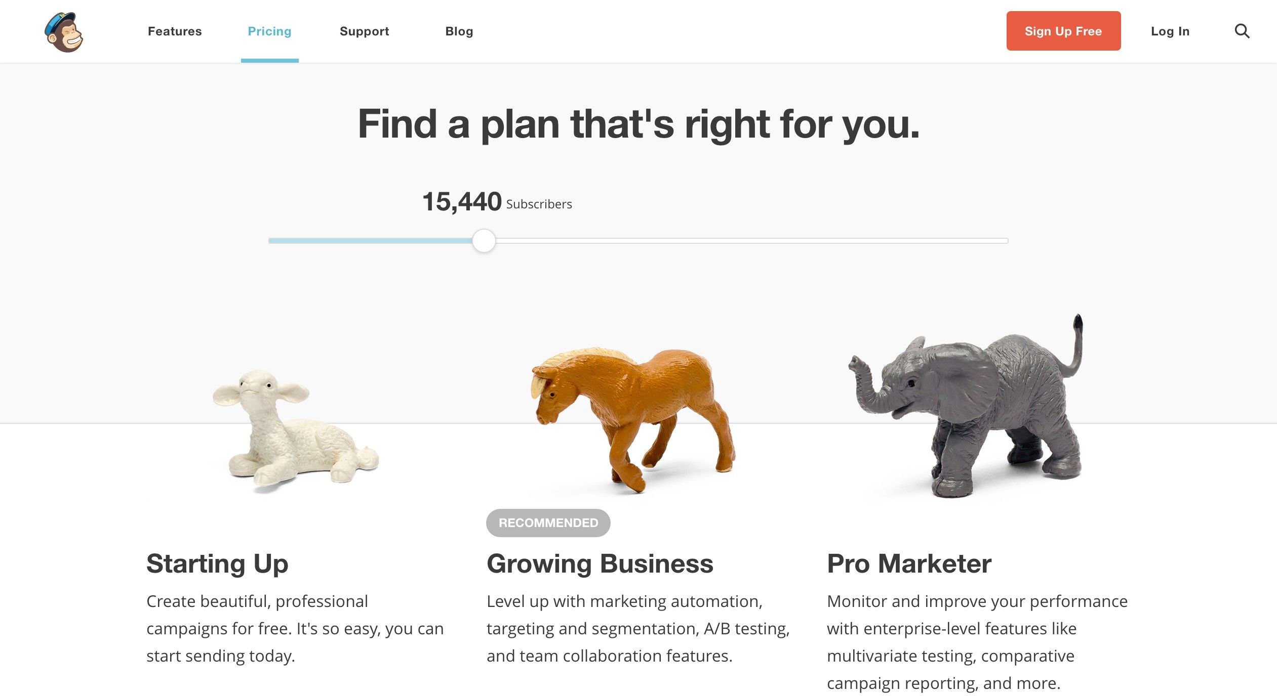
MailChimp is a web-based email marketing service. On its pricing page, it uses progressive disclosure to display service plans. A user can interact with the slider to communicate the number of subscribers to whom she will be reaching out using MailChimp. Based on the input, MailChimp displays a subset of three service plans on the screen and recommends one of them to the user.
© MailChimp, LLC, Fair Use.
Principle 4: Perceptible Information
“The design communicates necessary information effectively to the user, regardless of ambient conditions or the user's sensory abilities.”
Information is critical to users. Whether it’s communicated via text, pictures, audio or videos, make sure the information is easy to digest and access. When you incorporate this principle into your design, start with your users. You can figure out how best to present information by considering users with disabilities, such as those with vision or hearing impairments.
Guidelines for Perceptible Information
4a. Use different modes (pictorial, verbal, tactile) for redundant presentation of essential information.
4b. Provide adequate contrast between essential information and its surroundings.
4c. Maximize "legibility" of essential information.
-
4d. Differentiate elements in ways that can be described (i.e., make it easy to give instructions or directions).
-
4e. Provide compatibility with a variety of techniques or devices that people with sensory limitations use.
Design Example: Enable users with hearing impairments to watch videos with Video Transcription
Multimedia requires multisensory experiences, especially videos. People with hearing problems or language barriers have difficulty consuming information from videos. You can remove these barriers by providing video transcriptions and/or subtitles. Video transcriptions and subtitles add an alternative channel. They allow users to consume words and information from the video without relying on hearing. Designing with accessibility in mind can be a win-win situation for both the company and the users – just as it is for TED.
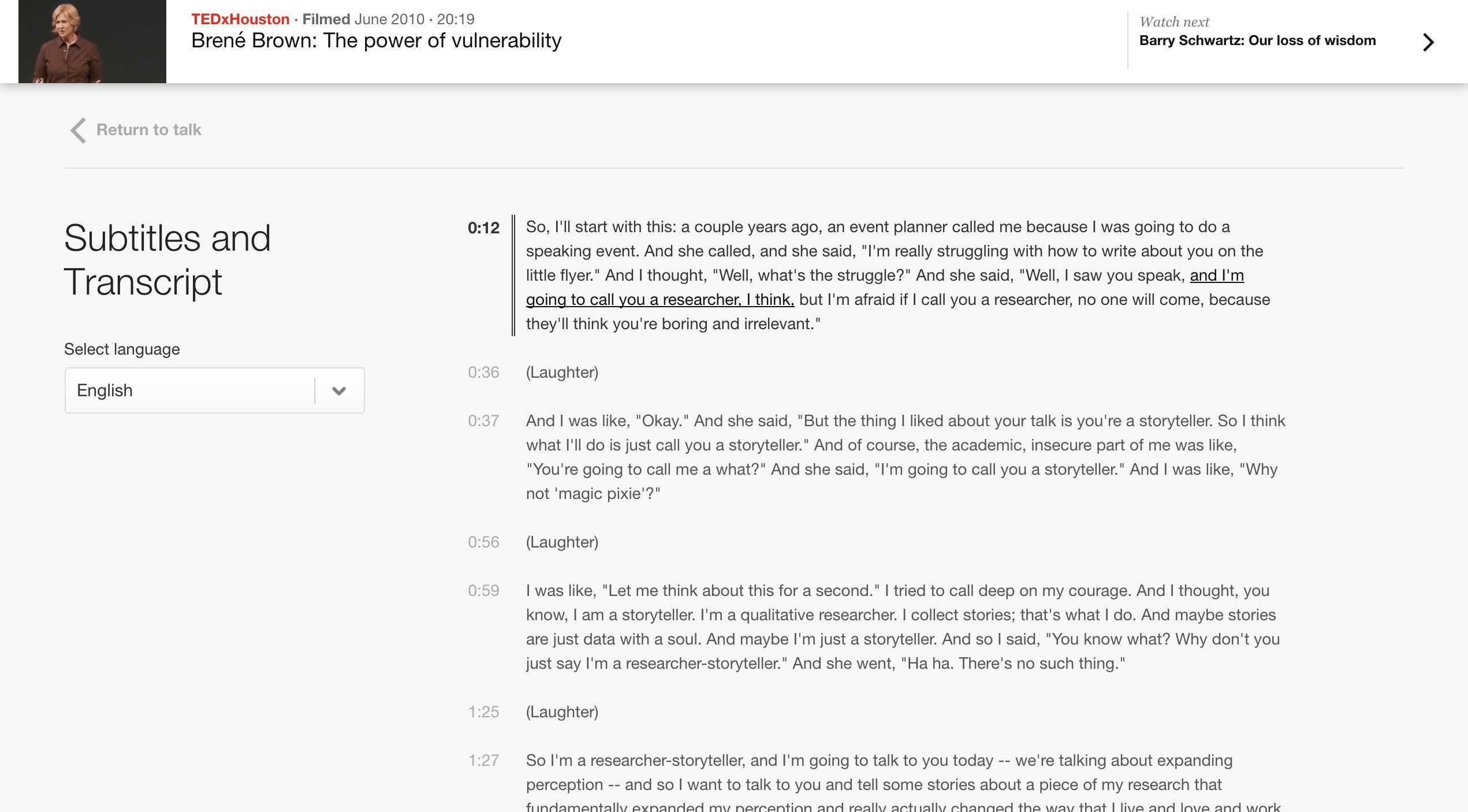
TED is a non-profit organization, which is dedicated to spreading ideas via short power talks. The talks are usually 18 minutes or less and are often uploaded as videos on their websites. In order to reach and help as many users as possible, TED's website provides subtitles and transcriptions for their online videos. It also provides the option to select a language. That’s a huge service for the hearing-impaired user, and it’s a great service for everybody else who prefers to read instead of viewing and hearing videos. In turn, it’s also good for TED as they reach more users and increase their popularity. When designing for accessibility, this is most often the case. It’s a win-win situation for both the users and the companies or organizations we design for.
© TED Conferences, LLC., Fair Use.
Principle 5: Tolerance for Error
“The design minimizes hazards and the adverse consequences of accidental or unintended actions.”
"Human beings should only use technology which if the worst case happens, it leads to an acceptable damage. Definitely nuclear energy is not in that category. I want an industrial world where people are allowed to make errors. Because human creativity has to do with being allowed to make errors. We want an error-friendly environment.”
— Hans-Peter Durr, a German physicist
Errors are inevitable amongst humans, hence the adage “to err is human”. While we are not designing for nuclear technology, we should design for an error-friendly environment. Universal Design aims to design for all users—as well as design in anticipation for different environments and users’ actions; this principle pushes you to think beyond the screen and how the system and user will interact with each other.
Guidelines for Tolerance for Error
-
5a. Arrange elements so as to minimize hazards and errors: most used elements, most accessible, with hazardous elements eliminated, isolated, or shielded.
5b. Provide warnings about hazards and errors.
5c. Provide fail-safe features.
5d. Discourage unconscious action in tasks that require vigilance.
Design Example: Reduce submission error with Form Validation
Form Validation minimizes and prevents user errors. There are three ways to validate form inputs.
1. Input Format Validation – Make sure the user has used the correct format for an input field. For example, the email address input field should have a format start with a string of alphabets and/or letters, followed by ‘@’ and an email domain name.
2. Data Validation – Check to make sure whether the data the user entered is in the correct context. For example, many hotel reservation systems need check-in dates to be no earlier than the ‘current’ day.
3. Server Validation – Input format validation and data validation are applied to a specific input field. Server validation sends all the data of a form to the server and checks for a correct data relationship. For example, a simple login form would use server validation to check whether the username and password are correct.
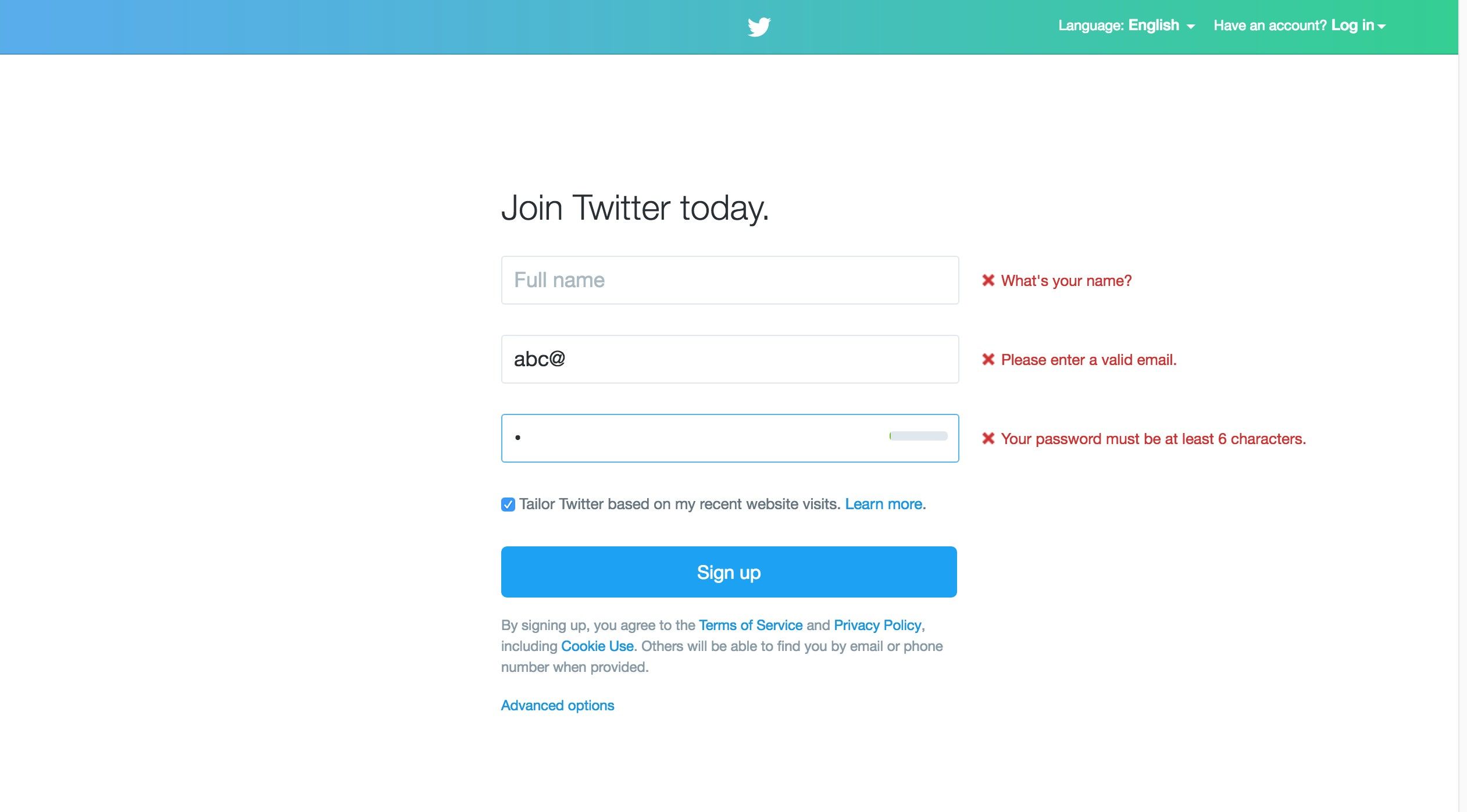
Twitter is an online social networking service, which allows users to send and read messages of 280 characters or less. Here is Twitter’s sign-up form with error messages for input format validation errors. It checks for correct email and password format.
© Twitter, LLC., Fair Use.
Principle 6: Low Physical Effort
“The design can be used efficiently and comfortably and with a minimum of fatigue.”
We may not first associate physical efforts with using the web. Anyone can easily just sit down and use a mouse, but technology is now integrated and ubiquitous in workplaces. Many people are using their computers for eight or more hours to perform tasks at work. The amount of time we spend on our computers is taxing on our bodies. In fact, people with physical disability have even more difficulty with using the web than normal users do. For example, those with mobility issues may have a hard time moving the mouse to the desired target. This is why designing for low physical efforts is vital to bear in mind whenever we work.
Guidelines for Low Physical Effort
6a. Allow user to maintain a neutral body position.
6b. Use reasonable operating forces.
6c. Minimize repetitive actions.
6d. Minimize sustained physical effort.
Design Example: Minimalize mouse usage with Keyboard Shortcuts
Keyboard shortcuts reduce the need to move from the keyboard to the mouse for simple tasks. Most browsers such as Chrome, Firefox, and Safari provide keyboard shortcuts to perform tasks such as copy (Ctrl + C) and paste (Ctrl + V). You can design superb interactive experiences by adding appropriate keyboard shortcuts. They will improve the navigation and make websites easier to use for all users.
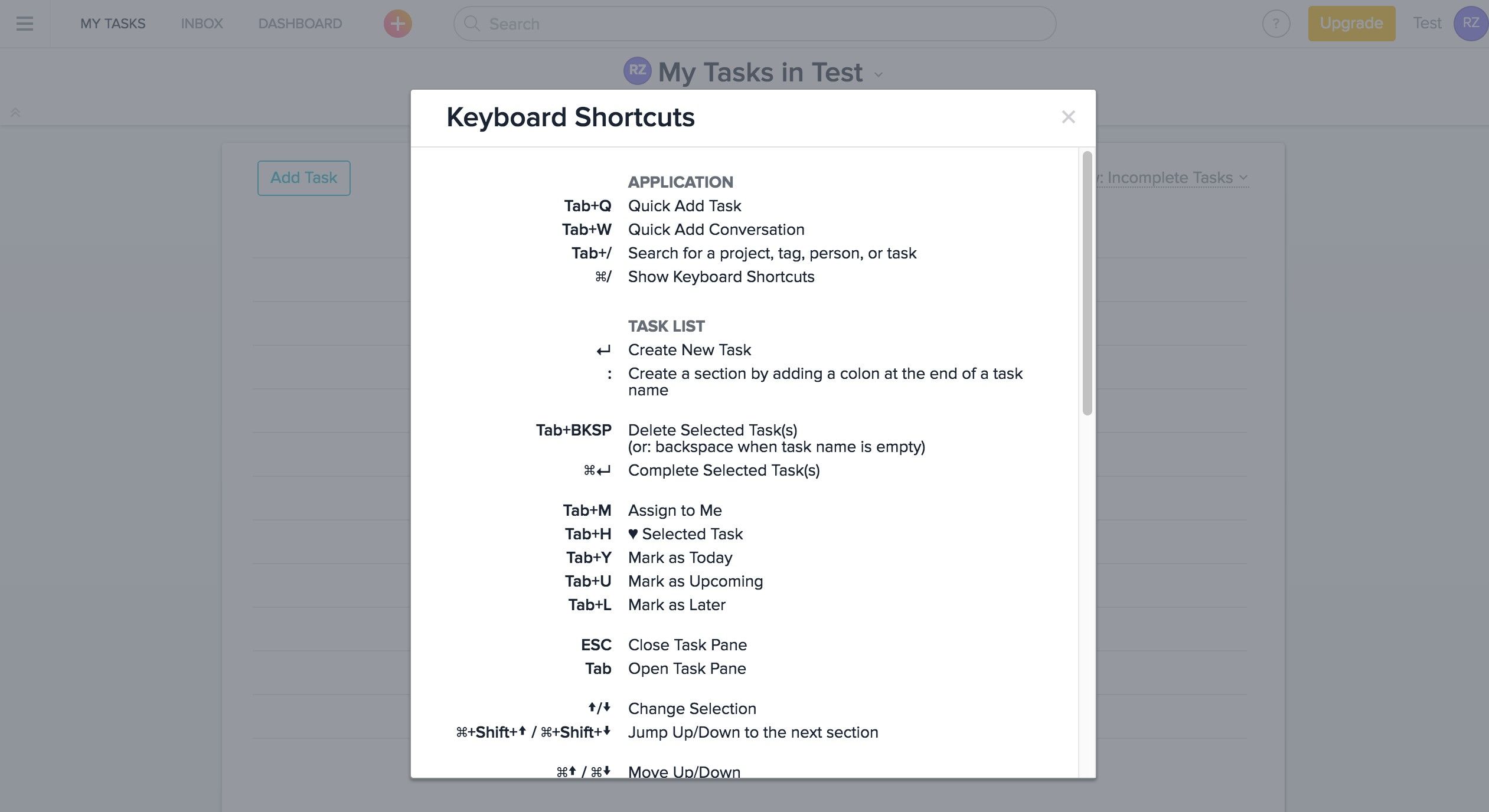
Asana is a web-based project management platform. It allows teams to track and manage work items. Asana has a rich set of keyboard shortcuts. These shortcuts reduce mouse usage and minimize repetitive actions.
© Asana, LLC., Fair Use.
Principle 7: Size and Space for Approach and Use
“Appropriate size and space is provided for approach, reach, manipulation, and use regardless of user's body size, posture, or mobility.”
For product designers, their focus is on form factors such as the size of and space involved with the product. As digital designers, our focus is less on form factors but more on what is on the screen. This is a shortsighted mindset because it is important to think outside of the screen and consider our users’ environment as well, especially as users view websites not only on desktops but also—increasingly—on mobile devices as well. As you can see, most of the guidelines for this principle apply more to product and environmental design. Nevertheless, we can still look at the principle and its guidelines so as to create a universal design website, one for both desktop and mobile devices.
Guidelines for Size and Space for Approach and Use
7a. Provide a clear line of sight to important elements for any seated or standing user.
7b. Make reach to all components comfortable for any seated or standing user.
7c. Accommodate variations in hand and grip size.
7d. Provide adequate space for the use of assistive devices or personal assistance.
Design Example: Consider the Target Area of your website when it is on mobile devices
On a desktop, a user interacts with a website via a small pointer on the screen. On a mobile device, a user interacts with a website using his or her index finger or thumb. A small target area can be a problem on mobile devices because it is more difficult to select with precision. According to an MIT Touch Lab study in 2003, the average size of a human adult index finger is 1.6 to 2 cm. Converting that, we have approximately 60–76 pixels on a digital screen. So, the next time you design for mobile, make sure your touch target areas take the human physical factors into consideration.

According to an MIT Touch Lab study in 2003, the average size of a human adult index finger is 1.6 to 2 cm. If we convert that to pixels, then it is approximately 60px to 76px on a digital screen. You can improve the accessibility of your product if you provide adequate target areas for your users.
© jéshoots, CC0
The Importance of Universal Design
The most important international work on accessibility is the Convention on the Rights of Persons with Disability (CRPD). We refer to it as the Convention by lawmakers and the disability community. It is the first major human rights treaty of the 21st century, and it protects the rights and dignity of persons with disabilities. It calls for the removal of environmental and attitudinal barriers in physical and digital spaces. The United Nations (U.N.) adopted the CRPD in 2007. As of July 2015, as many as 157 countries had ratified the Convention and 159 countries had signed it.
The Convention listed Universal Design as one of the general obligations to protect the rights of persons with disabilities. “To undertake or promote research and development of universally designed goods, services, equipment and facilities, as defined in article 2 of the present Convention, which should require the minimum possible adaptation and the least cost to meet the specific needs of a person with disabilities, to promote their availability and use, and to promote universal design in the development of standards and guidelines;”
— U.N. Convention on the Rights of Persons with Disabilities, Article 4, 2006
The Takeaway
Creating accessible products can be a challenging task. Sometimes, we as designers do not know where to start. Universal Design is a solid approach to design because the seven principles help us consider the needs of all users in general. Universal Design benefits everyone, not just the aging population or people with disability. The Principles of Universal Design is a great resource for us to use when we want to design accessible websites, ones which serve and cater to as many users as possible. These principles will help guide your design process. Thus, you should incorporate them into any project you do from the very beginning.
References & Where to Learn More
Hero Image: © Dan Zen, CC BY 2.0.
Course: Accessibility—How to Design for All
Text version of the Principles of Universal Design


