
Let’s examine a topic we often take for granted to understand what it’s really about. Doing so, you’ll be able to proceed with a broader appreciation of how users engage your designs.
The Overlooked, Misunderstood Nature of Accessibility
 © WhisperToMe, Public Domain
A design is only useful if it’s accessible to the user: any user, anywhere, anytime. We often mistake the concept of accessibility as involving people with disabilities. However, we’re all disabled in many contexts and circumstances. Accessibility is all about people. If you’ve ever broken a leg, you’ll know how difficult formerly simple tasks become. How about a power outage? One moment, you’re going about your business; the next, you’re plunged into darkness. Moving a couple of steps becomes risky! Whatever task we’d taken for granted suddenly has us negotiating barriers.
Mobile devices are a great example of dealing with users with accessibility issues. When using mobile phones, we’re on the go, doing other things, with our attention split several ways. With the pervasiveness of handheld smart-gadgets, we as designers need to embrace accessibility for all and in all contexts.
In many countries, designing for accessibility isn’t just morally correct; it’s also a legal obligation. Throughout the EU, legislation to prevent discrimination against disabled people exists; failing to comply with these laws could cost a company dearly. Compliance is cheaper, but it pays big dividends, too.
The good news is that there are standards for accessibility, and these are easy to understand. Better still, if we consider them at the start of the design process, we’ll find them easy to implement. Accessibility is simply a function of access. People with a visual impairment, for example, may not be able to read the text on your website. However, if you have properly formatted your text, they’ll be able to use screen reading software to hear your words.
Designing for accessibility takes some forethought. Examine your options in the planning phase and stay focused on accessibility throughout development. It’s easy to get caught up in the substance of your work and forget about this essential point. Keep it in mind, and test your designs often to be certain that your efforts are successful.
The Key Areas for Considering
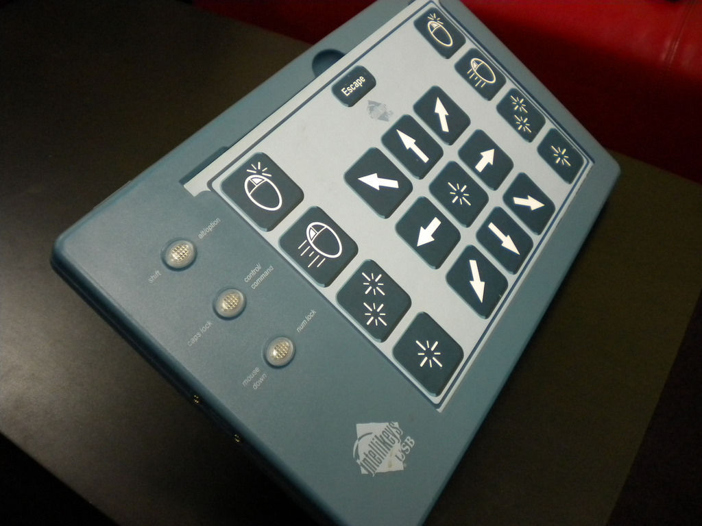 © Yahoo! Accessibility Lab, CC BY-SA 2.0
We are all, designers and users, different. Some of us have dyslexia; others have partial hearing loss, for instance. The areas of user needs we should consider for accessible design are:
Visual: Long-sightedness, blindness, color blindness, are all forms of visual disability you need to cater for in your design.
Motor/Mobility: This category doesn’t just extend to problems with the use of the hands and arms (which are very likely to cause problems with web accessibility), but also with other muscular or skeletal conditions. If, for example, your web design were to feature in a trade-show booth, you’d need to consider how someone in a wheelchair could access that booth, and turn around and exit it on completing the task.
Auditory: Auditory disabilities affect the hearing and come in varying degrees of severity, up to and including total deafness.
Seizures: Some individuals can be affected by light, motion, flickering, etc. on screen, thus triggering seizures. The most common issue in this category is photosensitive epilepsy.
Learning: It’s also important to remember that not all disabilities are physical. Learning and cognitive disabilities can also influence accessibility.
Now, think about yourself as a user. Have you ever noticed difficulties when driving and using your cell phone? How does it feel when you’re trying to multitask? Do you have automatic transmission to make it easier?
As users with handheld/mobile devices, we all face difficulties when we have to divide our attention. Happily, GPS systems speak to us, so we don’t have to take our eyes off the road, except for the odd glance to see how far ahead a turn is. Good GPS software designers are fully aware of what it’s like for motorist users and design to help, not hinder or distract.
Example: Arnold has an interview at 3 p.m. in a town he’s never been to, and he has to use a neighbor-friend’s car. His neighbor returns late. Unfortunately, a snowstorm has started, too. Worse, the car is low on gas, so Arnold will have to fill up on the way. So, the factors that are impeding Arnold constitute his disabilities as a user, which are:
Unfamiliarity with road
Running late
Snowstorm
Low fuel
Arnold has four handicaps slowing him down. He thinks about calling the interviewers. However, he decides against it and stays focused on driving. One thing that is going in Arnold’s favor, though, is his GPS. Its large screen format isn’t cluttered. A bright red arrow contrasting starkly with a light-green screen shows him his route at a glance with a minimum of text and images. He feels better when its voice tells him a gas station is near. After refuelling, he gets back on the road, passes Legoland, which his GPS shows as a large icon. His interviewer had mentioned Legoland as a landmark; they’re nearby. Arnold breathes a sigh of relief. Even with the snowstorm, he’s thereby 2:50 p.m.! The designers of his easy-to-use GPS deserve thanks.
Planning for Accessibility of a Website
 © Dennis311, CC BY 2.0
You can use many ways to make your website accessible. To get started, here are some simple tips that can help ensure that many people with disabilities can access your site easily:
If you use a CMS, choose one that supports accessibility standards. Drupal and WordPress, for example, support these. If you’re going to amend a template rather than create one for the theme, make certain that the theme was designed with accessibility in mind. It can save time, effort and money.
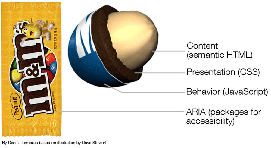
Use header tags to create headings in your text; ideally, ensure that you use CSS to make this consistent throughout the site. Try not to skip from one heading level to the next (e.g., H1 to H4, rather H1 to H2); this can confuse screen reader software. Users with more severe visual impairments may access your site using a refreshable Braille display or terminal, which depends on screen readers.
Use alt text on your images; if you use images to enhance content, then a screen reader will need to explain them— that’s what the alt text is for. However, if your image is purely for decoration and adds no other value (other than looking good), you should skip the alt text to avoid confusing someone having the site content read to him/her.
Have a link strategy. Screen readers sometimes stutter over links and stop on the first letter. That means it’s important not to have “click here” links scattered through the text. The best link descriptions have a text description before the link and then a unique name for the link. (E.g., “Read more about the Interaction Design Foundation, at their website.”) Consider offering a visual cue (such as a PDF icon) by links to make it clear what the link will deliver. Use underlines on links (they help color blind people distinguish links from text). Highlight menu links on mouseover to assist with locating the cursor.
Choose colors carefully; if in doubt, test your color schemes with some color-blind people. Color blindness is an incredibly common disability, and the wrong palette can make it difficult for a color-blind person to read your text or navigate your site. You also need to ensure that you provide high levels of contrast between text and background; the elderly, for example, can find it hard to see text unless the contrast is high.
Don’t refer just to the color of something when giving instructions; “click the red button” isn’t helpful to a color-blind person. “Click the circular button” is. Use shapes and forms to help guide users rather than relying on color alone.
Think about the design of forms. Screen readers can struggle with forms. Label fields, and use the tag to offer the description to a screen reader. Ensure that the Tab order on forms follows the visual order — it’s very easy for a screen reader to miss a field if this isn’t done. Make sure to assign an ARIA (Accessible Rich Internet Applications) required or not required role to each field, too. Screen readers don’t understand the asterisk, for mandatory fields, convention.
Avoid tables for layout. Screen readers can handle tables, but they start explaining how many columns and rows are present, which can be annoyingly distracting when the table is simply a layout technique. Keep tables for data presentation. Make certain to use the HTML scope attribute to explain relationships between cells, too.
Learn to use the proper HTML elements for lists and don’t put them on the same line as the text. This helps screen reading software to parse lists.
Put your mouse away, and see if your site works with a keyboard only. People with motion disabilities often find objects using trackpads. They may need a mouth stick or a single-switch input device; or, they may have to rely on their keyboard. Think about making it easy for people to skip through sections of content in this way, too… scrolling is a PITA without a mouse.
Familiarize yourself with ARIA (Accessible Rich Internet Applications) standards and learn to use them when necessary.
Consider the way you’re presenting dynamic content. Don’t auto-play video (which can play havoc with a screen reader). ARIA standards can help with overlays, popups, lightboxes, etc. If you’re using a slideshow, make certain to have alt text on all images and that users can navigate the show via the keyboard.
Validate your markup at the W3 standards website. Make sure that your HTML and CSS won’t conflict with assistive technologies. This also helps ensure that all browsers will read your code properly.
Avoid Flash. This hardly needs saying any more, given it’s no longer supported. If you still have Flash components on your website, remove and replace them with more accessible (and secure, light and modern) technology.
Offer transcriptions for audio files. Hearing-impaired users can’t use software to read voices… so, help them out and include a transcript.
Similarly, in video, offer captions for the hearing impaired.
Focus on readable content. The simpler the language, the easier it will be to read for learning-impaired users.
Technologies that Facilitate Accessibility Online
Much specialist technology is available for you to use to make your website a more accessible place. Some of the most common technology is listed below. In an ideal world, we designers would try to access this technology and test our sites with it to ensure site accessibility. We may understand that this isn’t always practicable, but it’s important to stay conscientious. Saving one user from having a bad experience is worth it.
Common Technologies Used to Facilitate Accessibility Online
Alternative web browsers
Braille for the web
Eye-tracking applications
Head wands
Mouth sticks
Screen magnifiers
Screen readers
The University of Minnesota-Duluth website provides a wealth of useful information regarding accessibility technology.
Accessibility Testing Tools
In addition to the W3 tools mentioned above, many different accessibility testing tools are available online. The following is a small selection of these:
WAVE—evaluates the overall level of accessibility for any given website.
Color Oracle— displays your site’s colors in a manner similar to how a user with color blindness would see the page.
Image Analyzer— examines website images and tests their compliance with accessibility standards.
Remember, users are people; no automated tools can beat testing your website for accessibility with real users. It’s also a great opportunity to conduct user research on a wider scale with those facing accessibility problems. Using the data can improve your website design for everyone, not just those facing certain challenges.
The Take Away
Designing with user accessibility in mind means envisioning all users as having needs that require attention. Although many users have physical and cognitive disabilities, all will be distracted at some point when accessing sites. Even so-called “fully able-bodied” users, sitting in quiet rooms with large monitors, will be hampered if the phone goes and they have to navigate with one hand.
Making accessible designs means planning and building in view of this. We have a variety of tips at our disposal, ranging from using header tags and alt text on images to having a link strategy. With careful consideration, we can determine what’s necessary to optimize accessibility, testing our designs on real users in the field.
Nobody’s perfect! Yet, by designing with everyone in mind in such an imperfect world, we’ll be another step closer to making better UXs.
Where To Learn More
Course: Accessibility - How to Design for All
Quesenbery, W. (2010). “Accessibility First – for a Better User Experience for All”. UX Matters.
Thurow, S. (2015).“Measuring Accessibility In the User Experience (UX) And The Searcher Experience”. Marketing Land.
Van Toll, T.J. (2014). “Mobile And Accessibility: Why You Should Care And What You Can Do About It”. Smashing Magazine.
Watson, L. (2012). “Accessibility is part of UX (it isn’t a swear word)”. No Mensa/blog.
Image
Hero Image: © Pixabay, CC0


