You may have heard of Occam’s Razor; did you know that you can apply it to web design? When you’ve got it in your “toolbox”, you’ll have an edge in the marketplace.
Occam’s Razor, put simply, states: “the simplest solution is almost always the best.” It’s a problem-solving principle arguing that simplicity is better than complexity. Named after 14th-century logician and theologian William of Ockham, this theory has been helping many great thinkers for centuries. Many industries swear by it.
How to Use in Design
In design, Occam’s Razor encourages us to eliminate unnecessary elements that would decrease a design’s efficiency. So, when two products or designs have the same function, Occam’s Razor recomends selecting the simpler. Therefore, when evaluating your designs, analyze each element and remove as many as possible, without compromising the overall function. This should ensure that you remain with elements you have minimized as much as possible but which still work perfectly
With the flexibility and power of the web and our design tools, it’s easy to get carried away. Designers can end up making very complicated sites or designs that may have a lot of functionality and information, but are difficult to use, build and maintain. One might think the site can do more, but it actually accomplishes less.
This is commonly an issue where companies feel the need to put everything they possibly could up on the website in the rare case that someone wants the information. In an increasingly competitive market, the pressure is on to get the message “out there”. What companies often ignore is that the overwhelming majority of the users will access about 20% of the content on the site (see the article on the Pareto principle; you’ll find the link at the bottom). Being ruthless about the value that a page or piece of content provides and removing anything unnecessary will make significantly stronger, more effective designs. It may be hard to weed out those unnecessary parts — you may say your business has no unnecessary parts; look harder.
For designers, using Occam’s Razor is all about careful thinking. It easier than you might fear. For instance, an editor-author who has a fiction career, but who also ghostwrites for clients, calls us. She tells us what she wants in her design:
Big handwritten font — autograph
Her photograph
Large-font mission statement
Contact information
Picture of the ranch where she works
Daily writing tip box.
Right away, we see we’ve got much to work into her design. Our author insists on an elaborate, decorative landing page. She loves her ranch and believes other writers will love it, too, so she wants a large photo of it.
We have to decide how to prioritize these elements. So, let’s see what’s necessary:
Author’s photograph
Signature/autograph—her branding
Mission statement.
These three parts embody her service. We want to present a famous author who can help other writers. However, we can move the unnecessary components to other pages using link buttons:
Daily writing tips
Contact Information
Picture of ranch.
We can show the ranch with her contact information, and we can perhaps design a daily writing tip as a pop-up.
The phone goes; our author loves what we’ve done with the design. However, she wants her ranch to feature on the landing page. We say: “We’ll see what we can do.”
Using Occam’s Razor, we see that we can fade the ranch into the background so that the images are there, but don’t distract. We want to cut out “noise”, which would distract/confuse users. So, we remove everything that would have got in the way. Our author friend is an enthusiastic person, but her enthusiasm gets the better of her. She’s scared of writers not contacting her. That’s the problem: she’s trying to push all her goodies onto the landing page, not appreciating that the flood of information will make user’s go: “What?” Instead of showing her good name and service in the best way, she got desperate and tried to squeeze ideas in, making a maze — walls, pictures, text, and spaces sprawling everywhere. Users coming to her site want help; they don’t want to have to work out how she can help them. Worse, it would tell them that this person can’t get ideas across properly. Why should they want her to write for them?
Occam’s Razor cuts down the walls that keep a message from getting through. Also, this rule speaks to the age-old saying that “A design isn’t finished when there is nothing more to add, but when there is nothing left to take away.” Design simplicity is elegant, sophisticated and much more effective than the complex decorative style that is so prevalent on the web these days.
Simplicity shows care, understanding and effort

Author/Copyright holder: 62 Models. Copyright terms and licence: Fair Use
It’s easy to think that the words “simple” and “easy” might show a lack of sophistication, or that working to produce simple designs means you don’t have to work very much. You might worry that a client will think that it took you 10 minutes to design something that he/she could have made.
Let’s do a reality check. Our author-ghostwriter has noticed the high number of hits her site is getting. She certainly doesn’t think that we’ve been lazy; she knows that we worked magic for her. The proof is in the number of page views — users have found it easy to navigate. Instead of shutting off on the landing page after squinting in confusion, many went on to learn more. The design’s simplicity, showing images and text in the best way (remember the other design principles here, such as the golden ratio), puts them at ease. They have a good user experience; most see her site’s simple, comprehensive design reflecting her skill as a no-nonsense writer who’ll work the same magic for them.
With this in mind, we can pat ourselves on the back for having done it for her. However, let’s look at what we did. We:
Asked how many elements the landing page needed, including choices or decisions our friend wanted users to make. She wanted them to click on her daily writing tip box so they could see previous days’ tips. We linked this elsewhere.
Asked what she wanted her users to do the most. She wanted people contacting her for help writing books. So, we highlighted the contact box, but we added one that took users to another page, where they could read all about her services first. This information was far more detailed than the simple description we put on her landing page: “Making manuscripts move into book and movie deals.”
Asked if a user, regardless of background, could get confused/frustrated. Her initial concept was confusing. We imagined approaching the design as ordinary people. Our friend wants to help other writers; well, if an 88 year-old author is looking for someone to clean up his manuscript, he might have had trouble with her design.
In summary, we translated what the writer wanted into a website that was easy to understand and use for the target users. Keeping in mind Occam’s razor, we focused on the key elements and keeping the interface simple.
The Internet is saturated with intricate and exquisitely complex designs. Many flash at us, offering all sorts of benefits, their designers not aware that it’s distracting, commonplace, and cheap-looking, Simplicity is refreshing.
Keeping Accessibility in Mind
Keeping our designs simple means that the websites we build are accessible. Creating a simple layout, with carefully placed images (remember the Rule of Thirds?) and simple, to-the-point, pithy text will keep users on the page.
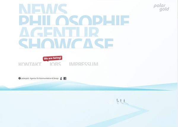
Author/Copyright holder: Polar Gold. Copyright terms and licence: Fair Use
What gets them navigating to the call for action, such as the shopping cart depends on how you guide them. Did you:
Shave off the unnecessary bits?
Tone down anything loud or distracting?
Use plain language?
Would my 80 year-old neighbor understand what the website is about?
Would my grandmother be able to buy what I offer through my site and feel good?
Or, you can always make a “reality check”:
And above all, will my users understand the website’s added value and how it targets their needs and desires?
The Take Away
Occam’s Razor is a problem-solving principle devised in the 14th Century that states that simplicity is better than complexity. It has many applications, running from detective work to deductive reasoning about the cosmos.
We UX designers find that it empowers us to aim past the tendency to over-think our designs. It’s easy to focus on a cool idea, without standing back and asking if it’s essential to what we want to achieve. Occam’s Razor lets us approach and plan a design carefully. Our tendency is to keep adding what seem like great elements, sometimes worrying that if we don’t get all we want in one place, we’ll fail by a) weakening the message, or b) looking lazy.
Think of Apple. Steve Jobs’ philosophy embraced Occam’s Razor. His iPad and iPhone, for example, are the proof: one button on the front of a seamless, self-contained device.
By asking ourselves a few questions about our design and our users’ expectations, and reacting accordingly, shaving off the clutter or moving less important bits to other pages, we’ll serve our users and ourselves best. Remember, your design isn’t ready until you’ve found that you can’t take anything else out. This isn’t like repacking a suitcase to match a weight limit; it’s about deconstructing your design. When you’ve got your piece down to its bare essentials, that economy will pay dividends. By getting in ahead of your user’s eye, you can judge. Their page views and clicks will tell you if you’ve made the right choices.
Okay, so you’ve made it all the way here but you’re thinking: “I live by the principle of the simplest solution is always the best”. Where’s my take away? Now that you have a name for this principle, it is yet another advocacy tool to user with your client, boss, colleague. Whenever they insist about adding more functionalities, more elements, more and more, remind them of the Occam’s Razor.
References & Where to Learn More
Duvall, A. (2015). “Taking the Occam Razor Approach to Design.” Speckyboy Design Magazine.
McConnell, C. (2010). “Occam’s Razor: A Great Principle For Designers.” Web Designer Depot.
Lant, M. (2010). “Occam’s Razor and the Art of Software Design”. Private Blog.
Read more about The Pareto Principle and Your User Experience Work