A red herring is something that misleads or distracts from a relevant or important issue. It may be either a logical fallacy or a literary device that leads readers or audiences towards a false conclusion. A red herring might be intentionally used, such as in mystery fiction or as part of a rhetorical strategies (e.g. in politics), or it could be inadvertently used during argumentation.
The origin of the expression is not known. Conventional wisdom has long supposed it to be the use of a kipper (a strong-smelling smoked fish) to train hounds to follow a scent, or to divert them from the correct route when hunting…
- Wikipedia
Over the years, a number of approaches to taking visual analytics “mainstream” have been tried. This is a common exercise in the ongoing effort to find viable retail use cases for heavy-duty technology, and some are attempts to use legitimate and sophisticated techniques from statistical, scientific, or engineering applications and apply them to more pedestrian purposes. You are likely familiar with the general struggle to tame technical complexity, including the endless folly of companies trying to force available technology to solve non-existent problems. Tech elites have historically overestimated consumers’ attention spans and tolerance for tinkering with fussy products. Big data, gamification, predictive, and storytelling are recent examples of this phenomenon applied to visual analytic consumption, with each movement promising breakthroughs in understanding and utility. Although these and other memes bring relevant benefits at the feature level, as comprehensive strategies they do little to address the needs of sustainable growth in visual analytic consumption. I’ve grouped these strategic dead ends below, with descriptions of what each offers, and why each is problematic, over-used, or over-estimated in its usefulness or future promise.
7.0.1 Decoration & Skeuomorphism
A folly extending well beyond the field of visual analytics, this category is well documented and has come to be known as skeuomorphism, or skeuo. I group it here with the more general practice of adding irrelevant decoration to analytic displays in lame attempts to increase their appeal. In the 1980s, drunk with newly-available formatting options, amateur “desktop publishers” filled their documents with multiple bad fonts, odd layouts, and cheap stylistic treatments. A similar orgy happened with visual analytics in the 2000s, with the advent of more powerful screen rendering capabilities and authoring tools. When the dust settled, everyone realized that the graphic design principles in place before desktop publishing were, for the most part, still relevant.
More recently, egged on by default product settings and examples in authoring tools from Microsoft, Xcelsius, and others, BI designers filled computer screens with reflective, three-dimensional, image-laden, animated, and interactive dashboards and reports. The intent was to attract attention, create the appearance of a usable interface, and “make information beautiful”. The approach leveraged new high-fidelity rendering and display capabilities to make digital product screen interfaces look and act, quite specifically, like real-world physical materials. Although the approach has a long history in digital user interface design tracing back to the metaphor-based model of the original Macintosh, and in many cases was used to good effect, it became irresistible and over-used with the new effects possible.
Even Apple, in a rare case of straying from its heritage of defining the avant-garde, took the bait and filled the original iOS with faux wood and metal surfaces and bulbous, glassy buttons. Eventually, cooler heads prevailed and the software’s appearance became more aligned with their minimalist hardware design style. The currently dominant visual design style is called “Flat Design”, which largely abandons stylistic reference to analog physical objects. Originally identified and popularized with Microsoft’s Metro UX design language for mobile devices, flat design retains selected behaviors from the physical world like sliding, overlapping, bumping, etc. as needed to support device status and navigation, but rejects highly literal faux surface effects, 3D object/spatial simulations, and clunky behavior replications of physical things.
For visual analytic products using skeuo, the marketing code for the perceived benefit is “stunning”, as in “stunning visualization”. I always found this practice in itself stunning – as in fact the definition of “stun” is, literally:
to deprive of consciousness or strength by or as if by a blow, fall, etc.
to astonish; astound; amaze.
to shock; overwhelm.
to daze or bewilder by noise.
[dictionary.com]
I can assure you that as a designer of visual analytic solutions for workers, I wish none of these results for my users.
Another marketing mainstay for visual analytics is “sexy”. Apparently many visual analytic marketers believe workers and their employers seek to be sexually aroused, mesmerized, and bewildered by looking at charts. I refer to design examples that use these tactics as product pornography. They provide meaningless stimulation that quickly becomes banal and boring. They reflect the industry’s positioning of visual analytics as a software UI fashion statement, an approach that helps the paying customer Choosers appear to have delivered a dramatically new and improved solution, but at the expense of their real users who then bear the burden of poor day-to-day usability and performance. Providing software for workers is like providing sports equipment to competitive athletes. Offering skeuo visual analytic solutions is like asking sprinters to race in high heels.

Figure 7.1: Routine typography is not intended to be rendered this way, and neither are data plots.
 Author/Copyright holder: Stephen Few. Copyright terms and licence: All rights reserved.
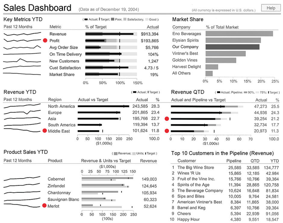
Figure 7.2: Level 1, Few’s original dashboard.
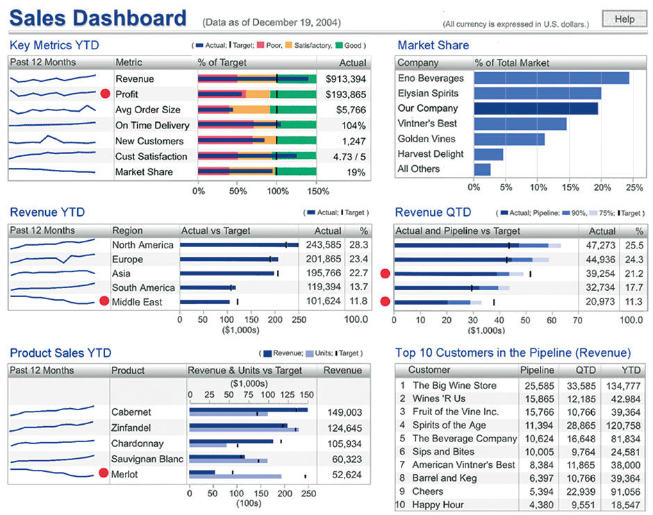
To assess my intuition about how BOBJ customers felt about stylistic treatments in visual analytic displays, I created a simple test, and conducted it with a user conference focus group in 2005. With an admittedly limited set of 15-20 customer representatives, I asked them to choose the most effective visual style from among multiple treatments applied to the same underlying dashboard layout and content. Most participants were responsible for the design and management of dashboards for internal consumption at their companies. As a source design I used Stephen Few’s sales dashboard from the original version of his book Information Dashboard Design. Using his design as the most minimal option, I created four modified versions, each with increasingly elaborate visual treatments such as frames, colors, backgrounds, and gradations.
 Author/Copyright holder: Stephen Few. Copyright terms and licence: All rights reserved.
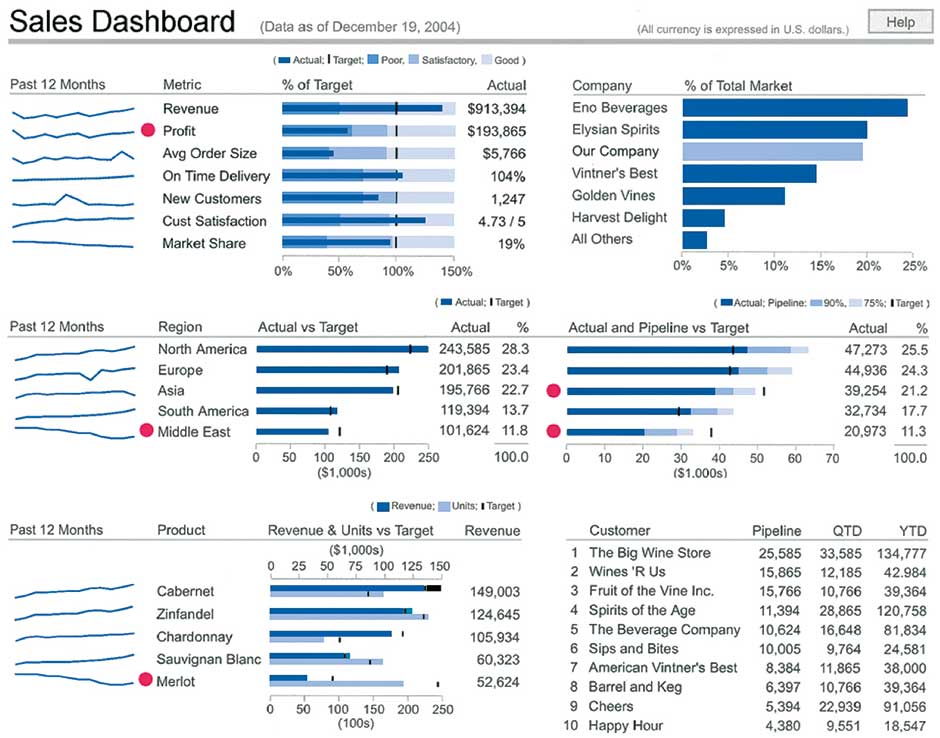
Figure 7.3: Level 2, Blue Bars, Sparklines, & Subtitles.
 Author/Copyright holder: Stephen Few. Copyright terms and licence: All rights reserved.
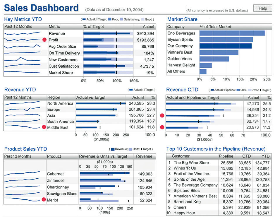
Figure 7.4: Level 3 (Level 2 plus applied blue bars & titles, chart frames, alternate row shadings).
 Author/Copyright holder: Stephen Few. Copyright terms and licence: All rights reserved.
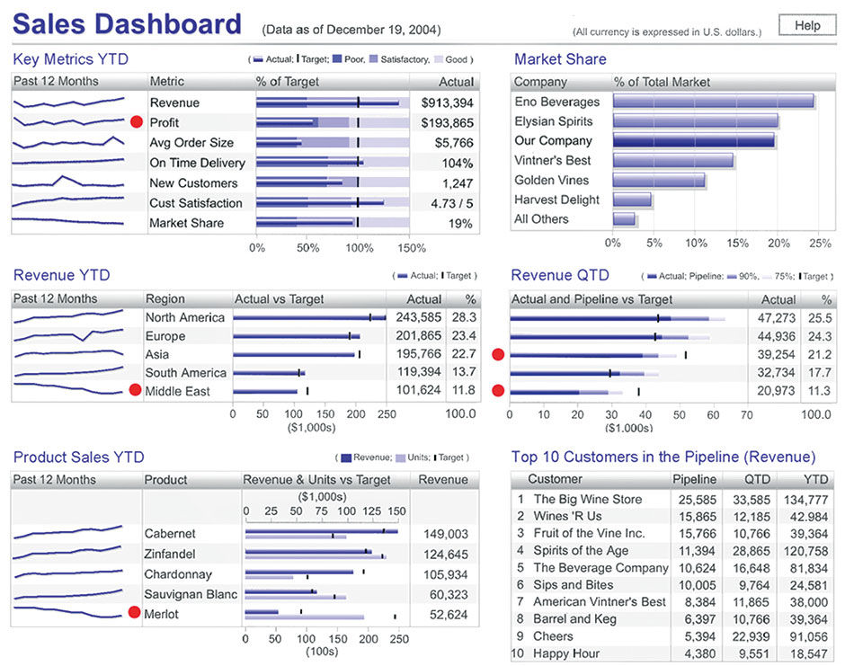
Figure 7.5: Level 4a (Level 3 plus gray background and gradations added to bars).
 Author/Copyright holder: Stephen Few. Copyright terms and licence: All rights reserved.
Figure 7.6: Level 4b (Level 3 plus red/yellow/green status levels in Key Metrics).
Most participants recognized and respected the Few design approach, but preferred Levels 2 and 3 by an overwhelming margin, primarily because of the use of blue for the bars. Few also acknowledges that such restrained use of color for data plots can be effective. Although they admitted that the red indicator dots in the Level 1 design were more attention-getting, they felt that some sort of color was needed in order to attract interest and attention in their user base, and secondarily that the inclusion of borders around each content element helped to distinguish them visually from each other. All agreed that the Red/Yellow/Green status backgrounds were a distraction, overwhelming all else on the screen with their Rastafarian flavor.
Many commented that their users wanted to interact with the content – to drill into more detail, see what was in the Others categories, or enlarge a chart for more detail. Some stated that adding color and some subtle dimensional shading served to move their users to try and interact with the content. By comparison, the Few example did not, in their minds, invite users to do this.
From speaking with Few on this topic, I know that he did not intend this dashboard, or others in general, to be highly interactive. He restricts interactivity because a dashboard, as he defines it, is exclusively used to rapidly monitor what’s going on, which benefits from a static design. My sense of his approach is that it’s fine to provide links from the summary KPI displays in the dashboard to other more detailed reports, or to provide a dedicated exploratory experience with another tool, also perhaps connected to the dashboard in some way to pass data and context between tools. My interpretation of what the participants were expressing was the desire in their customer base to get more detailed or personalized content from the display, but without the burden of enduring a “media break”, or an abrupt transition to another media form factor with a different URL, appearance, and/or interaction protocol. Their users wanted to do more within the same space, and that skeuomorphic styling was somehow the key to convey this functionality, even if in trivial amounts, when available.
My theory for this perception is that, historically, most information has been conveyed to us in static printed form, and we have evolved and refined the graphic design, editing, and printing craft into practical forms and conventions that proceeded in a steady, predictable trajectory over the centuries. The refined technology and art of visual communication was thus associated with static, printed artifacts of increasingly exquisite design and reproduction capabilities. As soon as the screen rendering enabled it, software application user interfaces adopted skeuomorphic metaphors like buttons, windows, and desktop paraphernalia to reflect the interactive nature of the digital display and the similarities of working with digital and physical documents. Doing this leveraged the legacy logic and procedures as a learning accelerator for users. Machines were the only inanimate things in the world with affordances for productive input/output interaction through control interfaces. Because computers were just a more sophisticated machine, they became easier to understand if their virtual controls looked and behaved similarly to their mechanical ones.
A bigger challenge came when the authored content itself became interactive, with the advent of interactive multimedia and then the Web. In order to get users to realize that they could navigate within digital documents, different styling cues were needed to get this very new idea across. I remember when Apple Evangelist Hugh Dubberly visited RISD with Hypercard, a pioneering interactive document authoring application. I didn’t understand its relevance at the time. The visuals were so crude and the uses so limited I could see no practical applications. At the time, I and most of my classmates were obsessed with pushing the envelope of meaning and communication with elaborate typography and imagery, not with enabling people to wander around in monochrome, bitmapped, non-linear documents, called “Stacks”. For us at the time, computers were a tool for making physical things, not a medium unto themselves. The idea of a text-embedded hyperlink, and that it could be clicked to magically “go” to another page or entity, was really new and foreign.
When digital content consumption began to grow, designers continued the use of the mechanical button and other skeuo metaphors for the styling of switches for enacting commands and navigation in consumption-oriented user interfaces. In a classic example of an iconic or indexical signifier being replaced by a symbolic convention, eventually, it was the Web’s blue underlined hyperlink standard that weaned users off the crutch of having user interface switches styled as their similar physical counterparts. HTML links could be text-based for fast downloading, were easily authored with html markup, and could be embedded within other text passages for enhanced context. Because web hyperlinks had no corresponding function in the real world, they were free to be styled in a new way, as there were no preceding referents in the world for designers to make them “look like”. Designers still added hyperlinks to graphic images of buttons, etc. in html pages, but with the advent of content-sensitive browser and display feedback like multiple mouse states, tooltips, and mouse-over content state changes, interactive content could communicate its nature to the user in a dynamic, on-demand fashion, instead of all at once and at all times. As users learned that through experimentation they could discover how something worked, the design cues for how content could be operated and manipulated – a product’s affordances – could be made ever more subtle, allowing more space and attention to be dedicated to content itself versus to the mechanisms for manipulating the content.
Separately from the urge to render quantitative data plots in faux 3D, as if they had their own volume or mass, the urge to style them as mechanical buttons when they eventually became interactive links became irresistible. With these two forces at play, and with no technical display barriers to prevent it, it’s no wonder that pies, bars, and lines became festooned with gradations and drop shadows as if to say “I’m alive, click on me!”, as well as “I’ve converted abstract numbers into something physical with measurable size and weight”, despite the associated visual clutter and distortions these treatments introduced. Software vendors began to feature such styles and choose them as default settings within products.
One conclusion to draw from this is that, to get a sale, these software vendors needed to distract buyers from known product shortcomings, such as poor performance and complex setup and provisioning tasks. Plus, because many numerical displays – and news in general – present predominantly bad tidings, many content creators themselves perhaps seek to distract their management from the often-unpleasant truth. As Wurman states in his book Information Anxiety, most people seek out news from the outside world for hints about what could go wrong or do them harm, resulting in the well-known negativity of the media in general. One way to make bad performance news look better is to sugarcoat the pill, to make it “look” better with a more friendly graphic “skin”.
For sales teams at large enterprise software vendors, visual analytics provide a colorful respite in sales demos from the hundreds of thousands of dry workflow screens making up the majority of an enterprise software suite experience. Perhaps the requirements to “stun” and “arouse” are to keep the customer awake through the sales pitch. Regardless, at the end of the day the entire analytics industry is founded upon the promise of securing accurate quantitative data about important things. At some point the products need to do this, and BtF is eventually needed for success. The recent round of distracting mannerist abuse was an exercise in the evolution of the field. Lacking productive ways to differentiate and improve their products, vendors resorted to adding irrelevant decoration and special effects.
It’s not necessarily my intention to shame people into being more honest and accurate presenters of quantitative data, although it’s interesting that Edward Tufte began his career as a political scientist with an eye towards pointing out how statistics and visualizations can be honestly or dishonestly misleading. I’m also not trying to preach to software sales forces, as in fact it was due to their difficult sausage-making efforts that I and my colleagues received our salaries and bonuses. Rather, I simply must assume that there is a large and legitimate market for factual, transparent, unbiased, and practical visual analytic communication to serve the pursuit of rational conclusions. While there is a role for pleasure and seduction in making people comfortable and confident while thinking with numbers, these aspects of the practice quickly diminish in value with serious, day to day utilitarian use, and when misused can be detrimental and inappropriate.
 Author/Copyright holder: SAP AG. Copyright terms and licence: All rights reserved.
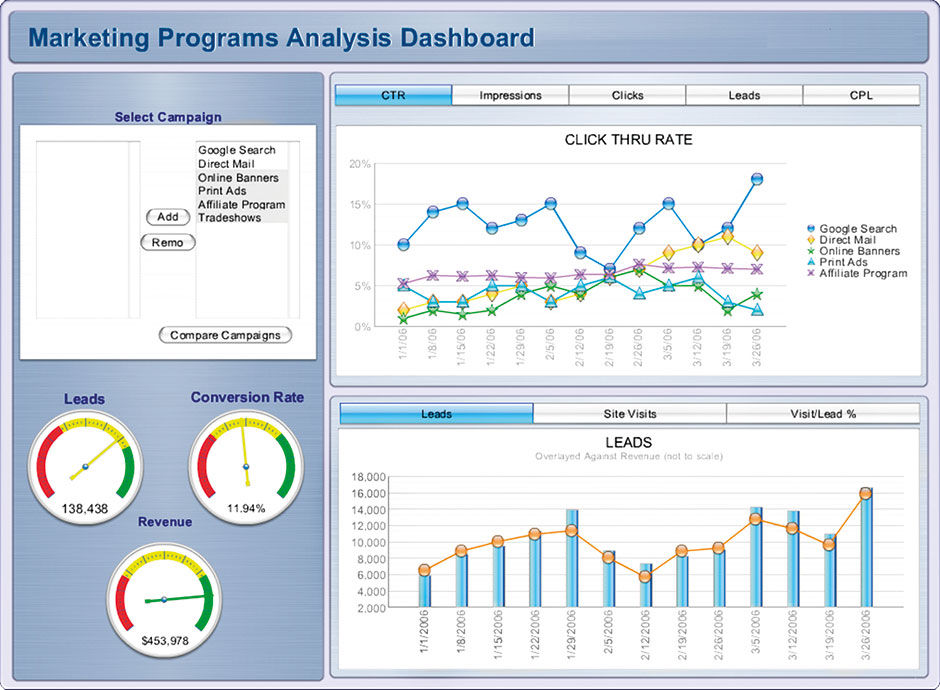
Figure 7.7: Marketing dashboard.
As already noted, the science of semiotics groups all communication into three categories according to intent:
Informative: To convey facts
Persuasive: To influence beliefs
Poetic: To entertain or inspire
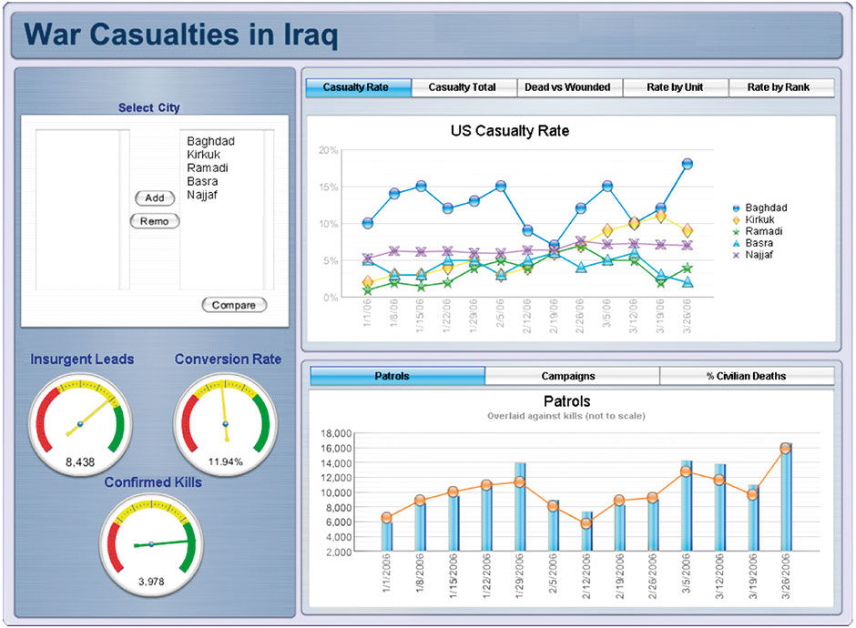
While most or all communication is in fact a blend of these intents, visual analysis is perhaps the purest imaginable form of the Informative intent. Per Marshal Mcluhan’s The Medium is the Message, communication’s form inherently impacts the interpretation of, and is inseparable from, it’s content. Visual styling intended to elicit an emotional response can only detract from any attempt to convey information in a neutral, unbiased form. For any informative communication vehicle to perform well, it needs a format stripped of unnecessary persuasive and poetic aspects — to convey facts in a neutral format. Visual analytics with bright, happy themes, for example, are not always appropriate. The dashboard in Figure 7.7 uses a previous default rendering style from Xcelsius. This visual style, a copy of Apple’s OSX design language — called “Gel” — with line charts reminiscent of Mardi Gras beads, might seem appropriate for the constantly upbeat realm of product marketing. With a different dashboard topic, such as that of Figure 7.8, such jovial styling is inappropriate.
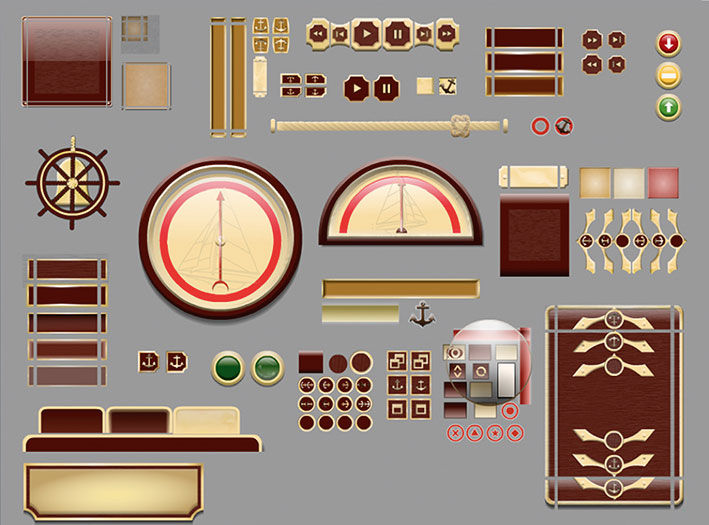
When a visual analytic display is used to convey facts representing good news or bad, it needs a neutral presentation for the content of the facts themselves to convey their status and sentiment. The most, well, stunning example I know of skeuo applied to visual analytics is the “Admiral” theme from Xcelsius. I discovered Admiral in 2011 when our UX design team in Shanghai, having been asked to spend time updating some of the Xcelsius style themes, asked for my support in their argument to discontinue several them. The Admiral was one, and it was absolutely ridiculous.
Themes, as used in Powerpoint for example, are pre-configured styling templates with the complete set of visual authoring elements rendered so that all appear in the same style. Xcelsius provides a library of visual analytic components such as buttons, text fields, chart types, and borders that designers can assemble into pre-styled dashboards. The Admiral used a kitschy antique nautical theme with faux wood and brass hardware styling, including an input dial styled like a ship’s wheel. Users could spin the wheel with their cursor to change variables in the dashboard and see the gauges react. The rationale was that this theme would appeal to rich CEOs who tended to own yachts. Although we convinced management to drop this and some other themes, the fact that such nonsense was ever put into a serious business product indicates the level of disrespect and misunderstanding at the time for the legitimate challenges of visual analytic authoring and consumption.
 Author/Copyright holder: SAP AG. Copyright terms and licence: All rights reserved.
Figure 7.8: War casualty dashboard with hypothetical data.
Author/Copyright holder: SAP AG. Copyright terms and licence: All rights reserved.
Figure 7.9, 7.10: The Admiral Theme.
Author/Copyright holder: Steve Morgan. Copyright terms and licence: CC BY-NC-SA 3.0
Figure 7.11: Screen from Magic Cap.
At the end of the day, the showmanship-versus-minimalist approach to visual analytics exemplifies the fundamental dichotomy in all design practice between the designer as self-expressing creator/celebrity versus the designer as the silent facilitator of better human outcomes. There is always a role for both, but the frontier of today’s visual analytic challenges demands the latter.
Having just vilified the skeuo design approach, I still recognize two viable cases when a skeuo design approach can work. The first relates to the power of metaphor in making the unfamiliar familiar. For people learning how to use an unfamiliar visual user interface for input/output operations, it helps to have the user interface look and act like something similar in the real world that the user already understands. This works fine up to the point where 1) Users learn the user interface and no longer need the metaphor as a crutch, thus rendering the metaphorical implements unnecessary, and/or 2) The effort of maintaining the metaphor’s consistency and integrity hijacks the product design direction away from better but perhaps more abstract user interface solutions – creating what I call a restrictive metaphor. General Magic’s Magic Cap user interface from the early 1990s is perhaps the most graphic example of metaphor gone wild, where users literally navigated virtual rooms and streets to open apps and find things.
The skeuomorphic approach for charts predates its use in software, as Tufte shows with his historical examples. The common tactic is to render the plots of two-dimensional data, such as pie charts or bar charts, to appear as faux three-dimensional objects, using techniques such as adding perspective views of bar facets or rendering a pie to appear dome-shaped, hovering over the screen surface and casting a shadow. The metaphorical connection is that these plots represent a real quantity of something – sales, people, houses – and that most quantities of something have mass and volume and occupy a physical space. So, what better way to teach and remind someone that a pie chart depicts real quantities of water that exist somewhere else than to make the pie chart appear to have volume and form just like the water it represents? This communicates the essence of the pie chart and differentiates it from adjacent screen elements not connected to some distant pile of matter.
While there is nothing wrong in theory with this rationale, the effect quickly wears off, and the resulting negative effects of distortion and distraction, as well documented by Tufte and Few, far surpass any semantic or usability value. Most people know what charts are, and if they don’t, then swollen or extruded data plots won’t help them. While in a way these approaches are an attempt to make numbers more concrete, by styling them and the controls around them like more familiar physical things, what fails is that the metaphors used are too literal. They over-emphasize something that most users already understand. They become restrictive.
While Skeuo was relevant for introducing unfamiliar software interaction paradigms to the world, general UI literacy and the overall improvement of product UX design and execution quality have made it unnecessary. This was confirmed for me when in 2010 a $3.99 credit card charge revealed that my three-year-old son had, on his own, found, bought, and installed an iPad game. Literacy of basic software usage conventions is now commonplace for most mass-market applications. While ease of use can always improve, today’s product battles are fought over access to the best content, functionality, and overall service value than over who is the first to provide a baseline-functional UX. The popular notion of a “retail-grade UX” is testament to the fact that the desired result is no longer an elusive mystery, but rather table stakes. We need not keep reminding users that software is interactive and provides digital versions of physical stuff. They get it.
In fact, when metaphors are used in software products today, they often refer to other software products, or at least other types of communication. If you are a UX designer, how many times have you been asked to make your design look or act like an Apple or Google product? Software is now so prevalent that it is becoming self-referential. Flat design, in fact, is a reference to conventional forms of print communication design, only embedded with magic powers to edit, communicate, and make stuff happen. This is the conclusion arrived at by UX design visionary Brett Victor in his influential Magic Ink essay.
Skeuo was appealing to visual analytic software providers because it was a promising way to solve the old conundrum of how to make numbers more exciting so that people would pay attention to them, use them, and pay money to get them. Having numerical displays bounce around with shiny surfaces in front of gorgeous photographs seemed like a fault-free shortcut to creating the illusion of legitimate value and progress. When quickly shown in demo format, the hidden, trivial, dead-end navigation paths and data filters appeared engaging, but became a nightmare for real-world designers to replicate, and for users to decipher. Few openly thanked these software vendors for providing so many obviously bad examples to use in explaining and contrasting with his alternative approach.
7.0.2 3D
The next dead end, that of showing quantitative data as 3D spatial renderings, is related to the first but with a different goal. Full 3D displays go beyond the trivial faux perspective and drop-shadows of skeuo to legitimately render data with 3D plots, sometimes in a navigable virtual environment. I say legitimate because 3D displays and environments are tremendously useful for the virtual inspection and exploration of many things, such as topography, physical assemblies and products, and architectural space. They are also among the few ways to visualize otherwise formless or abstract concepts like molecules or complex mathematics. In some cases they have value in visualizing complex multidimensional data, but only in the hands of experts skilled at their interpretation. They are overkill or downright annoying and misleading in the effort to make numbers more accessible to regular people.
As a consultant in the 1990s I worked on a project where the CEO was demanding a display that allowed everyday sales people to “fly through” a virtual world of sales data. Even his own product managers were rolling their eyes at this fantasy. More recently, I redesigned a global sales dashboard that had forced users to spin a two-inch globe with their cursor to select and view sales from a handful of cities around the globe. Each city was marked with a tiny symbol resembling a mushroom cloud. While in theory a quite accurate and intuitive way for users to locate and select a city on the earth, it was difficult and annoying for users to do, and an entirely inappropriate metaphorical exercise. The users of this product did not need to be repeatedly reminded that Moscow is on the opposite side of the earth from San Francisco. The producers of this dashboard were more interested in showing off the ability to embed a 3D viewer than in addressing any user need.
Few goes into detail about the unnecessary pitfalls of occlusion, or overlapping, introduced in any 3D presentation. Again, if we adopt physical-world metaphors for purposes that are not strictly bound to use them, we bring along the negative aspects of the metaphor as well as the positive. In the case of real and virtual 3D physical environments, opaque things literally get in the way of others. We cannot see behind them without moving them or changing our viewpoint. Despite the fact that we have evolved to exist in a natural world that behaves this way, it is an annoying drawback to endure in software if it’s not necessary. A fundamental benefit of communicating with two dimensional surfaces, which indicates a fundamental challenge of graphic design, is that it takes stuff that otherwise would be piled on top of and in front of each other, and lays it out nicely in order, so it can all be seen and focused upon in isolation. The “exploded diagram” format, familiar from technical journals and manuals of multi-part product assemblies, is an effective but limited technique to combat occlusion, and x-ray vision or making objects semi-transparent are even more limiting. They can help, but without the most sophisticated control and display affordances, will eventually turn the display into a soup of indistinguishable layers.
2D displays sacrifice a dimension of spatial orientation and expression in favor of a clear view of what is present. Translating 3D information to 2D presentations is an essential task of cartographers, and it is no coincidence that this was in fact Jacques Bertin’s original expertise. With a long tradition of skill and expertise, cartography has developed useful techniques for simulating the third dimension of geographic space using flat, graphic symbology. We now have the ability to collect, store, and display non-spatial information for analysis using the metaphor of 3+ dimensions, but our techniques for visualizing these data structures are still primitive and impractical. 2D map innovations have clarified landscapes by providing a practical, portable, synthetic replica of them, and now 2D visual analytics can provide the same benefit for multi-dimensional data.
In the end the user wants to get their question answered, not be mesmerized by how numbers can be made to look like objects. I liken it to when the quadrophonic audio standard was briefly championed in the 1970s. Two-channel stereo sound had proven so preferable to the previous mono “Hi-Fi” systems that the industry tried another leap by expanding stereo’s two channels of sound to four. In the end, the experiential impact was negligible while the production cost, complexity, and the consumer having to buy four loudspeakers versus two – despite the natural appeal to the system vendors – were just not worth it.
I’m not completely discounting the future potential of abstract or even numerical 3D displays or environments being good for something, but not now and not for popularizing numbers.
7.0.3 Radial Symmetry
The third dead end is the inappropriate use of radial display forms. This one, like 3D, is partly a mis-metaphor and partly the inappropriate use of a legitimate technique. As with 3D and skeuo, Few has made it a personal crusade of sorts to convince the world of the inferiority of pie charts and almost all round chart types. It’s a hard argument because the format is entrenched and popular, while the drawbacks are subtle and elusive. It’s hard to improve on Few’s detailed arguments, so I’ll summarize them and add some personal perspective.
Radial forms – typically circles – can plot three things: Location on the perimeter, distance from the center, and the relative angles formed by multiple radii – lines drawn from the perimeter to the center point. Pie charts leverage the familiar metaphor of the most common way of dividing a circular shaped pie, cake, or in France the “camembert”, in reference to the round Norman cheese. This makes perfect sense, and people easily understand what is being shown in a pie chart, namely a singular, homogenous whole of something relevant being divided into named parts of differing size. As any parent dividing a pizza or cake among kids will acknowledge, we are quite keen at judging size differences among such pieces. The pie chart is an example of a valid geometrical method of dividing space that relates well to everyday life, and thus serves as an immediate way to communicate division of a whole. It represents a nifty way to render a higher-fidelity one-dimensional scale by curving it into a circle so that it fits neatly into a square presentation space.
A one-dimensional scale draws a line and subdivides it with points so as to split it into two or more lengths that combine to equal the whole. A ruler, subdivided into centimeters and millimeters equal to its length, is a good example. If you take a ten-inch string on a piece of paper and 1) tie a knot at the point one inch from one end point and another four inches from the same end, and then 2) lay the string with two knots on the paper and wrap the string into a circle so that one endpoint meets the other, and then 3) draw a dot at the center of the circle and 4) draw lines from this dot to the two knots on the perimeter of the circle, you will have created a pie chart divided into three pieces: One representing 10% of the whole, the second 30% of the whole, and the third 60% of the whole.

Figure 7.12: Pie, String, Baguette?
The straight string with the knots conveys the same information as the pie chart, but differs in two ways. First, it occupies a long, thin rectangular area versus the circular but functionally square shape of the pie. Second, being a one-dimensional line, there is no two-dimensional area drawn between closed polygons as with the slices in the pie chart. Herein lie the differences and disadvantages of the pie. The one-dimensional linear plot is known as a stacked bar chart divided into what I call slices. If we continue with the food metaphor, we could call it a baguette or a sausage chart.
If shown a number of shapes in multiple sizes and asked to rank them by size, people approximate the area occupied by each shape and use this as the measure. For the same task conducted with lines, they approximate the relative line lengths and use this as the measure. Depending on the irregularities of the shapes compared, the necessary subconscious area calculations can be complex. In particular, people have a hard time judging spatial quantities involving curves, as indicated by the notorious difficulty of calculating Pi (no, there is no semantic connection). In the first test, pie slices would be one of the harder shapes to use, especially if they are shown in different orientations – with the sharp end pointing in different directions. This is exactly what a pie chart is. It takes a simple one-dimensional measure and converts it into a two-dimensional depiction that must then be converted by the viewer back into a one-dimensional realization. Tests have proven this to be true. Why put viewers through this when the one-dimensional linear presentation is simpler and more accurate? My son’s 1st grade math workbook is filled with linear visuals to help teach basic arithmetic. It never uses pie charts or any other radial forms to convey size, quantity, or subdivision.
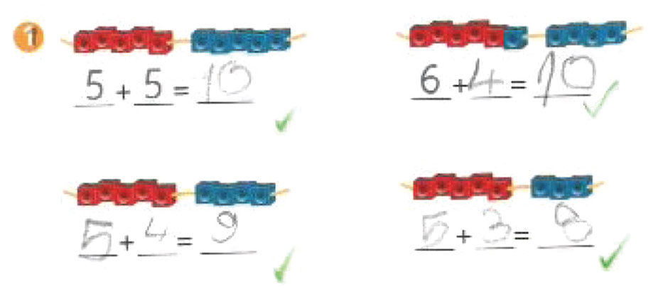
Figure 7.13: 1st grade math exercise.
 Author/Copyright holder: Three D Graphics, Inc, www.threedgraphics.com. Copyright terms and licence: All rights reserved.
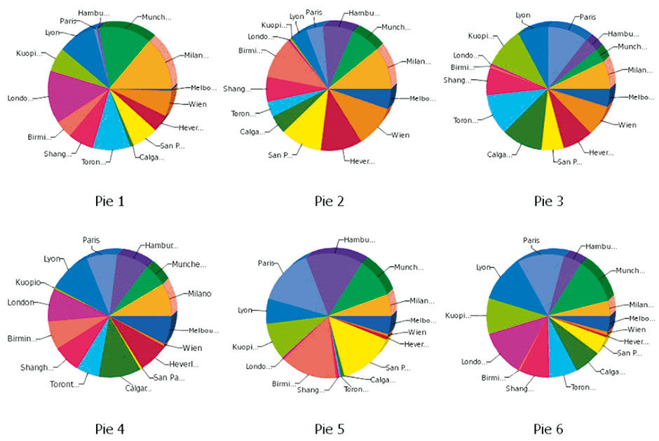
Figure 7.14: Multiple Pie Charts.
The stubborn pie has other things going for it. It gets a cognitive boost by virtue of people’s ability to calculate the relative difference of the angles formed by the slice division lines radiating from the center point. When used as a supplement to the approximate area calculations of the slices, the result is a bit more precise. Also, the square format is much more conventional than a linear one as a compositional element in the two-dimensional picture plane. After all, squares and low-ratio rectangles are how we present all other images and so we have conventions for how they appear interspersed with text. Finally, because it is a chart form useful for only one thing – showing the division of a whole into parts by one quantitative attribute – when we see one we instantly know what it is trying to tell us and how to read it.
But the pie has undeniable shortcomings. The first is the noted difficulty for users to judge the relative size of slices versus when the same data is shown in one or more one-dimensional strips or bars. This error, however, is slight, and on its own not enough of a drawback to invalidate the pie chart as a chart type. The pie really fails for two other reasons. The first is that, due to its radial form, it creates spaces that are awkward for the display of integrated typography. Unlabeled spatial plots are almost useless, and labeling pie charts is a nightmare. There is no reliable way to insert words or even numbers into irregularly-shaped pie slices. One remedy is to draw callout lines to a lists or labels outside of the pie area itself, or color code the slices and cross-index them to a legend. The former creates visual clutter, while the latter inevitably fails because of the limited precision of color as a coding mechanism, especially when color matching is needed among samples placed far apart within the picture plane. Colorblind users have an obvious disadvantage in trying to cross-index colored slices to small labeled color patches in a separate legend. And due to the difficulty of definitively distinguishing similar colors, even for the non-colorblind, pies with more than seven or eight colored slices cross-indexed to a legend run out of adequately unique differentiating colors. Color perception is limited and, thus, does not scale well for this task.
Perhaps the most limiting aspect of the pie chart is the difficulty of comparing relative percentage breakdowns of multiple pie charts in a display. While judging the size of pie slices in a single chart is harder than it needs to be, comparing slice sizes across multiple charts is even harder. Doing so multiplies all the shortcomings of plot shape, color cross-indexing, and titling, multiplied by however many pie charts are being compared. The worst case is when multiple cross-indexed pie charts vary in overall size according to the sum value of each chart’s members. Again, while it is immediately clear to viewers the intent of what is being shown, the precise cross-comparison among cross-indexed pie slices is almost impossible. It exacerbates the already-limited scaling issues of pie charts by rendering smaller sums in sizes too small to discern the slices.
Another limited use of radial forms is to vary the size of points positioned in a 2D matrix to indicate value size, commonly known as a “bubble chart”. Color coding the points, or “bubbles”, enables the plotting of up to four variables in a 2D matrix: The X position in the field (horizontal location of the point, increasing from left to right), the Y position in the field (vertical location in the field, increasing from bottom to top), the size of the point bubble (larger bubble mapped to larger value) and color of the bubble (categorical or scale mapping using a chloropleth color scale). The largest values in the first three dimensions will appear in the upper right quadrant of the field and rendered as larger bubbles.
Bubble charts can be effective. By animating a bubble chart with a fifth dimension of time, Hans Rosling famously demonstrated the relative historical KPIs of the world’s nations in a compelling, concise, narrated visualization of the history of recorded world civilization. Although a masterpiece of visual analytics, like Minard’s Napoleon chart its artisanal form is difficult to generalize and extend.
Another useful technique is to use bubble point displays to show relatively-sized measure values of points on geographic maps. In some cases, these bubbles themselves become pie charts, and we again have the issue of imprecise cross-comparison. And, if we maintain the scale integrity of point positions on the geographic map, we encounter the issues of occlusion and labeling. The bubbles of points with huge relative values can obscure large areas of the geographical map or plot field, reducing the orientational value of these measures. By having small bubbles appear in front of the large ones, making the bubbles translucent, and using dynamic filtering to reduce bubble clutter, these issues can be mitigated.However, it’s easy to see how this approach can turn into an incomprehensible pile of multi-sized poker chips thrown onto a map. In Figure 7.15, where is the state of Rhode Island, let alone Alaska and Hawaii?
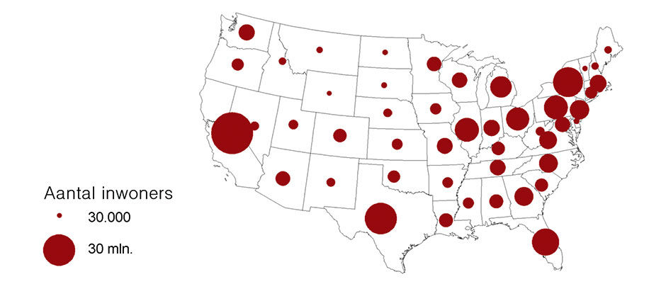
Figure 7.15: Bubble Map, Wikipedia.
Interactive display techniques, like dynamic filtering or careful artisanal editing and design, can mitigate some limitations of radial designs. Dynamic slice selection and mouse-over labels can eliminate the need for pie chart legends, but the values and labels still suffer from being shown within irregular radial spaces. However, these are expensive and/or tactical crutches that might involve a user learning curve, and cannot break through the real limitations of the form. They are just as useful when applied to more fundamentally sound visual forms. And as Few has shown, a more effective and reliable solution is to organize the data plots in one-dimensional form as a simple or stacked bar chart (strip chart) instead of as a pie chart (or in a 2D form with a Categoric Dimension – which I’ll describe in detail later – as multiple subdivided strips in a bar chart format instead of using multiple pie charts.) In the former case, labels can be stacked “inline” with the bars to maximize space for plot usage. In the latter case, a legend or dynamic display is still needed to identify strip slices but the resulting form is more effective because the strip slices are of a more uniform shape and thus easier to distinguish and select, and any dynamic label or value display fits more elegantly into the row-based, rectilinear structure without overlap and occlusion. Such forms provide the most obvious comparisons of relative plot sizes and, because of their linear, row-based structure, make the integration with typography much cleaner.
The dial is another radial form commonly used today in analog and digital displays. The dial is actually a full or hemi-spherical pie chart, with the hands or needle indicating the particular points on the perimeter. Common examples are car speedometers and analog clock faces. The dial hand acts as a radius, in comparison to another fixed radius of an implied benchmark or baseline – 12 o-clock in the case of the clock face and 0 in the case of the speedometer – dividing the face into two spaces that provide the spatial sense of the distance of the current dial state from the benchmark. For the speedometer, the first space is the distance of the needle from the baseline, and the second space is the distance in the other direction from the needle around the perimeter to the baseline again. The greater the former space, the greater the speed, and the numeric markers along the dial perimeter provide the associated numeric value of the measure. In actuality, speedometer scales rarely run the entire perimeter of the dial, instead tending to begin at about the 8 o’clock position and running to about the 4 o’clock position. This is to enable use of the 6 o’clock space for other displays, and essentially creates a hybrid pie/strip display that is essentially read as a one-dimensional linear scale display mapped onto a curve. Through repetition we come to recognize our speed by the direction the needle is pointing for general awareness, and the numeric value it points to for the specific value.
Dials are used for cars because of their mechanical connection to the wheels. Analog car speedometers work through a connection to the wheels via a spinning wire running through the center of a flexible metal hose. The faster this wire spins, the further the speedometer needle turns against the resistance of an internal metal spring. It’s hard to describe and imagine, but the point is that mechanically, because the speedometer is really measuring the turning rate of the wheel versus the actual speed of the car, it’s convenient to match the input indicator – a spinning force – to the output indicator – another spinning force. Today’s speedometers use electrical force to move the needle, and although there are other minor benefits to the radial display for this purpose, the dial convention remains popular primarily because of its familiarity.
The convention of round analog clock faces, the most common information visualization format, has a much deeper physical connection related to astrophysics. We have come to measure time by the cycles of the sun and moon, which of course along with the earth are radial forms themselves, and move according to the radial patterns of spinning and looping. As these are the forces determining night / day and the passing of the seasons, measuring and predicting them has been critical to civilization. As with the speedometer, although the metaphor of a circular, cyclical device used to track the behavior of circular, cyclical phenomena seems appropriate, this metaphorical connection is not what drove the design of clocks. Rather, it was again the convenient mechanical devices of the wheel, gears, and spiral metal spring. It’s no accident that the gear icon is used to indicate access to the hidden controls behind our digital products – gears and their wheel-based variants are the foundation of much of our mechanical world, including the earliest computers.
Modern calendars, in contrast, use a linear/matrix form to convey the passage of time and the relevant cycles of days, months, seasons, and years. We read calendars like we read rows of text (in the West) – in a scanning pattern of left to right, then back to the start of the next line, then to another page that repeats the same pattern. Because days themselves are not cyclical, notwithstanding the AM/PM division, the hourly calendar view is purely linear, essentially a vertical strip chart divided into hours and quarter hours. The current time indicator acts like a playback head running top to bottom. Can you imagine managing your daily schedule using a radial clock face, with divisions as pie slices and appointment names written at all angles? Me neither. Calendars can be radial, as with those used by the ancient Mayans, but for our purposes they are irrelevant outliers.
Interestingly, sundials often use a linear display, where the shadow of a post passes along an appropriately-scaled ruler to show the hour. The ruler can also take the form of a hemisphere but not a full circle as with a mechanical clock face.

Author/Copyright holder: Bsayusd. Copyright terms and licence: Public Domain.
Figure 7.16: The “three-pointer” aircraft altimeter displaying an altitude of 10,180 feet.
The radial clock face is actually two or three superimposed pie charts; one for the hour hand and others for the minute and second hands. Each hand draws a pie chart of two slices, one slice showing the counter-clockwise distance to 12 o’clock, the other slice showing the clockwise distance. It is a visualization of where we reside in time within the current half-day, hour, and minute. Interestingly, mechanical dials that must scale to show much greater ranges than those of car dials use a similar layering technique. Aircraft gauges showing airspeed and altitude are an example. To convey the measure value, they use differently-styled needles to convey each level of magnitude of the measure, while referring to the same set of 1-10 digits printed around the face of the gauge. For instance, the small hand pointing to 2, the large hand pointing to 8, and the thin hand pointing to 5 would indicate 28,500 feet of altitude. At ground level all the dials would point up to 0. Of course there is a cognitive limit of how many distinguishably-styled hands can be put onto a gauge. It seems to be practically capped at three, which works for altimeters, as 111,000 feet of altitude accommodates most flight. This model is in fact quite clever and efficient, as three magnitudes of granularity can concurrently use the same space-constrained scale.
Of course we also have numerical time display formats. These are quite space-efficient but have not supplanted the old radial dial, in part because of the inherent power of the spatial visual metaphor of the clock face, and its familiarity. One comment attributed to Jay Doblin conveys the spatial power of the clock face. The reason, he said, for the persistent preference of the radial clock face is that, when we check the clock, we are usually checking for how much time is left between now and when we need to be somewhere or do something. We do not care what time it is, but rather what time it isn’t. We check that we are not late, and to see how much time is left until we are late. In this effort, we check typically the minute hand and how much space there is between it and the 12 o’clock mark. Irreverent design firm M&Co. riffed on this theme for one of their series of whimsical watches called, appropriately, the Pie Watch.
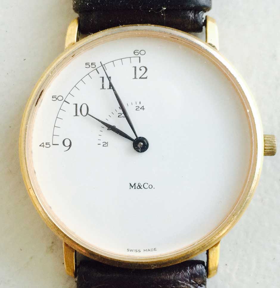
Figure 7.17: Pie Watch from M&Co.
The clock face landscape is so familiar that we instantly calculate the minutes based on the hand positions. A numeric clock display, although it conveys the same information, requires decoding, and thus a brief side-trip through translation and conversion to arrive at an answer. Its perception is not precognitive. Also, if a numerical clock display is somehow obscured, it can more readily become illegible, while even when blurred the general positions of clock hands can still be discerned.
The one application where the use of a radial form is essential is that of indicating relative direction in space. By relative direction, I mean position of a point in space relative to a reference point in space, and measured compared to latitudinal and longitudinal benchmarks. Two simple examples of this are the compass and the wind direction indicator, or weathervane. While most of us don’t use these instruments much anymore, they are critical to navigation and have been for a long time.
For most practical purposes, navigation is about traversing the earth’s virtual 2D surface. This is essentially about knowing where you are located, where you are headed, and where other things are in relation to you. Any point on this 2D plane can be identified with a relative direction by a compass reading, mapped onto a circular perimeter whose center point is the reference location (where we are) and divided into the gross categories of north, south, east, and west and the finer scale of 360 “degrees” of difference in relation to a benchmark direction. The benchmark direction is magnetic north, where the compass needle always points. This system is very useful for tracking the location of things relative to you upon the 2D surface of the earth. When combined with a vertical 360-degree measurement, a similar bearing can be determined for items in the surrounding 3D or spherical space. For convenience, pilots use a shorthand system to reference points in 3D space using the clock’s numerical positions in lieu of the finer degree system – 12 o’clock is directly ahead, 6 o’ clock directly behind – and a simple “high” or “low” to indicate relative altitude. Another aircraft to the right and above you would be located at 3 o’clock high. It’s easy to see how navigation, especially in featureless spaces like the sky or the open ocean, would benefit from such a system.
Nautical navigation, in particular sailing navigation, also relies upon the compass-based measurement of wind direction. Weathervanes indicate the direction of the wind vector – essentially the line that the moving air is traveling along – a measure relevant to local weather conditions. Interestingly, when asked to identify the wind direction, most of us point in the direction the air is moving to rather than where it is coming from. This is understandable – if we saw a person walking and were asked what his direction was, we would also point to where their vector was headed. The convention for wind direction is in fact the opposite. The weathervane points to where the wind is coming from versus where it is going, with the reason being that if you care about local weather and how it might change, you look to where the wind is coming from because the weather there will soon be your weather. Farmers care a lot about local weather conditions, which explains the presence of weathervanes on barns.
Sailors, another group that cares a lot about local weather conditions, have long been interested in wind direction because of sailing’s aerodynamic and propulsion dynamics. While it’s obvious how a sailboat can be pushed downwind – the direction the wind is headed – the real trick of sailing is to travel upwind, or toward where the wind is coming from. If we use 12 o’clock as the precise direction of the wind source, the limit to how “close to the wind” a vessel can sail is that of about 45 degrees, or between 1 and 2 o’clock or 10 and 11 o’clock, of the wind source direction. When trying to sail any closer to the wind, the power generated by the sail diminishes to where forward progress slows and then stops. The faster and closer in angle to 12 o’clock you can sail, the more progress you can make toward your upwind destination. Sailing begins and ends with wind direction and its compass relation to the target destination.
Because speed, accuracy, and distance in sailing have been at the forefront of commercial and military success, the 360-degree compass measurement system and the associated angles and vectors have obsessed navigators throughout history. However, despite its importance to navigation, compass-based visualization is rarely useful for today’s analytic tasks. I bring it up to illustrate a circumstance where radial form is the ideal way to visualize a key metric in a specific domain, in contrast to the majority of cases where it is not, and how its historical importance led to its ubiquity.
My final point about radial forms in visual analytics is perhaps a reach, but somehow I think it’s relevant. With a few exceptions – such as flatfish that develop asymmetry as they mature, and sponges that are fully asymmetrical – the body forms of organisms exhibit either radial symmetry or bilateral symmetry. Animals with radial symmetry are the most evolutionarily primitive, and include jellyfish, anemones, sea urchins, starfish, and many single-cell organisms. Their bodies are organized symmetrically — either in one dimension as with a starfish or in three dimensions as with spherical microscopic algae — around a center point which is often where the mouth is positioned. In general, if you slice these organisms apart through the center point at any angle within the plane(s) of their symmetry, each resulting half will appear identical. Over time, some of these organisms evolved into new species exhibiting bilateral symmetry, where one side of the organism remains a mirror image of the other, but only along one linear axis versus through a center point. This enabled a more efficient one-directional digestive track and, eventually, a spinal cord. The new form eventually enabled other benefits like faster and more precise locomotion, led by a singular head with eyes and an equal number of legs or fins on each side of the body. The most sophisticated organisms are organized –notice the interesting semantic root of “organ” – around a one-dimensional line from head to tail, often aligned along a spinal cord.
The fundamental benefit of bilateral symmetry is organ specialization. Instead of having to grow and support a body with many simple, identical sensing or locomotive organs distributed equally around the circumference of the organism’s body, bilaterally symmetry allows organs to develop specialized purposes, to be placed in more effective locations on the body, and to evolve more powerful capabilities. It’s better to have two powerful eyes on a swiveling head than to have multiple primitive ones on each leg of a starfish. Battleships and tanks followed the same evolutionary path. Leonardo Da Vinci’s first drawing for an armored fighting vehicle looked like a flying saucer, bristling at all angles with spears and blades. In stages, the tank evolved into a vehicle with a distinct front and rear, with a turret acting as the trainable head containing the brain (the commander) and main armament. Man-of-war sailing ships had tiers of cannons on each side, while newer designs, pioneered by the Monitor iron-clad warship of the American civil war, placed guns in turrets to allow the training of more firepower towards exactly where it was needed.
Animals seek perfect bilateral body symmetry, as a sign of genetic fitness, when evaluating potential mates. Interestingly, the summative appearance of these species (and our often anthropomorphic machines) – the information about themselves – is bilateral, while much of their structural and mechanical underpinnings, such as ball and socket joints, eyes, and swiveling neck, are radial.
7.0.4 Info Porn
Info porn, used to describe any type of misleading showmanship in quantitative displays, is particularly useful when referring to the endless attempt to clarify or embellish dry quantitative presentations by morphing the data plots into images and drawings of the underlying subject matter. Some practitioners have started to mis-appropriate the term Information Graphics to refer to the practice. As with the other dead-ends, if used carefully this technique can in fact be useful.
Using familiar icons such as national flags or corporate logos as labels in lieu of written country or company names is an obvious example. This works as long as the symbolic meaning of the icons is commonly understood by the audience. Because these forms are in fact originally designed to represent their subject in a compact, visual, easily -reproduced manner, they are inherently space-efficient and uniform in size and complexity.
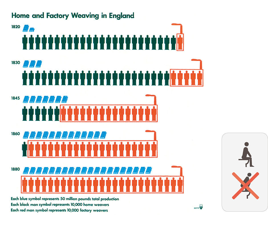
Another relatively harmless technique is the use of isotypes, popularized by Otto Neurath, an Austrian philosopher of science, sociologist, and political economist during the early 20th century. Isotypes, what we today would refer to as “icons”, are simple drawings of physical objects, such as people or cars, placed within instructional communication or signage to convey concepts quickly and multi-lingually. They can be used to plot measure values by forming columns and arrays using units depicted as simple images of the measured subject. Neurath was the first to use the bar charts you see that are drawn using multiple, generic restroom icons of men and women. Isotypes can be useful and elegant in certain circumstances when generic and easily-represented subjects are being counted and compared in simple bar or area displays. They provide an immediate cognition of the illustration’s topic and elements, that can offset the negative effects of added clutter, imprecision, and scaling issues.
In contrast with the near-universal legibility of quantitative relationships shown as geometric plots, using representational imagery within visual analytics introduces the potential for semantic misinterpretation, especially in cases of use across multiple languages and cultures. In contrast, the phenomenon of Chernoff faces, now popularly known as emoticons, is among the most universally understood communication types. Anthropologists have shown photos of common facial expressions to cultures around the world, including remote tribes in Papua New Guinea and the Amazon rain forest, and asked the locals to describe the emotions of the photo subjects. The responses are highly consistent from people the world over. Herman Chernoff continued this research by creating a language of facial expressions rendered with simple line drawings, with subsequent tests reaching the same convincing results. All people are wired by evolution to be extraordinarily sensitive to facial expressions, and the spread of emoticon use is evidence of the fact.
 Author/Copyright holder: words are pictures too. Copyright terms and licence: All rights reserved.
Figure 7.18: Isotypes from Otto Neurath, and a modern example demonstrating the universal clarity of the form.
Isotypes are best employed when comparing counts of physical objects, and thus are often used in a military context to compare strengths of opposing armies in terms of number of troops, planes, ships, or tanks. With such easily rendered and identifiable forms, used in an artisanal or highly constrained production environment, isotypes can be useful. Using iconographic imagery to render data plots is not appropriate for depicting abstract or unfamiliar subjects, for presentation at limited display resolutions, or for applications of repeated use where initial user recognition and cognition requirements diminish over time. The editorial and design judgment necessary for isotypes to work well effectively limits their practical usefulness to highly artisanal applications.
An almost universally bad idea is to render comparative plots using scaled images of the subject depicted. Despite some serendipitous examples, like using real pie images to show pie charts about pies, or baguette images to represent baguette data in bar charts, the subjects of most data we care about cannot be visualized well as scaled data plots of simple geometric shapes, and doing so creates counter-productive side effects that cancel out any benefit of faster recognition or poetic insight. The Newspaper USA Today is famous for authoring cute quasi-quantitative illustrations that use this technique to quite misleading effect. While RISD professor Krzysztof Lenk called them the “Big Macs” of information design – unsophisticated but generally harmless – I see them more as Chicken Mcnuggets– convenient and uniform but of mysterious origin.
Aside from these annoying but somewhat understandable detours, the overall presentation quality of visual analytics is improving, along with its consumption literacy and expectations. What is harder to know is whether the data being presented is accurate (is it really chicken?), relevant, and being used for informative and relevant outcomes.
7.0.5 Snot, Hairballs, Spaghetti Noodles, & Dancing Trees
Images generated from the visualization of quantitative data can be beautiful, interesting, mesmerizing, and generally weird and abstract in appearance. While such effects range from harmless to delightful, they are secondary to the primary goal of visual analytics, which is to enable rational insight and understanding. Just because data can be legitimately rendered in bizarre or exotic ways does not mean that doing so increases understanding or the ability to solve problems or get work done. When applied to complex, specialized applications in science, and when used by those trained to consume them, these dense displays can reveal patterns otherwise hidden within the data. They are not, however, a magic path to insight for the masses. Despite their potential beauty or novelty, they are simply indecipherable by untrained people looking for answers.
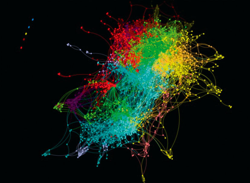
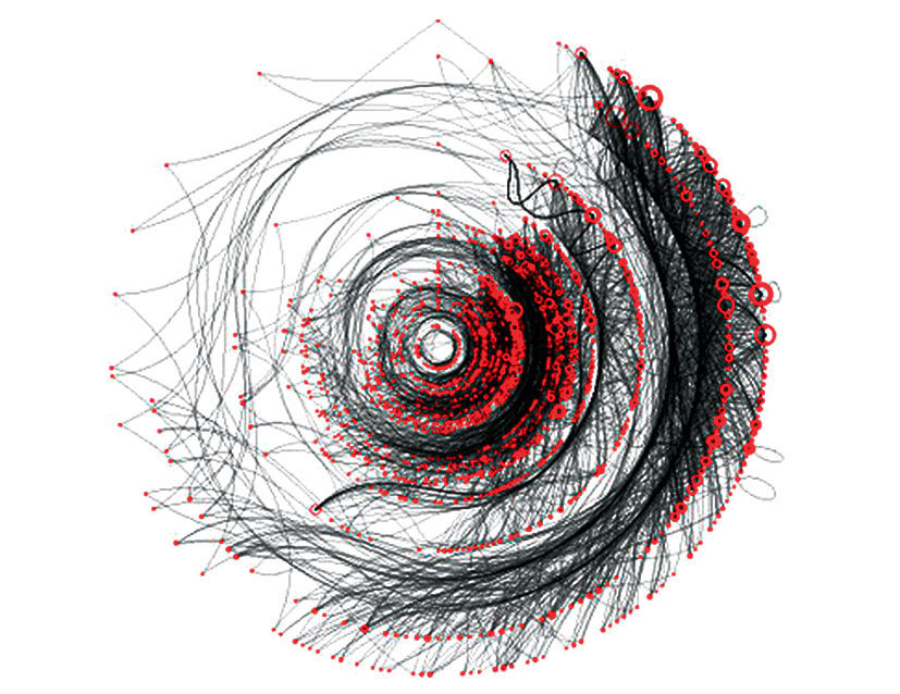
They often take the form of elaborate color-coded scatter plots that may be combined with hyperbolic, or star tree, displays that link the scattered points together with lines according to shared characteristics. Although typically filterable for clarity, the overviews can appear like infected mucous, or giant hairballs. (see figures 7.19, 7.20)
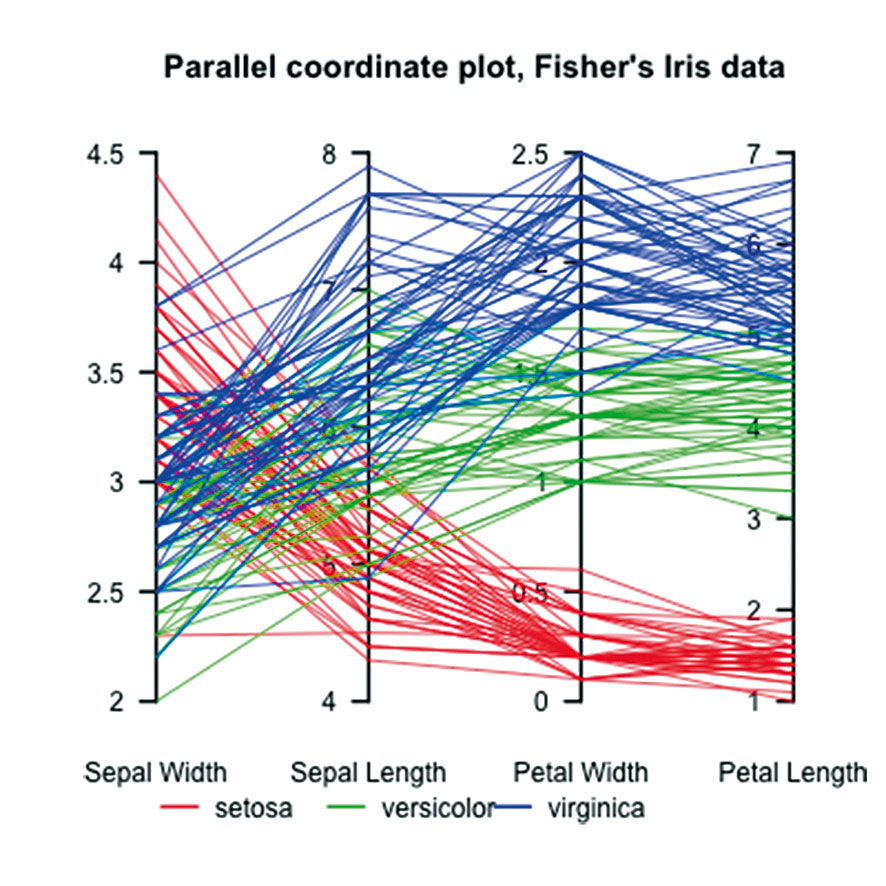
The parallel coordinate graph is effective for visualizing multiple measures of multiple entities, but is too complex to understand and use by most people. In Figure 7.22, data from a set of flower samples – represented as an individual horizontal line – are grouped into three categories of red, green, and blue, and plotted on scales representing four Measures of Sepal and Petal Length and Width. The chart reveals patterns, such as that samples in the red Setosa category have the lowest Petal Length, which does not vary much, yet have relatively high, but varying, Sepal Width. What makes the visualization effective is the ability to include multiple measure scales within one rectangle. Unfortunately, we still have cramped titles and a cross-indexed color legend. Worse, however, is that the majority of the data ink – in the form of the plot lines – are non-data bearing. The data are the points where the lines intersect the scales, not the lines themselves. Although the fact that that a blue sample jumps from a Sepal Length of 5 to a Petal Width of 1.75 is relevant, and revealed as somewhat of an outlier, the means used to show this takes some effort and skill to learn, and requires a lot of space and ink to convey. In the final chapter I’ll show how this data, rendered in with horizontal strip charts, becomes more accessible and usable.
Hyperbolic trees, or browser trees, are another over-hyped visualization technique. While they seem intuitive and engaging at first, they have never achieved the popularity of, for example, row-based indented text outlines. While they leverage the strong metaphor of branching trees in communicating a hierarchy or web of connections, by virtue of their quasi-radial symmetry they exhibit an inefficient use of space, and a layout scheme unsympathetic to typography. In fact, browser trees suffer from the basic inefficiencies of all radially symmetric forms. Despite the clever, dynamic layout algorithms that size and place lines, nodes, and branches within the rectangular space, the position of items in their picture plane is often essentially random. When too much content is added, lines and labels obscure each other and turn into a hairball.
Author/Copyright holder: Sigmajs, www.sigmajs.org. Copyright terms and licence: All rights reserved
Figure 7.19: Infected sinus mucous blown into a handkerchief?
Author/Copyright holder: Boris Muller. Copyright terms and licence: All rights reserved.
Figure 7.20: Hairball pulled from the drain?
Author/Copyright holder: JontyR. Copyright terms and licence: Public Domain.
Figure 7.21: Flower data rendered as spaghetti noodles.
Advocates say that such shortcomings are part of the point of using the form, in that with one view you can see the overall structure of an entire network of entities, and that in fact the organic branching structure enables a more fluid navigation and interaction experience. While these benefits do exist, the usability cost of abandoning the Cartesian coordinate system, and its accompanying typographic and measurement efficiencies, prevents hyperbolic trees from becoming a main- stream tool. They provide a gross portrayal of the number of nodes in a network, how the nodes are linked, and the overall network structure. One benefit is that peer nodes in the tree, because of their random positioning, are perceived as having equal status. Presenting them as a list, in contrast, demands a rationale for their order – be it alphabetical or another hidden attribute. In fact, seeing the data according to such order is typically what people do want to see at some point in their analysis or exploration, at which point the hyperbolic tree loses its value. For the task of accomplishing anything beyond seeing and navigating a network linking structure, they are ineffective for most general-purpose analysis tasks. They expend their most valuable resource – their layout – to convey the structure of the data, to the detriment of all else.
7.0.6 Storytelling
Storytelling, as put forth by BI vendors in the context of BI practice, is the delivery of a narrative argument or description of something happening in the world, and why. In BI and the business context, these stories are often about business operations and how they are proceeding, and thus are often quantitative in nature: Sales were this, they were supposed to be that, but they are getting better, and if this or that happens they could go down or up faster, etc. Storytelling is not unique to quantitative content, and is in fact mankind’s seminal communication format for complex ideas.
When I first saw the typical demo of BI tools being used in an analysis workflow, the idea of a journey to discovery was the first impression I had. The demos proceed like this: “When I saw the KPI showing this in the report I wanted to know why our overall customer satisfaction score had dropped, so I looked at the KPIs by product type, then by region, then by quarter. I discovered that the most complaints happened in Q2, so I zoomed into Q2 and again looked at the complaints by product and region, and found that the southern region had the spike in complaints. I read a few complaints and saw that many referred to the same issue with the confabulator seizing up when it was hot outside...” etc. The fictional user always finds the smoking gun hidden in the data somewhere, and becomes a hero.
To become the hero, however, the user needs to demonstrate that they have found the answer, and how they found it, to those with the authority to execute the recommended remedy, and this is where the storytelling comes in. My impulse in watching the demo was to provide a way for the user to bookmark or screengrab the views where they had found each clue in the trail leading to the answer. From these views, they could create a slide presentation to share with others and convince them that the analysis was rigorous and the remedy valid. I’ve had to do the same thing when booking family vacations, making sure to print out prices and options not taken to justify the final proposal to my skeptical wife.
This all makes sense, and the pattern is showing up in journalism, particularly from Nate Silver. In these Statpop stories, the author makes a claim and then proceeds to back it up with text interspersed with charts. Here is an example story about the 2014 world cup tournament:
http://fivethirtyeight.com/datalab/the-most-shocking-result-in-world-cup-history/
The result can be quite convincing, and if the data and reasoning is solid, the effect is powerful. Of course, the data or logic can also be flawed or incomplete, as I believe this to be:
http://www.wired.com/2014/07/why-are-songs-on-the-radio-about-the-same-length/
The author’s theories about how production and arbitrary distribution constraints determined the maximum length of pop songs are presented convincingly with visual analytics, but are disputed and debated heavily and rationally in the comments section. Regardless of who is right, it makes for an interesting read.
The main point here is that arguments backed up with quantitative evidence tend to be stronger than those without. And of course the more vividly this evidence is portrayed, the more effective it is, especially when the audience has less stake in the argument and thus needs to be seduced into paying closer attention by having their COT reduced. Another point is how important the factor of collaboration and sharing is to the creation of value from quantitative data. For high stakes decisions, anyone conducting the number crunching analysis is likely not the sole person making conclusions and taking action. The work of distilling, composing, and presenting facts to others in narrative form is critical to building the understanding and support for any sort of reaction. This narrative can typically be provided only by an informed person able to recognize patterns and connections in the data, relate them to a time-sensitive context, and then develop a hypothesis conveyable within the attention span of an audience that is empowered to take action.
This is the essence of storytelling, and if it sounds familiar, it is the reason why Powerpoint and other slideware are perhaps the most-used software applications in the business world. Whether the slides have charts or not, the screen-by screen cadence of the slide deck, typically sized to be delivered within fifty minutes – leaving ten minutes for Q&A – forms the heart of today’s business communication. These bite-size screenfulls of evidence contain statements, bullet lists, images, and diagrams as well as charts. While visual analytics are powerful pieces of evidence, when presented within a narrative they still need to be strung together with a presenter’s voice-over or, as in statpop journalism, a written narrative. Charts are actors in the stories, not the stories themselves. I bring this up because visual analytic vendors are building narrative capabilities into their reporting and analysis tools, to enable the creation of analytic-centric narrative slideshows within the analytic tool itself, versus the user having to export the visual analytic views to a separate slideware file for presentation and distribution.
While there is nothing wrong with this approach per se, it presumes a wide popularity of stories consisting of only a series of charts. A major benefit of presenting visual analytic stories within a dedicated analytic product is that the charts within can remain connected to their data sources and be updated if necessary. This, however, is of limited value. Per my scenario of the sales analyst tracking down customer complaints, the nature of business storytelling is typically both ad hoc and backward-facing, meaning that the majority of stories are about what has happened versus what might happen, and, once told, have a short shelf life. Even if a story involves predictive data about future projections, any associated conclusions are based on the state of these conclusions at the time written, versus later when the underlying predictive evidence might have changed.
This phenomenon of confusing live versus historically time-stamped data is, in fact, a fundamental usability issue with visual analytics. Both data states are useful, but it’s imperative to indicate to consumers which type of display they are viewing. Displays supporting the user mode of monitoring are expected to show data as fresh as possible, and to indicate the last refresh date and time. In the common case of workers using content as evidence for an action or proposal, it’s important to convey the time stamp associated with whatever state the content is shown in. This is a way to say “this is what we knew at this point in time”. Because most story-telling use cases demand time-stamped versus live data, involving any live updates to the content, intended or not, just confuses people. Finally, if updated data is intended for a story, it makes more sense to maintain the data and logic within its source application, and allow chart instances within stories to connect to them dynamically, as is done with YouTube-based videos embedded throughout the web and other content.
While it’s possible to add simple text commentaries to the narrative chart views – as well as crude clip art “info graphics” with elements like arrows, currency symbols, isotype icons, and other symbolic images of business paraphernalia – the expressive capabilities in these products for any non-analytic content will always be primitive compared to any dedicated slideware. And no matter how popular and accessible visual analytics become, stories that feature them will still represent a fraction of the total business stories told — not enough to warrant a specialized destination, authoring skill investment, a self-service consumption learning curve, and possible new file format for audiences to endure. As such, dedicated storytelling features for visual analytics are the tail wagging the dog. While marginally useful, visual analytic storytelling is not a breakthrough, but rather another attempt to use a minor convenience to lure users out of proprietary slideware as the dominant storytelling vehicle. It is but another distraction away from investment in fundamental advances.
7.0.7 Gamification
Gamification is seen as an enticing opportunity to get consumers of productivity software as engaged about using these products as they are when playing digital games. Many product design techniques from the gaming industry are quite relevant to the design of productivity products, most importantly the input/output responsiveness, fluidity of animation, and clear feedback of system events and status. Games are also very measured and analytic. In their effort to simplify performance, they rely on numerical scoring to clearly convey winners and losers in a binary fashion, from the level of play-by-play to that of the match, the season, and the career legacy/reputation of individuals and teams.
However the major benefit espoused by the gamification movement – that of the elevated player motivation that comes with clear rules and highly instrumented, fictional goals – is difficult to transfer to the more complex, nuanced, organic drama of work and life. Because of their enforced artificial boundaries and digital scoring, games enable the keeping of precise statistics. Baseball is naturally statistic-heavy, while the more fluid and amorphous soccer/football is not. While in theory a comparable amount of data is produced in a soccer match as in a baseball game, the highly categorized structure of baseball stats are much easier to record and analyze. In an essay claiming that soccer is, or should be, a better inspiration than baseball for the conduct of life in general, New York Times columnist David Brooks points out the risks of paying too much attention to precise measurement and individual achievement in sports.
Gamification provides tactics for improved general software engagement, but not a convincing strategy. While games are metaphors of life, their appeal lies in the simplistic application of boundaries and artificial success metrics, so as to distill the emotional drama of success and failure into a format that is understandable, consumable, compilable, and repeatable. In business and life contexts, the creation and maintenance of these boundaries is an organic management, political, and spiritual problem. While games like Sid Meier’s Civilization can model these variables, they remain trapped within Jaron Lanier’s digital straightjacket. To the extent that gamification can reflect these boundaries and optimize the conveyance of situational status, progress, and values within a productivity product, its tactics can add value. But it’s up to the designers of the encompassing life systems – executives, managers, administrators, and lawmakers – to design and maintain the rules and play of the game itself.
That being said, if there is any aspect of business whose dynamic already resembles a game, it’s that of sales. In sales, KPIs are typically much simpler than for most other roles. Salespeople have a time-based quota to meet, with clear rules and consequences often based on monetary compensation. A colleague once declared to me that “salary is how business keeps score”. Within the more complex game of running a business, sales is a simpler game, and many gamification attempts focus on this space.
As part of an experimental “concept car” exercise at SAP, I led a team that used gamification techniques in the design of a sales management product. Because sales is already like a game, this was a natural choice. Called the Banzai Pipeline, it is an example of a domain-specific metachart – I’ll define metacharts later on – embedded within a collaborative workflow application.
Figure 7.23: The Banzai Pipeline sales game board.
L7.1 | Banzai Pipeline
In this design, Rod Beck’s “pipeline” – the metaphor used to describe how sales prospects pass through a process from initial contact through qualification and closing of the sale – is rendered with deals depicted as “chips”, styled according to the deal’s size, success confidence, and status. A healthy pipeline needs deals at every stage of the sales process to maintain a steady revenue flow, as indicated by the bars below each column. As deals proceed through the process, they either move to the right along the columns towards the close, linger in an interim stage, or drop out. The goal is to provide a clear overview of pipeline status, and to be used as an input device and collaborative modeling space. Rod can enter simple status changes through this screen for recording and sharing updates. As depicted in the chat sequence, he and his manager can perform a what-if analysis, and even negotiate a pipeline strategy, by manipulating chip location, size, and confidence so as to optimize the pipeline and the upcoming quarterly finish. The pipeline view is much like a game board, with intuitive input/output feedback and modeling capabilities. The Pipeline Gameboard provides a concrete representation of an enterprise sales process, valid both in the aggregate and for individuals.
Another simple example of product design aligned with the techniques of gamification comes from the 1996 Planet SABRE application for travel agents. In the flight booking screen, users specify a flight in the Route Field at the top. According to the structure of the defined itinerary, a Booking Bin at the bottom draws empty slots for the user to fill by dragging & dropping their flight choices as tokens. The bin provides for multiple trip options for later choice and booking. The idea was to provide a literal, empty outline of the trip that the user fills with choices. Despite being an appealing and satisfying way to make a choice and see the result, the technique serves the strictly ergonomic purpose of clearly conveying the number of trip legs needing to be chosen. While not a daunting task for a simple round-trip flight, in the case of a more complex, multi-destination affair, such a clear, visual “fill in the blanks” approach helps to prevent errors and oversights. It uses a physical metaphor of the user moving around subtly dimensional “tile” tokens, per the ergonomic software conventions of that time. It makes the process more concrete by creating a working world of things, places, and actions that, although synthetic, leverage select physical metaphors to aid comprehension.
Interestingly, earlier designs tried to use maps and simple circular diagrams to show such trips. However, the complexities of literal cartographic and radial displays already discussed made the designs unworkable. We ran into the same difficulties of scaling that I pointed out in the Napoleon diagram. It’s easy to show simple trips on a map, but the devil appears in cases like how to depict a round-the-world itinerary. Only by turning what is in this case a bi-directional circular route into a more abstract, one-dimensional, linear map, ordered according to the list of destinations visited over time and visualized by the arrows in the Route Field, could the requisite variety for all possible routings be practically visualized.
A similar approach is taken for assigning seats to each leg, and each flight, of a trip for two passengers. Again, each item needing a choice is rendered in a table for completion. As choices are made, the table fills with the choices made from the realistic floor plan renderings. The limited skeuomorphic approach makes sense here as it refers to a true 2D physical landscape. While some enthusiastic developers on our team could not help but prototype a short-lived 3D, ¾ angle view of the seat map, their approach of course proved impractical.
Figure 7.24: Planet SABRE air booking screen for travel agents, 1996. L22.2: SABRE Golden Path final (pdf).
Figure 7.25: Planet SABRE Seatmaps component, from Edward Guttman.
The Banzai Pipeline design is plausible because of the logical simplicity of the sales role – sell a lot, get rewarded – leading to its natural gamification potential. For Planet SABRE, the clear and well-understood logic of the task, combined with decision-making involving direct manipulation of recognizable physical things and spaces, enabled a game-like interaction that leveraged familiar interactions from the physical world. These designs use metaphors, but in a way that is abstracted to the point where the metaphors are not restrictive. For other applications with more nuanced variables, such clear metaphorical expressions are more elusive. In general, I believe that game UX techniques are applicable to productivity products because they are good general techniques, not because they are game techniques. Gamification is a trickle-down phenomenon of borrowing good design innovations from gaming’s low-constraint fantasy domain, where UX R&D is paramount. In a way, digital gaming is the science fiction of UX design. Apple has served as a similar wellspring of innovation and best practices, made all the more impressive by its basis in reality.
7.0.8 Predictive Relevance
The enthusiasm for predictive analytics is a bit of a Black Box phenomenon. In several design projects over the years, after having presented a way for how the project’s target persona would go about answering some question, or completing a task with the product being designed, I’ve gotten responses reminiscent of “why can’t the system know the answer ahead of time, and have the user click the [answer] button? Or why can’t the system divine the answer and take action automatically? Shouldn’t the system anticipate what the user wants and just show them what is most important? Can’t the system just predict what will happen? That’s what people really want”.
“If we only had a brilliant system contained in a black box that told people the answer, all would be better.”
While it is always healthy to seek out ways that a system can remove burdens from any manual task, such forays into machine intelligence are difficult to get right, and bring to mind the scenario from the movie 2001: A Space Odyssey of the pilot getting locked out of his spacecraft by HAL the computer. Many predictive algorithms – or models – are built to predict the odds that something will happen in the future, such as the odds that a user will appreciate being prompted to view a certain metric buried within their dataset. Predictive models are only as good as the evidence presented to them as raw material. In the case of metric relevance to a worker, this is a complex problem akin to determining Web search results, only carried out within a limited corner of the information world, and of concern to a limited circle of people. Ironically, with the Web it’s relatively easy to learn the information preferences of the whole world, but hard to learn the preferences of isolated individuals and groups engaged in proprietary work. The challenge becomes a chicken-and-egg dilemma of needing to get more usage to better understand relevance, but needing better relevance to drive more usage.
One proposal resulting from SAP’s Elev8 research was to present a sidebar within Xcel that, based on the data contained in the file and what the user was doing, would suggest insights into what was most relevant about the proceedings in the form of metrics and dialogs. Although ominously reminiscent of Microsoft’s notorious on-screen helper “Clippy”, as a part of the march toward more productive system-generated automation, this approach makes some sense. The rub, as they say, is getting such a system to work right without being utterly annoying. SAP Lumira has the capability to draw minicharts — named Keypoints and derived from LAVA’s Point component — off to the side of the workspace based on what it thinks is most interesting about the data set. Minicharts are a special chart format designed for small rectangular display areas and thus having unique, strict systems of rules and constraints for the display of titles, values, and visuals. The initial results are perceived to be somewhat random and irrelevant, but with more effort they are likely to improve, especially if accumulated usage metadata can help to determine relevance. The path forward is to enable visual analytic consumers and their work groups to manually declare, explicitly or silently through usage tracking, the data and metrics that are most relevant, and then gradually introduce suggestions as the algorithms are trained.
7.0.9 Search
In 2006 I attended a BOBJ meeting on the topic of enterprise search and its implications for BI. Google had come out with an appliance that could index an enterprise’s internal data and make it available for, of course, a “Google-like” enterprise search. The disruptive argument was that this was a challenge to BI’s hegemony with enterprise quantitative data, while the skeptics felt that the power provided by BI’s platform, semantic layer, and highly formattable consumption clients and artifacts were a sufficient barrier to entry. Eight years later, the skeptics appear to have been correct, although the notion of querying quantitative data with a text string is gaining viability. I’ve even heard sentiment that providing an exploratory browsing experience for casual users will become obsolete, because who would waste time poring over and drilling through screens of charts, turning filters on and off, and flipping chart axes and types to find an answer when it can be summoned up by a typed (or spoken) command?
I don’t believe this. Text-based search will always be an iterative complement to browsing any content, in accordance with the information acquisition matrix of Search, Explore, Monitor, and Assimilate. For cases where consumers know what they want and how to express it, text search has a role. However, browsing is how we discover things that we did not know existed, or that we do not know the name of, and immediate visual feedback is key to the discovery process. Sometimes we just want to peruse what is available before declaring our intent, and sometimese we don’t actually how to express our intent with words in the first place. If we look at shopping behavior, a text search might retrieve an initial number of relevant sites or items, but the detailed comparison of item properties, and their position in context to alternative options, is how many decisions are made.
Interesting search query possibilities exist beyond the text string. There is the obvious ability to “show me more results like this” which can be done from about any type of content if the system has the metadata to do so. I remember Ben Shneiderman describing a search input device that allowed scientists to search among a database of materials according to the curve shape of a line graph mapping the dynamic of key element properties, such as expansion/contraction rate with temperature change. The user could draw the curve of the desired property graph and see results sorted by adherence to their input shape. It was an amazing example of searching for a value so elusive to define – in this case a dynamic – that it needed to be drawn.
But content exploration and discovery is iterative. The act of searching changes our initial goal as we learn more about the subject at hand and what is available. Having declared our initial intent with text or otherwise, we are presented with a menu of visualized content that feeds an ongoing dialog between us and what is made available. When immersed in this self-declared context, our tools now allow us to choose between high fidelity options, served up conveniently for us to see and evaluate, without us having to say or type our desires to define the way forward. The “I’m feeling lucky” search was always just for fun.
This multi-sense effect is why the physical retail shopping experience will never disappear, and why no matter how good text search becomes, it will always coexist with an experience that shows what is to the literal and figurative left and right / above and below, is smaller and larger, sounds like, looks like, etc. of what we think is the answer. Sometimes we only know what we want when we see it. This is the essence of exploration, context, and assimilated learning from ambient content.
7.0.10 Domain Specialization
One solution to the problem of having to design visual analytic solutions from scratch is to preconfigure solutions according to industry vertical markets, like retail or aerospace, or to horizontal domains like Customer Relationship Management (CRM) or manufacturing. Visier Workforce Analytics is a product doing this for the Human Resources (HR) function. Preconfigured solutions for known KPIs offer a more plug-and-play experience that allows customers to have an operational solution sooner, albeit one suited to only the most common business rules and practices.
This makes sense, and is following Geoffrey Moore’s script of chasm-crossing with a targeted solution that enables the introduction of new technologies, business models, and product designs with lower risk and more agile approaches. One catch is that by focusing on only one part of business, the ability for a niche solution to integrate with or expand into solutions for other parts of a customer’s business, is compromised. Unless there is some compelling reason for a unique visual analytic approach in a particular domain, or a breakthrough fundamental technology that just needs to incubate in a limited space before breaking out into Moore’s “bowling alley” of new potential applications, such a narrow focus has limited prospects. While I remember how analytic vendor Visier’s initial visual analytics were highly specialized to HR business practices, with specific workflow diagrams styled with very specific HR isotypes, their current offerings look much more generic. Instead of providing a proprietary, tailored visual analytic solution for HR analysis, they seem to have fallen back to more generic visual styling and layouts, and focusing more on domain-specific data acquisition, structuring, and workflow issues.
Specialized design patterns that target user bases smaller than the visual analytics market as a whole, but larger than the specific needs of a particular customer, will always have a market. As with the Banzai Pipeline, if affordable, the results can be quite dramatic. The issue is one of economics. By definition, tailored solutions have a limited market, and thus limited potential value and revenue to support the higher costs of solution design and maintenance. If there is some unique visual analytic UX innovation specific to HR analysis, users will likely need dedicated training and experience to understand and use it. Unless the solution spreads beyond the HR domain, any user investment in learning it will not be transferrable to other domains. As the key to financial success in software is to provide widely-applicable products that can be sold over and over again with minimal customization, the benefits of specialization are limited.
7.0.11 Natural Language
SAP’s SuccessFactors, which like Visier offers a visual analytics solution specialized for HR, is exploring a similar approach of instrumenting in detail the KPIs and cause/effect scenarios of typical HR operations. For example, if a manager’s employee attrition appears to be too high as displayed in a summary dashboard, she can “drill down” through a preconfigured tree that breaks down the chart to discover which divisions may be suffering more than others and then what roles, what level, etc. The system then prescribes possible reasons for the situation, and then suggests possible actions to be taken. This is done through tightly integrated charts and, in parallel, sentence-based descriptions of the chart.
Author/Copyright holder: SAP AG. Copyright terms and licence: All rights reserved.
Figure 7.26: Success Factors’ natural language/chart hybrid top level.
While the idea is impressive and powerful, the use of such highly instrumented solutions is costly, uncertain, brittle, and at risk of being annoying. One obvious issue is the difficulty of localizing such precise, custom, and grammar-specific visual/verbal constructs into multiple languages. Languages occupy varying amounts of space to convey the same expression – German is a notorious space hog – and accurate manual translation is needed for each language. And the grammatical structure of languages differ. Again, in German the verb is typically placed at the end of the sentence versus near the middle or front as in English. And, of course, the redundant visual/verbal expressions occupy more space than either does alone. Plus, putting suggestions into words literally makes them literal, and thus potentially interpreted as being obvious or condescending. What is the remedy for unhappy employees? Hmm, let’s see…

Author/Copyright holder: SAP AG. Copyright terms and licence: All rights reserved.
Figure 7.27: SuccessFactors’ assessments and remedy suggestion level.
LAVA describes its content by turning its titles into very simple logical phrases, such as “Sales by Month in Millions”. SAP marketed a product in 2005 called Intelligent Question, or IQ, that took this natural language approach to an extreme. It opened up quantitative data sets to a natural language query input that was quite simple and intuitive to use. Although an old idea, natural language query input was given new potential due to the dynamic animated faculties of the Flash authoring tool and a clever, simple layout and interaction model.
Despite extensive UX product design involvement and testing, and promising early sales, IQ was cancelled soon after its launch. Although ahead of its time, it was an odd fit in BOBJ’s product suite at the time, and likely a bit too literal in its adoption of natural language, which introduced functional limitations and severe language translation difficulties. Strictly adhering to existing language metaphors and the fundamental UX model, as happens in more trivial ways with visual imagery and interaction behavior, perhaps ended up creating more problems than it solved. Had BOBJ persisted with IQ, it might have worked. LAVA took a more hybrid approach, using wording and grammar in a limited, more synthetic way that fits better into existing communication formats.
In the physical world, it is only recently that we have created the ability for robotic vehicles to walk on mechanical legs, as we and most other animals do. In the interim we have used the wheel, something that, outside of astronomic or microscopic scales, does not occur in nature. It’s synthetic and not based on observed metaphors. Imagine the futility of having tried to develop carts and wagons with legs?
 Author/Copyright holder: SAP AG. Copyright terms and licence: All rights reserved.
Figure 7.28: The IQ interface. Structured editing of the query sentence above manipulates the visual analytic result. From Steve Kopp, Saurabh Abyhankar.
I believe there is also potential for awkwardness in some cultures by expressing content in writing versus graphically, almost as if a machine is dictating instructions. As with Clippy, slippery slopes exist anytime a user interface communicates in ways that are too prescriptive, literal, or specific.
All this being said, I think that natural language is a viable alternate output for simple metrics, as long as a robust, automated translation system with limited variety is employed. We can imagine a series of metrics being read out loud to us through our car’s audio while driving to work, or through a smartphone service like Siri. But, as a picture can show a thousand words, such systems will never approach the unique directness, speed, and subtlety of visual analytic displays.
7.0.12 BTF
I mentioned how far the BtF legacy has informed and helped to advance visual analytic practice, and there is still much cleanup left to occur. While the vendors and practitioners actively mine these best practices in search of competitive advantage, we see diminishing returns due to persistent attachment to the models of the relatively fixed illustrational chart, the separate and dedicated authoring & exploration tool, and the highly artisanal report-and-dashboard publishing scenario. There is limited value to be achieved from the systematic application of best practices accumulated from a print-based world, and in some cases these best practices can be counter-productive to achieving breakthroughs.
Part of the problem is due to how this content is published and distributed. It is exceedingly difficult to describe dynamic content with a static medium. I’m currently struggling to read a book about the history of movies that, while fascinating in its analysis, is hopelessly handicapped by the limitation of its content to words and movie still photos. In comparison to my film study class in graduate school, where we could watch the films together and discuss them live, the disconnect inherent to describing one medium by using another is tough to overcome. Tufte and Few give excellent in-person training seminars where more dynamic demonstrations and narratives are possible, but these are expensive, and still bound to their original content’s relatively static forms and rules.
I was in fact reluctant to try and write this book because I could not imagine how to explain the dynamic qualities of LAVA without a facile connection to narrated examples presented in animated, cinematic, or functional form. Only by experiencing the dynamics of the solution through its demonstration, and eventual use, can the essence and potential of time-based media be understood. My publisher’s hybrid online/offline distribution model reduces this barrier.
Although academic publishing and R&D can help to show the way, eventually it’s up to commercial enterprise, and its investment in new products, to accept the risks and rewards of adapting visual analytics to the new rules of mass audiences, endless data, super performance, dynamic situational and technical change, social media dynamics, and collaboration.
7.0.13 Summary
I refer to these topics as dead-ends only when they are considered as visual analytic consumption strategies or solutions , versus as attributes or features. Each has value, but none are silver bullets for mass adoption. Pieces of each can be orchestrated as features within an overall solution, without distracting from the true simplification effort that needs to come from another, more elusive source. I refer to what needs to be created as not Egoware, Salesware, or Nicheware, but rather Factware.
The challenge could be stated in terms of crossing a chasm, to use Geoffrey Moore’s familiar metaphor. But instead of narrowing the initial idea by specializing in a particular topic, market, or domain, its crossing enabler is to specialize in being extremely general in scope – in a sense by specializing according to function by providing only the visual analytic features most useful to the most use cases. This calls for the solution to re-frame the problem by creating its own set of rules outside of industry norms. Perhaps then it can be best introduced via the vehicle of a more specific horizontal or vertical application.
7.0.14 Media Assets
L7.1| Banzai Pipeline (video)
https://www.interaction-design.org/literature/book/bringing-numbers-to-life/assets
This product mockup was done as a gamification concept at SAP. Targeting the use case of a sales team managing their pipeline – the metaphor used to describe the set of deals in various stages of progress – the Banzai Pipeline uses a collaborative “gameboard” visualization. The concept’s UI styling and skin is that of SAP’s working standard at the time. Geff Gilligan and Hamilton Meyer contributed.
L7.2 | Banzai Pipeline (pdf) |
https://www.interaction-design.org/literature/book/bringing-numbers-to-life/assets
This is the same content as in L7.2, in pdf form. Arrow through the file for the animated effect. Viewing this with the Notes section displayed will reveal the narrative.
7.0.15 References
7.1 | Should a Calendar App Look Like a Calendar? The design battle that’s tearing Apple and the tech world apart (web) | Farhd Manjoo | Slate.com | http://www.slate.com/articles/technology/technolog...
7.2 | Hugh Dubberly (web) | http://www.dubberly.com
7.3 | Information Anxiety (book) | Richard Saul Wurman | Doubleday
7.4 | Understanding Media: The Extensions of Man (book) | Marshall Mcluhan |The MIT Press
7.5 | Brett Victor (web) | http://worrydream.com
7.6 | Magic Ink: Information Software and the Graphical Interface (web) |Brett Victor | http://worrydream.com/MagicInk/
7.7 | Hans Rosling (web) | http://www.gapminder.org
7.8 | Save the Pies for Dessert (book) | Stephen Few |
http://www.perceptualedge.com/articles/visual_business_intelligence/save_the_pies_for_dessert.pdf
7.9 | The Most Shocking Result in World Cup History (web) | Nate Silver |Fivethirtyeight |
http://fivethirtyeight.com/datalab/the-most-shocking-result-in-world-cup-history/
7.10 | Why are Songs on the Radio About the Same Length? (web) | Rhett Alain | Wired
http://www.wired.com/2014/07/why-are-songs-on-the-radio-about-the-same-length/
7.11 | Baseball or Soccer? (web) | David Brooks | The New York Times |
http://www.nytimes.com/2014/07/11/opinion/david-brooks-baseball-or-soccer.html
7.12 | Civilization (web) | Sid Meier | https://www.civilization.com/en/home/
7.13 | Crossing the Chasm: Marketing and Selling High-Tech Products to Mainstream Customers (book) | Geoffrey A. Moore | HarperBusiness
