SAP systems are like the Roach Motel. Data checks in, but never checks out.
- SAP system architect
Outside of those professions like mathematician, statistician, engineer, actuary, or scientist, for whom numbers are a core part of their work, how do the rest of us in the first world work with numbers in our work and lives, and what tools do we use? For households – the US government’s term for individuals or families managing personal finance and taxes – the task of managing income and expenses is our major interaction with numbers. Major banks, prompted by Intuit’s Quicken in the 1990s, and more recently by its recently acquired Mint.com, have made it easy to consolidate and manage money matters across multiple accounts and sources. Intuit was an early pioneer in defining the level of usability and appeal necessary to be labeled a “retail quality” software product, a necessity for engaging individuals who in the past might have been unable to manually balance their checking account, let alone to learn sophisticated accounting applications.
We also consume numbers through journalistic channels, where statistics are cited or presented in illustrative form as charts. General measures of economic and financial measures like stock indexes, GDP, unemployment, trade balance, and national deficit levels are a staple of news reporting. Other than via the mass amount of public financial information available, and a variety of powerful and accessible specialized tools for tracking and analyzing it, most of the visual analytic data we consume is prepared by editors and designers as a supplemental part of a larger narrative delivered as a blog post, article, or publication. I call the latter “custom” or “artisanal analytics”, and they function essentially as analytic illustrations. Websites like visual.ly serve as a crowd-sourced showcase of artisanal analytics. Here, individuals create and distribute posters that explain processes or situations using visual analytic techniques like charts, iconographic imagery, and flow diagrams. The New York Times provides the best visual analytic content of any major publisher. Going beyond the excellent editing and design of their static displays, they provide visual analytic applets that allow readers to interact with custom-designed models and data sets targeted at a specific subject. Nate Silver has gained a huge following and celebrity status in the emerging role of statistical journalist. Using state-of-the-art visual analytic design and sophisticated predictive algorithms – in particular via his 538 blog – he is leading the trend of interleaving serious number-crunching with written narrative to inform and persuade.
Again, as detailed by Tufte, visual analytic displays are only as good as the underlying data. Just as we cannot believe all we read, we also cannot believe all we see. Just as with those who use strictly words, analytic content authors can at worst lie with intentionally false or misleading statistics, and at best be reckless with statistical terminology, context, or design, to the same effect. Statistical arguments and visual analytic presentations come with a notoriously implicit credibility, leading to a false sense of confidence in answers presented with numbers.This can cause readers to lower their guard and allow the propagation of intentional or unintentional falsehoods, irrelevant points, or misleading conclusions. This phenomenon of subjective, spurious, inconclusive, or unnecessarily dramatic content, presented in the visual language of rigorous fact, is known as “the look of meaning” or infoporn. The same phenomenon exists in writing, where authors try to make content sound more authoritative or sophisticated than it really is by using big words, acronyms, jargon, and convoluted grammar. It would be naïve to think this will ever go away, but those of us serious about accuracy and credibility need to understand it, especially with the advent of honestly fuzzy quantitative conclusions coming from predictive methods and big data that, by definition, involve communicating elements of doubt and chance.
For the more ambitious individuals more deeply engaged in things like equity investing and the planning of large personal estates, early self-service brands like Charles Schwab have led the market to evolve into complete “wealth management” solutions, with sophisticated tools for planning, tracking, and transacting the assets of entire estates. For general-purpose work with numbers, spreadsheet software like Microsoft Excel followed 1979’s breakthrough Visicalc to achieve a platform-level of sophistication, and now dominate how individuals and businesses view the quantitative world. Spreadsheets use the familiar Cartesian rows and columns with the ability to insert charts where needed.
The business intelligence industry serves the needs of organizations needing analytic content at industrial scales. At a high level, BI can be divided into two aspects: Provisioning and Consumption. Provisioning is what occurs behind the scenes, mainly within the IT departments responsible for servicing the information needs of the enterprise. It involves the extraction, transformation, and loading of data – or ETL – as well as the creation and maintenance of most of the consumption artifacts — namely the reports, dashboards, and data sets used by the non-technical business users and semi-technical data analysts. Consumption is where the workers use the provisioned information artifacts for decision support in their daily work. There is also a middle-ground role lately referred to as the Data Scientist or Data Artisan, which has a foot in both worlds and which can operate relatively self-sufficiently. The general trend is towards the entire process being simplified into a more unified and self-service “end-to-end” BI model, where business users are more empowered to orchestrate their own BI solutions with more involvement in simple provisioning tasks, aided by simple products like those from Alteryx for example.
The greatest innovation in BI provisioning came from BOBJ, and was called the Semantic Layer. The Semantic layer allowed provisioners to convert data’s native computer-oriented naming and organization schemes into forms understandable by business users. In this regard, it represents a major user-centered innovation in the quest to make data accessible to people for decision-making. Another major element of provisioning is the enterprise BI platform, the underlying infrastructure to support the ongoing movement of data from databases through ETL processing into consumption artifacts and into the hands of consumers. It’s essentially a massive publishing operation, and the Crystal Decisions platform, acquired by BOBJ and then by SAP, has been known as the most powerful and robust.
The consumption category has historically been divided into the three areas of performance management, reporting, and analysis. Since the late 2000s a fourth category has emerged, that of hybrid authoring/exploration tools, pioneered by Tableau.
There is actually a fifth consumption category occupied by general-purpose spreadsheet software in general, and Microsoft Excel in particular. As confirmed by an SAP study titled Elev8, which I discuss later on, Excel is far and away the dominant tool for working with numbers today, both for businesses and individuals.
Enterprise Performance Management, or EPM, is the discipline of deciding upon the most important enterprise Key Performance Indicators – or KPIs – and then recording these in an easily-consumed, summarized format. EPM is essentially reports consisting of the enterprise’s most important health numbers, such as sales, profitability, profit margin, and employee satisfaction, presented in a carefully prepared visual format and consisting of goals, actual performance, and forecasts tied to formalized time periods. Because of the cost and difficulty of calculating all the numbers necessary to produce such reports, they have typically been limited to higher-level enterprise goals. However, these higher-level KPIs are really just aggregates of similar KPIs for lower-level organizations, and can be valid down to the level of individual workers. Jobs with simple quantitative performance metrics, like a call center worker, have personal KPIs for well-understood work units bound to time periods, such as the number of customer issues resolved per day. Individuals can have personal KPIs as well; weekly income, body weight, blood pressure & cholesterol levels, credit score, steps taken during the day, and hours of exercise per week are a few that come to mind. Because by definition KPIs are limited in quantity and intended for only a summary-level of detail, they are often deployed digitally in a dashboard format – a static and compact display of simple visual analytic content.
Reporting is the systematic creation of quantitative reports on topics of enterprise activity. A good example of a consumer report is a bank account statement. Because reports have historically been delivered and consumed in printed form, the constraints and design conventions associated with print media caused much of the sophistication of these products to reside in their layout formatting capabilities. Their strength is the ability to show any type of structured data in intricate detail, and Crystal Reports and BOBJ Desktop Intelligence are archetype examples. Reports are how all the detailed data behind KPIs can be seen and analyzed for clues on how things happened the way they did.
A major limitation of BI reporting systems is that their output is largely static. Because reporting tools produce reports primarily through a traditional print-based production and distribution process, much of the tool functionality lies in creating page-based templates. These templates are then fed data, with which they automatically lay out paginated tables and charts with titles, subtitles, indents, content breaks, and precise font formatting. Although eventually the distribution of these reports migrated to electronic distribution via pdf, html, or the proprietary Crystal Report document format, the underlying page-based metaphor remained. Over time, interactivity was made central to tools such as WebIntelligence, allowing consumers of online reports to filter and manipulate the reports to suit their personal interests, or perform simple analysis workflows. This extended the reach and relevance of the previously monolithic reports to more people, as they found it more convenient to manually look up the figures they needed.
Quantitative analysis is the highly interactive process of studying and manipulating a data set to discover its structure, trends, outliers, and any other clues as to how the data can describe its corresponding real-world phenomena. High-end analysis is typically done by highly-trained specialists and done with complex tools like Online Analytical Processing — or OLAP — systems. Users of these tools rarely take time to publish results with reports or dashboards, often preferring to get a quick answer and then continue with their larger task.
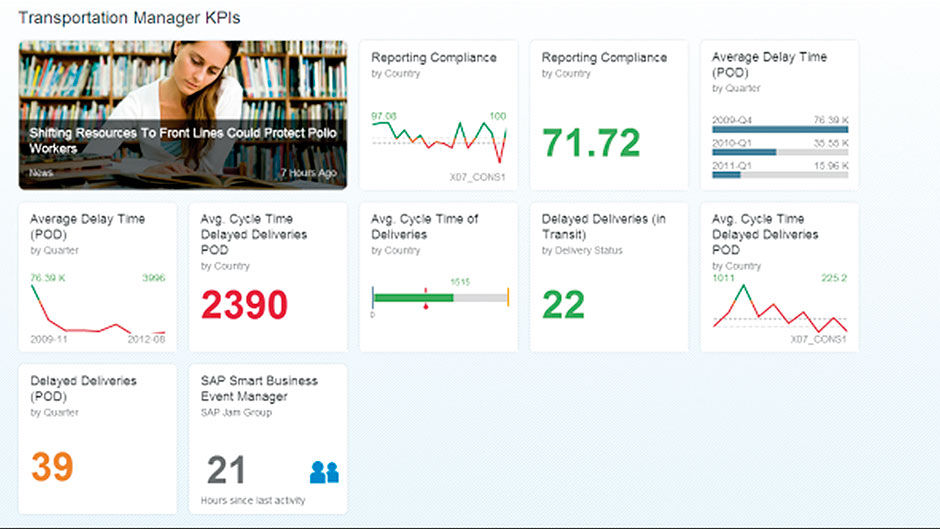
Author/Copyright holder: SAP AG. Copyright terms and licence: All rights reserved.
Figure 6.1: LAVA-Inspired Dashboard from SAP Fiori’s Smart Business.
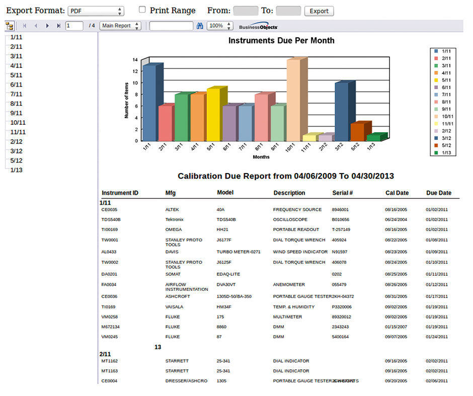 Author/Copyright holder: On Time Support, Inc. Copyright terms and licence: All rights reserved.
Figure 6.2: A report built with Crystal Reports.
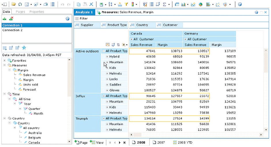 Author/Copyright holder: SAP AG. Copyright terms and licence: All rights reserved.
Figure 6.3: OLAP application from BOBJ.
As users demanded a more interactive, exploration-like experience – to more precisely triangulate on the most relevant data in a report, and then render a chart or report to show just this subset of content – the printed page metaphor began to break down. This led to the appearance of much more interactive, hybrid authoring products in the late 2000s, like BOBJ Explorer.
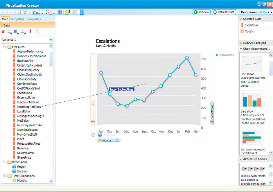
In 2006, BusinessObjects engineering manager Emmanue Laborde commissioned design consultants Edward Guttman, Ben Ireland, and Keith Mascheroni of Codestreet LLC to envision a new, easier way for users to create visual analytics from a structured data set. Called VizCreator, the direct-manipulation, drag-and-drop user model it employed eventually served as the foundation for the Visual Intelligence and Lumira products brought to market by SAP six years later. It was a chart-centric visualization tool, and Tableau was concurrently pursuing the same model in their early product versions. The VizCreator model featured a familiar, consumer desktop application-type metaphor more suitable for rapid input/output cycles, and placed charts in the forefront.
With VizCreator, users could first select the chart type they wanted to build, and then drag and drop data elements directly onto the desired column headers or chart axes. They could also select their data elements first, and then have the tool suggest the most appropriate chart to use. UI affordances in the chart’s working view readily conveyed it’s editable state, from which the chart could be previewed and published. The design is a great example of making a previously obtuse and cumbersome process, as was present in Excel for example, more concrete by allowing users to manually place the data elements directly where they were needed in the chart, and then edit them with clear feedback in the display. The selected data elements were rendered with subtle dimensional shading to convey their status as movable tokens. The workspace rendered a set of valid “Dropzones,” with subtle outlines for the tokens to be placed within. This physical metaphor was exercised in the most limited and impactful manner to clarify the task’s most challenging events. With instant rendering of event results, beginners could quickly learn chart creation logic through a comfortable trial-and- error protocol.
 Author/Copyright holder: SAP AG. Copyright terms and licence: All rights reserved.
Figure 6.4: BOBJ Explorer, 2007.
 Author/Copyright holder: Edward Guttman, Codestreet LLC. Copyright terms and licence: All rights reserved.
Figure 6.5: VizCreator concept design, 2006. L6.1 | Vizcreator Design Presentation (pdf)
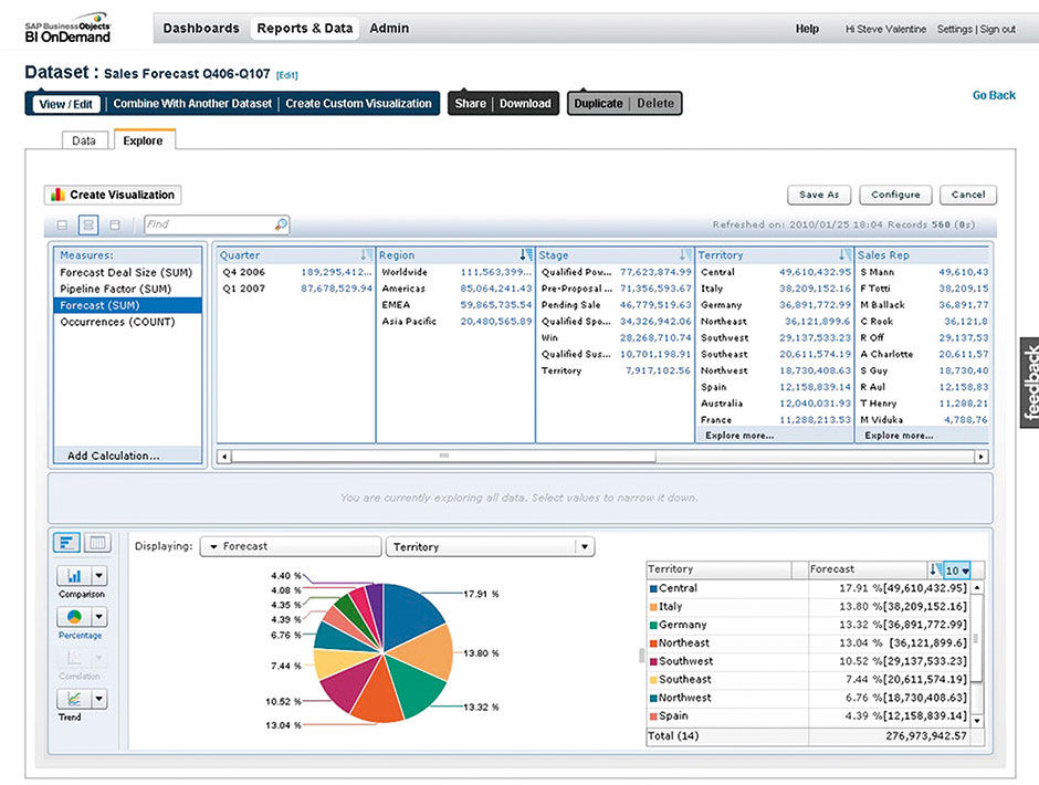
Users of these products no longer needed pre-formatted reports sent to them by back-office experts – they could rather open up a relatively raw data set into the viewing tool and, with a little practice, understand the entire set content and structure and proceed to build simple, screen-size reports themselves, and save or publish them if needed. This capability became known as “self-service BI”, with the goal of combining the power of interactive OLAP analysis with a highly visual authoring and output capability, and in a form that would be much easier to use than previous tools. Users could now explore the data set in a manageable way, and create charts with much greater ease than ever before.
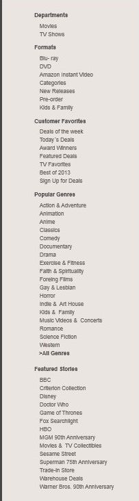
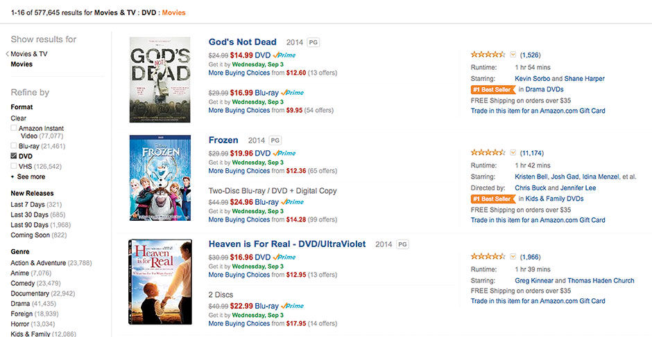
BOBJ Explorer was interesting for its ability to open a data set and automatically render it, using a faceted navigation system and chart rendering panel operating in parallel. Faceted navigation/search systems are an important advance in making structured data analysis accessible to casual users. Professor Marti Hearst at the University of California Berkeley conducted extensive research on the function and usability of these systems, which is published in her book Search User Interfaces. They now exist in several variants in products we use every day. Figure 6.7 is an example from Amazon.com’s Movies & TV shopping section.
In BI terms, the data set of movies and TV shows (Entities) are organized into the seven Dimensions of Department, Format, Category, Customer Favorites, Popular Genres / All Genres, and Featured Stores. Each of these Dimensions (capitalized here and throughout to indicate its specialized usage in BI terminology), or facets, acts as a filter for what is shown in the results set of entities, which are then shown to the right. We can apply the filters iteratively, in any order, to narrow down upon what we want to see in the results set. I might choose Movies, DVD, Kids & Family, Comedy, from Disney. Depending on the selections made and in what order, the Dimensions and their members might change due to them being completely filtered out by previous selections. For example, if I select the Horror genre I would expect Sesame Street and Disney to disappear from the Featured Stores facet, and vice versa. If we swap the list of movies in this search results screenshot with business-oriented quantitative content based on measures that can be aggregated into totals and calculated, such as values for sales, volume, profitability, etc, we can begin to imagine a retail-quality BI faceted navigation experience.
 Author/Copyright holder: SAP AG. Copyright terms and licence: All rights reserved.
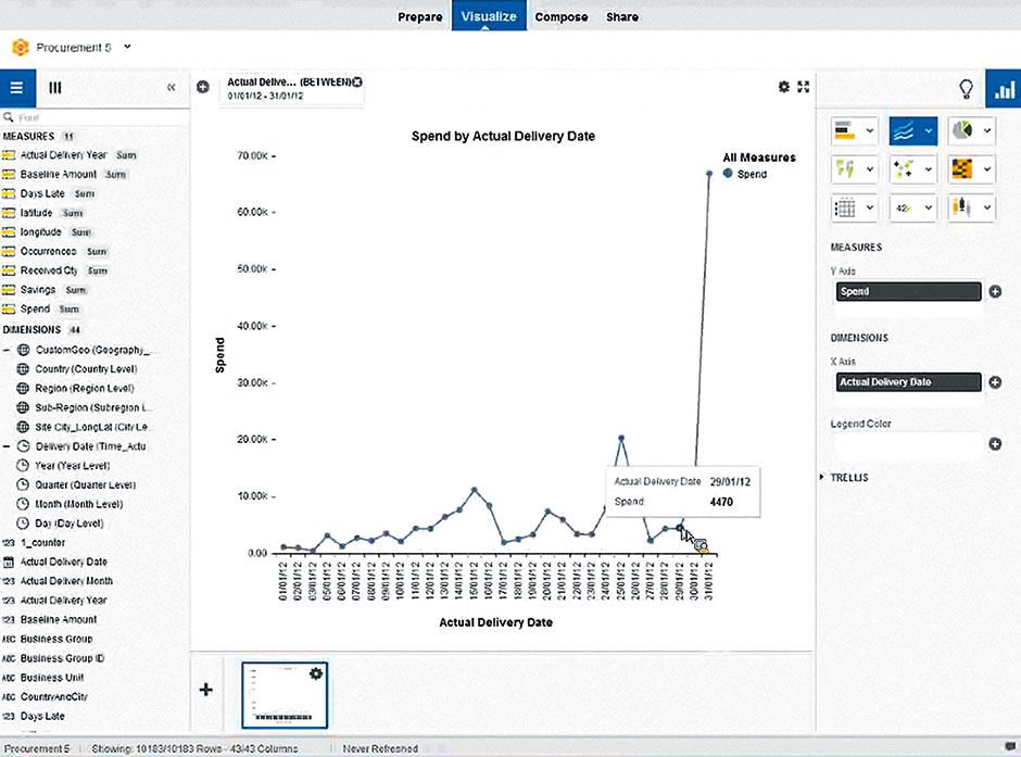
Figure 6.6: SAP Lumira Desktop, 2012.
This is what BOBJ Explorer tried to achieve with its faceted system, but with limited success. The key reason for why its user experience fell short was the fact that its workspace display maintained two parallel depictions of the data set: One in the word-based facet system at top, and the other in the chart-and-legend based system below. Users could select facet members to filter down the chart display – which automatically rendered a chart of the most appropriate form for the selected data – or select members rendered as bars or pie slices directly in the chart, or both in sequence. Each selection would update the selection and display status of the other. Users found it hard to keep track of what they had done , easily becoming confused and lost. What was really needed was a single unified text-and-visual display and exploration system, which became the main requirement behind the design of LAVA’s Lattice component.
Author/Copyright holder: Amazon.com. Copyright terms and licence: All rights reserved.
Figure 6.7: Amazon.com Faceted Search Filters.
 Author/Copyright holder: Amazon.com. Copyright terms and licence: All rights reserved.
Figure 6.8: Amazon.com Faceted Search Results.
In summary, because all quantitative inquiries in the enterprise are somehow related to enterprise performance, in a sense all BI is EPM, but at different levels of detail and pace. Similarly, all visual analytic displays are really reports, the variances being the level of content aggregation and formality, the form of the presentation, and the pace at which the displays are updated and manipulated. Dashboards are mostly charts, and show only important data that updates regularly. Reports are typically long, detailed snapshots of a certain point in time. Interactive analysis is the fleeting on-screen work of experts that may or may not end up being shared or published. Hybrid tools take the most useful aspects of the other types and make them more accessible and visual-oriented.
In 2010, the central UX group at SAP conducted an extensive study of how workers use numbers in the workplace, and the results offered few surprises. Codenamed Elev8, the study found spreadsheets to be the de facto standard for day-to-day number management in the business world. Business intelligence vendors and corporate IT governance departments have, in fact, long been on a quest to wean workers out of their Excel comfort zones and into a simpler and contiguous, but notably different, experience.
Excel’s widespread popularity has been a thorn in the side of BI vendors and IT groups for decades, in particular due to workers who use BI tools to extract, transform, and load data into an analyzable form, and then export the results into Excel’s familiar and powerful environment for consumption and distribution. It’s even used as a development platform for specialized business applications, and Excel’s Pivot Tables provide an OLAP-like experience for multi-dimensional analysis.
IT has long tried to convince workers to use BI suite solutions for ad hoc manipulation of live enterprise data directly connected to central databases. Despite their efforts, and the clear benefits of using a single, centralized version of the data, users still prefer to copy data out of the BI system into Excel for detailed manipulation, despite the related governance issues of spawning multiple unofficial data versions and analysis practices. Corporate IT has a vested interest in data security, consistency, and the traceability of use for greater awareness of content and service relevance. In a vivid example of the conflicting interests that arise in environments with a high “Chooser/User Gap”, or CUG, users like their Excel spreadsheets but corporate IT hates them. I’ll discuss CUG in more detail later.
Spreadsheets are just too prevalent, convenient, and powerful. As the demand for visual analytics surpasses spreadsheet abilities, the use of specialized tools like Tableau is growing, based on their superior usability and practicality for individuals and small departments within the enterprise. Excel’s strengths are its familiarity, power, and ubiquity, all of which combine to create momentum and conventions that are hard to break. However, because Excel is not particularly suited to the current trend of fast-paced, tailored, always-connected, self-service, mobile, and visual consumption , the space is opening up to more specialized products.
Although the Elev8 researchers found many opportunities for workers to be more productive by using more sophisticated BI tools, the existing habitual heuristics that the workers relied upon were seen as “good enough” for their needs. There was little awareness from the workers that better options might be available, and thus little incentive to branch out of their current methods. The study’s conclusion was that some effortless force, such as a black-box suggestion engine, was needed to “elevate” the analytic methods of rank-and-file workers, and that workers would not tolerate abrupt feature changes intended to remove pain points in their processes.
For workers manipulating data in search of answers, or of some sort of competitive advantage for their business, Excel is currently the preferred framework. However, with spreadsheets having a tabular-based interaction model, they aren’t well suited for the purpose known as “storytelling”. For this, the dominant business tools are presentation products such as Microsoft Powerpoint or Apple’s Keynote. Storytelling in a business context refers to the explaining or proposing of content as an exposition or argument, and this often includes some sort of numerical evidence gathered from key business metrics like sales, market share, productivity, etc. Despite Tufte’s questionable criticism that Powerpoint is helping to fragment, dumb-down and generally degrade modern speaking, writing, and thinking skills, presentation software is now a mainstay of business communication. Presentation audiences typically lack the time for exhaustive and detailed quantitative analysis. They count on the presenter to have done the tedious analysis ahead of time, and to present conclusions that are quickly perceived and to the point. As this is the strength of visual analytics, in particular the persuasive aspects, presentation slide decks tend to have a lot of charts and simple diagrams depicting flow and affinity relationships among its subjects.
All but the simplest visual analytics need to be authored in another tool and then composed alongside other words and images within these presentation files. Visualizations are more effective than spreadsheet rows and columns in this context because they are filtered, composed, and focused to highlight and support the presenter’s narrative, whether presented in person or when being read independently. Groups working live on projected spreadsheets are not engaged in a presentation but rather are typically in a collaborative editing or review session. Spreadsheets are like text documents in that they are not suited for the live delivery of content, but are rather more of a self-contained environment, occupied and navigated by the user to consume the content at their own pace. When presenting to an audience, scrolling around such environments in search of relevant facts is a waste of time.
Storytelling in a business context is usually a slide-by-slide explanation or prediction of something, backed up by numbers. This is the same format used by the new StatPop journalists such as Silver, only not broken into slides but rather consisting of a written narrative punctuated by charts. This presentation and publishing model places a premium on the ability to author a precise chart based on correct data, and then export it into its final deployment vehicle. The assumption is that the presenter has done the unstructured, ad hoc analysis work in their numeric spreadsheet environment, and then presents the key findings in a highly sharable visual format. The authoring can occur within the spreadsheet application, or with a specialized visual analytic application like Tableau.
Regardless, once the chart is pasted into the presentation file, its connection to its data source is severed. It becomes a static, inert illustration. Maintaining a live connection to an enterprise’s proprietary data, as well as the broader benefits of having a single enterprise-wide analytics system, is a major benefit of systems from the major platform vendors like SAP, Oracle, and Microsoft. Another major benefit, still largely unrealized today, is known as the “writeback” or “closed loop” scenario. I’ll discuss this capability in more detail later.
BI vendors also offer dashboard and performance management solutions. Dashboards are screen-based summary reports of an enterprise’s KPIs. Following the metaphor of car dashboards, the goal is to include the most important facts of the business on a single, non-scrolling screen for summary review. Although some dashboards expand into multiple tabbed screens, enable hierarchical navigation into details – called “drilldown”, or provide interactive affordances like filters or simple what-if models, simplicity and official relevance drive the design into being compact and definitive. While simple in concept, the task of specifying, gathering, and rolling up vast amounts of data from various sources and presenting them in an understandable form, in a tight space, and with low data latency, is quite difficult.
In over 20 years of involvement with visual analytics, half as a consultant and half within product organizations, I’ve worked on several so-called “executive management systems” or “executive decision systems” (EDSs). Their goal is always the same: To provide top executives with all the quantitative information they need to run their companies from a single digital display source. They always have compelling names whose metaphoric promise of power and control have escalated over time, from the traditional “dashboard” to “cockpit” to “war room” to “command center” to “headquarters”. They inevitably fail for two reasons. First, by the time they are up and working they are obsolete. Either the business or the executives and their needs change in the interim, and the system is never used. Second, the expense of building, maintaining, and updating the systems never justifies the servicing of only a handful of users, regardless of the users’ power and influence. The systems are just too brittle to change at the pace necessary. The sobering fact is that if these systems were not affordable for top executives, how could they ever be provided to middle and lower level workers, and tuned to their KPIs and needs?
An early, primitive EDS was adopted by Chile’s socialist president Salvador Allende in 1972. Called Cybersyn, it consisted of a central master control room replete with a teletype machine, multiple wall-mounted slide viewers, and a circular arrangement of armchairs with control buttons, ashtrays, and cupholders for whiskey glasses. Its design style was a cross between the sets of A Clockwork Orange and Wayne’s World. Every day, a team of four graphic designers created slides with analytic views of the country’s KPIs, which could be mechanically summoned from the chairs to appear on the wall-mounted viewing screens. It was designed to feed relevant data to leaders of the country’s major nationalized industries to inform their decision-making, but despite the best of intentions, the system’s insights were chronically late and often already apparent to the recipients. Six months after Cybersyn’s launch, Allende was overthrown in a coup and the system was destroyed.
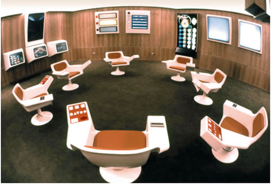
Figure 6.9: The Cybersyn command room.
The challenge is to provide relevant content in time for users to trust and rely upon it. Relevance is the hardest problem to solve, especially for small-cap workers making less-risky decisions. There are several bottlenecks in this challenge, included performance, ergonomics of the content presentation design, data availability, etc. But the main problem is that the IT support team never quite knows what their internal business customers want, and the customer needs are changing at an accelerating pace. While easier-to-use systems are the presumed answer to this problem, performance and ergonomic barriers have prevented any major breakthroughs.
Dedicated enterprise number-crunchers, known as data analysts, have often preferred OLAP solutions. These are powerful “spreadsheets on steroids” that directly access data warehouses containing multidimensional data “cubes,” converted from their original relational format to enable facile analysis scenarios. OLAP users operate in a world of data shown in columns and rows, cross-indexed for finding any set or sub-set of data using any available filters or groupings. Likened to operating a Rubiks Cube, this interaction mode is called “slicing and dicing” – cutting through lists of data along different axes to precisely isolate the desired facts and see them in the context of the entire data set. Although powerful and responsive, they are too difficult to understand and use for anyone other than an expert.
As already shown, similar fundamental capabilities and user behaviors present in OLAP analysis scenarios are possible in mass-market shopping sites like Amazon and Ebay. On these sites, products are cataloged according to their attributes, called metadata or “data about the data”, such as type, size, color, cost, location, etc. and accessible through a variety of controls that enable the shopper to isolate the product of their choice. The difference between these sites and power-BI solutions is that the retail outlets can tailor an intuitive UX to the focused task of shopping for whatever product type is offered, while OLAP systems, for example, are general-purpose and agnostic to the data type. I remember using Target.com to display, just for fun, products of any type available in red.
In summary, traditional BI products, such as Crystal Reports, BusinessObjects, and Cognos, are essentially publishing platforms for quantitative data. Their mainstay products are their reporting tools, which use a document-centric approach featuring paginated compilations of hierarchically organized tables, punctuated by charts, that users access via printed, pdf, or online formats. With these systems, teams of IT experts respond to information requests from the enterprise LOBs to find, extract, transform, load, clean, structure, and format into reports on an ad hoc or scheduled basis. While effective, the industry’s improvement vectors are to:
- Enable more responsiveness to ad hoc requests and modifications.
- Decrease data latency from the transactional system of record.
- Enable more precise reports of ever-more detailed and customized topics.
- Enable users to interact with the reports for personalized query, formatting, and what-if analysis purposes.
- Pursue the never-ending goal of cutting labor and equipment costs.
The progress made so far is exemplified by Tableau, who offered the first visual analytic tool compliant with BtF and easy enough for novice data analysts to use. Although BOBJ WebIntelligence and Cognos PowerPlay offer an online interactive report- and chart-building experience, Tableau was initially targeted at selling to individual users, and thus needed high standards of usability and literal self-service results. A darling of Stephen Few, Tableau is a chart-centric tool in that its basic model is to import data into the tool and create a chart or table. It’s intuitive to use because the user picks a chart type and fills it with available data from the selected data set. Through trial-and-error experimentation in its responsive visual environment, it’s forgiving and easy to learn. By using Tableau and Powerpoint, any number-literate business user can create a written narrative interspersed with well-crafted, custom charts to support their argument.
The chart interaction in Tableau, actually pioneered a decade earlier with the dynamic query capability of Spotfire, is so fluid that the usage experience fluctuates seamlessly from one of “authoring” to one of “exploration”. The user can manipulate the visual analytic so easily that they feel “immersed” within the data. With such an experience, the difference between the “raw data” and its manifestation in visualized form starts to fade away.
In an effort to cut the separate presentation tool out of the process, visual analytic tool vendors are building rudimentary presentation capabilities into their products to support the “storytelling” use case. While a far cry from the power and flexibility of using desktop presentation authoring tools, such solutions enable sharable, screen-by-screen narratives showing charts authored from within the same tool. I’ll discuss the storytelling phenomenon in greater detail later.
When combined with the ability to locate a data source and then craft and present an argument, or to simply get personalized answers for work, the former IT workflow of extract, transform, load, clean, structure, format, deliver, and consume is known as the “end to end scenario” or E2E. Users and customers want E2E to be enabled from a single tool, and operable by a relatively untrained business user. This, when combined with the holy grail of the write-back scenario in an enterprise deployment, would enable the entire workflow loop to be closed, allowing self-sufficient users to consume and act upon analytics in the workplace. However, for this to be enabled for lower levels of enterprise workers on a broad scale, the user experience of such a product needs to be one of strictly retail quality on the order of iTunes, Amazon, and other major digital brands. Because enterprise software vendors are just now achieving such quality levels for the simplest enterprise transactional workflows, like filing expense reports and requesting vacation, it will be a while before similar levels are achieved for such notoriously personalized needs as workplace analytics.
The shopping sites mentioned previously provide a model for what such an experience might look like. In fact, we might describe the desired activity as “shopping for numbers”. However, the problem with using iTunes, for example, as a model for a general analytics solution is that iTunes is tailored for a specific task – initially that of finding, buying, and playing music, and now extended to apps and other items – and thus has been hard-wired specificially for that task. The main challenge of any general-purpose product like a spreadsheet or chart-maker is that its designer needs to enable a broad set of use cases, thus ensuring that it will never be the perfect tool for any single one of these use cases. Because of the cost and difficulty of providing custom analytic solutions for a variety of work roles — for example window washers or copywriters — these solutions are not funded and built. Any sort of general-purpose solution for these roles would entail more effort to provision and use than their use would ever save.
In the current model, data exists that can help workers be more productive, but its cost allows only high-stakes workers – I call them large-cap workers, in contrast with small-cap workers, and I discuss them in detail later – or highly regimented roles to benefit from its application to decisions. Vendors provide tools and the infrastructure for enterprises to design and build solutions, but a major bottleneck is the lack of design resources to pinpoint the information needed by work roles within the long tail, and how to present it. The centralized model that is worthwhile in serving executives with analytics does not scale to small cap workers, let alone to individual consumers. The key factor is relevance, and there are four ways to achieve it for any type of information.
The first path to achieving relevance is by expert authoring, editing, and design – in essence, the institutional publishing route. In an enterprise, or the retail market, expert editors are paid to determine what is relevant for their audience, and control the content delivery systems. A tenuous feedback loop determines if the service level is adequate. For enterprise analytics, this comes through internal customer engagement efforts to ensure workers are getting what they need. Similar efforts, combined with sales performance, do the same for commercial publishers. As mentioned already, this can be expensive and slow, although with the general acceleration of the communication feedback loop, it’s improving. The use of cloud software allows the service provider to track detailed product usage, and is an underrated benefit of the move from on-premise, disconnected software to the cloud.
The second path is self-service discovery. In this model, users are provided with as many content options as possible and, hopefully, an intuitive and powerful tool to sift through it all. They themselves find and save what is relevant. The Web has evolved into this model, and away from that where AOL, Yahoo, and others would publish catalogs of edited, “approved content” through portals and directories.
The third path is automation, where algorithms track consumer behavior, and push them content likely to be relevant. Amazon’s “related products” is a famous example, and this tactic is starting to appear in visual analytic tools, through suggestions of similar or generally interesting charts based on whatever the user is doing or looking at. Clippy, Microsoft’s 1990s onscreen animated helper, is a notoriously annoying example of how this approach can go too far. Clippy was widely reviled for pestering users to be more efficient in their use of Windows and Office applications. Google’s Page Rank search algorithm, versus Yahoo’s manually-curated catalog of the Web, is a modern-day example of the rock-drilling machine versus the manual effort of the laboring folk hero John Henry. As in the original folk tale, the machine lost initially but eventually won out.
The fourth path is social recommendations and crowdsourcing, where people can see what others find relevant, and see if that works for them too. Page Rank relies on this in a mass, automated way. Most Viewed and Most Emailed lists on news sites, and the ability to see what personal networks are doing via social media, are obvious examples of this path. Of course, our actual experiences are a blend of all four paths, but the final three have combined to disrupt the editorial approach. As part of the larger trend of dwindling human editorial information gatekeepers — and all agency roles performed by middlemen — the same thing is now happening with quantitative information distribution.
In the Bridges episode of the PBS TV series Building Big, a famous bridge engineer claims that “It’s easy to make a bridge stand up. What’s hard is making it stand up just barely”. Referring to the universal constraint of cost, he makes the widely applicable point that while ambitious goals can be achieved in any domain, practical cost constraints allow only a sliver of viable space in which to deliver a satisfactory outcome. Anyone can conservatively over-engineer a solution, but it can be very difficult to balance acceptable performance and reasonable cost to make a project viable. In the same sense, it’s relatively straightforward to select a business role, for example a purchasing manager, and tailor an analytic product precisely to their needs, with custom layouts, workflows, and even visualization forms tuned to their work. The problem is that the investment required to develop and maintain such a solution is difficult to recoup through the amount that the world’s population of purchasing managers would be willing to pay, based on how much value they would get from using the solution.
A similar phenomenon is at play in the case of analytic illustrations or simple models created as journalism, with supplementary text to explain a phenomenon, process, or situation. The artisanal work of Nate Silver, Khoi Vinh, and others at NYTimes.com are good examples, and for their intended purpose they can be exquisite and quite informative. They require high-touch, handmade creation, and as they are not intended to scale or be repurposed for different use cases means, they can be hardwired to do a few things well and reliably. They stand in contrast to what I call systematic or sustainable analytics that try to pay for themselves by being general-purpose patterns, built and learned once but applicable to a wide variety of tasks. The latter’s development costs can be spread across broad and sustained usage. Artisanal analytics are like finely prepared meals that are too costly to eat every day.
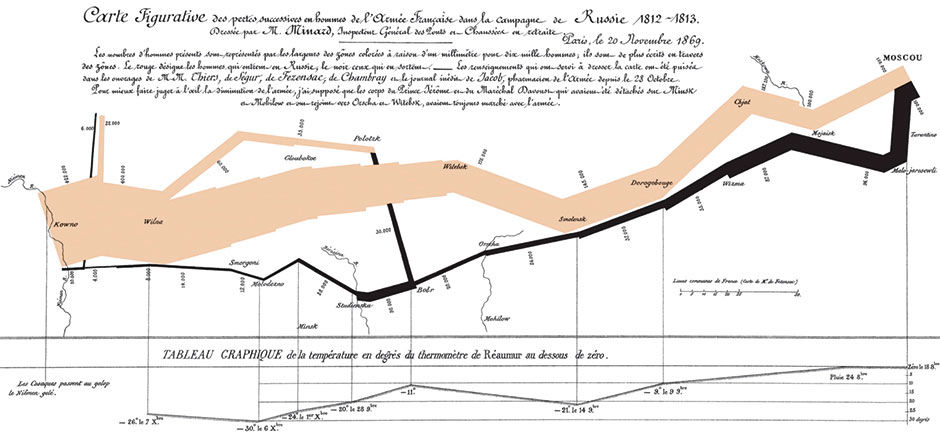
Charles Joseph Minard’s famous diagram of Napoleon’s 19th century campaign against Russia was popularized by Tufte as a sublime example of information design. While Tufte is right, many of his followers are not sure what further use it can provide. It is the extreme example of an artisanal creation, where the combination of an innovative and insightful designer, with data resulting from a deceptively coincidental and forgiving geographic and historical circumstance, resulted in a masterful application of data to a pictorial format. The problem with it’s use as an example is that it has few practical, ongoing applications. There is only one documented historical case of a concentrated army traversing horizontally across a vast expanse towards a single point, and then retreating back over the same space without being reinforced with more troops. Although Adolf Hitler’s armies tried the same thing in WWII, with a similar result, trying to use a similar diagram to depict this exponentially more massive and complex campaign would be impossible.
Minard’s diagram, while a masterpiece, is interesting more as an example of a providential coincidence of data and circumstances, to the point of realizing that given the simplicity and clarity of what happened, how could one not envision it being portrayed in such a way? Tufte has in fact been criticized for cherry-picking great existing designs for use as examples, but without creating any of his own, or demonstrating how they can be applied systematically to wider use cases. While Minard’s depiction of flow in the upper part of his diagram is now formally known as a Sankey diagram, its current active use is mostly limited to relatively abstract scientific depictions of energy flow.
 Author/Copyright holder: Jeff Dahl. Copyright terms and licence: Public Domain.
Figure 6.10: Charles Joseph Minard’s diagram of Napoleon’s 19th century campaign against Russia.
Just like all modern cars have four wheels, a motor, and seats, most interactions with numbers fall into a few basic patterns. The names and numbers change with the domain, but the underlying analytics are similar. Products that address these universal use cases well, and are made available to a critical mass of people at low cost, can transform markets. Instead of demanding custom solutions, people will adapt their expectations to something generic that is good enough. Once they realize that the same basic model can be used for other purposes, using it becomes habit and eventually viral. We have seen this happen with email, photo and video sharing, messaging, and money transfer. What will the webmail, Flickr, YouTube, Twitter, Facebook, and PayPal version of numbers look like?
General software consumers use a few overlapping yet distinct digital service categories to entertain themselves and help manage their work and life. The first category is communication, which includes email, messaging, social media, and telephony. The second, entertainment and media, includes news web sites and music/video services. The finance and accounting category is represented by online banking and personal finance applications. The planning category relies upon calendar tools. Online commerce is yet another category. If they author content it is usually in the form of writing or photography; for that there are blog and photo services and text/presentation authoring tools. In the workplace, the landscape is surprisingly similar, albeit with more time spent authoring and using operational task-oriented applications. So, communicating, amusement, accounting, planning, shopping, creating…is there room for another category called “quantifying”? Would it make sense to offer, say, a web site focused only on the quantitative aspects of your life and work? This in fact has been a major goal of BI in the enterprise: To create one tool, site, or source where you can find anything quantitative. In today’s reality, this quantitative content is spread across a number of distinct access points and must be hunted down and manually applied to the context of daily work.
For workers, is it realistic to imagine all relevant performance metrics to be made accessible in one distinct “place”? For individual consumers, would it make sense to have a service to manage all relevant metrics of your life? Such a service would likely start with finances and extend to other metrics like utility usage, travel metrics, phone usage, blog hit rates, time online, health monitoring data, temperature and humidity of the household, and anything else that’s measurable, displayable, and wired up to data feeds per the vision of the IoT. I’m not sure. How viable is an IoT device for monitoring the fill level of your outdoor barbecue’s propane tank? For masses of people to rely on quantitative content, such content would either need to push its way into the current list of fundamental service categories, or to be offered as a unique new category, perhaps as a major outgrowth of the accounting service, to include all things quantitative.
An alternative is to have metrics embedded within the current services we all use. For personal finance we already have this. For health metrics would we have a new destination to track things like weight, steps taken, calories ingested, etc.? Would we have another source for overall utility management with its own set of usage metrics? If you closely follow a sports team and care about their statistical performance, would you group this with entertainment, or with overall metric monitoring? The underlying question is, “is analytics important and distinct enough to warrant worker and consumer mindshare at the level of being a true destination and activity category?” If not, is there a way to imagine a service, like Google Maps, that can be embedded within other destination-level experiences so as to have a consistent relationship with analytic content in context, and then perhaps compiled in a single destination for review as needed? A comprehensive personalized metric history, with accounts added as is done with financial account aggregators like Mint.com?
Instead of designing custom analytic solutions tailored for work roles, is there a way to simplify analytics to the point where, like reading text, the recorded quantitative information related to anyone’s job or activities can be delivered and presented in a generic way, so that people can read numbers as confidently as they read text?
These are strategic-level business questions. Regardless of what happens structurally, given the overall reluctance, difficulty, and confusion of relating metrics to everyday work and life, enabling their use on the scale of email, social media, online banking, and ecommerce will require some sort of consolidation, set of conventions, and overall simplification of how numbers are presented and used. In order to find room as a destination, or as a reliable supplement in the tight attention spaces of modern life, analytics need to prove their worth by becoming trusted, reliable, understandable, and popular. Finding new design solutions to support the delivery of this value is the task I was given at SAP in 2010. The next chapters describe in more detail the design process used to assess the situation, to examine possible alternatives, and to reach a solution. Later I will give a detailed description of the solution itself, followed by more general process observations intended to make it easier for others to attempt similarly ambitious solutions.
6.0.1 Media Assets
L6.1 | Vizcreator Design Presentation (pdf) |
https://www.interaction-design.org/literature/book/bringing-numbers-to-life/assets
This was the final deliverable from the design consultants at Codestreet LLC. It presents the overall model for a chart-centric data exploration tool.
6.0.2 References
6.1 | 2012 The Year in Graphics (web) | NYTimes.com |
http://www.nytimes.com/interactive/2012/12/30/multimedia/2012-the-year-in-graphics.html
6.2 | Search User Interfaces (book) | | Cambridge University Press
6.3 | The Cognitive Style of Powerpoint: Pitching Out Corrupts Within (book) || Graphics Press
6.4 | The Planning Machine: Project Cybersyn and the origins of the big data nation (web) | | The New Yorker | http://www.newyorker.com/magazine/2014/10/13/planning-machine
6.5 | Building Big Bridges (video) | | PBS Video |
http://www.shoppbs.org/product/index.jsp?productId=3963807
6.6 | The Internet of Things you Don’t Really Need (web) | | The Atlantic | http://www.theatlantic.com/technology/archive/2015/06/the-internet-of-things-you-dont-really-need/396485/
