Learn ways to achieve simplicity in your designs and recognize why certain designs are overly complex. Simplicity is evident in many of the widely-used products created by some of the most successful companies. Simplicity is also one of the key reasons why some companies do better than their competitors. Google’s search engine, Apple iPhones, and WhatsApp messenger and clean weather widgets are just a few of the widely popular products that exhibit simplicity. This article will teach you how to recognize and achieve simplicity and why it results in great user interface design.
What is Simplicity?
Simplicity is all the rage these days. It is a design philosophy that is championed by many successful companies and fans of those companies alike. Apple Inc., a highly successful multinational technology company, fights for simplicity in design. Steve Jobs, the late CEO of Apple, an American entrepreneur and investor, once said:
“That’s been one of my mantras — focus and simplicity. Simple can be harder than complex. You have to work hard to get your thinking clean to make it simple. But it’s worth it in the end because once you get there, you can move mountains.”
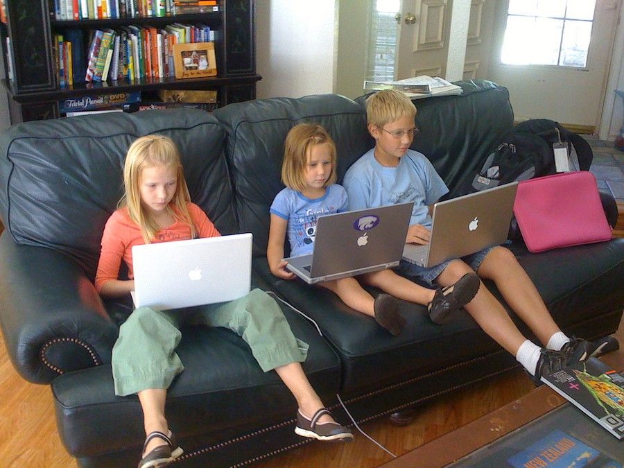 Author/Copyright holder: Wesley Fryer . Copyright terms and licence: CC BY 2.0
Users of all ages love the Apple MacBook. This is an example of how simplicity reduces intimidation and allows a wider range of users to be unafraid to use the product.
When you ask someone why they love their Apple iPhone or Apple MacBook, you usually get the answer similar to this: “Because it’s simple!”. When you probe further, most fans and users of the product can’t really explain how and why it’s simple. To them, “It just works.” as Steve Jobs would say. Simplicity is not easy to define or measure. Joe Sparano, an American graphic designer and design educator says it best:
“Good design is obvious. Great design is transparent.”
Designing a user interface that considers the user’s aims, whether vast or few, and offers the simplest means of achieving these goals, is the height of design sophistication. Simplicity in design isn’t just about the minimal colors you use or the whitespace you include, it’s about going deep into your user’s minds and using that understanding to design a product that rids itself of inconsequential elements and closes the gap between the user’s goals and the means to achieve those goals through your system.
4 Ways to Achieve Simplicity in Your Designs
1. Maintain Clarity: Understand and Design for your Users’ Main Goals
Whether your website acts as an online retailer for consumers or your product is an enterprise solution designed to help company executives manage their projects, maintaining clarity in the user interface you design is key to user success and user satisfaction. Clarity allows your users to understand what you’re trying to help them achieve. If your design has too much extraneous information, users will have trouble navigating your site. Help the user understand the message you’re trying to convey and the actions the user can take within the first few seconds of browsing. Call attention to only the core aspects of the page you want your users to focus their attention to.
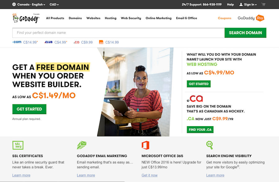
Here’s an example comparing the popular internet domain registrar and web hosting company, GoDaddy’s old website from 2005 with one that becomes less cluttered, a decade later in 2016. Websites are catching on to the value of simplicity in design but there is still a lot of work to do!
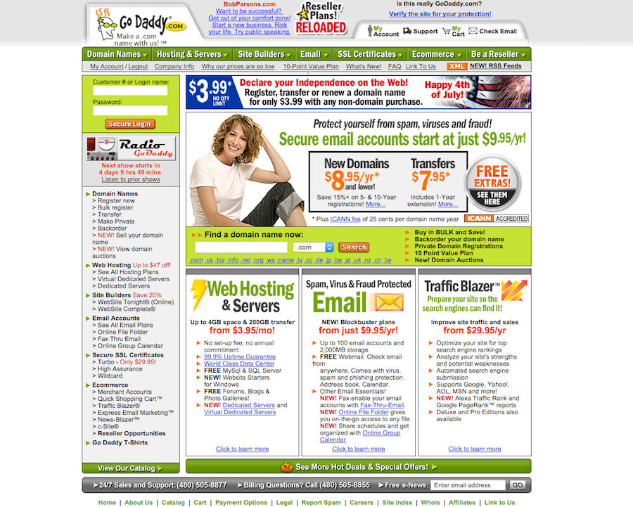 Author/Copyright holder: GoDaddy, 2005. Copyright terms and licence: Fair Use.
The domain-name provider, GoDaddy’s cluttered website back in 2005 shows how it is difficult for any user to figure out how to achieve their goal when there is no clear call-to-action or next steps. It seems that back then GoDaddy offered a lot of services without really knowing or valuing what the majority of their user’s aims were.
 Author/Copyright holder: GoDaddy, 2016. Copyright terms and licence: Fair Use.
The domain-name provider, GoDaddy’s improved and de-cluttered website in 2016 shows how much clearer your message can be if you focus on designing for your user’s goals. Before you start designing, be sure to figure out what your user’s main goals are.
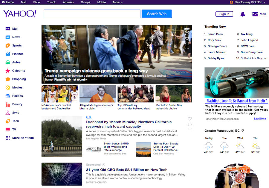
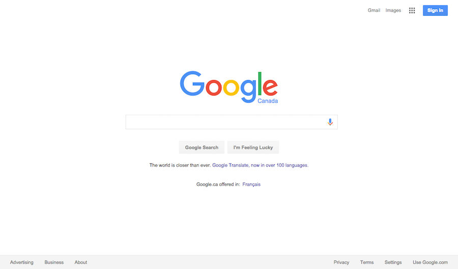
As the world’s most popular search engine with a market share of almost 70% as of September 2015, there are many reasons why Google Inc. beat out Yahoo Inc. and many other competitors back in the early 2000s. One of them is by staying true to simplicity by maintaining clarity. Comparing the two search engines, you can see that Google has a very clear user interface that matches the user’s goal when utilizing a search engine: search. Meanwhile, Yahoo’s home page has a lot for the user to take in. It is unclear as to whether Yahoo intends for the user to browse aimlessly or randomly select a popular new story that may be completely irrelevant (and distracting) to what the user is searching for.
 Author/Copyright holder: Yahoo Inc., 2016. Copyright terms and licence: Fair Use.
Yahoo’s home page diverts the user’s attention away from their main goal by having too many things going on at one time (2016).
 Author/Copyright holder: Google, Inc. Copyright terms and licence: Fair Use.
The world’s most popular search engine, Google, directs the user’s attention to one thing only: search (2016).
Remember: Maintain clarity by designing for your user’s main goals. Don’t confuse your users with extraneous information that are irrelevant to those goals. Help your users understand what actions they can take by calling attention to only the core aspects you want them to focus on.
2. Make Use of Automation: Design for a Minimum Amount of Conscious and Cognitive Effort
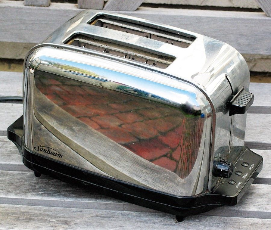
In the paper ‘Controlled and Automatic Human Information Processing’, cognitive scientists Walter Schneider and Richard Shiffrin stated that well-rehearsed behavior becomes “automatic”. This refers to the tendency for humans to perform common, practiced tasks with a minimum amount of conscious, cognitive effort. Take for example the toaster. It’s an invention that has experienced little change in the past several decades. The toaster is simple to use and requires very few interactions to achieve appliance-related goals. Therefore, interacting with the toaster requires a minimum amount of conscious awareness, leading to “automaticity”, which makes users feel at ease and in control without much effort.
 Author/Copyright holder: Donovan Govan . Copyright terms and licence: CC BY-SA 3.0
A two slice Sunbeam toaster from 2005 is an example of how an interface designed for automation stands the test of time.
Another example would be messenger apps that show little variance in appearance between the different mobile interface designs. With a familiar interface and common functionality, users are easily able to adapt to different messenger apps.
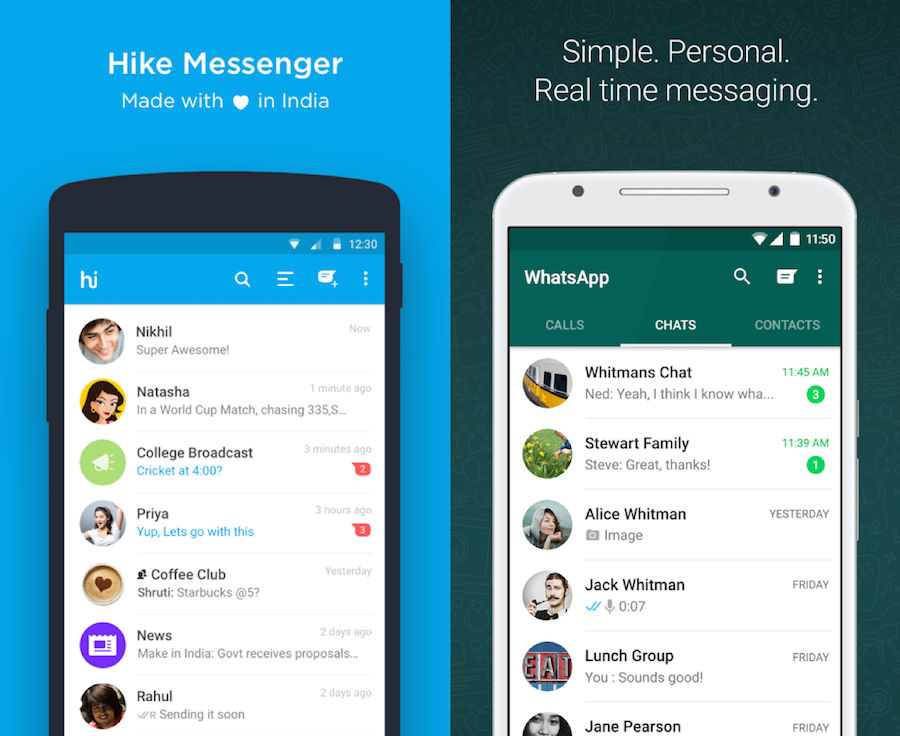 Author/Copyright holder: Hike Messenger and WhatsApp Messenger. Copyright terms and licence: Fair Use.
Two different messenger apps, similar mobile user interface components. This shows how leveraging existing customs and designs can help automate the user’s cognitive process when using your app.
Remember: Make use of automation by designing for the least amount of cognitive effort. Figure out what the commonly practiced tasks and processes are and incorporate them into your designs whenever possible.
3. Limit Options: Design for a Strong “Information Scent”
Among others, Ed Chi, an acknowledged American computer scientist and research scientist at Google identified our tendency to detect only those things that are relevant to our current goal; they called this “following the scent of information”. The best user interfaces lead users through a desired path with clear indication of the individual steps required to complete their user goals. This can be achieved by making the goal “scent” strong; displays need to be uncluttered and essential information centralized or in clear view.
In order to make information scent strong, we can limit the options for the user to consider in our user interface. Limiting options removes indecision and hesitation, eliminates confusion and reduces over-use of the ‘Back’ button. Apps and widgets are really catching on and focusing design efforts on the key goals of the user. For example, the weather widget does a great job of eliminating all elements that give off a “weak” information scent in a regular weather-reporting website. The designer of the weather widget knows that the user is really only looking for the key weather information measured by degrees Celsius (or Fahrenheit) and the ability to change location through the settings icon.
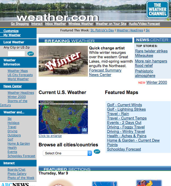
Author/Copyright holder: The Weather Channel Enterprises, Inc. Copyright terms and licence: Fair Use.
The Weather Channel’s website back in 1999 is an example of how too many options can cause poor user experience for something a simple as looking up the weather forecast.
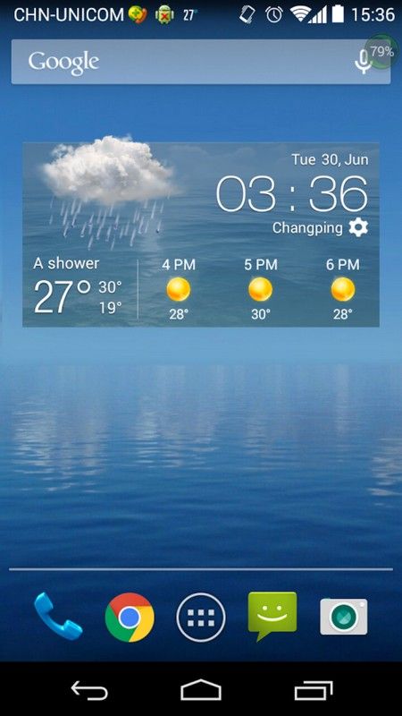
Author/Copyright holder: Weather Widget Theme Dev Team. Copyright terms and licence: Fair Use.
A typical and popular type of widget used in many mobile phones. This is an example of how limiting options can help users achieve their goals faster and more efficiently, which creates a better user experience.
Remember: Limiting options and designing for a strong information scent can help you remove the burden of indecision and hesitation from your users.
4. Reduce the Gulf of Execution: Make your Users see how your Product can Help them Achieve their Goals
In the popular book, ‘The Design of Everyday Things’ by Don Norman, a contemporary design thinker and co-founder of the Nielsen Norman Group, the term “gulf of execution” describes the gap between a user’s goal and the means to execute that goal. It’s a psychological gap between the human and the system interface where the screen representations of the steps towards the goal should match the psychological goals of the user as much as possible.
When a user looks at the user interface of a system, they should be able to translate their goals as they evaluate the system through its various limitations and capabilities. The harder it is for the user to see a means to execute their goal through the system, the wider the gulf of execution. The wider the gulf of execution, the higher chance your users will give up using your product.
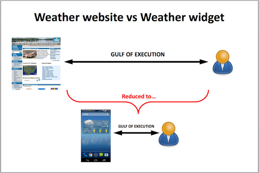
Comparing the Gulf of Execution of a weather website to that of a weather widget, you can see how a simpler user interface can lead to a narrower Gulf of Execution. The wider the gulf of execution, the higher chance your users will give up using your product. Designers should always strive for a narrow Gulf of Execution.
The weather widget, mentioned in the previous section, has a very narrow “gulf of execution” as the number of aims (e.g., looking up local weather information) are low and the means of achieving them is small. On the other hand, the Weather Channel website has a wider “gulf of execution” as the number of aims of the user remain the same but the means of achieving them is widely varied.
Increasing the number of means of achieving a limited number of system goals creates needless complication. Successful systems are designed with the user’s primary goal(s) in mind and take into consideration the limits of human memory and the amount of attention allocated to each goal.
Remember: The narrower you can make the Gulf of Execution, the more likely your user will understand how to interact with your user interface. Make your product simple enough for your users to understand how they can use it as a tool to achieve their goals.
The Take Away
It’s not easy to design for simplicity. It’s not supposed to be. Your job as a UX designer is to dig deep into the complexities of everything from user goals to system constraints in order to output a beautiful and easy to use design that will help users achieve their goals effortlessly. To get started on the path to simplicity and incorporate them into your designs, be sure to:
1. Maintain Clarity: Understand and Design for your Users’ Main Goals
2. Make Use of Automation: Design for a Minimum Amount of Conscious and Cognitive Effort
3. Limit Options: Design for a Strong “Information Scent”
4. Reduce the “Gulf of Execution”: Make your Users See Why they should Use your Product
When you take into consideration the limits of human cognition, you will find that you can better match user goals to the system tools and pathways you design for your users.
References & Where to Learn More
Course: The Practical Guide to Usability
To find more information on information scent, check out “On the hunt for seductive details”
Another interesting resource is “Information Scent: How Users Decide Where to Go Next”