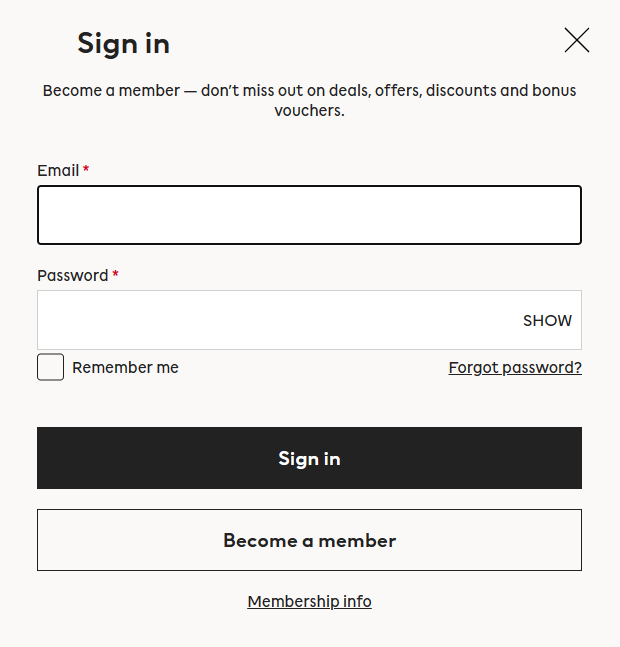
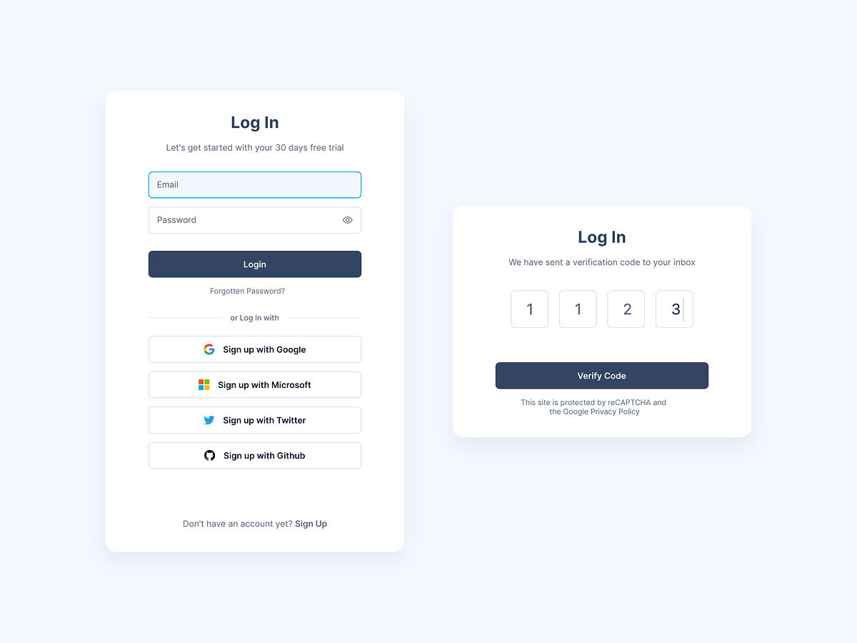
Login screens are the first point of contact between a user and an app or website—and they’re vital gateways to brands, whatever their products or services. That’s why it’s so important to create a better login screen—it, quite simply, sets the tone for the user's experience. An engaging, user-friendly login page makes a solid first impression; plus, it’s key to user retention and satisfaction. Learn how to create the best login screen for your mobile app or website with the top ten examples. These are ones that can help you transform your login pages into a pivotal part of the user experience that boosts engagement and retention.
Think about that all-important initial interaction users have with an app or website—which often begins at the login page—and how this interface shapes the initial user experience and perception. Today—when competition is fierce and user attention spans are short—your login page can make all the difference.
A great login screen combines aesthetics, ease of use, and security. If the login screen is hard to use and slow to complete, though, it can frustrate users immediately—not a good introduction for them to experience, and it’ll reflect in the number of users who abandon it.
A well-crafted login screen is particularly important for how it can set a good tone for the user journey. Like a kind of “brand ambassador,” it leaves the first impression on the users and significantly impacts their overall user experience.
So, keep on reading—we've got you covered if you want inspiration to create a standout login page! For our piece here, we found ten exceptional login screen examples to help you complete the job with flair, and they’re examples that illustrate the fusion of creativity and practicality.
Example 1: PixelPro Digital
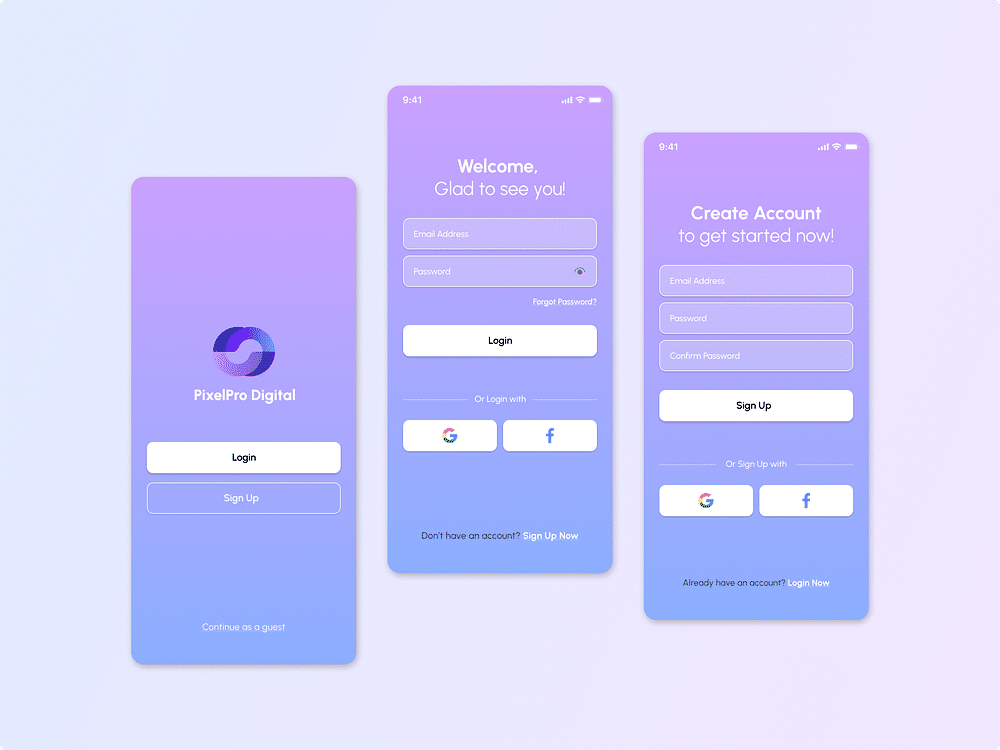
© Piyush Malvi, via Dribble, Fair Use
The login screen from PixelPro Digital is visually pleasing and user-friendly—and it presents a purple gradient that captures attention without overwhelming the users. The design includes marked fields for email and password—and it offers alternatives to logging in via Google or Facebook. What’s more, it provides a 'Continue as a guest' option—and that’s a really thoughtful addition for users who want quick access without commitment.
Strongest Point
Its most vital point is the blend of aesthetic appeal with functionality that it’s got—and the straightforward design guides users naturally from one step to the next. As it’s got the use of familiar icons for social media login, it enhances recognition and speeds up the process, too.
Why It's a Good Example
This login screen is an excellent example because it combines style with practicality, and the choice of colors, layout, and typography create a welcoming first interaction. The inclusion of multiple login methods respects users' time and their preferred ways to access content.
Major Takeaways
This example focuses on how important it is to have a clean layout and intuitive navigation. The screen shows that a brand that provides multiple pathways to log in is one that can cater to a broader audience—and the design demonstrates that you can maintain brand identity while ensuring user convenience, and that’s a vital blend to have.
Example 2: Spotify
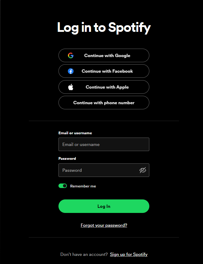
© Spotify, Fair Use
Spotify's login screen has got a clear, dark theme highlighting bright text. It gives users several quick login options, like Google, Facebook, Apple, and phone numbers. This variety is something that allows for a personalized login experience that caters to different user preferences.
Strongest Point
Its most notable feature is how it simplifies the login process. And the 'Remember me' option and the easy-to-find 'Forgot your password?' link show it values user convenience.
Why It's a Good Example
The login screen is an excellent example because it caters to users' need for easy login—and it arranges each element in a way that guides the user smoothly from start to finish.
Major Takeaways
This login screen can act as a guide to create a welcoming user interface—and the brand makes an inviting entry point that aligns with its excellent, modern image. This interface shows the benefits of multiple login methods and straightforward navigation for a better user experience.
If you create a welcoming login page, you’ll set the stage for user satisfaction—and more retained users based on that, too. A user-friendly login page invites and retains visitors. Professor Alan Dix, an expert in Human-Computer Interaction, explains this important aspect; so, watch this video and get invaluable insights from him on user experience.
Show
Hide
video transcript
- Transcript loading…
Example 3: Coffee House
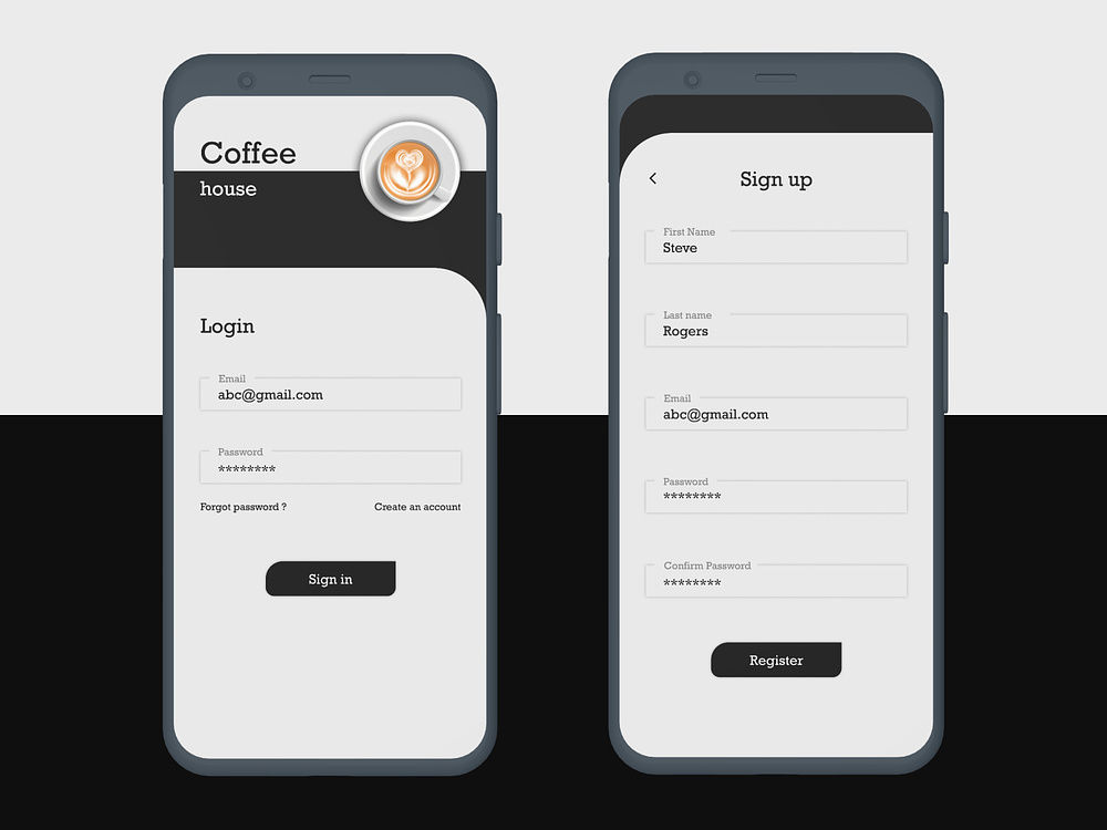
© Surya IG, via Dribbble, Fair Use
The Coffee House login and signup screens present a minimalistic and clean design. Not only do they feature straightforward forms against a light background—and it’s a neat factor that makes the content easy to read—but the coffee cup logo at the top adds a charming touch that ties the screens to the brand, too.
Strongest Point
The screens' strongest aspect is their focus on simplicity—and users can quickly navigate the login and registration process with no extra details getting in the way. This simplicity is precious as it helps to avoid any confusion or distraction, and users can get right to it.
Why It's a Good Example
These screens are good examples because they balance functionality with thematic design. They’re screens that provide a smooth and uncomplicated experience for users who are looking to sign in or create a new account. It’s a nice touch that mirrors the straightforwardness one might associate with grabbing a quick coffee.
Major Takeaways
This example emphasizes how important it is to include brand elements in login design and keep the layout nice and clean for user focus. The design demonstrates that you’ve really got to create intuitive user interfaces that reflect the brand's essential identity—and resonate with users.
Example 4: IKEA
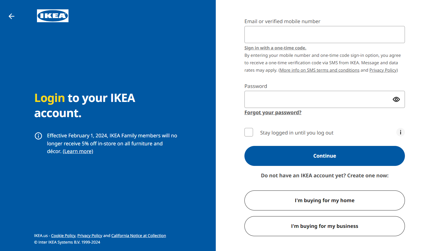
© IKEA, Fair Use
IKEA's login page is an excellent example of a simple, clean design that’s got subtle colors. Plus, the page lets users sign in with a one-time code sent via SMS to them. And it’s a feature that—along with traditional email and password entry—provides a versatile and secure login experience for users to enjoy.
Strongest Point
The most vital point about IKEA's login method is the added security and convenience of the one-time code. Users can quickly access their accounts without any need to recall a password—a neat factor that reduces the risk of unauthorized access.
Why It's a Good Example
It’s an excellent example of a user-friendly login design—and it’s one that demonstrates a forward-thinking approach to user security and access. The one-time code option respects users' time and privacy—and, what’s more, it makes it a notable practice in login screen design.
Major Takeaways
IKEA's login system shows why it’s so important to provide secure, user-friendly login options that adapt to modern security concerns. It really showcases the value of alternative login methods—such as one-time codes—and it can simplify the user experience without compromising security, big plusses for users.
Example 5: National Geographic
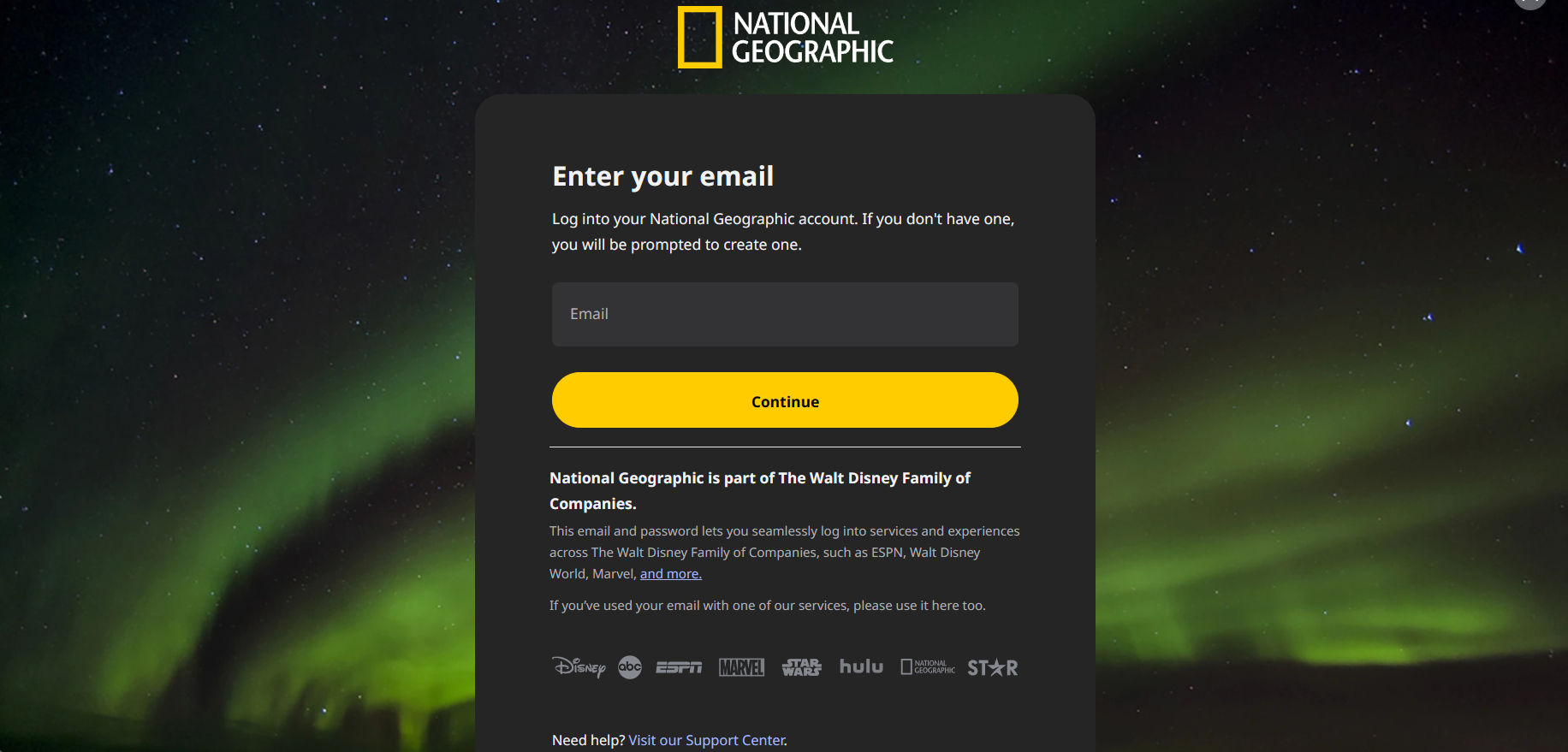
© National Geographic, Fair Use
National Geographic's login page is a simple yet captivating one—and nicely aligns with the brand’s identity. It features a stunning image of the aurora borealis—and it shows the brand's love for nature—and the use of title cases for headings follows a traditional style. The login process is straightforward—and there’s just one field for your email address. What’s more, the clean and neat design makes it easy to navigate.
Strongest Point
This login page stands out with its visually stunning background—the aurora borealis image does the job right, and it captivates the users. It nicely reflects the brand's commitment to showcasing the wonders of our world, too.
Why It's a Good Example
This login page is a prime example of brand consistency done right. For one thing, it uses a title case for the heading and immediately immerses users in the National Geographic experience. What’s more, the clean design and straightforward process with a single field focused on the email address to start the login process make this login screen better.
Major Takeaways
National Geographic's login page shows how powerful it can be to combine striking visuals with user-friendly design. It guides users with clear, simple steps for a quick and pleasant login experience, and—what’s more—the page wonderfully combines simplicity with the awe-inspiring imagery that the brand’s known for.
Example 6: Ghostlamp
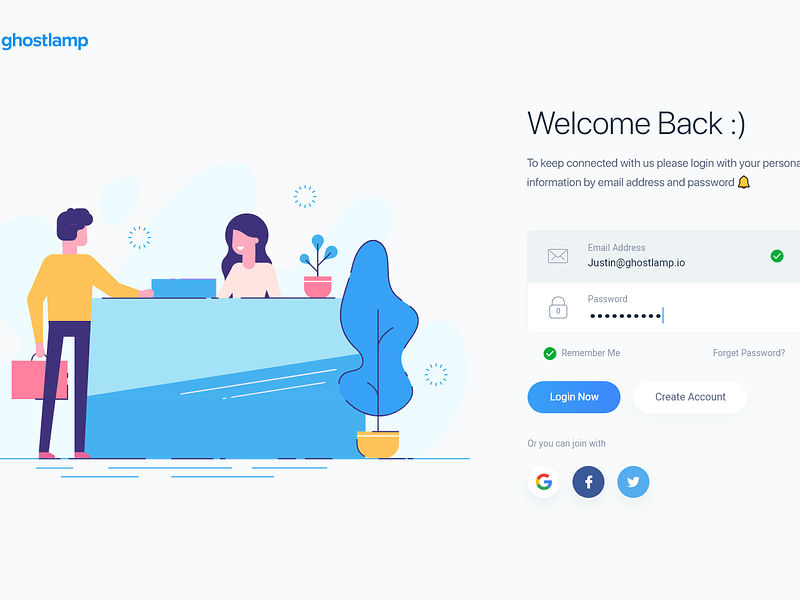
© Sourabh Barua, via Dribble, Fair Use
Ghostlamp's login page gets it right by greeting you with a cheerful 'Welcome Back :)'—and that’s a neat gesture that makes the page feel more personal. The layout is intuitive, and it guides you effortlessly through entering your email and password. What’s more, for a quick login, social media buttons for Facebook, Google, and Twitter are at your fingertips—and that’s a considerably convenient touch.
Strongest Point
The most substantial aspect here is the ease of navigation—it’s really easy to navigate. The interface is inviting, and it’s got a subtle call to action for social media logins or the direct form. This design is well-thought-out, and it nicely prevents users from feeling overwhelmed.
Why It's a Good Example
This page stands out for its simplicity and clarity—and they’re two vital ingredients in user experience (UX) design and user interface (UI) design. The white background and sharp fonts make everything readable at a glance, and it's one of the best UI login pages that values your time and ease of access.
Major Takeaways
The design speaks volumes about user-centric design philosophy—and the page's layout demonstrates how a straightforward approach can really boost the usability factor. It offers a dual login system without compromising the aesthetic, and it's a prime example of how simplicity and choice can coexist to improve your interaction with the website.
Example 7: Fintech App
© Ramotion, via Dribble, Fair Use
This login page stands out with its vibrant pink and red accents, and these make a refreshing take on fintech app designs—and, yes, you won't find the usual blue and silver here. The interface presents a clean design with essential icons only, and it’s a design that neatly guides users without any distractions getting in the way.
Strongest Point
Warm colors create a welcoming feel on the page—an unexpected touch for a financial app—and this choice of colors makes the experience more engaging. The design focuses on what matters—getting users to log in fast.
Why It's a Good Example
The design is a good mix of minimalism and warmth. It steers clear of clutter, and the interface focuses on the most critical part—ease of use—as it invites you to sign in without any fuss. Simplicity proves that less really can be more—and here we’ve got that splendidly on show.
Major Takeaways
The login page shows that finance apps can be friendly, too, and how the use of colors and simple design elements can nicely transform the mundane act of logging-in into something else—in this case, a more pleasant experience. It’s something that proves that good design in fintech is about being accessible and speaking—or displaying—to people in a way that shows the brand’s got empathy with them.
Example 8: OptinMonster
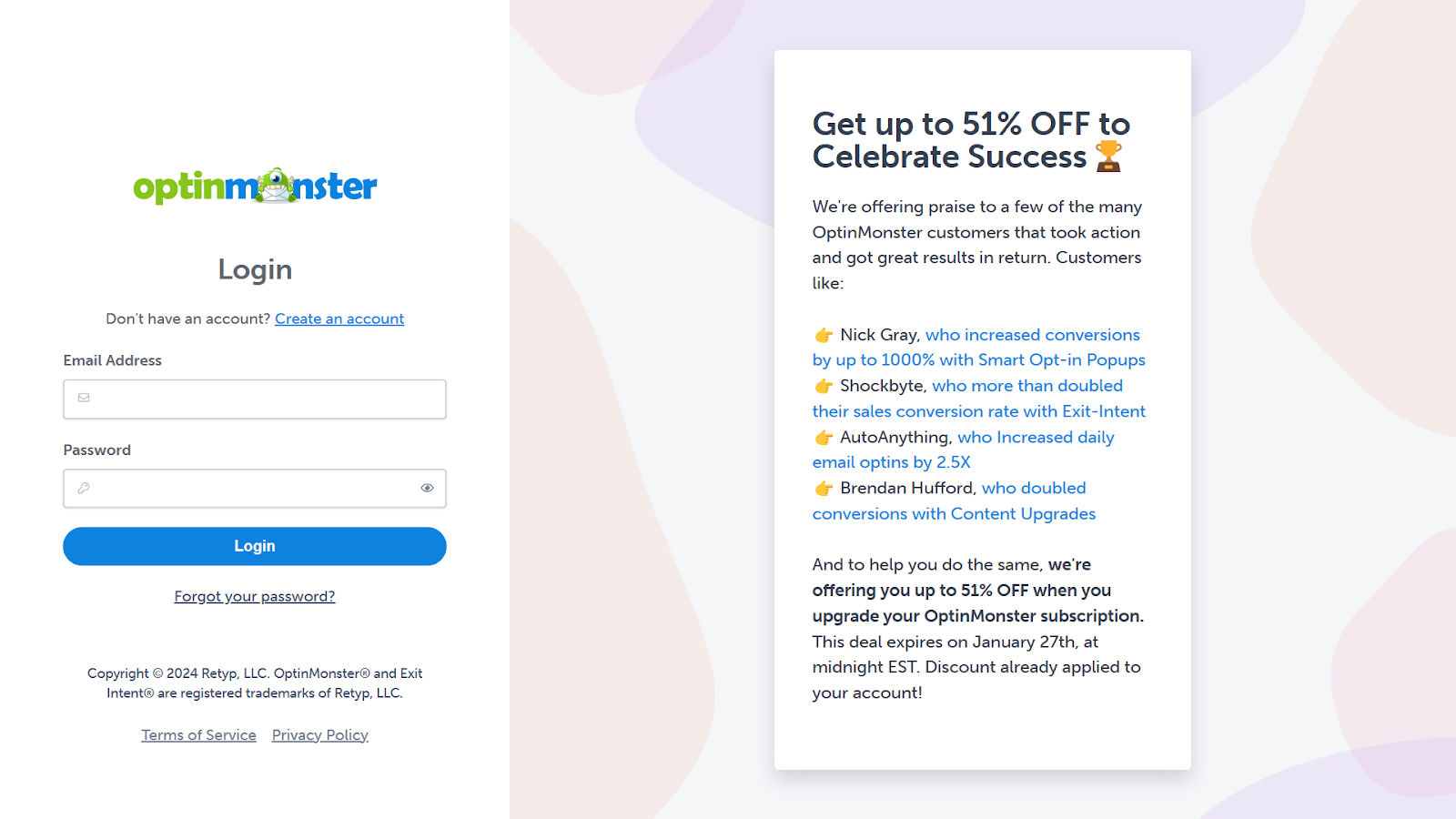
© OptinMonster, Fair Use
OptinMonster's login page showcases a blend of security, convenience, and user engagement. Its simplicity, minimal color palette, and clutter-free design are things that make it nice and easy on the eyes. Another thing—and what truly sets it apart—is how it leverages the login space to inform users about new features and improvements, and it’s a superb touch.
Strongest Point
The most impressive aspect of OptinMonster's login page is its dual functionality—it secures user accounts and doubles as a communication platform. This design makes sure that users are always in the loop regarding the latest enhancements, and that’s a point that may improve their user experience.
Why It's a Good Example
OptinMonster's login page is a prime example of a user-centric design. It considers the user's journey beyond just logging in, and—on top of that—it seamlessly transitions from entry to engagement by presenting new features on the login page. It's a subtle—yet effective—way to introduce users to unique aspects they mightn't have discovered otherwise.
Major Takeaways
The login system at OptinMonster underlines how important it is to take a multifunctional approach, and their focus extends beyond securing the gateway to an account to maximize the user's visit. It’s an approach that can increase user interaction with new features—and it directly impacts the platform's value proposition.
Example 9: Headspace
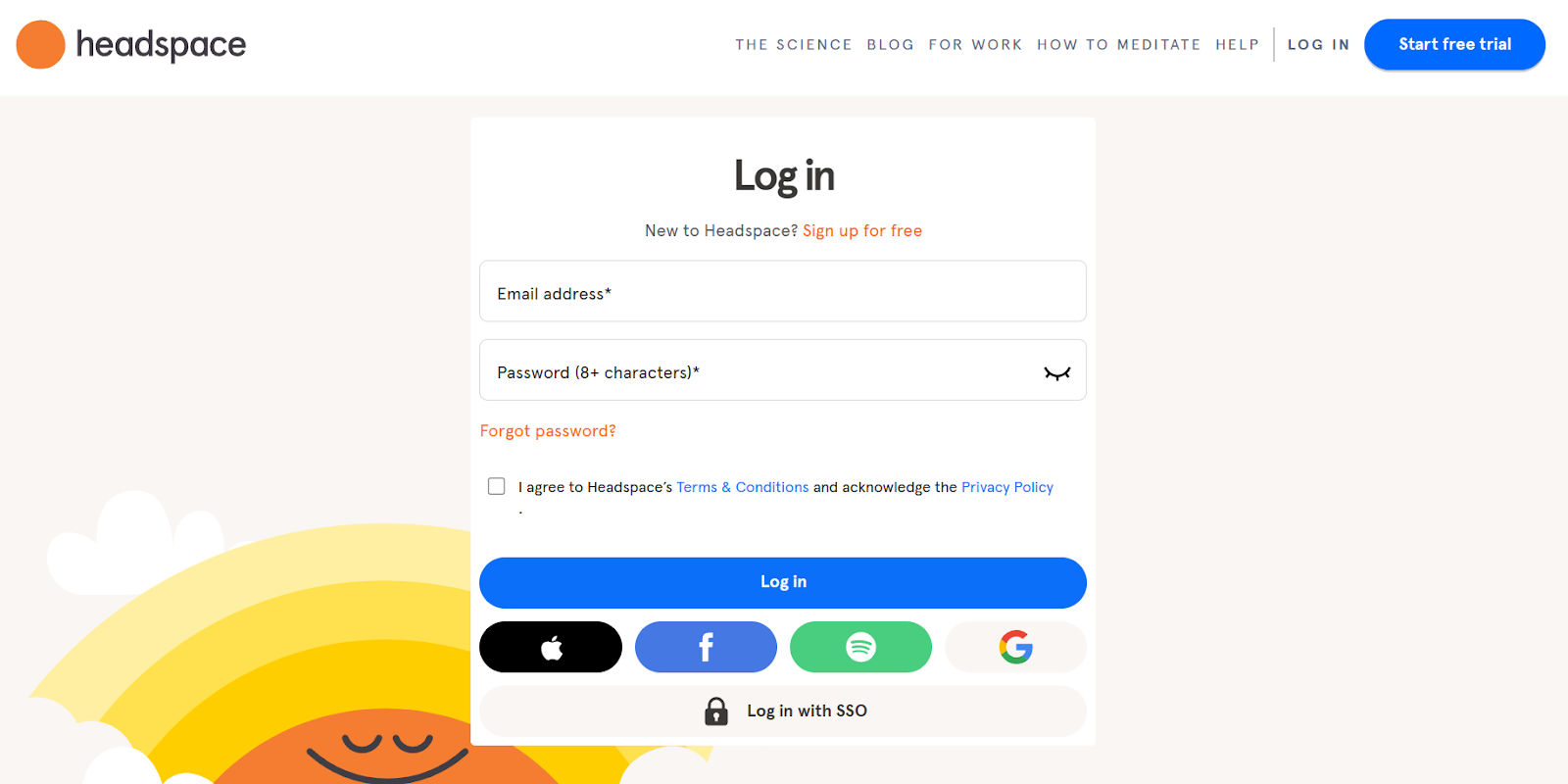
© Headspace, Fair Use
The Headspace login page stands out with its minimalist approach, and the minimalistic design—with its spacious layout and soothing colors—nicely promotes a sense of calm from the first glance. A generous amount of space around each element lets the page "breathe," and it adds to the overall peaceful experience.
Strongest Point
The most substantial aspect is the intentional spacious design, and that’s a factor that mirrors the clarity and focus that meditation brings to the mind. The presence of multiple login methods—especially Spotify—shows Headspace's commitment to user convenience and its understanding of user habits. As it promptly states the password guidelines, it scores another win—and it’s one that facilitates a smoother experience right from the start.
Why It's a Good Example
This login page is a prime example of a form-combining function in design, and it's visually relaxing and straightforward to use. The choice to include Spotify as a login option is a clever one—and it connects users directly to Headspace's audio sessions with ease. This approach is a neat one that really depicts an innovative user-centric approach.
Major Takeaways
The takeaways are clear: a clean and open layout can enhance user experience significantly—and that’s a vital point. Headspace caters to different user preferences as it provides various login options. A superb effect is how it makes sure that the meditation journey begins as stress-free as the practice itself, and it’s an apt reflection of the brand.
Example 10: Snapptrip
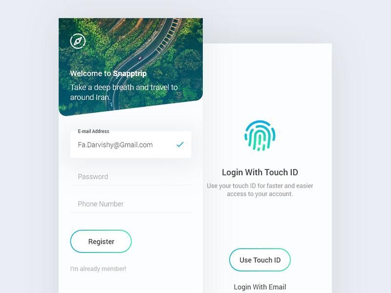
© Farshid Darvishi, via Dribbble, Fair Use
The Snapptrip login page presents a clean, intuitive design. It features both quick Touch ID login and traditional email options for enhanced convenience and security. It’s got a layout that offers a straightforward path to registration or account access.
Strongest Point
Touch ID on Snaptrip's login page is a game-changer for users, and this biometric authentication method provides a quick and secure alternative to password entry. It exemplifies how committed the platform is to adopting advanced security measures that cater to the user's convenience—and that’s a vital factor that works well.
Why It's a Good Example
Snaptrip's adoption of Touch ID for login purposes sets a high standard for user-centric design, and it illustrates both a deep understanding of user behavior and the growing demand for frictionless access. As it introduces Touch ID, Snaptrip enhances login security while it makes it easier for users, and this smart update shows they're keeping pace with the best user access options.
Major Takeaways
Major takeaways include emphasizing streamlined access with Touch ID—a feature that highlights a blend of security and ease. The dual login options cater to different user needs for better flexibility—and it reflects a superbly thoughtful approach to user convenience and choice.
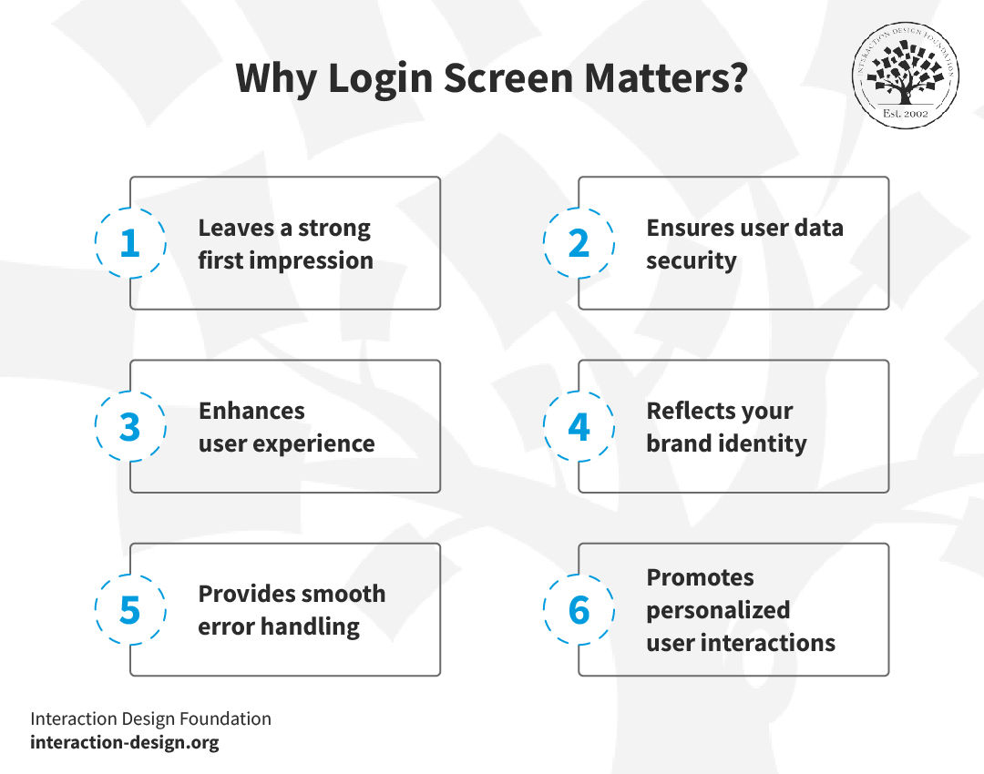
Why Login Screen Matters?
A well-designed login screen ensures ease of use and builds trust. It’s something that influences user satisfaction and retention.
© Interaction Design Foundation, CC BY-SA 4.0
1. Leaves A Strong First Impression
The login screen is often the user's first interaction with your application—and it’s this initial experience that really shapes their perception of the entire app. Gateways and entry points are like a kind of brand ambassador, and a well-designed login screen conveys professionalism and attention to detail; plus, it neatly sets the stage for a positive user experience.
2. Ensures User Data Security
A robust login process reassures users about the safety of their data—and how vital that is is impossible to overstate. Features like two-factor authentication and clear password guidelines enhance trust, and—if you consider the rise in data breaches—such steps help maintain user confidence in your platform's security.
3. Enhances User Experience
The ease of logging in significantly affects overall user satisfaction—and it’s another point that’s really impossible to overstate the importance of here. A user-friendly login screen with options like 'remember me,' social media logins, or password recovery makes the process seamless. Simplified login reduces frustration and drop-off rates—and it’ll have a truly positive impact when it comes to measuring user retention.
4. Reflects Your Brand Identity
The login screen is a golden opportunity to showcase your brand—and it’s often the very first glimpse users get when they arrive from search engines or however else they’ve got there. A consistent design with your logo, brand colors, and style strengthens your brand identity—and this consistency is something that ensures that users feel connected to your brand from the first interaction—and that’s a crucial thing for what they do and where they go next.
5. Provides Smooth Error Handling
A good login screen provides helpful feedback during the login process—and it does this with clear error messages and guidance for forgotten passwords or incorrect details. This support helps maintain engagement even when users encounter issues—and it’s critical to have this for them, not least since it shows that yours is a brand that cares.
6. Promotes Personalized User Interactions
The login process is valuable for data collection. You can use the information gathered to personalize the user experience, and this personalization can lead to increased user engagement and loyalty—and so speak to users that much more as a brand they can relate to.
The login screen is a critical element of your app or web design. Invest in an attractive, secure, user-friendly login screen and you’ll find it can have a big impact user perception and engagement.
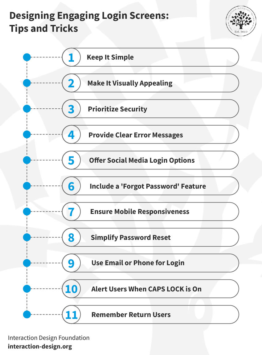
Design Engaging Login Screens: Tips and Tricks
It calls for a deep understanding of user needs and preferences to design an engaging login screen. Here are some best practices to make your login screen effortless:
© Interaction Design Foundation, CC BY-SA 4.0
1. Keep It Simple
Simplicity is key—plain and simple—so don’t clutter the screen with unnecessary elements. Today’s users appreciate the straightforwardness, hence why it’s vital to keep your focus on the essentials: username, password, and login button. Take this approach and you can reduce the chances they’ll get confused—and it’ll speed up the login process.
For instance, H&M's login page is straightforward and efficient. It offers clear, concise prompts to the users so they can enjoy easy navigation. The clean layout has got minimal fields, and it ensures a quick sign-in process.
© H&M, Fair Use
2. Make It Visually Appealing
Your login screen should be visually pleasing, so be sure to use colors and fonts that align with your brand. A harmonious color scheme and legible typography can make a big difference—and translate to more users—and customers—who are more loyal. Remember what the goal is—it’s to create a welcoming environment that resonates with your brand identity.
Here’s an excellent example of a visually striking login page of a traveling site. Its engaging beach theme makes it stand out. The page combines warm colors and a welcoming 'Log in' button, the layout’s clean, and the artwork sets a relaxing tone.
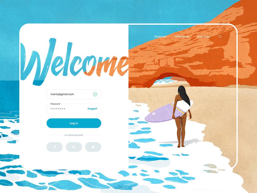
© Masha Kozikova, via Dribbble, Fair Use
3. Prioritize Security
Security should be a top priority—especially in today’s world of breaches and the like. So, go for solid password guidelines and implement multi-factor authentication. With that said, you’ve got to balance security with usability, and users should feel safe without feeling burdened by overly complex security measures—it’s a big deal.
This login page is a perfect example that includes a two-step verification process. When users enter credentials, it sends a code to their inbox, and this extra layer strengthens account security. It keeps user data safe.
© Dmitry Sergushkin on Dribbble, Fair Use
4. Provide Clear Error Messages
You’ve got to offer clear and user-friendly error messages whenever users input incorrect login details. One point that’s especially vital here is how these messages shouldn’t feature any technical jargon. Instead, they should guide users to rectify the issue—and it’s an approach that minimizes frustration and ensures a smooth user experience.
Microsoft's login page effectively communicates errors. It prompts users to retype their credentials if entered incorrectly—and it’s an approach that both reduces frustration and improves the user experience.
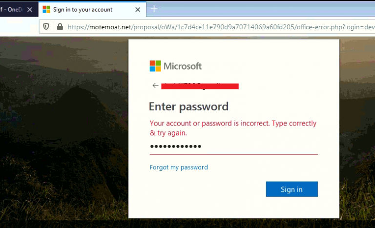
© Qual Heal, Fair Use
5. Offer Social Media Login Options
Social media logins can streamline the process. They allow users to sign in with existing social media accounts. This approach neatly reduces the hassle of remembering multiple passwords, and it's a convenient option that many users appreciate.
Airbnb's login page offers multiple social login options—and users can choose from Facebook, Google, or Apple for convenience. What's more, the traditional email method is there to provide easy access for all preferences.
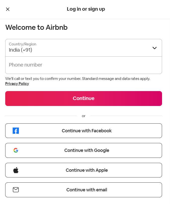
© Airbnb, Fair Use
6. Include a 'Forgot Password' Feature
It's common for users to forget their passwords, so be sure to include an easy-to-find 'Forgot Password' feature. Through this, you can show that you well and truly understand—and cater to—user needs. It's a small feature that is a big deal in how it can significantly improve user experience.
Dribbble's login page features a visible 'Forgot?' link for password issues—and its thoughtful placement right next to the password field simplifies the reset process for users.
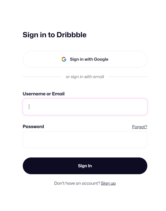
© Dribbble, Fair Use
7. Ensure Mobile Responsiveness
Mobile responsiveness has become non-negotiable today, and your login screen has got to look good and function well on various devices. Users expect a seamless experience—whether it’s on a desktop or a smartphone—and so, you’ve got to test it on different screen sizes to ensure usability.
When you focus on usability, you can turn complex systems into simple experiences—and that’s a vital thing to get right. It’s something that makes your designs convenient, efficient, and enjoyable. Watch as Professor Alan Dix, an authority on Human-Computer Interaction, explains three usability principles—and his video is a must-watch for those who want to create user-friendly designs.
Show
Hide
video transcript
- Transcript loading…
8. Simplify Password Reset
Make sure that your users can easily recover forgotten passwords. A smooth recovery process reduces user frustration and helps maintain security—both of which are crucial things that call for an empathic designer’s mindset to appreciate. Offer a simple, secure password recovery process—and it’s something that usually involves sending a reset link to their email or phone.
This login interface presents an easy password recovery option to regain access swiftly. What’s more, it includes a prominent 'Remember me' option, and—along with the easy password reset feature—it’s an item that ensures a smooth sign-in experience and reduces the need for frequent logins.
© Chase Bank, Fair Use
9. Use Email or Phone for Login
Let your users log in using their email address or phone number—and it’s often more convenient than remembering a username. Plus, it's a familiar, straightforward method that many users prefer.
LinkedIn simplifies logging in with a choice: email or phone number—and this flexibility enhances user convenience and streamlines the sign-in process.
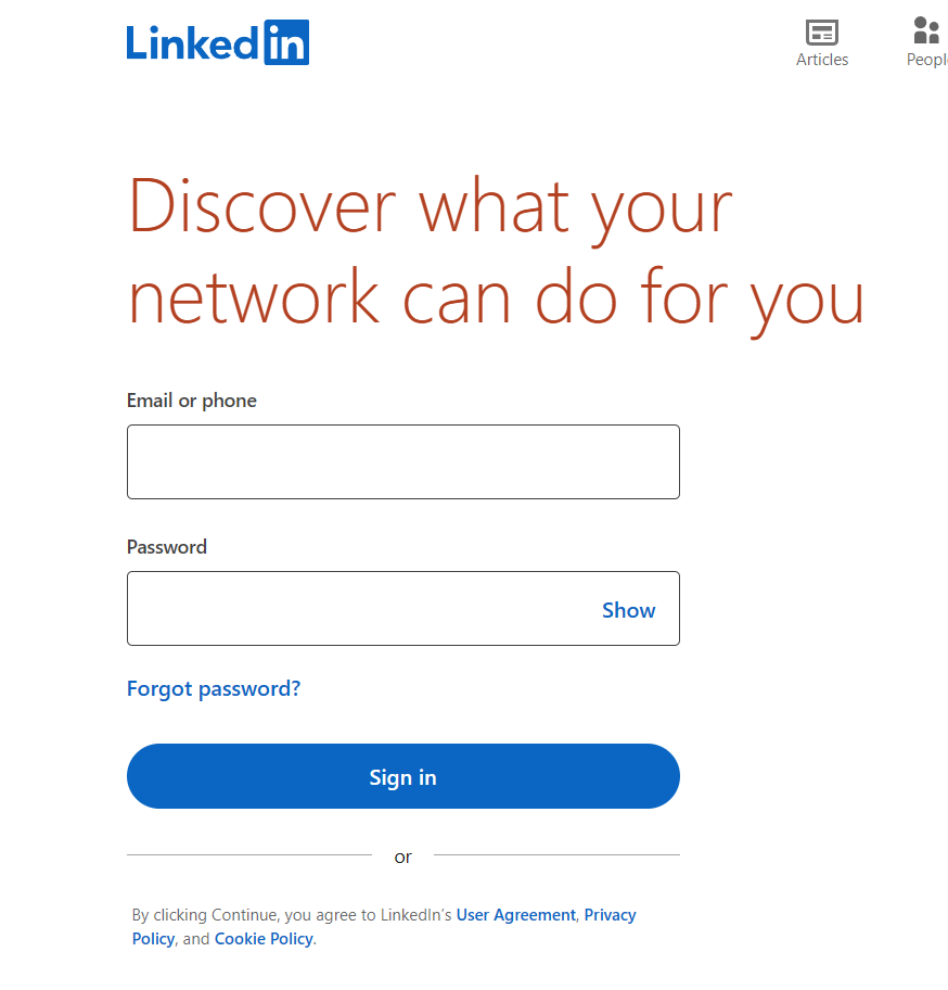
© LinkedIn, Fair Use
10. Alert Users When CAPS LOCK is On
Incorporate a feature that warns users when their CAPS LOCK is on during password entry—and many users can stumble into accidentally having this lock on, especially if they don’t notice the keyboard light. This small detail can prevent login errors and reduce user frustration, and it's a simple way to enhance the user experience.
WordPress promptly alerts users when CAPS LOCK is on—and so reduces errors during password entry.
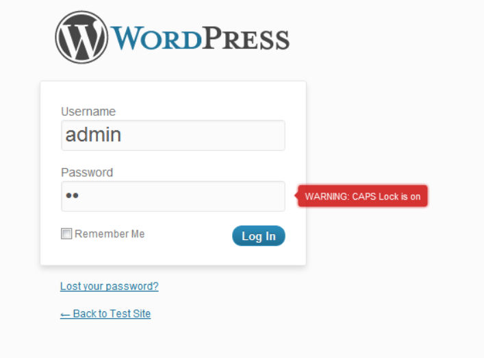
© Jaspreet Chahal, Fair Use
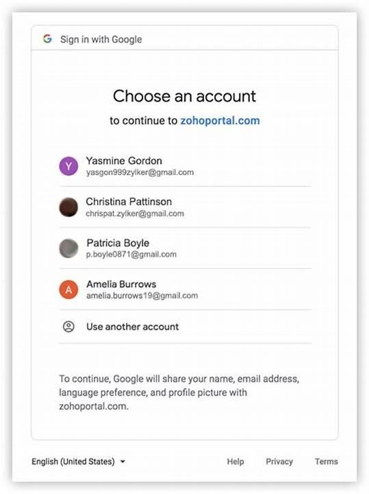
11. Remember Return Users
Recognize and remember returning users—you’ve got to keep them logged in or prepopulate login fields. It’s something that creates a seamless, hassle-free login experience.
Consider how Google remembers user information across its platforms—it’s an approach that simplifies the login process for returning users.
© Zoho Catalyst, Fair Use
If you’re going to design an effective login screen, it takes a thoughtful process—and it combines simplicity, visual appeal, and functionality. A well-designed login screen can significantly enhance the user experience and strengthen your brand's image for users and customers all over the world.
The Take Away
Your app's login page is the first aspect of your user's journey and—like an onboarding process—is a vital gateway for users to build trust and enter that all-important seamless experience. When you create a well-designed login page, it sets the stage for a positive, lasting impression, and this guide showed key elements that make login pages functional, engaging, and memorable. Remember these four key tips to create a great login page:
Keep the design simple and clutter-free.
Prioritize security while maintaining user-friendliness.
Offer multiple login options, including social media integrations.
Ensure mobile responsiveness for a seamless experience across devices.
Your login page is a powerful tool for user retention. It’s got to make logging in a breeze yet secure, and it should speak to your users in a language they understand—simplicity and efficiency. When you get this right, you’ll turn a routine step into an engaging experience.
References and Where to Learn More
Read Vitaly Friedman’s take on Rethinking Authentication UX
Learn How to Create a Custom WordPress Login Page
Go through Dribbble’s library to take inspiration from the most unique and creative login page designs
Take our course: Mobile UX Design: The Beginner's Guide