Let’s examine a subject that has more to it than meets the eye. Applying a deeper appreciation of consistency to your designs will yield precious results, including keeping users happy.
Consistency enables users to feel familiar with your website, your brand, etc. and to be reassured that it is your company with whom they are interacting.
Ensuring consistency means careful attention throughout the conceptualization and design phase of your site. Defining, planning, designing, and testing with consistency in mind can save many headaches at the end of the design process.
If you’re working on a design project that has a real-world (bricks-and-mortar) presence, the brand message, color scheme, etc. must not only be consistent on your website, but it must be consistent with the brand message in the bricks-and-mortar location, too. Virtual reality must connect to reality in a like-for-like way.
The core of this is that consistency creates trust. It creates an experience which users can rely upon every time. It goes beyond the look and feel of a site, too; it also reaches down into interaction and behavioral patterns and even deeper. As a designer, you need to ensure consistency from the core of the company. Consistency is born from the alignment of the business and users’ goals. How do people work with your brand? As a company, how do you want to be known? What questions might your users have? What are the easiest ways for them to complete a specific task or process on your site? Conceptualizing with consistency and thus delivering a consistent experience as well as a consistent design is incredibly important.
The evolution of brand consistency
In the 1950s, in the post-war milieu of optimism, a new mindset developed. Standardization — the process of developing and implementing technical standards — was emerging as a central force in a new age of prosperity.
The vision was there; however, the technological constraints were such that companies had to rely on modes of engaging the public that can make us smile today. Against the backdrop of more basic radio advertising, infant television advertising (on few channels!), and less sophisticated print technologies, companies couldn’t reach consumers in the dimensions they can enjoy now. Nevertheless, corporate designers made the most of what communication means they had and strove to aim for simplicity to get their designs “out there” consistently, in ways that customers would have no problems understanding. Branding was all about simple, catchy designs that, say, drivers could digest in a second while speeding past billboards.
Today, the ethos of yesteryear’s brand consistencyin design survives in a more demanding environment; even the way companies go about their branding has had to change radically. Those smart words and well-balanced, static designs from decades ago are what many now see as clichéd slogans and safe, samey colors. Looking too classic– if that’s not your goal - can cost you. Technology has redefined reality in many ways for users. Where before, companies were restricted by the technology then available, they were sheltered by it, too. Removed from such direct consumer interfaces, they didn’t have to face the challenges that their latter-day counterparts do now.
Author/Copyright holder: Amber Case . Copyright terms and licence: CC BY-NC 2.0
Postmodern society has become very judgmental about brands. Once, a brand’s reliance was on radio, TV, and print advertising. That’s exploded into another dimension now. The Internet first and together with social media now has forced companies to up their branding game. Consumers now interact with brands in many ways and places. The question of brand, image and the need for a company’s consistency has become more complex. Many users analyze, scrutinize and draw conclusions based on other criteria. They observe the brand’s presence through different channels and from devices in a myriad of contexts. With all these factors to consider, just how can companies strive for consistency? What can designers do to cater for brands in this ever-shifting set of expectations?
Well, as designers, the complexity of current times means that you should strive for total consistency knowing that with the diversity of channels, devices and contexts that companies and users move around now, it is getting more and more difficult. We have to stay realistic in the real world of our users to maximize their experience. The good news is that there are ways to keep up and adapt to meet our users’ expectations. It’s not a flux out there; far from it.
It is not just about marketing
Consistency is repetition for marketing. It ensures that users always find the same message over and over again, however they access a brand. Think about your favourite restaurant chain. Now, imagine that you’re feeling hungry (maybe you are!) and have just turned the street corner, expecting to see that comforting sign above the restaurant. Whether you realise it or not, when your eye picks out that expected sign with its logo and color scheme, etc., you feel comforted. You have faith from seeing that standard that you’re a few paces away from getting what your brain is telling your stomach it wants. Thus, the consistency of the design has done its job.
However, there is more to it now; companies and their brand names have to be adventurous in this new arena. The definition of their identity has moved on, too. The logo used to mean everything. Now, the manner in which the brand interacts with users in the virtual world as well as the real world is every bit as important as the logo to establish (and sustain!) identity.
Branding has gone from the old, passive way (catching the logo on a TV screen, billboard, or magazine ad) to a highly interactive sequence of processes. If you guess that such interactions happen on a computer, you’d be correct. Did you know that 90% of media is consumed on screens, according to a major Google study? About two-fifths of that occurs on smartphones — users engage brands on handheld devices. Because of this, brands have had to rethink their strategy. Modern designers have had to enter the fray by making fluid brand identities.
More than branding: Providing a consistent experience
Consistency is key for usability and user experience. A coherent design across devices and formats reduces the learning curve and promotes familiarity and bonding. It ensures that users don’t have to “meet” a brand for the second time. Design for consistency is a must for the emotional and cognitive aspects of the user; it’s also much easier to maintain from the organizational point of view. Users remember details in a design. Changes will disguise it, prompting them to wonder if the brand is an imposter. Change can cost a loss in faith, even if it is sometimes needed.
AOL (America Online) is a good example of a brand that risked much in transforming itself. Ironically, it’s an Internet pioneer, large in the US and big in Britain. It’s made a comeback. “AOL” is now “Aol” — it features on everything from goldfish to a “throwing horns” hand. This means that it’s transplanted well into a dynamic multi-dimensional tableau. Users can engage it far better than its original triangular brand design from 1991. In the United Kingdom, AOL had relied on an iconic character called ‘Connie’ to feature in the branding from 1998 to 2002, levering users with no Internet experience into a comfortable UX. Tall, calm and with a dress that kept changing like a computerized design sequence, she was “designed” to soothe and lead users. Once users in Britain became more experienced, Connie (and the actress portraying her) vanished from AOL’s branding.

AOL, UK’s Connie tells the public about AOL and the Internet, 2001.
The Superbowl is to American Football what the World Cup is to Football. Anyone who’s ever watched the Superbowl on TV in January knows that a draw for viewers is the advertising. Those cutting-edge, funny and cool designs present brands to ever-more demanding audiences. In the US, it’s the ultimate way to engage users on television. Brands such as Budweiser and CBS know that casting ever-more impressive brand identities is vital. Even sitting at home, watching large-screen televisions in the same spirit as earlier generations, users in America in 2015 have one advantage. During and after the game, they’ll interact on their mobile phones to check out brands; they will talk about the brands that had the coolest ads. Others look for those brands to check out what they missed.
Users face more ranges of goods from brands than ever before. Frequently, they’ll struggle with getting used to a group of related products from the same company because these look and work so differently from one another. That leaves the users with something called a broken user experience.
Broken user experience is a big problem. Brands can remedy this in five ways. As a designer, you should familiarize yourself with the scope of the remedial process:
Visual consistency & simplification – make the design more basic at the planning stage, using more uniform fonts and colors, etc.
Behavioral consistency – Reuse design patterns that have been proven to work.
Behavioral optimization – Design to make users perform tasks with either less (or more effective) work (eliminating redundancy/unnecessary work).
Unified experience strategy – Reconsider the ideal workflow for individuals working on the project.
UX Culture – Understand and make UX a core priority before we design.
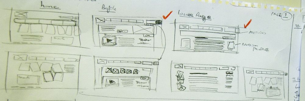
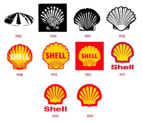
Visual design for consistency
Author/Copyright holder: Yoninah. Copyright terms and licence: CC BY-SA 3.0
Once you’ve defined a consistent UX, this consistency also needs to be translated into the interface and the graphic design. Let’s take a close look at how we can achieve that visual consistency. We just have to think about the elements of our designs, for example:
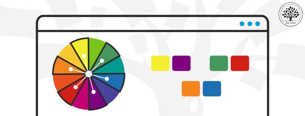
Colors—What is your focal color? What will be your secondary colors? Remember the significance of different colors. What is the nature of your brand?
Graphics—How will you use imagery or photos? What about icons and buttons? Think about the tone and character of your brand. Is it appropriate to be rigid and business like throughout? Or, is your brand more fun? Reflect that in the graphics.
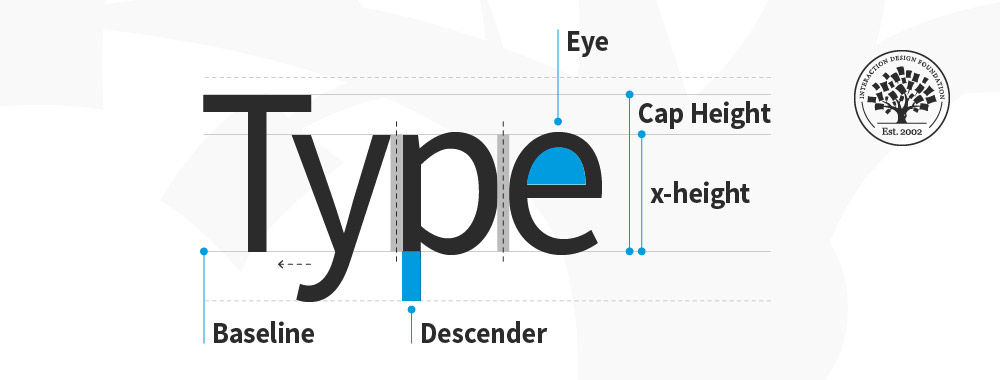
Typography—What hierarchy will you use (headings, sub-headings, etc.)? What font sizes? Where will you display text in relation to the other elements of the design? Once again, can you afford to be light-hearted and inject some playfulness?
Sizes—What size of content blocks will you use? What size of images? What relationships will you convey between design elements with size?
While consistency matters between all pages, it’s particularly important to be consistent about the way you’re using the most important elements of your visual and interface design. People will notice if your logo jumps about between pages. They will notice if the menu suddenly switches from the top to the side. They are much more likely to notice inconsistencies in the most familiar items on a page than a font change in the 13th paragraph of content.
Recently, designers have had to become more fearless, while not being foolhardy. This is the era of brands that are adaptive and playful. Think of Google and its logo. They are not afraid to tweak it and adapt it! Gone are the days of rolling out a design and assuming consumers will love it. Now, designers have to cater to the consumers based on their feedback. It’s a risky game, but it works. Keep to the core principles that created and kept the brand together historically and match it with your target users’ needs and characteristics; from there, you have to be flexible.
Building Consistency in Your Designs
Happily, there are many ways to ensure that your designs are consistent, including:
Style Guides
A style guide is a written document specifying how to use design elements. It’s similar to brand guidelines clients sometimes give designers, but it goes deeper and relates the key styles and elements of the intended web design. Many web designers will create a style guide for the client’s approval in the early part of the design process.
Pattern Libraries
A pattern library is like a style guide but on steroids; these are detailed documents that touch on every single possible element in the design. Pattern libraries normally come in three flavors:
Design Patterns
Markup Patterns
Content Patterns
These detail the design elements and how they will be used. They include styles for headings, text, icons, etc.
This is the CSS and HTML pattern library – with HTML and CSS classes provided so that it’s easy to expand the website consistently in the future.
This defines the tone and style of any content you’ll use on site. These can be quite challenging to develop; it’s difficult to foresee all the types of content you might use in the future. However, delivering content patterns for clients can help ensure that your designs are in keeping with the content that they employ.
CSS Frameworks
You can use a CSS framework to help deliver consistency in a design. This is a very common thing to do in WordPress designs. Twitter Bootstrap is often used to manage CSS Frameworks.
The Take Away
Consistency lets users feel familiar with your website, brand, etc. We designers use consistency in our designs to establish and foster trust with our users. Long ago, this was an easier matter; however, in the multi-platform interactive age, we have a wealth of formats, channels and devices to consider and choose.
At the conceptualization phase, think about what users might associate with your brand, how they feel about it. Are you designing for a toy manufacturer? Then you can inject fun into your images and fonts. If you’re designing for a florist, it would be prudent to maintain an appropriate tone; flowers are for all occasions, remember. This consistency is defined from the alignment of the business and target users’ goals and then is “transported” everywhere in the company: from branding and marketing, to the user experience (here we talk about consistency in the product and service behavior and throughout the different devices), to the interface and graphic design.
How do you want your users to feel? Reflect this in your design; your designs can guide your users to interact with your brand. Keep consistent in even the smallest things, such as margins, because users will notice. Keep in mind that consistency in design makes a trustworthy brand. Users will build faith in a good design that keeps consistent during their UX. This is how iconic designs are born.
Where To Learn More
Shillcock, R. (2013) Building Consistency and Relationships into Your Designs. Web Design Tuts Plus. Retrieved from: http://webdesign.tutsplus.com/articles/building-consistency-and-relationships-into-your-designs--webdesign-14849. [2015, May]
Salmeron, J. M. (2013). “If You Love Your Brand, Set It Free”. Smashing Magazine.
Klocek, S. (2012). “Fixing A Broken User Experience”. Smashing Magazine.
Smith, T. (2010). “Consistency: Key to a Better User Experience”. Interaction Design.