At the base of Maslow's hierarchy of human needs we find the physiological level, which encompasses the basic, yet self-preserving needs, such as sleep, water, and shelter. The ability to work our way further up the hierarchy, to satisfy our more complex needs, is based on fulfilling the physiological needs. Designers can tap into our unconscious desires with an understanding of color psychology and how certain types of text and styles influence consumer behavior. There are innumerable examples where color, text, and styles have been used to significant effect; however, so as to successfully design according to the primary human needs, you must achieve a balance between targeting underlying human psychology and preserving the brand or purpose(s) of your product.
Abraham Maslow's 'Hierarchy of Needs' presents a five-stage model of the drives behind human behavior. At the foot of this hierarchy lie our basic, survival-ensuring needs, such as food and shelter, which Maslow referred to as our physiological needs. In order to advance through the other stages of the hierarchy, we must first satisfy these primary needs. While most of the products we now use do not directly satisfy these needs, we are no less driven by them when we are making our purchasing decisions and interacting with those we choose to buy.
Playing with our physiological needs
If you are not selling something that directly satisfies our primary needs, then how can you take advantage of these drivers? Well, the good news for designers, and those selling products, is that we are highly susceptible to imagery and text that suggests we will satisfy one or more of our basic needs, regardless of whether there is any true connection. For example, many products targeted at men – young men, especially – involve young women (usually with very few clothes on) either using the product, draping themselves over it or showing interest in someone else who is using the product. There are countless examples to choose from, but perhaps one of the more enduring can be seen in the Lynx deodorant adverts, which take the latter approach of suggesting, with little subtlety, that men who use the product will manage to attract the attention of potential sexual partners.
Such examples of designers and advertisers targeting our physiological needs highlight the subconscious influence certain types of imagery have on our behavior. The tenuous link between sex and deodorants/cars/computer games, etc. often goes unnoticed, as do most other occasions where our physiological needs are exploited in a similar manner. So, in spite of our failure to sit up and point out the ill-fitting combination of sex and cars, sex and exercise equipment, sex and chocolate, and all the other examples of products being sold using our physiological needs, the message still manages to seep into and influence our thought processes.
Using color
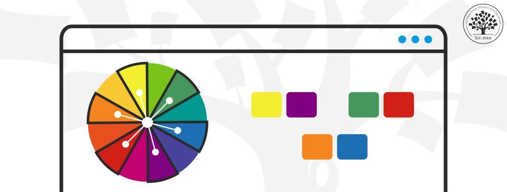
There are also a number of other, more subtle methods of tapping into the subconscious level, such as using colors to grab attention, signal threat, give the impression of comfort, and even stimulate appetite. Satyendra Singh, researcher at the University of Winnipeg (2006), investigated the impact of color on marketing, providing some compelling findings that highlight just how significant color is to our emotions and subsequent behavior. Following Singh's research, he summarizes the findings thusly:
“Color is ubiquitous and is a source of information. People make up their minds within 90 seconds of their initial interactions with either people or products. So, prudent use of colors can contribute not only to differentiating products from competitors, but also to influencing moods and feelings - positively or negatively - and therefore, to attitude towards certain products. Given that our moods and feelings are unstable and that colors play roles in forming attitude, it is important that managers understand the importance of colors in marketing.”
Psychologist Natalie Nahai (2012) outlines some of the ways color is thought to affect perception and behavior. For example, pink is seen as youthful and indicative of mid-range prices in the UK, while more neutral colors are rated as being 'boring and dull' and 'for a mature person'. You may have also noted that fast-food chains, such as Pizza Hut, KFC, McDonald's and Papa John's, use red and yellow in their store and web designs and much of their promotional material. This is no coincidence; these colors are thought to stimulate appetite – perfect for a fast-food chain!
Evidence
One of the most significant pieces of evidence that color influences emotions and, as a direct result, consumer behavior can be seen in the successful re-design of the Ty-D-Boi packaging (Nahai, 2012). Originally, the toilet-cleaning agent came in a light blue bottle, but following a recommendation from color consultant James Mandle, the packaging was changed so the text was bright and the background dark, thereby providing striking contrast and making the letters seem more prominent. This small change saw a staggering sales increase of 40% over an 18-month period. While there may have been other factors to take into consideration, such as more targeted advertising, special offers, and general re-branding, the color change represented the only alteration to the bottle design itself. Therefore, color is seen to have a significant effect on consumers, in the same way sex sells cars and deodorant: by making us feel some emotion through targeting our unconscious desires and perceptions.
Using Text and Styles
Certain fonts and writing styles evoke different emotions and thoughts. For example, on some websites text appears to be written by hand—a seemingly personal touch, giving the impression of familiarity and trustworthiness. This is also true of styles which may evoke memories of different eras and events associated with these times. Designers can use text and styles to capture consumers' attention and give the impression they are in safe hands. Bold text creates emphasis and grabs the observer immediately, while soft-colored text (combining the two methods of tapping into the physiological level of Maslow's hierarchy) is calming and suggests security.
The Take Away
At the base of Maslow's hierarchy of human needs we find the physiological level, which encompasses the basic, yet self-preserving needs, such as sleep, water, and shelter. The ability to work our way further up the hierarchy, to satisfy our more complex needs, is based on fulfilling the physiological needs. As designers, we can tap into our unconscious desires with an understanding of color psychology and how certain types of text and styles influence consumer behavior. There are innumerable examples where color, text, and styles have been used to significant effect; however, to design according to the primary human needs successfully, you must achieve a balance between targeting underlying human psychology and preserving the brand or purpose(s) of your product.
References and where to find out more
Hero Image: Copyright Holder: freePik on www.flaticon.com, Copyright License and Terms: Public Domain
Singh, S. (2006). “Impact of color on marketing”. Management decision, 44(6), 783-789.
Nahai, N. (2012). Webs of Influence: The Psychology of online persuasion. Pearson UK.