Your constantly-updated definition of Visual Alignment and
collection of videos and articles. Be a conversation starter: Share this page and inspire others!
97shares
What is Visual Alignment?
Visual alignment is the strategic placement of elements like images, text, and user interface (UI) icons so their edges, axes, or centers line up consistently and help users enjoy better user experiences. When you visually align elements in interfaces and presentation materials, you improve readability, group related items, guide the eye, and build trust through layouts that feel structured, coherent, and easy to scan.
Explore how to empower screens and pages with effective visual alignment that users and viewers notice, in this video with Alan Dix: Author of the bestselling book “Human-Computer Interaction” and Director of the Computational Foundry at Swansea University.
ShowHide
video transcript
Transcript loading…
Alignment is more than a design detail; it’s a credibility signal. When your visuals are aligned, people instantly see order, professionalism, and authority. When they’re not, even your best ideas can look sloppy or rushed.
Use Alignment to Build Instant Trust
Think about how you feel whenever you first see a webpage, presentation slide, or any other page or screen that contains information. Whether you need to know something quickly or have a little time to spend digesting what you find, if the screen is laid out well with strong alignment, you’ll quickly notice what’s important.
When users access a digital product or some part like a website’s home page, they judge what they find there in a few seconds. Designers understand the need for strong alignment. It’s one of the most fundamental layout principles in UX (user experience) design, as it directly influences how users perceive order, relationships, and professionalism on a screen or page. Do visual alignment well, and it reduces friction; however, when it’s not there, the lack of order fuzzes the clarity of the message and undermines trust.
Visual alignment isn’t just a design principle, though; it’s a communication superpower you can master, no matter if you’re creating a product interface, a pitch deck, or a single slide for a meeting. Alignment shapes how people see you and your ideas. When someone sees what you have to show them, your design, a webpage, a slide, or even a quick (but well-presented) sketch, represents you as if you’re a brand in your own right and it’s your “product.” Effective, consistent alignment signals order, professionalism, and trustworthiness, and you’ll look professional, credible, and easy to follow, whatever you’re presenting a target audience with.
Discover top tips on how to win your audience’s attention and trust, in this video with Morgane Peng, Managing Director, Global Head of Product Design and AI Transformation.
ShowHide
video transcript
Transcript loading…
Alignment: The Fastest Way to Look Credible on Stage
Think of alignment as part of your stage presence. Your voice and non-verbal communication, such as your body language and impression of confidence, shape how people perceive you. Similarly, alignment shapes how they perceive your content such as your slides or other screen materials. They’re two sides of a potentially “golden coin.” And in much the same way as designers lay out content strategically on webpages and app screens, the content you present audiences with should complement you as you present and help to:
Boost Readability and Scanability
Clean edges guide the eye naturally, so your audience follows your story without effort.
Reinforce Hierarchy
Alignment groups related ideas and separates unrelated ones, which makes your logic easier to grasp and keeps audience members on board with both what you’re saying and what they’re seeing.
Reduce Cognitive Load
Effective visual alignment makes information easier to process, which frees your audience up to focus on your message. This is essential because if they have to pause to decipher clutter for even a moment, it breaks the flow of your presentation for them and they might lose the meaning of important points, and why they should care.
Appear Professional
What you show can make you glow, so think of mastering alignment as being more than serving up good layouts. It’s a major factor of how you present like a professional, too. How you frame, explain, and deliver your aligned visuals can make the difference in how your audience connects with them, trusts you, and acts on your message. Well-aligned layouts tell your audience you care. And when you explain them with clarity and confidence, you project credibility: they’ll see, hear, and know that you know your stuff.
One of the most important aspects of visual sense-making is alignment. Elements that are aligned vertically or horizontally tend to be seen as related.
Good visual alignment in design can help achieve powerful results in any case, but effective alignment in presentationscan help define a presenter’s career. Try these steps:
1. Start with a Grid
A grid gives structure, and grids feature in designs of all types for no small reason. When you align elements consistently, your slides look coherent. It shows your strategic thinking and that you’ve mindfully constructed a most effective presentation. For example, in a project update slide, you might use a simple three-column grid to align “Problem, Solution, Outcome” so your audience instantly sees the flow.
2. Anchor Key Elements
Place headlines, navigation, or calls-to-action on strong axes where they get noticed. For example, you might put your slide titles along the same left edge, and the sharp alignment will help you stay on point as you proceed through your presentation.
3. Group Related Items
Aligned groupings signal relationships and prove a good presentation mindset. For example, if you’re giving a presentation using a Demonstrator approach and taking your audience members through a revised website, you can refer to vertically aligned form fields and then explain: “By lining up these inputs, users instantly know they belong together.” Alignment plus clear narration doubles the impact on your audience.
4. Maintain Baseline Rhythm
Whether it’s a user on a new website or an audience at your presentation, consistent line spacing improves readability. However, you’ve got a golden opportunity to do more than just rely on visuals: use your voice to create rhythm, too. Slow down at key points (think of it like a drumroll to introduce them), pause to make gaps (sometimes great to let important sections sink in before moving on), and let alignment and delivery work their magic together.
5. Use Optical Adjustments
People, being organic beings with human visual perception, find that sometimes strict mathematics looks “off.” It’s that phenomenon when you center an object perfectly in terms of its pixel position, but somehow it doesn’t sit right with the eye. So, learn to adjust visually, and then, such as in a presentation where you’re demonstrating a digital product, explain why: “I nudged this icon slightly, because what feels centered to the eye matters more than the numbers.” That blend of design instinct and clear articulation builds trust; it shows you empathize with users as people and care about their user needs while the competent professional in you knows exactly what to show them.
6. Reinforce with White Space
In the same way as the “blank” sections in a canvas help make a superb painting and silence and quieter sections punctuate a beautiful piece of music, so too does white space, or negative space, help alignment. As alignment’s best ally, white space can create a great deal of positive “magic”; it separates groups, reduces noise, and highlights what matters.
In your delivery, you’ll want to use silence the same way and maximize the impact so your ideas arrive, and stay, in your audience members’ minds; so, pause to let your point land and set up a memory. For example, add generous spacing around a key chart, then pause after verbally introducing it to give the data room to “breathe”.
7. Test Across Devices
Alignment can shift on mobile versus desktop, an essential fact that speaks to the need for responsible and responsive design. Prepare to show both, and tailor your explanation to the context. For example, if you’re demonstrating a design, you might show your audience both views and explain: “Here’s how the same screen looks on mobile. Notice how the alignment still guides the eye, even in a tighter space.” And when you show you’re aware of what you’re showing and what audience members should notice, you prove strong audience awareness. This art of giving just the right level of detail is a large part of what makes you engaging.
Discover how to sharpen your audience engagement skills and adjust if you need to using active listening, in this video with Morgane Peng.
ShowHide
video transcript
Transcript loading…
Pick from Alignment Types to Fine-Tune Your Best Visual Presentations
Whether you’re designing user interfaces or slides for presentations, seize on these core alignment considerations to help guide the best decisions for how you place and show content.
Layout Alignment
Layout alignment refers to the overall shape of a page or screen. For most purposes, layouts have fixed margins at the top and left (for left-to-right languages), while the right and bottom margins vary with the actual content. Other arrangements are possible, but when designing digital products and screens, you need to be careful that the overall approach is responsive for smaller devices, particularly smartphones and tablets. Content alignment needs to support visual hierarchy and help users find what’s important fast.
Discover other aspects about how to land powerful user experiences whoever the audience may be, in this video on visual hierarchy.
ShowHide
video transcript
Transcript loading…
Grid-Based Alignment
You use column and row grids to anchor placement, and it’s a standard in responsive design systemsthat “flow” to show content consistently across screen sizes.
Get a greater grasp of how to use responsive design as a main ingredient for successful screens and products, in this video with Frank Spillers: Service Designer, Founder and CEO of Experience Dynamics.
ShowHide
video transcript
Transcript loading…
Edge Alignment
You align tops, bottoms, or sides of elements toacommon edge, which creates a neat “frame” for eyes to feed from.
Center Alignment on Axis
You align elementsaround a shared vertical or horizontal axis, which can neatly draw the eye to a “line of influence” where you can engage viewers’ attention well. It’s excellent for object alignment, and when objects vary noticeably in size, then central alignment is aesthetically more appealing.
Optical Alignment
You adjust elements for visual perception, such as nudging icons so they appear centered despite uneven shapes.
Baseline Alignment
You ensure text lines across columns or containers rest on the same baseline. You can find special alignment tips about text in the sub-section below.
Visual alignment turns up in the subtlest ways, but is essential to get right.
Choose from Alignment Types to Engage Audiences: Text
For text, you’ve got four primary alignment strategies for digital products and presentation pieces:
Left Alignment
As the most common choice in Western interfaces, left alignment matches natural reading patterns for most audiences. Left-aligned content works best for body text, lists, forms, and long passages, as it improves readability through the clean vertical lines on the left edge it creates.
Center Alignment
Center-aligned content draws attention and creates symmetry. Its strength there also serves as a reminder to use it sparingly. It’s best for short text elements like titles, invitations, or standalone phrases. Overusing center alignment for long blocks makes scanning difficult. With both edges “jagged,” a viewer’s eyes must hunt for where new lines start.
Right Alignment
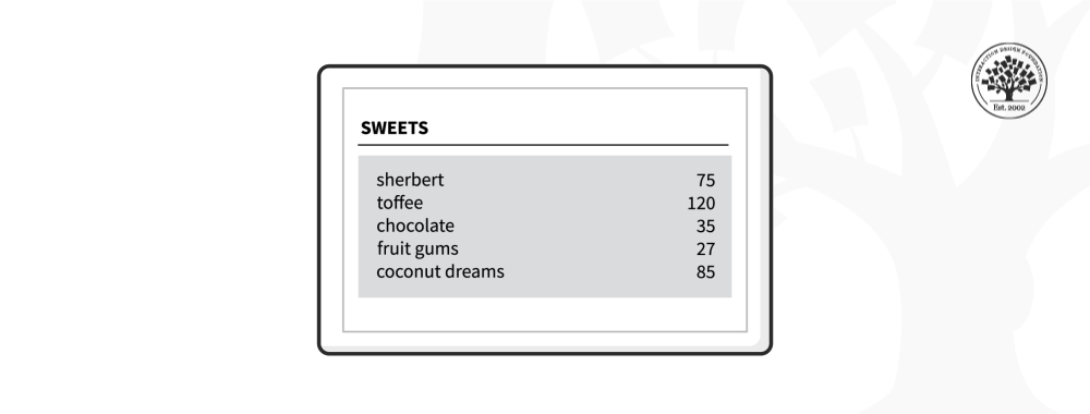
Right-aligned layouts are uncommon in Western cultures, as the right-to-left reading pattern is more common for languages such as Arabic. However, it’s still valuable in specific contexts for Western audiences, such as when you want to align numbers in tables. In English interfaces, right alignment can provide visual balance when you pair it with left-aligned content.
While left alignment of text tends to be the rule in left-to-right languages, there are situations where other alignments are preferable. In this example, the right-aligned text reduces the gap between columns.
Justified text aligns both left and right edges and creates neat vertical margins to give a straight edge to each side. It’s visually clean, but it can cause uneven word spacing and “rivers of white space,” which makes longer passages harder to read. So, use justified alignment sparingly and only with careful typographic control.
Notice how this title slide guides the eye in a timelessly effective way.
Note the alignment in the top slide: crisp, clean, and even, helping guide the viewer’s eye to what’s important right away, confident that they’re encountering clear and professional slides. Remember to load your screens to just the right level. Your visual presentation content should complement your speech, and good alignment helps prove you know what to show and why it’s important.
Overall, good visual alignment can make a great deal of difference to help you win trust and results whether your design is a slide, a prototype, or a finished product like a website. It’s like both a guiding rule and a “sea wall” to keep chaos from washing in and messing up what you show others, so words like “sloppy,” “careless,” or “unconvincing” don’t get associated with you, while “professional,” “competent,” “caring,” and “trustworthy” do.
Remember the bigger picture of visual alignment, too; it isn’t just about clean layouts but also about clarity, trust, and influence. When you align your visuals and present them with confidence, you don’t just look professional; you prove you are professional. Every well-chosen, aligned element becomes part of your carefully crafted message in building trust in presentations and beyond. Every confident explanation you deliver with your best presentation body language and compelling content builds your credibility. And every well-delivered presentation can help accelerate your career.
So, the next time you prepare a page, screen, or slide, remember: alignment is far more than part of presentation design principles or effective communication in design; it’s a core part of communication above that. And when you show up with professional presentation skills to mirror excellent content, you’ll not only make your work look better; you’ll make yourself unforgettable in the process.
Alignment directly affects user experience by creating visual harmony, clarity, and flow. Users can scan, interpret, and navigate interfaces more easily when elements align. Aligned layouts reduce cognitive load by guiding the eye in predictable patterns,raising comprehension and confidence levels.
Poor alignment leads to confusion and visual clutter. For example, misaligned text blocks or buttons can make interfaces chaotic and cause users to miss key actions or information. Good alignment also signals professionalism and trust. Users instinctively associate well-organized visuals with quality and reliability.
Designers use alignment to create hierarchy and rhythm, anchoring elements to grids or common axes to improve structure and accessibility.
Explore how to create a visual hierarchy to help users achieve goals in seamless experiences with your digital solution and brand.
How do I spot poor visual alignment in an interface?
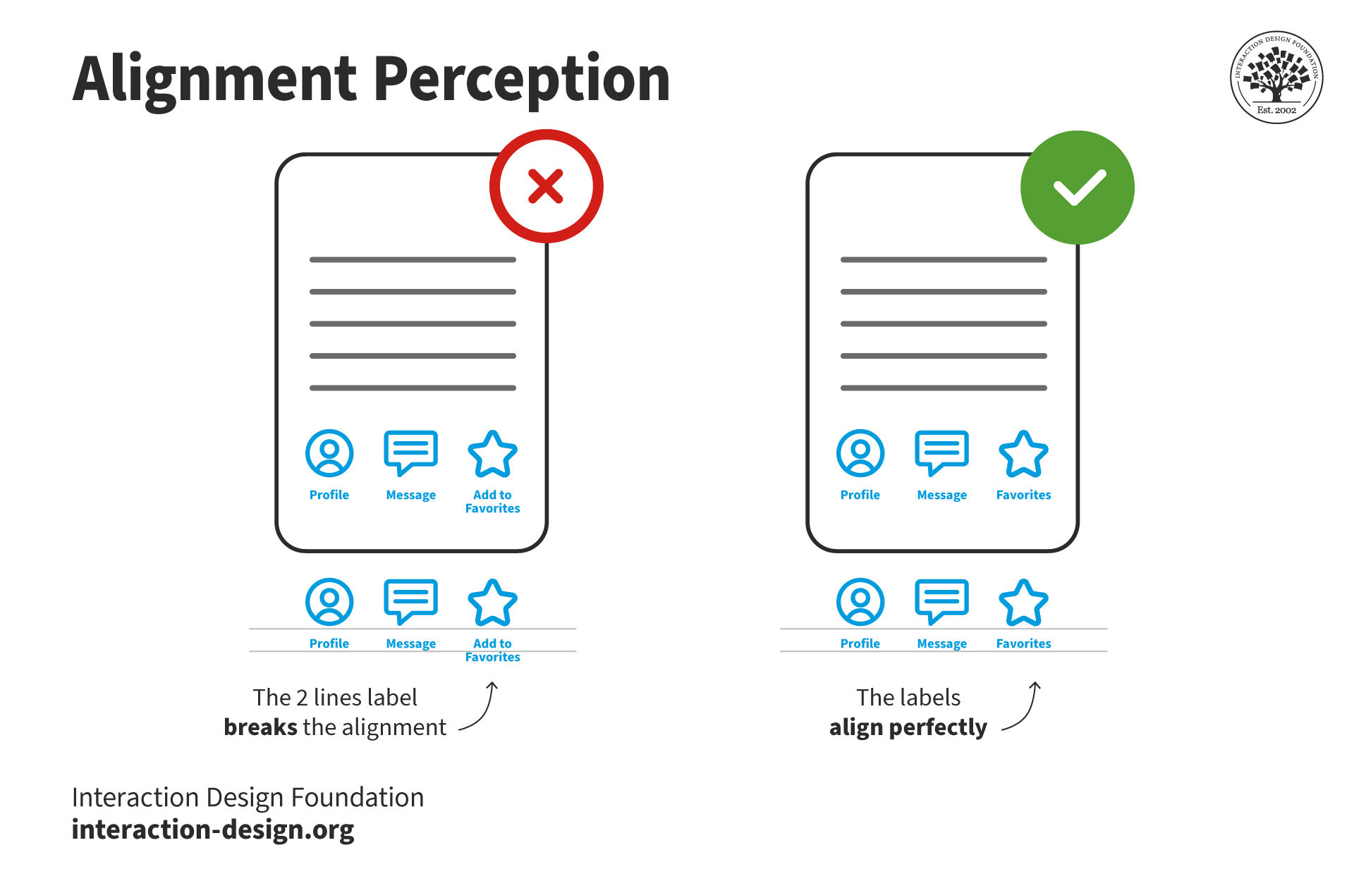
To find poor visual alignment in an interface, look for elements that don’t align horizontally or vertically. Misaligned text, icons, buttons, or images often make the visual flow awkward. Scan for inconsistent spacing, uneven margins, or itemsthat seem visually “off” even if only by a few pixels.
Use invisible reference lines or a grid overlay to check whether key elements share common axes.Examine left, right, top, and baseline alignment across sections. A common sign of poor alignment is when the eye has to “jump” between items, which disrupts scanability and causes visual strain.
Consistent alignment creates visual order; however, breaking it signals sloppy design.
Discover how to use grid systems to guide better alignment visually.
When should I use left, center, or right alignment in UI design?
Use left, center, or right alignment in UI design according to context, content type, and user expectations. Left alignment works best for body text and form labels; it matches how users read in most languages and improves readability. It’s the default choice for clear, fast scanning.
Center alignment suits short, standalone content like headings, calls to action, or splash pages. It creates visual balance but is something to use sparingly; centered text becomes hard to read in longer blocks.
Right alignment is rarely ideal for text, but can work for UI elements like aligning totals in tables or positioning buttons at the edge for visual balance.
Choose alignment to support hierarchy, clarity, and visual flow, not just aesthetics.
Explore the world of designing for other cultures, in this video with Alan Dix: Author of the bestselling book “Human-Computer Interaction” and Director of the Computational Foundry at Swansea University.
ShowHide
video transcript
Transcript loading…
Video copyright info
Copyright holder: Tommi Vainikainen _ Appearance time: 2:56 - 3:03 Copyright license and terms: Public domain, via Wikimedia Commons
Copyright holder: Maik Meid _ Appearance time: 2:56 - 3:03 Copyright license and terms: CC BY 2.0, via Wikimedia Commons _ Link: https://commons.wikimedia.org/wiki/File:Norge_93.jpg
Copyright holder: Paju _ Appearance time: 2:56 - 3:03 Copyright license and terms: CC BY-SA 3.0, via Wikimedia Commons _ Link: https://commons.wikimedia.org/wiki/File:Kaivokselan_kaivokset_kyltti.jpg
Copyright holder: Tiia Monto _ Appearance time: 2:56 - 3:03 Copyright license and terms: CC BY-SA 3.0, via Wikimedia Commons _ Link: https://commons.wikimedia.org/wiki/File:Turku_-_harbour_sign.jpg
What’s the difference between pixel-perfect alignment and optical alignment?
Pixel-perfect alignment means aligning elements exactly on the same pixel grid lines: mathematically precise. Meanwhile, optical alignment is aboutadjusting placement slightly to make designs look visually balanced, even if they aren’t technically aligned. Designers use optical alignment when geometry alone creates imbalance.
For example, with text and icons; uppercase letters may align with a box edge, but visually feel misaligned without optical tweaks.
Great designers combine both: start with pixel-perfect grids, then fine-tune with optical alignment for true visual harmony.
Find out helpful information about another helpful tactic in visual design: symmetry.
How do I align text with icons or buttons cleanly?
To align text with icons or buttons cleanly, match their visual centers, not just their bounding boxes. To start, align the icon and text baselines, especially when pairing inline elements like “Save” with a disk icon. This ensures readable, balanced flow.
For stacked or block layouts, use a consistent vertical or horizontal grid.Align the icon’s optical center (its perceived midpoint) not necessarily its edge, which may include empty space. Use padding or margin adjustments to fine-tune alignment visually.
Buttons with text and icons should have equal spacing between elements and align content centrally within the button shape.Keep spacing consistent across all instances for cohesion and usability.
What are the most common alignment mistakes in UI design?
The most common alignment mistakes in UI design include inconsistent spacing, misaligned text or icons, and ignoring grids. Designers often misalign elements by just a few pixels, which disrupts visual flow and makes interfaces feel messy or unpolished. Skipping alignment with surrounding elements, like placing a button slightly off-center, breaks hierarchy and rhythm, too.
Another frequent mistake is using multiple alignment styles (left, center, right) within the same view, which confuses users and weakens structure. Many designers also end up overlooking optical alignment, relying only on mathematical centering even when it looks off.
Clean alignment creates trust and usability, while sloppy alignment distracts and frustrates users, no matter how good the content or features are.
How do I deal with alignment issues in responsive or dynamic layouts?
To deal with alignment issues in responsive or dynamic layouts, use flexible grid systems and relative units like percentages or ems. These tools help you maintain alignment across screen sizes, including desktop and mobile. Define consistent padding, margins, and spacing tokens in your design system to ensure predictable behavior when elements shift.
Use media queries to adjust layout rules at specific breakpoints, keeping key elements aligned as screen width changes. For complex layouts, consider flexbox or CSS grid; both let you control alignment without hardcoding pixel values.
Preview and test your designs on multiple devices, too. Responsive alignment isn’t just about resizing; it’s about preserving visual hierarchy and clarity at every scale.
Read up on responsive design to discover how to make the most of this important approach to ensuring consistency and more in design.
How does alignment affect accessibility and readability?
Alignment plays a crucial role in both accessibility and readability. Left-aligned text, for example, creates a straight edge that helps users, especially users with dyslexia or low vision, track lines more easily. By contrast, centered or justified text creates uneven spacing, which disrupts reading flow and makes comprehension harder.
Consistent alignment supports screen readers and keyboard navigation, too.When labels, inputs, and buttons follow a clear structure, assistive technologies can interpret and present the content more logically. Visual hierarchy guided by alignment helps all users, especially those with cognitive disabilities, understand relationships between elements quickly.
Inaccessible alignment confuses, while thoughtful alignment enhances clarity for everyone.
Access a greater grasp of why accessible designs are essential in a modern world, in our video.
ShowHide
video transcript
Transcript loading…
How do I align content in mobile-first or minimalist designs?
To align content in mobile-first or minimalist designs, prioritize simplicity and clarity. Use a single-column layout with left-aligned text and evenly spaced elements. This supports natural reading patterns and ensures that users don’t have to work to interpret layout or hierarchy on small screens.
Rely on consistent margins and paddings to create rhythm. Center alignment works well for short elements like buttons or headings, but don’t center long text as it reduces readability. Stick to grid systems or baseline grids to align elements vertically, which keeps spacing predictable across screen sizes.
In minimalist design, alignment replaces decoration. Clean, consistent alignment adds polish and reinforces usability without visual clutter.
When is it acceptable to break alignment rules for aesthetic reasons?
Break alignment rules only when it enhances clarity, emotion, or brand identity, never just for decoration. Designers may shift elements off-grid to draw attention, create contrast, or deliberately guide focus. For example, breaking alignment in a hero section can add dynamism or visual interest, especially in editorial or creative layouts.
Even so, do it purposefully and sparingly.Breaking alignment randomly leads to confusion and disrupts flow. Always test with users to ensure the visual effect doesn't harm readability or navigation, and remember accessibility considerations to help users with low vision, especially.
Controlled misalignment can create standout moments without sacrificing usability when used carefully and with intention.
Learn how, among other visual aspects, good readability is essential for reaching users.
What are some helpful resources about visual alignment?
This post emphasizes how proper hierarchy and alignment make interfaces easier to scan and understand. It explains that alignment reduces cognitive load by guiding visual flow, such as text aligned on the same baseline or icons spaced evenly, making your UI feel deliberate and polished. Carlson demonstrates how misalignment interrupts reading patterns, while consistent alignment supports visual hierarchy and efficient navigation. UX designers will appreciate the hands-on guidance, like aligning text with text instead of icons, and using horizontal/vertical alignment for clarity. This article offers immediate, actionable strategies to enhance readability, usability, and the perceived quality of digital products.
This comprehensive overview defines alignment as arranging elements in relation to shared axes or baselines to create harmony and structure. It covers different alignment types, horizontal, vertical, edge, typography, grid systems, and explains how grid alignment boosts responsiveness, readability, and user guidance. The post also identifies common alignment mistakes and offers best-practice examples, helping UX designers avoid clutter and reinforce visual hierarchy. Practical takeaways include leveraging typography alignment and responsive grid layouts. This article is especially valuable for UX teams wanting to build systematic design systems or improve visual consistency across screens with a structured, theory-backed toolkit.
Ellen Lupton’s Thinking with Type (3rd ed., 2024) is a definitive resource in typography and visual design for UX practitioners. Now fully revised and expanded, it includes thirty-two additional pages, a broader diversity of typographic voices, and expanded coverage, ranging from letterforms and kerning to grids, alignment, Gestalt principles, and responsive layouts. The book’s clear diagrams, critical essays, and practice exercises foreground how precise alignment and spacing underpin readability, hierarchy, and visual balance. It integrates contemporary writing systems, modern typeface technologies like variable fonts, and accessibility considerations, making it essential for designers aiming to enhance clarity and coherence in both print and digital contexts.
What are common mistakes people make with alignment in slides?
One of the biggest mistakes is mixing alignment styles: left-aligning some text, centering other text, and then randomly placing images, as it creates visual noise and forces the audience to work harder to process what they’re seeing.
Another mistake is uneven spacing: for example, if you leave a large gap above one heading and almost no space under another. People also often place elements too close to slide edges, which feels cramped.
Last, but not least, over-relying on automatic centering can make slides look flat and lifeless. To avoid these pitfalls, pick one main alignment style (usually left or center), use consistent spacing, and leave margins around the edges. Consistency is what makes your slides feel intentional and polished, and that you own your presentation like a professional.
Discover some other areas to watch out for so you can deliver exceptional presentations, in this video with Morgane Peng, Managing Director, Global Head of Product Design and AI Transformation.
ShowHide
video transcript
Transcript loading…
Should visuals and text always share the same alignment?
Not always, but they should feel connected. If you place an image on the left, aligning your text flush with the right edge of that image creates a natural relationship. The viewer’s eye sees them as part of one unit. Problems arise when visuals float without alignment anchors, as it makes them feel disconnected from the message. For example, a chart centered in the slide while the title is left-aligned above can look awkward. Instead, align the chart’s left edge with the title’s left edge. This kind of detail keeps the slide balanced and helps keep your audience on board.
You don’t need rigid rules; sure, sometimes breaking symmetry adds interest. However, consistent alignment between text and visuals is what makes a slide look deliberate and professional, not accidental or haphazard.
How can I practice visual alignment so it becomes second nature?
The fastest way to practice is to use guides and grids every time you build slides. To begin, use a simple three-column or two-row structure and commit to aligning all content to it. Over time, your eye will naturally notice misaligned elements, even outside your slides, on posters, websites, or even menus.
Try this other useful exercise: take an old presentation and spend 15 minutes only fixing alignment: equal spacing, consistent margins, and aligned headers. Compare the “before” and “after” versions; you’ll see how much more professional the aligned one feels. Treat alignment like editing. You mightn’t always notice when it’s perfect, but you’ll instantly notice when it’s sloppy. With practice, alignment will become a habit you never skip.
Earn a Gift, Answer a Short Quiz!
Question 1
Question 2
Question 3
Get Your Gift
Try Again! IxDF Cheers For You!
0 out of 3 questions answered correctly
Remember, the more you learn about design, the more you make yourself valuable.
It's Easy to Fast-Track Your Career with the World's Best Experts
Master complex skills effortlessly with proven best practices and toolkits directly from the world's top design experts. Meet your expert for this course:
Alan Dix: Author of the bestselling book “Human-Computer Interaction” and Director of the Computational Foundry at Swansea University.
Now that we’ve seen some grids at work in the Rule of Thirds article, let’s examine them a little more deeply. As a conc
1.4k shares
5 years ago
Open Access—Link to us!
We believe in Open Access and the democratization of knowledge. Unfortunately, world-class educational materials such as this page are normally hidden behind paywalls or in expensive textbooks.

.png)
.png)
