Typography has its very own language. It’s full of typographic terms that make up its basic anatomy. Just like it’s vital for your doctor to learn human anatomy to make an informed diagnosis, it’s important for you to understand the anatomy of type to use it effectively.
Let’s begin with the basics of anatomy. Designer and educator Mia Cinelli will help us understand.
Show
Hide
video transcript
- Transcript loading…
Understanding all these terms can be a bit confusing, so we’ve created a comprehensive list that will help guide you through the common anatomy of type terms.
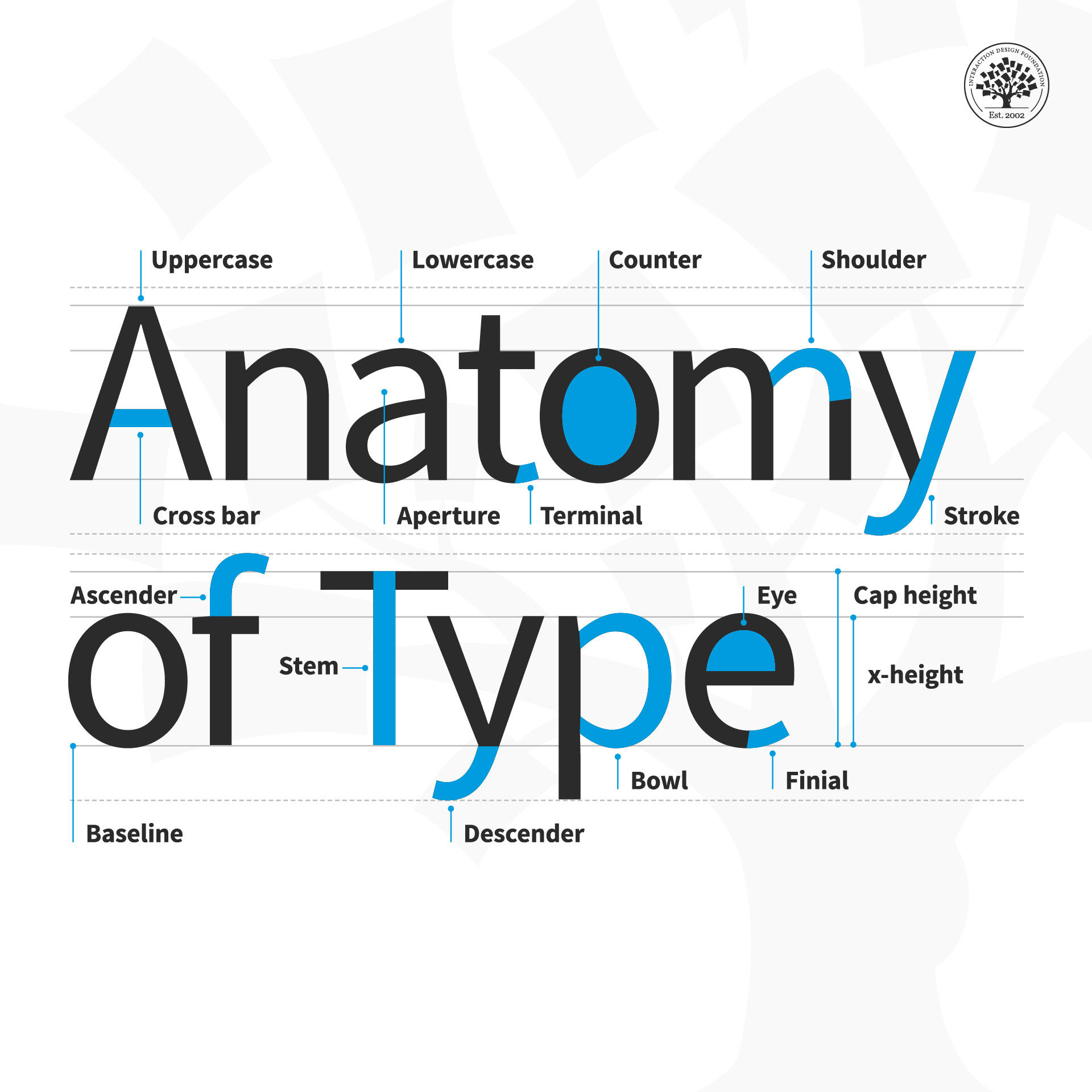
© Daniel Skrok and Interaction Design Foundation, CC BY-SA 3.0
Anatomy of Type Terms
Aperture: The partially enclosed space of a letterform.
Ascender: An upward vertical stroke that extends beyond the x-height.
Baseline: The invisible line on which all letters rest.
Bowl: The generally round or elliptical forms which are the basic body shape of letters.
Cap height: The distance from the baseline to the top of the capital letter.
Counter: The white space enclosed by a letterform.
Cross bar: The horizontal stroke in letters.
Descender: A downward vertical stroke that extends beyond the baseline.
Dot: Also known as a tittle, is a small diacritic on a lowercase i or j.
Eye: The closed counter of a lowercase e.
Finial: A tapered or curved end on a letterform.
Ligature: Two or more letters tied into a single character.
Lowercase: A smaller form of letters in a typeface.
Shoulder: A curved stroke originating from a stem.
Spine: The main curved stroke of a lowercase or capital letter.
Stem: A main stroke that is more or less straight, not part of a bowl.
Serif: A stroke added to the beginning or end of one of the main strokes of a letter.
Small Capital: Short capital letters designed to blend with lowercase text.
Stroke: A straight or curved line that creates the principal part of a letter.
Terminal: A circular form at the end of the arm, leg or brow in letters.
Uppercase: A typecase containing capital letters.
x-height: The distance between the baseline and the height of the lowercase letter ‘x’.
Weight: The thickness of a font’s stroke.
The Take Away
As Mia mentioned, type has anatomy. It has its very own language full of serifs, shoulders and stems. Whether you’re an aspiring designer or a typography enthusiast, learning the building blocks of typography will help you apply it effectively within your designs.
Remember, all letters rest on an invisible line known as the baseline. The distance between the baseline and the height of the lowercase letter ‘x’ is the x-height. And the distance between the baseline and the top of the capital letter is the cap height. Some letters extend beyond the baseline and x-height. These vertical strokes are known as ascenders and descenders.
The thickness of a letter's stroke determines its weight. Letters may appear in capital letters known as uppercase, in smaller forms known as lowercase, or in short capital letters designed to blend with lowercase text known as small capitals.
A stroke is a straight or curved line that creates the principal part of a letter. A curved stroke originating from a stem is a shoulder. A stroke that is more or less straight is a stem. A curved stroke is a spine. The horizontal stroke in letters is known as a cross bar.
A bowl is a rounded stroke that forms the basic body shape of letters. The white space enclosed by a letterform is known as a counter. The partially enclosed space of a letterform is known as the aperture. An eye is the closed counter of a lowercase ‘e’.
Two or more letters tied into a single character are known as ligatures. A dot, also known as a tittle, is a small diacritic on a lowercase i or j.
A stroke added to the beginning or end of a letter is a serif. Similarly, a tapered or curved end on a letterform is a finial and a circular form at the end of the arm, leg or brow in letters is known as a terminal.
Now that you understand the anatomy of type, take what you learned and handle type that much better than before.
References and Where to Learn More
Learn more about the Typography by reading this thoughtful book by Ellen Lupton:
Ellen Lupton. Thinking with Type. 2010. (Link)
Learn more about Type Anatomy at Thinking With Type.
Understanding Typography by visiting Google Material Design:
Practice Shaping Letters in this interactive game.
Image
© Daniel Skrok and Interaction Design Foundation, CC BY-SA 3.0