
Online forms with input fields should not make you feel like you’re back in the fifth grade, taking a pop quiz and being totally unready for it. Rather than ‘grilling’ your users and leaving them feeling inadequate when they don’t know the correct answer, you will want to implement designs that whisper helpful hints softly in their ears. Perhaps some users are experienced enough not to need your help, or even not to notice any support you’re giving them, but implementing the input hints design pattern will undoubtedly help them be more efficient. Here, we’ll show you all about the benefits of this kind design pattern and give you a step-by-step rundown on how to use them to great effect in your designs.
The Design Problem
Contrary to popular belief, entering data can be a taxing task, and there might be times when users need a short prompt here and there to help them identify exactly what they are meant to put in a particular input field. So as to be mindful of what users can face in this sense, try and remember one of the worst paper forms you ever had to fill in. Was it too rigid and unaccommodating (e.g., it was set so you only had nine spaces to enter your last name, and your last name was longer, like “Washington”)? Or was it maybe so lacking in direction that you ended up writing your entire address, including the state and zip code, in the “ADDRESS” field, only then to notice a tiny couple of boxes, tucked away in at the corner asking for the state and ZIP? (It’s always worse if you’re not allowed to use a pencil, isn’t it?) Whatever it was, something malfunctioned badly enough on the design side to make you sigh, seethe, swear or even shout.
Let’s jump back to writing in an electronic sense, and—with a clear picture of that awful form in mind—let’s consider the users. Yes, their time is limited, but they are also likely to have a low threshold for correcting a tiny mistake that takes just two seconds. Users like to feel enabled and empowered – like the rest of us, they hate getting tripped up. So, they’ll be glad of any guidepost to help them input at speed.
The Design Solution
Input hints help users establish what information should be entered into an input field. They are concise descriptions given inside—or just beside—the data entry fields that guide users to enter the right information. Having examples on display helps keep them right, particularly when it comes to passwords and the date format.
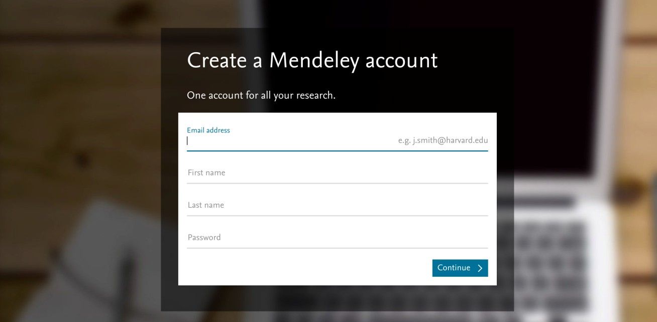
Author/Copyright holder: Pixabay. Copyright terms and licence: Free to Use
On the Mendeley page, the input hint is provided beside the actual input field, although a clear separation between the two is missing. By aligning the input hint on the right, the hint does not need to disappear while the user is typing.
Why Choose an Input Hint Design Pattern?
“A computer shall not waste your time or require you to do more work than is strictly necessary.”
—Jef Raskin, American Human-computer interface expert and pioneer of the Apple Macintosh computer
As designers, we have foes that lurk behind us while we work or make plans – they’re called assumptions. For instance, we might forget that not all users are as well-versed in getting around online as we are, or we might assume everyone knows what a full-length email address is. This is where input hints come in very handy for the users of the sites we create. They can support users when they are filling out forms or entering data into input fields. Small hints can lead users through a laborious task; from seeing exactly what they have to do in a particular situation, users can merely follow the computer's lead and devote as little time and mental effort to the process as possible.
Especially when users are novices at a certain task, input hints can help them figure out what the system requires them to do if they want to achieve something. For example, elderly users may not be accustomed to creating online profiles, or the term ‘email’ might just make them think of everything that comes before the @ sign. This is where input hints shed a bright light on what’s needed and can dispel confusion. It’s thanks to the inclusion of such hints that many users can see at a glance what a profile name is and what it will be used for. From there, they can gain more confidence in creating names that suit them.
Even when users are experts, however, input hints can still be beneficial. For example, many websites differ in the security requirements for a login password. Some only require a minimum number of characters (which we might view as ‘weak’ but still acceptable), while others require at least one number, one symbol, and so on, right up to the strongest, most mind-bending assortment of characters that will make you write that password down on several Post-Its and stick them under your desk and chair. When you’re designing an interface that has these types of requirements, input hints will prevent users from having to correct their mistakes. So, far from being patronizing, self-evident things, these hints actually serve to prevent a negative user experience. We might imagine them to be rather like painted lines and arrows on the road in that regard – beneficial for all, especially when we’re traveling at speed, and let’s face it – who doesn’t at least feel the need to travel at faster than a snail’s pace online?
Best Practice: How to Implement Input Hints
Establish your input fields.
Provide short hints that are instantly understandable and directly linked to the task. For example, if the user is requested to enter his/her name, the hint might be an example name (such as “e.g., John Smith”). If the input field is for the user's date of birth, the hint may state “e.g., 12/31/1976”(note the date format is geared for American users here). Ambiguity can be confusing, so these input hints must be in line with what the user would expect; this is not an area to show creative flair. Simply provide the user with the information necessary to satisfy all elements of the task as quickly as possible.
Now decide on the superficial aspects of the input hints. Traditionally, the hint font is in a lighter color to the user input font. This allows users to distinguish immediately between the input fields that have been completed and those that are still outstanding. You may want to use a different font entirely or show the input hints in italics. Just make sure the users can perceive the difference between their own input and the hints themselves.
Once the user clicks in an input field, make sure the input hint disappears, so the user does not end up typing in the box with the hint still present.
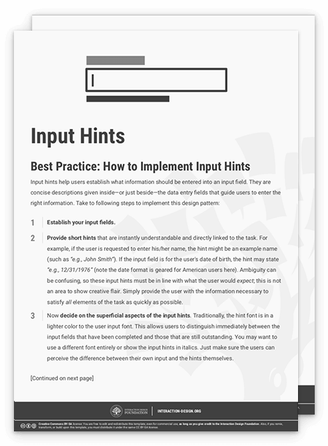
To help you get started implementing input hints, you can download and print our “Input Hints” template:
Potential Problems with Input Hints
When the user clicks in an input field, the input hint must disappear instantly; the user should not have to delete the hint manually before being able to start typing. If you fail to implement this feature, users might accidentally start typing in the input field without first deleting the hint, which will more than likely invalidate their entry, slow them down, and frustrate them in the process. Always treat the hint as if it exists on a different level – so that it can never be read as real input data. As the user might be switching between different input fields, you may want to reinstate the input hint if the user moves to another box and leaves the previous input field blank. If you take this approach, you will want to use a lighter colored font for the input hint, so users are immediately aware of which input fields contain their own responses and which contain the input hints.
Date formats and password security demands need special attention. For instance, although other date formats are gaining popularity, the traditional mode is year/month/day in some countries (Sweden, for example). So, keep this point in mind if you’re designing for an international client (and, yes, some English-speaking countries such as South Africa and Kenya still often adhere to this) and tailor your hint appropriately (e.g., “yyyy/mm/dd”). As ever, ensure you’re familiar with your organization’s stipulations for password length and content. A simple oversight in either of these areas can leave users scratching their heads – for a little while, before they try other formats or arrangements, try contacting your “Help” desk... or leave, never to return.
As a general rule, while you should keep these hints faint, remember also that many users may have vision limitations. The color tone you should use should be strong enough to be more than easily visible to you but washed-out or cool enough to suggest that it’s no more than a hint – an almost-insubstantial ‘ghostly’ guide that vanishes when it senses users making that first keystroke in the field, confident they’re on the right track.
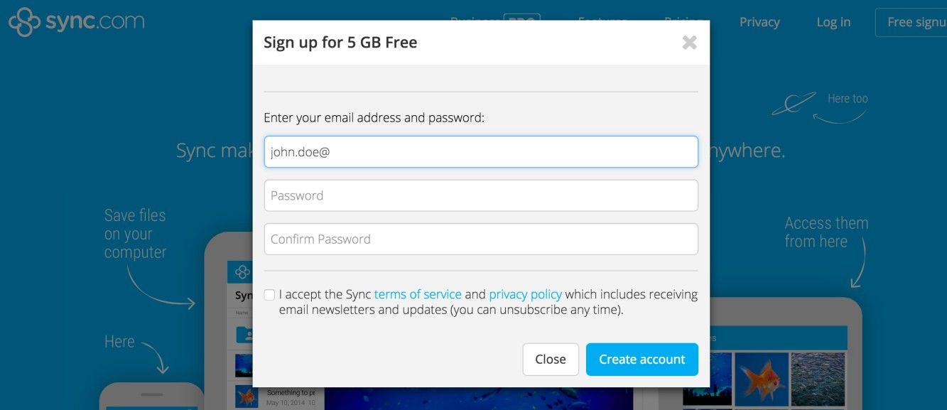
Author/Copyright holder: Sync.com Inc. Copyright terms and licence: Fair Use
When a user is signing up on the Sync web page, the input hints disappear once the user starts to type in the input field. The typed input is just slightly darker than the remaining input hints of the other fields, allowing the user to distinguish between what he or she has entered and what steps are still required to take so as to complete the form.
The Take Away
Input hints are an excellent way to guide your users in the right direction and prevent them from making errors. They are concise descriptions given inside or just beside the data entry fields, and they guide users to input the right information. This design pattern will give them the confidence they need to give you the required input and complete their tasks without too much mental effort. While they may seem like a small matter, never forget that users hail from many backgrounds as regards experience, ability, and culture, and even proficient users stumble due to speeding and sticking to habits that don’t suit a site’s demands. All it takes is one tiny error to stop these visitors in their tracks. Often, these hints can mean the difference between a practically seamless user journey and that awful moment when the magic we work as designers fails and users say “What?!” and frown.
References & Where to Learn More
Hero Image: Author/Copyright holder: LinkedIn. Copyright terms and license: CC0.
Jenifer Tidwell, Designing Interfaces: Patterns for Effective Interaction Design, 2010
Martijn van Welie, Pattern Library, 2008


