Your constantly-updated definition of Color Modes and
collection of videos and articles. Be a conversation starter: Share this page and inspire others!
192shares
What are Color Modes?
Color modes are the settings designers use to show colors consistently across devices and materials. Commonly used modes are LAB, RGB, CMYK, index, grayscale and bitmap, which differ in quality and file size. Designers pick modes to optimize images and ensure these appear identically across media for brand consistency.
“The main function of color should be to serve expression.”
— Henri Matisse
Learn about the intricate properties of color here.
ShowHide
video transcript
Transcript loading…
How to Achieve Color Consistency and More in Screen and Print
The designs we create appear on many devices and materials, and how we manipulate color greatly depends on the medium we use. This is due to differences in color spaces (i.e., the specific organization of colors), and the two processes for producing color, namely:
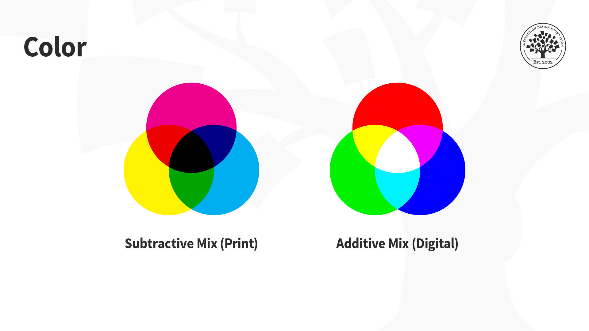
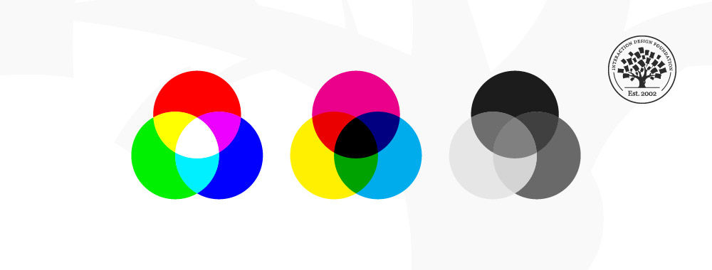
Additive: Involves the blending of light. We “create” white by mixing all the colors at full intensity; black is the total absence of color.
Subtractive: Involves mixing physical substances (e.g., ink, paint). Each dot/splotch covers the medium (e.g., paper). A classic example of mixing all paint colors is that curious dark grey-brown hue.
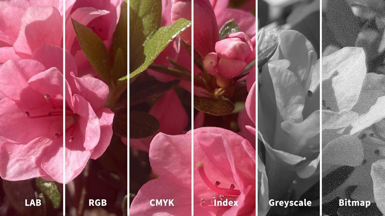
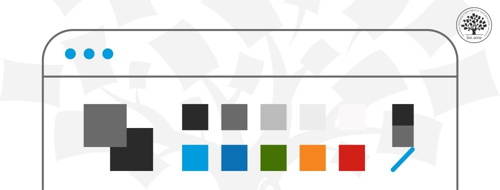
You may have seen how printed-out colors can look different from those on-screen. This phenomenon happens because the printer’s colors (using the subtractive process) didn’t replicate the screen’s (using the additive). Such inconsistencies can be easy to correct if you choose the suitable color mode. The illustration below depicts the difference between LAB, RGB, CMYK, Index, Greyscale and Bitmap color modes. You’ll notice how the quality from left (LAB) to right (Bitmap) decreases as the amount of color decreases.
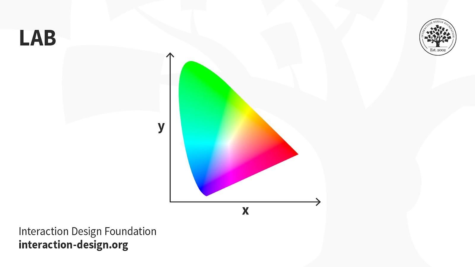
LAB: Also called CIELab, LAB is based on how humans perceive color. It comprises one channel for lightness (L, ranging from the values 0–100) and two for color (A—the Green-Red Axis channel—and B, the Blue-Yellow Axis channel, ranging from +127 to -128).
LAB color is device-independent, making it easy to achieve precisely the same color across different types of media so your (e.g.) digital logo appears identically on a mug, banner, etc. However, LAB’s large file sizes can delay load times.
Uses:
Branded Products (e.g., T-shirts, banners).
Color Reference.
Photography.
Improving images with a natural and vibrant look.
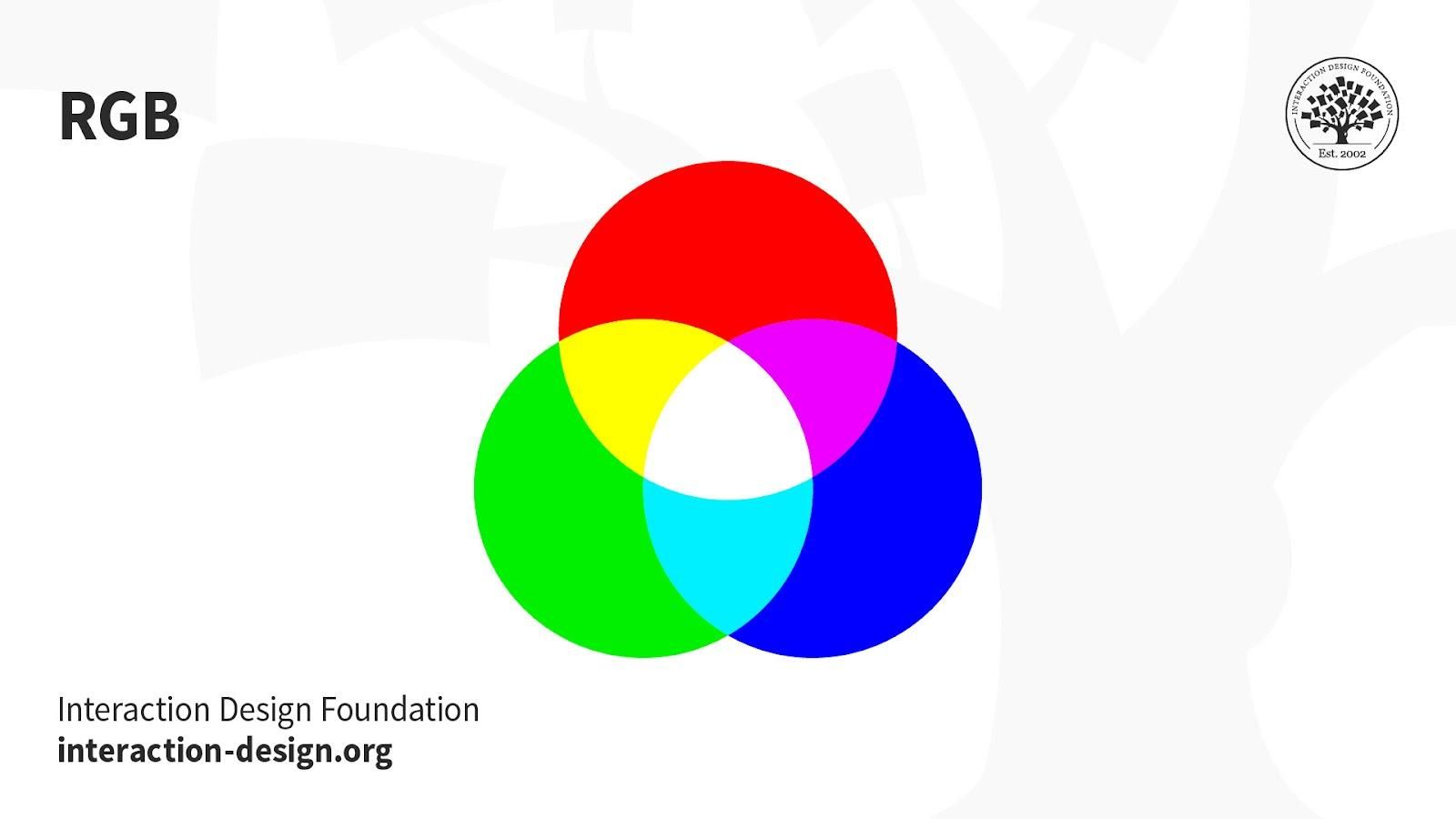
RGB: This color mode uses the additive process. It comprises Red, Green and Blue hues that combine to create extensive color variations.
RGB exists exclusively in digital formats (e.g., mobile screens). Although RGB is present across most electronic devices, the color elements vary across systems and models. So, an image can display differently on-screen from brand to brand.
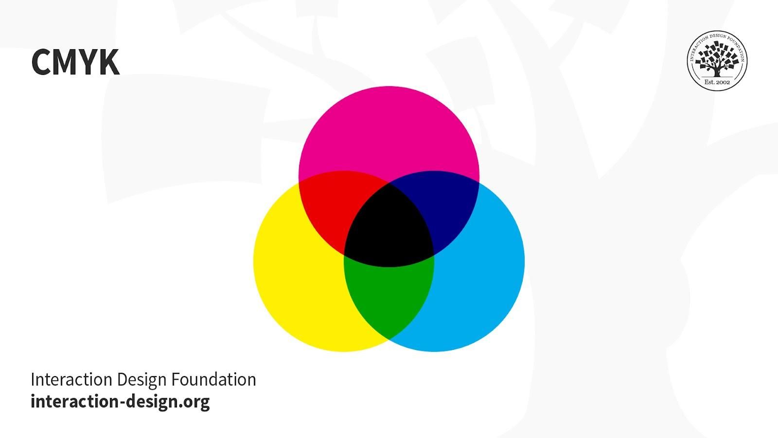
CMYK: This subtractive color mode comprises Cyan, Magenta, Yellow and Key (Black), which combine to produce a range of hues. This four-color process works for most printers.
Printed images are a series of layered four-color dots (measured in dots per inch) that create different hues and gradations. Although CMYK is a standard color model, the exact range of colors represented can vary depending on the press and printing conditions.
Uses:
Stationery (e.g., business cards).
Advertising (e.g., posters, flyers, brochures).
Product Packaging.
Tip—Use CMYK mode when preparing an image to be printed with process colors, as image conversion from RGB to CMYK creates a color separation. If you start with an RGB image, it’s best to edit first in RGB and then convert to CMYK afterward.
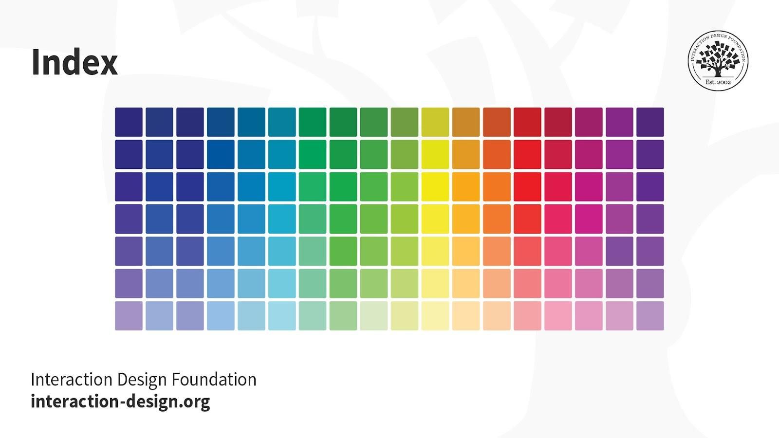
Index: This mode produces 8‑bit image files with up to 256 colors. Like RGB, this color mode is exclusively for digital formats, on-screen. When you convert an image to index color, a color table gets built to store and index the image’s colors.
While its color palette is limited, index color can reduce file size yet maintain the desired visual quality for digital presentations, websites and mobile applications. So, this mode is ideal for image optimization. For extensive editing, it’s best to convert temporarily to RGB mode.
Greyscale: This black-and-white-looking mode comprises various shades of grey within an image.
You can use it in print and digital formats. In digital, each image pixel has a value ranging from 0 (black) to 255 (white). In print, the values range from 0% (white) to 100% (black), representing the amount of black ink used.
Uses:
Digital formats to express a specific tone in your designs.
Print formats to lower costs and minimize ink usage.
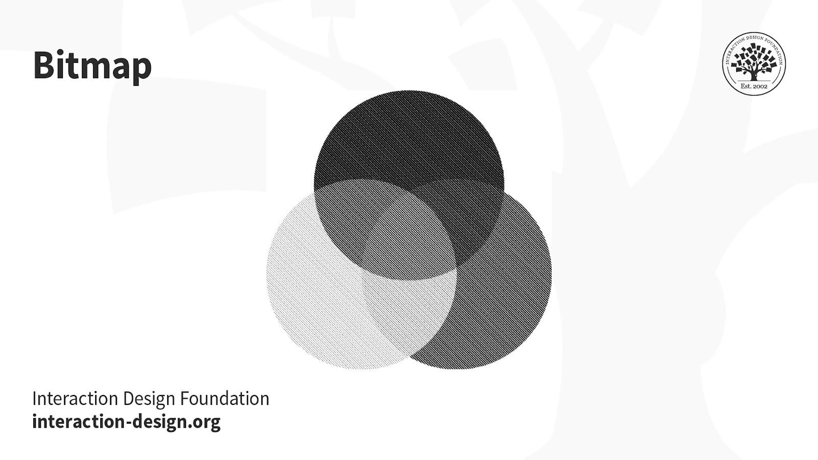
Bitmap (a.k.a. line art): This mode comprises black and white pixels, with no colors or shades of grey.
In digital formats, black and white values represent an image’s pixels, while black ink dots and the white of the paper represent the overall image in print formats.
Uses:
Print and digital formats to create a line drawing or hand-drawn sketch or make vintage effects.
While jagged-edged on-screen, bitmap images usually print smoothly with high resolution.
The Interaction Design Foundation has published multiple articles on the use and definition of color modes. Take the Visual design course by IxDF to understand when and how to incorporate colors in your designs. This course provides comprehensive insights into the strategic use of colors in your plans in digital and printed formats. It also highlights the detailed use of the color modes in different scenarios and design types.
Understanding color modes is essential in making your designs visually impactful, whether on screens or in print. Colors play a crucial role in capturing attention and conveying messages effectively. Designers use suitable color modes to make their work stand out.
Watch this video to learn what the visual design course offers.
What is the 20-20-20 rule?
The 20-20-20 rule is suggested for users who spend prolonged periods in front of screens. They could be software developers, graphic designers, or end users. The states that users should take a 20-second break to look at something 20 feet away every 20 minutes to reduce eye strain from screen exposure. The rationale behind this rule is rooted in tackling the effects of prolonged screen time, such as digital eye strain and computer vision syndrome. By redirecting the gaze to a distant point, users engage their eyes in different focal lengths, reducing fatigue and potential discomfort. Incorporating the 20-20-20 rule into regular screen-based activities promotes eye health, contributing to sustained visual comfort and well-being.
Can you tell the difference between CMYK and RGB?
There is a difference between CMYK and RGB across many factors. RGB is the more vibrant color mode, uses an additive process, and is used in digital designs. Its ability to create a broad spectrum of vivid colors is particularly advantageous in the digital realm. CMYK is the printing-based color mode, uses a subtractive process, and is used in printed designs like flyers, brochures, etc. Knowing this difference is vital while deciding on the palette for your UI design. The visual characteristics of RGB and CMYK can impact a design's overall aesthetics and consistency across various mediums. Designers must navigate these distinctions thoughtfully to ensure optimal visual outcomes in digital and print contexts. This article by IxDF tells you about the must-knows of UI color palettes.
Which color mode is good for the eyes?
No rule or restriction exists on which color mode is best for human eyes. It is subjective and depends on anomalies, in the viewer's eyesight and in viewing conditions. Generally, warm and muted colors with appropriate brightness are considered eye-friendly. However, personal preferences and visual comfort can vary. Considerations such as color contrast, text size, and ambient lighting play significant roles. Designers may experiment with different color modes, contrasts, and brightness levels to optimize visual comfort based on the context and target audience. Ultimately, a thoughtful and user-centric approach and an awareness of individual visual sensitivities contribute to creating visually pleasing designs.
ShowHide
video transcript
Transcript loading…
Watch this video to understand how and why we see colors.
Why does RGB look better than CMYK?
RGB may look better than CMYK on screens due to the additive color process, but the choice depends on the intended medium. While RGB may excel in digital environments, its vividness may only sometimes translate accurately to CMYK's more subdued and subtractive color process, commonly used in print. Designers must consider the medium's characteristics and choose the color mode accordingly. With their intense hues, RGB colors often evoke a sense of appeal or extremity, aligning with human emotions and perceptions tied to colors. Humans connect feelings with colors; hence, RGB colors are better for depicting designs. Learn more about color symbolism and how colors portray different emotions and feelings.
What is the best color mode for printing?
CMYK is the best color mode for printing. The 4 color combinations of Cyan, Magenta, Yellow, and Key(Black) are found in most printers. Printed images use a series of these four color dots. Using complementary colors in your designs is suggested for a better appeal. Designers aiming for vibrant and accurate printed outputs should favor CMYK to ensure that the colors visually translate from digital design to print. An additional consideration for enhanced visual appeal in print design involves incorporating complementary colors. Utilizing colors that complement each other within the CMYK spectrum can elevate the overall aesthetics of printed materials. Refer to this article to learn more about the use of complementary colors.
What happens if you print RGB instead of CMYK?
RBG and CMYK follow different color processes, making the theme suitable for specific formats. This is because any digital design will appear different to the eyes when viewed in printed format. RGB relies on an additive color process, combining red, green, and blue light to create a spectrum. In contrast, CMYK employs a subtractive process using cyan, magenta, yellow, and black ink for printing. When a digital design created in RGB is directly printed without conversion, the colors may appear differently in print than on-screen. This will affect the design's visual appeal in the physical form. Converting RGB to CMYK is essential before printing to ensure accurate color reproduction.
Which color mode is better?
The choice between RGB and CMYK depends on the context. RGB is the better choice when designing for digital consumption, as it utilizes an additive color model. Designs intended for digital screens, such as those for websites, apps, and social media, appear more vibrant and visually appealing when using the RGB color mode. CMYK is the better choice for designs that must be printed, like the packages on products, flyers, brochures, and advertisements. CMYK ensures accurate color representation in the printed output, aligning with the capabilities of physical printers. Designers must align their color mode choices with the intended medium to optimize visual impact.
ShowHide
video transcript
Transcript loading…
Watch this video to learn how colors change in different modes.
What are RGB and CMYK color modes?
RGB is a color mode that uses Red, Green, and Blue hues that can be combined to produce a spectrum of colors. It uses the additive process and suits digital, web, app, and social media designs. CMYK comprises Cyan, Magenta, Yellow, and Key (Black). Primarily used in print design, CMYK colors use the subtractive process and are layered in various combinations to achieve a full spectrum. This mode is crucial for printed materials such as advertisements, brochures, flyers, business cards, product portfolios, and packaging, ensuring accurate color representation in the final output. Digital displays almost exclusively use RGB.
How many modes of color are there?
Recognizing the right colors for your design is essential for every designer. A precise knowledge of the color modes can make it easier for a designer to choose correctly. There are four modes of color:
RGB: This color mode utilizes additive color mixing and is used in electronic displays.
CMYK: Relies on subtractive color mixing and is essential for print design.
LAB: This color mode represents colors in a way that aligns with human perception, making it valuable for precise color reproduction.
Pantone Matching System (PMS): The Pantone system is a proprietary color space used in various industries, primarily printing. The Pantone system allows for nearly exact color matching and standardization, meaning designers and printers can know they're on the same page regarding color expectations.
ShowHide
video transcript
Transcript loading…
Watch this video to learn more about colors.
Earn a Gift, Answer a Short Quiz!
Question 1
Question 2
Question 3
Get Your Gift
Try Again! IxDF Cheers For You!
0 out of 3 questions answered correctly
Remember, the more you learn about design, the more you make yourself valuable.
It's Easy to Fast-Track Your Career with the World's Best Experts
Master complex skills effortlessly with proven best practices and toolkits directly from the world's top design experts. Meet your experts for this course:
Mia Cinelli: Associate Professor of Art Studio and Digital Design at the University of Kentucky.
Joann Eckstut: Color Consultant, Founder of The Roomworks, and one of the 12 designers chosen by the Color Association of the USA to create the yearly forecast used by industries to keep up with color trends.
Arielle Eckstut: Author, Agent-at-large at the Levine Greenberg Rostan Literary Agency, and Co-Founder of The Book Doctors and LittleMissMatched.
UI Color Palette 2025: Best Practices, Tips, and Tricks for Designers
Color is vital in user interface (UI) design because not only does it enhance the aesthetics on screens, but it shapes t
1.2k shares
1 mth ago
Open Access—Link to us!
We believe in Open Access and the democratization of knowledge. Unfortunately, world-class educational materials such as this page are normally hidden behind paywalls or in expensive textbooks.