Micro-interactions are small but crucial elements that enhance user experience (UX). They offer intuitive cues and turn routine tasks into enjoyable moments. Learn about their significance in modern UX design through examples and best practices. Understand how these subtle interactions contribute to more engaging and intuitive digital environments.
When you want to create a delightful user experience, the emphasis lies mainly on information architecture, seamless navigation and engaging content. These aspects form the backbone of any digital product. They ensure users find what they need without hassle. What’s more, they help users connect with the content on a deeper level.
Even so, the essence of an engaging user experience often lies in the finer details. Think about a button that changes color when you hover over it or an animation that plays when you complete a task. These small details transform the user experience from functional to enjoyable—and that’s what micro-interactions are all about. They’re subtle moments that play a critical role in enriching the user journey. They make digital platforms more engaging and intuitive.
Micro-interactions guide users with intuitive cues in mobile apps and web design. They turn ordinary tasks into moments of delight when you do them well.
If you want to enhance digital experiences, you’ve got to learn about micro-interactions in detail. We’re going to highlight how these small actions contribute to a superior user experience as we talk about the key components, best practices and examples.
What’s a Micro-interaction?
A micro-interaction is a small, task-based interaction in digital products. It provides feedback or visual responses to user actions. These interactions guide users as they offer subtle cues about how to use a product.
Although small, designers create these single-purpose animations to transform boring actions into memorable moments. They make the product more intuitive, engaging and efficient with the aim to enhance the user experience.
“Microinteractions are an exercise in restraint, in doing as much as possible with as little as possible. Embrace the constraints and focus your attention on doing one thing well. Mies van der Rohe’s mantra of “less is more” should be the microinteraction designer’s mantra as well.”
— Dan Saffer, Author, Microinteractions: Designing with Details
A few examples of micro-interactions include:
A light animation when a user likes a post to indicate the action was successful.
The sound of refresh when a user pulls down to update a feed.
Autocomplete suggestions appear as a user types in a search bar.
A progress bar that fills as a file uploads to provide status information.
The ability to see the other person is ‘Typing’ on messaging apps.
The Psychology Behind Micro-interactions
Micro-interactions play a subtle—yet powerful—role in shaping user experiences. They leverage principles such as feedback and confirmation to enhance user confidence, and this makes it easier to navigate through a digital product. Users don’t need to make an effort to understand its use. You can use important features through these interactions and guide users more effectively.
Micro-interactions offer positive feedback on user actions to encourage continued engagement. They infuse emotional value to create a connection between the user and the product. This attention to detail improves the product's perceived performance and so can make a good user experience so much better, whatever the target audience a designer creates products for.
Designers focus on recognition when they create micro-interactions. This approach helps users move through a site or app more naturally. Familiar design cues make new spaces feel like known territory.
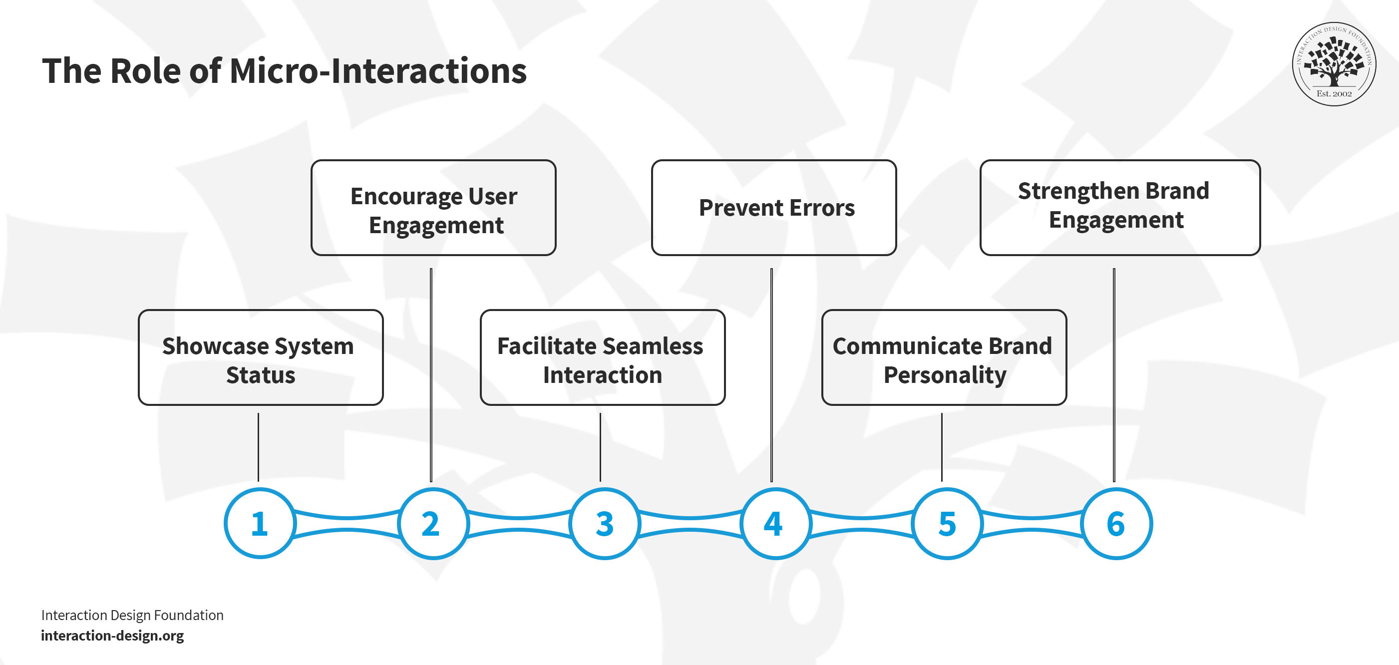
The Role of Micro-Interactions: (Why Companies Use Them?)
© Interaction Design Foundation, CC BY-SA 4.0
Micro-interactions offer nuanced ways to engage and inform users across various platforms. These small yet impactful elements provide clarity and enhance interaction. Let’s explore how micro-interactions improve user experience and why companies prioritize their implementation.
1. Showcase System Status
One big job of micro-interactions is to keep users in the loop. Imagine a user who wants to download a file and see a progress bar fill up. That's a micro-interaction at work! It tells the user, "Your download is in progress and this is the remaining amount." This visual design information clarifies the process for the user and gives them a sense of control.
2. Encourage User Engagement
Micro-interactions often encourage users to engage more deeply with a product. Have you ever liked a post and seen a little heart pop up? That's another micro-interaction. It's a quick way of saying, "Your like has been counted!" This small action makes the experience more rewarding. It encourages the user to interact with the content and can boost the conversion rate if they answer calls to action.
3. Facilitate Seamless Interaction
Micro-interactions guide users through the product. They often preempt and prevent errors. They show the user where to click, tap or swipe. For example, when the users hover over a menu item and it changes color, that's a micro-interaction telling you, "You can click here!" It makes navigating through apps and websites easier and more intuitive.
4. Prevent Errors
Micro-interactions are also there to help you avoid errors. Suppose a user wants to set up a password and as they type, checks appear next to the requirements they have met. This immediate feedback helps the user get it right the first time. It's a subtle way to guide the user through the process without frustration.
5. Communicate Brand Personality
Small details can also show a brand's personality—and they’re neat ways to bring the brand closer to the user. If a brand is playful, its micro-interactions might include fun animations. The interactions will likely be sleek and straightforward if it's more professional. In any case, they’re things that can help the digital product feel more alive and in tune with its brand identity.
6. Strengthen Brand Engagement
Micro-interactions can make certain moments stand out. Unique sounds or visuals that you use with key actions can stick in the user’s memory. This makes the brand more memorable and differentiates it from others. Think of your phone's sound when you plug it in to charge. That's a micro-interaction you probably recognize and associate with your device.
Micro-Interactions vs Micro-Animations
Two small but mighty elements enhance our online experiences in the digital world: micro-interactions and micro-animations. Both help to make apps and websites functional and enjoyable.
Micro-interactions guide users through their online journey with tiny, task-based interactions. They include things like visual or audible feedback when you like a post or a notification that pops up when you receive a message. These interactions make digital platforms more intuitive and engaging.
Micro-animations are small, visual animations that help draw attention to certain elements or actions on a page. They can highlight a change in a button’s state or indicate a page loading. These animations add a layer of polish and interactivity to the user experience.
You can find a few similarities between both:
Both aim to make digital experiences smoother and more engaging.
They guide users and make interfaces easier to navigate.
Though you may find both small in size, they have a big impact on the overall feel of a digital product.
Even if micro-interactions and micro-animations share similarities in enhancing user experience, they serve distinct purposes. Let’s look at the differences between the two:
Aspect | Micro-interactions | Micro-animations |
Purpose | Guide users through tasks and provide feedback on actions. | Draw attention to or highlight elements and actions on a page. |
Interaction
| Often require user action to trigger (e.g., click of a button). | May not require direct user action; can animate automatically. |
Feedback
| Provide immediate feedback or confirmation (e.g., a button lights up when clicked). | Enhance aesthetics and user attention without direct feedback. |
User Engagement
| Directly influence user engagement by encouraging or discouraging actions. | Indirectly influence engagement by improving visual appeal. |
Examples | Toggle switches, pull-to-refresh indicators and form validation messages. | Hover effects, loading animations and background element movements.
|
While micro-interactions are more about functionality and direct user engagement, micro-animations focus on visual appeal and indirect user guidance. Both elements, though, contribute to creating a seamless, enjoyable user experience. What’s more, they prove that the smallest details can positively impact digital design.
The Key Components of Micro-interactions
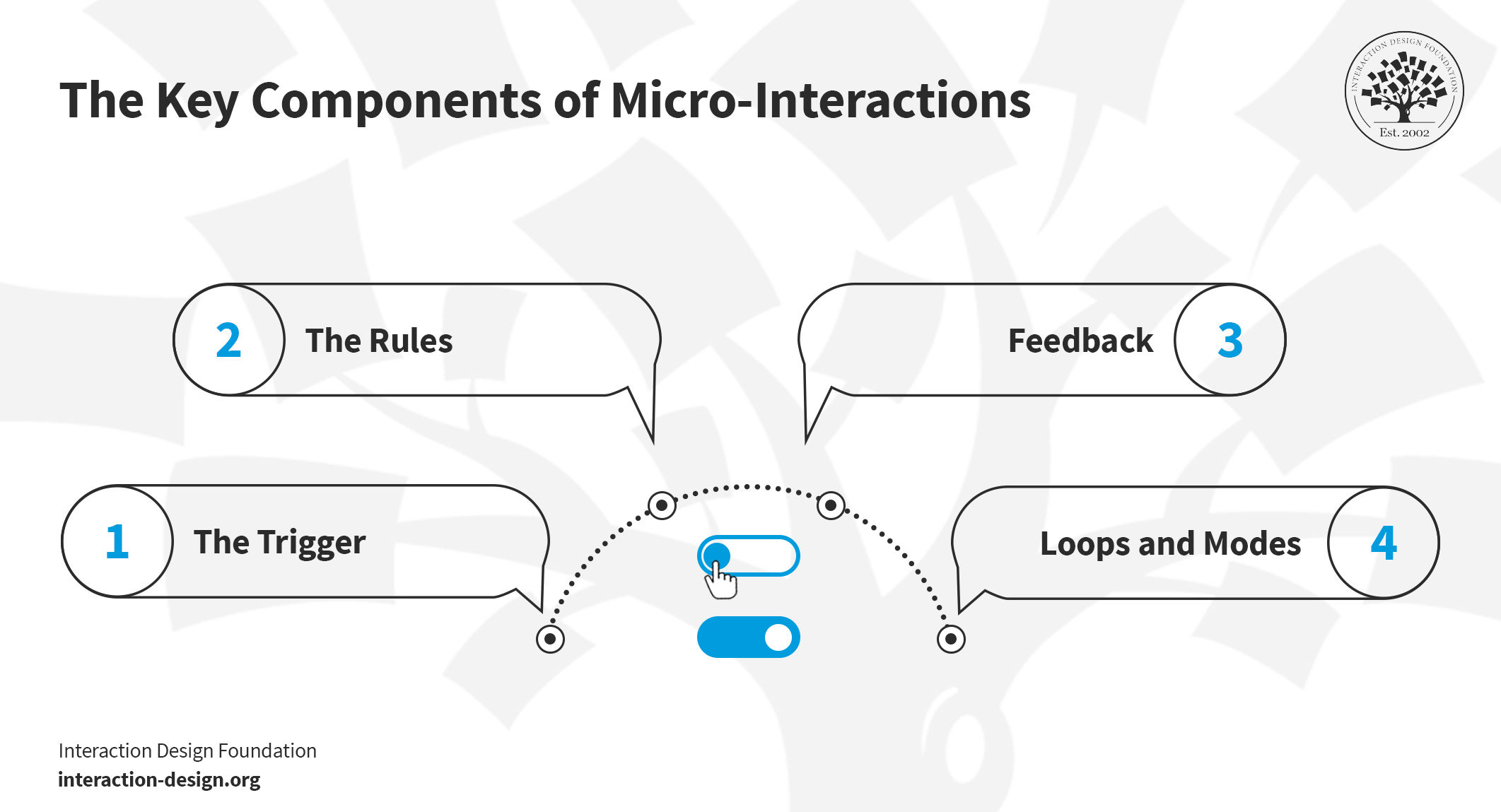
© Interaction Design Foundation, CC BY-SA 4.0
Dan Saffer, in his book Microinteractions: Designing with Details, breaks down the key components of micro-interactions into four essential parts: the trigger, the rules, feedback and loops/modes. Let’s explore each of these components and their roles in creating successful micro-interactions.
1. The Trigger
Triggers start the micro-interaction. They come in two types: user and system. User triggers require direct action, like a click, swipe, scroll or button press. They can even include gestures like a clap or a wave. The system triggers, though, happen when the system automatically meets specific conditions—like when users receive a message notification or a pop-up.
2. The Rules
Rules outline what occurs after a trigger activates. They create a logical flow so that the outcome meets user expectations. For example, various actions might follow when users engage with an icon. Clicking could launch an animation, sign the user out or trigger another specific function.
3. Feedback
Feedback confirms to the user that the system recognizes their action. It can be visual, auditory, haptic (like vibrations) or involve movement. For example, an iPhone vibrates to indicate that the user set it to silent mode.
4. Loops and Modes
Loops determine how long a micro-interaction lasts, including whether it repeats or changes over time. For example, most products only show the onboarding process to first-time users, not existing ones. Existing users, familiar with the product, find no real value in this process. Modes alter how a micro-interaction typically functions—things like changing a location in a weather app or setting a phone to ‘Do not disturb.’
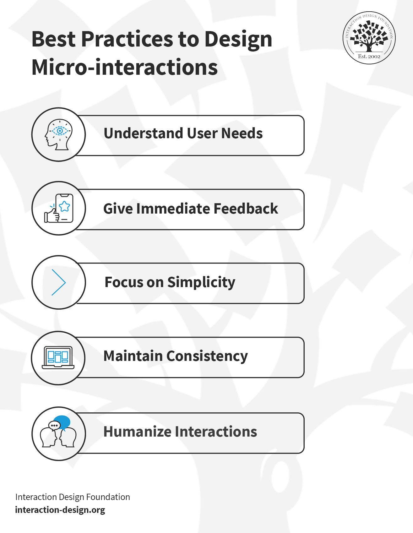
Best Practices to Design Micro-interactions
© Interaction Design Foundation, CC BY-SA 4.0
You must understand user needs, create intuitive responses and ensure consistent experiences when you design micro-interactions. Focus on these six best practices to create these subtle yet powerful elements in UX design.
1. Understand User Needs
A micro-interaction can serve several purposes. That’s why it’s so important to know what your users need. For example, you can use micro-interactions for:
Showing progress
Feedback and Confirmation
Security and Trust
Personalization
Error Handling
Teaching functionality
Before you create a micro-interaction, consider the following:
What purpose will this micro-interaction serve?
How will it improve the user experience?
Does it contain any unnecessary details or components?
To answer these questions, you can use surveys and interviews—observing user behavior is probably the most relevant, though. It’ll help you understand if your users prefer a micro-interaction, and this step makes sure that your micro-interactions address real issues. For instance, Mailchimp uses a checklist for password requirements. It turns a potentially frustrating process into a guided, user-friendly experience.
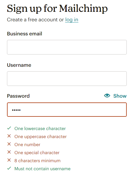
Mailchimp prioritizes user security while it guides the user through a subtle micro-interaction.
© Mailchimp, Fair use
User research maximizes the impact of design efforts. Watch this video highlighting user research's critical role in the design process. It shows various methods and stages of user research to align products with user needs for enhanced market performance.
Show
Hide
video transcript
- Transcript loading…
2. Give Immediate Feedback
Immediate feedback confirms that the system recognizes their actions and reacts promptly. This quick response helps avoid confusion and makes interactions flow better.
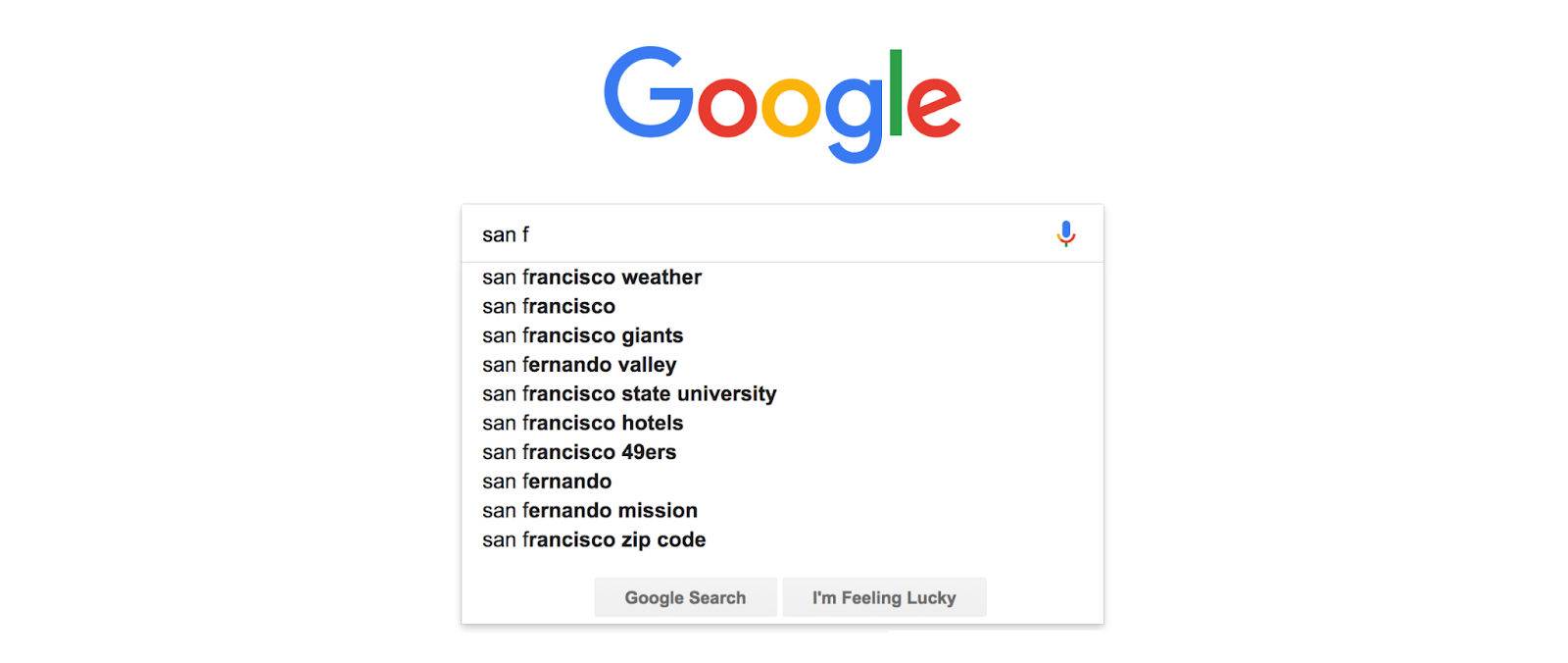
A good example is Google's search auto-complete—there, users see suggestions that match their search in real time as they type. It’s something that helps them find information faster and guides them by offering search alternatives. This kind of feedback also makes things easier for users. Along with factors like its iconic white space and visual elements, Google’s inclusion of this feedback is another point that makes it stand out among search engines.
Feedback in micro-interactions guides users subtly to enhance their experience.
© Google, Fair use
Besides making things easier, immediate feedback also makes users feel good. When users complete a task and immediately see a success message, it creates a positive feeling. This encourages them to interact with the product.
3. Focus on Simplicity
You’ve got to aim for simplicity when you create micro-interactions. Simple choices help people make quick decisions—meanwhile, overly complex micro-interactions can confuse users.
Take YouTube's like or dislike buttons, for example. They offer a straightforward way for users to interact with content. It’s something that makes the process easy and memorable—and with clear options like the like or dislike buttons, users don't feel overwhelmed. This makes using the platform a better experience. People prefer websites and apps that are easy to navigate and use.
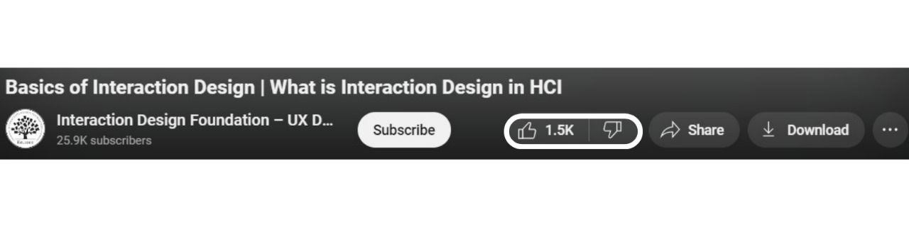
Simple micro-interactions streamline user tasks and make experiences intuitive.
© YouTube, Fair use
4. Maintain Consistency
Consistency builds a predictable environment and reduces the learning curve for users. They know what to expect—and how to interact—with the app or website. This familiarity speeds up tasks and reduces mistakes.
Let’s take a cue from Gmail's swipe-to-delete function—there, users can swipe any email and send it to the trash. This reliable action across the email interface makes it simple and intuitive to manage your inbox. This uniformity makes the system easier to use and boosts user confidence—they always know what will happen with their actions.
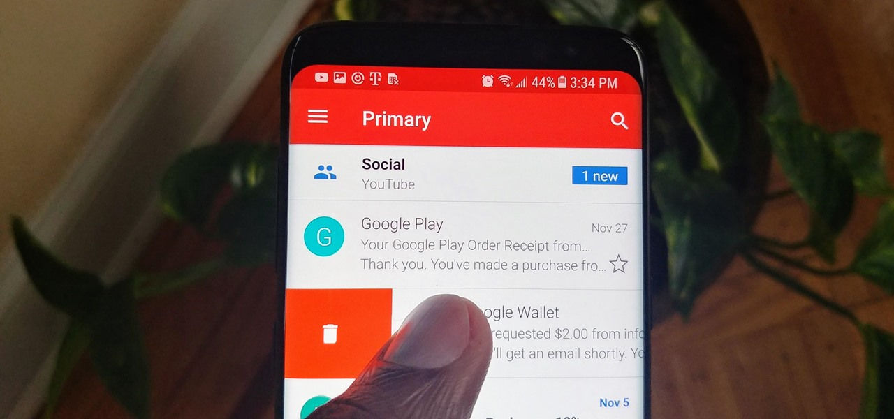
Gmail’s swipe-to-delete works consistently, no matter how many times a user uses the function.
© Gadgethacks, Fair use
You must aim for uniformity across all interactions. For you as a designer, this means you’ve got to plan how each micro-interaction works and matches others. Each action should follow similar patterns—from a click to a swipe.
5. Humanize Interactions
A human touch draws users closer to the platform—and it shows users that you understand and value them. Simple clicks become meaningful interactions. For example, Facebook's (now Meta’s) wide range of reactions lets people share their feelings more deeply. It’s an approach that makes the platform feel more personal and less mechanical.
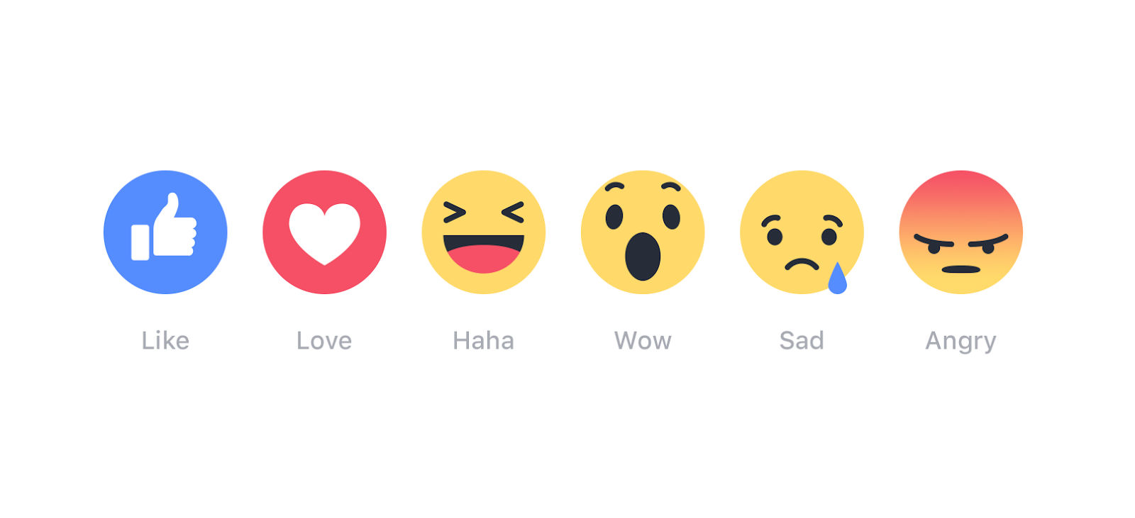
Stickers/emojis/reactions add a layer of personalization and humanization to the user experience.
© Meta-Facebook, Fair use
You can aim for features that stir emotions and build connections. Choices in design should spark positive feelings and a sense of community. This makes the digital experience more pleasant.
5 of the Best Favorite Micro-interactions
Let’s explore five standout micro-interactions that have won over users. Each example shows how thoughtfully crafted details can enhance an application's functionality and aesthetics.
1. Facebook: Interactive Emojis
© Facebook, Fair use
Facebook's "tap and hold" feature transforms the simple act of liking into a rich interactive experience. Initially, clicking the thumbs-up button signals approval—that’s the conventional way to like posts and comments. Yet, the real magic unfolds with a tap-and-hold. This action reveals a spectrum of animated emojis, each one brimming with life through real-time movements.
It's a prime example of an engaging micro-interaction. This feature rewards users with lively, animated emojis—so elevating the experience beyond a mere click. It enhances user engagement and adds a layer of fun to expressing emotions on the platform.
2. Asana: Celebratory Creatures
© Asana, Fair use
Asana's celebration feature stands out in micro-interaction design for its ability to blend productivity with joy. A fun character like a unicorn might appear when you finish a task. It's a surprise that makes you feel good about your work. This feature is more than a fun one, though—it taps into the human need for recognition and celebration.
The strength of this feature is its unpredictability. It adds a layer of excitement and anticipation to the work process. It's like a digital "pat on the back." It provides instant gratification and positive reinforcement.
Asana's celebration creatures show the importance of emotional rewards in task completion. They show you that positive emotions about our actions can make even regular tasks feel special. It encourages continued productivity.
3. Porsche: Car Configuration
© Porsche, Fair use
Porsche offers a car configuration tool that allows customers to customize their vehicle. Users pick their preferred model online—and then they choose colors, wheels, and interior options. Advanced technology integrates into the design process. Customers see real-time updates as they make selections. This tool also estimates the price based on chosen features.
Porsche makes sure there’s a personalized experience to make each car unique to its owner. The configuration process highlights the brand's commitment to innovation and customer satisfaction.
4. Dropbox: File Upload
© Dropbox, Fair use
The Dropbox file upload is an example of a micro-interaction design that simplifies the user experience. When you upload a file to Dropbox, it displays a progress bar. This bar fills up as your file uploads. It gives you a clear visual cue of the upload status.
This micro-interaction is a powerful one because it's direct and informative. You see the progress in real time. There's no uncertainty about how long you have to wait. And once the upload completes, a checkmark appears. This tells you everything went well.
This example shows that good design keeps users informed. Users feel more in control when they can see what happens. What’s more, this transparency builds trust in the service. It shows that even a simple action—like a file upload—is something that can boost the user experience when you handle it thoughtfully.
5. Google Assistant: Floating Dots
© Google Assistant, Fair use
The Google Assistant's animated dots provide excellent visual cues. It highlights active responses to voice commands. These micro-interactions unfold in two stages and feature the four colors of the Google logo.
When someone activates the assistant with "Hey Google," the dots appear as vibrant, bouncing spheres. This indicates that the assistant's ready to listen. And, as the person begins to speak, these dots transform into sound wave animations.
This design cleverly solves a common user issue: the confirmation of responsiveness from the app. It delivers a distinct brand experience—one that's both functional and aesthetically pleasing.
The Take Away
Micro-interactions may be small, but they significantly impact user experience and deserve the same level of attention one might give to, for instance, design principles or engagement metrics like bounce rates. They fill the gap between human interactions and digital responses to make everyday tasks on apps and websites more pleasant. These design elements offer visual feedback, encourage engagement and add a layer of enjoyment to otherwise mundane interactions. The top examples show that:
Micro-interactions have a big impact: Even the smallest detail can make a product feel more intuitive and enjoyable.
Design for the user: Understand what users need to ensure micro-interactions solve real problems.
Micro-interactions can be useful and delightful: Strike a balance between clear feedback and a touch of personality.
Use micro-interactions to express your brand: Subtle animations and design choices can subtly communicate your brand values.
Use these insights to add micro-interactions into digital products. These design elements can transform user interfaces from functional to exceptional.
References and Where to Learn More
Read the Forbes articles on Leveraging Microinteractions To Convert And Retain.
Take inspiration from top micro-interaction designs on Dribbble to make your own.
Learn more about micro-interactions and accessibility from Enhancing Accessibility through Micro-Interactions.