Learn to prevent negative emotions in the user experience of your product. As a User Experience (UX) designer, you want users to enjoy using your product by eliminating negative experiences and inducing positive emotion in your users. This article will teach you how to prevent anger and frustration from your users as you design the optimal user experience for your product.
How Friction in User Experience Hinders Decision-Making and Leads to Negative Emotions
Since videotapes and DVDs were replaced with streaming sites like Netflix, have you ever been faced with agonizing indecision when choosing a movie to watch because there were too many choices at your fingertips? When CD players were replaced with mp3 players that can hold over 40,000 songs, like the Apple iPod for example, have you ever found it difficult to stay on one song and enjoy it without thinking about what song to switch to next? Many times, you can even find yourself changing the song before it’s even over.
There is plenty of research on how an abundance of choice can actually be demotivating for people. One popular study, ‘When Choice is Demotivating: Can One Desire Too Much of a Good Thing?’ by psychologists Sheena Iyengar and Mark Lepper, found that when there is too much choice, people are less likely to decide on anything at all. And if they do decide on something, they end up feeling less satisfied with their selection.
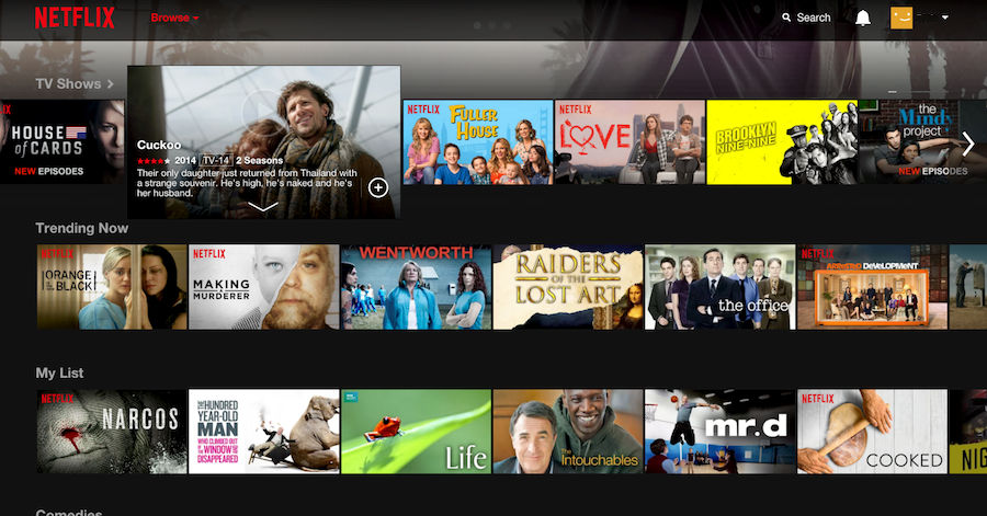 Author/Copyright holder: Netflix. Copyright terms and licence: Fair Use.
The overwhelming selection screen for the streaming site, Netflix, is an example of how an abundance of choice can cause users frustration and guilt due to indecision.
Causing your users to feel negative emotions is something you definitely don’t want to do as a UX designer. As Don Norman, notable cognitive scientist and best known for his popular book ‘The Design of Everyday Things’, had stated in his popular paper on emotion and design:
“Negative affect can make it harder to do even easy tasks: positive affect can make it easier to do difficult tasks”
Hindering your users from decision-making by offering too much choice is just one of many ways to cause negative emotions like frustration and guilt in your users. If you want users to enjoy using your product, help them make decisions. Make it easy for them to move through the user flow you’ve designed by aiding them to understand the concept or message you’re trying to convey, not only at every touch point, but also at any point in which the user lays eyes on the interface you’ve designed for them.
Instead, you can look for ways to induce positive emotions in your users as you design any user experience. Alice Isen, an American psychologist and professor of Psychology and Marketing at Cornell University conducted a number of studies investigating how positive emotions such as joy, interest, and alertness can influence decision-making. In one study, Alice Isen and Barbara Means (1983) asked consumers to make an informed choice between six hypothetical cars. They found consumers with positive emotions induced in them prior to the decision-making process were noticeably more efficient in their task processing. This has significant implications for web design, especially eCommerce where user’s consideration of a wide selection of potential options is essential to the viability of a business.
Examples of Negative Experience in User Interfaces
You can look to a variety of areas throughout the user experience where you can induce positive emotion. The first step, however, is to learn to recognize parts of the user interface (UI) that could lead to negative emotion in order to eliminate or fix those problem areas. Let’s look at some examples:
Avoid Causing Friction between Users and the UI
User flow can be disrupted in a variety of ways, causing friction between your UI and your users. One example of this type of disruption is seen when online retailers force the user to sign up for an account and provide an e-mail in order to purchase a product. If, in the real-world, people can purchase products in the store without providing an e-mail or going through the hassle of providing personal information, then why should your users have to bother creating an account on your website? After all, one of Jakob Nielsen and Rolf Molich’s ten user interface guidelines state that the systems we design should match to the real world. Therefore, we should remember not to ask for too much of your users. Perhaps from a marketing stand-point, getting as many e-mails as possible in order to build the marketing database is your original intent, however your job as a UX designer is to always think from the user’s perspective, and be an advocate for your user.
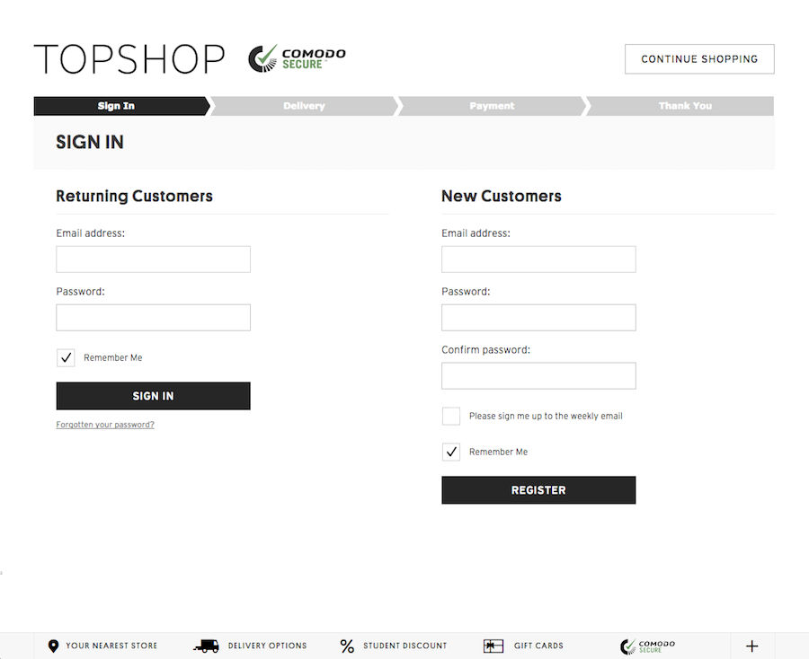 Author/Copyright holder: Topshop. Copyright terms and licence: Fair Use.
When the users have decided to purchase and click checkout at Topshop’s online shop they are led to this account registration or sign-in screen. This extra step of “Create your account” or “Sign-in” before letting your users make a purchase can disrupt user flow causing them to feel frustration and annoyance and potentially even lose the sale. Asking your users to create an account could be better included in a marketing campaign or something that shows it will benefit the user, not the other way around.
Avoid Tech-Speak
Designers should never take it for granted that users will understand certain phraseology or technical terminology. Where possible, avoid using 'tech-speak' such as NFC ready, quad band and Signal Boost. Instead, use plain, simplified language that do not require your users to look up words. Be intentional when choosing language to communicate with your users. Tech-speak is one of many factors which can lead to negative affect, such as anger and frustration. When a user is presented to tech-speak the user may find simple tasks complicated and their decision-making may be narrower. The user may even abort the current task and not buy a product from the site which is surely the worst case scenario for online retailers.
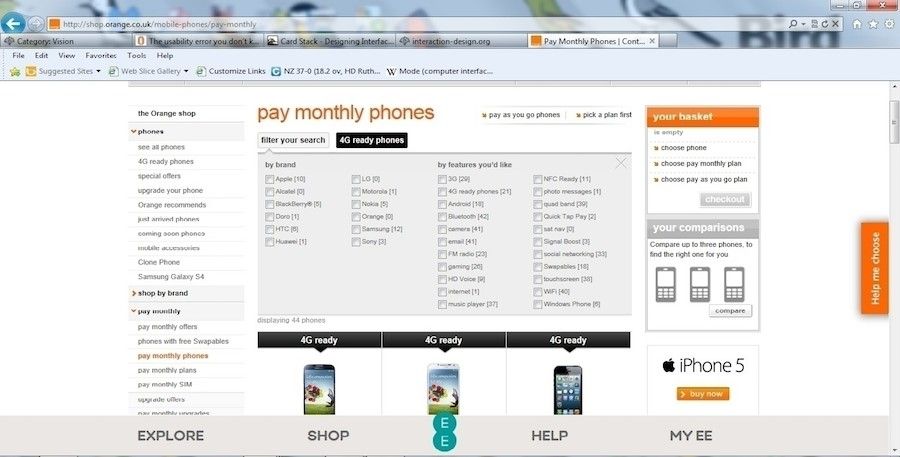 Author/Copyright holder: Orange, 2012. Copyright terms and licence: Fair Use.
Many online retailers resort to using tech-speak. Don’t make the same mistake!
Avoid Poor Information Architecture
Confusing navigation is often caused by both poor placement of content in your UI as well as content hierarchy that is not very well thought out in the first place. Make sure proper sitemaps are created and derived through systems thinking and card sorting sessions whenever possible. Further, keep in mind that search results are derived from pages that are sorted by various factors but most notably by their content and content structure, regardless of whether it’s a giant search engine or an eCommerce site.
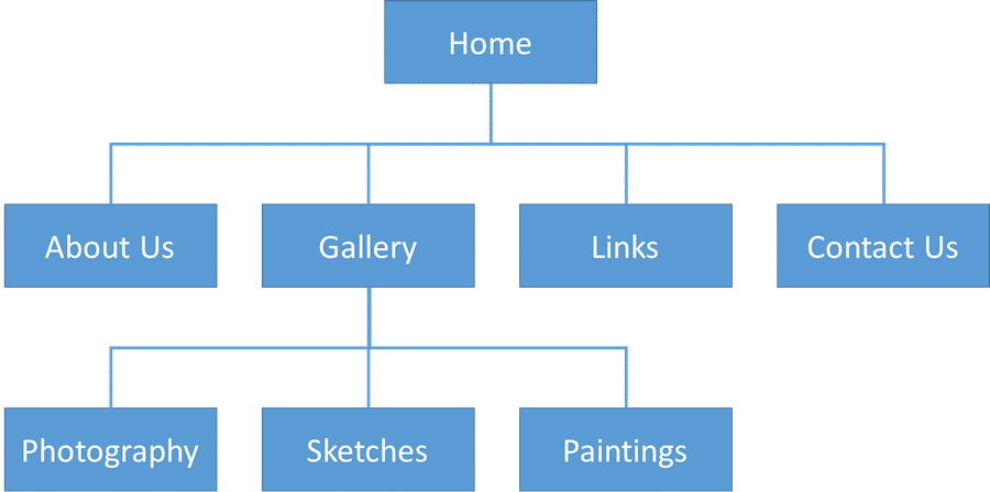
The information architecture of a mock art gallery website. The key here is that regardless of how simple or complex your website or system is, creating a proper site map in the early stages can help you design a better navigation experience for your users in the end.
3 Ways to Prevent Negative Emotions in the User Experience of Your Product
Reduce friction between your users and the UI by inducing ‘flow’ state in your users. Flow is the mental state a person goes through when they feel fully immersed when performing an activity. Immersion is often accompanied with a feeling of energized focus, full engagement, and enjoyment in the activity. To achieve this, always seek to minimize disruption to your users by taking out any unpleasant experiences like pop up ads or forcing account logins. This may be going against the demands of the marketing department, but your job as a UX designer is to be an advocate for your users, therefore, fight for their benefit and explain to the team how each disruption you remove enhances the user experience.
Demonstrate intention by anticipating user needs and wants. Think through each touch point with clarity. Put yourself in their shoes. Consider every interaction from your user’s conscious experience and perspective. There are a variety of ways you can demonstrate that you’re thinking about how the user perceives and processes all of the visuals and interactions you present to them. If you know that your target audience is the general public, avoid using ‘tech-speak’. If you anticipate that the user may need extra help or guidance, provide walk-throughs or a help area. Ensure that the visual experience provides a good amount of contrast for readability. Understand that while a beautiful UI is key to catching people’s attention, good UX is about keeping their attention by having a purpose behind every interaction and feature of your site.
Build the best information architecture possible because it is extremely important regardless of whether your product is a website for marketing, an entire system, a mobile app, or an interface in an automobile. Information architecture is the structural foundation of any interface design. Without it, your users will not be able to find what they’re looking for, they will become frustrated, and you will lose their business. You can achieve this through systems thinking, proper site mapping, as well as card sorting.
The Take Away
Design should attempt to increase positive emotions such as happiness and pleasure, and decrease negative affect, such as anger and frustration. Otherwise, the user may find simple tasks complicated and their decision-making difficult. Alternatively, they may simply abort their current task and not continue with your site; surely the worst case scenario for any business. There are a variety of methods to keep those negative emotions at bay and increase positive emotions through design. Start by looking at ways to reduce friction, demonstrate intention, and place a greater focus in building an information architecture that works.
References & Where To Learn More
Course: Emotional Design — How to Make Products People Will Love
Learn more about ‘When Choice is Demotivating: Can One Desire Too Much of a Good Thing?’
Learn more about The Paradox of Choice.
Read more about Emotion & Design: Attractive things work Better.
To learn more about the influence of positive affect on decision making, check this out.
Hero Image: Author/Copyright holder: Maki. Pixabay. Copyright terms and license: CC0