Your constantly-updated definition of Mobile First and
collection of videos and articles. Be a conversation starter: Share this page and inspire others!
290shares
What is Mobile First?
Mobile first design is an approach that embraces the constraints of smaller screens and focuses on what’s indispensable for users to improve the overall mobile User Experience (UX).
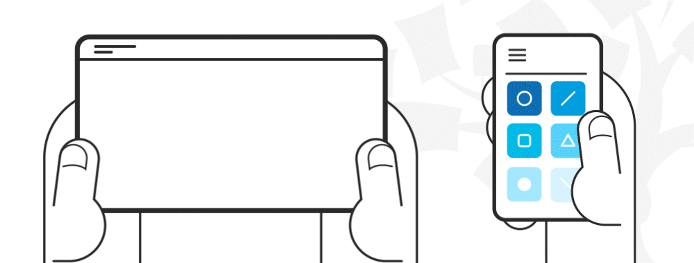
The mobile first design approach involves starting the product design process by designing for the smallest device first and progressively enhancing the design features for larger layouts—e.g., start designing for mobile and then move on to desktop.
There are other approaches to mobile UX design, like content-first or task-oriented design. Mobile first was initially proposed in 2009 by Luke Wroblewski, Google's Product Director. In his book Mobile First, Wroblewski explains that designing web products, starting with the desktop version, is becoming a backward way of thinking about design. Instead, he suggests adopting the mobile-first approach, which forces the designer to focus and enables innovation.
Progressive Enhancement vs. Graceful Degradation
Mobile first supports itself in the concept of progressive enhancement. This web design strategy emphasizes web content first, providing universal access to essential content and allowing users with additional browser features or faster internet to receive an enhanced version of the same page.
Progressive enhancement shares some commonalities with another well-known web design concept, "graceful degradation." One of them is their goal of making content available for all and how it looks in different browsers. However, the difference is that graceful degradation focuses on designing for the most capable and up-to-date web browsers. At the same time, progressive enhancement is concerned solely with content availability, which is why it is preferred for modern web design.
Mobile First Approach Core Principles
Keep it simple: Consider white space as another design element you can use in your favor. White space enables you to maintain a clean, clutter-free layout that is free of distractions. Similarly, ensure your navigation contains only the most essential items, as human memory can only store between 5 and 9 items.
Visual hierarchy: Mobile first is content-first, so focus on providing a clear and concise experience by prioritizing information. In other words, show your users what content is most important by using headings, paragraphs, captions, and other text styles to get your message across.
Optimize text for visual scanning: Users do not read; they scan. People will look for patterns systematically to make sense of what is in front of them, such as from left to right or top to bottom. You can take advantage of that quirk and position your most important information following a known pattern. Also, add the most critical bits of information above the fold and use short paragraphs no longer than two or three sentences.
Do not use hover effects on mobile, as they are impossible to implement. Instead, use touch or slide events. Furthermore, "think app" and utilize the gestures that users already know.
Leave complex graphs and images for the desktop version: optimize your images so there are no awkward cuts on mobile.
Make your design fat-finger-friendly: this means designing wide tap targets no smaller than 30px (Apple recommends at least 44px). When you create tap elements that are easy to find and click, you are also building a more accessible web environment.
A mobile first approach is about keeping the user at the forefront of your design efforts and concentrating on delivering content clearly and concisely. This means the content should load before anything else, so ensure your images have appropriate alt-text descriptions, which also helps your website to improve its SEO rankings.
Information architecture becomes critical when using the mobile first approach, as it helps weed out unnecessary details. You can also use a content inventory document to help you organize and visualize the elements you wish to include.
Designers should use a mobile-first approach because most people now access the internet on their phones. If a website or app works well on mobile, it will likely work well on larger screens too.
First, mobile-first design improves usability. Smaller screens force designers to focus on the most important content and features. This keeps the experience simple and clear for all users.
Second, Google ranks mobile-friendly sites higher in search results. A mobile-first approach helps businesses reach more people.
Third, faster load times improve user experience. Designing for mobile first ensures lightweight, efficient pages that perform well even on slow connections.
Last, but not least, mobile-first design increases accessibility. Many people rely on phones as their only device. Prioritizing mobile ensures they get a smooth, inclusive experience.
By designing for the smallest screen first, designers create products that work better for everyone.
Watch as CEO of Experience Dynamics, Frank Spillers explains important points about mobile-first design and more in this video:
How is mobile-first different from responsive design?
Mobile-first and responsive design both ensure a good user experience across devices, but they take different approaches.
Mobile-first design starts with the smallest screen. Designers create a product for mobile devices first, then scale up for tablets and desktops. This approach keeps interfaces simple, improves performance, and ensures the most important features remain clear.
Responsive design adapts layouts to different screen sizes. Designers create a flexible grid that adjusts based on the user’s device. The design does not necessarily prioritize mobile but ensures everything looks good on all screens.
The key difference is starting point and priority. Mobile-first focuses on essential content and performance first—from the start. Responsive design ensures adaptability but may not optimize for mobile needs first.
From using a mobile-first approach within a responsive framework, designers create faster, more user-friendly experiences across all devices.
What are the key principles of mobile-first design?
The key principles of mobile-first design ensure a smooth, efficient experience on smaller screens.
First, prioritize essential content. Start with the most important information and features, then add extras for larger screens.
Second, design for touch. Make buttons large enough to tap easily, avoid tiny links, and leave enough space between interactive elements.
Third, keep layouts simple. Use a clean, uncluttered design that helps users find what they need quickly.
Fourth, optimize performance. Minimize images, reduce code bloat, and ensure fast loading times, especially for slow connections.
Fifth, use scalable typography. Choose readable fonts and sizes that adjust well across different screen sizes.
Last, but not least, ensure accessibility. Accessible design is a vital consideration, so use high-contrast colors, clear labels, and alternative navigation options for all users.
Watch as CEO of Experience Dynamics, Frank Spillers explains important points about mobile-first design and more in this video:
How do designers prioritize content in a mobile-first design?
Designers prioritize content in a mobile-first design by focusing on what users need most. Small screens require clear, essential information without distractions to help bring about mobile-first experiences that feel intuitive, load quickly, and provide real value.
First, identify core content. Determine what users must see first to complete tasks quickly. Remove anything unnecessary.
Second, use a clear visual hierarchy. Place the most important elements at the top and use bold headings, short paragraphs, and clear buttons to guide users.
Third, keep navigation simple. Limit menu items and avoid deep navigation structures that force users to tap too many times.
Fourth, place critical actions above the fold. Ensure users see key buttons or information without scrolling.
Last, but not least, design for scanning. Users do not read word for word. Use bullet points, whitespace, and clear sections to help them find information fast.
Watch as CEO of Experience Dynamics, Frank Spillers explains important points about mobile-first design and more in this video:
Designers often make common mistakes in mobile-first design that hurt usability and performance.
First, they overload the screen with content. Mobile-first requires prioritizing essential information and removing clutter. Too much text or too many elements confuse users.
Second, they use small tap targets. Buttons and links must be at least 44px wide so users can tap them easily without frustration.
Third, they ignore performance. Large images, unoptimized code, and unnecessary animations slow down loading times, which drives users away (and might make the brand behind the design less popular with them).
Fourth, they forget about accessibility. Low contrast, tiny fonts, and difficult navigation exclude many users. Designers must ensure clear text, good color contrast, and multiple ways to navigate.
Last, but not least, they neglect real-world testing. Simulating mobile screens on a desktop isn’t enough and may be asking for trouble in this sense. Testing on actual devices helps identify usability problems and delivers an authentic mobile experience.
Watch as CEO of Experience Dynamics, Frank Spillers explains important points about mobile-first design and more in this video:
How does mobile-first impact layout and navigation?
Mobile-first design impacts layout and navigation by simplifying structure and prioritizing ease of use on small screens.
First, it creates a clean, focused layout. Designers remove unnecessary elements and emphasize key content, ensuring users see the most important information first.
Second, it simplifies navigation. Instead of complex menus, designers use clear icons, collapsible menus, or bottom navigation bars that users can reach with one hand.
Third, it ensures responsive scaling. Designers build layouts that expand naturally for larger screens without losing usability. Starting small prevents bloated desktop designs.
Fourth, it prioritizes touch-friendly interactions. Buttons, links, and form fields must be large enough to tap easily, with enough space to avoid accidental clicks.
Last, but not least, it optimizes scrolling. Mobile-first layouts encourage vertical scrolling instead of forcing users to click through multiple pages.
Watch as Author and Human-Computer Interaction Expert, Professor Alan Dix explains important points about navigation:
How do designers scale mobile-first designs to larger screens?
Designers scale mobile-first designs to larger screens by expanding layouts while keeping the experience clear and usable, so making for seamless experiences.
First, they add more space and structure. White space, larger margins, and multi-column layouts make content easier to read on bigger screens.
Second, they enhance navigation. A simple mobile menu can become a visible navigation bar on desktops, reducing the need for extra clicks.
Third, they introduce additional content. While mobile-first focuses on essentials, larger screens allow for supporting details, sidebars, or extra tools without overwhelming users.
Fourth, they adjust typography and images. Text can scale up for readability, and higher-resolution images ensure clarity on bigger displays.
Last, but not least, they maintain consistency. The core design remains the same, but interactions, spacing, and layout adapt smoothly to different screen sizes.
How does mobile-first design work with progressive enhancement?
Mobile-first design works with progressive enhancement by building a strong foundation for all users and then adding advanced features for larger screens. Combining mobile-first design and progressive enhancement means designers can create scalable, inclusive, and efficient digital experiences.
First, designers start with essential content and functions. They ensure the core experience works well on mobile devices with limited space and processing power.
Second, they enhance for larger screens. As screen size increases, designers introduce more layout options, additional content, and richer interactions without breaking the mobile experience.
Third, they improve interactions. Mobile-first ensures touch-friendly navigation, while progressive enhancement adds hover effects, keyboard shortcuts, and advanced animations for desktops.
Fourth, they optimize performance. Small-screen users get a fast, lightweight experience, while larger devices handle high-resolution images, videos, and complex layouts.
Last, but not least, they maintain accessibility. Every user gets a functional experience, regardless of device or connection speed.
Watch as CEO of Experience Dynamics, Frank Spillers explains important points about mobile-first design and more in this video:
What are some successful examples of mobile-first design?
Several successful examples show how mobile-first design creates fast, user-friendly experiences.
First, Airbnb built its platform with mobile users in mind. The app uses large buttons, clear navigation, and simple booking steps to ensure a smooth experience.
Second, Instagram started as a mobile-first app. Its scrolling feed, touch-friendly interactions, and minimal design make it easy to use on small screens.
Third, Spotify designed its app to work smoothly on mobile before scaling to desktops. Large touch targets, intuitive navigation, and offline downloads improve usability.
Watch as CEO of Experience Dynamics, Frank Spillers explains important points about mobile-first design and more in this video:
What are some popular and respected books about mobile-first design?
Wroblewski, L. (2011). Mobile first. A Book Apart.
Luke Wroblewski’s Mobile First is a pioneering book that emphasizes designing for mobile experiences before expanding to larger screens. He argues that starting with mobile constraints forces designers to prioritize essential content and interactions, resulting in cleaner, more effective designs. The book explores mobile growth, design constraints, capabilities, and best practices, guiding readers through creating user-centered mobile experiences. Wroblewski provides data-driven insights and practical techniques for leveraging mobile-friendly layouts, navigation, and touch-based interactions. This book has become a fundamental resource for UX designers and developers aiming to create responsive, user-friendly digital experiences in an increasingly mobile-centric world.
Earn a Gift, Answer a Short Quiz!
Question 1
Question 2
Question 3
Get Your Gift
Try Again! IxDF Cheers For You!
0 out of 3 questions answered correctly
Remember, the more you learn about design, the more you make yourself valuable.
It's Easy to Fast-Track Your Career with the World's Best Experts
Master complex skills effortlessly with proven best practices and toolkits directly from the world's top design experts. Meet your experts for this course:
Frank Spillers: Service Designer and Founder and CEO of Experience Dynamics.
Mia Cinelli: Associate Professor of Art Studio and Digital Design at the University of Kentucky.
Joann Eckstut: Color Consultant, Founder of The Roomworks, and one of the 12 designers chosen by the Color Association of the USA to create the yearly forecast used by industries to keep up with color trends.
Arielle Eckstut: Author, Agent-at-large at the Levine Greenberg Rostan Literary Agency, and Co-Founder of The Book Doctors and LittleMissMatched.
Ellen Lupton: Award-winning Author, Designer, and Senior Curator of Contemporary Design at Cooper Hewitt, Smithsonian Design Museum, as well as Professor at the Maryland Institute College of Art (MICA).
How to Craft Effective Mobile Experiences: The Role of Content Strategy and UX Writing
People use their devices in search of content: to solve problems, get information, consume entertainment, or do work. Th
520 shares
2 mths ago
Open Access—Link to us!
We believe in Open Access and the democratization of knowledge. Unfortunately, world-class educational materials such as this page are normally hidden behind paywalls or in expensive textbooks.


