
For many users worldwide, mobile was their first Internet experience and continues to be their primary way to access information. This is also true for people who don't need to use computer desktops, particularly since smartphone applications have dramatically changed how we live our lives. Here, we'll look at three UX approaches to design for a world that relies heavily on mobile to solve problems for entertainment, health, wellness and more.
© Frank Spillers and Interaction Design Foundation, CC BY-SA 4.0
Distractions surround mobile users. Hence, when you design for mobile, you must prioritize what is important for the user: give them what they need and do it efficiently within their changing environments and contexts.
We can consider three approaches to design interactions for mobile:
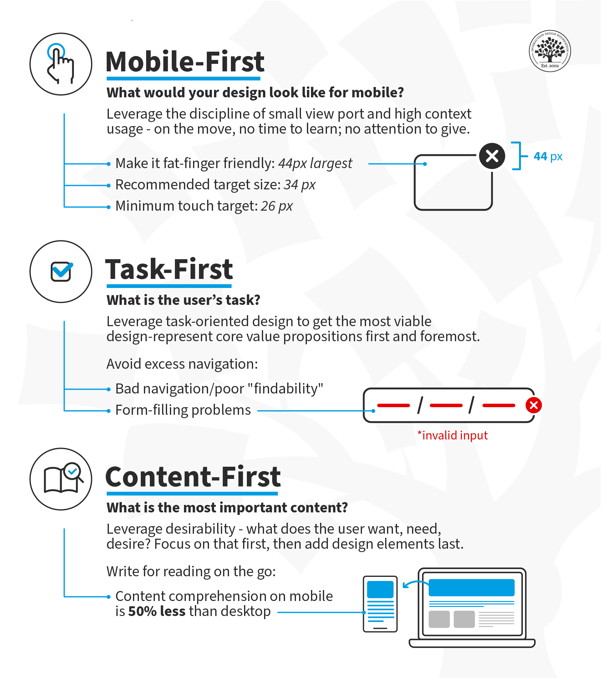
Mobile-First: Design for small screen sizes first and then expand to larger device sizes. Users are on the move; they can spare neither time nor attention. Under these constraints (movement, time, attention), decide what makes sense on your screen(s).
Task-First: Design the core value proposition first. Focus on the users' primary task and support successful task completion.
Content-First: Start with Desirability—what does the user want, need and desire? Design the content around that desire and add the other elements of user experience (interactions, interfaces and usability) afterward.
What is Mobile-First?
In the mobile-first design approach, you start your design process with mobile users in mind first and then scale up to larger screen sizes. This means you prioritize the mobile experience and ensure all your content and features are accessible on smaller screens. Another way to approach mobile-first is to prioritize content from the outset so that even if you begin your design process on a larger screen, you still have the flexibility to show your content effectively in a mobile environment.
Luke Wroblewski, a Product Director at Google, proposed this concept in 2009 and offered three reasons for designing for mobile first. Here, we've updated Luke's arguments for going mobile first to reflect the new mobile landscape:
1. Mobile Has Exploded
It's undeniable that the use of smartphones has become ubiquitous in today's society. Ensure your app provides an exceptional user experience across different platforms and screen sizes to reach a global audience.
2. Mobile Forces You to Focus
Regardless of device specifications, the one thing that's key to all mobile devices is portability. People use them on the move, which means that you must focus on the most important actions and tasks for your users.
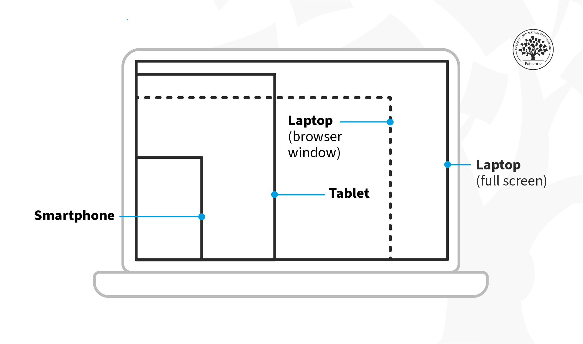
There's much more room on a desktop screen, and you can afford to add extraneous features, but smartphones don't give you that luxury. Remember that the user experience on smartphones is also determined by how they're used—on the move and in short, sharp bursts of activity, which is very different from sitting at a desk and browsing the internet for hours on end.
© Interaction Design Foundation, CC BY-SA 4.0
3. Mobile Offers New Capabilities
On desktop, the web is the standard way to interact with most businesses, but on mobile, the preference has shifted to applications. This is due to smartphones' many sensors and features, such as GPS, accelerometers, pedometers, touchscreens, gesture controls, augmented reality, and eye tracking.
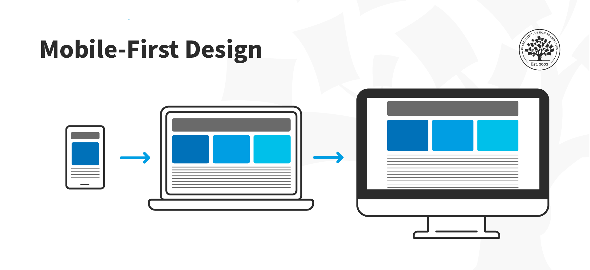
The mobile-first approach enables designers to leverage the full potential of mobile, rather than replicate the desktop experience on a smaller screen.
© Interaction Design Foundation, CC BY-SA 4.0
What Is Task-First?
This approach prioritizes user tasks over other design considerations, such as aesthetics or technical feasibility. This ensures the app is designed with the users’ needs in mind, resulting in a more efficient and practical experience. By focusing on user tasks, designers can also identify pain points in existing workflows and streamline them to improve overall user satisfaction.
For example, let's look at an application like Shazam, designed with a task-first approach. Its primary function is to assist users to identify songs playing in their vicinity. The app achieves this thanks to its clean layout and user-friendly interface that makes it easy for users to complete the main task without any extra distractions or complications.
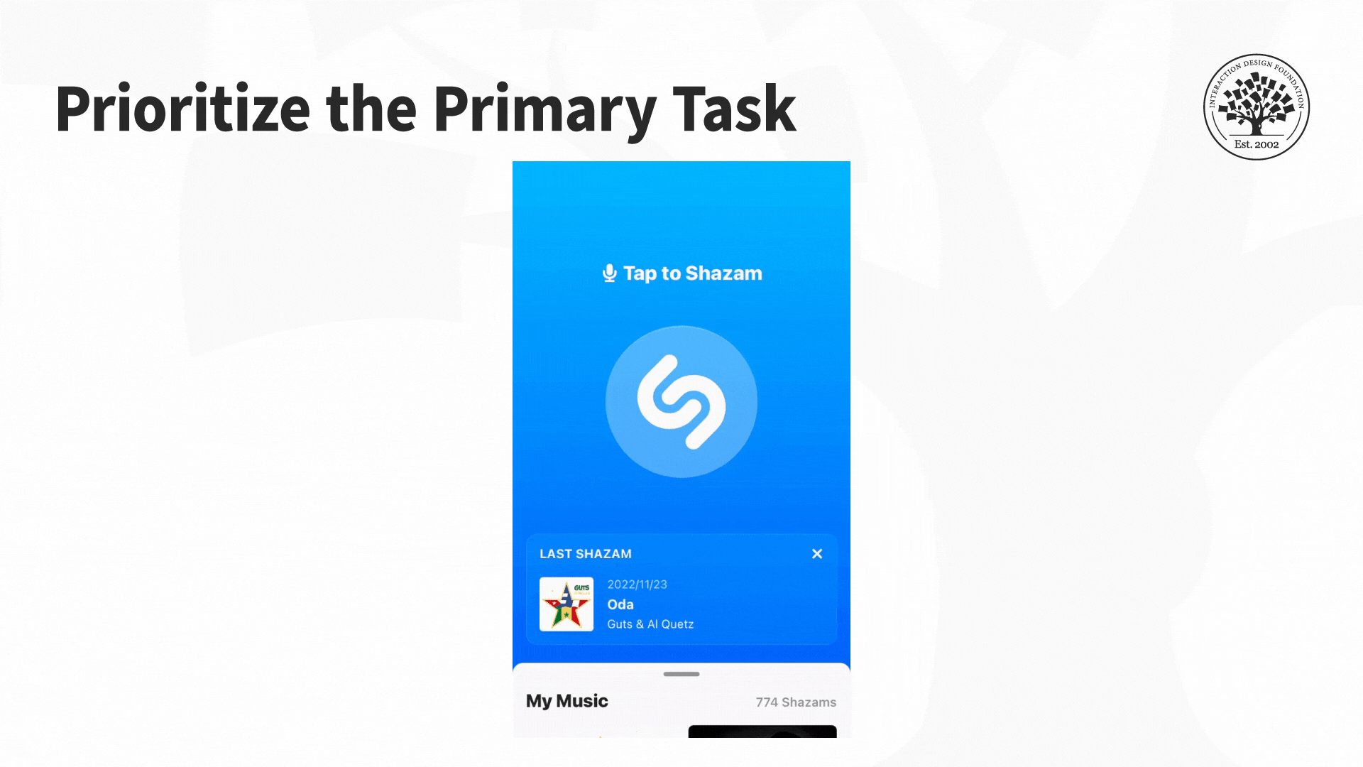
The Shazam app features a clean interface that helps users accomplish the main task: to identify music playing nearby.
© Interaction Design Foundation, CC BY-SA 4.0
The Task-First approach prioritizes giving users what they want as quickly and easily as possible without requiring them to hunt, search, or think too much.
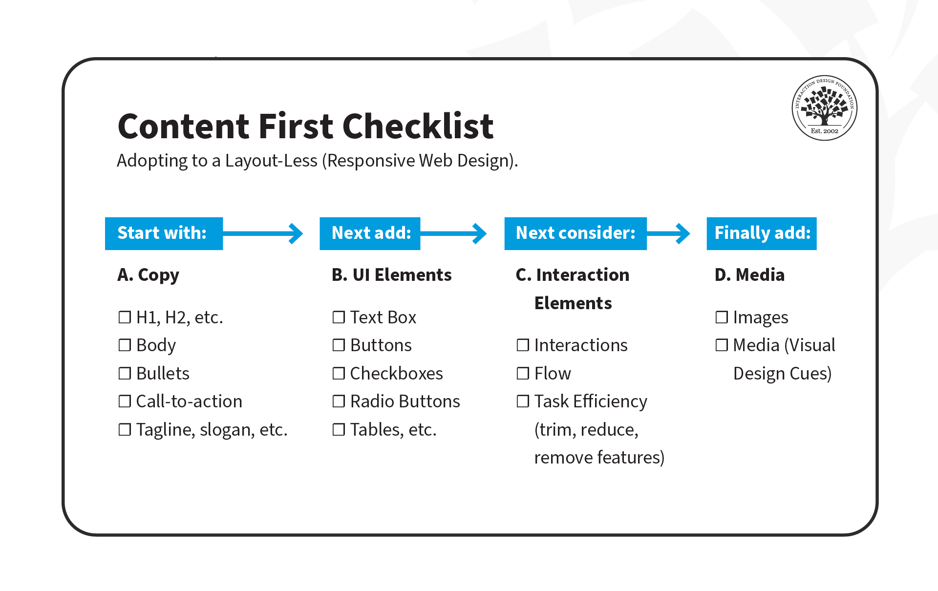
What Is Content-First?
The concept of a content-first approach has been around since the early days of web design, but it gained new relevance with the rise of responsive design. The basic idea is that content should be the primary focus of mobile UX design, as users come to apps and sites primarily for the content they offer rather than for the interface's design.
As UX designers, we often focus on interfaces and wireframes, but the content-first approach suggests that we should define the content structure first and then add UI and interaction elements later.
There are three stages to this approach:
Copy: Create clear and concise copy that conveys the intended message to users. This may include defining typography, font sizes, and heading structure (H1, H2, H3, H4, H5), which is critical for accessibility. Properly defined headings make it easier for screen readers to parse a page.
UI Elements: Once the copy is defined, it's time to add UI elements such as buttons, icons and graphics that support the content and help guide users through their tasks.
Interaction Elements: Add animations and transitions to enhance the user experience.
© Experience Dynamics, Fair Use
Interested in adopting the content-first approach? Here's a helpful checklist to assist you on your transition. Download the template, and share it with your team!
Put It All Together: A Demonstration of Mobile-, Task- and Content-First Approach
Now that we've covered the three approaches, let's see them in action! In this video, Frank Spillers will show you how to create an interface for a health app that enables patients to chat with doctors. He'll use examples from each approach: mobile-first, task-first, and content-first.
The Take Away
It's important to understand the unique challenges and opportunities of the mobile platform. Here are three powerful prioritization approaches to keep in mind:
Mobile-First: Mobile-First is a design strategy that puts mobile at the forefront of the design process. It recognizes the importance of the mobile web and emphasizes the need to create an experience tailored specifically to mobile devices.
Task-First: Task-First prioritizes users' tasks. It helps them complete tasks quickly and efficiently and minimizes cognitive load. This approach is particularly well-suited for mobile devices since users are often on-the-go and need to complete tasks quickly.
Content-First: Content-First puts content at the center of the design process. Rather than starting with wireframes or UI elements, this approach begins by defining the content structure first. This allows designers to optimize experiences for different contexts, physical or otherwise.
References and Where to Learn More
Read Luke Wroblewski’s original proposition for Mobile First.
See Clayton Lewis and John Rieman’s original definition of task-centered design in Task-Centered User Interface Design: A Practical Introduction.
More about content first in these articles:
Content First Approach in Design: Collaborating with Content Strategists and UX Writers
Why you should design the content first for better experiences?
To know why the heading structure is crucial for accessibility, see this resource:
Accessibility at Penn State
Read the forecast number of mobile users worldwide from 2020 to 2025, from Statista.
Hero Image: © Interaction Design Foundation, CC BY-SA 4.0


