
There are clear differences between smartphones and tablets and key differences in how users interact with them, which ultimately affects mobile user experience (UX) design. Here you’ll learn these differences so that your designs can satisfy both usage scenarios.
It has become an industry standard to put “mobile first” when you design for the mobile web. Generally, this is a good thing but can lead to neglect for the tablet platform.
Show
Hide
video transcript
- Transcript loading…
The smartphone tends to dominate discussions of the mobile internet, and there are no major surprises about that.
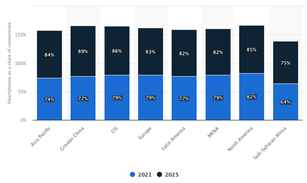
As of 2021, North America has the highest smartphone adoption rate, with 82 percent of total mobile connections. However, North America is expected to see a small increase in smartphone adoption in the future, while regions such as Asia Pacific and CIS (Commonwealth of Independent States) expect a dramatic increase.
© Statista, Fair Use (Link)
Key Usage Differences
Some earlier data from a Forrester Research (2014) mobile study, still relevant to usage behavior, found that tablets kept users engaged for longer periods than smartphones. This data reinforces other research that links smaller-size resolutions to shorter periods of engagement when using the device. Short, quick bursts of attention are the default on smartphones. This means that UX designers need to be even more vigilant regarding clarity and understanding on mobile.
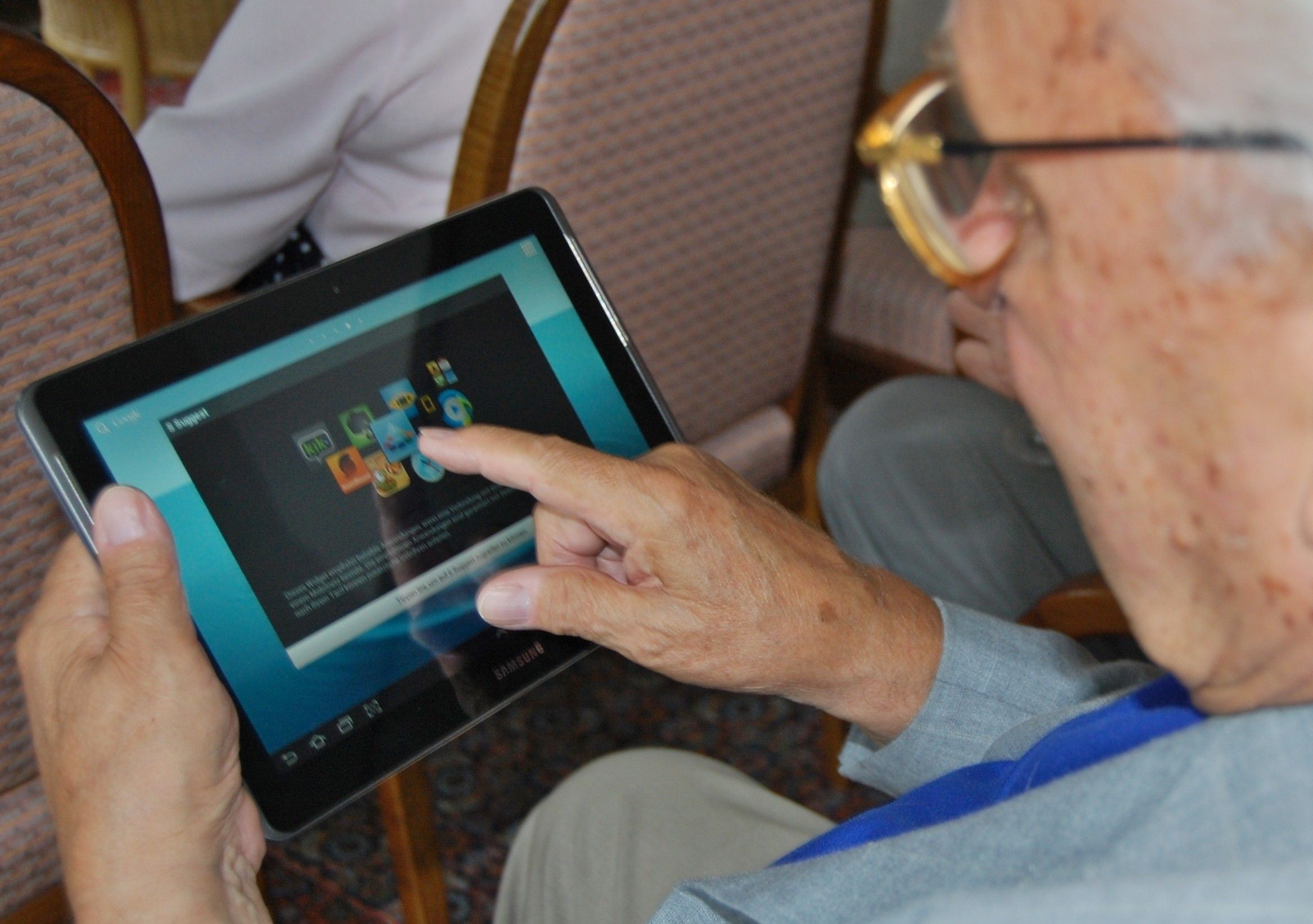
© Sigismund von Dobschütz, CC BY-SA 3.0
Tablets allow for a more relaxed experience. A user might sit on a couch, chair or bed for prolonged periods while using one. While this is also true of phones, they tend to move more (known as the “carry principle”) as the user can take them from one area of the house or office, for example, a bit more easily (e.g., in pockets). Therefore context of use and context awareness is critical.
UX designers can show users more media (images or video content) on tablets. You can also engage users more fully (through a game or interactive visualization) on tablets than on phones. Finally, remember the “hand-off” principle (Apple tried to build it into iOS, though it’s not as smooth as the vision it seems): users will move between phone and tablet and even over to desktop and back. Consider how users will engage with content across each platform.
Key UX Considerations for Smartphones and Tablets
There are some clear distinctions between the two device types. We need to consider these when we design user experiences.
The Smartphone
Smartphones are:
More mobile than tablets and more likely to be used in a wide variety of locations and scenarios.
More likely to suffer from distracted use.
Smaller screen size than tablets.
Rarely the primary access point for users to the internet (though in developing nations they may be).
Likely to be used for multi-tasking (users flit from app to app rather than spending significant periods of time doing any particular task).
More personal and thus more likely to be used for social and emotional contexts.
Less likely to have controlled lighting available when in use.
The Tablet
Tablets are:
Less mobile; they’re too big to be user-friendly in all spaces (though we’ve noticed this doesn’t stop people from trying, nonetheless).
More likely to be used in a fixed position (at home, in the office, in a café).
More likely to be shared among family or partners, especially children.
More likely to provide higher resolution (or at least bigger) experiences than a smartphone.
More likely to invite the “free browsing” of content versus the more focused experience of scrolling through images and text on mobile
Both tablets and smartphones require “fat finger friendly” designs. 44-pixel targets are a recommended minimum for buttons, icons, etc.
The Take Away
The tablet user experience differs from the smartphone user experience. A “one size fits all” mobile design approach will leave one mobile platform poorly catered for. We need to consider how space constraints can enhance tasks. Equally, consider the swipe and real-estate advantages tablets offer over smartphones.
Think about whether your content or app forces migration to another platform and if it complements device-switching. If device-switching is a pleasant experience, you’ve made it worthwhile. If it isn’t, the device-switching behavior is a lost opportunity. As long as we keep these considerations in mind when we design, we can satisfy users no matter their mobile platform.
References and Where to Learn More
Continued growth for smartphones—check out the IDC report.
Techcrunch’s analysis of the Forrester data on the tablet and phablet market.
The Pew Research Center study (2021).
Hero image: © Interaction Design Foundation, CC BY-SA 4.0


